At a previous company, we were forbidden from using translucency (with a few exceptions) because of the performance cost of blending. There are debugging tools we'd use fairly often to confirm that all layers were opaque.
I have been using 8 year old iPhone just fine, but features like these over time will make the experience slower and slower and slower, until I am forced to refresh my iphone
To be clear, these are new features that will likely have a setting to turn off. There’s no conspiracy, nothing “forcefully” added for the purpose of driving upgrades. (Ah, ninja edit): There’s not even a guarantee these features will be supported on an eight year old phone.
It’s a legitimate concern even assuming good intent.
But Apple has had to publicly admit bad intent specifically with their batteries and had to offer people money etc.
Strange to criticize people for something Apple publicly admitted they did wrong.
When is the last time a company has admitted wrong-doing? No, Apple admitted to slowing down phones when the battery was shot so it wouldn’t just suddenly shut down.
The worst part was that during the boot sequence, the CPU ran at full-throttle for a few moments until the power-management components were loaded. So I couldn't restart it. As long as I didn't open a game or YouTube or a wonky website with super awful javascript, I could continue using the phone for another couple hours. But if the phone turned off, it couldn't be turned back on without charging it more ... even though it had "18%" battery left (as determined by voltage, not taking into account increased internal resistance in the battery as it ages).
I was envious of iPhone users that got a real fix for this (Apple slowing down the phone when the internal voltage got low). I would have greatly preferred that Samsung had done the same for my phone too.
That said, Apple _significantly_ erred in not over-communicating what they were doing. At that point, the OS would pop warnings to users if the phone had to thermal throttle, and adding a similar notification that led the user to a FAQ page explaining the battery dynamics wouldn't have been technically hard to do.
which I am doing exactly, but still new iOS version make my phone slower and slower and I cannot even opt out of updates.
because some apps are forcing me to use the latest version of iOS (Authentication, Okta 2fa, etc)
And you can use third parties as well which Apple now officially supports.
It is just a lie to say you need a new phone.
There is literally a zero percent chance it was anything to do with batteries. This is not a conspiracy theory. It's an objective fact.
I'd much rather us have progress and people with 8 year old phones suffer than ensure that everything continues to run smoothly on any old device for eternity.
Apple absolutely effed up by not communicating the specifics well, but that’s corporate policy. Apple docs have always been targeted at the non-technical user and therefore inadequate for others.
You have what an iPhone 6? 1GB of RAM vs 8GB for modern devices, the first A chip came out 2 generations after yours as has 2% of the power of a current chip so modern chips are likely close to 100x as powerful as your phone.
Why should we hold back software to support extreme outliers like you?
What are apps and mobile sites doing differently today besides loading up unnecessary animations and user tracking? How has user experience improved for those operating on devices fast enough to make up for developer laziness?
I can now do on-device transcription without issue, security improvements at the chip level, HD graphics for video streaming, etc.
You can't choose when to use your OS, and you need to 'update your os' to stay secure.
Laggards cost society by running insecure devices that generally impact the rest of the world besides just complaining about no one continuing to support them long after the useful life of their devices.
Maybe there's also a cost to updating phones as frequently as people do, and inefficient software running across billions of devices.
I wouldn't blame people who make their hardware last longer and call them "laggards". And it's not their responsibility to write security patches for their device, that falls on the manufacturer.
For these people, me included, they don't need the latest hardware features to ray trace a game or run some local LLM. We're just taking some photos, making calls, getting map navigation, messaging, interacting with CRUD apps, and web browsing. None of that requires the latest hardware, and especially Apple hardware from 8 years ago is more than capable of handling it smoothly.
If you're running an insecure device past it's support life it's your responsibility and your fault if it's used to attack others. You are fully to blame for choosing to use something past it's serviced life. You cannot expect companies to support old software forever.
For what? So a designer can get a promotion? This is not progress, this is pure fashion. As if the planet being literally on fire needed more fuel.
So that we can have better features and functionality in our future systems. Backwards compatibility is an anchor. If you want new things then expect to get new platforms to run them on don't expect everyone to limit their possibilities to support you.
We are not talking about new features. Of course no one expects to run a LLM on an ten year old phone, again we are talking about fashion. It is change for change's sake. It is not providing value to users it is so the the designer gets to eat and management and shareholders are kept happy.
There is a difference between actual technical progress and you throwing out your skinny jeans because baggy pants are now in fashion.
Why shouldn't we build phones that last ten year, twenty years, or even more?
>We are not talking about new features
We are, you are just choosing to ignore them and call them fashion. There have been immense changes in capabilities over the past 10 years.
>Why shouldn't we build phones that last ten year, twenty years, or even more?
We do, dumb phones, why don't you own one of those instead of trying to limit progress in the phones pushing progress?
If we want to take increasing device lifetimes seriously we need to normalize testing and development against slow/old models. Even if such testing is automated, it’d do wonders for keeping bloat at bay.
Otherwise saying it is definitively true is misleading to put it mildly.
Whatever is it that you're saying that Apple does, it's either not obvious or they're shit at it.
like Charlie Munger have said: "Show me the incentives and I will tell you the outcome"
Reality is that designers, product managers, engineers — they all wanna build cool things, get promoted, make money etc.
You don’t do that by shipping plain designs, no matter how tried and true. The pressure to create something new and interesting is ever present. And look we have these powerful Apple silicon chips that can capably render these neat effects.
So no I don’t think it’s a shadowy conspiracy to come after your iPhone 8. Just the regular pressure of everyday men and women to build new and interesting things that will bring success.
And yes, “looking different” doesn’t have to mean “requires faster hardware”, but picking something that requires faster hardware makes it less likely that you will be accused of being a copy-cat of some other product’s UI.
oh wait. it's not like they did. they did say it.
Plus, vista was released in 2007, XP SP2 (the most popular version) was in 2004. so its like ~3 years diff. So its not like hardware has progressed in 3 years, its more like new software got significantly slower
They WAY overreached in their goals with Longhorn. When they finally decided to cut back features to something actually attainable, they didn't have enough time to make a high-performance OS.
Windows 7 was a well-loved rebrand of what was essentially just a Windows Vista service pack and improved performance (though it was still too heavy for a lot of the older machines people tried to upgrade to Vista). If they'd have cut back on their goals earlier, Windows 7 is likely a lot closer to what would have shipped as Vista.
Windows 7 benefited from coming later with Vista being the battleground in which vendors were forced to update to NT6.0 models.
For older models, on the other hand, it would be an issue, and will put pressure to people to buy a new one.
Unlike previous GDI acceleration, DWM.EXE could composite alpha channel quickly with the GPU, and generally achieved much higher fill rates on the same hw - if the drivers worked properly.
Even on modern devices though which have more computation and graphics power to the point that they aren't going to actually lag or anything while rendering it, why waste cycles and battery animating these useless and distracting things? There's no good justification.
Apple at the time created their own 'approximate gaussian blur' algorithm specifically to enable this, and it ran crazy fast on devices where a simple gaussian blur would barely achieve double digit FPS. Even if this 'liquid glass' effect is heavier to compute, on the hardware we have today it will be a negligible performance concern.
"Without any performance issues"? Entirely false - reviews at the time noted iOS 7 dramatically reduced battery life - all across the board for Apple devices, even for the then latest iPhone 5S and 5c (https://arstechnica.com/gadgets/2013/09/ios-7-thoroughly-rev...).
The abuse of transparency/translucency in the UI was the primary reason - you could go to Accessibility settings and disable animations + transparency/translucency and get notable increases in both runtime speed of the OS UI and battery life.
It has been like this for every Apple release for over 20 years.
Also, they do listen to feedback and do gather it. They won't change entire design language now tho.
WebKit sounds like the kind of scrappy startup Apple might want to acquire and gain some hard-earned engineering knowledge.
But apparently they still welcome app-crashing bugs and UI-stalling code!
Screwing with the battery life on a mobile device would be a showstopper bug if Steve were still around.
I's also true that iOS 7 made the 4/4S seem much slower, but the frosted glass effect still ran at 60FPS - that was my point. It was really impressive at the time. Though unless you spent hours sliding the control center up and down, it's hard to blame the blur effect for the reduced battery life, as it rarely appeared inside apps. Most likely the result of increased OS bloat and proliferation of background services.
And all of this just to make the whole UI white and generic.
I just want everything to look like Windows XP. I don't get it.
The demos only show a very limited array of shapes. Precompute the refraction, store the result in a texture, and the gist should be sample(blur(background), sample(refraction, point)). Probably a bit more complicated than this—I’m no magician of the kind that’s needed to devise cheap graphics tricks like this—but the computational effort should be in that ballpark. Compared to on-device language models and such, I wouldn’t be worried.
(Also, do I need to remind you of the absolute disdain directed by 95/98/Me/2000 users at the “toy” default theme of XP? And it was a bit silly, to be honest. It’s just that major software outfits don’t dare to be silly anymore, and that way lies blandness.)
Great observation! We need some of that sillyness back. Everything is all serious and corporate nowadays, even 'fun' stuff like social media or games. Even movies can't be silly anymore.
Myself, I can appreciate corporate stuff presenting corporate. More truthful, feels a little less manipulative.
Okay, but what about the battery connected to the GPU? The battery in my iPhone has already degraded below 80% health in the 2.7 years I've had it, so I'd rather not waste its charge on low-contrast glass effects.
I don’t know, just kidding :-)
If GPUs can handle it, I guess why not. It’s some people will notice and say “wow, looks pretty, glad I upgraded”
3:30–3:45 in the video is painful. Describing “giving you an entirely new way, to personalise your experience”, while showing… white. White white white. Oh, and light tinted backgrounds to set your white on. I hope the personalisation you wanted was white.
But it is worth remembering that dark mode does actually get you some things; it’s not all bad: the restrictions do have some value.
Full customisation became paradoxically limiting: when you give too much power to the user, the app is essentially operating in a hostile environment. Of course, a lot of it was laziness on app and UI framework developers’ parts, but it really did limit innovation, too.
Dark mode gets you a pair of themes that you can switch between easily, and an expectation that there are only two themes you need to consider, with well-defined characteristics. This is a much more practical target, a vastly easier sell for app and framework developers.
The funny thing with monochrome icons is that in some ways they were actually a better fit for a full-customisation environment, where you had arbitrary background and foreground colours. Once it’s just mundane light and dark themes, you could more safely have full colour in two variants.
Certainly light mode and dark mode does not mean things need to be monochrome.
I made a comment about this a couple of years ago, but I fudged the explanation of it. https://news.ycombinator.com/item?id=34937618
I suspect that their new technique implements the existing fast gaussian blur, and since the patent is about to expire, it was a good time to spice it up.
I suspect as others have mentioned here, they use a "Liquid Glass" shader which samples the backing layer of the UI composition below the target element and applies a lens distortion based on the target element's border radius, all heavily parameterized so as to be used with the rest of the system's Liquid Glass applications like the new icon system.
And yes, later iOS on early hardware was huge PITA and slowdown.
They're going to backport this? I seriously doubt it.
It’s in beta so ofc I’m getting a ton of frame hitches, overheating, etc. but my summarized initial thoughts are “it’ll take some getting used to, but it feels pretty fast”
I have a feeling the whole smooth animations thing contributes to this a lot. Obsessing about the reaction time and feeling of how stuff comes on the screen. But yeah iPhone 16 pro is probably a bad performance test case
> It’s in beta so ofc I’m getting a ton of frame hitches, overheating
The overheating is a common occurrence, but it doesn't persist. It seems to be certain things (setting the animated backgrounds in iMessage is a good example), but the moment I'm not doing one of those things the temp feels fine. My battery does drop a percent or two during those cases (which sucks), but my typical use of the phone hasn't yielded any noticeable battery life loss compared to 18.5
I don't know how long you've been following Apple but with previous "high cost on old hardware" features they just disabled them for old hardware.
Apple loves their battery life numbers, they won't purposefully ship a UI feature that meaningfully reduces them. Now bugs that drop framerates and cause hangs, they love shipping those.
For devices currently being sold, primarily.
It's the first iPhone I bought and has lasted longer than any of the three Android phones I had before it.
...under pressure of consumer protection and e-waste laws. As it should be, I hope the other phone manufacturers are experiencing the same pressure.
I imagine this was on mobile devices.
Blending was relatively expensive on GPUs from Imagination Technologies and their derivatives, including all Apple GPUs. This is because these GPUs had relatively weak shader processors and relied instead on dedicated hardware to sort geometry so that the shader processor had to do less work than on a traditional GPU.
Other GPUs vendors rely more on beefier shader processors and less on sorting geometry (e.g. Hierarchical-Z). This turned out to be a better approach in the long term, especially once game engines started relying on deferred shading anyway, which is in essence a software-based approach that sorts geometry first before computing the final pixel colors.
I feel like a few years back when I still used an Intel macbook i noticed an increase in battery life and less frames dropping (like during 'Expose' animations) by disabling transparency in Accessibility settings.
I think this was after the BIg Sur update.
Also reported here for example: https://discussions.apple.com/thread/255911835
Re-enabling transparency improved this a lot, also keyboard still hangs a bit from time to time. I’m always in power save mode, on an iPhone 12, running iOS18.
I had "Reduce Transparency" check-box in settings turned on because I distaste semit-transparent interfaces. Was not noticing performance problems except one application - Ogranics Maps which were unusably slow after switching to another app and returning to maps so I had to restart it freqently (swipe up). I was thinking that the problem is with Ogranics Maps code.
After seeing this comment re-enabled transparency (iOS default) and Ogranics Maps working fast even if I switch between Organic Maps and other apps!
Also reported here for example:
https://www.reddit.com/r/iphone/comments/1d2ncvu/if_your_old...
Not sure if it is planned obsolescence but it certainly is an upsell to upgrade.
Just kidding: Yeah, it's just that when I think about a digital glass effect it feels more right with square corners than rounded corners. Because glass windows which we look through usually have square corners. Says I, who spend most of my time looking through a curved motorcycle helmet visor.
I'm very curious which items you went through before concluding that glass almost never has rounded corners.
That's why we have round glass coasters, round lenses, round glasses for drinking, etc.
I can barely cope with their being no option to turn them off on Mac, especially for windows. I literally had to make my background pure black because the few pixels of backgrounds always showing pissed me off so much.
It's straight from the 2000s, with Linux users using Compiz and... Amethyst(?), stuffing their entire desktop full with gaudy transparency, transforms, jiggles and bounces.
More of a nit, but the sentence
The new design extends across iOS 26, iPadOS 26, macOS Tahoe 26, watchOS 26, and tvOS 26 to establish even more harmony
Yeah, this really looks like an Apple temper tantrum of "Nobody wants to program for the Vision Pro? Fine. We'll MAKE you program the iPhone like the Vision Pro. Take that developers. Now get back to doing our job for us, you lazy slobs."
So, you can either assume that Apple are blundering, incompetent dolts who have completely lost the plot (certainly possible) or that Apple has an actual purpose behind this.
If you ask for the purpose and the look at the GUI, you see Apple cramming a UI update targeted with the design language from AR (transparency behind everything, motion cues to activate orienting reflex, etc.) down the throats of all developers as opposed to just those on the Vision.
updating ticket to closed
Given the huge change and sensitivity to accessibility I'm going to guess the opposite -- it will be designed to look nice without transparency.
It’s simply a matter of “which settings would MOST of our users want enabled by default?”
I do agree that the accessibility settings can make ios pretty ugly though. It’s a real shame. :(
iOS: Settings -> Accessibility -> Display & Text Size -> Reduce Transparency.
You're welcome.

When switching between screens, there’s just a long pause instead of the animation. These pauses drive me crazy, it’s simply not possible to configure the device to be responsive.
This animation slows every transition by one second including entering and leaving fullscreen mode, because on Mac OS fullscreen works by moving the window to a new workspace. There is no justification for this.
My strategy for multiple desktops is to not use them at all. But I'm enjoying the comfort of a 43" screen, so all the windows I need just fit.
IMHO iOS strikes an almost perfect balance. It animates things in response to continuous drag gestures (notification centre, app switching), but almost nothing else. Maybe macOS could take a page from that book? E.g. dragging the menu bar; the animation plays out in direct response to user action.
No, you can not. You can reduce _some_ animations, but most of them actually remain. Including the most annoying ones like the slowwwww screen switching, or the bottom sheet animation.
An amusing anecdote: I have animation turned off entirely on my Android phone, and I was demoing an app on it. People commented how amazingly fast it felt compared to iOS, simply because there were no animations.
Transparency confuses me regularly - and I then waste cycles trying to understand why a particular heading has a strange colour before I work out it is bleeding through from some unobvious background thing.
I’m not just thinking of myself here. I’m concerned that a lot of people who don’t consider themselves disabled will be disabled by this.
It’ll be fine.
Why would you design readability and visibility to depend on chaotic, highly varied and probably sometimes bad underlying backgrounds?
I fail to see any systematic approach/ consistent design language at play here.
Let's hope this does not survive for long.
"And this is how easy I can replace this custom component with a new glass component...".
The whole thing is just wild.
There was plenty of UX enhancements which looked solid, but just for them to be paired with a design choice of N=1 elements is... well let's see if it pays off I guess?
Thank you.
To me, being socially awkward is kind of a secondary, less important trait, but that’s the one everyone seems to notice. We’re weird on the outside because inside, we’re dealing with overwhelming sensory input.
Curse HackerNews' narrow indents!
O no, there is a systematic approach.
1. Bosses in UI division get promotions & raises for their new implementation of shiny
2. Marketing guys get to use their bird brains to promote shiny
3. Apple UX guys get to have their med prescriptions renewed
I'm just wondering if Apple is going to make matching CSS updates in Safari so web app developers have matching visuals.
color: contrast-color(rebeccapurple);
People pretend this isn't a solved problem.
Alegria, flat design, pastel colors, or unholy amounts of whitespace. It's been the story of the last 15 years of UI design at least.
Well, this is what Apple does, and the reason I hate their devices with a passion. It always was style over substance.
It honestly saddens me how far Apple has fallen.
When I was at NeXT, Steve Jobs told me that if it was up to him, Apple would get rid of the Human Interface Group. (Steve was rather hostile to Larry.)
Later, when it was up to Steve, he did exactly what he said: he got rid of HIG.
I think it’s easier to sell visual design than it is to sell usability because people see visual design immediately, but it takes time and experience to see and understand usability (and some users never seem to consciously notice it at all).
A dream desktop OS for me would be something with a classic Mac interface and with conformity to the Apple human interface guidelines of the 1990s, but with Lisp- or Smalltalk-like underpinnings to support component-based software. It would be the ultimate alternate universe Mac OS, the marriage of Smalltalk (with Lisp machine influence) with Macintosh innovations. Of course, there were many projects at Apple during the 80s and 90s that could’ve led to such a system.
Now that I’m a community college professor, I have more free time in the summer months for side projects...
Hopefully. I wouldn't mind being young. I am also not a designer, so UI/UX history may be lost on me.
I can only say that the only Apple product I genuinely enjoyed from a design perspective was the iPod Nano I bought sometime in early 2000s.
Heavy research indeed
I don't doubt designers spent a lot of time researching it. It still reads like an incredible amount of carefully crafted bullshit.
The more the design of things "evolve", the more I appreciate designs that simply don't.
I'm a Schrodinger's old man.
Same. For just one example, consider how submenus work. You don't notice when they're done right, but when they're done poorly, they will disappear when you try to choose a submenu item, or stick around when you expect them to go away. Getting them right is subtle; Apple got them right, and plenty of web pages still get them wrong.
That's interface design. Flashy translucency effects are something else.
You've already judged the system as only good for "looking good on screenshots and marketing materials" when you haven't even seen anything other than the announcement.
We are talking about the same company that to make a the MCP a little bit thinner released that crap with only two USBC ports, forcing everyone to carry fucking dongles everywhere.
And let's not forget that awful butterfly keyboard.
So much usability, so much accessibility. No vibes, no sir.
And yes, I am aware those silly toy computers have a couple more ports nowadays, I have to use that on a daily basis for work.
Lord only knows Altman is probably doting on him in the same way. This industry just never learns.
Yes, I think they would do that.
Lots of historical examples of Apple making weird design choices for decades now. I'm old enough to remember the hockey-puck mouse on the original iMac.
Also, here's a list of bugs I've personally observed over just the last two months: https://gist.github.com/BenWheatley/29a3c22203d90ae80465cdb1...
3.3 trillion dollar market cap, and the *clipboard* is no longer reliable. The mail badge is an unreliable count. The wallpaper sometimes disappears. The alarms don't play out of whatever speaker or headphones you're using for all your other audio.
If their hardware wasn't so damn good for my professional work, I wouldn't go near this child slavery enabling shitshow of a corporation. I don't know if I've ever felt as trivialized or patronized as watching someone in formal dress talk to me about how many new ways I can express myself to my friends via emoji or whatever else as I have when watching Apple keynotes. It feels like they've tried to commoditize interaction even more than Meta. It all feels so hollow. You can tell Steve is gone.
Yes, and where have you been for the last two decades? :) The last time Apple did actual UX research must have been in the late 1990s.
The Apple of today is nowhere near what the Apple of Steve Jobs was.
Bugs galore, UX issues galore. Overall it's a mashup of various staff egos over everything.
Anyway, I also bet they will tone this transparency stuff down a lot in the betas leading to the stable version in September. iOS 7 all over again…
Interface design is not a place for unlimited creative expression. But recent user interface trends exclude many design idioms and relegate one to a limited range of creative expression also. Some people think they look better. Some do not.
Accessible interfaces have become uglier in ways which did not improve accessibility. And recent trends have made them less accessible in some ways also. Choose not enough contrast or too much. Choose contrast or color where both were before.
[1] https://www.nytimes.com/2003/11/30/magazine/the-guts-of-a-ne...
I want to make things bigger in pixel resolution, not make pixels bigger.
It looks so tacky.
That said, Windows 7 had an option to turn off all the translucency, so hopefully Apple ripped that idea, too.
https://preview.redd.it/zzxh77iv906f1.png?width=2358&format=...

Surely anyone who's fiddled with the caption background opacity on their TV or video player knows this is a mess?
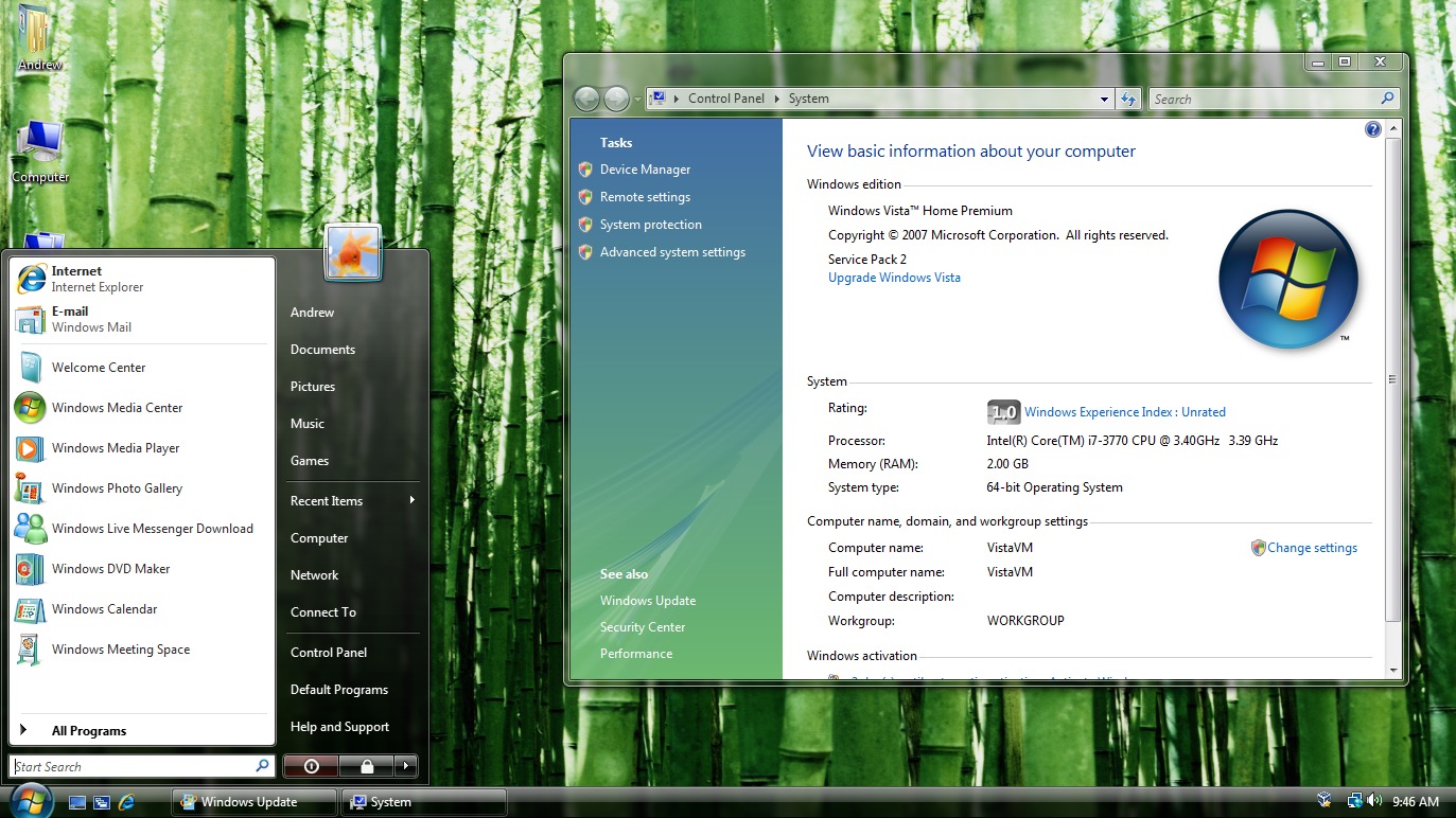
Would have been nice for someone to explain why we're getting Windows Aero[1] for main content and not just bezels.
I don't think this design language is mutually exclusive with readability, it actually looks really cool in many ways; I just can't fathom why the examples in the presentation seemed good enough to show.
This will be a massive improvement in usability over flat design, which made UIs only learnable by trial and error.
https://cdn.arstechnica.net/wp-content/uploads/2015/07/Scree...
I don't know that a redesign was called for at all. I guess they needed to show something if Siri still isn't ready, but this is just not it.
I'd have personally hoped for them to beef up iCloud+ but I know it doesn't sell devices to the general user.
This certainly is not that. Like it or not, a huge multi-OS redesign is not something you rush out for a keynote because your first choice didn't pan out at the last minute.
(I don't particularly have an opinion that this was their line of thinking, just pointing out that for a company like Apple they would have been thinking "what if X isn't ready in time" months or even years before the point of actually knowing if X is it isn't ready on time.)
On the other hand, I can already tell I'm going to despise this on macOS. I always work with windows maximized on my laptop, because I just want to concentrate on the document I'm editing, or code I'm writing, and have maximum space for that. And the past couple of versions of macOS by default make your menu bar a weird pale purple or pink or green that is hugely distracting because it's a blurred image of your desktop. Fortunately you can turn that off with the "Reduce Transparency" accessibility option, which I do.
But the idea that people using Macs want to always being seeing some colorful desktop image around the edges and at the top just seems bizarre to me. iPhones and iPads are more for consuming, so this makes more sense. And within apps on Macs this seems like it'll be fine. But I hate that it doesn't seem designed to let me "tune out" the desktop image while I use an app. It's taking existing translucency and just making it worse...
I used to like solid background, but lately screens got so good that it makes sense to put something up.
I liked webpages in the 1990s before the blink and marquee tags. I wasn’t excited by skeuomorphic design, but it was at least fun. Then there was flat blocky design which really sucked. Then that was undone by putting curves back in, and it was ok. Then people started adding a shit ton of empty space everywhere which was the first time when Millennials started f-ing up design. I still blame them today because they’re still the most opinionated and make terrible, TERRIBLE design decisions. I don’t think I’ll ever be happy again with interface design. It’s super f-d.
Another bit I'd like to pick on is the speed at which transparent context bubbles spring out. Waiting for a panel to bounce back and forth so that you know where to put your finger next is so bad as a UX choice that I'm losing confidence in Apple.
From a visual point of view, there is now flat design mixed with this voluminous transparent design which is a weird combination of skeuomorphic and abstract designs in one. I really don't know what they were thinking.
How can that possibly be? Didn't he say it will: "bring joy and delight to _every_ user experience"
That means YOU as well. No way he could over-selling something. Inconceivable.
It should, however, be as invisible as possible. Being only functional is a compliment.
But for something like a phone or messaging app, I want to see the return of fun, creative, and unique. We had such a great era of design around 2006-2013 and then it all rapidly went incredibly dull since then.
I want to see creative menus back, I want to see whacky UIs like windows media player skins back. Ultimately for basic stuff of low importance like your phone, the most absolutely optimal UI doesn’t matter, much like I don’t care for the most absolutely optimal furniture. Its visual appeal matters.
With that said, my pants' pocket still manages to somehow initiate the "emergency call" procedure every couple of months or so, I have no idea how that happens (I don't even know how I'd do that with the phone placed in front of me).
Yep. I keep making accidental emergency calls too. Another interesting incident which happened only once:
I accidentally opened instagram, a group chat, and changed the background to bubbles or something like that, all with my phone in my pocket. I guess I put my phone into my pocket unlocked by accident because I can't imagine accidentally typing my PIN.
I agree with the huge disagreement. That 2006-2013 era was, in my opinion, horrendous and takes the second spot as an offender just after “peak flat”.
However, I never denied that visual appeal matters. But design is how it holistically works, not how it looks.
Maybe, at some point, some team will get back to Dieter Rams 10 principles and hammer it into an UX experience. We were so close in the 90’s.
Maybe we can agree on: make the os maximally unobtrusive by default but include options to customise to taste?
I am actually Apple-phobic, a diehard linux user and incapable of doing simple tasks on Apple products. However, I think they have got a winner here. Although people talk of Vista Aero, it is more sophisticated than that, and, when this rolls out, Android will look distinctly old fashioned and low status, even if it is better as far as accessibility. I like what they have done here, even if it is not for me.
Meanwhile, Android's Material You/Expressive design language is taking almost an opposite approach. Personally, I prefer it to Liquid Glass by a wide margin.
To me visual noise in user interfaces is a severe distraction and I tend to prefer applications with minimal UIs (not minimal features). I disabled text cursor blinking in the browser and use a program to auto-hide the mouse pointer after a few seconds because it can distract me from reading.
I do like this new UI Apple shows here, though I would probably get tired of the effects if I had to use it for extended periods of time. Just like animations look satisfying until you realize they slow down everything you do on the computer because often their main purpose is marketing and not usefulness.
It’s also annoying, slow you down, and anyway useless if you don’t have a physical issue with them.
i’m not too worried, but let’s see. The new design is super ugly though.
One of the accessibility features included in macOS for visually impaired people lets you reduce transparency for exactly this reason.
Apple is pretty good on accessibility but sometimes it does involve changing some settings.
Even for the current sorry state of Apple's design regime, this is disappointing. It's way beyond a squandering of desperately-needed-elsewhere engineering resources; it's a dated-looking degradation of usability (and potentially performance).
Depressing.
I’m usually a big fan of Apple design and UX. Any change faces some initial resistance, but this is first real “Ugh, hard no” reaction I can recall after seeing some of those.
A "hard no" is where I am with this "improvement".
Besides that huge dealbreaker though, HC mode is amazing for people like me who think UIs should be clear, obvious, and functional first rather than “elegant” and pretty as the main priority.
Many applications for see-through screens: HUDs, AR, literal camera viewfinder, tile-ability, low-weight.
Also just the general flex and coolness that a "no visible seams" (I mean no visible wires/metal) approach will bring - a case of form meeting function - the screen in the abstract sense is an abstract - a general portal through which anything can appear. A "pure screen" is the physical realization of that.
We’ve had books/scrolls for thousands of years, laid out in beautiful proportion, and now it has all melted in the oven!
https://preview.redd.it/zzxh77iv906f1.png?width=2358&format=...
If there's a bright blue background behind the control panel buttons (like the wifi button), you can't tell if it's blue because it's on or because it's off but the background is blue.
Slide down the control panel when the blue weather app is open to kinda see what I mean.
Translucent layers generally make software unusable for me. In the video, I saw several instances that would be really really bad for me, where I’d be straining to understand the text. Looks really cool and futuristic though. Just like a movie. Big whoop.
I’m autistic, but this won’t only affect autistic people. A lot of people are going to have problems with this. I hope there’s a very prominent way to turn it off.