Now imagine this happening to your car. I would sell the car as soon as possible. Cars, like ipods, are tools that should not require extra attention at random moments.
What mechanisms are at play that allow professional UX design teams to fuck up a car display?
like literally i dont want to think when i need to defrost my window going 70mph and yet here we are
The only times I was able to ship proven correct and virtuous designs was a) sneak stuff thru when no one was watching and b) being product manager imbued me with the juice to get what I wanted.
Every other time, good design was sabotaged by yahoos and chuckleheads, unburdened by experience or domain knowledge, yet were somehow gifted with the certainty of "what users really want".
Never attribute to malice that which is adequately explained by the need to sustain the visibility of own necessity.
90% of PR and Web/UI/UX people could be safely fired after a couple of interactions of the design (and brought back 3-5-7 years later when the new or re-design would be needed). Sitting and not doing anything would make them fired, so they invent "new", "innovative" and other bullshit named things to justify their pay.
Eg: my bank, which changed the logon page like 10 times in 3 years. All times with a lavish descriptions of how the experience got even more better. The page consists of a login and password boxes, just like it had 10 years ago.
Isn't this most positions and just people in general, in some capacity?
  Business and sales pushing for new features that no one necessarily needs.
  Back end devs padding their CVs with hot tech and often doing refactoring for the sake of refactoring.
  Front end devs adding more bloat for marginal visual gains and messing with the UI/UX.
  DBAs mucking about with indices which will either improve or worsen things when the DB is performing adequately already.
  Ops pushing for using new industry practices which will probably introduce undue complexity into the mix.
  QA being overly nitpicky about bugs or even visual flaws that no one will ever even run into or notice.
  Security complaining about supposed CVEs that automated scanning picked up, but that cannot realistically be exploited.
It is.
Thing is, technical positions (compared to 'artistic') have the means to show the proof of work, though sometimes it requires 'translation' to manglement-speak and they are not immune from 'I can't see|touch you work - means you are not needed'.
Creative positions... they literally show the [finished] product, and in our sphere it is usually seen immediately - you can't imitate redesigning the home page of yoursuperbank.com, or spend months on it.
But while DBAing, administrating or securing is a never ending process, re/designing is a process with a clearly (well, usually) defined finishing line. So if you want the paycheck - you need to sell the dire need to tweak fonts every couple of months.
You are reducing this whole academic field that produces UX designers with the like of UI/visual/graphic designers who never studied or learned how to evaluate designs and study how people use designs (usability testing), which would TRIVIALLY catch and solve the issue in the OP of a severe usability issue with the V11 Tesla UI redesign.
A lot of time design is outsourced to low grade ux designers in other countries who start with design and never test anything in my experience, Accenture, TCS, etc. that churn out these usability design disasters.
If the team is in house, then they aren’t running a legit UX research practice, just focused on aesthetics, minimalism, and cool factor of Tesla in-house and I will bet you money their resume is visual/UI design heavy and HCI is not even mentioned.
UX =\ UI, and you have proven that this misconception still exists and we need to try harder as an industry to call out the dilettante UX teams who are really UI designers faking it to command a higher salary without doing the real hard work to understand user behavior and test designs for usability issues, etc.
The whole point is moot here.
Tesla, with enough money to hire the whole alphabet soup, DIDN'T made it right.
> You are reducing this whole academic field that produces UX designers with the like of UI/visual/graphic designers who never studied or learned how to evaluate designs and study how people use designs (usability testing), which would TRIVIALLY catch and solve the issue in the OP of a severe usability issue with the V11 Tesla UI redesign.
Apart from bringing shortcomings in our educational systems to light (e.g. the pace at which the industry moves ahead and the inability of many academic programs to keep up with it), i'm not sure i can agree with the entirety of the argument, because it almost reads like the "No true Scotsman" argument: https://en.wikipedia.org/wiki/No_true_Scotsman
Should more academic knowledge be applied to the industry? Sure! But since that's clearly not happening, it's useful to explore why that is: in my experience, much of the academic research and ideas (model driven development in particular or many approaches to testing software come to mind) never find their way to being applied in the industry, don't get turned into viable products or even practices. Thus, i'd say that it's not like this academic field is maliciously being reduced in that argument - it has simply failed to make itself relevant as a whole, one that would be worthy of consideration (even if it should). That's how we get these UX messes.
Sure, one can talk about outsourcing and how these consulting companies are responsible for the end results, but the blame also lies in the businesses who don't want usable software in 5 years but good enough software in 1 year. Can you really blame them for trying to remain competitive and cutting out all of the non-essential factors just to be the first to market and be able to iterate quickly? I think i can, so perhaps it's useful not to blame some underpaid person who's under the pressure of made up deadlines, but rather the company that wanted to go down this path (both the client and supplier), as well as the whole economic system as a whole. In my eyes it's not that dissimilar to how everyone wants to hire experienced devs, yet no one wants to invest in new devs.
The tone in your comment rubs me the wrong way, maybe because it seems like gatekeeping or elitism. Clearly if the industry was better aligned with sustainability and a friendly approach to HCI, these good patterns would emerge naturally: if a compiler can point out problems with code or plugins do the same with code style, or even Lighthouse tell you about potential improvements to the page structure, why don't we have the same for accessibility and everything else?
Just look at Flutter, something that was touted as a great advancement in interface design, yet breaks not only screen readers (at least up to recently), but also cripples basic browser functionality like right clicking: https://gallery.flutter.dev/#/
Look at "The Website Obesity Crisis", a trend that plagues the entirety of the industry and seems to be like the front end equivalent of the Wirth's law: https://idlewords.com/talks/website_obesity.htm (which also coins the term "Chickenshit Minimalism", as funny as it is)
I don't think the solution here is to point fingers at one another and to claim that person X isn't a true developer because they didn't ignore the economical climate that they are in to pursue creating the perfect UX, or that person Y doesn't fit the criteria either because they didn't rewrite their codebase in Rust with 100% code coverage, or even that they didn't attend an academical institution for an arbitrary amount of years.
As someone with a Master's Degree in CS with the added qualification of a Programming Engineer, i feel like a lot of the things that i learnt were due to my own initiative and caring about it all, rather than some formalized study course. And even so, i sometimes find myself making tradeoffs or sub-optimal choices (albeit well described ones and clearly logged as technical debt) because i enjoy having food on the table, so to speak.
I think we should start with the realization that many industry trends are actively harmful, that you can only work against them in a limited capacity and have to make the best of it: http://www.stilldrinking.org/programming-sucks
Disclaimer: not downvoting your comment, because while i disagree with a part of your argument, i think it's worthy of discussion.
The elitism you sensed was just me struggling to articulate my frustration of going through the rigorous academic route, yet in this industry there is a plague of graphic/10-week UX bootcamp designers who are polishing portfolios and getting hired above junior levels and thus dragging down the field of UX design when they make deleterious design decisions in a user interface and are either uninterested in or too inexperienced to run proper usability testing or UX research methods to evaluate unintended/harmful designs.
“The market seems to want generalists, because they seem cost effective, and because most operations are too small to support a team of specialists,” says Steve Krug, a veteran usability specialist and author of the influential book Don’t Make Me Think. “But I think it’s pretty hard to be really good at more than one of the many subspecialties. It’s a conundrum.”
The skillset to understanding user mental models and behavior is a key component of being a great UX designer and allows you to illuminate where harms exist in design and that can be mitigated when design matches user mental models on a user population representative level. Having this skillset and design practice would have easily caught the issue presented in the OP regarding confusing button schemes in the Tesla V11 UI update.
The fact that it was pushed out to Tesla drivers without nuanced user testing by UX professionals (UX researchers if we break it down into specialization), says a lot about the design team at Tesla, or lack thereof. All this has nothing to do with the developers who are simply taking these designs and implementing them, who are typically overworked and focused on delivering features driven by success of measured KPIs.
You know, i can fully understand why someone would be frustrated with these things! Yet, at the same time, getting a degree didn't prepare me for the realities of working in the industry either - that took further years of work. Perhaps it's a bit like someone expecting to learn C++ in 2 months whereas in reality getting to really know it might take anywhere from 2 years to 2 decades (depending on what you actually want to do, be it write your own compiler, write a physics/game engine, or some low level piece of software that should be bulletproof, vs just a package or two for your own needs).
The first step at getting good at something is to be bad at it - personally, i really appreciated being able to work with microservices in an academical setting and learning about the many ways it can go wrong, but even now, in my day job i am still learning a lot, albeit it takes a lot of care to limit the fallout of mistakes. In this industry, new technologies and methods just never seem to run out, so it's a constant process of learning and churn, sometimes without good reason.
I do agree that figuring out someone's seniority and what they should be entrusted with is difficult and oftentimes nebulous, but perhaps that's just because of the rapid pace of this industry and how much of a "Wild West" it is at the moment.
> “The market seems to want generalists, because they seem cost effective, and because most operations are too small to support a team of specialists,” says Steve Krug, a veteran usability specialist and author of the influential book Don’t Make Me Think. “But I think it’s pretty hard to be really good at more than one of the many subspecialties. It’s a conundrum.”
With this, i might have to concede. I still think that having inter-disciplinary engineers who are competent at everything even if not brilliant at any one particular thing is probably a good idea, but there can definitely be a good argument to make about having specialists. Yet, the financial realities of our world will often force our hand in one particular direction or another.
> The fact that it was pushed out to Tesla drivers without nuanced user testing by UX professionals (UX researchers if we break it down into specialization), says a lot about the design team at Tesla, or lack thereof. All this has nothing to do with the developers who are simply taking these designs and implementing them, who are typically overworked and focused on delivering features driven by success of measured KPIs.
Partially agreed! There are usually "known unknowns" (e.g. "we don't know how this piece of code will interact with that other piece, we should probably set up automated tests to catch them diverging over time") and "unknown unknowns" (e.g. "we probably should have been aware of the UX impact of these changes, which totally escaped our consideration"). Maybe people knew about the UX impact, but didn't want to speak up or be contrarian in that particular environment. Maybe they knew, but just didn't care much, since no one would go to jail for shipping bad UX (at least in the automotive industry in the current year, it would be a different situation in aerospace industry). Or maybe no one even considered it for a variety of factors.
I guess we'll never know, but i agree that it's probably telling of what the priorities were, perhaps being a reflection of the greater trends in our industry. I am yet to see the likes of ADA (https://www.ada.gov/pcatoolkit/chap5toolkit.htm) compliance ever be mentioned as a concern in any of the commercial projects that i've worked on, lest it be explicitly demanded in the design spec. But talking about which front end framework or component library to use? Endless bike shedding: https://en.wikipedia.org/wiki/Law_of_triviality
1. https://www.acm.org/special-interest-groups/alphabetical-lis...
> So if you want the paycheck - you need to sell the dire need to tweak fonts every couple of months.
You could say the same about addressing technical debt. Or introducing containers. Or a service mesh, or another form of service discovery, load balancing, circuit breaking. Or refactoring your old code. Or adding more tests, or more kinds of tests (e.g. chaos engineering, or even browser automation tests). Or clustering your database, or maybe sharding it. Or rewriting your software in Rust, for stretching this argument a bit further.
Many products out there could be considered "finished" in their current form, maybe only apart from security updates which need to be constant (to address things like Log4shell), or maybe scaling them (though that shouldn't always require constant rewrites, short of a very optimistic growth scenario).
For example, if Skype's development stopped 5 years ago (or before whenever the last redesign happened and new features were added) and it remained "stable", the world wouldn't be any worse of a place or even the product worse off than it is now, at least in my eyes. Of course, many say that it's largely dead and has been displaced by the likes of Zoom or Teams which is perfectly fine albeit probably not very relevant to the discussion - it's not like their updates seemed to help them much in this regard.
Products evolving more gradually doesn't entirely solve the issue you're concerned by, but users don't have to take on the full brunt of massive product changes all at once.
If the UI update is bad and the car is now worth less, you've damaged my property.
Edit: apparently the updates are opt-in so it's not quite as bad, but still.
Who needs Netflix or games on the center console of their daily driver? But yea, I supposes Tesla is betting hard on FSD making attention unnecessary and preemptively deals with driver boredom. Except FSD is no where near trustworthy especially with consideration to other drivers or - Go forbid - if you have family onboard.
Just put an 12" iPad Pro into the passenger compartment it doesn't matter at Tesla pricing range anyway, at least you get one high quality machine with your purchase then.
B2B? Not so much, if you care about those 6+ figure renewals afterwards.
My Samsung S21 just updated to Android 12 yesterday, and with it a new One UI is on my phone. There's no striking difference here, but the size of items in the curtain have been made smaller, and the brightness slider is different. I have no clue why those things changed. The curtain seem to change every two generations at most, usually just changing spacing and size of the items. It's annoying at best, and the only positive thing is that feeling of "something new", which wanes fast.
Why would companies spend budget on this kind of pseudo improvement is beyond me.
I agree with everything you said apart from the "Spotify is great" part.
Granted Tesla is pretty naggy about the updates should you choose to hold off. But as far as I know, it's not limiting any functionality should you choose to do that.
For example the Polar watch app simply says you need to update the app firmware to keep using the app: that's not opt-in.
[a]: Genuinely asking. I don’t own a Tesla
I have it sitting on that screen, nagging me, and, honestly, it's depressing.
You're not forced to. The car will alert you when there's new software available and even download it when you're connected to wifi (which I never am because I live in an apt and park far from my actual apt), but you still need to decide when to schedule the install, because it can take 30-90 minutes to complete. The UX has not yet degraded to the point where Tesla decides 'eh, you don't need your car at 3am to go to the airport/hospital today.'
I do believe there are cases with critical bugs where Tesla can force the update.
I have the v11 update sitting on my car and I'm not installing it until I hear some of this stuff is fixed.
Telsa will eventually push an update through to your car over cellular. (or during service, when your car will automatically connect to the tesla service center wifi)
It's a bit disturbing they're able to make such drastic level of changes without heads up.
Can you imagine, taking your Honda Accord in for an oil change, and you find out that dealer completely re-arranged your center console?
I wish more features tied to safety should be available via physical switches. Even Model 3 has a physical hazard light switch.
Which can make their results absolute garbage.
Like data driven can tell you a button is "not used often" it can't tell you that a button is "essential to be fast available in some safety critical situations". (Or for other examples, that a feature is not unused because people don't want it but because it's hidden or bad designed.)
But somehow I still meat people which believe that poorly data driven approaches will yield the best results, which as far as I can tell is complete unrealistic. (Which doesn't mean in any way you shouldn't also use data for decisions, just be aware that data just shows a part of an picture and can often be very misleading.)
Myself and quite few others who come by themselves to the gym more infrequently andwere using the machines (you need a spotter for the same exercises on the free weights). Now both groups paid the same for membership, but they essentially removed the ability for one group to train, needless to say I moved to a different gym. By blindly following the data they optised for worse customers (you want people to subscribe but not show up often).
There are other considerations. If it costs a lot more to have someone using the machines than to have someone using the free weights, you might be better off with just the free-weight crowd than you are also having the intermittent machine guys. You want customers that are profitable, which isn't the same thing as customers that only rarely show up.
If it's really what happened I'd see that as a pretty great move.
At same spaces, yes! Good quality barbells and weights, while expensive, keep for over 30 years. Bodybuilding and powerlifting doesn't take much space, so you don't need a large space, and the customer base is dedicated and can often tolerate their gyms being a bit out of the way. Machines, however, like to break and are incredibly expensive compared to barbells and weights.
When people want to join a gym they ask the fit guy which gym they recommend. It's a bit like techies recommending thinkpads or macbooks which gave those respective products massive boosts.
As a non-English computer user, I'm increasingly annoyed by Crowdin-style jumblations. Missed context is the common trope for both - whether the less-used feature do mean the feature is less important, or whether the "Play" on a button do mean "I instruct you _Play_ this media" or "I want to _Play_ this game" depends on the context(the language I mainly use do use separate words for the latter two).
Pretty much the problem in a nutshell.
App/icon X may be the most COMMONLY used one.
But it doesn't necessarily make it the most IMPORTANT one, the one I need to reach in a hurry / most easily.
I don't know how to capture, via automated telemetry, "this occasional button I REALLY REALLY need"... so it's just hubris then.
I'm an outsider, I've only entered Tesla's as opposed to driven them, but the UX is such a massive deal-breaker for this old grouch, it's unbelievable. I wish it weren't so but c'est la vie.
So now I have to type “news.” before it will fill news.ycombinator.com, because it started showing me the wrong option and I kept inadvertently picking it because it used to give me the right one.
There doesn’t seem to be any mechanism for it to realize “every time this happens he closes that website immediately and goes to a different one that we ranked #2 in the autocomplete search.” So until I retrain my muscle memory I’ll just keep on mistraining the autocomplete even further.
This is a disheartening yet frighteningly common problem with UI automation. It doesn't learn enough to actually be aware of the expected result, yet it can't be programmed to behave exactly as you want or need.
Automation in user interfaces should be exactly the opposite. It should try to learn your repeated actions so that you can perform them automatically, yet if the learning goes wrong, the user should be in control at all times and override the automatic deduced actions.
I use them at least a few times a year, though far less than I used to when I was on the interstate a lot more. Any time traffic rapidly drops more than about 20mph, I light up my hazards to let following traffic know, "Yes, you see brake lights, no, they're not just people scrubbing a few miles an hour off - get on your brakes now!" Probably a habit I picked up from truckers, a lot of them do this for the very understandable reason that a big rig doesn't stop on a dime, and even if they will, you're likely to unstack your cargo in the process.
Super infrequently used compared to other buttons, but also not something I really have the time go sorting through menus for when I need it. And neither do I trust the car's automatic systems to turn them on for me.
Though, if I could dream, we'd use LED brake lights to encode braking intensity somehow. The car knows if I'm barely touching the pedal to cancel cruise control and light up the brakes, or if I've just mashed them to the ABS actuation point, but the brake lights don't encode any of this useful info. You couldn't rely on it for car behavior (trivial to spoof, and get rid of tailgaters), but it would be an additional useful input for driving - "Woah, hey, that car in front of you just nearly locked up their wheels, radar data agrees, slow down!"
I suppose regulations do not allow it in the U.S. but at least here it can be programmed on/off via service terminals.
Random example from YouTube: https://www.youtube.com/watch?v=dJk-rJpgF1o&t=108s
Maybe the concern is that in heavy traffic a sea of flashing lights will overwhelm / distract people too much? Or cause seizures? I'm really not sure.
I don't know the legality of them, but nobody ever complained on the motorcycles.
Most German cars will flash the brake lights when you push the brakes hard, and they will also automatically turn on hazard lights if you brake hard to a (near) full stop (assuming you were going some minimum speed of 50 or 70 km/h).
ABS stepping in is not a requirement as far as I could tell (had this a few times when erring on the side of caution when the light turned yellow). Not requiring ABS makes sense because even if you’re driving on proper roads and your recent German car has great tires and brakes and doesn’t need ABS to decelerate quickly, the truck behind you probably still needs a bit more time and early warning to avoid a collision.
For the type of situation that you mentioned, it’s common to design counter metrics or context dependent metrics. Define the “really important” situation, see how often people can use the necessary button in that time. Define your goals based on that ratio and you are on the right track.
The thing is, interfaces are limited. I think there’s a reasonable discussion around how important different features are, especially when they are rarely used in general.
Again, I’m not too familiar with Tesla, and it sounds like they made choices different than you think they should. But it’s not the approach that is the problem - setting bad goals or bad strategies is at issue.
I suppose a way is to correlate use of the button with activity that may indicate an emergency situation. For example strong accelerations, quick movement, etc... Some touchscreen can also sense how strong the push is, and we have a tendency to push harder on important buttons.
This is stupid. It's a car and you need controls accessible in an instant, not hidden behind a login page and captcha.
Rarely used buttons may be hard to find and yet very important in specific situations. If car companies really want to use some form of AI in the UI, that's going to be bad in almost all cases, except if they use it to help you find that important but rarely used buttons in those rare situations where you need it.
Of course it should also still be immediately accessible in its normal spot.
There's a reason things like planes and industrial equipment don't have dynamic interfaces.
Touchscreens for any functions related to operating the vehicle should be regulated out of existence IMO. It’s a car not a phone.
The optimisation function should be how much you can do without needing to look away from the road.
You're assuming Tesla's end goal is to make the car more usable, and not to maximize revenue.
Their goal is to be transportation smart TV. Sell apps, media, advertising, etc. That's why so much money is being poured into self-driving cars. Americans in particular spend a massive amount of time staring at pavement, and that represents a huge untapped market.
Self-driving cars aren't about the betterment of humanity; the deaths and injuries are certainly horrific in scale, but self-driving cars don't solve the primary problem: our heavy use of low occupancy vehicle trips is not sustainable environmentally, energy-wise, land-use wise (roads or parking), logistically, economically (6+ year car loans, crumbling infrastructure because we can't afford to keep it all in good repair, etc)
(If you think this sounds like an exaggeration, just look at how technology is currently being used for government control around the world, and consider how self driving cars will be different).
That's because a physical hazard light switch is required by law.
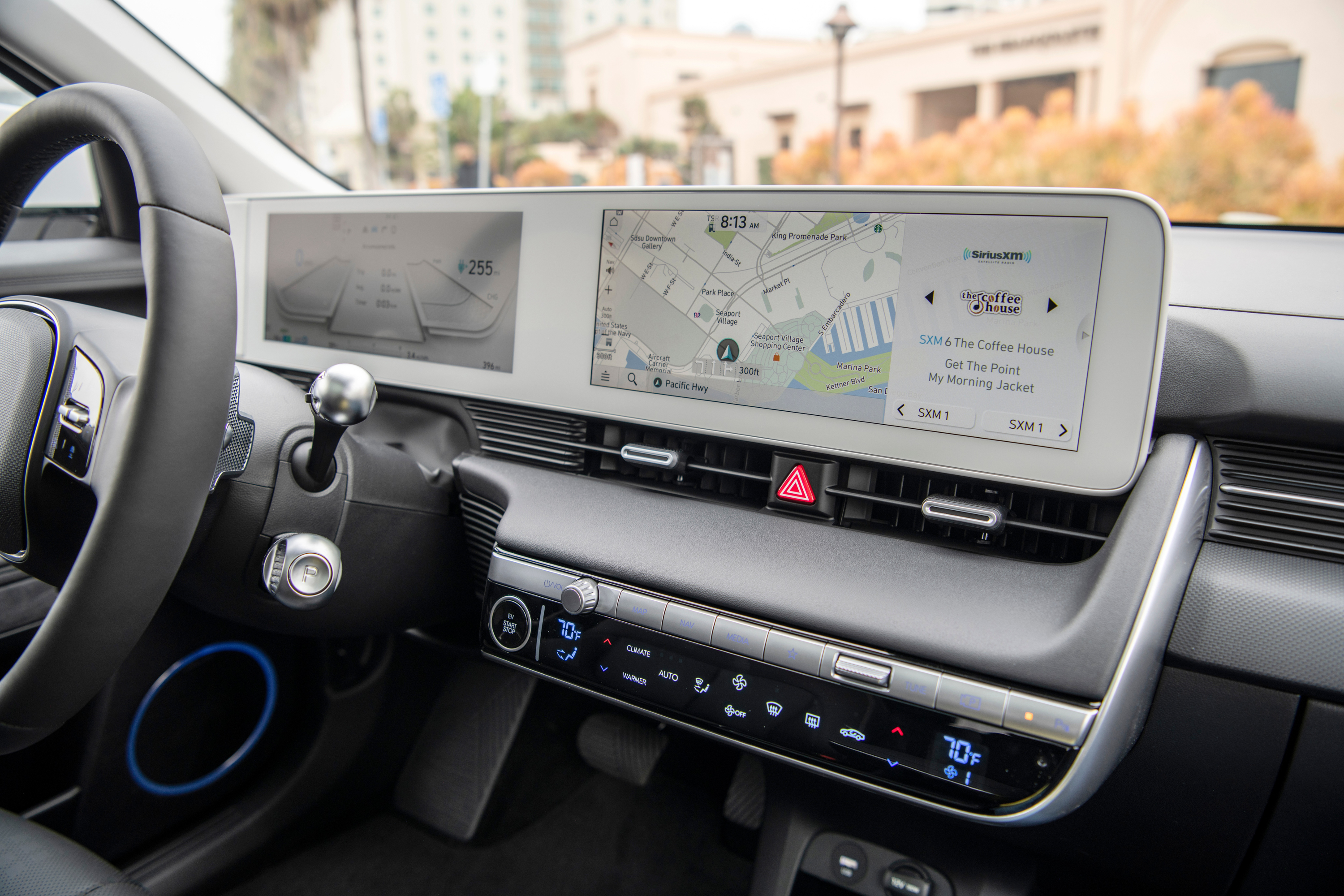
Compared this to Hyundai cars, who I don't think gets enough credit for their ergonomics.
https://cdn.arstechnica.net/wp-content/uploads/2021/12/2022-...
https://www.genesis.com/content/dam/genesis-p2/kr/assets/mod...

If it's actually on the ceiling, I either know it's there, or I'll be into pulsing my brakes manually before I bother to find it should I actually need it.
https://www.youtube.com/watch?v=zIBMxGdbjfo
On every other car I've been in, any switches in that location I would naturally assume are for controlling the lights right next to it, but evidently no one in Tesla's design chain thought of that...

But model 3 takes the cake.
The trim of the dash in the picture, as much as luxurious it may be, reminded me of driving a desk, a walnut or ?mango wood desk... sitting in a comfy four-wheeled office chair. Also notable so many buttons on the driver side door, not sure for what purpose.
Mercedes did eventually fix the issue in the most recent model w223 https://car-images.bauersecure.com/pagefiles/96149/mercedes_...
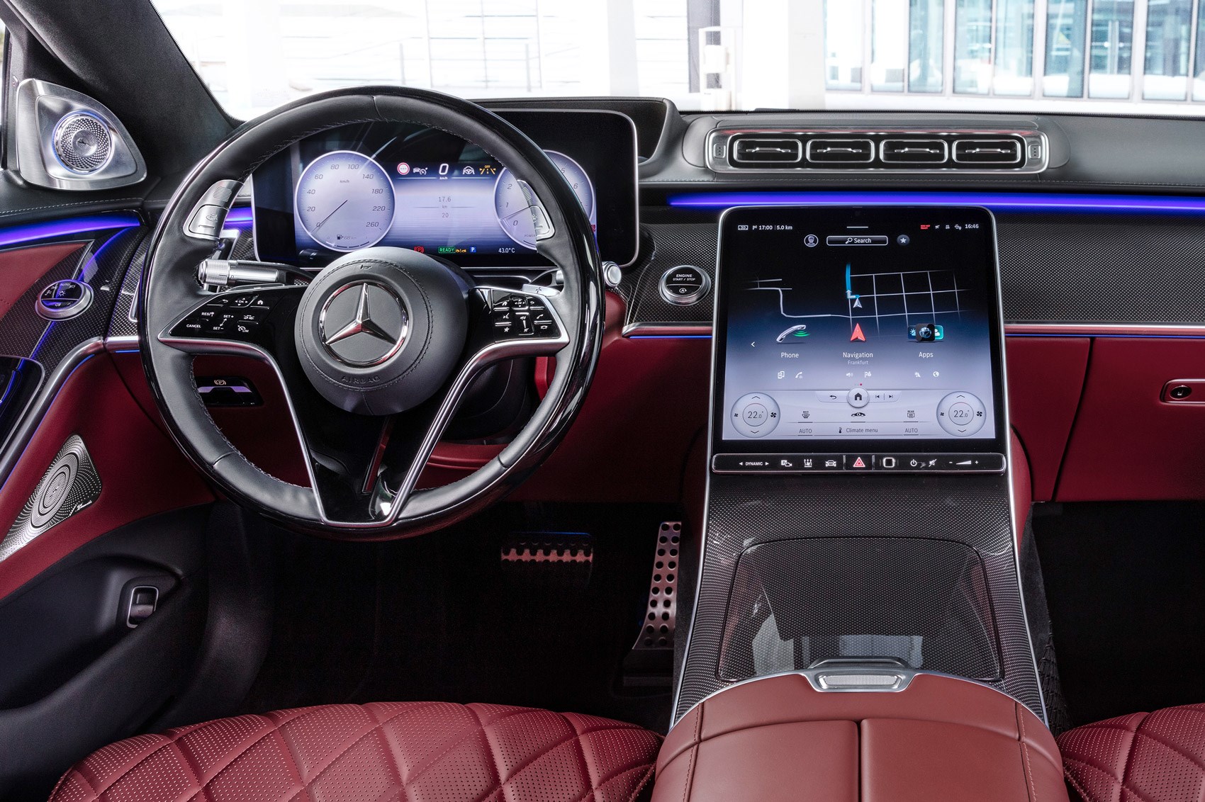

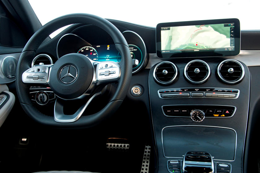
He might have intuition in this area, but one individual's intuition is a poor substitute for actual data.
If there is one thing that I hear way too much out of intelligent, moneyed minds, is that people need to be controlled.
I'm a big Model 3 fan but I hate the new UI. At least let us use the new docking areas for every possible function.
Up till now the windshield wiper control was the biggest model 3 UX issue. When I took delivery of my model 3 it started raining and I almost had an accident trying to figure out how to get the wipers working. The auto-wiper function sucks big time. But now there's more fairly important functions that are really hard to get to, from annoying (driver profiles) to safety (defog).
This is really hard to understand and concerning.
That got me laughing. :) I would be _convinced_ it's a joke and my friends are behind this and want to give me a treat in already sucking Covid-times..
This is also how we ended up with the ribbon interface in Microsoft Office 2007 and beyond, then later other places within Windows (Explorer, Paint, etc). Microsoft essentially collected click statistics across various UIs and used those for decision making to choose which buttons would be big and which would be buried under small icons or sub-menus.
I'm used to it now, but it was jarring and took a while.
If ever there was a case of “you break it, you bought it”.
It's a CAR, ffs! Tesla, please stop acting like it's a cell phone
What's next, Microsoft Excel?
I knew Tesla UX was, um, interesting, but this takes it to a whole another level.
Has the regulation changed? Is it now legal for a car to play Netflix while you are driving?
Sadly we see such things more and more. For example a 3 year old TV looses apps such as Netflix or Skype which where specifically advertised on the box.
There ought to be an option to 'stay' at any 'version' you want. Only permit bug fixes. You know, LTS....
Doing it with a car is a whole different level though. I’m pretty sure it’d still fall under the same laws but returning cars is very tricky even when you have a legal reason.
Tesla software updates have in general been good with some setbacks. So the model still seems definitely better than what the industry usually does. A rollback option would be nice as this update shows. It would also give them some extra data on what people actually think of the updates.
That being said, the new interface is terrible. So many things now take 3 taps as opposed to one.
I wonder if Tesla made the mistake of using A/B testing instead of vision-driven design like Apple. (Side note, just finished reading "Creative Selection" by Ken Kocienda of Apple, an interesting read on Apple's approach to design and why it is so successful as opposed to Google's).
In a car you want muscle memory, not "good for the brain"
I would also be irate if my coffee maker or microwave rearranged it's buttons. Any argument that it's "good for you" is inherently hostile.
What a waste of brainpower and education.
Bad news: worst-case scenario with bad car UX also prevents Alzheimers.
But +1 in part for suggesting an interesting-sounding book.
To make it clear: with bad car UX you may not live enough to get Alzheimers.
Apple gets a lot of pass on a lot of stuff, but their UI is pretty terrible.
What they're really good at is overall device integration.
What I took away from it is that the design decisions at Apple are in the hands of a few. The chain of command is small, it takes countless iterations until it "feels" right and you obviously can't consult with too many people when it's a secret project. A/B testing is out of the question.
There's a setting for this in System Preferences > Keyboard > Keyboard. My recollection is that this was previously a checkbox that toggled the "double-Fn to invoke Siri" function on and off, but as of Big Sur (at least) this is now a popup menu control, where the choices are "Change Input Source", "Show Emoji & Symbols", "Start Dictation (Press Fn Twice)", and "Do Nothing".
My test M1 machine was set up from scratch last year (i.e. no account migration) and has "Do Nothing" selected here, so I can't confirm that "Change Input Source" is the default for new users, but its position as the first item on the menu is suggestive.
Tesla are trying to recreate that new car smell and feeling by refreshing the digital dash board and software features. And deploying an old Microsoft trick of rearanging buttons to produce a new experience out of nothing. Instead of fighting the falling attention spans, Tesla hopes to remove the need for them altogether. So you can continue tapping and scrolling while driving.
[0] Warning: even Carrot Top may offend some viewers today. https://www.youtube.com/watch?v=byhzsQ0AzYI
Tesla UI has always seemed pretty terrible to me though. Their use of space, and insistence that you need to see a photo realistic picture of the car you are driving that takes up a massive amount of real estate is crazy to me.
On the other hand, I find a lot of car companies struggle with UI once screens come into play.
This annoys me because our Model 3 can never decide who is getting in for a drive. Without fail it trys to adjust the seat to accommodate my 5 foot partner when my 6 foot frame is in the seat.
The removal of the profile icon makes undoing this even more of a chore.
Lots of hate on this TMC thread on v11 [1]
[1] https://teslamotorsclub.com/tmc/threads/v11-software-update-...
From all the other stories on TMC, TeslaLounge etc., I think the more notable detail is that you got a loaner at all.
Stories abound of "Sorry. No loaner. You get Uber credits." "Uhh, there's not really any Uber near me." "Sucks to be you, I guess."
Maybe Tesla's UI team thinks they design the UI for self driving car
/end rant
Slightly off-topic, but out of curiosity: what is your typical defense here? I've seen a lot of people complain about it (and their arguments make sense to me), but I haven't seen anyone defending it. Yet.
Nothing on earth would convince me there is any necessity whatsoever to having a screen in your car, much less a touchscreen. But then again I'm also against power steering, ABS, and generally any and all electronics that obstruct feeling from the steering column. Don't even get me started on automatics. Cars for me ended in the 80's, everything after that has been gravy. I see Tesla as nothing but gravy.
I'd be curious to hear why/how you defend it? I cannot think of a single benefit.
Regarding the other examples of driving aids, yes, those are abstractions with some drawbacks, and a top-of-the-curve driver could do a better job without it. But still they could be a net positive because of the benefit they bring to not-that-good drivers.
Screens though, those I agree 100% shouldn't be on a car.
I think drivers education is severely lacking in North America. If it wasn't we wouldn't need to rely so heavily on building $100k armored tank vehicles with .01nm of force behind the wheel that nobody has a chance in hell of repairing themselves. There's no reason Granny shouldn't also be able to catch a slide.
A human is incapable of performing as well as a modern ABS system which can independently operate each wheel and can adjust hundreds of times per second. Same with traction and other stability assists. Most of these things tend to be unused at highest levels of motorports not because the drivers don't need them but because they're banned so as to make the spectacle more exciting.
Even if you fancy yourself a Colin McRae, leave your electronic assists enabled while driving on public roads.
As in: "I made all my money back in the first week, everything since has been gravy."
I notice the kids don’t see hazards (pedestrians) as well on the car with a backup camera as they do in the car that requires you to physically turn around.
The original backup camera was on the Prius because it had a huge blind spot, this fix should have been to th blind spot, not the degraded function of a fisheye lense and a driver facing forward.
I think the physical action of tuning is a somatic trigger that the steering is different and to swivel the head around for hazards.
However, I hear the point of the parent comment that the writing prefers an aesthetic/tactile experience of driving cars in the traditional way with minimal assistive technology (though I personally think that modern vehicles typically give you more control over your car).
[0] https://mycardoeswhat.org/safety-features/anti-lock-braking-...
There's also a corner case - winter driving conditions - where manual steering might give you lots of critical feedback.
(that said, I wouldn't purposefully get a manual steering car anymore)
Powersteering has allowed cars to have much more available grip and it is not a inherently a bad thing although it comes with its downsides too. Mainly fuel efficiency and overconfidence issue.
For example, this may not be common, but I find I can glance at the speed/car status section of the screen more quickly than I can glance down at a set of dials in the traditional position, and weirdly the sidways/down glance seems to retain more peripheral vision of the windscreen/road than the downwards glance to the traditional location.
>(current UI update aside)
One thing at least I'll never have to deal with is finding a brand new re-arranged center console in my Geo Metro the next morning!
>but I find I can glance at the speed/car status section of the screen more quickly than I can glance down at a set of dials in the traditional position, and weirdly the sidways/down glance seems to retain more peripheral vision of the windscreen/road than the downwards glance to the traditional location.
I think you just got used to it. Tesla adding a touch screen has not magically superseded the tens of millions of hours car designers put into interiors.
Search 'Akai midimix' to get an idea if what I am thinking at.
Even better, the buttons could have e-paper labels to show what function they perform.
Not only does it hide commonly-used safety-relevant functions behind extra taps in sub-menus (as detailed), it was apparently done to free up space to offer a 'dock' of app buttons - three permanant and three 'recently used'. I struggled to choose three apps I needed enough to fill the permanant spaces - and certainly don't need quick access (when I'm driving!) to Netflix, or games, or whatever is popping up in 'recently used' today. I would like the driver profile menu to be quickly available, but alas that's been hidden too.
It's a total cluster-f*ck that makes no logical sense when considering the need of drivers, and I hope they listen and revert at least this aspect of the UI.