News for hackers. Stuff that matters.
Re:The end of the nice GTK button by SkeuomorphicBee on Thursday March 24, 2022 @06:37PM (#30796296)
I agree 100% with the author, the old GTK button was gorgeous, it will be missed.

> I have had to explain to people tons of times that the random word in the UI somewhere in an application is actually a button they can press to invoke an action.

This is one of my biggest complaints with the super flat modern designs. Many widgets lost their skeuomorphic depth, which encoded a lot if visual information (the clickability, the current status), but in many cases nothing was added to supplant the loss of those visual cues, so now it is just a label (or a label in a white or grey box) and there is no way of knowing if it is clickable or its current status.

Re:The end of the nice GTK button by RachelF on Thursday March 24, 2022 @08:21PM (#30797306)
> I have had to explain to people tons of times that the random word in the UI somewhere in an application is actually a button they can press to invoke an action.

Exactly this. I often help others use computers and phones. In the old days it was easy to see what could be clicked. Now input and output look the same. It makes it harder to use.

In many ways it is a victory of style over substance - UI's are now designed by the same crowd who designs high fashion, that is clothes not designed to be worn but to be gawked at.

Re:The end of the nice GTK button by chefandy on Friday March 25, 2022 @01:10AM (#30798832)
> In many ways it is a victory of style over substance - UI's are now designed by the same crowd who designs high fashion, that is clothes not designed to be worn but to be gawked at.

Oh? Where do the Gnome designers list their runway appearances on their site? https://wiki.gnome.org/Design/

I'm an art-school educated designer, decade+ full-time web developer for over a decade and regular FOSS contributor for about as long, and regular FOSS users since the late 90s. Like most other designer/developers I know— there are way more than you think— I contribute code regularly but never design work. Why? Because it's a sucky experience.

Most FOSS UIs are akin to someone's first website made from cargo-culted code from free tutorials. Fixing it is harder than starting from scratch and either approach takes significant intellectual work before even seriously proposing changes... and those proposals are received with something on a spectrum of suspicion to outright hostility.

Would you contribute code to a project run by people with no coding experience but were extremely opinionated about code, bikeshedded and poopooed all code changes as a matter of course AND referred to developers and their work with the same glib contempt you and so many other developers here displayed in your comments? Gosh I hope not.

I often hear FOSS developers lament lack of designer involvement, but won't even entertain the prospect of having any culpability for that. I mean, come on.

UI design as a discipline fundamentally assumes the person designing the interface doesn't intuitively understand what's better or what's worse— they should investigate, check, and confirm their strategies. The problems you see in UIs are because the people running the projects Solicited the wrong kind of designers or let people without subject matter expertise trampler on some core features of the design.

Re:The end of the nice GTK button by FeepingCreature on Friday March 25, 2022 @02:05AM (#30799114)
> UI designer proposing changes is received with hostility

> solicited the wrong kind of designers

This points to me that the root problem is that we can't tell what kind is the wrong kind. It's a trust issue, but also a competence legibility issue.

That said-

> referred to developers and their work with the same glib contempt

Uh yeah? Developers absolutely refer to developers with glib contempt.

Re:The end of the nice GTK button by chefandy on Friday March 25, 2022 @03:31PM (#30806209)
> can't tell what kind is the wrong kind

To some extent you can tell from their title and previous work, just like with developers. Foe example, I had an entirely non-technical boss that understood I might not be the guy to re-write some printer drivers because I was a web developer. He didn't know the specifics, but being in charge, knew he had to ask someone who did, or do enough research to figure it out.

Likewise, UI designers will specialize in designing UIs and be better at making buttons look like buttons than Graphic Designers, and Experience Designers will be better at integrating user feedback and research into projects. Just like you wouldn't trust any one developer to implement critical functionality you don't understand without outside input, you probably shouldn't rely on one designer to that either. If you maintain a project, though, you can't expect designers to instinctually work around what you don't know. Being in charge means that you're in charge of figuring out how to evaluate it. I'm positive that a "I'm not sure how to interface with this sort of thing. Let's work through it so I can figure it out." will be received kindly by people you should consider working with. Good design proposals should already come with explanation and justification to help you down the path

This is a random selection from a google image search of proposal ideas. It was from another post where I was talking about higher-level topics but the principle is the same. Changing a set of control widgets should require no less thought and explanation.

https://github.com/openstreetmap/iD/issues/759 https://github.com/stashapp/stash/issues/1549 https://github.com/newrelic/nr1-groundskeeper/issues/3 https://github.com/creativecommons/creativecommons.github.io... https://github.com/godotengine/godot-proposals/issues/1823

> Developers absolutely refer to developers with glib contempt.

ok— now copy and paste the rest of what I wrote. An overly opinionated, defensive person with veto powers that understands the purpose and value of your work is fundamentally different.

Re:The end of the nice GTK button by sime2009 on Friday March 25, 2022 @04:46AM (#30799849)
The complaint about flat design isn't levelled only at FOSS, but at the whole industry. Your points may explain the situation in FOSS, but it doesn't explain the poor work being put out by the thousands of designers and UI/UX people working as professionals in industry.

The failings of flat design are everywhere.

Re:The end of the nice GTK button by ansible on Friday March 25, 2022 @05:58AM (#30800243)
Part of me wants to throw up my hands in the air and cry out "Why, God, why?" when I encounter yet another UI with flat design.

It is like a mass delusion or something that some segment of the population seems to think it that flat design is actually useful for the everyday user.

We've seen other stupid useless crap spread like a wave across our industry, across our society... so I guess I shouldn't be surprised. Though I've started to question my own sanity.

Re:The end of the nice GTK button by brimble on Friday March 25, 2022 @12:46PM (#30804389)
Modern UI design is optimized for screenshots in a PowerPoint, and from there, to screenshots in a portfolio and on marketing pages where the audience that needs to be satisfied is marketing themselves, and especially people very concerned that every piece of everything be "on brand" and who are entirely sure this matters a ton for making sales.

That's what's going on, as far as I can tell.

Re:The end of the nice GTK button by berkes on Friday March 25, 2022 @05:09AM (#30799979)
I'd go as far as to say that these failings started in proprietary software, hyped, marketed and then copied by FLOSS.
Re:The end of the nice GTK button by chefandy on Friday March 25, 2022 @04:46PM (#30806876)
First, I was addressing design in FOSS because:

a) there probably aren't many lead designers, creative directors and art directors on this developer-centric site b) interface choices for most commercial products are deliberately made by other people c) interface choices for most FOSS projects are made by developers

Second, I didn't directly address the criticism for the same reason I don't go into game forums and argue with the inevitable teen tech wizard lobbing glib, unsubstantiated technical criticism at the "stupid devs." Their peers might believe their saying that a "microservices architecture" caused low frame rates in the last release, but professional developers will roll their eyes hard enough to sprain an eyelid.

I won't waste my time with a point-by-point teardown, but if you're actually interested, here's the first half dozen unsubstantiated assumptions I've seen here about design/designers and the design process:

- 'Flat designs' are uniform enough to judge their value as a unit. - A bad flat design was bad because it was flat— not the hundreds of other problems a design can have. - Designers change things solely to suit their taste or follow trends - Designers don't commonly test or measure usability with quantifiable, auditable data - Bad usability is acceptable if it looks good. - How well you parse something is representative of how everybody else does regardless of their culture, age, experience with other objects, experience with computers, vision, disabilities, etc. - Skeuomorphism was the most effective form to convey those visual cues.

aaaand the list goes on. It's fine that many developers don't totally understand how design works because nobody expects you to be a subject matter expert in anything other than development. That said, confidently making sweeping judgements about design and designers when you don't understand some important fundamentals is just bad form.

Re:The end of the nice GTK button by spacexsucks on Saturday March 26, 2022 @01:13AM (#30809413)
A very glib response. I can go on and on. But i wont.
Re:The end of the nice GTK button by chefandy on Saturday March 26, 2022 @01:31AM (#30809494)
Thanks for your valuable and well-reasoned contribution to the thread, spacexsucks.
Re:The end of the nice GTK button by xg15 on Friday March 25, 2022 @05:01AM (#30799937)
> UI design as a discipline fundamentally assumes the person designing the interface doesn't intuitively understand what's better or what's worse— they should investigate, check, and confirm their strategies.

As a developer who always had an interest in UI design but has zero formal education in the field, I be really interested to know more about this. Could you maybe explain some of those strategies?

My subjective impression is that design has shifted from building a consistent "language" to a more goal-driven and data-driven approach today. The product owner defines a list of user stories and UI is primarily concerned with making those user stories as frictionless as possible - even if this means a less consistent overall design snd even if it means that less common features become harder to use. Performance is measured in a feedback loop through telemetry and A/B tests.

I might be wrong though, so I'd be interested in a qualified opinion.

(Also disclaimer: I grew up with Windows 98, ME/2000 and XP. So I guess this is my "good old times" spot then, where I'm wearing the rose-coloured glasses.)

Re:The end of the nice GTK button by chefandy on Friday March 25, 2022 @05:02PM (#30807026)
Yay! UI design is cool. I really love helping people solve their problems with software and often find the intellectual work involved with crafting their interactions to be far more interesting than getting the best algorithm for something, implementing the most reliable architecture, etc.

What I believe you're noticing is the the adoption of ideas under the (poorly named, IMO) UX umbrella. UI design is either considered part of it, or close enough to get the UX/UI slash treatment. It's not quite there as an idea— people can't decide if UX people are the same or UX Researchers are different than UX Designers or if UX Designers just do wireframes and user flows or also design UIs or if that's left to Interaction designers, blah blah blah. The base ideas seem to be an amalgam of human factors engineering, graphic/media design communication theories, and quantitative marketing type work.

While there are hundreds of trillions of articles on the topic by people thirsty for medium claps, I think the most interesting jumping-off point might be an image search for ux design process and using the charts you see to guide an exploration. The Nielsen Norman group has a TON of stuff online about the topic. Not just design itself, but measuring the maturity of usability organizations, research techniques, best practices and data strategies... I mean all kinds of stuff.

I think a lot of the ideas are tremendously valuable but much of what's written about it feels a little bit too much like marketing material. The ideas are presented a bit too confidently considering how often they change, and too much has that LinkedIN magic bullet kind of vibe. Also, like tech, the industry is subject to spike trends (like tech saw with NoSQL databases) and pendulum swings (like centralization vs. decentralization of services, thin vs thick clients, etc.) For something a bit more structured, the former Lynda.com, now LinkedIn Learning has some really fantastic educational resources on modern design of nearly any stripe.

I'll swing back through if I can think of any specific resources worth checking out.

Re:The end of the nice GTK button by xg15 on Sunday March 27, 2022 @06:38AM (#30819216)
Thanks a lot for those pointers. Looking forward to dig into that stuff!
Re:The end of the nice GTK button by dspillett on Friday March 25, 2022 @06:56AM (#30800604)
The one that irritates me these days is working out at a glance what has input focus. Window borders are so thin, and the difference between focused and not minimal, app have custom chrome so while titlebars are a good indicator sometimes often they are not, or are just two subtle, etc. MS Office apps are an offender here.

An example taken right now with Firefox under Windows: https://daveflix.deeohhtee.enneeetee.net/stuff/tmp/FocusNotO...

Which of those has focus? There is actually a difference (and to take the screenshot they overlapped making it obvious that way) but it is subtle. Try spotting it reliably when they are on different monitors.

At some point it'll annoy me enough that I'll write a util to scan for the current window that is top of the stack and draw a bright green border (or otherwise unmissable clue) around it… It'll look ugly, but I'll darn well know where what I'm about to type will go!

Re:The end of the nice GTK button by notatoad on Friday March 25, 2022 @01:25AM (#30798905)
i don't think flat design is really a question of style over substance. flat design has been popularized because designers like it, but designers like it because it's easy.

a flat element can be re-coloured without having to worry you've gotten the shadows correct on the new color. you can put two buttons beside each other without worrying that one appears to have more depth than the other. we make things flat because we're lazy, not because we think it looks good. a culture of lazy designers has convinced people it looks good, so we can continue being lazy.

Re:The end of the nice GTK button by grishka on Friday March 25, 2022 @01:19AM (#30798878)
Yeah I keep saying that modern UIs are designed to be looked at and enjoyed like museum art pieces, not to be actually used. They look nice-ish when static, but they're unbearable in real use.
Re:The end of the nice GTK button by lenkite on Friday March 25, 2022 @01:02AM (#30798792)
We probably need to start paying UI folks NOT to change stuff. They can do all their flat-experimenting in custom themes.
Re:The end of the nice GTK button by berkes on Friday March 25, 2022 @05:12AM (#30800003)
In the case of the article, that is somewhat unfair.

> GTK4 has been in development for a bit and has improved a lot of the internals. One of the great upsides is that it can take more advantage of the GPU when rendering the UI.

So there was a clear need to rewrite parts to fix internals.

> The Adwaita theme has also been nicely carried over and looks very similar to the GTK3 counterpart. ... > When I want to make a gtk4 application for mobile I would need libhandy, but libhandy for gtk4 is not a thing. The "solution" is libadwaita. This provides the widgets I need but it comes with the downside of having some of the worst decisions in application theming.

So, there we have it: it's not "UI folks just changing stuff", its a ground-up rebuild of a UI-language.

Now, whether or not that ground-up should be flat, modern, or just copy the old, is another discussion.

Re:The end of the nice GTK button by hulitu on Friday March 25, 2022 @04:59AM (#30799927)
> In many ways it is a victory of style over substance

Or as Statler and Waldorf would have put it: it is a victory of care over matter - we ( developers) don't care and you ( users) don't matter.

Re:The end of the nice GTK button by bobthechef on Thursday March 24, 2022 @09:57PM (#30797892)
> In many ways it is a victory of style over substance - UI's are now designed by the same crowd who designs high fashion, that is clothes not designed to be worn but to be gawked at.

Is it? Style is no style at all if the thing in question does not fulfill its function. The whole point of something stylish is that it accomplishes its end so well and respects the appropriate constraints that is pleases the intellect when it recognizes this perfection.

So if someone is designing a UI that is difficult to use, that is a failure of both style and substance since there is no style without substance.

Re:The end of the nice GTK button by JasonFruit on Thursday March 24, 2022 @11:36PM (#30798388)
Fine, a Pyrrhic victory of style over substance.
Re:The end of the nice GTK button by capdeck on Thursday March 24, 2022 @07:05PM (#30796592)
A couple of times i found myself clicking on various text labels just to see if it is a title or a button. All these flat minimalist designs are a step in a horribly wrong direction.
Re:The end of the nice GTK button by userbinator on Thursday March 24, 2022 @11:47PM (#30798461)
I've seen all 4 combinations of "looks like" vs "is actually" {button,static text} on a web app I was once forced to use. Some of the plain text was actually a clickable button (with NO hover effect), and some of the "buttons" (or more precisely, short actionable text with a rectangle around it) were actually just labels. Imagine the word "Order" presented in both styles, and my astonishment when I figured out which one I actually had to click.
Re:The end of the nice GTK button by hulitu on Friday March 25, 2022 @05:02AM (#30799947)
And sometimes a text label hides a menu.

The best i've seen was a web page with a hamburger menu which had no action.

Re:The end of the nice GTK button by HeckFeck on Thursday March 24, 2022 @06:45PM (#30796383)
I'm also really not sold on those new "tabs" which are just text with an underlined colour. It's low effort and dreadfully unclear. I can only vaguely guess what they are based on their upper placement, but what's to really distinguish that from a menu? or just a descriptive label?

I don't like saying this because I want Linux desktop apps to have every success, but these small and pointless frustrations kill my enthusiasm.

Re:The end of the nice GTK button by adhesive_wombat on Thursday March 24, 2022 @07:10PM (#30796659)
I spend far too long in GTK apps looking for the right menu to do basic stuff. It's like someone once saw an iPad from across a room and tried to implement what they remembered of it.
Re:The end of the nice GTK button by eptcyka on Thursday March 24, 2022 @08:19PM (#30797291)
Funny, I usually have the same opinion of iOS user interfaces.
Re:The end of the nice GTK button by hackmiester on Thursday March 24, 2022 @09:44PM (#30797815)
You would benefit from the “Button Shapes” option in accessibility! It underlines or outlines text-only “buttons.”
Re:The end of the nice GTK button by berkes on Friday March 25, 2022 @05:17AM (#30800032)
This is really not the best place to throw condescending anecdotes around to insult FLOSS.

What, on an iPad, should a designer look at in detail to improve the GTK app, for example?

Re:The end of the nice GTK button by adhesive_wombat on Friday March 25, 2022 @06:13AM (#30800333)
Where did I say GTK should follow iOS? All I said was that it looks like they did, and did it badly.
Re:The end of the nice GTK button by michaelmrose on Friday March 25, 2022 @01:28PM (#30804929)
The first step is them realizing they have a problem.
Re:The end of the nice GTK button by Sunspark on Thursday March 24, 2022 @07:33PM (#30796878)
The flatness of some UIs along with the removal of some visual cues has happened that I have tapped on things that aren't actually a button thinking that they might be one.

When I make my own apps one day, I am going to ignore design fads and only make intuitive interfaces.

Re:The end of the nice GTK button by calvinmorrison on Thursday March 24, 2022 @09:23PM (#30797700)
we started using Full Story at work. It tracks clicks on non clickable items. It is staggering that this is even a problem. Having to explain to people that links and buttons and radio boxes and checkboxes should look uniform has gone the way of the dodo and now we must instead have people clicking random items to hope something happens.
Re:The end of the nice GTK button by totalkrill on Friday March 25, 2022 @07:38AM (#30800865)
> It tracks clicks on non clickable items

This rattled my brain, that this is a feature now, says volumes about the quality decline in UI. I am a developer, and mainly use tools on the command line, or with TUIs.

But whenever I use android apps and websites, I constantly find myself longclicking or rightclicking things, hoping for stuff to happen, that just doesnt.

Re:The end of the nice GTK button by Sunspark on Friday March 25, 2022 @09:51PM (#30808623)
It is interesting to contemplate how much of this problem is artificially induced by executives in suits screaming at people to "innovate".

Strangely enough, we don't seem to mess around with steering wheels in cars.

Re:The end of the nice GTK button by cout on Thursday March 24, 2022 @11:20PM (#30798289)
If you really want to go against the grain, may I suggest radial menus, which allow the user to muscle-memory through menu selections:

https://bindpose.com/custom-marking-menu-maya-python/

Re:The end of the nice GTK button by RedShift1 on Friday March 25, 2022 @12:36AM (#30798692)
Visually nice but it's almost always going to overlap the thing you've right clicked. Under any circumstance I still want to see the thing I've right clicked.
Re:The end of the nice GTK button by userbinator on Thursday March 24, 2022 @11:52PM (#30798484)
Interesting concept, but I would add keyboard shortcuts (underlined items) to the menu to make it more of a reminder than be forced to use the mouse all the time.
Re:The end of the nice GTK button by smegger001 on Friday March 25, 2022 @01:31AM (#30798944)
That was originally part of the IBM Common User Access style guide 80/90s, back when user interfaces for software valued function over form.

https://ia800200.us.archive.org/0/items/ibmsj2703E/ibmsj2703...

the figure on page 2 shows exactly what you are describing.

Re:The end of the nice GTK button by account42 on Friday March 25, 2022 @10:15AM (#30802415)
This and many variants of the idea has been explored in games a lot - in particular in point and click adventures and isometric (or at least top-down view) RPGs. Probably also in strategy games and anything else that has both a cursor and context-specific actions.
Re:The end of the nice GTK button by sph on Friday March 25, 2022 @06:19AM (#30800371)
Fly-Pie, a radial menu for GNOME: https://github.com/Schneegans/Fly-Pie
Re:The end of the nice GTK button by BolexNOLA on Thursday March 24, 2022 @08:29PM (#30797374)
Just go full-audacity and drown people in drop down menus lol at least I know what to click!
Re:The end of the nice GTK button by WesolyKubeczek on Friday March 25, 2022 @06:19AM (#30800370)
Audacity is a piece that made me learn its hotkeys. Once you do that, it’s pretty nice actually.
Re:The end of the nice GTK button by znowcone on Friday March 25, 2022 @06:27AM (#30800417)
It works, I guess. But after I've worked with a proper DAW (Reaper in my case), Audacity felt like a toy
Re:The end of the nice GTK button by BolexNOLA on Friday March 25, 2022 @10:06AM (#30802314)
A toy with the best noise cancellation tool of any audio program out there though.
Re:The end of the nice GTK button by Pxtl on Thursday March 24, 2022 @11:38PM (#30798403)
This. The author dumps on ms for going flat, but MS did it with rock solid consistency.

I had a win phone 7 device. It was the pinnacle of consistent Gui.

Is it colored? Then it's a button. Is it white? It's a Text box. Is it a giant title? It's tabbed horizontal scroll.

Are you a "designer" who wants to color something non-clickable? Piss off, you don't get to do that.

Re:The end of the nice GTK button by adhesive_wombat on Friday March 25, 2022 @03:38AM (#30799565)
Misuse (or no use) of affordances is so, so annoying, both in software and real life.

Things like having pull handles on both sides of a door that has to be pushed from one side. Or having no push plate on either side of a glass door. Do I push? Is it a sliding door that's not working? Don't know!

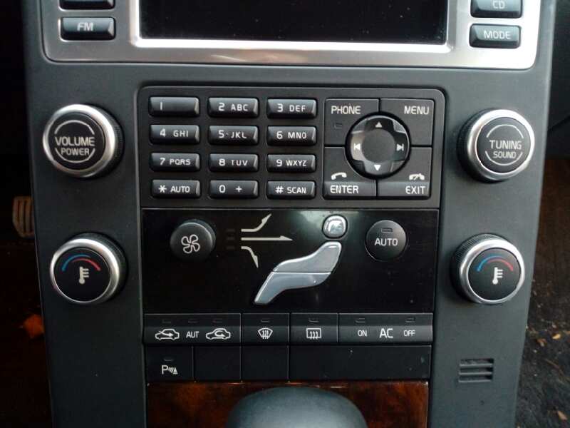
My car has the climate controls hidden behind a graphic of the current state on the stupid touch screen. It used to be buttons that had three zones for head, body and feet, a wheel for fan and a wheel for temp[1]. Volvo used to pride themselves on having controls you could use with gloves on, so all the buttons had 3D features and a positive press feel.

Now it's not even obvious the graphic is a button at all (it's also incredibly dangerous as you cannot do anything without a multi-click modal process with only visual feedback that you have to look at to use). Thankfully the window demister is still a physical button because that would be incredibly dangerous to hide behind a soft screen interface: when you need it you need it. However, it's lost its 3D profile and is now just a flat button.

My office has an amusing one: there's a door at each end of the building. The building is the same on both sides, neither side looks more "fronty" than the other, and the doors are the same. Only one of these is the main entrance. The door next to the car park (i.e. where anyone unfamiliar with the site will arrive) is not the main door. Therefore there are no call buttons. However, there's also no indication that there is another door on the other side. A whole building basically has no obvious start menu. Just...why do that?

[1] https://bparts-eu.s3-eu-west-1.amazonaws.com/ftp/azor_2/000/...
Re:The end of the nice GTK button by silisili on Thursday March 24, 2022 @11:54PM (#30798505)
100% agreed. I want buttons to, at minimum, indicate that my click or touch was successful. Even a little wiggle. Flat design has me wondering with no visual indication, and I hit this all the time.
Re:The end of the nice GTK button by Schroedingersat on Thursday March 24, 2022 @07:31PM (#30796859)
But at least they spread out all the unnecessary fluff elements and then made the clickable portions tiny and close together
Re:The end of the nice GTK button by chillfox on Thursday March 24, 2022 @10:32PM (#30798073)
Had that experience before where I spent ages looking for how to do something and what I had tough was a label was actually a button.

Now if I can't find anything then I just start clicking on random design elements in case they turn out to be a secret button to a hidden page.

Re:The end of the nice GTK button by dheera on Thursday March 24, 2022 @07:01PM (#30796560)
UIs go through 3D and 2D in phases.

Windows 2.0 - 3.1: 2D

Windows 95 - 7: 3D

Windows 8 - 10: 2D

MacOS 6 - 7: 2D

MacOS 8 - 10: 3D

MacOS 11: 2D

As a side point, I predict Sheriff and Sans-Sheriff fonts to also go into similar phases too though over a longer time scale. We're in a very long Sans-Sheriff phase now but I think Sheriff will be "in" in 20 years.

Re:The end of the nice GTK button by mceachen on Thursday March 24, 2022 @07:11PM (#30796673)
FWIW, Macintosh System 6 was just black and white (and only 640x480px), so 3D wasn't really tenable.

System 7 and 8 had support for color, and was as 3D as it could muster, like highlight and shadow treatment on buttons and other widgets, and embossed, draggable thumbs.

https://en.wikipedia.org/wiki/System_7#/media/File:Mac_OS_7....

Mac OS X brought Aqua, which was a pinnacle of 3D and skeuomorphic design. You know you're going hard for 3D when you add a drop shadow on all the text in your menubar:

https://en.wikipedia.org/wiki/Mac_OS_X_10.0#/media/File:MacO...

(and that IE logo in the dock wasn't there as a joke: it really was the best browser for OS X until Safari was a thing, years later)

Re:The end of the nice GTK button by RuggedPineapple on Thursday March 24, 2022 @10:19PM (#30798018)
512×342 actually, at least for the compact macs with the built in screen.
Re:The end of the nice GTK button by rayiner on Thursday March 24, 2022 @09:57PM (#30797897)
Those pinstripes.
Re:The end of the nice GTK button by chrismorgan on Thursday March 24, 2022 @09:48PM (#30797846)
Recently I’ve been enjoying serif fonts in more places than I used to, because I instructed Firefox not to allow sites to override my font choices (so I get exclusively Equity for serif, Concourse for sans-serif and Triplicate for monospace), which is quite pleasant and relaxing in general (Google’s foolish/poorly-implemented ligature-based icon font technique is the only notable breakage/uglification I’ve found in the couple of weeks I’ve been doing this), but apparently it’s more common than I realised for people to omit the fallback “sans-serif” or “serif” or “monospace” that they should always have on their font-family stacks, and my fallback default is serif. (e.g. I’m just now looking at a `font-family: 'Lato','Helvetica','Arial';`, and yesterday examined a `font-family: some-web-font, Open Sans;`.)
Re:The end of the nice GTK button by chipotle_coyote on Thursday March 24, 2022 @11:56PM (#30798517)
> Equity for serif, Concourse for sans-serif and Triplicate for monospace

Are you a lawyer? (There is an in-joke here, I swear)

Re:The end of the nice GTK button by chrismorgan on Friday March 25, 2022 @12:15AM (#30798592)
No, but Matthew Butterick, who made them, is: https://mbtype.com/, https://mbtype.com/bio.html.
Re:The end of the nice GTK button by chipotle_coyote on Friday March 25, 2022 @01:52PM (#30805200)
Yes, that was the in-joke. :) They're among my favorite typefaces (as is his newer Century Supra).
Re:The end of the nice GTK button by ejolto on Thursday March 24, 2022 @07:14PM (#30796697)
Sheriff? I think you mean serif, partner.
Re:The end of the nice GTK button by bdefore on Thursday March 24, 2022 @07:21PM (#30796763)
Deputy. Perfect name for a new Sans-Sheriff typeface.
Re:The end of the nice GTK button by cwillu on Thursday March 24, 2022 @09:47PM (#30797840)
…there's a new serif in town.
Re:The end of the nice GTK button by Stratoscope on Friday March 25, 2022 @12:45AM (#30798728)
I think Ken Shirriff would have something to say about this.

http://www.righto.com/

Re:The end of the nice GTK button by kQq9oHeAz6wLLS on Thursday March 24, 2022 @07:21PM (#30796755)
I'm assuming they are a victim of autocorrect, pilgrim.
Re:The end of the nice GTK button by nathell on Friday March 25, 2022 @06:23AM (#30800393)
In some languages (e.g., Polish), the word for "serif" is the same as the one for "sheriff".
Re:The end of the nice GTK button by fsiefken on Thursday March 24, 2022 @07:18PM (#30796731)
Windows 3.0/3.1 buttons are quite 3D, perhaps you meant the flat Windows 2.0 buttons? http://toastytech.com/guis/win31.html https://www.howtogeek.com/674574/windows-3.0-is-30-years-old...
Re:The end of the nice GTK button by mananaysiempre on Thursday March 24, 2022 @08:29PM (#30797376)
Raymond Chen commented on the fashion cycle back when Office XP started drifting in the flat direction[1].

[1] http://bytepointer.com/resources/old_new_thing/20040728_291_...

Re:The end of the nice GTK button by gjvc on Thursday March 24, 2022 @07:23PM (#30796779)
Mac OS X has been in a Sans-Sheriff phase since Steve Jobs died
Re:The end of the nice GTK button by lwkl on Thursday March 24, 2022 @08:16PM (#30797269)
Is macOS 11 a lot different than macOS 12?

I'm using macOS 12 right now and there are a lot of 3D elements especially if you compare it to Windows 10 or Gnome in the screenshots of this post. It seems to be a mix of both approaches (similar to GTK 3).

Re:The end of the nice GTK button by chipotle_coyote on Friday March 25, 2022 @12:05AM (#30798552)
It's not very different. I don't know if "flat" was ever the right word to describe the look it started moving toward post-Aqua; I think I'd be more inclined to call it "minimal", occasionally to a fault. With a few exceptions (most notably the bonkers choice to make all keyboard shortcuts gray in menus so at first glance they all look disabled), though, I mostly like the look that Big Sur's ushered in.
Re:The end of the nice GTK button by eternityforest on Thursday March 24, 2022 @08:28PM (#30797362)
The Serif Sheriff wants you in jail if you use Serif these days
Re:The end of the nice GTK button by tzot on Friday March 25, 2022 @06:12AM (#30800324)
You sansed the serif? What about the DPI-t?
Re:The end of the nice GTK button by grishka on Friday March 25, 2022 @01:14AM (#30798848)
Borderless buttons to have the right to exist, but you should be very careful with their use. For example, take this UI I made recently: https://mastodon.social/@grishka/107998100334356147, 2nd screenshot. The button to decline invitation looks like a link (same color) and it's next to a real button. No one would ever get confused by this, it's pretty clear it's clickable.

But a black word in a larger font among black text would definitely NOT be recognized as a button by most people. Context matters a lot.

Re:The end of the nice GTK button by spoils19 on Friday March 25, 2022 @02:35AM (#30799255)
I disagree. I had to sit and think for a few minutes as it was extremely unintuitive - my first impressions were that I couldn't decline the invitation at all, and the button was disabled or missing for some reason (I've seen some bad CSS in my career so it no longer surprises me when it goes missing).
Re:The end of the nice GTK button by sph on Friday March 25, 2022 @06:24AM (#30800397)
The button and link next to each other is a common pattern that has been used for decades at this point. It's core to Google's material design.

I agree that it might not be ideal, but when it is used literally everywhere I do not believe it's that hard to read.

Re:The end of the nice GTK button by amatecha on Friday March 25, 2022 @01:39PM (#30805066)
Decades? Any examples of this? Material Design has only been around since 2014, so that's not really a good example to cite.
Re:The end of the nice GTK button by zestyping on Friday March 25, 2022 @02:53AM (#30799338)
It does not look like a button. It's just a label floating around.

When designing user interfaces, use the mantra: "Don't make me think!" Don't make the user think about whether something is a button or not. Don't make them have to infer that the label is in fact a button due to context.

Just make it look like a button!

Re:The end of the nice GTK button by ShroudedNight on Friday March 25, 2022 @02:59AM (#30799359)
I am but an ignorant user, but making you think to do complete one action but not another seems to be a significant part of the point. I find it deeply coercive, and hope to see the other side of this trend sooner rather than later.
Re:The end of the nice GTK button by silon42 on Friday March 25, 2022 @08:06AM (#30801113)
Yeah... personally I detest anything flat or rounded... give me square pixel sharp corners any-day... and not just for buttons.
Re:The end of the nice GTK button by ShroudedNight on Friday March 25, 2022 @02:56AM (#30799346)
Moving the goalposts, but the decline button in your example looks significantly harder to engage than the join button, and engaging with it would cause at least a twinge of anxiety in anticipation of having to essentially coerce the interface to accept that I do not wish to travel the gilded path.

It frustrates me that this sort of design has become not just acceptable but celebrated as 'correct', and I long for the days when interfaces did their best to seek my enthusiastic consent to my chosen course of action.

Re:The end of the nice GTK button by amatecha on Friday March 25, 2022 @03:04AM (#30799388)
It's not very clear to me it's clickable.. Is it an action, or a link to a different page/view? If it's an action (accept/decline invite), make it a button. If it's navigation, make it a text link. You are giving totally disparate cues to the user when the actions taken upon clicking are of the exact same type.

My initial reaction to a piece of text directly next to a button is "why is there random unrelated text there?" and then the sensation of anger as I come to the realization someone consciously decided to make me think about the UI more than I needed to. It's purely a distraction.

Just make it look like a button. There is literally zero reason not to, and you can eliminate the chance of confusion. Why increase the possibility of uncertainty at all? What value does that provide to anyone?

Every UI or design element that causes me to think about it wastes precious moments I could have been thinking about something I actually cared about, for example the actual task I was in the middle of. On top of that, when you use unconventional design, even after someone learns the seemingly-arbitrary, specific quirks of the design you've used, you will cause them to think about it all again later when you redesign the application.

Re:The end of the nice GTK button by gsinclair on Friday March 25, 2022 @04:39AM (#30799811)
Literally zero reason not to? I think it’s emphasising the “default” action quite nicely, and de-emphasising the other action quite appropriately.

“Decline invitation” needs to be something you can do, of course, but it will be used < 1% of the time, I imagine.

I find that having buttons side by side forces me to think in a mildly unpleasant way, like I have to read two thinks more carefully because there is more onus on me to decide which is the typical action.

Re:The end of the nice GTK button by amatecha on Friday March 25, 2022 @01:31PM (#30804968)
No, that's still not a reason to conceal the behaviour/purpose of the UI element.

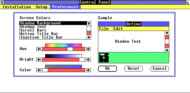
If you want to emphasize/de-emphasize a UI element, you can do something like was established on most GUIs 30+ years ago: make the default/safest option have a thicker border, and the secondary/de-emphasized option have a thin border. Early examples (1985 and 1991 respectively):

https://guidebookgallery.org/pics/gui/settings/appearance/wi...
https://guidebookgallery.org/pics/gui/system/features/search...
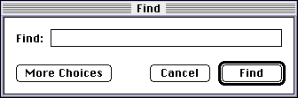
Note how immediately-obvious it is which action is the "typical". You don't even have to read the text, you could even squint your eyes or glance from a great distance and still understand which button is the one you probably want.

UI design involves trust, especially for software where people are trying to actually get something done. Making unconventional designs erodes your users' trust. Have respect for them and what you can reasonably expect them to "know" arriving at your software, and they will have an easier time and love you for it. As we can see, these conventions have existed for decades, and deviating from them warrants a very compelling reason, not just "cuz it looks neat".

Re:The end of the nice GTK button by pessimizer on Friday March 25, 2022 @12:46PM (#30804394)
> I think it’s emphasising the “default” action quite nicely, and de-emphasising the other action quite appropriately.

What's the reason that the designer wants to nudge me to accept invitations again? I missed it.

Also, what's the difference between that and a dark pattern?

Re:The end of the nice GTK button by michaelmrose on Friday March 25, 2022 @01:44PM (#30805122)
The button to decline doesn't add an entity. There are already two options to consider whether to accept or decline. Making the external state and internal state match avoids confusion.
Re:The end of the nice GTK button by swiftcoder on Friday March 25, 2022 @02:50AM (#30799321)
> No one would ever get confused by this, it's pretty clear it's clickable.

I don't know how you can reach that conclusion, because we only recognise it because of how many times we've been fed this exact pattern over and over again in flat UIs (and failed to realise it was clickable the first N times)

Re:The end of the nice GTK button by AlanYx on Friday March 25, 2022 @10:05AM (#30802304)
>No one would ever get confused by this, it's pretty clear it's clickable.

It's pretty clear that it's clickable, but I definitely wouldn't think it's a button. My best guess would be that it's a navigation element, and that clicking on it brings you to some other page where a decline invitation button might be found, or where you have to fill out some form to explain why you're declining.

Part of it is because it looks exactly the same as "Test User", and presumably that isn't a button... I imagine that is a navigation element. But part of it is also because quite a few recent Microsoft corporate products (Sharepoint, Dynamics, etc.) seem to use the idiom you're trying to use for signaling that something isn't a button.

Re:The end of the nice GTK button by totalkrill on Friday March 25, 2022 @09:34AM (#30801962)
Like so many other pointed out, this is wrong, I got confused, it looks like a link, would that get me to some kind of unsubscribe page? is it phising?

buttons should be actions, links should be directions,

directions would take me somewhere, actions would has an effect and consequence. That you think this is okay, and assume no-one would ever be confused by this. Is clearly an issue in the industry at large

Re:The end of the nice GTK button by zozbot234 on Friday March 25, 2022 @09:51AM (#30802159)
Perhaps online, but links in a GUI dialog box are often actions too.
Re:The end of the nice GTK button by zozbot234 on Friday March 25, 2022 @03:30AM (#30799527)
That's an action link, not a button. In a UI context it would be rendered in a different color and underlined, to highlight it being an active element rather than a simple label.
Re:The end of the nice GTK button by happymellon on Friday March 25, 2022 @01:57AM (#30799084)
It's bold, so that helps. I assume you are able to click the group name and test user since they are also bold?

I would still prefer a border around the button as I'm not sure what you gain by removing it, but at least you provide hints.

Re:The end of the nice GTK button by ghosty141 on Thursday March 24, 2022 @07:53PM (#30797061)
I too hate the material design kind of flatness. For me, only apple somehow gets UI right (at least for me) and it feels very intuitive for me while also looking very good.

The new "flat" design that pops up everywhere sometimes just feels like a lazy version of UI design, where you basically don't need proper styles anymore and just make everything b/w with maybe a border here and there.

Re:The end of the nice GTK button by kjeetgill on Thursday March 24, 2022 @09:40PM (#30797794)
My understanding of material design is that it tries not to be too flat. Material design reduces the 3d roundedness and gradients of many elements but still relies heavily on drop shadows to indicate hierarchy and overlapping.
Re:The end of the nice GTK button by lelanthran on Friday March 25, 2022 @03:23AM (#30799490)
> I too hate the material design kind of flatness. For me, only apple somehow gets UI right (at least for me) and it feels very intuitive for me while also looking very good.

I dunno about that (both Apple using flat, and the "gets it right" part).

I'm looking at activity monitor now, under memory pressure, and the table of memory types has "Memory used" row expanded, and yet none of the rows are actually clickable. I spent a few seconds yesterday trying to click the other rows.

Then I looked at system preferences, and it's not actually flat widgets - they have relief for those things that can be interacted with. Things that are clickable are visually marked as such.

Re:The end of the nice GTK button by tonyedgecombe on Friday March 25, 2022 @06:17AM (#30800356)
>I'm looking at activity monitor now, under memory pressure, and the table of memory types has "Memory used" row expanded, and yet none of the rows are actually clickable. I spent a few seconds yesterday trying to click the other rows.

I can see why you might get confused there but it feels like nitpicking. I never expected to click on any of those elements because they don't look like a traditional table or outline view.