I agree that it might not be ideal, but when it is used literally everywhere I do not believe it's that hard to read.
When designing user interfaces, use the mantra: "Don't make me think!" Don't make the user think about whether something is a button or not. Don't make them have to infer that the label is in fact a button due to context.
Just make it look like a button!
It frustrates me that this sort of design has become not just acceptable but celebrated as 'correct', and I long for the days when interfaces did their best to seek my enthusiastic consent to my chosen course of action.
My initial reaction to a piece of text directly next to a button is "why is there random unrelated text there?" and then the sensation of anger as I come to the realization someone consciously decided to make me think about the UI more than I needed to. It's purely a distraction.
Just make it look like a button. There is literally zero reason not to, and you can eliminate the chance of confusion. Why increase the possibility of uncertainty at all? What value does that provide to anyone?
Every UI or design element that causes me to think about it wastes precious moments I could have been thinking about something I actually cared about, for example the actual task I was in the middle of. On top of that, when you use unconventional design, even after someone learns the seemingly-arbitrary, specific quirks of the design you've used, you will cause them to think about it all again later when you redesign the application.
“Decline invitation” needs to be something you can do, of course, but it will be used < 1% of the time, I imagine.
I find that having buttons side by side forces me to think in a mildly unpleasant way, like I have to read two thinks more carefully because there is more onus on me to decide which is the typical action.
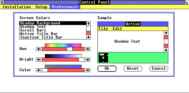
If you want to emphasize/de-emphasize a UI element, you can do something like was established on most GUIs 30+ years ago: make the default/safest option have a thicker border, and the secondary/de-emphasized option have a thin border. Early examples (1985 and 1991 respectively):
https://guidebookgallery.org/pics/gui/settings/appearance/wi...
https://guidebookgallery.org/pics/gui/system/features/search...
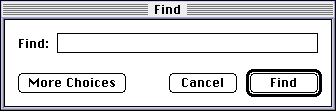
Note how immediately-obvious it is which action is the "typical". You don't even have to read the text, you could even squint your eyes or glance from a great distance and still understand which button is the one you probably want.
UI design involves trust, especially for software where people are trying to actually get something done. Making unconventional designs erodes your users' trust. Have respect for them and what you can reasonably expect them to "know" arriving at your software, and they will have an easier time and love you for it. As we can see, these conventions have existed for decades, and deviating from them warrants a very compelling reason, not just "cuz it looks neat".
What's the reason that the designer wants to nudge me to accept invitations again? I missed it.
Also, what's the difference between that and a dark pattern?
I don't know how you can reach that conclusion, because we only recognise it because of how many times we've been fed this exact pattern over and over again in flat UIs (and failed to realise it was clickable the first N times)
It's pretty clear that it's clickable, but I definitely wouldn't think it's a button. My best guess would be that it's a navigation element, and that clicking on it brings you to some other page where a decline invitation button might be found, or where you have to fill out some form to explain why you're declining.
Part of it is because it looks exactly the same as "Test User", and presumably that isn't a button... I imagine that is a navigation element. But part of it is also because quite a few recent Microsoft corporate products (Sharepoint, Dynamics, etc.) seem to use the idiom you're trying to use for signaling that something isn't a button.
buttons should be actions, links should be directions,
directions would take me somewhere, actions would has an effect and consequence. That you think this is okay, and assume no-one would ever be confused by this. Is clearly an issue in the industry at large
I would still prefer a border around the button as I'm not sure what you gain by removing it, but at least you provide hints.
But a black word in a larger font among black text would definitely NOT be recognized as a button by most people. Context matters a lot.