Touchscreen for radio control, AC, answering (bluetooth) phone, and stuff... no, thank you, give me physical controls.
Is that actually on a car that you've used? What a horrible design. A few Ford models have a dedicated button for ambient lighting that cycles through the colors, and a knob beside it to adjust the brightness. https://www.youtube.com/watch?v=W2TiKCEzQIA
https://www.bentleymotors.com/content/brandmaster/master/ben...
Why can’t it be a dedicated dial? If you run out of room, maybe it’s not so important
Being able to offer users a myriad of config options without the need for tons of knobs.
Not saying I like it, but a lot of people seem to.
I guess the ideal setup would be knobs for essential stuff like volume, AC, etc, and then a touchscreen for the rest of the stuff.
  BACK |       UP        | ENTER
   /   | LEFT ---- RIGHT |   /
EXIT | DOWN | MENUThe central Commander can be tilted up/down/left/right and pushed. Also if my memory is not cheating, it has a capacitive touch surface.
Now it's been replaced with headlight moving knob in newer cars, which is more awesome.
Touchscreens in cars suck
Changing profile is a separate story. It changes mirrors , sound preferences, temperature, seat position. I'm doing it that with two touches on the screen. Now imagine you're doing all that manually with old dumb knobs and buttons? Imagine you're doing that every day?
Your kids will be laughing how stupid cars were in 2020's while having all the computers and possibilities to make your car really comfortable.
Separate keys, one for each driver. The profile is chosen by which key is used.
As a surfer, this is problematic.
Same for printer menus. To get the IP address of your printer, you have to wade through 1-line menus and print a physical page, seriously?
[1] https://cdn-web.vtp-media.com/products/CM/CM18445/CM18445_VT...
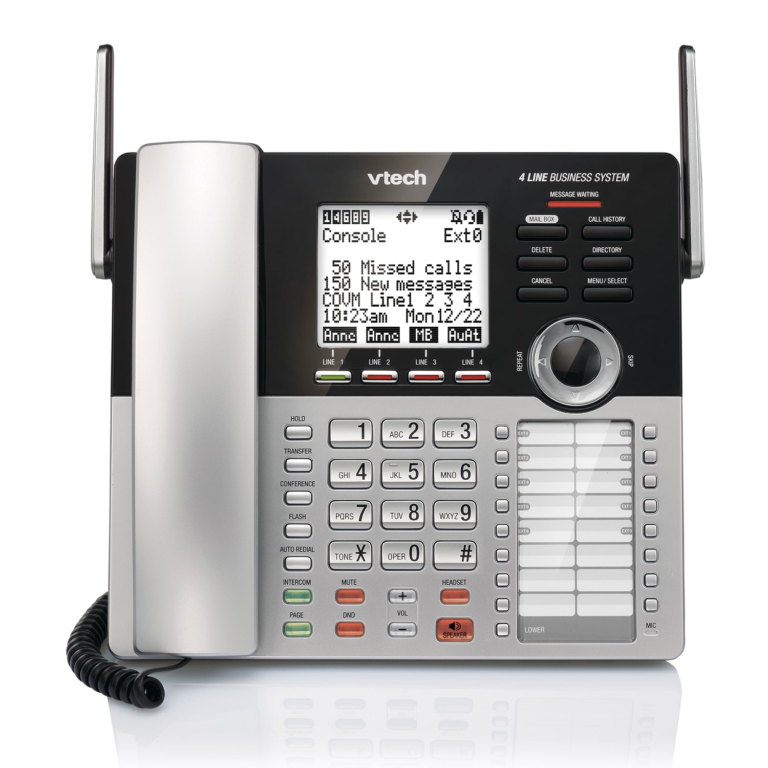
Also the buttons are not context sensitive. Ideally they should disappear when you can't press them. I want a basic interface with clear options, and unfolding menus whenever I want to do something more advanced like making a conference call.
How would a touch screen change that?
>Also the buttons are not context sensitive. Ideally they should disappear when you can't press them.
Ok, so you enter a menu and now you have a "conference" button displayed, but you still have no idea what it does. I think touch screens are useful for actions that require a lot of interaction like entering navigation, but removing physical controls for basic inputs like volume knob or HVAC controls is an obnoxious anti-pattern, especially Tesla moving the wiper controls to a menu. Dirty windshields and worn out wipers are enough to make auto-sensing wipers act inconsistently. Removing the physical controls from them is a stupid fashion choice, much like Jony Ive screwing up the MacBook pro over the last decade in the name of design.
Mazda and Honda already are: https://www.motorbiscuit.com/honda-and-mazda-ditch-touchscre...
With the last gen I only barely used the touch function in the pre-Android-Auto days, to help put the address to its builtin navigation system faster. Later they provided the optional upgrade of Android Auto (for $500) and I don't think I ever used the touch feature after the upgrade. In the current gen Android Auto is standard configuration and I never missed touching.
Besides the removal of touching, they also have some other small but useful improvements on the screen on the current gen that I really appreciate:
1. They made the screen wider in the current gen, so with Android Auto you can have 2 apps displaying at the same time, usually maps and music, with one horizontal and one vertical.
2. They made the screen slightly slanted towards the driver in the current gen.
Another thing I think most people don't realize is that the design around non-touch screen could mean that the screen can be placed to a better position. When the screen is touchable, it has to be within arms reach, which usually means it has to been lower, and the driver has to look down when they need some info from the screen. The current gen Mazda move it upper, so the driver only need to roll their eyes slightly to see it.
I'd recommend a Mazda, on this basis alone, to anyone that asks - and ridicule other brands when it comes up (with someone that hasn't just dropped thousands on a new car).
I bought a new Toyota tacoma and it has the worst UX I've seen in a vehicle. The touchscreen UI is bad, the physical button layout is terrible also. It took me a good 5 minutes to figure out how to turn off the truck bed light. The steering wheel button placement is also horrible.
Even the push to start button has like 3 different modes (which I don't fully understand). A number of pushes for accessories only, accessories + power windows, ignition.
However, having driven my share of cars that are exclusively touch screen, even when you know where something is (capacitative volume buttons, touchscreen climate change controls), it takes too long to find and adjust the settings compared to having physical knobs that you can easily reach over and adjust without taking your eyes off the road.
Honda makes the Civic, not Toyota.
Pinching to zoom and using your finger to drag a map around to get sense of the terrain in an unknown area is fantastic. Using a touchscreen to reduce volume is stupid. Etc. Etc.
I specifically avoided Honda/Toyota/Mazda because I didn't like the UX of their touch screens.
People seem okay to Tesla's implementations as well because they also have a very responsive system.
Don't forget that you can have crappy UX with physical controls as well.
Plenty of those still on the roads.
My father bought his last new truck in 1998.
The salesman ask my father about power windows, and other accessories. My father was a Shade Tree mechanic his whole life. He just looked a me, and said, "I hope I never see the day I can't roll down a window, and those motors are just another thing to fix."
I was comfortable with the computer controlling the truck. I knew they had federal standards, and requirements. I also remember an instructor telling us, you will see a lot of mechanics replace the computer. It's not the computer. The failures rate of a vechicle's computer is extremely low. What happens is the mechanics damages the computer by checking it's ohms with the wrong DVOM, or short it out by accident.
My point is about simplicity, and the availability of parts.
I believe the only computers that the federal government demands high standards for are the main computer that you plug your scan tool into, and in many vechicles the sewerage power train computer.
All those dash computers don't have the same quality demands from the government?
I just don't want to see the day where only wealthy people buy vechicles because of maintenance/repair costs.
The reality is that even if the knobs and the touchscreen were identical in cost, the touch screen allows for a separation between the software and hardware design teams.
It's quicker to update, enhance, patch, redesign, etc. It's just better from a manufacturing perspective, and aside from the tactile loss, allows more options and more data presentation for the consumer in a much smaller space.
it allows for the illusion that there is a separation, which isn't the case because when you're controlling a physical system through a digital interface both are inherently connected.
What it likely allows for is significantly more bad design, because both teams have no idea what the other one is doing or how changes in one system affect the other.
It's like arguing that separating the head from the body allows for better medical treatment because you can ship one to the psychologist and the other to physiotherapy when in reality you end up in the morgue (a fate you might be sharing with the touchpad distracted driver who was staring at data presentations while driving into the busy intersection)
Like, I honestly cannot imagine anyone at Porsche actually thinks this is a good idea - it exists purely because a team somewhere had to fill a quota for "features" they are responsible for.
So this is my beef with this approach to today's manufacturing. It is never complete and relies on future updates. The final product is never fully delivered.
It started with games, but the demographics skew young and those are not exactly savvy consumers. I lost it when Tesla was allowed to bring this model into cars. Constant updates including ones that affect how the battery you bough operates. Even if you buy the same model, it is not a given that the car will behave the same way ( as more recently evidenced by Model Y and "Phantom Breaking").
And this is the part it don't get. Buying cars is not exactly a cheap affair. It can't be just the case of 'fool and his money', because the trend is being adopted by other manufacturers to an extent so there must be research suggesting people will buy it and anecdotally in my MBA class students were earnestly pitching IoT devices with subscription models for cars along the lines of 'this is about to break'.
I just want something that works. It is a car. It is not a website. It is supposed to a job. You don't need to redesign UI every few weeks just to feel relevant.
GDI, now I really feel old.
A touch screen is not required for that separation. Physical controls can also be interfaced to hardware in the same fashion. A knob control can be a "soft" knob, where it only reports the direction of rotation (or the current knob position, and the software determines the delta).
Single-function knobs should be mandatory for anything you might need to reach for while you’re driving, but seriously - what’s with the physical control fetish?
(I am not currently visually impaired but have experienced several weeks of temporary blindness...it's a completely terrifying experience. Suddenly computers were almost wholely useless to me.)
The question is, what is better? To me touch interfaces in cars are very bad from a safety standpoint: they are impossible to use without looking at them, thus not looking at the road. Physical buttons are more practical, since you can just feel them, I don't need to look at my AC controls to change temperature, I just have to rotate som knobs or push some buttons that I know where they are located. Same thing with radio controls, I know where the buttons are and I can perfectly operate them without looking at the radio itself.
Beside that, but it's my opinion, touchscreen are more ugly to see, all modern car seems to have a big tablet, that not only is ugly but it reduces the field of view of the driver, or of the passengers. When I'm on a car trip I want to view outside the panorama, not an ugly 10" display to show me the radio station that I'm tuned to as it did the old 20 character display of my old radio.
I love the dashboards of older cars, with knobs, switches, dials, colored LEDs, an 8 segment displays. Now every car seems identical to another.
If we talk about more data presentation, yes more useless data presentation for sure. Useless information distracts you from driving, and thus makes car less safe. If you want then to extract whatever other data from the car... a cheap ODB-II interface that connects via bluetooh to your car is all you need. Of course to be used only when you are not driving.
The only 75% cynical part of me thought that the move to touchscreens, removing ports, etc improved device lifetime and also lowered the unit cost of things like AppleCare.
The less moving parts the less chance of failure, right?
Of failure by impact and vibration, perhaps. But that's pretty much a solved problem in car dials and buttons - we have decades ols cars with fully functional dashboards and controls.
Otherwise, risk of failure is driven up by complexity, in which case a computer, with all its components, plus an operating system, drivers, etc, and apps on top of it add many layers of complexity in comparison with buttons and dials.
Ultimately no one really uses these touchscreens cause they are ux nonsense. All this work done on redesigns (crap, where is that thing again?) goes straight to the trash, bypassing any criticism.
more data presentation for the consumer
Never heard it as an argument for buying a car. “Why did you choose BMW? Oh, you know that data presentation thing and more on-screen options!” I can’t help but burst out laughing imagining this conversation.
The only reason this happens is that it is a small thing embedded into a big one, and one doesn’t simply turn the big thing down because of a (relatively) minor nuisance. When android or iphone design team break your workflow again, you sigh but don’t throw it away, because it’s still android or iphone and there are no alternatives. These touchscreen teams get ZERO negative feedback except some whining on tech forums.
I hope Tesla is internally in shambles leadership-wise, because I would hate to be the person that gave the green light to shipping that and not be able to blame it on endemic dysfunction. What a farce.
I've never been in one (and don't intend to), but that precisely describes what I imagine being in a Tesla to be like from watching videos of it.
The funniest one I've seen was the one where they were following a truck full of stop signs, and it appeared on the screen like a bubble machine endlessly creating stop signs.
These things are funny to watch but terrifying to me that something this half-baked could be released into the public.
There's also the recent one where it was going to drive the car directly into a pole until the driver grabbed the wheel at the last moment.
It's definitely a hard problem, but I believe that Tesla's hubris will NOT be rewarded.
https://danluu.com/car-safety/
https://news.ycombinator.com/item?id=23689538
Volvo in the short term could not advertise their cars any better than their competition, who was passing the same tests.
However in the long term (and we're talking decades here) them going above and beyond what was mandated earned them a reputation for safety.
[1] https://cars.usnews.com/cars-trucks/best-cars-blog/2012/01/y...
Let me translate it from journal-ish. They said they’d like fuel data and music in their smartphones because in-car touchscreen ui is utter bullshit.
> Drivers ages 16-17 continue to have the highest rates of crash involvement, injuries to themselves and others and deaths of others in crashes in which they are involved. Drivers age 80 and older have the highest rates of driver deaths. Drivers ages 60-69 were the safest drivers by most measures examined.
edit: tangentially, physical controls of newer BMW are badly placed as well.
the preferences of people with little or no experience shouldn't drive safety considerations.
younger people prefer touch screens?
make them optional and let the customers chose if they want them or not.
My dad just bought a new Toyota Civic and I've watched him be completely frustrated and overwhelmed by the touch screen. I've also had to use it a few times while driving it and noticed that my eyes needed to be off the road for way longer than I'm comfortable with (just to turn the volume down!).
Is there ever going to be a movement towards these car companies going back to physical controls for this stuff? Or are we pretty much heading towards a steeringwheel-less wrap around touchscreen dashboard that plays advertisements for nearby businesses.
I'm legitimately curious about the safety of these things, and has any studies been done? It's just strange to have car companies investing billions in self-driving cars claiming "you're too distracted to operate a car yourself" and then making current models where adjusting the A/C requires drilling down thru menus.