Those can be placed side by side with buttons that have fixed purposes delineated by printed or debossed lettering.
I realize that we're getting pretty far from the automotive use-case, but this style has worked remarkably well over the years, and has made it into all sorts of equipment.
He was doing it for his grandfather, a wheelchair user, who was nearby. The grandpa couldn't use the ATM himself because there was no wheelchair ramp. Seeing the teen's failing attempts he started asking passerby for help.
My takeaway from this story: we need more wheelchair ramps, not touchscreens.
Having said that I like machines enough that I assume I can figure anything out because it was intended to be used by someone, so I rarely struggle unless it's a truly awful design. Touchscreens are way more intuitive for most people, though in cases such as you describe I wonder what the helpless people think the buttons outside of the screen are there for and why they're reluctant to try pushing them.
I’ve never seen an electronic voting machine and hope I never will.
My banking group has (I guess) >90% of their ATMs indoors; I can only think of ever using 4 or 5 locations that were outdoors (my dataset is probably something like 100 ATMs). But there are also some banks which seem to favour outdoor, or at least have less of a strict "indoor policy".
Especially "generic" ATMs at tourist spots or train stations seem to be outdoors.
I don't see how that affects the comments you're replying to in any meaningful way. They only mentioned a particular election to establish a timeline.
> Around here
Voting varies wildly between parts of the US too.
Because many countries won’t have had a meaningful difference in election systems in that window?
It's not like this is inherently bad or anything like that, it's just a remainder that sometimes the inhomogeneous composition of the HN commenters should be considered. And as you pointed out, that's also the case inside the US.
Also, others used the opportunity to state how their country/state uses (no) computers for voting. So there seems to be some meaning to it.
> the second is more along "we do it like that, so all the others probably do it like that as well"
2016 is quite recent for a first encounter anyway, so I don't see it as "we do it like that", just an anecdote that it's spreading. No "others probably do it like that".
I have seen the bubble sheet type, but the voter interface to those is a pen and paper.
https://www.washingtonpost.com/investigations/2022/08/15/sid...
Seems like a reasonable path to me, though I'm still a bit distrustful of the whole process (I live in Texas currently, so Shenanigans(TM) are not out of the question).
Not that it's directly relevant, but this phrase reminded me of this moment in Dr. Strangelove: https://youtu.be/zZct-itCwPE?t=96
It seems both sides have reason to push for voter-verifiable paper trails, but I'm not seeing a lot of momentum along those lines legislatively.
The context dependent buttons on old feature phones
The red/green/yellow/blue buttons on old TV remotes for Teletext
Things like eliminating lag, organizing menus into predictable paths that can easily be committed to muscle memory, and designing buttons and dials that can be used even in high vibration environments, are all key design criteria for these cockpit controls. It's so sad that automotive design refuses to take any lessons from that industry.
It suggests it was meant to be part of a series but I've not found any other examples????
Philip Greenspun wrote about some of its problems (back in 2006):
> In some ways this makes life more difficult for the pilot. For example, suppose that you are busily trying to fly the airplane and study an approach plate when ATC gives you a new transponder code. With a less integrated system, you know exactly where the buttons are to enter a transponder code and your fingers will find their way there almost automatically. The buttons are always in the same place, i.e., on the physical transponder box, and they never change their function. With the G1000, you find the soft key labeled "xpdr" and press it. Then some more soft keys take on the function of digits. It is clearly a less direct and more time-consuming procedure. Similarly for entering a frequency into COM 2. With a traditional radio stack, you reach over to COM 2, which is probably underneath COM 1 and labeled "COM 2". You twist the knob that is always there and that always adjusts the COM 2 frequency. With the G1000, you study the COM freqencies display (typically four numbers) and figure out which number is surrounded by a box. This is the number that you are going to be changing if you twist the COM knob. If the box isn't surrounding the number you want to change, you have to think long enough to push the COM knob to toggle between "I'm adjusting COM 1" and "I'm adjusting COM 2" modes.
> A 1965 Cessna has what computer nerds would call a "modeless interface". Each switch and knob does one thing and it is the same thing all the time. This is a very usable interface, but it doesn't scale up very well, as you can see by looking at the panel of a Boeing 707. Both the Avidyne and the G1000 have some modal elements. Knobs and switches do different things at different times. The G1000 is more deeply modal and therefore, I think, will always be harder to use.
In some ways I would. I wouldn't call it "intuitive," but once you understand its semantics, it's phenomenally predictable in its behavior. And quite well thought through I think. Here's one of my favorite examples: On the MFD, in an urgent situation, two of the most helpful pages are the "map page," and the "nearest page." These are (unintuitively) the first and last page. Until you realize that that means you can access both without looking which page you're on by spinning the page knob either all the way left or all the way right.
It isn't perfect, but I find it generally well thought through.
I certainly can't argue with the points about transponder and com1/com2 inputs, but within the parameters for the device, I consider the UX for the G1000 to be ... maybe not a paragon in its entirety, but certainly much more thoughtful than what I encounter in other life daily.
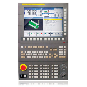
https://www.fanucamerica.com/images/default-source/cnc-image...
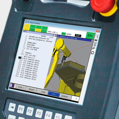
https://www.fanuc.eu/~/media/corporate/products/robots/acces...
https://i.imgur.com/3vsHBhl.png

(OK, maybe the AB went a little overboard on the number of function keys...) but these are really effective tools to structure menus and build HMIs.
This is just absolutely not true in practice.
Many synthesizers have the described design where you have a set row of knobs or buttons and what those controls do changes based on the current mode or state. A screen tells you the current function of each control.
It is much easier to build up muscle memory that lets you grab the right control and do what you want than it would be if you had to interact with the screen itself. The difference is so stark that it's hard to even explain if you haven't experienced it first-hand.
And this is for musical instruments used in live performance, often in the dark, where muscle memory and interacting instantly and correctly is vital.
The same it turns out is true of steering a multi-thousand pound metal rolling deathbrick.
On a second thought, if the options are hierarchical, the sequence of clicks may not be cumbersome at all. Also, in a car the state can be something really easy to keep track of, like "the car is running", but even then, I'm not sure it's safe to rely on this.
I have a VW car with a basic HUD (2015-ish era HUD, where a glass pops up). It can show lane keeping state, adaptive cruise control, current speed, recognized signs and navigation directions. Those features are essential for normal driving, so I don't look at all on the instrument cluster (either dials or the screen). The fact that you don't need to look down and change the focus of the eyes makes a significant difference.
This, though functions like climate control, audio, and anything needed to operate the car while in motion should still have dedicated buttons. Touchscreens in cars are an abomination.
> I have no idea why you absolutely need to put buttons in the middle of the screen to be touched.
They don't need to, they're just following the touchscreen all the things UX fad. Turns out capacitive touchscreens were a great fit for cell phones, but that doesn't mean they have a place anywhere else.
"Touchscreen all the things" was cargo-culting. Apple made a trillion dollars with touch screens, therefore we should use touch screens too.
If an operation is infrequent and doesn't need to be made when driving, burying it in a touchscreen menu sounds great: conserve those physical control surfaces for stuff that matters so you don't have a ridiculous surplus of buttons. You can go and put the majority of functions on touchscreen menu hell. But don't go and put the climate or windshield wipers or even audio modes on touch surfaces, please. :/
That's a bit of a straw man. No one seriously says literally every function needs a button.
And it makes sense to bury seldom-used things in menus. However, there's no reason those menus need to be touchscreen menus.
E.g., in my car, care settings are in a menu, but the screen for it is in the instrument panel and controlled by buttons on the steering wheel. I believe the reason is when it was made they still offered a low-end trim level without a touchscreen entertainment system. This menu is better than a touchscreen, but IMHO it would have been better with done with menu-buttons in the center console screen.
It's not a straw man; it's nuanced agreement. It's a shame that people expect argument so much that they can't see where the edges of one opinion are being offered.
> However, there's no reason those menus need to be touchscreen menus.
Might as well be touchscreen menus. Using up and down buttons to pick things in a modal interface isn't clearly superior to a touchscreen for experienced users and worse for new people.
A good button menu system is better than a bad touchscreen, especially with experience. But in a rental car, I appreciate the touchscreens to pair my phone, etc.
I understand that, that's why I said it was "a bit" of one.
> Might as well be touchscreen menus. Using up and down buttons to pick things in a modal interface isn't clearly superior to a touchscreen for experienced users and worse for new people.
IMHO, if you have the space, f-key/button menus (e.g. the hardware shown at https://www.informatique-mania.com/en/tutoriels/quest-ce-que...) are better than touchscreen menus.
I like avionics and ATMs where you see these. They're great for experienced users with relatively fixed functionality.
You can't tradeoff UI factors so easily, though. If you usually have 5 options, and found you have 6 somewhere-- you need to break up the section or add a page, etc. And if you add an option the user UI workflow completely changes.
While, with a touchscreen you could accept a smaller target for the least-used option, and adding a new target on a page doesn't change things too much for users (and is arguably more discoverable).
I don't miss noisy potentiometers :D
And having a bus with user operations being streamed to it means that designers can choose mappings and behaviors late.
The issue is the delay. I have a lot of amplifiers with knobs that are perceptually instant, even if they really are encoders behind the scene. Stuff is fast enough now that there's no reason for delay. I've built control systems that use encoders that operate at 1000Hz over slower embedded networks than are in modern cars.
Figure maybe 65dB of useful dynamic range in a car + 10dB of range needed based on levels of the recording. That implies you want about 150 steps.
Go ahead and display a number between 1-30 if you want-- that's probably good for usability. I can find "13" and be close to what I typically want. Just, have the actual control surface move 5 steps per number so that I can fine tune.
I agree with that, but I don't see any added value of a touchscreen for the other things you mention. It could as well be a deep menu that is still accessed with many button presses to drill down into it.
I think if I'm not driving, the usability of picking from menus by touch is usually nicer than using buttons to navigate.
If I'm really experienced with the controls, buttons are better than a meh touchscreen.
In a rental car, I appreciate the touchscreen menus.
Swipe keyboards are good enough and physical keyboards are out of fashion long enough that it’s been a while since I’ve seen an bluetooth keyboard build into a phone case. But I haven’t actually tested my preference in years.
In similar way as current/recent SUV cargo-culting. For premium performance manufacturers like Porsche or BMW it didn't make sense, why have bulky car with shitty driving characteristics, slower, much higher roll risk, much higher center of gravity, much smaller inside space than usual family wagons, that costs more to run and buy it from premium brands... thats what you have Fiat Peugeot etc for. Especially for people who drive on paved roads 99/100% of the time, ie typical soccer moms.
I know that inexperienced drivers enjoy higher seating position and feel safer, but I would suggest taking some driving lessons if thats a problem for a given driver, much better results and resulting real safety.
Yet Cayenne and X5 and whatnot sold like hot cakes for premium money because footballers and other celebrities bought them, so eventually every manufacturer jumped on that bandwagon, screw any logic if people buy it. The more performance the brand, the longer it took them to pick this trend up, and thus Ferrari is the last (from what I gathered, not following this topic seriously). And so folks today buy crossovers and god knows what other names are in vogue these days, which are tiny short cars with high ground clearance. To drive in cities.
Couldn't agree more. I have ~50 hours of seat time driving a high performance mid engine car on a track but in any amount of traffic I prefer my truck. Better visibility, and (imo) better safety due to weight.
It's rarely brought up but even an elementary understanding of physics makes it obvious that less massive things are more fragile and susceptible to deformation than more massive things, all else being equal. Sadly that last point involves a zero sum game: the safer a heavier vehicle is to its occupant the more dangerous it is to others. Even more sadly its a game many people are forced to play.
1. https://www.iihs.org/ratings/driver-death-rates-by-make-and-...
Worse safety for everyone but the driver I would argue. Same for most heavier cars, such as SUVs.
Touchscreens let you build arbitrary UI/UX. You can click anywhere and do gestures anywhere and type anywhere. When there doesn't need to be UI, like when watching a video, the whole phone is the screen. So the UI can optimize for the best UX. It's much more powerful.
With physical buttons, software is pigeon-holed into UI designed around those buttons. It's a massive trade-off. Something we take for granted like navigating a website becomes much more tedious when you only have buttons.
Just look how much effort goes into making software-specific hardware like the scroll wheel/drum on old-gen music players like the iPod, yet it doesn't solve something as simple as typing in a song search query.
Because you are always staring at the display while using it?
Why would I want I/O to become IO?
It would be great, there is very little in the way of a worse UI than trying to use a touch screen in a moving vehicle.
IMHO, that's one of Apple's biggest competitive advantages. They have so much cachet that everyone assumes whatever they do is "best" and mindlessly apes it. That way they never have any real competition, because followers are always at least a step behind.
Yes but to be clear they are still an enormous compromise there. Maybe it is this generation of UX people, maybe it is fundamental to the technology, but there hasn't been much advancement in touch interface tech in years. Apple tried "deep touch" or whatever with feedback but then abandoned it because nobody (users or devs) wanted to deal with it. We just deal with all the downsides of touch screens because the rest of the device gives us such an incredible capability, even with the (sometimes literally) painful UX.
Sure. However removing the physical buttons on cellphones was a pretty big loss that the touchscreens do not make up for.
You can now watch a movie, play a game, even browser a crappy website with desktop-only layout on an iPhone Mini. Try to do this if half the screen estate is replaced with physical button.
I am a big fan of physical buttons though, I which apple would add more of them on the sides, with some programmables, that would be awesome. Some Android devices have this for example.
As you know, products aren't made for the customer, they are made for the equation: customerMoney - (ProductionCost + MarketingCost etc etc) = Profit
You might think that, but lots of people complain about how BMWs have different turn signal stalk behavior than other cars.
Easy enough to dodge but it'd be nice if people didn't simply assume they are alone at the front. I don't.
Is there actually a way (apart from pulling a lever to open it and looking in a mirror if it is the type which flips open)?
The symbol on the fuel gauge indicating the side of the tank opening is a myth isn’t it? Doesn’t consistently hold true for my car, and people seem to remember the version the does - does the hose indicate the side of the flap or the side the hose needs to be on?
It exists. It's a small arrow, and most _rental_ cars have it. For cars sold to the public it's hit or miss. My new car doesn't have it either.
[1] https://6abc.com/gas-tank-indicator-prices-road-trip-tips-su...
https://www.ableton.com/en/products/controllers/apc40mkii/tr...
https://www.native-instruments.com/en/products/komplete/keyb...
1. The entire page hierarchy was only one level deep. You had 10 buttons that select a parameter, and a single data entry slider. So, with two hands, you could very rapidly manipulate parameters. I believe the Yamaha DX7 also had this, but what made the ESQ-1 cool was that the button usages were listed right on the digital readout next to the buttons themselves, rather than off to the side and hard-coded to the parameter. So it was like hitting a hardware button that could automatically remap.
2. Again unlike the DX7, there was no button-press needed to "edit" -- you just hit the button and moved the slider. It felt very natural to use even though it was technically a digital parameter being editing. If you needed additional editing power, you could still hunt for the other buttons outside of the 10 "screen" buttons.
I had one about 5 years ago, and swapped it for a JP-8000. I regret it. Very cool synth, very innovative UX.
There is a difference between working with a touch screen where you can focus on it and using a touch screen where you need to focus elsewhere (like the road). There is also a difference between something like a plane where you have a great distance from other moving objects most of the time and a car where you are regularly around other cars.
My wife has a slightly older car with no touchscreen. We can operate it by feel. Without ever needing to take our eyes or focus off the wheel. My car has a touch screen. I can't operate that by feel. Constant glances are required.
These are different experiences. Looking at the situational environment is important when creating a good user experience.
I wish I could buy a car with more physical buttons. Would make the whole car driving experience more usable with me as a less distracted driver.
Having tactile, easily memorized controls with screens is a solved problem in the avionics industry. It's just that car makers refuse to learn any lessons from them.
Soft keys specifically have an intuitively understood relationship - usually through physical placement - with the screen to link them to their purpose. The "softness" is about the keys purpose, as it can change depending on context of the screen.
A key without a intuitive link to the patch of screen, is just another F-key...
Even commercial and fighter aircraft -- which have human-interface requirements of incredible depth and complexity -- are transitioning to large touchscreen displays. ALL of which require physical boundary buttons and knobs as a redundancy for touchscreen controls.
In fact, controlling the screens via buttons are the preference for many pilots since accurately fiddling with touchscreens during turbulence, pulling Gs, evading missiles, while being task-saturated etc is very hard to do, but doing the same with physical buttons is far more reliable. Button-pushing tasks can be performed from memory in the blind (or while not looking) (a.k.a. "memory items").
There's always been a dichotomy in human-machine interfaces between airplane customers (airlines, charters, governments, and militaries) vs. their own pilots. Airplane builders have to keep up appearances and look cool by putting in putting in flashy, futuristic features like big screens and AI, and ditching old button-laden displays and the "old way of doing things." It too often disregards the needs and wants of pilots and "human factors" engineers. Fortunately, safety comes first, so the buttons and redundancy must stay.
The control panel has:
* 6-8 buttons for switching between different MMI modes, labeled
* 4 universal buttons, function contextual to the current screen
* 1 return button
* Turn/press controller
I can navigate 90% of the menus blindfolded. Despite my older MMI not being a marvel of UX, I can access functions 5 actions deep, while driving, from pure muscle memory.
[1] Which is totally ridiculous IMHO, because even with my completely amateur skills, wiring up a few buttons to an embedded chip is NBD.
Another comment claims Audi no longer uses this system and went to touch as well.
Absolutely. It's why smart-phones and tablets (the ultimate 'touch' devices) still put some physical buttons (power, volume control).
A well designed UI, complemented with physical input (buttons or knobs) is best.
Context-sensitive buttons are less awesome. They might be superior, if you memorize the combination, but they're decidedly inferior to touchscreens for the long tail of infrequently used features.
The study linked here focused on "simple" tasks, and the top performing cars probably have dedicated buttons for everything measured. The story would likely be very different for context sensitive buttons, and subjective reporting would likely be unreliable, if studies on the speed of mousing vs keyboarding are anything to go on [1].
[1]: https://ux.stackexchange.com/questions/30682/are-there-any-r...
Give those physical buttons and 99.999% of complaints vaporize, and people are happy. Apply your idea for stuff that's up in the air. Boom. Done.
To the automakers, when two controls have overlapping things they're good at doing, maybe pick the one that fits best and just include that, but at a bare minimum make sure they are always used consistently and clearly, please.
* a row of programmable buttons with LED or lit e-ink screens for software developers to go nuts with =) – and for end users to customise to their preference. * static physical buttons for basic functions (climate control, wipers, cruise control, volume, etc.)
And of course a large touchscreen with buttons on the sides as well.
ok, ok, it’s probably too expensive… As an option maybe? Let the end users vote with their wallets.
It just requires context. How that context is critically important. If it is a hierarchical menu, then the context is the navigation path (i.e. the sequence of previous button pushes, each of which transitions from one state to the next). Importantly, with a fixed hierarchical menu, the path to a button's functionality doesn't change and can be memorized. With some audio feedback, the current state can also be announced, so that a person's mental state matches the state the interface is in.
There are several problems with touchscreens, not the least of which is the context issue. The next issue is there is no tactile feedback, which requires you to look at where you are touching, often because interactive things can appear anywhere.
The lack of tactile feedback on touchscreens is an issue when using it, but I'm not convinced that it's any better or worse for partial-attention tasks. For full attention tasks (e.g. navigating a settings menu) it's far superior to a button-based approach.
Also, hard no to "just as bad". I have no issue with volume control buttons also being camera triggers on my phone, for example.
Details matter.
When you aren't driving, if you have to set up something (like configure the doors to auto-lock when when you shift into drive or something) then a touchscreen is clearly superior. You can navigate to a menu and read the options and select the appropriate one. But like the camera shutter button, this is a situation where you can afford to pay some attention to the task at hand.
While operating a vehicle, if you're trying to turn up the fan on the A/C, then using a button to switch to climate controls, then using a button to switch to fan settings, then clicking the up button three times, is just as bad as a touchscreen, because if you switched to climate but didn't yet switch to fan settings, and you have to put more attention on the road because you're exiting, you've lost context and can no longer know where you are in the navigation with looking and assessing the situation.
So dedicated climate controls >>>>>> touchscreen or context-buttons. The difference is close enough to be indistinguishable.
If you get a popup saying "there's traffic ahead click here to accept a new route" then dismissing it by jabbing the screen and dismissing by jabbing a button, it's really hard for me to see a lot of air.
There's a place for middle ground though: sequences of button presses.
For instance, keying in 1-3-4 to enable this or that feature (where the buttons are 1 to 5).
It can be done purely by touch, but it'd be hard to discover and memorize such sequences without a screen. However, once you discover them, you don't need to look at the screen.
I'd love buttons with braille on the surface so I could read what they said without looking at them. Does someone make mems braille screens?
*edit, looks like there is a bunch of stuff in the works
https://duckduckgo.com/?t=ffab&q=mems+braille+screen&iax=ima...
I'd love more physical buttons because, and this may come as a shock, usually when I need to use these darn things, I'm driving.
They're thinking about making their vehicles look differently than everyone else's instead of thinking about what would work the best?
I've tried building out several projects like this, and using HID keyboard as standard, you are relegated to ANSI keystrokes or combos that a user/os wouldn't need, or third party drivers that come with their own headaches. Another option is a video game controller.
I never understood why we can have a billion emojis but adding some additional unused input mappings is a bridge too far.
The problem is that it’s contextual, so you still have to look to it you can trust that a hardwired button won’t change purpose; that’s the important property here.
This works for cheap oscilloscopes because you're not simultaneously driving a car. What you're proposing would make the safety issues worse, and probably be unacceptably frustrating for most people.
With simple menus (or a custom setup of your own), the common things could be on buttons, instead of taking your concentration off the road.
but not by a deaf driver
Normalized functionality is required by law for air and medical to reduce risk of operator error.
The auto industry does not have to consider a confused operator killing someone else. That risk is on the individual driver, not a hospital, airline, or airport.
With a decent response time and hierarchical menus, it's easy to make a system that is navigable without looking. Throw in some (hopefully non-annoying) audio feedback, and it is extremely accessible--even by a blind passenger! In fact, that's a good benchmark. If a blind passenger could operate the thing, then the driver should be able to as well.