News for hackers. Stuff that matters.
Re:Introducing the new Google+ by rogerbinns on Tuesday November 17, 2015 @04:31PM (#10584102)
Google seem to keep making worse the thing that matters most to me. What I want is to conveniently read. I want to see content, from a variety of sources. I want density. I want to catch up and be aware.

It was like that in the earlier days. Every update kept reducing the amount of visible content, and severe reductions in density. Here is a screenshot of my screen - http://i.imgur.com/fM2WIVf.png (1920x1200) - almost two million pixels. There are a total of 7 (yes seven) sentences of article and 5 sentences of comments. I have to click and/or scroll to see anything more. (This is their densest layout - the single column version has a total of 4 sentences.)

With Reader they had a community of people who read a lot, and an interface design that worked well for doing that. They took that away. By not having access via an open standard like RSS for G+ streams, they don't even allow alternative interfaces that can address their problems.

I can only conclude that the people who persevere with G+ do so despite it, not because of it. They must also be very patient and do a heck of a lot of scrolling.

Re:Introducing the new Google+ by sytelus on Tuesday November 17, 2015 @08:09PM (#10585245)
I think the biggest issue is the design. The card layout is generally big no-no in design community. It presents too many choices for the reader for where to focus. Users don't like to make choices because it represents friction in consumption. The FB layout is one item at a time with small column so eyes doesn't have to scan right to left too much. If user doesn't like item you just move on. The ranking of posts is absolutely the core fundamental key to keep user interested. This is such a simple and basic design issue that I'm surprised no one is talking about and no one is fixing it. Making consumption choice-free, decision-free and friction-free should be the guiding principle in all social apps. Once you fix this problem, more users can start posting and vicious cycle can start to roll on. of course, the other issue is that G+ discourages cross posting, 3rd party apps and related APIs which again limits people who are willing to take on further friction. These issues are easily solvable and too glaring to ignore.
Re:Introducing the new Google+ by sirtastic on Tuesday November 17, 2015 @08:45PM (#10585376)
> The card layout is generally big no-no in design community.

I disagree-- it would appear to be exactly the opposite if you look at current design trends (checkout dribbble.com), cards look to be a very big yes-yes in the design community. I believe googles implementation of the cards within Google+ very poor UX. If they made each card the same height so your eyes can move about the page more orderly it might make Google+ more palatable. You are right in that it is very hard to digest the content with that design.

Re:Introducing the new Google+ by sytelus on Tuesday November 17, 2015 @08:57PM (#10585422)
Trending design ≠ efficient design. Lot of me-too designers try to copy what's on popular websites even though it's clearly a wrong approach and that's how bad designs become viral (Jumbotrones is another example which has become viral but has measurably lower engagement metrics). Also many designer falls in to side-by-side measurement trap while what they should be measuring is users engagement metrics. Card layout looks pretty in PowerPoints and SBS numbers would generally shine but any designer who have actually measured actual engagement metrics with card layout would agree that it's horrible idea. BTW, I'm taking about card design where there are more than one horizontally laid-out cards.
Re:Introducing the new Google+ by sirtastic on Wednesday November 18, 2015 @12:42PM (#10589306)
Didn't say it was the right thing to do but that is surely up for debate though it is definitely a current design yes-yes. Personally, I like the card trend. It makes designing for responsive a bit easier and I enjoy the material looks which plays well with "cards'.
Re:Introducing the new Google+ by newsignup on Wednesday November 18, 2015 @04:19AM (#10586750)
Pinterest?

Design is only a part of the experience, most of the value comes from usefulness.

Re:Introducing the new Google+ by felipeerias on Wednesday November 18, 2015 @06:03AM (#10587027)
It depends on the content and the users' goals.

Pinterest is mainly focused on pictures and its users like to scroll at leisure through long lists, collecting items that catch their eye. On the other hand, G+ is more focused on reading single articles: notice an interesting headline, read the first few lines, click to read more.

This distinction between grazing for images and hunting for text articles is why lack of horizontal alignment makes Pinterest more enjoyable and G+ harder to use.

Re:Introducing the new Google+ by tapp on Tuesday November 17, 2015 @08:50PM (#10585392)
> The card layout is generally big no-no in design community.

Interesting. Could you provide any links/citations for this?

I ask because it feels like practically every designer I talk with these days wants to force a card layout onto everything (even text-oriented sites) and I'd love to hear the other side.

Re:Introducing the new Google+ by XJOKOLAT on Tuesday November 17, 2015 @09:05PM (#10585451)
+1 for a damned list ...

I mean look at the front of hacker news.

Speed. Read.

Re:Introducing the new Google+ by bhaumik on Wednesday November 18, 2015 @12:52AM (#10586185)
HN isn't considered great design by majority of users outside this community.
Re:Introducing the new Google+ by krapp on Wednesday November 18, 2015 @01:02AM (#10586226)
It isn't necessarily considered great design inside either, judging by how popular Hacker News plugins and readers are.

But a pretty strong argument can be made that, for sites focused primarily on text and reading, simple layouts may sometimes sometimes be better than complex ones.

Re:Introducing the new Google+ by TeMPOraL on Wednesday November 18, 2015 @01:56AM (#10586383)
HN is kept this way on purpose. That the GenPop doesn't like it is a feature, not a bug.

As for designing sites focused on reading, I wholeheartedly agree with this: http://motherfuckingwebsite.com.

Re:Introducing the new Google+ by phaemon on Wednesday November 18, 2015 @03:17AM (#10586592)
Almost. I agree more with this: http://bettermotherfuckingwebsite.com/
Re:Introducing the new Google+ by leni536 on Wednesday November 18, 2015 @04:39AM (#10586819)
>A little less contrast

Other than this, I agree. Black on white is fine, and hell no, don't make the background slightly gray. If my display is too bright I turn the brightness down.

Re:Introducing the new Google+ by phaemon on Wednesday November 18, 2015 @11:29AM (#10588692)
Do you dislike the slightly grey background on HN? I can't say I really notice such things.
Re:Introducing the new Google+ by leni536 on Thursday November 19, 2015 @07:03AM (#10594270)
Oh, yes I do. And I hate the grayed out downvoted comments. I have a chromium HN plugin that fixes the background.
Re:Introducing the new Google+ by 2muchcoffeeman on Wednesday November 18, 2015 @04:21AM (#10586753)
>"You're a fucking moron if you use default browser styles." >- Eleanor Roosevelt

Why are the default styles so bad?

Re:Introducing the new Google+ by dredmorbius on Wednesday November 18, 2015 @12:44PM (#10589319)
There are two interpretations of your question, which do you mean?

1. What is wrong with leaving HTML completely unstyled and allowing the browser to apply its defaults?

2. Why is it that the default settings applied by (most) browsers are so awful?

The answer to the first is pretty much, as another HNer noted, the topic of the Better Motherfucking Website page. The defaults suck.

Why the defaults suck is ... probably an accident of history that's difficult to undo. Browsers default to no margins and a whole slew of other stuff, and CSS requires that you either start from known defaults or explicitly style each and every element.

If every browser used its own distinct set of deviations-from-default for various entities, CSS would be even more of a hack than it already is.

Some of the fault also surely lies with standards organisations, including the W3C. If they elected for specific defaults to be applied to all pages, and, by some miracle, browser vendors actually adhered to these, you could conceivably have a world in which most Web pages didn't need much if any styling, and where users could choose to apply default styling to pages.

I do this presently via uBlock and uMatrix on desktop, and via ReaderMode on Mobile. I virtually always prefer the simplified, standardised view to a site's native design.

You've asked a simple question, but a deep one.

Re:Introducing the new Google+ by mgraybosch on Wednesday November 18, 2015 @03:01PM (#10590316)
The default styles are lousy because there's no reasonable standard on how pristine HTML5 untouched by CSS should look. So browser developers make assumptions because they figure everybody will just use CSS anyway.

Fortunately, we have stuff like normalize.css (https://necolas.github.io/normalize.css/) nowadays.

Re:Introducing the new Google+ by TeMPOraL on Wednesday November 18, 2015 @04:25AM (#10586771)
The whole site tries to explain that.
Re:Introducing the new Google+ by TeMPOraL on Wednesday November 18, 2015 @03:28AM (#10586622)
This is great! Together, they form a perfect design philosophy!
Re:Introducing the new Google+ by krapp on Wednesday November 18, 2015 @11:07AM (#10588461)
> HN is kept this way on purpose. That the GenPop doesn't like it is a feature, not a bug.

The "GenPop" don't even know this site exists and, if they did, would be turned away by the content, not the layout.

That argument is made here often, that somehow liking the plainness of HN's layout is a shibboleth to detect quality users, but i've never really bought into it. Sites like Craigslist, Reddit and 4chan manage to do quite will with relatively simple looks and broader appeal.

Re:Introducing the new Google+ by TeMPOraL on Wednesday November 18, 2015 @11:49AM (#10588879)
I wasn't really trying to make an argument out of it; I think there's a direct quote from pg floating somewhere that this is one of the reasons HN's design is kept bare-bones. I may be misremembering though.

EDIT: I found one quote:

"So the most important thing a community site can do is attract the kind of people it wants. A site trying to be as big as possible wants to attract everyone. But a site aiming at a particular subset of users has to attract just those—and just as importantly, repel everyone else. I've made a conscious effort to do this on HN. The graphic design is as plain as possible, and the site rules discourage dramatic link titles. The goal is that the only thing to interest someone arriving at HN for the first time should be the ideas expressed there."

http://www.paulgraham.com/hackernews.html

Re:Introducing the new Google+ by krapp on Wednesday November 18, 2015 @12:17PM (#10589099)
Fair enough, but even if pg said it I still disagree with the premise, albeit respectfully. You can have a site with a simple layout which features the content without having ugliness be a conscious design principle. The problem lies in the assumption that plain design will "repel" one kind of user, but attract another, I don't believe it does.
Re:Introducing the new Google+ by TeMPOraL on Wednesday November 18, 2015 @12:35PM (#10589257)
> You can have a site with a simple layout which features the content without having ugliness be a conscious design principle.

That I agree 100% with. I too believe that. Hell, I find myself liking simple layouts more than what's the usual startup trend for pretty backgrounds (and background videos; whoever does that deserves to have their Internet access limited to crappy 3G modem with fixed rate of $0.1/MB) and fluff.

Personally, I think HN is actually too simple. Reddit seems uglier, but they have lots of very small features that greatly support discussion on the site. I actually think that the interface for general discussion on-line lies somewhere between HN and Reddit - simple but useful tree-like forum.

Re:Introducing the new Google+ by krapp on Wednesday November 18, 2015 @01:02PM (#10589494)
One thing i've found odd about HN is that the only really customizable feature for logged in account seems to be the background color of the top bar, after you get enough karma. Just imagine how many complaints people wouldn't be making if they could adjust the default text size, line height or some other colors?
Re:Introducing the new Google+ by TeMPOraL on Wednesday November 18, 2015 @01:11PM (#10589563)
Yeah. I don't really understand why this feature even exists. Maybe it's some artifact of HN's history, pg experimenting with that particular part of HN's engine in Arc or something? Because this and all the other things you've mentioned can be accomplished by user setting up an additional CSS for the website client-side, with an implicit assumption that audience here is generally smart enough to figure out how to do this.

Also, the orange bar is basically the single visual element that makes HN HN, so I don't know why people would even like to customize it...

There's some mystery here.

Re:Introducing the new Google+ by krapp on Wednesday November 18, 2015 @02:44PM (#10590202)
Back in the day, Myspace would embed any arbitrary CSS you pasted into your profile. I'm not suggesting Hacker News make itself that hackable (it would be hilarious, though, if they added that "feature" to the thread submission form) but it seems like it should be a bit more hackable than it is, given its nature.
Re:Introducing the new Google+ by dredmorbius on Wednesday November 18, 2015 @04:16AM (#10586740)
The problems I've got with HN would with one exception be best addressed with less design.

It assumes fixed screen / viewport widths and font sizes. Foreground / background contrast is poor. The more code: collapsable subthreads.

Otherwise, it's a basic text-heavy design for a text-heavy site.

Re:Introducing the new Google+ by astral303 on Wednesday November 18, 2015 @11:45AM (#10588839)
It gets the job done for the audience. It's very fast. There is no clutter.

Therefore it's almost great design. Up/down buttons too close together for reliable use on touch screens (because of the inability to correct a mistap) is what's keeping it one step short of greatness.

Design is experience. Graphic design is almost orthogonal.

Re:Introducing the new Google+ by draw_down on Wednesday November 18, 2015 @02:47AM (#10586517)
It's not great graphic design, true. But I'll take it over garbage like grandparent's screenshot any day.
Re:Introducing the new Google+ by bhaumik on Wednesday November 18, 2015 @12:52AM (#10586191)
Great UX but the UI isn't as appealing to everyone outside the HN community.
Re:Introducing the new Google+ by vilhelm_s on Tuesday November 17, 2015 @08:26PM (#10585305)
But Google+ used to be single column! Then one day they switched to the two-column card layout, the content was exactly the same but suddenly you needed to scroll up and down to be able to read both columns. (i.e. when you finish reading an item in one column you have to scroll back up to get to the beginning of the next item in the other column).

I really wonder why they decided to change it.

Re:Introducing the new Google+ by RyanZAG on Wednesday November 18, 2015 @12:11AM (#10586043)
It definitely looks better when viewed as a screenshot or in a graphic design presentation. Of course actual usability is far worse, but nobody cares about that. Only how shiny it is. The people making the decisions on which design to go for are given screenshot or mockup presentations in 5 minutes and asked to choose which design to go for. They will always go for the shiniest one, and you end up with stuff like this.

There's some comment about the low attention span we force on executives by making them take 1000s of decisions per day that they aren't even experts in and rewarding them for it in all this.

Re:Introducing the new Google+ by 21echoes on Wednesday November 18, 2015 @03:32AM (#10586628)
... you honestly think Google has no analytics on whether or not design changes affect UX? And that they'd stick with a significantly worse-performing page?
Re:Introducing the new Google+ by nissehulth on Wednesday November 18, 2015 @05:23AM (#10586937)
They will only have numbers for the people that are actually using Google+. The millions that prefer other social networks may have different views on the G+ usability.
Re:Introducing the new Google+ by r00fus on Wednesday November 18, 2015 @01:36AM (#10586329)
Somewhat counterintuitive... I mean Google knows better than relying on stills for what is interactive content, right?
Re:Introducing the new Google+ by tajen on Wednesday November 18, 2015 @02:24AM (#10586458)
I don't know, did they ever hire an Apple designer? Ah, no, they had a no-poach agreement. Perhaps they had to revert on poaching Pinterest designers, though.
Re:Introducing the new Google+ by reitanqild on Wednesday November 18, 2015 @02:22AM (#10586452)
> But Google+ used to be single column!

...

> but suddenly you needed to scroll up and down to be able to read both columns.

I guess many of us don't read any column in google plus, we just glance them and take a closer look at a few things.

... > I really wonder why they decided to change it.

I have a couple of reasons why they might have done it:

1.The focus is on lots of short-form (think twitterish).

2. Stacking smaller blocks sideways neatly lets you format posts themselves the same way in multiple screen resolutions.

Twitter is a darling it seems despite wasting most of my screen.

Google plus is hated for everything despite being IMO a better product both technically and design-wise.

Re:Introducing the new Google+ by mattlutze on Wednesday November 18, 2015 @04:23AM (#10586765)
It's in vogue in the design community where the primary use case is passively consuming images and media. This seems to be where Google is sending Google+, and how all the feeds I still have followed on it are using the service -- sentence of text + image/video.

From what I understood in the post and a few reviews of it, Google don't (and shouldn't) want to compete with Facebook in friend cross-posting interaction activities.

> Making consumption choice-free, decision-free and friction-free should be the guiding principle in all social apps.

In what world is that true? The point of social interaction enabling apps is to increase the likelihood of users regularly choosing to abandon passive consumption and interact with things. Friction is the only thing in your maxim that makes sense I'm afraid.

Re:Introducing the new Google+ by michel-slm on Thursday November 19, 2015 @12:20AM (#10592898)
As one of those loyal Reader users, I have since switched to Inoreader via Feedly. For me, there is no single view that works for everything, really -- and the nice thing about a proper feed reader is that you can have a customized display per feed group.

My articles are normally either in list or magazine views, and only graphically-heavy feed groups (like comics or photos) are in card view.

Re:Introducing the new Google+ by kldavenport on Tuesday November 17, 2015 @09:01PM (#10585437)
Amazon's UX designers feel the same way. G+'s card layout does not make it easy to infer what's the latest vs the most commented on item and what the logic is behind it's positioning laterally. I think basic gestalt principles in cognitive science would support the problem with laterally adjacent but vertically edge overlapping tile placement.
Re:Introducing the new Google+ by markdown on Tuesday November 17, 2015 @08:59PM (#10585429)
> The card layout is generally big no-no in design community.

Pinterest.

Re:Introducing the new Google+ by sytelus on Tuesday November 17, 2015 @09:05PM (#10585447)
Pintrest is different use case. Pins typically have little other content than images for consumption and card design works great where major content is images.
Re:Introducing the new Google+ by bluthru on Tuesday November 17, 2015 @10:52PM (#10585805)
That's different. You're supposed to peruse like a catalogue.
Re:Introducing the new Google+ by dredmorbius on Wednesday November 18, 2015 @12:35AM (#10586121)
A site I hate, avoid like the plague, and block via /etc/hosts where possible.

But thanks for the example.

Re:Introducing the new Google+ by markdown on Wednesday November 18, 2015 @03:28PM (#10590506)
I'm sure Pinterest appreciates that. Users outside the target market drain resources for no benefit.
Re:Introducing the new Google+ by toyg on Tuesday November 17, 2015 @04:42PM (#10584167)
It's not just a Google thing. Recently there was a HN thread on devmag.io -- they have the same problem. I measured it: in the same space HN gives me 18 stories, Devmag.io gives me barely 2.

Unfortunately, I think Google people know and they just don't care. They don't want people who know what RSS is, people who care about information density; they are going after the Pinterest crowd, the sort of people who read Cosmopolitan, watch reality shows, and post drunken pics on Facebook.

Re:Introducing the new Google+ by yoodenvranx on Tuesday November 17, 2015 @04:49PM (#10584215)
The new reddit mobile page has the same problem. On the old http://i.reddit.com I usually get 1-3 more links per page than on the new http://m.reddit.com

Who actually thinks that all that padding and those stupid navbars are a good idea? On mobile my screen estate is very valuable and I don't want to waste it on unnecessary things.

Re:Introducing the new Google+ by bitwize on Tuesday November 17, 2015 @05:40PM (#10584536)
Designers from San Francisco, that's who. Current design trends favor "negative space", so text has to be spaced widely, with huge margins and hairsbreadth-thin fonts.
Re:Introducing the new Google+ by bluthru on Tuesday November 17, 2015 @10:54PM (#10585813)
Negative space is always useful. Simply spacing shit out to create low information density isn't the same thing. Adding a bunch of unnecessary dividers (cards and shadows) are definitely not the same thing as negative space.

Negative space would be allowing the space between items to create a division instead of the borders and shadows.

Re:Introducing the new Google+ by ajmurmann on Tuesday November 17, 2015 @08:41PM (#10585359)
You forgot to mention the very low cost, especially for font because we gotta hide that pesky content that we have to show after all.
Re:Introducing the new Google+ by alexschleber on Wednesday November 18, 2015 @05:00PM (#10591082)
Images (even small, low-quality ones) are far more costly than text, no?
Re:Introducing the new Google+ by nosuchthing on Tuesday November 17, 2015 @07:53PM (#10585173)
The saying "Form follows function." is well ingrained among industrial designers, UI designers ought consider it as well.

Although my assumption here is front end designers are often subjected to death by a thousand revisions from 'the suits'.

Re:Introducing the new Google+ by gravity13 on Tuesday November 17, 2015 @06:22PM (#10584759)
Yeah but the action of maneuvering through the content is fleeting. Rather than squinting and parsing a whole bunch of stuff - you're just filtering as you move down the page. I do the same exact thing on HN. It's just that I can be lazy with the affordance of a large screen.

Also, reddit is different as a consumption medium, rather than news aggregator. With reddit, you consume. With HN, you peruse.

Re:Introducing the new Google+ by SixSigma on Tuesday November 17, 2015 @04:53PM (#10584248)
And yet they already have just what you want, why are they wasting time re-inventing it!

http://reddit.com/.compact

Re:Introducing the new Google+ by yoodenvranx on Tuesday November 17, 2015 @05:13PM (#10584379)
Http://i.reddit.com is the same as adding ".compact" to a link.

I also don't understand the redesign. The old version is way better then the new version, but I guess it just does not look flat and material enough.

Re:Introducing the new Google+ by andrepd on Tuesday November 17, 2015 @05:35PM (#10584506)
As a major point in their favour, at least they kept the old version. They could have just redesigned the webpage and put it on i.reddit.com. Instead I can keep using the same good old layout while those who want can use the new m.reddit.com.

That's more than I can say for many, many other things, where whether I like it or not I'm forced to have the latest design fad (flat, pastel colours, long and inefficient animations and huge, unnecessary padding nowadays) shoved down my throat.

Re:Introducing the new Google+ by x1798DE on Tuesday November 17, 2015 @08:04PM (#10585225)
I know nothing about this, but there's a flag on https://m.reddit.com that says "Beta", and on https://i.reddit.com there's a link to "try the beta", so I think it remains to be seen whether the old version is still available when m gets out of beta.
Re:Introducing the new Google+ by thekingshorses on Tuesday November 17, 2015 @11:05PM (#10585851)
I don't like the new http://m.reddit.com/

Try this my redesign reddit. http://reddit.premii.com/ I hope reddit does something like this, and let user configure layout for each subreddit.

Re:Introducing the new Google+ by yoodenvranx on Wednesday November 18, 2015 @02:31AM (#10586478)
I like the design, but why is there a nav bar? I browse reddit a lot in horizontal view and the navbar just takes very important space away.
Re:Introducing the new Google+ by thekingshorses on Wednesday November 18, 2015 @08:21PM (#10592081)
I am assuming you are on Android.

iPhone doesn't have a hardware back button, and most people don't know you can navigate back by swiping.

I will add tracking in http://hn.premii.com/ to see how many user uses in landscape mode vs portrait.

Hiding navbar in the landscape mode is an option.

Re:Introducing the new Google+ by Spoom on Tuesday November 17, 2015 @08:45PM (#10585374)
I love i.reddit. When they take that away (and I expect they eventually will), I will probably use reddit a lot less.
Re:Introducing the new Google+ by DanBC on Tuesday November 17, 2015 @04:56PM (#10584270)
Hang on, the problem with Pinterest is the aggressive user hostile "sign in" stuff on the apps and mobile pages. But Pinterest is, for what it is, really freaking good. If you want humanitarian faces or Japanese ceramic or Scandi Furniture or etc you'd be daft to ignore Pinterest.
Re:Introducing the new Google+ by bobwaycott on Tuesday November 17, 2015 @06:47PM (#10584870)
>> the problem with Pinterest is the aggressive user hostile "sign in" stuff on the apps and mobile pages.

Spot on. Desktop pages are just as bad. It seriously annoys to no end. If it was a paid service, I could understand.

Re:Introducing the new Google+ by nostromo on Tuesday November 17, 2015 @04:53PM (#10584254)
I was with you until you dissed Pinterest.

Pinterest is very information dense. It utilizes every inch of screen space, and it does so without looking cramped at all. It's a huge design success.

Re:Introducing the new Google+ by sp332 on Tuesday November 17, 2015 @05:00PM (#10584300)
It seems very image-oriented though. I wouldn't try to read news on it.
Re:Introducing the new Google+ by adimitrov on Tuesday November 17, 2015 @05:31PM (#10584473)
Well, but it's not for news — it's not supposed to be, and that's OK. I don't use pinterest much, except for creative pursuits. For example, browsing for inspiration for calligraphic scripts is a lot of fun on Pinterest:

https://www.pinterest.com/search/pins/?q=textura+quadrata https://www.pinterest.com/search/pins/?q=cadel+flourish https://www.pinterest.com/search/pins/?q=caligrafitti

I treat it as a source of inspiration, not information.

Re:Introducing the new Google+ by hussong on Tuesday November 17, 2015 @07:22PM (#10585027)
I think the problem is that people see the beauty of the pinterest layout (which works well for pinning images) and then adapt it to show textual content (which works much worse than a plain list of headlines for scanning news).
Re:Introducing the new Google+ by mehwoot on Tuesday November 17, 2015 @07:27PM (#10585053)
Right, but that just means they have made a design that suits what is being displayed on their website.
Re:Introducing the new Google+ by FoeNyx on Tuesday November 17, 2015 @05:27PM (#10584455)
"A picture is worth a thousand words"
Re:Introducing the new Google+ by 6d0debc071 on Tuesday November 17, 2015 @05:34PM (#10584499)
Depends on the words, the picture and the audience. I wouldn't attempt to understand your API's system contract via a picture of the computer.

One of the concerns I have is that we may end up moving to a very image-oriented media that finds it difficult to meaningfully communicate certain thoughts - and perhaps encourages an audience largely unable and/or unwilling to meaningfully attempt to understand them.

Re:Introducing the new Google+ by Animats on Tuesday November 17, 2015 @06:24PM (#10584772)
That's television. The web is a step up from TV in that regard.
Re:Introducing the new Google+ by TeMPOraL on Wednesday November 18, 2015 @02:17AM (#10586439)
And they said the same thing about TV just a decade ago. I'm pretty sure it's still bullshit, just like it was wrt. TV.
Re:Introducing the new Google+ by vijayr on Tuesday November 17, 2015 @05:25PM (#10584444)
Pinterest crowd, the sort of people who read Cosmopolitan, watch reality shows

That crowd is way bigger than the crowd that hangs out at places like HN. So it would make sense for G+ to go after them, no? This is a numbers game.

Re:Introducing the new Google+ by izacus on Tuesday November 17, 2015 @06:00PM (#10584643)
That crowd is already camping out on Facebook, while G+ was being adopted by more techy people.

Companies running for the same average Joe and forgetting about other groups of people leads to quick deaths of services.

Re:Introducing the new Google+ by drumdance on Tuesday November 17, 2015 @06:24PM (#10584769)
I've always thought Google should buy Github and make that the basis for a new G+. It's too late now but a few years ago who knows.
Re:Introducing the new Google+ by andrepd on Tuesday November 17, 2015 @05:36PM (#10584510)
Sadly yes. Doesn't mean I can't feel sad that is the case, though.
Re:Introducing the new Google+ by ajmurmann on Tuesday November 17, 2015 @08:46PM (#10585380)
I don't think it's either or. I obviously read hacker news, but I'm also very passionate about ceramics especially Japanese and Korean ceramics and Pinterest is a treasure trove for images of work other people have done as well as new techniques. For contrast: I don't have a Facebook account.
Re:Introducing the new Google+ by dredmorbius on Wednesday November 18, 2015 @12:44AM (#10586158)
Google have been tremendously coy about what their success metrics for G+ are, though they've played highly disengenuous all-but-utterly-fake numbers games in playing up "engagement" since the very beginning.

I'd argue that the issue isn't numbers, but relevance. G+ is lousy in many ways but has a few small areas of success, notably its Notifications mechanic, a community which, for me, works fairly well, and a search which while pathetically under-featured is comprehensive and fast.

Winning the numbers game for social vs. Facebook in its current incarnation is a fool's errand. Numerous people have pointed this out, including ex-Googlers pointing at the "Interest Graph" (though suggestions for following / pursuing this date to the first few months of G+).

If Google does grab the Cosmo crowd, that's fine, so long as it doesn't also chase off the Nature/PLOS crowd in the process. Unfortunately, Google's proven more than happy to sling absolute snot (as in the G+ "What Snot" feature ... oh, no, that's "What's Hot").

Power users learn how to disable that instantly.

Re:Introducing the new Google+ by agentdrtran on Tuesday November 17, 2015 @07:02PM (#10584933)
> they are going after the Pinterest crowd, the sort of people who read Cosmopolitan, watch reality shows, and post drunken pics on Facebook.

Inferring a bit much there?

[deleted]
Re:Introducing the new Google+ by GrantS on Tuesday November 17, 2015 @05:18PM (#10584407)
It's true, but it's such a shame. I still remember the day metacritic switched away from their original design [1] where every movie currently in theaters was in that single column on the left hand side. You visited one page, you looked at it for 15 seconds and you were done. Apparently this was not the best way to make money, but it was so useful.

[1]https://web.archive.org/web/20090117041216/http://metacritic...

Re:Introducing the new Google+ by TeMPOraL on Wednesday November 18, 2015 @02:10AM (#10586417)
That's how for-profit world works. It's not about providing value to customer - it's to provide as little value as you can get away with wile still getting paid. If a company can sabotage their customer's experience and make him pay more at the same time (whether directly or via ads), the company will pick that option.

This is the incentive gradient that's present everywhere, especially on the Internet - that's why I personally won't mind if ad blocking will kill all ad-supported websites. I'll call it good riddance.

Re:Introducing the new Google+ by jmspring on Tuesday November 17, 2015 @05:48PM (#10584588)
Same goes for the Skype Client. These apps seem to want to treat PCs like mobile devices where the app owns the whole screen.
Re:Introducing the new Google+ by yid on Tuesday November 17, 2015 @06:31PM (#10584800)
> Unfortunately, I think Google people know and they just don't care.

If this is the case, then it probably means that a majority of people find the less-dense layout easier to read. It would also explain why Reader didn't have enough usage to keep Google interested.

Re:Introducing the new Google+ by fredkbloggs on Tuesday November 17, 2015 @06:50PM (#10584886)
> If this is the case, then it probably means that a majority of people find the less-dense layout easier to read.

Maybe. But the service doesn't exist for the people using it to read, or to post either for that matter. They're not paying for it. If Google knows people would rather a different layout but don't care, it's because the people who are paying for it prefer it this way.

Re:Introducing the new Google+ by yitchelle on Tuesday November 17, 2015 @05:39PM (#10584533)
If there is a service that converts your G+ feed into a rss feed, would you use it?
Re:Introducing the new Google+ by rogerbinns on Tuesday November 17, 2015 @06:06PM (#10584671)
There were a few, but none worked reliably at all. I do use a external service that converts twitter to RSS (something they dropped a while back), but also have to redo those every year or so as the various services break or stop functioning.

The thing about RSS is that it is a good match for providing a feed. By Google not providing that sort of thing, you have to use their user interface. Others can't try experiments, cater to certain usage styles, or introduce new ways of using the service. You'll note that twitter had that vibrant experimentation and growth, until they decided to cut that possibility in 2011 - http://fortune.com/2015/10/21/twitter-jack-dorsey-apology/

Re:Introducing the new Google+ by yitchelle on Wednesday November 18, 2015 @04:29PM (#10590886)
A service like this will always be a band aid solution. You are at the mercy of the provider of the source data, and they can easily screw you up (as you have pointed out.)
Re:Introducing the new Google+ by andrepd on Tuesday November 17, 2015 @05:36PM (#10584514)
What's wrong with Pintrest?
Re:Introducing the new Google+ by techbullets on Tuesday November 17, 2015 @07:41PM (#10585126)
You'll like the condensed presentation of https://techbullets.com/ It's tech updates summarized into bite-sized updates which you can easily expand to explore deeper.
Re:Introducing the new Google+ by SquareWheel on Tuesday November 17, 2015 @04:58PM (#10584290)
Just because you can fit more information into a space, doesn't mean you should. At a certain point it hurts user experience.

http://www.bulkrenameutility.co.uk/Shots/BRU_Main_Screen.gif
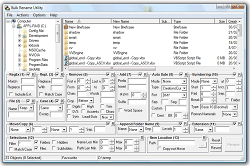
UI design is largely about directing flow. Scrolling down is certainly not the end of the world, and hiding less-commonly used features helps make those which are used stand out.

Re:Introducing the new Google+ by TeMPOraL on Wednesday November 18, 2015 @02:16AM (#10586436)
Thanks to such UX guidelines we don't have tools anymore, we have only toys and fluff. One of the most important characteristics of a tool is that you need to learn how to use it. Today's design is focused on making everything effortless from the get-go. But there's only one way to achieve this - and that is to dumb the thing down and cut out features until what you get is a very limited / pretty useless trinket.

BRU is an extreme case, but it's clear that it is a tool. Spend 5 minutes looking at it / reading a manual, and you'll be infinitely more productive with it than with whatever the beautiful UX artpiece du jour is.

And honestly, I'm tired of this dumbing down (= making useless) of everything. General-purpose computing is a very powerful technology and we're absolutely underutilizing it.

Re:Introducing the new Google+ by 72deluxe on Wednesday November 18, 2015 @04:58AM (#10586869)
Very informative, and I would agree with this. A car dashboard seems complicated when you get into a car, but after you have had lessons, the car is a great tool. Nobody seems to be arguing that the cockpit needs simplification, yet in the computing industry (as you state) everything is dumbed down to etch-a-sketch simplicity for fear of alienating new users.

Mixing consoles also look complicated to a first-time user but I don't think anyone would argue that they need simplification.

Interestingly, Apple News app on the iPad uses cards and a simple layout, yet seems to work well and with no stuttering. This cannot be said for Google+ (and no, I don't want to join communities, stop showing them to me).

Re:Introducing the new Google+ by felipeerias on Wednesday November 18, 2015 @06:21AM (#10587082)
A tool is a way to solve a pre-existing problem that is outside the tool itself. Something which creates its own problems for you to solve is not a tool, but a toy.

Whether a tool needs learning beforehand or not determines how likely you are to try the tool in the first place (by estimating whether the expected result justifies the effort), and how likely you are to actually be able to use the tool to solve that problem successfully.

It helps to determine what the real goal is in this case. It is not really "allow me to browse through lots of headlines at maximum efficiency", but something more like "entertain me and let me keep in touch with people".

Re:Introducing the new Google+ by andreasvc on Tuesday November 17, 2015 @06:19PM (#10584742)
Yes that interface is bad. I think Reddit is a good example of an interface with high density that works. A page is simply a list of 25 links, while in your example there is the complexity of different kinds of elements and their relationships.
Re:Introducing the new Google+ by agumonkey on Tuesday November 17, 2015 @05:04PM (#10584322)
Since the web has gone into distributed application / magazine, density has dropped.

http://imgur.com/MRnd81J

http://motherfuckingwebsite.com/

http://justinjackson.ca/words.html

TBC

Re:Introducing the new Google+ by moonchrome on Tuesday November 17, 2015 @05:29PM (#10584464)
>http://motherfuckingwebsite.com/

>You dumbass. You thought you needed media queries to be responsive, but no. Responsive means that it responds to whatever motherfucking screensize it's viewed on. This site doesn't care if you're on an iMac or a motherfucking Tamagotchi.

Except that it's really hard to read on a wide screen. I get it - it's a satire - but it goes too far and fails to make a convincing point because it's not really a functional layout.

There are good reasons for things in design like column/page width/ratios, margins, line spacing, font family/size etc. purely from usability standpoint (ignoring subjective/stylistic choices). You don't need to add 10MB of images and JS/CSS but making sure your sentence doesn't span over 20 something inches isn't over designing things.

Third link is much better.

Re:Introducing the new Google+ by Liru on Tuesday November 17, 2015 @05:42PM (#10584546)
Re:Introducing the new Google+ by moonchrome on Tuesday November 17, 2015 @09:34PM (#10585553)
Yes that really drives in on those points glad someone took the time to actually present them like that :)
Re:Introducing the new Google+ by ksk on Tuesday November 17, 2015 @09:01PM (#10585434)
>Except that it's really hard to read on a wide screen.

I think the issue is - who gets to decide how wide the content is. Is it the user or the website? Or to put it another way, does the act of maximizing a window represent an intent or does it represent a default error state that needs to be worked around by laying out the content in a different way.

I think that the user should get to decide how wide they want the content to be. For almost all GUI applications 'Maximize' has always meant "I want to see more of it".

>There are good reasons for things in design like column/page width/ratios, margins, line spacing, font family/size etc. purely from usability standpoint (ignoring subjective/stylistic choices).

What are those non-subjective reasons?

Re:Introducing the new Google+ by moonchrome on Tuesday November 17, 2015 @09:25PM (#10585520)
>I think the issue is - who gets to decide how wide the content is. Is it the user or the website? Or to put it another way, does the act of maximizing a window represent an intent or does it represent a default error state that needs to be worked around by laying out the content in a different way.

This is why CSS exists - it separates style from content - if you want what that site has just disable all CSS and you'll get raw content.

>What are those non-subjective reasons?

There are things like optimal line length based on eye travel distance and a bunch of "defaults" that have been found trough centuries of experience in design/print. I don't do design professionally so I don't remember the exact rules but I did take design classes back in high school so I know they exist - I'll let someone who's an expert fill in on what they are :D

Re:Introducing the new Google+ by agumonkey on Wednesday November 18, 2015 @06:47AM (#10587155)
What gets me with MFWS, it's that when I really read something, when in flow and only the ideas behind the words matters to me, no amount of presentation will ever help or be of any importance. The most valuable ideas I got were written in old busted books with bare typesetting.
Re:Introducing the new Google+ by mikeash on Tuesday November 17, 2015 @07:25PM (#10585041)
Why not make your window narrower?
Re:Introducing the new Google+ by brazzledazzle on Tuesday November 17, 2015 @07:44PM (#10585136)
I don't entirely agree but I can see the appeal of forcing decisions on ignorant people. Someone might want their browser as wide as possible while favoring sites with narrowed content and not even realize why they like the content in a narrow format.
Re:Introducing the new Google+ by rhizome on Tuesday November 17, 2015 @11:44PM (#10585964)
Someday you may encounter a person who has trouble zeroing in on a 4px resize handle.
Re:Introducing the new Google+ by dredmorbius on Wednesday November 18, 2015 @01:26PM (#10589683)
So much this.

I'm spending a great deal of time with a colleague who has significant visual impairments and who, while a domain expert in their own areas, is neither particularly proficient with computer technology nor do they wish to be (there are certain prerogatives which come with age).

Hiding tools for compensating for poor accessibility design behind small, faint, hard-to-see, only-sometimes-visible, and/or other graphical elements is sheer madness.

Case in point: recent builds of Firefox have a "reader mode" feature, which I use heavily (my own visual capabilities are largely intact, but, well, 99.99966% of Web design is crap).

The icon:

1. Is faint.

2. Appears at a corner of the navigation box. E.g., it's not at a Fitts point (top of screen, corner).

3. Worst and most unforgivably: it only appears AFTER a page has fully loaded, doesn't appear on all pages, and cannot be specified as a default (e.g., always open pages in Readability mode, unless broken).

From a UI/UX standpoint for someone who is already visually disabled this is unforgivable.

(Yes, I've submitted feedback to Mozilla on this.)

Re:Introducing the new Google+ by moonchrome on Tuesday November 17, 2015 @09:28PM (#10585532)
Do I really have to explain the value of sane defaults to a developer :D
Re:Introducing the new Google+ by mikeash on Tuesday November 17, 2015 @10:12PM (#10585666)
Of course. Developers are the ones who always say "just configure it to your liking." It's the normal folk who need sane defaults!

Slightly more seriously, maybe the sane default should be a sane window size for the browser. Not everything needs to be fullscreen. Or maybe the browser window could be wide but could present a narrower viewport in appropriate circumstances. There has to be something better than having every web site separately specify whatever it thinks is a reasonable reading width.

Re:Introducing the new Google+ by moonchrome on Tuesday November 17, 2015 @10:27PM (#10585723)
I guess but a) backwards compatibility probably comes in to play b) can you imagine the level of bikeshedding
Re:Introducing the new Google+ by intrasight on Tuesday November 17, 2015 @07:26PM (#10585051)
How is it hard to read on a wide screen? Just make your window smaller. "It's responsive"
Re:Introducing the new Google+ by dredmorbius on Wednesday November 18, 2015 @04:22AM (#10586757)
You might also be interested in: http://codepen.io/dredmorbius/details/KpMqqB
Re:Introducing the new Google+ by soared on Tuesday November 17, 2015 @08:33PM (#10585326)
Please tell me you are kidding with that first image. Seriously. Not a single website actually looks like that.
Re:Introducing the new Google+ by leviathan on Wednesday November 18, 2015 @04:39AM (#10586816)
I know this is a bit late, and the content is in arabic, but check this: http://www.saidaonline.com/

That's an actual news website.

Re:Introducing the new Google+ by agumonkey on Tuesday November 17, 2015 @11:02PM (#10585840)
To be honest I have a 1024x768 12" laptop, believe me that image is far too close to reality far too often.
Re:Introducing the new Google+ by makomk on Tuesday November 17, 2015 @06:14PM (#10584716)
I actually gave up using Google search on mobile a few weeks ago because of basically this. The information density had got to the point where it was basically useless - and this was search, their main product! (On the positive side, all the extra whitespace pushed the non-sponsored links way off the bottom of the screen. That must be profitable for them.)
Re:Introducing the new Google+ by gdulli on Tuesday November 17, 2015 @04:51PM (#10584225)
Maybe I just don't see it in that screenshot but it looks like it doesn't have that option like Keep has where you can change the multi-column layout to a single one.

Although in Keep sometimes you can change the view and it just ignores your setting, reverting back to the default layout. Keep seems like one of those things they never dogfooded.

Like the way you open Keep on the web and it loads your entire history in the initial page load. Making the page load take 20-30 seconds (and stall the browser in the meantime) if you have a significant history. And being sluggish no matter what you want to do with it after that. Even if you just want to see your last few notes quickly, or add a new one, which is what I usually want to do. How could a product possibly get created like that if the creators are using it with a non-trivial amount of data?

Re:Introducing the new Google+ by rogerbinns on Tuesday November 17, 2015 @04:57PM (#10584272)
> ... you can change the multi-column layout to a single one

It is a setting. I mentioned in my comment that you can switch to that layout and get a total of 4 sentences on the screen. And a lot of white space.

My pet peeve with Keep is how it keeps rearranging lists as the page is loading. I can't work out what the criteria is, but can rule out most recently changed and most recently used.

Re:Introducing the new Google+ by drumdance on Tuesday November 17, 2015 @06:22PM (#10584763)
It's funny because literally five minutes ago I was talking with our designer about how we need to take a cue from Reddit and put more information in less space.
Re:Introducing the new Google+ by largote on Tuesday November 17, 2015 @07:03PM (#10584940)
That screenshot is from the previously existing site, not the new version launched today.
Re:Introducing the new Google+ by jhoechtl on Tuesday November 17, 2015 @04:56PM (#10584263)
Preparing to make more space for advertisment
Re:Introducing the new Google+ by ocean3 on Wednesday November 18, 2015 @12:31AM (#10586105)
I do like the interface. I usually just scan the contents hence the card layout works fine. But don't like card interface for sites like hackernews/reddit. There i am mainly interested in user comments.
Re:Introducing the new Google+ by tsurantino on Tuesday November 17, 2015 @07:32PM (#10585080)
The experience is pretty awful. I am on a community of Computer Science students and it's hard to find threads I get updates for in my e-mail because they are horribly categorized. On the view you attached, you'll find it incredibly hard and annoying to focus on a particular thread. When viewing within a thread, you still have to expand each comment, and so on.

Definitely a case of style over function. It's really frustrating.

Re:Introducing the new Google+ by frik on Wednesday November 18, 2015 @12:34AM (#10586117)
Please split YouTube comments from Google+. The YouTube comments used to be a traditional comment system, amd was a good source for infos related to the video. When the merged it with Google+ the comment quality tanked. Nowadays you read a lot of "hey my friends have a look at this video" with replies from friends. A very bad decision and user experience.
Re:Introducing the new Google+ by dredmorbius on Wednesday November 18, 2015 @12:52AM (#10586188)
That sucks from both ends. YouTube doesn't want to see G+'s comments. G+ users don't want their threads overwhelmed by YT comments.

And, frankly, I've got less than zero interest in my activities on YouTube being public in any regard. I've created a randomly generated name for my latest Android device and even there I cannot compile lists of vidoes for my own use without making them public. At least not on YouTube itself.

So I don't do that.

Re:Introducing the new Google+ by nilkn on Wednesday November 18, 2015 @12:50AM (#10586177)
This is actually part of why my recent switch from Android to iOS was so refreshing. While material design looks great on some level, it seems to be so remarkably wasteful of space. Google+ actually feels claustrophobic to me in a way: there's so much content, and yet you can see so little of it at a time. It creates a feeling of being constantly lost.
Re:Introducing the new Google+ by cseelus on Tuesday November 17, 2015 @07:38PM (#10585111)
Information density is one thing. For me the size of the text is just too small to read it comfortably, especially with longer posts.
Re:Introducing the new Google+ by danols on Tuesday November 17, 2015 @06:16PM (#10584723)
If you become a power user of any Google product you are on deep water and are setting yourself up to be disappointed when they pull the rug under your feet retiring features or even products that you have learned to depend on. Never depend on a Google product or feature unless you are in the 80% regular user category.
Re:Introducing the new Google+ by foxylad on Tuesday November 17, 2015 @07:28PM (#10585064)
One of the challenges of being a power user is accepting you're going to hit the boundaries of whatever product from whatever company it is.

And "Google pulling the rug from under your feet"... please let's stop this ridiculous meme. Any company is entitled to withdraw a free service, and if you don't agree then go right ahead and develop a replacement for Reader. After five years of development and hosting costs with thankless users demanding new features and old interfaces all for free, I bet you'd pull the plug too.

Re:Introducing the new Google+ by danols on Tuesday November 17, 2015 @08:14PM (#10585261)
Sure they are obviously free to do what ever they want with their products and maybe "pulling the rug under your feet" is a bit dramatic but it is true that they are pulling features left and right (not only Reader) that unless it is used by the 80% enough is under hard scrutiny. But if the top 20% which is also the people that are going to help you innovate are getting tired of getting used to a product working in a certain way and then it no longer does they will be wary of being too dependent on products from that company.
Re:Introducing the new Google+ by niutech on Tuesday November 24, 2015 @04:59PM (#10623875)
You can use the basic version of Google+ - https://plus.google.com/app/basic/stream/
Re:Introducing the new Google+ by macu on Tuesday November 17, 2015 @07:22PM (#10585028)
I wonder if this keeps people mystified when they visit the news feed, wondering what's beyond the fold and scrolling their hours away.
Re:Introducing the new Google+ by erispoe on Tuesday November 17, 2015 @04:47PM (#10584197)
Packing the maximum of text on a screen is not what design is about. Having less content on a screen is a perfectly reasonnable choice if it means better interaction. I'm not saying they achieve this here, but interaction should be the criterion, not sheer density. Otherwise, get a Bloomberg Terminal.
Re:Introducing the new Google+ by tdkl on Tuesday November 17, 2015 @05:25PM (#10584442)
This is why my opinion of Material design is that it's pile of garbage.

The mobile YouTube app being a prime example.

Re:Introducing the new Google+ by NN88 on Tuesday November 17, 2015 @07:54PM (#10585174)
if they bring back google reader, i'm golden
Re:Introducing the new Google+ by vubuntu on Tuesday November 17, 2015 @08:26PM (#10585301)
I moved to digg reader and it is pretty good.
Re:Introducing the new Google+ by wahsd on Tuesday November 17, 2015 @11:38PM (#10585949)
It's not just G+, it's all across Google assets. The white-space drives me nuts. I'm convinced that along with the basic color palate Google thinks it's customers are 4 year olds or something.
Re:Introducing the new Google+ by tdkl on Wednesday November 18, 2015 @02:07AM (#10586407)
You need to mask the fact you're collecting data somehow and what's better then cute Google doodles and colorful graphics ?
Re:Introducing the new Google+ by nailer on Wednesday November 18, 2015 @12:39AM (#10586142)
I personally prefer it than Facebooks super dense 'UNIX window manager from 2003' look.