The real issue is that Apple has to have some fallback protocol for texting with non-iMessage devices, but refusing to upgrade the fallback protocol beyond SMS/MMS makes the texting experience worse for everyone, as described in the article.
(To avoid additional red herrings. No one is thinking here about opening up iMessage itself to non-Apple clients, just upgrading the fallback option. Also, I can't speak for everyone, but among the non-terminally-online Gen Xer and late-Millennial Americans I know, "texting" means using the built-in app on your phone. Switching to another app is a relationship step. Many of them are blithely unaware that they can't "just" text a photo or video to me or other Android users, nor that I can't just sign out of a group chat when I feel like it.)
Edit to add: those bubbles are green too. That’s what the bubble colors really mean. Blue and green are not iPhone vs Android, it’s iMessage (end to end encrypted) vs SMS (less secure, less private).
Besides the other issues... as soon as I heard that adolescents and teens (i.e., hyper-self-conscious, wanting group acceptance, figuring out social status) would be appearing differently in chats with schoolmates, based on whether they used Apple or non-Apple... that sure is a way to sell them Apples.
And then they leave them plugged in at home and forward the messages to their Android device.
Just so that they show up as a blue bubble on their friends phones.
About 1 in 12 males are colorblind. I’m in this group.
I find white text on a bright green background very difficult to read.
I do agree that the green bubbles aren’t great looking but thats what they chose for iOS even prior to iMessage existing.
This isn't a good answer. We can use sensible attractive UI/UX defaults without being exclusive.
The thing with accessibility is that it does affect everyone.
  If you get woken up by a call and open iMessage in the middle of the night,
  being able to read the message accurately while blinking away eye gunk matters.
Better contrast helps you read your text message if your phone is on a table across from you lying flat.
There's going to be times you're trying to read a message and your phone won't be 100% in front of you at arms length and you are able to take the time to bring the phone into focus with proper lighting around you.
If you get woken up by a call and open iMessage in the middle of the night,
being able to read the message accurately while blinking away eye gunk matters.
I still believe this is an issue. Colorblind or not, everyone probably has had difficulties reading their phone in direct sunlight. But these are seriously not insurmountable technical problems at all and the excuse is pretty weak.
This is not up to Android, it is up to Apple how their UX displays texts to non-Apple users.
What if 3 in 12 who aren’t colorblind find it easier to read white on green?
Not everything is worthy of a social justice battle.
> Please don't comment on whether someone read an article. "Did you even read the article? It mentions that" can be shortened to "The article mentions that."
Regardless if they read the article or not, they were addressing one specific complaint which is unrelated to the others.
First, RCS is not a very modern or practical standard. It was created in 2008 by carriers (GSMA!!) for their SMS/MMS centric (at the time) platforms. So is it a good idea to adopt this more than a decade later? I don’t think so.
Second, it’s really not Apple’s fault that Google has failed to come up with a messaging solution. Google has released 13 separate messenger apps since 2011!
“Right now, Google runs three mainline messaging apps: Besides this Google Messages/RCS platform, there's also Google Chat, which is a more traditional over-the-top messaging service, and Google Voice, which is a Google-provided phone number with SMS. Google Hangouts is technically still around as the fourth messaging app, though that's shutting down in November. There are also siloed messaging apps built into Google Maps, Google Photos, Google Stadia, Google Pay, Google Assistant, and Google Phone, and none of them talk to each other.
Google's head of messaging also quit last month, so there's no telling what the future of Google messaging holds until someone takes the reins. I would suggest Google get its house in order before it starts throwing rocks at Apple.” https://arstechnica.com/gadgets/2022/08/new-google-site-begs...
All that Google is asking is for the fallback to be at least in the current century, is that too much to ask.
Is a standard from the 90s acceptable then? Do we say Apple shouldn't migrate to USB-C since it's old-ish? A standard being around a long time is a good thing, but when a better one comes along I don't see what excuse Apple has to not migrate (besides anti-competitiveness, which is a really good reason I suppose).
>Second, it’s really not Apple’s fault that Google has failed to come up with a messaging solution. Google has released 13 separate messenger apps since 2011!
The argument in the article could be made irrespective of Google. The article isn't saying "Apple isn't playing nice so use our stuff instead", it's a critique of an obvious attempt by Apple to build a walled garden around messaging. Google is arguing for a standard adopted across the industry, not one of their many messaging apps.
For direct messages, the colored bubbles are only used on messages you send. Messages received are always white text on black background (dark mode) or black text on grey background (light mode).
edit: my bad. "increase contrast" option is on, set years ago.
[1] https://medium.com/@krvoller/how-iphone-violates-apples-acce...
But it's not just you! The green on Google's site looks visually brighter because the entire bubble is on a blue background. On iPhone, the green is normally on a white background.
Now, try setting your iPhone to Dark Mode in Settings, and you'll find that the green bubbles are still #48dd8f green and the text is still #ffffff pure white; it's harder to read on a black background, IMO.
On the page: #75d993
In the video: #58bf5d
From my iPhone (iOS 15.6): #317332
Edit: scratch that! Apparently I turned on “increase contrast” years ago.

Maybe a personalization option?
https://s.wsj.net/public/resources/images/B3-CB781_1017ST_2_...

My contrast tool says the blue contrast is 3.4:1 while the green is 1.9:1
@Time0 -> Priority1=X, Priority2=Y
@Time1 -> Priority1=X, Priority2=Z, Priority3=Y
Across this timeframe, Y's priority was lowered from P2 to P3, because the org intentionally decided to make Z a higher priority.
One could argue that improving this experience was never in their priority list; but as long as product leaders in the org knew about it; its the same thing. Letting something linger in the backlog, and intentionally deciding to never add it to the backlog in the first place, are identical.
I don't know about "maleficence", but intentional: Yes. Cognizant inaction conveys intentionality.
He's pointing out that Apple considered green originally the best background color for texting, and then added their own protocol with a blue background.
So it's not like they deliberately relegated SMS to green because they were certain blue was better; if they believed blue was superior, they'd have used it from the beginning.
Regardless, they could improve it at any time, yet its been like this for... a decade now? Cognizant Inaction Is Intention. It doesn't matter why it is how it is; they can make it whateverthehell they want, they run the code, they run the org, they got the keys to production, so: fix it!
The original color may not have been malicious, but it WAS DELIBERATE. Every design decision at Apple is deliberate; to assert otherwise is to be revisionist. Cognizant Inaction Is Intention. Its color was deliberately chosen originally; its color was deliberately changed; their inaction in fixing the accessibility issues that change created is Deliberate, because Cognizant Inaction is Intention.
[1] https://d2bs8hqp6qvsw6.cloudfront.net/article/images/750x750...

As others point out, there are accessibility options for people who want more contrast (and which benefit users with trouble reading these outbound messages in far more useful places).
If you send a message via SMS/MMS to an iPhone user, it's green.
There is no detection if the user on the other end is an Android user.
The colours do not pass the A11Y standards, which means people with poor eyesight can't read the messages properly.
This did made me curious to see if the blue background passes - and it doesn't either. https://color.a11y.com/ContrastPair/?bgcolor=047aff&fgcolor=...
At least the blue background passes WCAG AA with larger sized text, while the green doesn't pass at all.
(Same result using #64C567 for the green bubbles, which a sibling pointed out is the correct value.)
I've only seen it brought up in internet tiffs about how Apple is using green message bubbles to "shame" non-Apple users. Which is similarly straw-graspy.
Conversely if you're a parent with a distraught teenager being teased about this, I imagine that's cold comfort.
Why Apple’s iMessage Is Winning: Teens Dread the Green Text Bubble
https://www.wsj.com/articles/why-apples-imessage-is-winning-...
Before iOS 5, and the release of iMessage, all messages on iOS were green.
That Google is painting this as something else speaks to how disingenuous this whole conversation has gotten, in all corners.
The green is inherited from iChat on Mac OS X, which used black text for the green bubbles: https://cdn.arstechnica.net/wp-content/uploads/archive/revie...

You have no idea how much of a hot topic this is I modern bullying
Bullies will always find something to bully others for, thats why they are bullies and not just expressing a preference.
I’m fairly convinced the bullying problem is a result of a society who treat kids as their parent’s property instead of communal property. Parents enable bullying.
You can send SMS messages to Apple devices, from an Apple device, if you're not signed into iMessage, or they're not, or if your data connectivity is limited, or theirs is.
And additionally, you're asserting that its impossible to change or improve? That its just such an intractable problem which we inherited, and changing it would be such a herculean effort that its not worth moving the needle on?
I've never seen the codebase for the iOS messages app. I believe, even acknowledging that, its probably an absolute mess of legacy code, and I have a ton of sympathy for the developers working on it. I also believe, even acknowledging that, that changing one color is something an intern could do (and because its a big tech product org, there'd be fifty user studies and three orgs of product managers involved and Tim Cook would get a say in it, but those are manufactured problems. Also, let's be clear; if Jobs were still alive & in control, even all those manufactured roadblocks would be torn down, if it were a change he cared to prioritize, because that's the kind of leader he was).
Inaction is Intentional. Inaction is Intentional. Inaction is Intentional.
Then a decision was made that iMessage messages would be blue.
I'm asserting this was not done with animosity. It was a decision by Apple's UX team to make it easy to visually identify the difference between the message mechanics and capabilities of the end-user.
It is remarkably simple, effective and easily understood.
If Apple chose to make it so there was no visual distinction between the message sending mechanisms, that would be a worse, and more confusing, user experience.
If Apple changed the colors, whatever the new colors they chose to use would just be the new focus of the debate. It would become "Orange Bubbles vs Blue Bubbles" or "Purple Bubbles vs Blue Bubbles". People would argue that Apple chose the new color based on some secondary negative characteristic of the new color, just as they do today with green.
Also, I'm not asserting that Green is bad. The issue is the shade of Green, and the a11y issues it creates. I don't know how you jumped on "entirely different colors" or "the same color"; Android's criticism in the original article is very clear, its an a11y contrast issue with the light green background and white text. That's it. Nothing else.
This issue is, seriously, a lot simpler than you're exploding it to be. Make it 10 shades darker; done. They even have an option in their accessibility settings to make it so. This is a simple change, any a11y expert (including, maybe, the MANY apple themselves employs) would say the way it stands today is bad, but their inaction conveys intention.
They are not "inactive".
(It's also important to remember that the "green bubbles" applies to messages sent, not received. Received texts, no matter to mechanism, are either black text on grey, or white text on near-black depending on Dark mode)
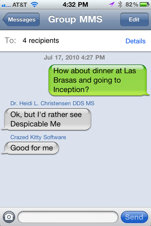
Now compare it to green bubbles today. Anyways, when I had iPhone, flat green bubbles annoyed me. Not because "hurr-durr I have a iPhone and you don't" but because SMS lacked many features and was hella slow to send. Plus, pretty much anywhere I lived I had horrible cellphone reception which made sending SMS a nightmare.
Prior to the invention of iMessage - (iOS 6?) - all iPhone texts were this colour of green. It was the same no matter who you texted.
This means Apple never intentionally designed the green bubbles to be more difficult to read.
https://www.gottabemobile.com/how-to-tell-if-youre-sending-a...
White text on green is significantly different - the older green bubbles with black text are noticeably clearer IMO, even if I also find it unlikely it was done deliberately to make SMS look bad. That said, Apple will certainly be aware of the cultural thing of the green vs blue bubbles given major news outlets have written on it (in the US anyway), so...
https://www.wsj.com/articles/why-apples-imessage-is-winning-...
Not to mention that Apple's messaging is hideously broken in more ways than Android integration. iMessage will simply delete your phone number from its "can be reached at" list, which breaks years-long threads with a single (iPhone-using) friend into inexplicable new threads.
Ever go overseas? Try putting a local SIM into your USA phone somewhere else, and watch your phone "forget" all of your contacts. Seriously: WTF? Suddenly all of your contacts are unrecognized by number. It's idiotic.
I have a paid-up developer account, so you can be assured that I filed a well-supported bug report on it.
Incoming messages are always black on grey, for SMS and iMessage both.
If the color scheme actually impacts legibility, it would only affect messages which you yourself wrote. It wouldn't have any effect on legibility of messages other people wrote, where that really matters a lot more.
This quoted bit is actually incorrect. All messages from android and from iMessage are in identical gray text bubbles.
The blue/green bubbles are for your own sent messages only
I got the impression RCS de-facto depends on Google servers in some way. Can someone confirm if that's the case?
https://pocketnow.com/why-you-should-probably-avoid-googles-...
Google has exactly zero credibility here. Look how many messaging platforms they've created and killed off. Who's to say Google won't kill off RCS when they get a chance?
If Apple implemented support, they would have their own server, they wouldn't use Jibe or the carrier's.
Wow. I can't really come up with anything creative to blame Google for this one. Whatever you want to say about Google's messaging mess and RCS - Apple seems to go out of their way to make it inconvenient to text with Android users.
Also it doesn't sound like Google's asking Apple to give up iMessage - just that they use RCS instead of SMS/MMS to talk to Android users. Not an unreasonable ask given RCS is likely to be a widely adopted standard and an non-trivial improvement over SMS.
Edit: Color aside, the read receipts, MMS quality, Wifi send etc all seem worth fixing with RCS.