Same goes for Linux. My CachyOS install on my Framework 13 Pro has a touch screen. There’s literally no downside for me having it. I don’t have to use it if I don’t want to. But if I want to scroll a website or scrub a video the option is there.
We saw the same thing happen with mobile first on websites.
Or for that matter, that adding support for game controllers (something that has actually happened with Linux desktops) would led to curtailed development of non-controller parts.
Well, a lot of devs did move back to the terminal ;)
One of the most common actions among all computer users, zooming and centering a photo, is easier with a touch screen.
Even adding just that one thing is worth having a touch screen for.
Another example: working in the iOS simulator is now way easier because you can touch your apps that you're developing for iOS and iPadOS. And, by the way, macOS can run iOS/iPadOS apps directly from the App Store, so if there's something you really want to run that you just can't find a macOS equivalent for, there you go, you can just do it and interact with the app more naturally.
The value of “tablet mode” would mainly be if I want to do content consumption, like watch video or read a book, while on the couch or in bed since it allows a wider range of postures you can sit or lay in when you don’t have to rest it on a flat surface.
If you can’t fold it back I just don’t get the appeal.
The sweet spot for me is the iPad mini, but I tend to use tablets as glorified e-readers and video players; the only serious work I do on them is reading.
With that said, I have zero problem with touchscreens or convertable form factors. In fact, I used a Surface Pro for years as my main laptop, and it was one of the best Windows laptops I've used.
But again, I'm not a big fan of mobile devices as primary computing devices unless I'm actually working on the go.
Even for commuting back and forth between an office and a home office, I'd rather just put something along the lines of a Mac Studio in a bag — for a few months last year, it was actually a SFF (not micro, weighed about 10 kg) Dell OptiPlex in an aluminium briefcase, which was fine!
Windows 8, which was tablet-oriented, was one of these skip generations of windows that nobody cares about in the end, and when the next comes everybody forgets. I never installed it anyway. I have not owned a touchscreen laptop myself since then, but from friends that have and I have used theirs, it is like OP described as a "harmless additional feature/why not", something that just makes certain interactions a bit faster.
But especially on an actual laptop, one that you cannot just separate the screen from the keyboard, stuff like "virtual keyboard" and "tablet mode" matter much less because it is not like you will take it and use it as a pure tablet anyway.
So actually, you are harmed by this decision every day you use a Windows 10/11 laptop. You live with this every day. You just don't know what you're missing.
Would it change anyhthing? No. Because developers of the programs what are not part of Windows aren't keen on keeping "the same efficiency". Audacity 4, Thunderbird are good examples of a bad interface - and they did it disregarding the OS UI.
They are basically throwing away the existing UI asking with its decades of refinement in favor of something that looks like what you'd get if apple mail and outlook had a disfugured child.
That's because you are just accustomed to it [0]. If you would have a fresh look on it, especially on a small screen - it would find it atrocious.
There is still a separate SMTP configuration and it's a separate separate SMTP configuration for the each account.
There is absolutely useless left vertical bar which... does nothing what can't be shoved unto the useless, empty top bar. There is useless empty top bar which holds a search box and a hamburger menu.
For the unknown reason[1] this top bar is twice the tall of the regular menu. Oh. There is TWO search boxes[2]. Enabling Quick Filter adds another toolbar instead of using the bar where the button 'Quick Filter' resides.
And if you have multiple accounts and for some reason you can't auth for a moment (eg server problem, not with a connection) you would be spammed with the auth boxes and even if you successfully auth in one - you would still need to cancel or auth in all other what was spammed on you.
There is a lot, a lot of things where TB sucks. You just familiar with it.
[0] and probably configured it years ago and never touched the config too.
[1] actually it to be tall enough to hold hamburger button - because there is an option to add buttons to it. But you can't move buttons from the left useless vertical bar to the top bar. So you can have 'Mail', 'Calendar' etc duplicated on the top bar... for what?
NB yes you can hide the left vertical bar. Hide, not remove. Still it was thought on, implemented and shoved on our asses for absolutely no reason..
But even if I accept your premise, I’ll remind you that Windows 7 came out 19 years ago. I didn’t exactly own a 27” 4K monitor in 2009, and a 14” or 16” screen laptop in 2009 would not have been thin and light like it is today. 2009 was like “my bezels are over a half inch wide” era.
The OS is fully scalable as well. You can just make it smaller in a very granular way. Windows 7 wasn’t capable of that.
This isn’t an unimplemented theory. You can head over to Best Buy right now and see what it’s like to use a touch screen laptop.
I feel like all this debate is taking place in an odd vacuum where a lot of us are talking about a bunch of potential problems with having a touch screen on a computer and all these problems are already resolved.
Maybe it’s similar to the whole iPhone duo thing where Apple users are just discovering all the caveats of a foldable phone, but we’ve already gone over all of it with competitors.
I rarely used tablet mode but genuinely miss having a touchscreen.
However, I still feel like Apple is in their Microsoft era where they're making some of the same mistakes Microsoft have made in the past 20 years.
Aero -> Liquid Glass
Ads in the OS -> Ads in core applications
Fullscreen ads for Microsoft services in the OS -> banner ads for Apple services in the OS
Dark patterns for Windows 11 upgrades -> Dark patterns for macOS 26 upgrades
Windows Mixed Reality -> Vision Pro
I could also say Surface Duo -> iPhone Duo but at this time it's too early to tell. I also think that a touchscreen Mac is a mistake. Not because it's something Microsoft already did but because the reason a MacBook does not need a touchscreen is because Apple has best-in-class trackpads.
what i've learning developing and creating products over the years is that harmless features tend to be the ones that cause the most problems. for ex, now you have to add touchscreen code to the OS vs previously not having it at all. and this code or feature we will support for the rest of the lifetime of that product.
In the case of touch screens, it hasn't caused a lasting problem in Windows or Linux.
1. Takes extra battery 2. I’m not touching my screen regardless. It gets dirty enough
My last three or four laptops, which never even booted Windows, have had disabled touchscreens
Apps in Windows and KDE don't really change their behavior just from having a touch screen.
I routinely forget that my Framework 13 Pro even has a touch screen.
Every watt matters, and turning it off hurts nothing I care about.
And apps DO change their behavior. The on screen keyboard pops up when the screen on a KVM connects before the keyboard.
Why the hostility? I’m not going to touch my screen anyway to try to avoid making it filthy.
I'll list out two immediate benefits with zero UI changes that macOS touch screen users will get:
iOS developers will be able to touch their apps in the simulator.
Pinch/zoom/centering photos will be highly intuitive for basically everyone because basically everyone has family photos and a photo library.
Go over to the Lenovo/Dell/HP website and you'll see that they offer a touch screen option for something like $50 and you can just choose whether you have it or not.
Go buy a $450 iPad from Apple and it has a touch screen. That's cheaper than any Mac on sale.
Hey, that's another great point, maybe Apple's laptops could be more customizable and modular, wouldn't that be nice?
Basically a product for the people currently carrying around a MacBook Pro and an iPad Pro.
Just touch on a laptop screen makes no sense. I’ve never felt the need to do this.
I think touch screen Mac is mostly pointless though.
I liked the touch bar for some things, but I deeply hated it, add to this the butterfly keyboard, and you got yourself the perfect storm...
Yeah I could see that being annoying.
On my MBP M1, the Esc key is physical one sitting in the same place as normal; top left. On the top right is the power / Touch ID button. And filling the space between them is the Touch Bar.
And I think the reason I like the Touch Bar is because being able to slide the screen brightness and the speaker volume up and down on it is both pretty quick and precise. Much more comfortable than only having volume up / down and screen brightness up / down buttons. And I can’t really think of anything that I am missing physical Fn buttons for in anything of what I am doing on the machine. Even booting into recovery mode does not involve use of any Fn keys. Just press and hold the power button when powering the machine on and keep holding it pressed until it goes to startup options.
My main gripe is that some of the buttons move around depending on which app you have focused.
The top of the keyboard is literally the worst location I can think there to be a short, long touchscreen.
Maybe it's not a problem for people with tiny hands but I'm bordering on, "palm a basketball" size.
ive never seen someone use a laptop touch screen effectively
just get an ipad
The marketing material shows a person playing a virtual piano with their fingers..
Buttons sized to be hit by your physical thumb and buttons sized to be hit by a tiny high-precision cursor are very different things.
I am sitting on a macbook pro with the vertical tab pane open in chrome, with 12 tabs. The outer joint of my thumb covers the entire list, in both width and height. A touch-friendly version of that would be humongous in comparison.
The end result will be akin to taking keyboards away from Platinum league top tier Korean pro RTS players. 500+ operations per minute down to 10
That just hasn’t happened with Windows touch screens.
Yes, Microsoft did fuck around and find out with Windows 8, but by the time Windows 10 landed an entire decade ago, this whole issue has been completely settled. That’s right, your Windows/Linux user friends have been using touchscreens (or no touch screens) without issue for a decade. No UX sky has fallen in this regard.
There’s absolutely zero downside to having a touch screen on Windows and you also absolutely don’t need a touch screen to use it.
I’m using a touch screen on my Linux laptop right now and it’s great. I don’t have to use it. The screen being touch didn’t cost me extra money. It’s just there if I want it.
The Apple camp seems to believe that every technology included with a product must have some kind of intentional holistic value. Apple removed the USB-A port because USB-C is the future. Apple removed the escape key and the function keys because the Touch Bar would replace it.
But the truth of the matter is, sometimes the option to just include both isn’t some kind of magical barrier that Apple can’t do.
You go out and buy a ThinkPad X9 15p and it has 3x thunderbolt, HDMI, SD card, and USB-A. Why doesn’t a MacBook Pro include USB-A? Well, remember, USB-A is the past! It’s legacy!
But the thing about it being unnecessary doesn’t change the fact that it remains trivially expensive to include, and it comes in handy for a bunch of peripherals that aren’t even that old.
So, I think this is why everyone assumes that Apple is going to destroy the OS because of some new thing they add to the hardware. Because the Apple cult is all about the mythical finely crafted experience. If you don’t do things the Apple way you’re holding it wrong. but in Microsoft/Linux-land, they don’t really care. Linux is fully free, and Microsoft knows their demographic net is too wide and their marketshare is too high that they can’t dictate form factor, choice of peripherals, etc. Their whole philosophy is that Windows is suitable for anything and everything.
The Apple culture can’t contemplate a technology company just including an extra option for users with no specific intended use case. PC manufacturers include a touch screen because, screw it, it only costs a few cents extra and maybe someone might like it, software integration be damned/that’s not our problem.
Macs had managed to avoid this degradation for a while because they didn't have touchscreens, but Apple put in the giant finger-friendly padding regions as part of the UI changes in Tahoe, which got a lot of negative feedback. Now that they're introducing touchscreen laptops, it's unlikely that they'll ever fully revert those changes since it will make the touch experience worse.
This is even true with laptops since bezels have dramatically shrunk in size.
I've heard a lot of complaints about the Settings app being a downgrade from Control Panel and being too padded or whatnot, but let's not forget that the old Windows XP era Control Panel couldn't even be maximized. It was just one size no matter what.
We forget this because Windows 7 was ugly and Windows 10 and 11 are nicer looking and that feels like progress, somehow. But you don't get nearly the functional information density with Windows 11 that you did with 7.
The taskbar icons are the exact same size. The tray icons are the exact same size. I’m struggling to figure out what’s different.
I personally use KDE which you can fully customize in terms of sizing, it’s great on a touch screen.
I still don’t really see the information density problem. You can fully customize the OS scaling way more than you ever could with older OS versions. Again, things like windows task bar icons and tray icons are the exact same size as Windows 7. Yeah they’re bigger than Windows 95 but I only had 800x600 to work with in those days.
No, we didn't. And yet we didn't have to scroll through a settings list with 10 elements.
And no, information density isn't "make everything smaller". It's "use space on screen efficiently".
For example, "modern" startup menu shows fewer items on an area 10x larger than the entire screen available to win95. And no amount of scaling can fix that. And this permeates the entire OS: https://www.buildwindows.com/wp-content/uploads/2024/11/4-4.... vs https://pbs.twimg.com/media/HBTFbzlXwAA5OwD.jpg
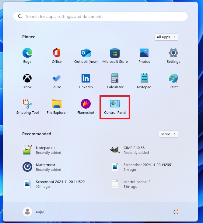

Do I need to see a list of every single application on my computer (utilitarian) or do I need to see the applications I use the most and added most recently (functional)?
The "list every application ever" paradigm predated search indexing. There was no alternative to an alphabetical list of every installed application. On a desktop/laptop computer, I spend entire days without using the Start Menu/macOS Dock/Application Launcher (KDE's "start menu") as an actual method to launch programs. I'm hitting Command/Alt + Space or the Windows key and typing in the first letter or two of the program I'm trying to launch.
Information density was also a necessity of the era, not a design preference. You and I might prefer information density as power user coders or what have you. Do my parents prefer information density? Nope!
I would agree with you more broadly that the Windows 11 Start Menu isn't really a great design but I can see what they were going for. The execution isn't there but I think the overall idea makes sense.
We can also have the rose tinted glasses about Windows 95 with the cascading menus but it was really clunky when your application list gets really long or you have a lot of nested folders. It was easy to accidentally misclick or lose your sub-folder.
E.g., in that screenshot you posted, if I hovered my mouse over "Kids Choice" and wanted to get to a program inside there, but then I accidentally moved my mouse over "Visio Home SE" and lost the "Kids Choice" submenu selection, then I have to bring my mouse back to find it again.
No. The comparison I'm making is non-functional design vs. functional design.
Modern "designers" wouldn't know functional design if it hit them in the face and couldn't design one if their life depended on it.
> Do I need to see a list of every single application on my computer (utilitarian) or do I need to see the applications I use the most and added most recently (functional)?
Again, you're completely missing the meat of my argument while focusing on superficial.
The meat is: why the hell our huge 5k monitors manage to show less information on screen than 600x400 14" monitors of 30 years ago?
Your answer is "but scaling". No, scaling doesn't solve the issue. At best in modern designs you will see 11 items instead of 10. Where there's space for 50.
I wasn't saying that Win95 start menu was perfect. I was saying: modern start menu manages to show less information, and more poorly[1], on an area that is 10x the size of the entire screen available to Win95. And that this issue is repeated through the entire design of the OS.
[1] not to say more slowly, but that is an additional can of worms
I don’t really believe in that. The power user who wants that can make that happen.
The median customer doesn’t benefit from information maximalism. They need the system to be intuitive and easy to use.
Display scaling 75%: 9px font, 36px button
Where's the setting for 12px font, 24px button?
Windows laptops never expected tough screen adoption to hit 90% and still touch degraded the experience.
The worry here is that with Apple's e2e design control over the Mac, that this pivot will mean our MacOS UX will be removed in lieu of a more iPad-like experience.
Just look at other developer-friendly features like unlocked bootloaders, background jobs, unsigned software that Apple has removed from their hardware .
So this is a big deal and significant. It's different than you running Linux on your Windows laptop because the touch experience there never had a chance to push out the traditional UX.
Windows laptops have been majority touch screen for a long time, so in theory this touch experience could have pushed out the traditional windows experience more. With the exception of the repressed memories of Windows 8, it just hasn’t happened. Despite most Windows laptops coming with touch screens, the interface is very much mouse and keyboard oriented.
But also, Apple still can’t make Mac mini or Mac Studio users use a touch screen.
In theory the iMac could gain a touch screen, the Studio Display could gain one, but I think that’s very fundamentally different ergonomic situation than a laptop.
When I’m at a desk like a coffee shop I can rest my arm on the table and scroll the browser with my thumb at the lowest part of the screen very easily on a laptop. A desktop computer screen is a lot different than that, usually sitting higher and further away, so I still think every desktop Apple sells will stick with non-touch for the foreseeable future.
Perhaps the strongest indicator is just that Apple has Microsoft as a case study. Everyone saw what happened with Windows 8 and knows not to repeat that sort of debacle.
Finally, I have to imagine that software development tools are much better now where it’s easier to make dynamic interfaces where user preference can rule the day.
Back in the day, if 1% of Apple users wanted a touch screen, Steve Jobs could say "we're not focusing on that."
Today, 1% of Apple's install base (if we include iOS and iPadOS) is hundreds of millions of people.
What Microsoft introduced touch surfaces, they came out of the train wreck of Longhorn and they were under the belief that they could push windows down to phones. Reality was that they pushed touch surfaces in a barbell distribution… ultra high end and ultra low end. Mostly low end as screen costs were super high.
With Apple, look at the pencil and the iPad. They’ve had a lot of fits and starts, but the Apple Pencil didn’t fundamentally change the iPad, but it did open the door for a very high value use cases for things like procreate.
I mean the entry level price for this is $2,899, "only" $400 more than the comparable non-touch MBP.
Agreed. There has been a long history of the clarity and usability of teams having a single focus. I mean we’re still feeling the negative downstream effects of the “3D touch” last seen on the XS.
For those who are too young to know what I’m talking about: you missed out on a level of elegance and refinement that probably won’t be replicated
But for example, as iOS Developer, this is something I could use to test apps in different simulators.
So, it seems Apple is not promoting the touch screen as the main control, but just as something additional to the trackpad and keyboard. Like 'This will be useful in specific scenarios'.
But there is an intermediate point somewhere between “no touch” and “all touch” that I think could make sense for a modern laptop that is created for a generation of people who are brought up with iPhones and iPads. I can’t imagine this feature being useful for me, but I would appreciate the better OLED screen on my regular MacBook Pro. And a lighter machine to boot. And if I can turn off the touch features, then I’d be pretty happy with the hardware — if not the price.
With the difference that Apple has got a near monopoly on tablets.
I don't like touch screens, they are a counter-pattern for a laptop. Yet I don't mind people liking it and using it. But I am in fear that the UI will get impacted also for non-users.
Since we can run ios apps on mac now, touch makes sense as the mouse experience is very meh for some apps.
Also, I would have loved a touch screen mac when my job involved building mobile apps.
Finally, I suspect apple will execute UI well on touch, they get to learn from everyone's early mistakes... Vista especially.
I like that they do this. If it doesn't catch on, they will change back, like with the touch bar.
What I want is a do-not Touch-screen
Trackpad is enough, and closer to where I am already busy touching the keyboard
All the apps will likely have to be compatible with both modes as well moving forward.
And now Apple may force UI components to be big enough for touch control….
That’ll hold me over until the next generation of touchscreen MBP’s, or at least until touch is just a normal feature in the Apple world, whichever comes first ..
That means Apple will begin imposing all sorts of UI dreck on all of us, whether we want to use our screens as touch surfaces or not.
This is basically what happened with Microsoft - Windows Vista and 7 were installed in plenty of laptops with touchscreens, and customers would complain about not being able to maximize windows without closing them, not being able to open menus without touching toolbar buttons, etc.
Eventually Microsoft listened to them and we got Windows 8. Now this is the beginning of the same process for macOS.