If you would rather stare at an array of numbers or a non colorized version (black-and-white) it would be much harder to make out the various features.
So think of it as a visual aid, rather than an arts project or a way to falsify the data: the colorization is part of the science, specifically: how to present the data best.
Guess, that’s my main question.
I get that the aquired data needs to be transformed in a way so we get an image that depicts a reality we can visually process.
I honestly thought there’s some tools in Nasa’s imaging group that, based on scientific rules, pumps out an image that is correct - seeing Photoshop in use left me wonder…
I get that the investment needs to be “sold” too, would be sad though if we reached fashion-ad conduct for science…
And don’t get me wrong: I am in awe and more than happy this thing finally gets put to use.
For example, some algorithm might filter the raw images and extract objects matching some properties, fit them, and then run every reasonable manipulation of that filter to give the fit an error bar. Or they will compare spectra from many galaxies to understand their composition, again running every reasonable variation of the calculation to get some kind of uncertainty.
The end science result will be a graph of some kind in a paper, but it costs very little extra to make these beautiful images on the side.
I can't tell you because I wasn't looking over the shoulder of whoever made the image, but at a guess they started off from a black and white image, then turned it into an RGB image and change the various hues until relevant details became easier to see. The reason that that works is because a large scale structure has areas that emit at roughly the same intensity so you can bring these out by colorizing such a range with a gradient around a single hue.
This is not an automated process because a computer would not know what we humans find 'interesting structures', if you could put that into some form of definition then you might be able to automate the process in the same way that black-and-white images are automatically colorized (which works, but which is sometimes hilariously wrong).
As for the sausage, how it is made is interesting, how it tastes is from a PR perspective probably more interesting. And regardless you could argue that anything that differs from an utterly black square is 'not truthful'.
Since we can't visually process spectrums other than visible, there's no "correct" way to show the image.
If you use an optical telescope to look at the Orion Nebula, you'll see it, but it'll appear pretty much grey. (No scope and it'll be what looks like a bright star, with perhaps a little bit of a blobby nature.) Hook a standard SLR camera up to the telescope and do a long exposure, though, and the reds and blues become readily apparent.
Here's one I took with a standard camera and a 6" scope: https://www.instagram.com/p/CMtHMicBwvI/
https://en.m.wikipedia.org/wiki/Horsehead_Nebula
Maybe one or another of them is more "true to life" but since human eyes never evolved to view this stuff, there's no reason to think that the best and most informative view of an astronomical object is the visible light one.
If the Sun had been redder or bluer and your eyes were the size of your head or much smaller, everything would look very different.
The Webb images are infrared so "in real life" you'd never see them as shown here. You'd see whatever was visible in optical wavelengths.
This isn't just a quantitative difference. Those science fiction imagined alien worlds covered in little tiny technological lights - just like Earth - are a fantasy. Aliens might see UV instead of optical frequencies, and Earth would look like Venus to them - an opaque planet covered by a thick haze. They might light their spaces with UV, which we wouldn't be able to see so their planet would look dark to us.
And so on.
At this level 'distance' = 'time'.
The Carina Nebula (imaged) is 7,500 light years away. It is still there.
It seems like people are going through mental gymnastics to avoid answering the question. If someone asked what a famous black and white photo like raising the flag would look like in person, would people give the same nonsense answers? e.g. "There is no "in real life", "the past cant be seen"
For the Carina Nebula[2] :
"Several filters were used to sample narrow and broad wavelength ranges. The color results from assigning different hues (colors) to each monochromatic (grayscale) image associated with an individual filter. In this case, the assigned colors are: Red: F444W, Orange: F335M, Yellow: F470N, Green: F200W, Cyan: F187N, Blue: F090W"
This is in comparison to the human eye, which sees 630 nm for red, 532 nm for green, and 465 nm for blue light.
That is not to say the Nebula isn't also observable in visible light, you would just be seeing different colors and perhaps features. probably something like this visible spectrum imagine of a different part of the nebula
For the other images, what you would see in person ranges from very similar to nothing depending on the image, and pixel in the image.
[1] https://en.wikipedia.org/wiki/Raising_the_Flag_on_Iwo_Jima
[2] https://webbtelescope.org/contents/media/images/2022/031/01G...
They would look different, have different colors and features. Galaxies would look more like andromeda as viewed via telescope.
Although the accuracy of infrared, or other non-visible spectrum digital representations, could be disputed you would definitely see something similar in visible spectrum as compared to infrared, but with much more dust. Most objects that are emitting energy are doing so in many portions of the spectrum.
See this example: https://esahubble.org/images/heic1406c/
I think this is an old interpretation of the speed of light and spacetime, since it describes travelling very far through space and also time. So it's more of a statement about the realities of space travel than what it would be like to be there now.
As you said, distance = time, so saying that too much time has passed is the same as saying that it's too distant to see, which is kind of beside the point.
I would say that what we see in the pictures really is the nebula as it exists now, but if you tried to travel there at near the speed of light, your speed through time would increase so much that you would see it rapidly change.
The real question is, what would you see if you were there now (at the time during which the shape of the nebula matches the photo).
After some thought, I wonder if it is more an issue of neurodiversity. Perhaps some people cant imagine themselves viewing a celestial object, or can't imagine the desire to do so.
So I'm not sure where the sentiment that these are just images for the public is coming from. That's certainly part of why these observations were made and processed this way, but there is science too.
I don't think you're correct. PR images from telescopes aren't new, so if you are correct then surely you'll be able to find papers based on older photoshopped images from Hubble.
Are you able to find any?
Here is an example of color-coded images from Hubble being used - https://iopscience.iop.org/article/10.1086/345911/pdf - The same beautiful image used to get the public excited about space is used in Fig2 to locate where helium, nitrogen, and oxygen are in a planetary nebula. Even the 'Pillars of Creation' image was used for this sort of analysis, though it was less interesting than most images.
"Beautiful" just happens to overlap with "highest contrast and most useful for study". JWST has more sensors than ever before, so it will be more colorful than ever before.
In that case you could render the image differently depending on how many millions of years in the past you were interested in.
I.e these used to be human “visible” on earth, but eventually their colors shifted beyond what we can perceive with our eyes.
It depends on the science of course, but generally the sausage is made with specialized software that produces contour plots with error bars and what-have-you. The actual calculations will be done using just numbers, fitting models to data without any pretty pictures at all.
This likely wouldn't have made #1 on HN without "pretty pictures" (this is what astronomers calls them). Photoshop is made for pretty pictures so it would be silly _not_ to use it. :)
Based on their distance, hence blue-/redshift, you could at least predict the visible colors we might perceive.
Here's a mental model that I found particularly beneficial:
All electromagnetic radiation is the same. In the sense that every proton/neutron is the same. But adding a few more protons/neutrons creates an entirely new element, with entirely new chemical properties. From something simple come incredibly new powerful behaviours. So just as Iron is massively different from Plutonium, Microwaves are massively different from Gamma rays.
What we call "visible light" is not particularly special, except to us, and our specific human biology. It feels more real because it's visible to us, but it's not on the grand scale of the universe.
What we're observing through these telescopes isn't a dog chasing a ball. We're seeing stuff billions of light years away, millions of light years in size, billions of years ago. Passing by trillions of other stars and planets on the way.
These objects are emitting a gargantuan amount of information. Why should we only present the information that happens to be in the same subset as what our primitive primate vision cones can process?
So, no, if you were to teleport to the nebula/galaxy that we're showing images for, it wouldn't look exactly like that to your human eyes. Instead, what you're seeing is what a god with perfect vision of the universe would see. You're seeing the universe for what it is, not just the part of it that is presented to humans.
1. photoshop is really good at composing different (spectral) layers together. There is alternatives to this like pixinight that are more geared toward deep sky astronomy work but I'm sure it's easier to hire people that can just take a Photoshop class.
there are many layers/masks involved for different filters. the filters accept or reject certain wavelengths of light and may be designed for specific elements on the periodic table. people often talk about hydrogen filters or oxygen filters, sulfer filters etc. the color distinction you see is actually indicating elemental composition much of the time. I'm not sure what filters webb is using.
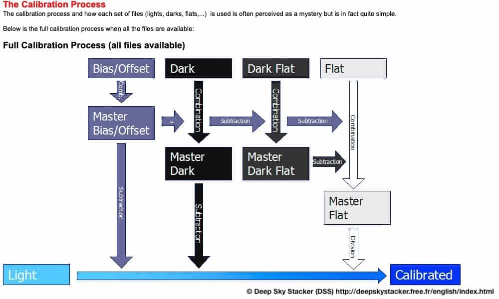
2. modern telescopes clean up their images by taking a "master dark frame" that is a stacked frame of many frames taken with the lens cap on. The goal there is to compute the noise profile of the sensor. I'm sure before launch the darks for the sensors were determined and are at the ready to correct and calibrate images coming from the telescope. think of it as applying a bespoke noise filter for that sensor. It's a fast process to apply it, but not to generate it. If they really make the raws available I'm sure we'll see more noise there.
3. the touch up you see them doing is the removal of a hot pixel which survived the calibration process with the dark frame. no doubt on space telescopes they still get errant hot pixel of some kind of particle or cosmic ray they don't want makes it to the sensor and flips a bit (and is therefore not account for in the master dark). happens all the time. they're probably keeping a map of where they're getting hot pixels.
Did you mean you thought they were adjusting the content and not just fixing noise?
This is not a criterion of high quality software.
(And have been eagerly waiting for this moment for ages)
It just seems “unscientific” to just use Photoshop and above all curious about the set of rules and algorithms, that enables them to decide which hue to pick for which region, levels, etc.
Photoshop can do just about anything with spatial image data and if it's not built-in, you can probably find a plug-in to do what you want or write a script. The trade-off is the software can be very complex because over the decades it's grown to support an incredible number of use cases.
Over the years I've also seen PS used in unexpected ways at work. If you need to do something programmatic to image or spatial data, PS is a good host platform for custom code because it will handle importing file formats, color space conversion, bit plane manipulation, alignment, scaling, cropping, perspective correction and masking before your custom processing and then it'll export the output in whatever sizes and formats you need. And it will do it on gigapixel data sets under script control. That's a lot of grunt work you don't have to implement. I've even seen it wired up to Matlab.
But when you have 10k x 5k pixel images and channels that don’t directly correlate with visual spectrum I don’t see why using photoshop extensively is wrong especially for images to be released to the general public. I’m even sure some local touch up is acceptable for me.
These color composite images really show off how awesome JWST is. They're meant for the public to enjoy (astronomers enjoy them too).
There's a bit on the data policy on wikipedia [1] but basically the operations costs are funded (in part) by people paying for telescope time. The project that is currently paying for the telescope gets exclusive access for a 1 year "embargo" period, after which the data becomes public.
[1]: https://en.wikipedia.org/wiki/James_Webb_Space_Telescope#Gro...
This article goes through processing a Hubble image of one of the same objects that Webb did today and includes an example of what it looks like before adjusting for contrast and tone.
https://www.rocketstem.org/2015/04/20/how-astronomers-proces...
Kinda disappointing if it's really just a paint by numbers Photoshop to look nice
Anyway, this post shows an example comparing a "flat" color composite and one that's been tonemapped etc. This is using Hubble data but it's the same subject as one of the JWST images.
https://www.rocketstem.org/2015/04/20/how-astronomers-proces...
This video goes into some detail about the filters that were used for one of these JWST images:
I guess that scientists will also use specialized software for fine analysis, but it doesn't make Photoshop useless.
Modern sensors are amazingly low noise. 10 years ago, I used to have to calibrate out darks, bias and flats just to remove my sensor noise. Now with modern CMOS sensors, people still do that but it isn't as necessary and you can overcome much of the sensor noise by capturing enough data - and that's where JWST just dominates. THere is nothing impeeding the data causing noise.
Shot noise is easily removed by integration, Read noise on modern sensors is almost non existent and easily calibrated out, dark current is extremely low, bias, hot and cold pixels are all things that can be removed with calibration and integration and with space telescopes cosmic rays are probably the most annoying thing but if you stack enough images they integrate right out.
But back to photoshop, the final images are just publishing art. I use pixinsight myself for all the heavy lifting, pixel math, integration and calibration but sometimes go out to photoshop for cleanup - especially for web/print.
He said: A) there are two of them in the team doing the imaging B) it doesn’t start with an image - it’s literally heaps of binary data that the scientists stitch together C) he then does the colour overlay based on agreed norms (one colour per input frequency for consistency) D) most of his “touch up” work is getting the colour gradient right between the brightest and dimmer objects - without this a lot of resolution would be lost (brights too bright, or dim not visible).
Hope this helps…
Here's the API to access the boring original data.
Also, there seem to be multiple layer-masks involved for specific regions and objects.
I get that you can shift and composite color, based on hue, apply filters etc, but: Photoshop?
Curious if anyone can explain, that what we see is actual science or some touched up version of objects in our universe.
p.s.: What struck me the most is the absence of noise, especially for the deep field photo. Hubble took many exposures over weeks, which normally would allow for reliable reduction of noise, webb took some shots over the course of hours and there’s hardly any noise to see. Weirdest part is seeing them just “healing brushing” away some dots - how is the decision process on altering images like that?
(edit for typos)