If you've picked a typeface, and designed other UI elements that look good in conjunction with it, but suddenly that typeface becomes unaffordable, then you have to do some work to find an alternative that's still acceptable.
In particular, game UI tends to be designed around the particular dimensions (metrics) of a font's characters. So a string of text whose size is "just right" in one font might look too big or too small in another, even at the same nominal font size. And this can affect many different pieces of text throughout a game.
Arial is popular because people see it and say "good enough!".
Serif fonts were used in print media for ages but when computers came around sans serif became significantly more popular as no longer was there the legibility concern with dodgy pigment applicators etc.
People started to switch to sans serif fonts more and more and would seek out an alternative to the widely defaulted Times New Roman in early days. They'd open the alphebetically sorted fonts list and what did they see at the top?
Arial.
Keep in mind, when personal computing started out, we didn't have a ton of fonts packaged with the system to start with. Just a handful. Arial has pretty much always been there.
But, designers have cared about things like this for a very long time (ages, as you said.) Arial is joined at the hip with Helvetica, which got a movie[1] because of it's massive cultural impact and it's praise within design circles.
Among professional designers, there were very strong opinions on Helvetica and Arial--almost fever pitch at times. iirc, Arial exists do to the popularity of Helvetica and the background of this goes back to the 1950s. It wasn't just where it was placed in the font selection menu, it was given top billing in that menu deliberately (in Windows.) If you're interested, I think the Wikipedia page for Helvetica (Font)[2] covers it fairly deeply.
That all said, I haven't heard it hotly debated for some time now. The explosion of freely available fonts; popularity of new font families like Open Sans, Noto Sans, etc; and the ability to add custom fonts on the web seems to have slowly killed off the discourse in the last decade or so. I'm not in those design circles as often anymore, though.
From what I know, Monotype was responsible for the name Arial (although IBM called the family Sonoran Sans Serif.) But, even at that point, the intent was to create something that would stand in for Helvetica.
I don't know that the name was selected deliberately to be ahead of Helvetica. But, it's not unheard of in branding to put your product ahead of or near the competition alphabetically. (It was especially important then because people were manually looking up things in phone books and libraries.) I wouldn't be surprised to hear that aspect was considered during naming.
Not true at all. For instance, Arial was/is typically used as the fallback font for Windows users visiting a website that relied on system sans-serif fonts, while Helvetica shipped with OSX and would be prioritized for those lucky users.
Arial would be chosen by Windows users as good enough because they were already locked in a prison of bad design and terrible typeface rendering anyway, and didn't have other sensible options installed by default.
Microsoft decided to have a font adapted to computer screens, with characters that match the screen grid better for a crisp result.
It's not really "bad design and terrible typeface", but different choices with each their pro and cons.
Of course it's different now with high DPI screens.
My point is not that font substitution never happens (it quite clearly does). My point is that no print designer has ever thought "yes, I want Helvetica here, and sometimes we won't pay for Helvetica so sometimes it will look like Arial, and this is what I want". Probably back in the days of PostScript built-in fonts and font cartridges some people thought about that. But since TrueType and embedded fonts happened, I don't think a single designer has ever given a shit about these two fonts being metric-compatible instead of just, you know, picking one and designing with it.
Web design is its own beast and any web designer who wasn't designing, from day one, for different fonts possibly being used without even any regard for metric compatibility wasn't doing their job.
E.g. supermarkets suddenly charging the hundredfold amount? → Should have started a farm or made solid contracts if you didn't want be be dependant...
Fontworks’ team, type inventory, IP, technology, and services will join global type specialist Monotype–Monotype’s first acquisition in Japan.
https://old.reddit.com/r/graphic_design/comments/1jqqlm6/mon...
I would gladly go back to the older 14+14 system, even though I have nontrivial income from royalties. In my opinion, copyright should motivate people to create new things, not one cash cow that they then will milk for eternity.
>Your request has been blocked due to a network policy.
>Try logging in or creating an account here to get back to browsing.
>If you're running a script or application, please register or sign in with your developer credentials here. Additionally make sure your User-Agent is not empty and is something unique and descriptive and try again. if you're supplying an alternate User-Agent string, try changing back to default as that can sometimes result in a block.
>You can read Reddit's Terms of Service here.
>If you think that we've incorrectly blocked you or you would like to discuss easier ways to get the data you want, please file a ticket here.
>When contacting us, please include your Reddit account along with the following code:
Reddit is weird these days. I'm not even sure how this is related to fonts.
It sure has its style and I stand by what I've always maintained about gameplay being infinitely more important than polished graphics, but that does sound ironic to my ears!
I am not sure if it's possible to parameterize it to have the look that game developers wanted.
If any of us wanted to hear what ChatGPT had to say, we would have prompted it ourselves.
But thankfully, you do not.
I shared the info (yes, it is from AI, but the source does not matter really (AI LLMs themselves source such info from public domain sources, I could have simply refered to them and got similar info), the intent does), so that anyone else wondering about this thread context (like I was) can become aware of this bit of info.
And hey, what you do or do not do with ChatGPT, is upto you and it, clanking or otherwise.
But, as everyone else has mentioned, font usage in games (and most creative visual works) is more particular than just the bare minimum of "does it actually render the glyphs". Imagine if all text in your favourite game was all Times New Roman, it would make the game worse.
Now it's been years since I played a game in russian (almost a decade at this point I think) and I am so glad I don't have to put up with that anymore. Once in a while I see a screenshot from a cyrillic-using language translated game and probably half of the time the fonts are still bad.
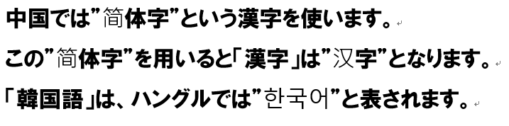
Because Japanese and Chinese characters are slightly different, but Unicode decided to unify them under the same codes....
https://images.rpgsite.net/image/da49c9a1/102696/original/FF...
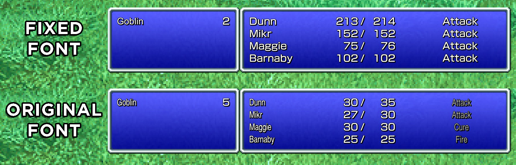
Ironically, they had a better Latin font _in the Japanese language version_ for all the genre loan abbreviations like MP/HP/LV etc., (https://terimaland.com/Memory/Steam_FinalFantasyPixelRemaste...) so that image is comparing the modded in Japanese Latin font vs the font the game includes by default.
(They also have a retro blocky "pixellated" font option iirc, which doesn't have the super narrow widths)
https://mailmate.jp/blog/half-width-full-width-hankaku-zenka...
Realistically it’s only katakana that you can make this mixup on. My desktop IME will let me type カタカナ or (reluctantly) カタカナ, though it turns out iOS doesn’t have a way to type the half width kana, and IMEs have differing opinions on if they prefer full width digits, so you might see full width numbers like 5000。
Perhaps it is time for more people to invest in royalty free IP? We are seeing a bit of a tragedy of the commons type of situation going down, right now.
I guess the trouble is that game companies can't really band together and pool money to make a good font since the point is to look unique, so this only works for the largest studios. Otoh, at least for now, the smaller ones might stay below the 25k user limit
It is that existing annually paid licences are converted. The extra work for existing titles is the problem. And:
> The crisis could even eventually force some Japanese studios to rebrand entirely if their corporate identity is tied to a commercial font they can no longer afford to license.
Type layout in Japanese in particular has a system of layered, complex rules that include rules that define how to combine Western glyphs with Japanese glyphs and produce visually harmonic work. Swapping a font out due to a cost issue is not workable.
Also, not all pan-asian fonts contain all the glyphs you need to render all the characters you want. A CJK font has tens of thousands of characters, and it wouldn't surprise me if some of these video games will use fonts with particular glyphs that are not always included in other fonts.
Monotype is giving these customers the finger while also ramming a bulldozer in their asses with this change. It's completely unacceptable, painfully rude, and ridiculously tone deaf. In fairness, this is totally on brand for Monotype.
How do the big Unicode OSS fonts like Noto, Deja Vu deal with this?
Yes there is: https://fonts.google.com/noto/specimen/Noto+Serif+JP
This is "Han Unification", a terrible idea from early in the development of Unicode. The idea was so bad that the affected glyphs are now also given always-Chinese and always-Japanese Unicode points, making it possible to, for example, compare a Chinese character to a Japanese character in the same document.
But the fix exists. You can specify that you have no idea what you're trying to write by coding it as U+76F4 (直). Or you can specify a Chinese character by coding U+FAA8 (直). Or you can specify a Japanese one by coding U+2F940 (直). There isn't actually a reason you'd want U+76F4 - it's just a dead, useless unicode point - but we can observe here that my default font doesn't include a glyph for either U+FAA8 or U+2F940 even though U+FAA8 is by definition identical to U+76FA (since this is a Chinese font).
The fact that it was the only one that properly rendered for me is an actual reason.
You don't want U+76F4, you want buggy Asian fonts to be fixed.
(On second thought... did it render correctly for you? Did you check?)
- In cases with the Noto project, they've given up long ago on literal singular font in both name and file to cover every languages; they have bunch of variants as different fonts(TC,SC,HK,JP,KR,...), available as both individual files as well as combined files[1].
- In cases with most Latin fonts like Deja Vu - I think this is where bulk of "wrong font" problem comes from. They don't support CJK at all, and operating systems often handle fallback to system defaults for missing characters, but sometimes OS falls back into wrong CJK fonts and cause text mIshmashlnG[2] problems or show bunch of square placeholders(aka tofu). The latter is usually solved by installing Noto fonts, and former by specifying what fonts are to be used for fallbacks(anyhow it's done, it can be OS or game engine dependent).
- There are also bunch of domestically made fonts such as IPA Gothic; they usually only support the targeted one of CJK + ASCII(+ISO-8859-1). Most Japanese-English _bi_ lingual contents take this route, which had lead to curiosity by some as to why Japanese content creators appear to have unique and specific taste for fonts[3] - in fact they're just reusing the font files already in the project folder.
- For creative purposes such as games, FOSS fonts sometimes don't cut it, but that is not unique to the Japanese language.
1: https://cdn-ak.f.st-hatena.com/images/fotolife/s/satob/20231... | https://archive.is/6qeVm

2: https://blog.enjo.life/wp-content/uploads/2022/08/fonts-and-... | https://archive.is/jSQzn
Maybe it's because it's a dumb question but the article doesn't really set the stage for me why it's an issue that 1 font licensing company raised its prices. I guess they must have a monopoly or else this change isn't commercially viable (the article just says "one of the country's leading font licensing services"), but even then, there ought to be open options