Now it's been years since I played a game in russian (almost a decade at this point I think) and I am so glad I don't have to put up with that anymore. Once in a while I see a screenshot from a cyrillic-using language translated game and probably half of the time the fonts are still bad.
Because Japanese and Chinese characters are slightly different, but Unicode decided to unify them under the same codes....
https://images.rpgsite.net/image/da49c9a1/102696/original/FF...
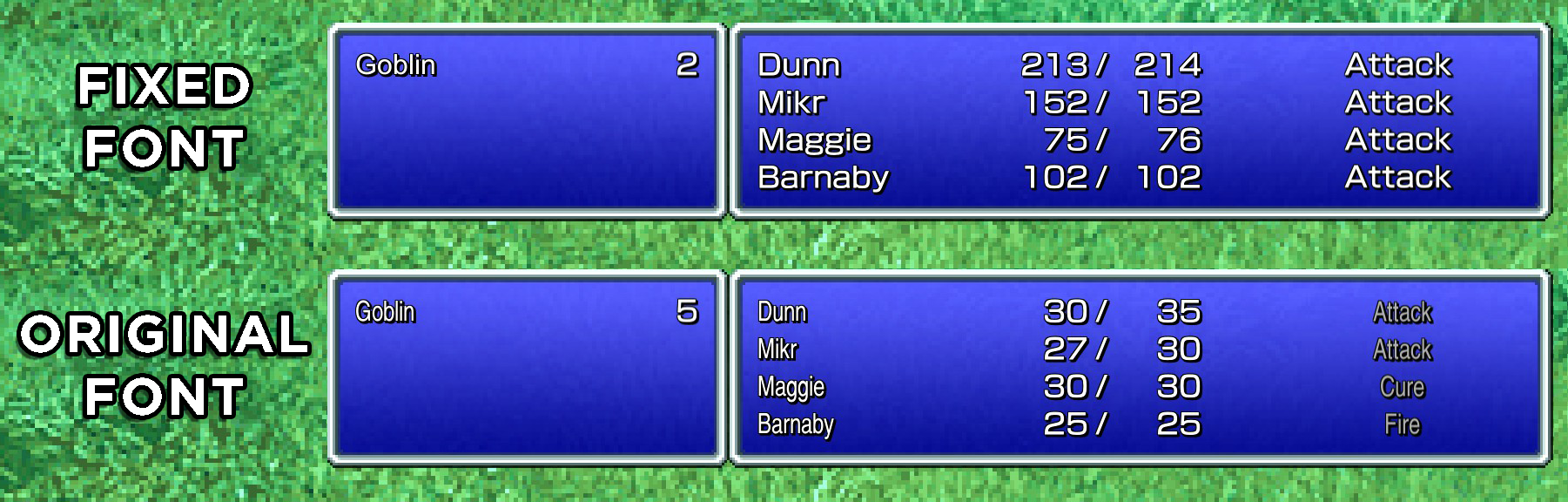
Ironically, they had a better Latin font _in the Japanese language version_ for all the genre loan abbreviations like MP/HP/LV etc., (https://terimaland.com/Memory/Steam_FinalFantasyPixelRemaste...) so that image is comparing the modded in Japanese Latin font vs the font the game includes by default.
(They also have a retro blocky "pixellated" font option iirc, which doesn't have the super narrow widths)
https://mailmate.jp/blog/half-width-full-width-hankaku-zenka...
Realistically it’s only katakana that you can make this mixup on. My desktop IME will let me type カタカナ or (reluctantly) カタカナ, though it turns out iOS doesn’t have a way to type the half width kana, and IMEs have differing opinions on if they prefer full width digits, so you might see full width numbers like 5000。
Perhaps it is time for more people to invest in royalty free IP? We are seeing a bit of a tragedy of the commons type of situation going down, right now.
I guess the trouble is that game companies can't really band together and pool money to make a good font since the point is to look unique, so this only works for the largest studios. Otoh, at least for now, the smaller ones might stay below the 25k user limit
But, as everyone else has mentioned, font usage in games (and most creative visual works) is more particular than just the bare minimum of "does it actually render the glyphs". Imagine if all text in your favourite game was all Times New Roman, it would make the game worse.
[1]: https://fonts.google.com/?lang=ja_Jpan