News for hackers. Stuff that matters.
Re:Safari 15 on Mac OS, a user interface mess by rubyist5eva on Saturday June 19, 2021 @09:40AM (#27560379)
I vehemently disagree that vertical space used is negligible. Due to standard aspect ratios, the vertical space of the display is at a premium. 1920*1080 means you have 840 less vertical pixels than horizontal - it makes a lot of sense to me to try to reclaim some of that space for actual content instead of widgets.
Re:Safari 15 on Mac OS, a user interface mess by Bud on Saturday June 19, 2021 @02:00PM (#27562731)
Things like the tab bar and the reload button are not mere "widgets"; they are the core UI elements. They are the single most important part of the app. This is simply a bad call.

I'm all for saving vertical space whenever possible. But this is a bad call.

Re:Safari 15 on Mac OS, a user interface mess by montroser on Saturday June 19, 2021 @03:09PM (#27563431)
The single most important part of the app is the content.

I would be interested to see a version where the tabs and url bar roll up to one line if you have the space (few tabs, large monitor), but wrap to two if you don't (lots of tabs, small monitor).

Re:Safari 15 on Mac OS, a user interface mess by bitsoda on Saturday June 19, 2021 @08:43PM (#27565951)
To a certain extent. If you show too much content at the expense of navigation you simply make your app harder to use. There’s a sweet spot in the UX bell curve and I feel like the new Safari missed the mark. Although, the iOS version looks like an upgrade for one handed use.
Re:Safari 15 on Mac OS, a user interface mess by thirdlamp on Saturday June 19, 2021 @03:47PM (#27563788)
I’ve been using a vertical tab bar on the left in Firefox for a while, offers many tabs and lots of vertical space
Re:Safari 15 on Mac OS, a user interface mess by Asmod4n on Saturday June 19, 2021 @04:39PM (#27564268)
Can’t remember the Mac OS X Release when Apple removed the dedicated reload button from Safari. Was it 10.6?
Re:Safari 15 on Mac OS, a user interface mess by martimarkov on Saturday June 19, 2021 @05:18PM (#27564543)
I'm on Big Sur and have it on my Safari?
Re:Safari 15 on Mac OS, a user interface mess by apple4ever on Saturday June 19, 2021 @08:35PM (#27565902)
It was a separate button on the toolbar, not right next to the address bar (which if you misclick you end up editing the URL instead of reloading).

And it was Safari 4, released in 2008!

Re:Safari 15 on Mac OS, a user interface mess by tcoff91 on Saturday June 19, 2021 @09:00PM (#27566038)
Command R. I use a browser that has a refresh button and I don’t bother using it ever.
Re:Safari 15 on Mac OS, a user interface mess by boraoztunc on Monday June 21, 2021 @02:31AM (#27576839)
This is my habit as well. Rarely click refresh button.
Re:Safari 15 on Mac OS, a user interface mess by shinycode on Saturday June 19, 2021 @05:21PM (#27564565)
I CMD+R every time and I guess for the amount of time people reload it’s not costly to learn it …
Re:Safari 15 on Mac OS, a user interface mess by zapzupnz on Saturday June 19, 2021 @07:33PM (#27565541)
In usability heuristics, that's called an accelerator. We would normally call it a shortcut. Whatever you call it, the point is it's an alternative to doing it in a more accessible way, not THE way.
Re:Safari 15 on Mac OS, a user interface mess by shinycode on Saturday June 19, 2021 @08:15PM (#27565808)
I understand that, maybe they’ve done studies on how often people reload a page and made a decision based on numbers. After 20 years of browsing the web, at least for me, THE way became the shortcut and I never click on that (now useless) button. I can understand why they pushed it a click away, maybe numbers/studies back this up, maybe not. Personally I like having some buttons on the toolbar but I think I prefer the cleaner UI even more and I don’t mind doing 1 click to find them back. Anyway when we play games we never count clicks right? It’s not like it really cost us anything … but that’s just me.
Re:Safari 15 on Mac OS, a user interface mess by zapzupnz on Sunday June 20, 2021 @12:00AM (#27566962)
> After 20 years of browsing the web, at least for me, THE way became the shortcut and I never click on that

Again, that’s an accelerator. That’s for advanced use. So you’re an advanced user, good on you. Things are not designed just for advanced users.

> I can understand why they pushed it a click away, maybe numbers/studies back this up

No studies would back up making an interface less discoverable, thus less intuitive for new users, and also increasing cognitive load by requiring users to remember where something is rather than it just being there. ‘…’ and hamburger menus have always been poor substitutes for well-designed navigation hierarchies.

Someone actually ran the new tabs against Jakob Nielsen’s usability heuristics, respected in the industry for 27 years: https://twitter.com/feetsnz/status/1403849426683138053

The results were not good.

There are no numbers on the planet that could justify lowering usability. Apple themselves gave a WWDC session on how minimalism != usability. Of course, they can have a minimalist interface; that should never come at the expense of usability. They don’t eat their own dog food.

> Anyway when we play games we never count clicks right?

What do games have to do with a web browser?

Re:Safari 15 on Mac OS, a user interface mess by shinycode on Sunday June 20, 2021 @01:28AM (#27567368)
You are right
Re:Safari 15 on Mac OS, a user interface mess by bobbyi_settv on Saturday June 19, 2021 @09:49PM (#27566327)
If I CMD+R on Hacker News, it reloads the page. If I do it on outlook.office.com, it starts drafting a reply to the email I have selected. Reload button does the same thing everywhere.
Re:Safari 15 on Mac OS, a user interface mess by shbooms on Saturday June 19, 2021 @10:51PM (#27566681)
This is one thing I'm grateful for as a Firefox user, I can disallow websites from overriding built-in shortcuts both globally or on a site-by-site basis. I don't believe Safari offers this unfortunately.
Re:Safari 15 on Mac OS, a user interface mess by vishwajeetv on Saturday June 19, 2021 @11:09PM (#27566782)
Yes, I wish webapps didn't put unnecessary keyboard shortcuts (or disable them by default)
Re:Safari 15 on Mac OS, a user interface mess by least on Saturday June 19, 2021 @07:17PM (#27565442)
I use ⌘+R and actually just press R with vimari but if i'm just casually scrolling the web with my mouse sometimes I just want to press the reload button which is now two clicks.
Re:Safari 15 on Mac OS, a user interface mess by mahoho on Saturday June 19, 2021 @10:53AM (#27560937)
But the tradeoff here isn't between a few dozen pixels vertically and a few dozen horizontally. It's 28 vertical pixels in exchange for cutting the horizontal space for the address bar and tab bar each in half, roughly.
Re:Safari 15 on Mac OS, a user interface mess by read_if_gay_ on Saturday June 19, 2021 @11:07AM (#27561077)
Who really needs an address bar spanning the entire width of their screen? If you run into an URL that long then it's highly unlikely to contain useful information anyway. Or do you regularly notice yourself scanning through 400 characters of query string gibberish and thinking "that information was so useful that I always need all of it on screen"?
Re:Safari 15 on Mac OS, a user interface mess by aniforprez on Saturday June 19, 2021 @11:57AM (#27561593)
You don't. But why use that space to put the tab bar which DOES require the entire width? Chrome's and Firefox's compromise seems good enough where they stuff everything else to the right and left of the address bar except tabs. This Safari change is just awful
Re:Safari 15 on Mac OS, a user interface mess by hultner on Saturday June 19, 2021 @05:18PM (#27564549)
Chrome is horrible when you’ve got more then a few tabs since each tab just shrinks to a tiny unrecognizable notch, Safaris approach of scrolling in the tab bar is vastly superior in my opinion and makes the area much more useful even if it’s smaller. And this is without considering the new tab groups. I never really liked chromes tab-bar.
Re:Safari 15 on Mac OS, a user interface mess by read_if_gay_ on Saturday June 19, 2021 @12:10PM (#27561723)
Tab groups are Apple’s solution to having less space for tabs. As a casual Tree Style Tabs user I can see them really working better than one giant mess of tabs.
Re:Safari 15 on Mac OS, a user interface mess by zarzavat on Saturday June 19, 2021 @03:13PM (#27563462)
Honest question. How are people using tabs such that they would want to organise them? Most of my tabs have lifetimes of seconds to minutes and there is no order in the chaos to be found.
Re:Safari 15 on Mac OS, a user interface mess by matwood on Saturday June 19, 2021 @04:59PM (#27564420)
I find how people use tabs a lot like how people use Excel. Excel is super flexible with thousands of features, but people only use a few of them. The rub is each person uses a different few. Tabs are similar. They are a flexible tool and people design personal workflows around them.

How I use tabs is probably nothing like how you use tabs or another random person uses them. I’m actually fascinated how people design their own workflows in this way. Anytime I see someone’s screen I end up with a ton of questions asking ‘why’.

Re:Safari 15 on Mac OS, a user interface mess by mmphosis on Saturday June 19, 2021 @10:06PM (#27566438)
I definitely wish that I could group tabs when I am working. I keep groups of tabs together, and these tab groups have long lifetimes. I also open various differently size windows depending on the content of each page. All of this is to work around the mess of "good enough" user interfaces that I deal with everyday. If I see myself opening more "ad hoc" tabs, I closed them as soon as I can. I don't need any more chaos.

Right now I am not at work, and I have three browser windows open and there are no scroll bars. I have managed to turn off tabs for the most part using Firefox userChrome.css and about:config. If I need another browser page, I'll open another browser window. When I have more than 4 or 5 browser windows I start stacking/offsetting the windows.

Unfortunately, "Tabs" are modes. http://www.nomodes.com/

Re:Safari 15 on Mac OS, a user interface mess by curun1r on Saturday June 19, 2021 @05:01PM (#27564437)
I’m on chrome, but I’m using them through a simple development extension I wrote which examines the url of ungrouped tabs and adds matching tabs to a few predetermined groups that I’ve hard-coded into the JavaScript. It was a quick and dirty hack that took me about 30 min to setup, but it’s made the tab grouping functionality so much more useful.

I’m toying with the idea of adding an options page so that I could release it to the chrome store, but I hate UI work, so I haven’t gotten around to that yet.

Re:Safari 15 on Mac OS, a user interface mess by Tempest1981 on Saturday June 19, 2021 @04:56PM (#27564399)
I keep 2 browser windows, each with 10+ tabs. One is those with short lifetimes, as you mention. The other is a "reminder list" of things I want to defer for a few hours.
Re:Safari 15 on Mac OS, a user interface mess by apple4ever on Saturday June 19, 2021 @08:36PM (#27565909)
I maintain separate windows, but they still end up with 30+ tabs each.
Re:Safari 15 on Mac OS, a user interface mess by xvector on Saturday June 19, 2021 @12:41PM (#27562015)
Hard disagree. The Safari change is a godsend for someone with a small laptop display. Every bit of space I can reclaim helps.
Re:Safari 15 on Mac OS, a user interface mess by IggleSniggle on Saturday June 19, 2021 @01:36PM (#27562490)
As someone else with a small laptop display, I run everything in fullscreen mode, and toggle out whenever I need to use the controls. If you’re hiding the controls anyway, why not just use fullscreen mode? Then, when you want the controls, you don’t need to have them hidden in a bunch of layers, they can just all be there.

Hey, whatever if we just made all the browser controls a modal or fullscreen context of it’s own?

Re:Safari 15 on Mac OS, a user interface mess by xvector on Saturday June 19, 2021 @01:38PM (#27562504)
You can't always use full screen, often you need to have multiple windows open next to each other, and that's where minimizing chrome is especially important, because your windows are smaller now but the size of the chrome remains the same.
Re:Safari 15 on Mac OS, a user interface mess by pseudalopex on Saturday June 19, 2021 @03:18PM (#27563516)
Multiple address and tab bars next to each other doesn't work well on a small laptop. Separating them works much better.
Re:Safari 15 on Mac OS, a user interface mess by bryanrasmussen on Saturday June 19, 2021 @02:02PM (#27562763)
Is there a browser where the address bar spans the entire width of their screen? I've got FF Dev on Mac right now - about 60% of the screen eyeballing it. Have managed not to install Chrome on this machine and have to give it back in a couple weeks so I don't intend to install it if I can help it but from what I can recall it's not 100% either. Where is this entire width of the screen thing coming from?
Re:Safari 15 on Mac OS, a user interface mess by shinycode on Saturday June 19, 2021 @05:19PM (#27564555)
I agree, even in dev situation I copy paste the url elsewhere to read/work on it. It’s a smart move to shrink the address bar like that.
Re:Safari 15 on Mac OS, a user interface mess by yxhuvud on Saturday June 19, 2021 @11:05AM (#27561059)
Which is why it makes it so strange that no browser designers seem to get that the way to go is to stack tabs in a vertical list instead of horizontally. It would use more space but the space is in less demand so it wouldn't matter anyhow.

So until the browser designers get a clue I will be stuck with Firefox and the Treestyle tabs plugin which is the least horrible solution for people that use a lot of tabs.

Re:Safari 15 on Mac OS, a user interface mess by kitsunesoba on Saturday June 19, 2021 @01:19PM (#27562345)
I've tried tree style tabs a few times but it always ends up being too much.

The implementations of vertical tabs I've liked best so far are OmniWeb's (perhaps one of the original vertical tab browsers), Edge's, and Firefox with Tab Center Redux and custom CSS to hide Firefox's frustrating mandatory sidebar header.

Re:Safari 15 on Mac OS, a user interface mess by seritools on Saturday June 19, 2021 @02:09PM (#27562829)
I know of at least Edge and Vivaldi that do it.

Granted, it seems that nobody at the Edge team thought of actually giving the vertical space used by the horizontal tab bar back once you flip to vertical tabs mode, but the feature itself is there.

Re:Safari 15 on Mac OS, a user interface mess by apple4ever on Saturday June 19, 2021 @08:39PM (#27565921)
OmniWeb, back in the early days of OS X, did that. They used the drawer concept.

I really loved that. All my tabs (with mini pictures of them) were on side, which made them easy to see and didn't take up vertical space.

(OmniWeb was a great browser in other ways).

Re:Safari 15 on Mac OS, a user interface mess by freediver on Sunday June 20, 2021 @07:27AM (#27569055)
Did you know you can download OmniWeb for modern Macs (they resumed development late last year)?
Re:Safari 15 on Mac OS, a user interface mess by freediver on Saturday June 19, 2021 @03:40PM (#27563726)
If you are on Mac and want to try a new WebKit based browser, Orion comes with native vertical tabs.

https://browser.kagi.com

Re:Safari 15 on Mac OS, a user interface mess by kitsunesoba on Saturday June 19, 2021 @07:29PM (#27565515)
Just so you're aware, I believe the form validation on your beta signup sheet is messed up. I'm unable to submit the form under Safari and Chrome.
Re:Safari 15 on Mac OS, a user interface mess by isignal on Sunday June 20, 2021 @12:19AM (#27567041)
Microsoft edge has the option for vertical tabs, at least on Windows.
Re:Safari 15 on Mac OS, a user interface mess by techpression on Saturday June 19, 2021 @11:54AM (#27561568)
Vivaldi does what you’re asking for, natively without plugins.
Re:Safari 15 on Mac OS, a user interface mess by reflectiv on Saturday June 19, 2021 @09:53AM (#27560461)
This is basically what I tell people when they ask me why I put my start menu and task bar on the left side of the screen.
Re:Safari 15 on Mac OS, a user interface mess by bscphil on Saturday June 19, 2021 @05:26PM (#27564596)
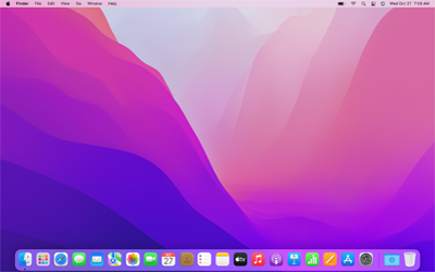
Exactly. Which to me is why the parent complaint is a bit silly. If vertical space is at such a premium on Mac laptops supposedly, why then does the default Apple UI [1] consume such an enormous amount of vertical space? This is many, many pixels more space than on Windows, where you only have the taskbar at the bottom. Apple's dock is much larger than the taskbar, in addition to having a global bar on the top!

So I conclude that Apple's designers are in fact not attempting to maximize vertical space, or at least that to the extent they do care about this, they're willing to make absurd compromises in apps like Safari while not fixing the glaring issue with the overall UI.

[1] https://upload.wikimedia.org/wikipedia/en/9/98/MacOS_Montere...
Re:Safari 15 on Mac OS, a user interface mess by mixmastamyk on Saturday June 19, 2021 @07:25PM (#27565486)
MacBooks have 16:10 screens, not 16:9, so there is a bit more room. I still hide the dock however.
Re:Safari 15 on Mac OS, a user interface mess by ziml77 on Saturday June 19, 2021 @10:45AM (#27560829)
I find that horizontal space to many times be more constrained. If I toss and IDE and browser window side-by-side so I can code while looking at docs I need to at least close the vertical tabs on my browser to have a sane amount of space left for content. Usually also collapse one of the sidebars in the IDE to get a decent width for the code.
Re:Safari 15 on Mac OS, a user interface mess by read_if_gay_ on Saturday June 19, 2021 @11:00AM (#27560994)
Clearly horizontal space is going to be more constrained than vertical space if you put two windows next to each other horizontally, as you're going from 16:9 to 8:9. But if you stacked them vertically, well obviously vertical space would be even more constrained than that, to the point where it's so useless you don't even think about doing it. So this is an argument for vertical space being more scarce than horizontal space actually.
Re:Safari 15 on Mac OS, a user interface mess by michaelmrose on Saturday June 19, 2021 @10:10PM (#27566467)
Maybe all non page UI ought to auto hide until a key is pressed for your use case.
Re:Safari 15 on Mac OS, a user interface mess by maxwell on Saturday June 19, 2021 @10:27AM (#27560687)
You don't hide the start menu and task bar?
Re:Safari 15 on Mac OS, a user interface mess by slver on Saturday June 19, 2021 @11:10AM (#27561125)
Hiding it usually works.

Unfortunately on Windows there's this annoying slide-out animation that slows you down. It happens even if you disable UI animation.

On top of that sometimes the bar doesn't show up at all when specific windows are maximized. Which means you need to press the start button to get it out.

At some point one figures "f this shit, just toggle off auto-hide".

I do autohide in macOS on laptops tho.

Re:Safari 15 on Mac OS, a user interface mess by zamadatix on Saturday June 19, 2021 @10:44AM (#27560816)
A lot get frustrated with the slide but if you disable animations the autohide becomes instant too.
Re:Safari 15 on Mac OS, a user interface mess by banana_giraffe on Saturday June 19, 2021 @01:44PM (#27562568)
For what it's worth, you don't need to disable all animations to stop this, just the menu ones.

https://superuser.com/a/1644831

Re:Safari 15 on Mac OS, a user interface mess by zamadatix on Saturday June 19, 2021 @03:12PM (#27563456)
That's actually a fantastic tip, thanks!
Re:Safari 15 on Mac OS, a user interface mess by sys_64738 on Saturday June 19, 2021 @07:30PM (#27565527)
Do you use Mac laptop apps in fullscreen mode? That's what I do so the dock auto-hides. I do however keep the start menu on the right for Windows.
Re:Safari 15 on Mac OS, a user interface mess by daniel_reetz on Saturday June 19, 2021 @10:08AM (#27560569)
Wow. I hadn't thought of it this way, and I even go as far as using a second monitor in portrait mode.
Re:Safari 15 on Mac OS, a user interface mess by beebeepka on Saturday June 19, 2021 @10:36AM (#27560753)
I have been doing this ever since 16:9 became a thing, and have converted several people to this simple solution.

Canonical had the right idea with Unity which not many people are willing to acknowledge

Re:Safari 15 on Mac OS, a user interface mess by mixmastamyk on Saturday June 19, 2021 @07:28PM (#27565513)
The Windows task bar has been movable since 95 I believe. I know because I moved it to the top in the old days. With Mate I keep the main panel on the left as well, however some widgets were not happy in vertical orientation until a few years ago.
Re:Safari 15 on Mac OS, a user interface mess by pourred on Saturday June 19, 2021 @10:30AM (#27560707)
Yet one obvious UI change on Big Sur is they added pointless padding to windows and menus.
Re:Safari 15 on Mac OS, a user interface mess by ksec on Saturday June 19, 2021 @02:38PM (#27563113)
I dont agree with getting rid of "widget", but I do agree vertical space are very limited. Your example of 1080P will be on a 16:9 Screen or iMac. MacBook uses 16:10, but even that, vertical space are still at premium. Once you have Dock at the bottom, and all web design has another layer of navigation at the top, you are quickly looking at 480 out of 1600 gone [1]. That is 30% of my vertical screen space. Leaving effectively 2560 x 1120 for content at Aspect Ratio of ~21:9 ultra wide.

I would have used Full Screen Option if I could have Tab Bar showing instead of Address bar + Tab Bar. And Safari for some reason has strange GPU / CPU usage problem with full screen usage which hasn't been addressed for years.

May be instead of software design, hardware should have adopted to it. Microsoft Surface Laptop has a 3:2 Aspect Ratio. On the same MacBook Pro 13.3", that would have been an additional 120 pixel.

Another point worth mentioning, the Big Sur redesign actually have the Safari ( and macOS )Toolbar "thicker" as in taking more vertical space.

[1] I tend to hide the Dock Bar, without the Dock it is only 340 of vertical space.

Re:Safari 15 on Mac OS, a user interface mess by zamadatix on Saturday June 19, 2021 @03:07PM (#27563406)
More than aspect ratio or physical pixels the real metric is "inches of screen space". You can put 8k in a 13" laptop but if you want to read the window title and url bar and dock you're still eating the same amount of physical real estate as if it were a 1080p laptop. You can change the aspect ratio sure but outside of desktop setups the space constraint is already in depth so all you're doing is chopping off width that wasn't a problem while keeping the same depth profile. I.e. very few are buying a 13" laptop because 15" is too wide rather than too deep.
Re:Safari 15 on Mac OS, a user interface mess by Diesel555 on Saturday June 19, 2021 @09:29PM (#27566207)
I agree. I'm running the new OS. There were some UI changes that frustrated me. But when I thought about why I was frustrated, the reason was simply because the UI was new and my old habit patterns didn't work. When I took the time to learn the new UI, I liked it more. The event was a learning experience in why people hate change. It takes effort to realize the benefit (if there is one), otherwise without the effort just frustration (unless the change is bad).
Re:Safari 15 on Mac OS, a user interface mess by sergiomattei on Saturday June 19, 2021 @09:57AM (#27560493)
On a MBP 13 inch, vertical space like this is a premium as well.
Re:Safari 15 on Mac OS, a user interface mess by coffeefirst on Saturday June 19, 2021 @10:51AM (#27560911)
Right, everyone had the exactly opposite complaint about Firefox.

Safari 15's design is so odd I'll have no idea what to make of it until I can actually test it out.

Re:Safari 15 on Mac OS, a user interface mess by imbnwa on Saturday June 19, 2021 @07:57PM (#27565706)
Does anyone else not just use spatial browsing on OS X with Safari? Its the best browser for that. I almost never use the tab bar but will have multiple windows open and I can just three-finger swipe down on my touchpad to get exposé for all my open Safari windows and can visually identify a page versus the sliver of nothing Chrome for example gives you with tons of tabs open
Re:Safari 15 on Mac OS, a user interface mess by sbierwagen on Saturday June 19, 2021 @04:04PM (#27563933)
>1920*1080

Worse than that, high end PCs are going to ultrawide monitors. I'm on 3440x1440 right now, and 3840x1200/5120x1440 panels are dropping in price.

Of course, you almost never fullscreen a browser window on a monitor like that, but it is what the OS would default to.

Re:Safari 15 on Mac OS, a user interface mess by vishwajeetv on Saturday June 19, 2021 @11:07PM (#27566774)
Yes. One of the first thing I do when I set up a new Mac for myself is to move the bottom dock to the right side. Then the vertical space feels much more comfortable. This is applicable for both 15 inch and 13 inch macbook pros.
Re:Safari 15 on Mac OS, a user interface mess by barrkel on Saturday June 19, 2021 @11:23AM (#27561271)
This is why tree-style tabs make sense. It puts the tabs on a sidebar, where their content can be read, and leaves maximum vertical space for the actual page content.