What is the jank? It's a tabbed interface of buttons instead of menus and sub menus
I've been using Office since the early 90's and the ribbon interface for the last 13 years. I still can't find stuff easily in the ribbon interface. It's like there's some cognitive barrier to me retaining the layout of anything beyond the Home ribbon (or tab?). Any time I switch to the other ribbons (tabs?) I find myself hunting, wondering if I've got the right tab.
There's something about the spatial layout that seems to impose an extra cognitive load. I know menus are spatial too, but it seemed easier to remember them. Perhaps, because each menu occupied its own area of the window when expanded. With the ribbons, the same area is reused when you switch tabs.
With Word and Outlook, I've got slightly better retention. However, with Excel, where I seem to have a wide distribution of seldom-used functionality, it's an exercise in frustration. I know something exists, but it takes ages to find it because the last time I used it was probably a few weeks ago.
I also question the basic premise that the tabbed interface is somehow more intuitive for new users. Like many UI related assertions, absolutely no concrete evidence is being provided to support this point. I would think that it would be easiest for new users (as it is easiest for myself) to have options sorted into neat menus with uniformly sized elements where information is laid out in a vertical list (which is how lists are written in basically all left-to-right and right-to-left languages) so that it is easier to parse quickly.
I think you hit on something here with the irregular size of the buttons, probably moreso than the icons. The arrangement makes it difficult to just read through all the options left to right, because they're all jumbled.
A common/recommended design pattern for older Mac apps is to have a top toolbar of large icons, which is actually quite similar to the Ribbon in some ways. But there, the options appear in a single horizontal row. https://i.ibb.co/wd6MR9c/Screen-Shot-2020-07-10-at-11-58-37-...

This would also explain why other icon based UI's like the tool palette in gimp don't seem to suffer from the same problem. A grid of buttons is about as "programmer UI" as they come but once you learn where everything is it's quick and easy.
Uh, yeah there was? Go dig through the wayback machine for Jensen Harris’s blogpost series about the design of the ribbon, or watch his MIX08 talk on it; he was the design team lead for the change, and the reason they did it was because the old UI was failing their users. There were usability studies done during the ribbon design which fedback into, and changed, how it worked to adjust to ordinary people’s expectations and needs.
> “I would think that it would be easiest for new users to have options sorted into neat menus”
Like many UI related assertions, absolutely no concrete evidence is being provided to support this point.
But power users and ordinary user's needs are world's apart, and the office suites have to cater to both of them. Thus the deep divide.
Top level menus full by Word 95. Office 97 added command bars. Nested menus and toolbars full by Office 2000. Office XP added Task panes, full of features by Office 2003. "the Task Pane was the last attempt to find a way to scale old-style UI to programs as full-featured as Office. Although it was a successful stop-gap measure, it ran its course in only two versions." - https://docs.microsoft.com/en-us/archive/blogs/jensenh/new-r...
> "The downside [of nested dropdown menus], however, was clear and eventually terminal: increased complexity. It's much more difficult for people to form a scanning strategy with hierarchical menus: you have to keep track at each moment which levels you've visited and which you've haven't. What was once a simple structure to visualize was now a more complicated, branching structure."
- https://docs.microsoft.com/en-us/archive/blogs/jensenh/ye-ol...
> "As we watched more people use the prototypes, we started to understand more the scanning process that was taking place. Later on, we did eye-tracking studies to watch how people scanned the Ribbon"
> "I was reading a blog entry of someone who was kind of critical and dismissive about what we're doing and our designs. One of his criticisms was "how bad the usability of the Ribbon would be because it's got icons scattered all over of various sizes." What we've learned is actually the opposite. People can scan disparate patterns more easily than homogenous patterns. When we use more toolbar-like layouts--a bunch of equally-spaced, equally-sized buttons, people scan them less quickly than when each chunk has a memorable layout. So we actually try explicitly to vary the layouts between chunks--it helps people find the thing they're looking for more quickly. That's something we wouldn't have known if we didn't have a commitment to watch people work."
- https://docs.microsoft.com/en-us/archive/blogs/jensenh/be-wi...
> "One of the concepts behind the Ribbon is that it's the one and only place to look for functionality in the product. If you want to look through Word 2003 to find an unfamiliar command, you need to look through 3 levels of hierarchical menus, open up 31 toolbars and peruse about 20 Task Panes. It's hard to formulate a "hunting" strategy to find the thing you're looking for because there's no logical path through all of the UI.
> Office "12" consolidates all of the entry points into one place: the Ribbon. So if you're trying to find a feature and don't know where it is, the scope of your search is drastically reduced. Click on the leftmost tab, and click across the tabs until you reach the end. That it. It's either there or it's not--there are no other "rocks" to look under, no other places we've hidden functionality. We've found in early tests that people find it easier to discover how to do new things in the Ribbon, and they're more apt to explore the UI looking for better ways to get things done."
Testing showed that people found the Ribbon easier, found more things, and were more willing to explore it. - https://docs.microsoft.com/en-us/archive/blogs/jensenh/enter...
> "* Back in the olden days of designing software at Microsoft (say, pre-2003), design decisions were mostly supported by guesswork. [...] How much data have we collected? [in the Customer Experience opt-in program] About 1.3 billion sessions since we shipped Office 2003 (each session contains all the data points over a certain fixed time period.) [...] one of the biggest reasons that we decided to do the new user interface for Office 12 is simply that, for the first time, we have the data we need to make intelligent decisions.*"
- https://docs.microsoft.com/en-us/archive/blogs/jensenh/insid...
And that's not even from the design blog, which appears to be offline and not in the wayback machine.
Totally wrong about people finding menus easier, totally wrong about there being no evidence based design behind the ribbon.
Nit pick on this quote: every time I've used the ribbon, I need features that have been collapsed into a "more" list (hamburger menu?) for that section of the ribbon.
Also:
> you need to look through 3 levels of hierarchical menus, open up 31 toolbars and peruse about 20 Task Panes.
I'm really dubious that the ribbon is better in this regard. Those menus still exist, and I end up falling back to them with some regularity after searching the ribbons and not finding what I want (perhaps it is hidden in a hamburger menu). Furthermore, each option in the ribbon takes up far more screen real estate than an item in the drop down menu, and there are sub-dialogs still abound.
The desire to keep the document (or whatever it is) worked at on the screen during the "hunt" I consider a mistake. When mixing paint on a pallet the eyes are focused on what you are doing. You might want to look up to the canvas and back down again several times but there is never a need to do both.
I also feel drop down menus are a mistake. There (imho) should be a key on the keyboard to bring up the "hunting" screen (perhaps one that can be panned to the left right top and bottom with the arrow keys) and every "button" on that screen should be visually mapped to a key combination. F keys are great for this. First F key for the "button" group, second F key to pick one or a 3rd for 12 x 12 x 12 options.
When folder trees stop working because you have to much in them you should do tags (in addition) that can hold duplicates of the functionality. Then when tags also fail to scale you need a search feature. Each interface "button" or group should have a lot of hidden text by which it can be found. Typing cursive should highlight the italics "button".
It would definitely become a big mess but my gut says it can be sorted out and be equally accessible to people using it every day and first time or rarely users.
The only reason traditional artists use a palette far away from their art for their paint is because that works in the physical world. Mixing my colors right next to my virtual canvas is a huge speed-up compared to painting a ton of thumbnails with different colors.
I'm watching MIX08 The Story of the Ribbon [1] and trying to be objective. He is optimizing for 50% who paste with mouse. Essentially it is Microsoft Bob 2.0.
Office was done, "good enough" but some people complained, there was bad press. Microsoft added intellimenus, task pane - acknowledged mistake. Then ribbon. It could work for new users. Not for me. Now I better understand why.
The menu / toolbar / shortcut UI provides progression - from least often to muscle memory. Menu is hidden, fallback, toolbar provides customization, no need File > Save or Edit / Clipboard once I know shortcuts.
Ribbon is always expanded menu represented like task pane. They display text when icon is not enough. And group name ... because something. Information density is extremely low. Actual toolbar moved on the title bar.
Layout demo looks good. But as writer tool it is awful, clutter is still here, just behind a tab. Could be fixed with Firefox-like customization menu, not with their spaceship like-control.
I can see how he applied design tenets but in very specific meaning:
* a person's focus should be on their content - constantly changing UI, "content" is styling
* reduce the number of choices - no way to customize toolbar, select one of the tabs
* increase efficiency - of those who struggle with discoverability
* embrace consistency - among office, not OS
* give features a permanent home - even universally known
* straightforward is better than clever - no hidden controls, more visual clutter
* design tenets has to be religion - stick to decision, do not listen to users
Same tenets produce my layout, which is opposite.

And...search for a menu item is a 2nd class feature on the OS. I wish I could click a text field on the menu bar and find stuff. I wish the actions were indexed with the documentation. Oh—and I wish that the keyboard shortcut for that was standard. Not on my Mac, but I’m pretty sure that I had to type it in from a Mac productivity magazine.
Faster to search for "save" or press Ctrl+S? Faster to search for "save" or click the save icon at the top of the screen? Searching is slower, clearly. Even if searching was always faster, it doesn't refute "bull crap stuff" because there was no claim that the Ribbon is the fastest full stop, it's a balance of discoverable and usable; search requires you to know the right search terms to use, and it suffers the problem of the old Office self-customizing menus - the results aren't always in the same predictable order - and if what you want is not in the top few results, you don't know if the feature doesn't exist, does exist by another name, or is in the hundreds of results you aren't going to read. And it has no way to surface features and make them discoverable.
Not every program implements a Help menu, and not every program that implements a Help menu implements the standard shortcut. But in my experience, a large majority do. (Nearly all native apps do, but even some Electron apps get this right. Visual Code does both, for instance, and Slack at least has the Help menu with the search field in the first place.)
Microsoft did massive amounts of user testing, just because you don't know about it doesn't mean it's not there. This is a good starting point if you have about 20 spare hours: https://docs.microsoft.com/en-us/archive/blogs/jensenh/ They also backed their tests with a ton of data and metrics.
Let's just say the community's reaction was not in line with those studies...
I'd bet on Microsoft's approach over these rants, every day of the week.
Reminds me of when facebook pushed autoplaying ads. A/B metrics when through the roof. Sales never saw so much engagement. Every slapping each other on the back. Ask a user they didn't understand what was happening, there was a fear that was introduced around scrolling your own feed.
Science is great but only attempts to answers the questions you give it.
It was bar none the worst desktop interface that anyone has ever released for a computer.
You have asserted without evidence that MS's UI is driven by science and you are assuming that Microsoft's research is in fact any good. Based on consistently mediocre results I have reason to doubt that. To support your position I suggest you actually cite some research instead of assuming it has been done competently.
The contextual toolbar is one of the better ideas though.
this also creates a fixed 'path' cognitively since you are reading/naming the intermediate nodes on the way to any given task, and the intermediate nodes are consistently located in the same place spatially and in terms of the path. This is not the same as 'funky star button 2/3 of the way to the right and 1/3 down of the sub-scrolling subpanel of the customizable ribbon'
My guess is that more people learned to use office after 2007 than before, so the majority of people have no problems using the ribbon.
I still yearn for ms-word on dos, and oracle forms on terminal interfaces, once you learned the keyboard shortcuts, nothing was faster. Kind of like knowing vi(m).
Or, perhaps they are just used to a lower level of productivity? I've had 13 years to adapt, and I still find it frustrating.
I think I find the "jumbled mess" easier to scan because my memory is visual, and the items are visually distinct. On the other hand, with a list I actually have to read every item.
On the subject — I’ve learned the “classic” office but really like the ribbon. I’m not a power user though — just a doc or a spreadsheet every now and then.
Or maybe they didn't have other options...
I find this pattern quite distracting. Always feels like I'm staring at the old-time toolbar customization dialog, as if someone spilled buttons out of a toolbox onto the screen, and to make it more fun, also mixed them with labels...
Anyone remembers the initial requirement for the ribbon to use the specific font, as it was used for positioning and could not be customized? Not sure if it's still the case.
I wish MS promoted a style-based workflow/mindset more than the free-hand formatting. Perhaps, this would by itself eliminate the need for the busy toolbars, if only during style design.
Some of that still lives on in Visual Studio, where it is even extended to context menus: https://docs.microsoft.com/en-us/visualstudio/ide/how-to-cus...
There's also the Quick Access Toolbar, which is exactly like the toolbars of old if you pin it below the ribbon (not in the titlebar).
I can't speak to the Mac version, but on Windows there is a search box at the top that returns a result for whatever you want.
"A menu you can read from top to bottom, but a ribbon you need to scan from left to right and top to bottom, making it much harder to use."
No, menus are 2D as well. There's 1 vertical dimension, and then there's the hidden second dimension where you have to hover over each item to see what's inside. For example, in Google Docs under the Insert menu there is an item for "Headers and Footers", which opens a menu with two items: "headers" and "footers". The ribbon flattens this and just lays both out in the tab.
"making it much harder to use."
"Much" harder? Really? Honestly, I've used both interfaces extensively over the years and I've gotten plenty of work done in both. I just don't see what the big deal is about this little war that's been going on for 13 years, and claims of one being "much" harder than the other seem greatly exaggerated. Like... oh, you had to scan in two dimensions to find functions. Okay, how much does that really impact your productivity? How much of your time is really spent scanning a menu? Once you found it.... you can make a shortcut for it. I've got a shortcut for all the common tasks I use, and it's really no different than a custom toolbar from the pre-ribbon era.
As far as “deciphering” pictures, there’s an association that builds over time. When I see the picture I make the association automatically. There’s research that shows people recognize pictures faster than they read words, since words all look visually similar and pictures have more cues to differentiate between them.
Alice is a new user who has never used Word before. Between word 2003 and 2020, I grant she'll pick up 2020 much more quickly - point in favour of the new one.
Bob is an employee who uses Word just short of 4 hours a day, 5 days a week writing and editing reports (the rest of the time he spends in Outlook, excel etc.). If there's a task that Bob does 50 times in a typical week, then it doesn't matter so much to him whether it takes a bit longer to learn the command (after about the 150th time he'll have got used to it), but it matters a lot how fast he can do it once he's learnt it. Bob literally becomes more productive by having an interface which he can operate by muscle memory, in a way that more than pays off the initial training costs.
Think of keyboard shortcuts for example: they're completely unintuitive to a newcomer, but with experience, Control+Z and Control+C, Control+V and the like save time, and time is money. My favourite word trick in this category, incidentally, is Control+Space "remove formatting" for text you've pasted in from elsewhere; it doesn't work all of the time though. You used to be able to do Control+Shift+V for "paste as plain text", I don't know which version removed that again but I consider it a great loss. Paste -> Keep Text Only takes just longer enough to be annoying.
Pre-Ribbon I could have the menus, file operations, font and paragraph settings, and the reviewing tool bar at the top of my screen. I could have the object and image editing at the bottom.
Post-ribbon the exact same amount of space is does a third as much. Reviewing for some reason is now on a separate tab. The menus are less commonly used functions are non-existent, stuck somewhere under "File" which now takes over the whole screen when I open it.
It is not just "different" it's worse. It removes the basic ability to prioritize my interface to the types of tasks I'm doing, in favor of some vaguely defined every-user who is not actually a real user.
“What you can customize: You can personalize your ribbon to arrange tabs and commands in the order you want them, hide or unhide your ribbon, and hide those commands you use less often. Also, you can export or import a customized ribbon.”
Wrap text? Alt H A W
Open settings? Alt T F T
Change to page break view? Alt W I. Go back to normal view with Alt W L
Take the border I currently have on the top edge of a cell and swap it to the bottom? Alt H B M Alt+T Alt+B
Paste values transposing? Alt H V S V E. Want to follow the old accelerator? Alt E S V E also works
Power users don't need to care what the ribbon / menu looks like. They learn hotkeys.
Of course that's discounting the idea that a power user would still want to customize their UI to get less frequently used but still common functions into view and keep them there.
Which is what I, an intermediate user, definitely want: at the time the ribbon happened I was in chemistry research. Excel and Word are important parts of that process! And having them work the way I want was valuable to me. Just not so valuable that I needed to learn a huge number of hotkeys. And yet somehow, the ribbon manages to still be in the way rather then letting me keep a productive, dense UI in view for when I am in those tools - which I'm definitely not in all the time since most of the actual job is being in the lab.
The Formatting/Reviewing split was one of the most irritating possible things as a result of the ribbon: I can't keep the formatting tools in view alongside the Reviewing tools? Like, what?
1. The ribbon interface has more levels of depth, which equals more clicks. If most of your commands are in the same toolbar, you can have a lot of commands that are only one click away, even if you don't customise. For example, to "insert symbol" in word to get an em dash or non-breaking space or similar, you have to select the insert tab, click the symbol dropdown and then "more symbols ...". Used to be one click on the "omega" button, or two via the menu (insert / symbol). The fact that I have to move the mouse from one end of the screen to the other and then half the way back again also doesn't help.
2. Maybe this is just me but Alt+N, U, M for "insert symbol" is a lot harder for me to memorise than "the button with an omega up there to the right". It feels less intuitive somehow - I really like working with visual muscle memory (if that's a thing) where I remember the place and shape of a button.
3. Customisability. Yes you can do this to some extent with the ribbon, but in Excel you can't just swap out "merge and center" with "merge across (but do not center)", you'd have to replace the whole "section" - I've tried.
4. Speaking of visual muscle memory - the number of times I've come in to work and found that my ribbon has changed in an update overnight. Some of these are work installing new plugins, but most of it is microsoft adding new "features". No thanks, I don't want my documents "integrated with LinkedIn" when I'm working to a deadline.
5. There have been several major changes to how the ribbon looks and works as Word has gone through new versions since it was introduced - in a lot less than 17 years. Of course that happened with toolbars too (I think around 2000 everything went "flat style", but you could at least turn it off), but I found it easier to adapt back then. Maybe I'm just getting old but each new version that comes out feels like learning half the things I need for work all over again.
Also, when you paste, Word shows a small button labeled 'Ctrl' — you can click it or press Ctrl, and adjust your paste.
Try Control+Alt+V. I have Office professional plus 2016, works here, however it opens a popup. Plain text is at the end of the list, making the complete sequence Control+Alt+V, End, Enter.
I remember in years gone by, there was a (Sun?) keyboard with extra keys down the left with names like cut, copy, paste, insert, close and so on. I'm half tempted to buy one of those gaming keyboards with programmable macro keys and map one of them to this "paste as plain text" sequence.
I can see how it's unusable on a laptop, on a full-size PC keyboard that's OK.
> how often do you want the formatting from the source, vs. seamlessly matching the target?
I don't write word documents unless I want rich text features. Just for text there's nothing wrong with plain text or markdown files.
Copy-pasting from visual studio is the easiest way to apply good quality syntax highlighting to a code snippet. The IDE is even smart enough to copy them with dark-on-white colors despite I use dark theme.
Also, I often cut & paste within the same document.
Just for clarification, Paste as Plain Text doesn't paste an unformatted string, it blends with the target formatting. So for example if you are copying a phrase you copied off a web page into a Word doc where the current paragraph is 12pt Georgia, you get 12pt Georgia no matter what the formatting was on the original document. The default Paste will attempt to replicate the color, weight, font size and family of the original web page into your Word doc, which is highly unlikely to fit in with the rest of your document.
It's not just begginers who value feature discovery.
Once I leveled up past basic Ctrl+C/V/X, hitting Alt and having the Ribbon UI guide me through the shortcut combinations was helpful. I concede Control+Shift+V is easier, but having a visual guide until I finally memorize all the different paste options with ALT H V has it's merits as well.
Shift+Control+V
Came here for this. The first version of Office for windows (which is what most people are familiar with in terms of UI) is from 1998, so the non-ribbon interface has been around for 9 years, vs 13 for the ribbon interface.
Office 95: https://i0.wp.com/isoriver.com/wp-content/uploads/2020/01/06...

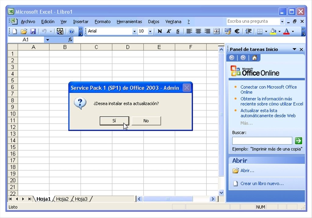
Office 2003: https://imag.malavida.com/mvimgbig/download-fs/office-2003-s...
Honestly even Excel 3.0 (1990) doesn't look that disimilar (https://goughlui.com/wp-content/uploads/2014/05/about-excel....)

So that's 17 years for toolbars vs 13 for ribbon
It even wouldn’t fully surprise me if, a few years from now, there were more MS Office users who never used the pre-ribbon interface than who had used it.
You are not even close to right. Excel for Windows is from 1987 (20 years with non-ribbon menus), Word for Windows is from 1989 (18 years with non-ribbon menus). And of course the menu bar paradigm itself is older still.
I have to use Excel enough that I've finally rote-memorized where frequently used things are. But when I have to find some tool I don't know where is, it is faster to google for instructions than hunt around the application itself, so I do that first.
I'm sure it is fine if you live in MS-land. I don't, and it fails for this casual user both for discoverability and streamlined use.
We knew all the shortcuts keys in the old version. The ribbon UI meant that a big chunk of the previous shortcuts didn't work anymore.
Killed our productivity for a good few months.
For a program as ubiquitous as Word (and as complicated as Word), unless there were clear benefits from the new interface, it shouldn't have been changed. The change itself was the problem.
Your comment is getting at an important, fundamental UX principle: all conceptual change is inherently painful, and every time you ask a user to re-learn something you are always wasting their time, even if the new design is better.
Sometimes a UX designer looks at two interfaces as completely separate, and thinks their job is just to pick the best one. The reality is that usually UX decisions can't be separated from the current state of the app. UX design is more like surgery, and the invasiveness of the operation has to be a consideration.
Having said that, I'm mildly skeptical that the interface didn't need to be changed. The old interface for Word was extremely user-unfriendly. If you go through a few of the interviews about Ribbon[0], there was some really interesting thought put into the new approach around discoverability, and while I'm not sure I agree with all of the theory they used to justify it[1], the changes did seem to be addressing a real problem.
But I think it's debatable whether or not the discoverability benefits were worth the pain, and I think there may have been better ways to roll out the changes.
[0]: sorry, too lazy to hunt them down and link them
[1]: I am mildly skeptical of contextual menus/toolbars. They're not wrong, they just have drawbacks that people don't always consider. Sometimes it's useful to tell people what is disabled, and to give them grounded, unchanging "landmarks" in the UX that they can use orient themselves while using a program.
It was a real nightmare! Especially when the old shortcuts were also remapped to a completely different function, and your moving s so fast you don't realise where your data has gone!
If I recall correctly, pasting data while removing duplicates in the ribbon interface was Alt+AQORT, but only Alt+XY in the old Excel (I don't remember what X and Y were, but I know it was a 2 key combo!)
If there was an alt-keyboard shortcut for paste removing duplicates, that should still work.
Edit: Forgot the AutoCAD command line. You can still turn that on too, and type commands like it's the 80s. It's actually kind of a paragon of a mature product that maintains all its older interfaces.
You might find this interesting - https://www.truity.com/blog/intuitives-guide-getting-along-s...
There was a discussion on HN about this a while back but most people learn computers by “if I want x I do y.” And guards just how they learn. Changing UI for them is catastrophic because they literally have to relearn -everything-. Op is probably a sensor and finds that stability tremendously useful.
This really helped me be less frustrated in seeing how people can’t just figure out technology on their own and how I can just mess with it until I figure out the ”language” the app is using to have users interact with it. Most people can’t do that.
Yes, but it's surprising to see a large contingent of them on HN and other technical forums. The rapid change of software technologies all but mandates adaptability and willingness to learn.
Like many others, I STILL to this day have to google to figure out where things are with the ribbon interface, probably the least intuitive interface I've ever used.
It is a little hard to parse what you mean, but Microsoft did a quite substantial amount of research leading up to the ribbon. A quick search on the net will lead you to summaries of it.
I vehemently disagree, in 2007 NOBODY liked the ribbon. My wife's company refused to upgrade until absolutely forced to because it was such an atrocity. The most glowing reviews I ever saw were "I guess I'll get used to it eventually" and/or someone who used office once a year and found navigation easier when the extent of their workflow was changing font sizes.
https://www.zdnet.com/article/oh-the-horror-why-is-microsoft...
https://answers.microsoft.com/en-us/msoffice/forum/all/turn-...
https://www.infoworld.com/article/2651076/microsoft-s-ribbon...
The problem is that the ribbon also killed the menu bar. Menu bars are a standard, known quantity across every application, which clean easy semantics for keyboard access. On some OSes they even augment the menus with searchability, celebrating the power of plain text.
That keep changing and moving about.
I use Word on Mac. It has the ribbon. 90% of the time I use the old style menu bar at the top of the screen.
It has the menu bar, which every Mac app has since it's a fixed and global UI element. It has the ribbon which is good for many users and makes many tasks easily accessible.
I'm not sure how you'd make this compromise on Windows without making a mess of things, but on the Mac it works very well.
Personally, I don't see the big ribbon issue. It's easy to search for arcane features in the help menu.
IMO, they really need a Mac where you get the top menu bar and a ribbon-like thing. Or some sort of gnarly keyboard mode that would become emacs for lawyers.
I find ribbon interfaces highly irritating anywhere I find them, which is rarely - they haven't really caught on outside a couple of MS apps, AFAIK.
Last year we recruited an attorney from a firm that still uses WordPerfect for all their documents.
They also maintain PaintShop Pro, WinDVD, and WinZip. I think they're running a retirement home for distinguished software products.
The thing is I get why people hang on to COBOL or Attachmate. The company licensing WinZip is the puzzler to me! :)
GP probably meant something like "forerunners" or "predecessors"; some form of "those who came before" that doesn't necessarily imply a familial relationship.
But from functional perspective I do like the old interface better, and especially that I can pullright to get at things without having to make multiple clicks.
A combat pilot would respectfully disagree. :)
Source: Diving pulling 5Gs canopy side down.
The most common operation is trying to decide which ribbon something is supposed to be on. And it's difficult to get straight even after more than a decade, if you're just an occasional MS-Office user.
That is literally the entire and sole purpose of a user interface.
What is the jank? It's a tabbed interface of buttons instead of menus and sub menus.
The most common operations are descriptive buttons.
Give someone word 2003 or word 2020 who has never used a word processor before. Which one would be more intuitive?
It's bad UI if people just learn where to click. They should be able to think in terms of "I want to do X" and be able to do that as quick as possible.
Of course with specialised tools that's a different story. AutoCAD hasn't really changed its interface but it got superceded in areas by new applications that break people's workflows in a lot of cases.
It's just a word processor. The knowledge you should have gained when being taught was the concepts of what you can do with one.
That should allow you to adapt to different software. Once you've used a word processor you don't need to read the help page for Google Docs.
It's not like switching from Maya to Blender.
I don't agree on the free software projects point. Often they're made by volunteers. And anything too "daring" would be shouted down by the community.