Windows 2000 was also one of the most consistently designed versions of Windows. XP also introduced tons of design language chaos as they only migrated some of the UI over to the new controls and left big chunks of the OS to languish. I think Control Panel had widget rot well into Windows 10 (Maybe still has this issue?).
I only grudgingly moved to XP and shortly after switched to Desktop Linux full time.
> I'm still rather baffled about how people look back fondly on XP
XP was the first consumer version of adult (non-w95 based) Windows. Relatively few people used Windows NT or Windows 2000. If you are one of the many people who's Windows use either started with XP or you went from W95 to XP, then XP was clearly the best Windows you've ever seen.
It's been 15+ years? since I regularly used Windows so maybe I'm mis-remembering this, but I definitely remember there being quite a few WTF moments working with the Windows XP Control Panel. Lots of changes for no apparent reason, and many weird/ jarring things. Its definitely not a Windows 10 thing because I've spent roughly 15 minutes using Windows 10.
Even in Classic View, there are admittedly some items that have user interface styles that date back to Windows 3.1 (one example being part of the Fonts area), so there are some oddities. But switching to Classic View takes care of a lot of them.
For example, the German version of Windows XP renamed the entry for "Software" to "Programme und Funktionen"/"Programs and functions".
It's something that even over a decade later keeps catching me off-guard because for the longest time I was so used to look for "S like software".
And Windows 10 did it again with the whole "App" thing where I'm still somewhat confused if that's the new name for software, or if I'm installing some kind of integrated gadget from the Windows store or what the actual difference between these two is supposed to be.

I had a machine that refused to sync NTP until I went into Control Panel, even though everything looked fine in the new Settings
After growing up with Amiga and then MacOS, I only really encountered Windows XP when I started my first proper job.
Couldn’t believe that that was the default OS for professionals and businesses. With all the chunky graphics and bright colours it looked so childish - like it was designed for preschoolers, not 98% of the world’s computing.
There was even a puppy animation when doing a search.
You could easily switch it to look like earlier versions of Windows, however. I miss that ability in 8.1 and 10; up through Window 7, I could make my desktop look like Windows 95 if I wanted to, and sometimes I did. Nothing like having a colleague walk up to you in 2017 and asking you, "is that Windows 2000?"
Control Panel: win 3.0 lineage
Computer Management/device manager: WinNT lineage
Settings: Win8 lineage
It's all a big mess. You want to configure your audio settings or printer? You'll find options in all three areas, all with slightly different UI controls.
If anything slowly rendering the older stuff obsolete and moving settings into the new unified settings system makes the most sense to move forward without people freaking out.
Your only options, for windows users is to do things very slowly or just don't move forward or innovate at all and as of today there is very little reason to dig into the older versions apart from very esoteric settings.
There are a few examples of things that are now much harder than they need to be because the settings have been spread over several different places, and you have to know the correct route to them or you get an incomplete settings menu.
Some Dell laptops will use a generic Windows driver for a mouse device, instead of installing the correct drivers for the trackpoint / Pointstick and touchpad. This is a suboptimal experience, and installing the correct drivers is harder than it needs to be.
But once you've installed the correct drivers where do you find the settings?
Start > Settings > Touchpad will give some settings, but not for the pointstick.
Device manager doesn't give you the settings.
Search > Control Panel > Hardware and Sound > Dell Touchpad > Launch Mouse Control Panel will give you a window that then allows you to open the Dell settings.
The easier way is to open the hidden icons in the notification area, right click Dell Touchpad, and open the settings from there.
I find it interesting that during the past 15 years the industry has switched away from 4:3 displays to 16:9 displays (which seem to provide more horizontal space at the expense of vertical space), yet Microsoft's designs seem to consume more vertical space as opposed to horizontal space. Instead of ribbons, I prefer the horizontal inspectors that are found in macOS applications.
On Hacker News I'm seeing more interest lately in the desktop UIs from the 1990s and 2000s. For example, the latest beta release of Haiku, an operating system inspired by BeOS, garnered a lot of attention. What I like about Windows 2000, macOS (both the classic Mac OS and Mac OS X), BeOS, GNOME 2, and other classic desktops is their utilitarian focus on design, where form and function are intertwined. UI design isn't about "the bling"; it's about providing a good experience to the user. Mac OS X's Aqua interface did a good job providing a compelling interface to users that was also beautiful. Unfortunately, some people only saw the "bling" and not the functionality behind the Aqua theming, and thus we've been suffering from fashion-driven UIs for nearly 20 years, a trend that has been made worse by the advent of mobile computing. Hopefully the pendulum will swing back to how things were in the 1990s; we can learn a lot from the human interface guidelines Microsoft and Apple published in that era.
I still have to think when I look at the control center on my phone, uh.. moon == Do not disturb, and is it on or not?? The faux-3d let you know. I also wish there was text under the controls.
I've resorted to turning on some of the contrast accessibility stuff to make it a little more usable.
And don't even get me started on the hamburger menu.
Vs code. How many seconds does it take to figure out the active code tab?
I think it traces transition from power users to casual. It makes sense, but there was no alternative. Screen become cluttered so much that most applications run on full screen only. And web become spoiled too - sticky headers everywhere (uBlock fixes this), wide content (media queries kicks in much narrower windows, Stylus to the rescue).
Explorer (shell) decorations is much to blame. Do we actually need task bar, title bar, menu bar, tool bar, status bar, scroll bar? I do not think so - plenty of space and distraction free [4]. There are a lot of tiling managers on Linux, but Windows has its share too. Like dwm port [5] (never tried on Windows) though I prefer wmii and xmonad with wmii layout.
[1] Windows Explorer Through the Years https://news.ycombinator.com/item?id=23487698
[2] Windows 1.0 tiling https://upload.wikimedia.org/wikipedia/commons/d/df/Microsof...
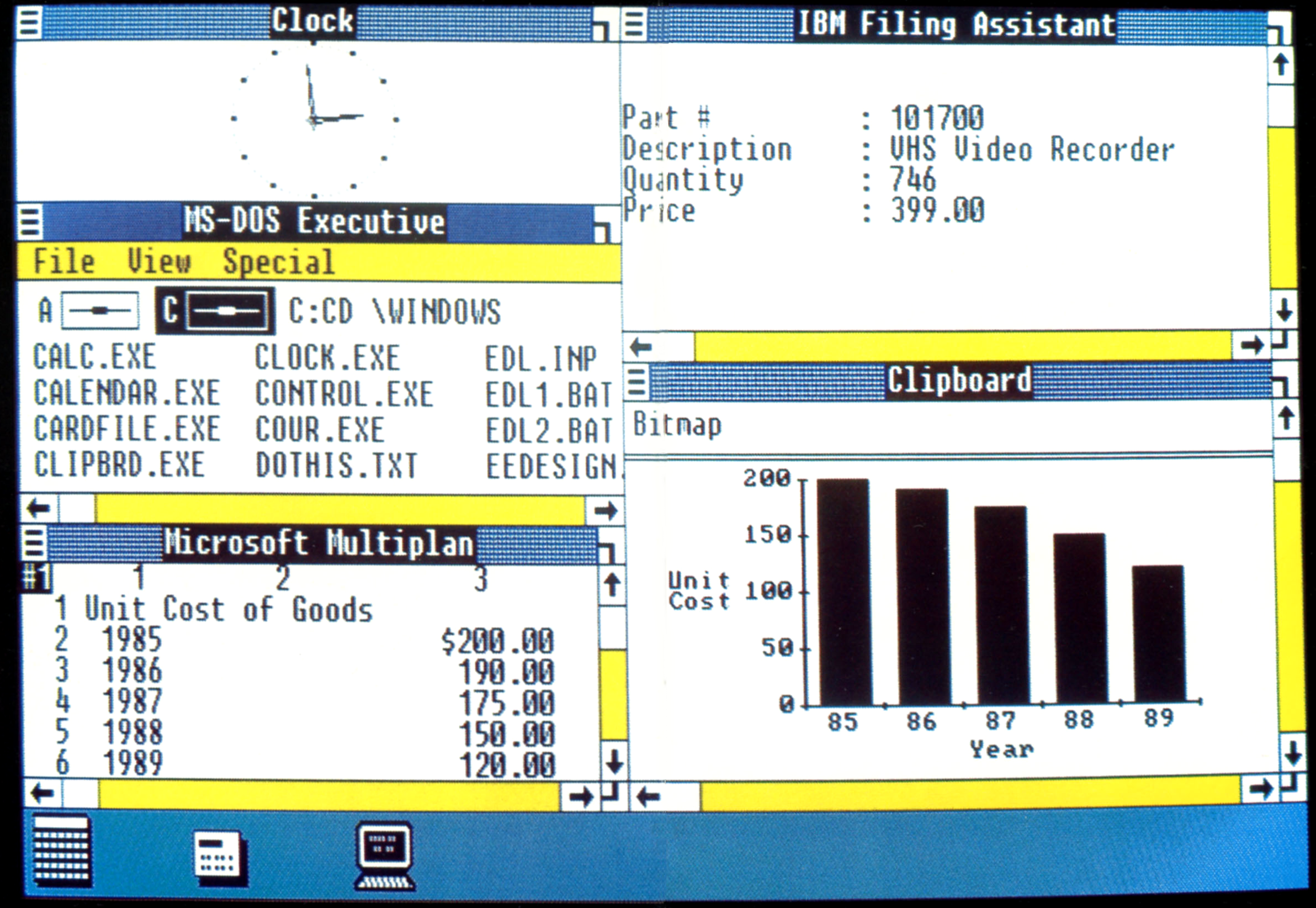
[3] Windows 10 tiling https://i2.wp.com/www.nextofwindows.com/wp-content/uploads/2...

[4] No decorations http://sergeykish.com/side-by-side-no-decorations.png

[5] DWM on Windows https://www.brain-dump.org/projects/dwm-win32/
While we've been thrown a few bones like start menu search, most of the gratuitous changes have been for the worse. Sleeker but harder to use for professionals. Gnome 2 was approaching Win2k but then made a hard turn into tablet/novice land. XFCE is in the neighborhood but never got to the level of Win2k.
I didn't care for skinz in the 90's and instead of going away, every app now is a unpredictable skinned mess.
Beyond that... the system appearance used prior to Platinum was, simply put, crude. It was an outgrowth of a UI design which had originally been constructed for black-and-white systems with limited CPU power, and it wasn't especially consistent. It lacked standard UI elements for many controls which had become common, like dropdown menus, utility windows, disclosure triangles, or tristate checkboxes, forcing many applications to implement their own inconsistent versions of these items. Even for the UI elements it implemented, like buttons and checkboxes, its appearance was simplistic in the extreme -- buttons were black outlined round-rects; checkboxes were black outlined squares, etc. There was very little use of color or shading outside of window chrome -- most of the UI was black and white, just as it had been from the start.
Hard disagree, Gnome 3 is like i3 except without the legacy cruft.
Agreed, yet somehow its Start menu is still better than what you get on Windows 10 these days: https://i.stack.imgur.com/rwZqf.jpg

> ...installing the Zune theme was the first thing I did after a fresh install to try and tone it down.
Everyone knows the best XP theme was Royale Noir! https://www.istartedsomething.com/20061029/royale-noir/
Or, maybe the Win8 one was better. It's a bit hard to be sure about this, but the first half of the comment stands.
I actually came to like the 8.1 Start screen, though it took awhile. Basically my most-used programs are pinned to the start screen, so I can tap Windows, and use the mouse to select one, with a large margin for error. Or I can search based on the name of the program, and unlike Windows 10, it's only to match local items, and not include any web results.
I think a big part of this is a combination of two factors: First, most non-tech people never ran Win2k. They went straight from 98/ME to XP. Second, no one remembers WinXP before SP2. (You know, when it was a complete trainwreck.)
FWIW, when I was doing software development in the latter days of XP, I found that I actually liked the style of the UI widgets from the default theme. Its just the titlebar and taskbar styles that I couldn't stand. However, some size tweaks made them more tolerable.
Oh well, who cares now, it lies in its well deserved grave, I guess.
Other people I know couldn't get past a VxD error on the first install, others couldn't get faster K6 or PIII's to be stable with it.
It was a love it or hate it thing--my opinion of Vista and 8.0 are similar.
It was an almost undeniable local maximum in Windows releases from the consumer side, which does make some of the fond memories make sense.
It often feels like the biggest difference between Vista and 7 was actually time. As such, the cheap computers 7 shipped on were much better than the cheap underpowered computers Vista shipped on (despite both OSes likely having similar realistic requirements).
Win7 kinda was the SP2 of Vista more than a major version.
This is probably a very unpopular opinion but I rather liked Windows Vista's design. It was still very compact compared with later designs, and it had a certain charm from its prevalent use of translucency. I disliked XP for the same reason you cited, and upgraded to Vista almost as soon as it came out, despite early Vista's instability.
I find flatUI far more brutalist in the way it disorients by removing and humane clues as to its structure and use.
Win7 had a fairly decent balance of shiny chrome and usability by reducing both of those, while still retaining enough visual cues to e.g. clearly highlight buttons.
>the classic theme was a lot leaner on system resources
maybe, but it probably also made things run slower because it forces everything to be done in software rather than hardware.
https://devblogs.microsoft.com/oldnewthing/20130327-00/?p=48...
>Starting in Windows Vista, a lot of visual effects were offloaded to the graphics card. Consequently, the impact on system performance for those visual effects is negligible, and sometimes turning off the effect actually makes your system run slower because you disabled hardware acceleration, forcing operations to be performed in software.
Weirder, MDI windows use Win7's classic\b\b\b\b\b\b aero basic styling, so apparently some of the Win7 styling is also still available.
Another major annoyance: the resize area for a window is seemingly 1 pixel wide. You used to be able to specify a width and all windows would be bordered with it. I get that Win10 looks sleeker but did they really have to take that control away
What really bothered me was that back in XP days it seemed that .theme files seemed really interchangeable save for MS signing. I remember downloading numerous theme files, placing them in the right spot, and installing a cracked themes dll, and they'd just work.
I wouldn't call them "classic". They're closer to the "aero basic" theme from vista/7 than the "classic" theme that was available from windows xp to windows 7.
It's really a bit of a mistake, maybe a limitation(?) of the Windows UI system.
I mean the border on OS X is 1px too but the resize area is about 8 pixels.
Would love it if MS could do another spin on the deep details and just make it all work nice.
> It's really a bit of a mistake, maybe a limitation(?) > of the Windows UI system. > > I mean the border on OS X is 1px too > but the resize area is about 8 pixels.
Is it? My impression is that Windows behaves the same there, i.e. the border is drawn 1 px wide, but the full width of it is still available for grabbing, only it's being drawn invisible. If I hover my mouse over a window border, the cursor certainly switches into resize mode for more than just 1 pixel's worth of distance.
You could in theory design a modern UI that resembles the classic UI, but it wouldn't really be "the classic UI". A large part of what makes the classic UI have the particular look it does is that it has custom constraint-layout logic for each control, the outputs of which are fed as parameters into the arbitrary hand-written GDI draw-call logic used to draw each control.
Some of the more interesting controls have Turing-hard constraint logic, which just can't be replicated in non-Turing-complete constraint-layout systems like XAML or CSS. (You can get close, but it requires using huge hierarchies of layout nodes with tons of overhead, where the Windows UI actually got by with very few.)
The classic theme supports arbitrary sizes (in px or "device-independent" units) for both text and widgets, which addresses HiDPI and touch readiness. What it might have trouble with however is mixed DPI, where moving a window across two screens requires rendering it with different pixel densities. But that was not on the horizon in the Windows 8.x days.
It doesn't always produce the most beautiful results, but it's serviceable. And to be fair, it's taken a long time for high-DPI to consistently look beautiful even on recent versions of Windows. I shudder to remember looking at Device Manager on a display set to 125% in the DPI settings.
This claim is entirely baseless. The "classic theme" is just a gray background plus some light/dark borders. There's absolutely zero difficulty doing that in hi-DPI, or any other environment for that matter.
Stop making excuses for Microsoft. Windows XP was a panicked and half baked response to the shinny Mac OS X Aqua interface, because that's what Microsoft had always done: following Apple's lead. I can't really blame them either, as following Apple's lead had led to great success for Microsoft.
Actually I lied, I do blame Microsoft for blindly chasing Apple's new shinny. Having established themselves as a pioneer and authority in UI design/usability with the revolutionary Windows 95 GUI, they should've had the confidence to stick to their guns and iterate their GUI without too much influence from the competition.
I bet this would look awesome. Especially in high DPI.
Disable transparency and windows animations (Settings > Display > Show transparency on Windows, Show animations in windows). Also disable "Fade or slide menus into view". Much better experience and not much to offload.
* Disabled transparency
* Disabled animations
* Disabled scroll-bars being auto-hidden
Unfortunately, I couldn't find "Fade or slide menus into view", but the rest of the settings are night and day! Thank you.
* My Computer
* Right click
* Properties
* System properties
* Advanced
* Performance
* Settings
* Uncheck "Fade or slide menus into view"
* Apply / OK
If I recall correctly, Win2K was a lot slower than NT 4.0 on the same hardware, and it featured some really bad UI ideas, like menus that auto-hide advanced menu items.
By the time XP was released I gave up the fight.
The initial XP theme was just awful; clearly a knee-jerk reaction to the OS X Aqua. It's too bad. The MS Whistler prototype screenshots looked great.
https://guidebookgallery.org/screenshots/whistler2257
The later XP theme (Powerpack?) was half decent.
Nowadays I only run Windows 2000 in a VM, and CRT refresh rate is no longer a concern, it may be worth considering going backing to NT4, as I'm pretty sure I can set the background to the warmer W2K gray in NT4. Thanks for the idea!
It was an interesting idea about how to combat the problem of having too many menu items, but it wasn't great for discoverability. I can understand why it faded out.
Title bar, menubar and toolbar nicely muted down on background windows. Very professional look. And taskbar - so clean. Thank you, I like it even more than Classic theme.
BeOS was a deliberately “vapourwave chiselled look with 90s cartoon icons” that screamed F.R.E.N.D.S and Melrose Place and edgy or avant-garde typography in nineties magazines.
NeXT on the other hand was austere, alabaster, eminently workable, but... so regular, so regular, so well thought-out, so utterly restrained and so internally consistent.
Those were wonderful GUIs. They had no pretence of disappearing into the background. They had to be clear signage for generations educated in the age of text-mode (and sometimes even still coming from the tail-end of the “typographic age”).
The late 90's screamed "workplace", "multimedia" and the information exchange era. Brutalist and futurism.
OFC Helvetica was mimicked from press, the media and press were HUGE back in the day, they had the same power as MS, Amazon, FB, Google and Netflix today. So we tried to clone magazines, VCRs, TV's, cubicles and stereos/radios in our computers. We succeeded.
Trying to explain the 90's with "vaporwave" is ridiculous. Those could be maybe for the early 90's demoscene for PC/Amiga. They were as obsolete in late 90's as Windows 98 today.
The late 90's were about replicating the mainstream media in your computer.
To get the best of both worlds I ran a spare copy of Windows Server 2003 as my "daily driver" on a Thinkpad back in the early 2000's. It had the Windows 2000 UI with the behind-the-scenes updates that came with Windows XP. Most software that installed on XP installed fine on Server 2003. It was nice.
I don't mind XP's look so much, but I always switched back to classic style. I loved the ability to customize every color, font, etc. The rainy day theme is still my favorite.
I see this all the time. A great deal of whitespace, and the "meat" of the display is confined to a small subsection with scroll bars.
One thing I like about HN is the focus on using the display for content, rather than decoration.
Imho that's probably based on Windows Vista setting the bar so low that, in contrast, XP looked like something rather good.
Best if run on a DEC Alpha chip
The in-your-face over decoration of UI's thankfully hasn't persisted, but instead we're seeing a similar kind of decadence among our supposedly minimal and flat interfaces. The misuse of space and screen real-estate has gotten pretty bad as of late, and I'm all for an appropriate amount of whitespace (I keep railing against certain linux DE's for not getting this right) but modern software seems to be devoid of any kind of efficiency with layout or a sensible information density.