I still have to think when I look at the control center on my phone, uh.. moon == Do not disturb, and is it on or not?? The faux-3d let you know. I also wish there was text under the controls.
I've resorted to turning on some of the contrast accessibility stuff to make it a little more usable.
And don't even get me started on the hamburger menu.
Vs code. How many seconds does it take to figure out the active code tab?
I think it traces transition from power users to casual. It makes sense, but there was no alternative. Screen become cluttered so much that most applications run on full screen only. And web become spoiled too - sticky headers everywhere (uBlock fixes this), wide content (media queries kicks in much narrower windows, Stylus to the rescue).
Explorer (shell) decorations is much to blame. Do we actually need task bar, title bar, menu bar, tool bar, status bar, scroll bar? I do not think so - plenty of space and distraction free [4]. There are a lot of tiling managers on Linux, but Windows has its share too. Like dwm port [5] (never tried on Windows) though I prefer wmii and xmonad with wmii layout.
[1] Windows Explorer Through the Years https://news.ycombinator.com/item?id=23487698
[2] Windows 1.0 tiling https://upload.wikimedia.org/wikipedia/commons/d/df/Microsof...
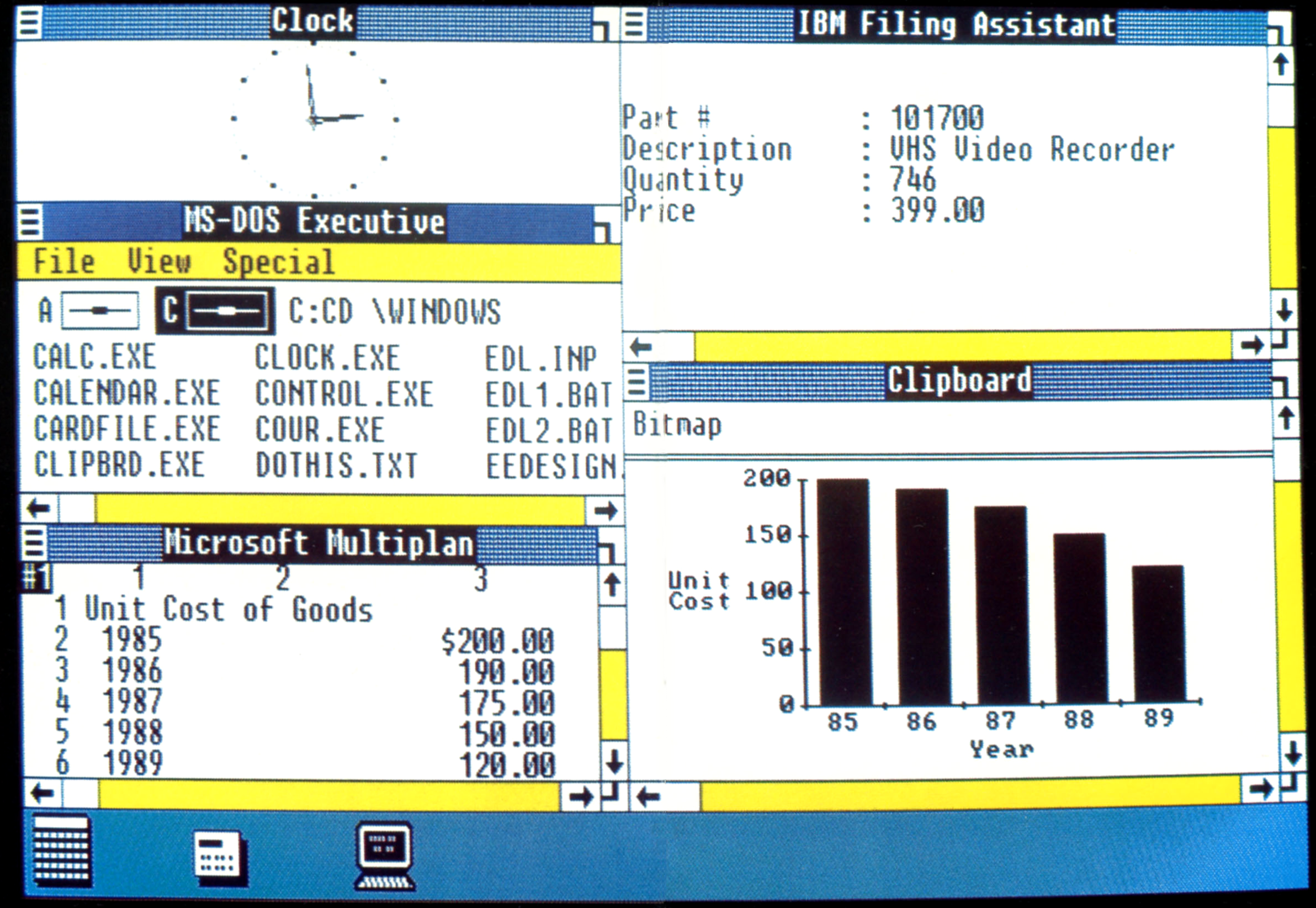
[3] Windows 10 tiling https://i2.wp.com/www.nextofwindows.com/wp-content/uploads/2...

[4] No decorations http://sergeykish.com/side-by-side-no-decorations.png

[5] DWM on Windows https://www.brain-dump.org/projects/dwm-win32/
I find it interesting that during the past 15 years the industry has switched away from 4:3 displays to 16:9 displays (which seem to provide more horizontal space at the expense of vertical space), yet Microsoft's designs seem to consume more vertical space as opposed to horizontal space. Instead of ribbons, I prefer the horizontal inspectors that are found in macOS applications.
On Hacker News I'm seeing more interest lately in the desktop UIs from the 1990s and 2000s. For example, the latest beta release of Haiku, an operating system inspired by BeOS, garnered a lot of attention. What I like about Windows 2000, macOS (both the classic Mac OS and Mac OS X), BeOS, GNOME 2, and other classic desktops is their utilitarian focus on design, where form and function are intertwined. UI design isn't about "the bling"; it's about providing a good experience to the user. Mac OS X's Aqua interface did a good job providing a compelling interface to users that was also beautiful. Unfortunately, some people only saw the "bling" and not the functionality behind the Aqua theming, and thus we've been suffering from fashion-driven UIs for nearly 20 years, a trend that has been made worse by the advent of mobile computing. Hopefully the pendulum will swing back to how things were in the 1990s; we can learn a lot from the human interface guidelines Microsoft and Apple published in that era.