lots of whitespace and "air" has become especially fashionable in the past many years. it makes design easier in some ways without necessarily pushing it forward. yes, it forces more conscientiousness of essentiality and contribution of each element (a good thing), but it's also used as an ipso facto justification to resist change and meeting needs (a bad thing).
i love seeing designs that are intricate yet coherent. that seems to push boundaries more than "air". that approach seems more challenging than "cut as many elements as necessary to achieve a desired white space ratio".
[0] https://www.bulkrenameutility.co.uk/assets/img-bru/mainscr.p...
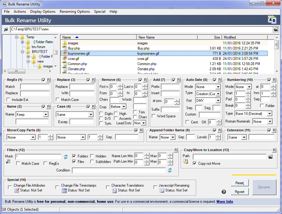
And I don't even see a reason that all these different modes need to be visible at the same time. It also takes up alot of space.
There are probably many ways to make this more user friendly, but if it works for you, thats great
As the parent comment said, software should really be built for the user and not just so everyone and their children can use it (unless that's your target group).
Financial terminals don't have the super nice designs to it, but they are highly functional, customizable and fast. A lot of cashier terminals are still running on old hardware with bad designs, yet they are highly functional.
I think there's always room for improvement and with every change you'll see a certain amount of push back, but I think it's important to consider the user and not write "simplified" software, when you have power users in front of you.
It is also true that looking cluttered at first sight does not mean it's not good UX.
Just sticking to some proven standards, even from a 20 year old software book, can really enhance an interface. Right off the bat I can spot a half dozen instances where a text input could easily span to align with an element above it, but it falls a few pixels short.
here we call it the deer - headlight problem. why doesn't the deer dodge? because it's a novel situation, he's under pressure to understand and there's no frame of reference for instincts to take over
same with non driven users (users that aren't doing a specific job) having a novel interface, they don't know which operations and options are irreversibile and so get frozen trying to understand everything the computers tells them at once and once they're overwhelmed they just get stuck
giving UX air is a good catchall that both forces you to parcel only what's important for your user and help user not getting overwhelmed by options
a more detailed advice would be to present branching decisions in order of commitment and only showing the relevant options at each step, but more whitespace is a good rule of thumb because it forces you into wizards without becoming a mouthful like this one, and gives you enough agency to come up with alternatives design to wizards of you can get by with other representations of the data to be manipulated
That's a dangerous thing to say, I think. Because the way it looks is the way it works.
A huge part of design is managing the prominence (and presence/absence) of various elements, so people understand what something does, and find it as effortless as possible to find and take the actions they want.
Prominence is managed by relative size, weight, hue, brightness, saturation, shadow, whitespace, opacity, ornamentation, vertical ordering, horizontal ordering, and so on.
All of those things are how it "looks".
Presence/absence is managed by hierarchy, expand, hover, etc.
All of those are also how it looks, by what's removed or shown.
I think I agree with where you're coming from, especially in your last paragraph. I'm just worried that your first sentence is easily misinterpretable as "as long as all the information is on the webpage, fonts/colors/spacing are mostly irrelevant".
For most, yes, it will end up represented in 'how it looks', but I'm underlining the importance of 'how it got there'.
(Aside: worth just highlighting for everyone that not everyone is sighted, that accessibility matters, and that not every design choice is visual.)
You're thinking of visual design. That's obviously a significant part of a thing's design, but design is about so much more.
This is such a common problem that there is a meme about it "Can you make it pop a little more?".
Providing advice to technical folks is just a small part of this problem.
The IDEO philosophy – which has really influenced a lot of Silicon Valley's best teams – is all about what you're saying. Design Thinking is really about making everyone on the team a designer. Everyone has their speciality, but the Designer's role is to bring everyone together with a process that involves everyone.
This was the approach used by Apple when they first launched their Apple Stores, twenty years ago. Rather than impose a design created in a vacuum, they brought together a diverse team that included someone representing the retail employee perspective.
Also, just to nitpick - Apple has produced some of the worst products with no understanding of what the user wants - for e.g. Apple Music App. Also, Google, a recent one - Google Meet hides its mute/unmute button and in a completely undiscoverable way. Imagine driving a car where the brake pedal disappears only to appear when you hover your arm in a particular position left of the steering wheel. Now you can apply brakes. That's what they're doing with Google Meet, when I want to unmute to say something, I have to hover my mouse on the bottom of the screen and the unmute button pops up. Why isn't it always visible!? If I were leading that project, I would ask the team to scratch the entire UI and rebuild it and make sure these things don't happen again.
Microsoft Teams does the same thing, only with the entire toolbar, not just a single button.
The former tries to distill design into a largely linear, repeatable process (that can be peddled by consultants, if I’m being a bit cynical), the latter would characterize such approaches as reductionist and limiting.
Dangerous to separate these. Poorly looking sites have poor experiences. Of course, aesthetics are subjective, so I'm speaking generally here.
My philosophy for design is to always, without exception, strive for a good looking and functioning site. You can't have a site that works well that looks like shit. Conversely you can often find sites that look great but are absolutely unusable.
The best Visual Designers have superb pattern-recognition skills for applying principles they've become familiar with in their education and professional work. They can quickly recognize a certain type of problem, and call on their depth of experience to apply a solution. But even the best can slip into habit of using well-worn tricks in situations where perhaps a different approach would be more fitting.
There are many sites that work well even though they look like shit. Craigslist is a good example.
You said "poorly looking sites" can't work well. But Craigslist works fine, even though it's visual design is as homely as anything you'll find.
The point is that "visual design" is not "design". If you don't like my example, surely you can think of others.
I think:
1) Design is like a muscle, you can always develop it
2) Digital experiences [1] are all around us! And they play a more pivotal role in our lives as time goes on.
So, hit the gym (practice) & with time everyone can improve.
[1] As the https://mintdata.com founder here, I'm highly biased -- I'm not a designer but certainly aspire to improve along this dimension.
I agree that it's trainable, but to create a good icon a first timer can spend several hours. Several hours in which they could be doing work that they have trained for.
If one intents to be a sole developer then yes, they have to improve in all fields, but when one is in a team one has to let some things go, and let people better than them on that field do them.
In fact a UI is a programming language, just a visual, and usually very constrained one (for better or worse).
What I'm saying is that beauty in design doesn't come from slapping a facade onto something. It comes from a harmonious relationship between all the elements, adding up to something that solves the particular 'problem' of that site.
UI is a specialization within UX, the way databases are a specialization within Computer Science. CS deals more broadly in the constraints of memory, time, resources, etc. Databases deal with the same things, but through a specific lens.
UX deals with a set of constraints as well. The business needs, the user needs, etc. UI deals with a narrower subset of those constraints.
The fonts you choose, the colors you choose, the information density – if these are intentional choices based on your particular set of constraints, you'll end up with something elegant. That elegance is what makes something feel right.
Design is technical. Illustration is creative.
To expand on that, it’s how the pieces fit together within your set of constraints. There’s a LOT in common with what makes code beautiful or not. You get to the essential; nothing more, nothing less. This doesn’t mean “minimalist” , per se — just be wary of ornamentation that doesn’t add value.
A design can be award-winning without much “flash”. A readable font. A thoughtful, consistent, grid, that gives the content some air. Color choices based on accessibility, constrained to a palette that has some meaning for the project, etc.
Don’t be afraid to learn about design! Look to resources like IDEO, who take a principled approach to design that’s not superficial. Think about the field of Architecture, where engineering and aesthetics have been combined for centuries — and where the same concerns of “essential” vs “ornamental” remain an active area of debate to this day.