[0] https://www.bulkrenameutility.co.uk/assets/img-bru/mainscr.p...
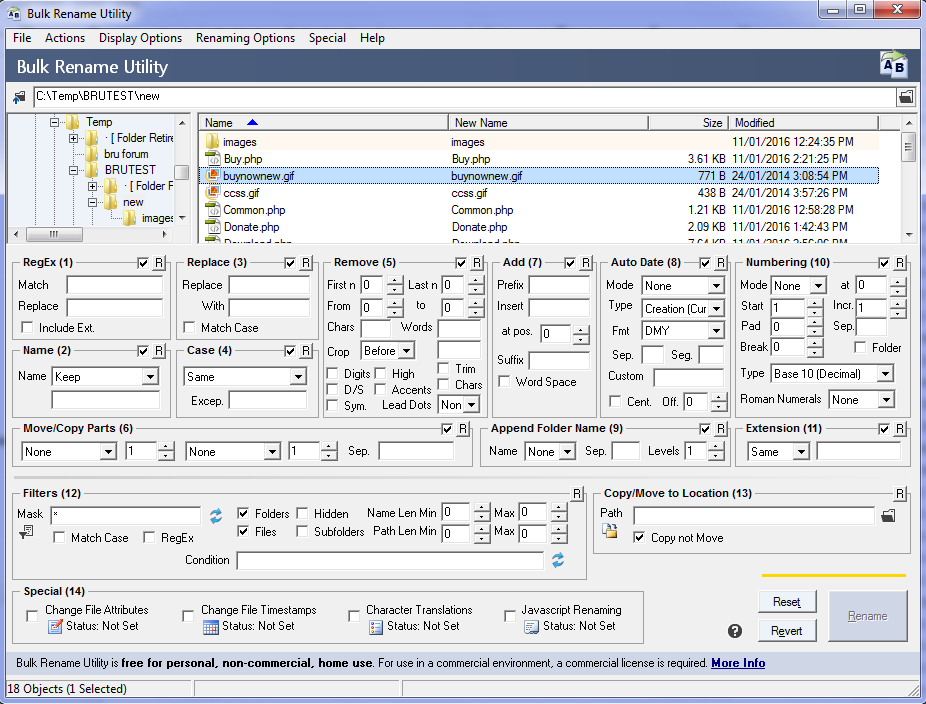
And I don't even see a reason that all these different modes need to be visible at the same time. It also takes up alot of space.
There are probably many ways to make this more user friendly, but if it works for you, thats great
As the parent comment said, software should really be built for the user and not just so everyone and their children can use it (unless that's your target group).
Financial terminals don't have the super nice designs to it, but they are highly functional, customizable and fast. A lot of cashier terminals are still running on old hardware with bad designs, yet they are highly functional.
I think there's always room for improvement and with every change you'll see a certain amount of push back, but I think it's important to consider the user and not write "simplified" software, when you have power users in front of you.
It is also true that looking cluttered at first sight does not mean it's not good UX.
Just sticking to some proven standards, even from a 20 year old software book, can really enhance an interface. Right off the bat I can spot a half dozen instances where a text input could easily span to align with an element above it, but it falls a few pixels short.
here we call it the deer - headlight problem. why doesn't the deer dodge? because it's a novel situation, he's under pressure to understand and there's no frame of reference for instincts to take over
same with non driven users (users that aren't doing a specific job) having a novel interface, they don't know which operations and options are irreversibile and so get frozen trying to understand everything the computers tells them at once and once they're overwhelmed they just get stuck
giving UX air is a good catchall that both forces you to parcel only what's important for your user and help user not getting overwhelmed by options
a more detailed advice would be to present branching decisions in order of commitment and only showing the relevant options at each step, but more whitespace is a good rule of thumb because it forces you into wizards without becoming a mouthful like this one, and gives you enough agency to come up with alternatives design to wizards of you can get by with other representations of the data to be manipulated
lots of whitespace and "air" has become especially fashionable in the past many years. it makes design easier in some ways without necessarily pushing it forward. yes, it forces more conscientiousness of essentiality and contribution of each element (a good thing), but it's also used as an ipso facto justification to resist change and meeting needs (a bad thing).
i love seeing designs that are intricate yet coherent. that seems to push boundaries more than "air". that approach seems more challenging than "cut as many elements as necessary to achieve a desired white space ratio".