News for hackers. Stuff that matters.
Re:Creating Windows XP Icons (2001) by nexuist on Thursday December 13, 2018 @01:31AM (#18670292)
Maybe this is just me, but does anyone else think the XP design is timeless? Maybe it's because I grew up with it, but looking at these icons....it's not ugly. The interface strikes a good balance between skeuomorphism and unique digital design that I feel is missing from all of today's UI designs.

I don't know. I think XP looks nice, even compared to today's standards.

Re:Creating Windows XP Icons (2001) by int_19h on Thursday December 13, 2018 @05:34AM (#18671282)
Personally I hated the default look and feel back when it was released. It was screaming "plastic" all over, except for Luna Silver. Icons were less plasticky than the rest of it, but still meh.

IMO, the timeless Windows look is Win2K - it's when they got the original Win95 / WinNT4 look perfect. They adjusted the colors a little bit so it was less dark, and IIRC that was also the first version to have sky blue wallpaper background by default, and blue gradient title bars. It was also the first to switch from MS Sans Serif to Tahoma 8pt for the UI font, and Tahoma was pretty much pixel perfect at that size.

So the overall effect was that it looked more cheerful than Win9x, but not cartoonish.

https://i.imgur.com/jwzJiSW.png

Re:Creating Windows XP Icons (2001) by V-2 on Thursday December 13, 2018 @07:04AM (#18671685)
I liked the non-standard, black Zune theme on XP. The default blue one is indeed timeless, but not in a positive sense, imho. It was a textbook case of the UI drawing attention to itself for the sake of it. When the dominating colour is so bright and jarring, how do you make the accents stand out?
Re:Creating Windows XP Icons (2001) by V-2 on Thursday December 13, 2018 @07:07AM (#18671701)
Re:Creating Windows XP Icons (2001) by amenod on Thursday December 13, 2018 @12:59PM (#18674428)
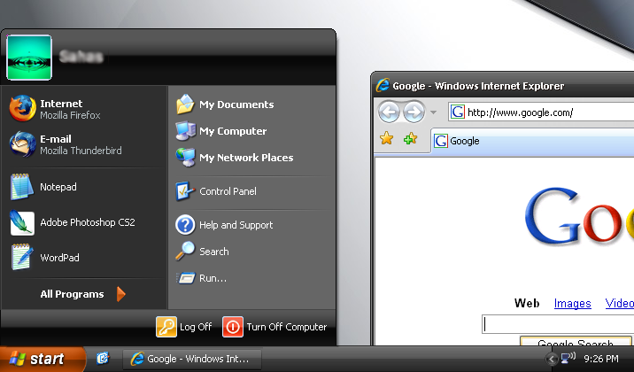
Is it just me or was this Start menu much easier to navigate than the Win10 one?
Re:Creating Windows XP Icons (2001) by naikrovek on Thursday December 13, 2018 @03:15PM (#18675622)
Not just you, but I don't see how it's any easier. Most of the same stuff is on that start menu as is on as the Win10 version, they're just arranged slightly differently.

People like what they like, you don't have to justify why. I hate carrots. Why? Doesn't matter, it's still a valid choice, same as start menus.

Re:Creating Windows XP Icons (2001) by Alex_Fragd on Thursday December 13, 2018 @09:09AM (#18672368)
this image brings a wistful tear to my eye
Re:Creating Windows XP Icons (2001) by bwat49 on Thursday December 13, 2018 @01:03PM (#18674477)
I liked the Royale theme that came with the media center edition
Re:Creating Windows XP Icons (2001) by babypuncher on Thursday December 13, 2018 @02:25PM (#18675179)
I liked the blue variant of this called "Royale"
Re:Creating Windows XP Icons (2001) by Shorel on Thursday December 13, 2018 @07:26AM (#18671813)
I still use it in my XP partition.
Re:Creating Windows XP Icons (2001) by richev on Thursday December 13, 2018 @07:49AM (#18671914)
I think that the blue gradient title bars came in with Windows 98. I remember marveling at how smooth the gradient was!

Before that, the Office 95 applications had a curiously black-to-dark-blue custom drawn title bar.

Then Windows 2000 introduced the subtle mouse pointer shadow, and translucent fade-on-click effect on menu items.

Agree with you about Tahoma being pixel perfect, at 8 point I think. Then came the marvels of ClearType!

Re:Creating Windows XP Icons (2001) by int_19h on Thursday December 13, 2018 @05:07PM (#18676565)
You're right - the gradient was in Win98.

As far as translucency - Win2K introduced the new APIs that any app could use to make a window translucent. That was used for those fade-on-click effects, and also for tooltips. But after people figured out that you could do it on any top-level window, there was a brief craze where random apps added it as an option, sometimes for no reason at all other than showing off (like, why would a CD burning app need a translucent window?).

Re:Creating Windows XP Icons (2001) by zozbot123 on Thursday December 13, 2018 @09:15AM (#18672405)
> I remember marveling at how smooth the gradient was!

Ironically, you used to be able to run KDE1 in 8 bits per pixel color mode (256-color palette - quite important for performance back then) and that did support titlebar gradients, unlike Win98 in the same hardware mode. That gradient was far from "smooth" of course, but like its Windows equivalent, it was still very helpful in making it easier to spot the titlebar at a glance.

Re:Creating Windows XP Icons (2001) by UI_at_80x24 on Thursday December 13, 2018 @10:13AM (#18672809)
I agree 100%.

IMHO it was the pinnacle of 2D UI design. Clickable areas were visually obvious, and there was no ambiguity about what happened and why.

And now we live in a world where fashion rules over function.

Re:Creating Windows XP Icons (2001) by petilon on Thursday December 13, 2018 @10:35AM (#18672994)
Windows 95's 3D look & feel was copied from NeXTSTEP. To me the pinnacle of 2D UI design was OS X from Steve Jobs' time. https://en.wikipedia.org/wiki/Mac_OS_X_Tiger#/media/File:Tig...
Re:Creating Windows XP Icons (2001) by gnu8 on Thursday December 13, 2018 @10:45AM (#18673107)
I miss the brushed metal theme too, but Tiger never looked quite right. There is way too much white space in that finder window, especially compared to the way the dock packs them so close together. The icons on the side bar not matching the folder icons is also annoying, when the document icons already don’t match the application icons on the dock. There are three different symbols on the screen for music, and that doesn’t make visual sense.
Re:Creating Windows XP Icons (2001) by int_19h on Thursday December 13, 2018 @05:09PM (#18676589)
Looking at NeXTSTEP screenshots, I would say that what got copied was the grey color palette used to make the widgets non-flat. But the actual widgets are rather different, that aside.

And didn't NeXTSTEP built on Motif in turn? Is Motif the granddaddy of "chiseled 2D", or was there something before it?

Re:Creating Windows XP Icons (2001) by brazzledazzle on Thursday December 13, 2018 @05:51AM (#18671352)
I’m right there with you I think but for me it’s Win2K3. Not hugely different but there were enough UI changes to make it feel like peak Windows design. Superficially they might look pretty similar but I think it’s worth mentioning as a distinct product instead of lumping them together.
Re:Creating Windows XP Icons (2001) by int_19h on Thursday December 13, 2018 @06:35AM (#18671549)
Win2K3 was basically Win2K + XP icons, as I recall. I did the same thing in XP, always switching it to classic mode. Then later in Vista, and even in 7 for a while. Unfortunately it's gone in 8+...
Re:Creating Windows XP Icons (2001) by zozbot123 on Thursday December 13, 2018 @09:28AM (#18672482)
"Windows Classic"-like widgets are also gone from GTK3 in Linux (whereas GTK2 still has its "Redmond" widget mode). Luckily the default 'Adwaita' theme is quite close in appearance, even more than what's now in Windows 8 or 10.
Re:Creating Windows XP Icons (2001) by jszymborski on Thursday December 13, 2018 @11:51AM (#18673760)
You can similarly get MATE really close to the classic windows UI using the Redmond theme.
Re:Creating Windows XP Icons (2001) by zozbot123 on Thursday December 13, 2018 @12:21PM (#18674042)
I know about that being an option in Ubuntu MATE, at least. But AIUI that's about 'UI' as in the large-scale layout of the desktop environment, with the "Redmond" option giving you a 'traditional' taskbar and system notification tray. (You can definitely get the same thing going in Xfce, though it involves fiddling with the panels - and it's a default in Cinnamon and LXDE.) Widget style is its own thing, though.
Re:Creating Windows XP Icons (2001) by pmorici on Thursday December 13, 2018 @07:26AM (#18671812)
The first thing I always do / did was switch to the "Windows Classic" theme.
Re:Creating Windows XP Icons (2001) by degenerate on Thursday December 13, 2018 @07:42AM (#18671877)
I've been using "Classic Start" ever since it came out, and I wish there was a way to make Win10 feel more like 2000/XP/Win7 visually. Having a functioning start menu is good enough I guess.
Re:Creating Windows XP Icons (2001) by rubyfan on Thursday December 13, 2018 @09:42AM (#18672582)
Windows Whistler Beta circa 2000. Had the simplicity of W2K with a little flair and a new start button menu. Way better than all the noise you see today.
Re:Creating Windows XP Icons (2001) by pndy on Thursday December 13, 2018 @11:57AM (#18673815)
There were Visual Styles mimicking Whistler theme from betas dubbed as "Watercolor" [1], [2]

[1]: https://i.imgur.com/gpJbTLl.jpg

[2]: https://i.imgur.com/lpKrYe0.jpg

Majority of powerusers despised default Luna and often used Classic theme instead; Watercolor had a potential of being Classic v2 with its 9x simplicity and modern (as for those days) touch, sadly it wasn't included by default.

Re:Creating Windows XP Icons (2001) by rubyfan on Friday December 14, 2018 @07:30AM (#18680333)
I loved that style and was so disappointed with what XP shipped with. I’d still take that style of any Win10 style.
Re:Creating Windows XP Icons (2001) by babypuncher on Thursday December 13, 2018 @02:25PM (#18675176)
Windows 98 also had a gradient in title bars if you ran your desktop at a high enough color depth, though the colors they used were less tasteful than Windows 2000.
Re:Creating Windows XP Icons (2001) by pndy on Thursday December 13, 2018 @07:05AM (#18671692)
> The interface strikes a good balance between skeuomorphism and unique digital design

I've read many times people called it Fisher Price UI because how it resembled the colorful plastic used in kids toys. Personally I liked the default blue Luna until people figured out how to crack uxtheme.dll (which MS liked to patch back to its own defaults) and Visual Styles become a thing which opened the way to the real customization of Windows interface. Before Vista was released the greatest achievement of skinning community was releasing packages which were replacing default system bitmaps and often obsolete 9x graphical elements and giving in return the true visual integration. But there was also a price - system could be bricked once update was applied.

The true skeuomorphism Microsoft has achieved in Vista - mostly with plexiglass-looking icons which flattened isometric variants are present today in Windows 10. Vista and 7 UI was more closer to OSX Aqua than XP's Luna was but today, both systems as well as Linux DE (notably KDE's Breeze) are following simplicity of semi-plastic flat simple interfaces. Still, in my opinion the Metro design of Windows 10 seems to be least pleasant among all current operating systems UI design but the weird announcement of Office new default icons (I assume there's nothing else to introduce in term of office suite features so new icons set is the way to show that developers do something) seem to previewing another change coming to Windows as an attempt to improve its UI look and feel. Even as some criticized already that these icons look similar to Google's in mockups presented on video, I think such change will do some good to all that Metro's silhouettes.

As for last thing: there were attempts of porting OSX Aqua onto Windows in various Visual Styles, resources packages which obviously look ridiculous; even WindowsBlinds had own theme but not everyone knows that there were also people going the opposite way: https://i.imgur.com/wAm23tU.gif

Re:Creating Windows XP Icons (2001) by crazygringo on Thursday December 13, 2018 @10:00AM (#18672720)
Kind of: there has rarely been an OS interface before or since that has been so consistent and clear. (The earlier System 7 is the only other one that comes to mind.)

Yes, XP was plastic-y, cartoon-y, a little day-glo, verging on infantile.

BUT: everything felt meticulously planned, logical, consistent, and easy-to-use. Everything felt like it was in it's "right" place. It was a triumph of UX for its time.

Unlike today, where OS's tend to include a confusing mix of paradigms that are anything but consistent. E.g. on macOS, a totally confusing mix of UX skins ("traditional", iOS-inspired like Stocks and Voice Memos, skeumorphic dashboard widgets, old "dark" apps like GarageBand, new "dark" mode for all).

Re:Creating Windows XP Icons (2001) by combatentropy on Thursday December 13, 2018 @11:03AM (#18673292)
> does anyone else think the XP design is timeless? Maybe it's because I grew up with it

I think it's because you grew up with it. For me, the original Macintosh icons seem timeless. Really it's just nostalgia.

Windows XP repels me, as does any other version of Windows, even Windows 10, though it is nearer my taste. This is because no Windows version was ever my computer as a child, when the nostalgia pixie dust is trapped in your heart. Instead I was a Mac user in the 80s and 90s, then switched to Linux. I had to use Windows many times, but it was always forced upon me, which does not help engender warm feelings. Furthermore Windows always seemed to me slow, flaky, clunky, bloated, and corrupt in all senses of the word.

If I were to try to dissociate these feelings from the style of the icons, I still think they are not timeless. In fact it's quite the opposite, they look chintzy and faddish. Their colors are too garish, and there is too much detail. I like icons that are efficient, conveying information with a lightweight visual footprint, like the Reinhardt icons, https://store.kde.org/p/1120613/

Re:Creating Windows XP Icons (2001) by Aardwolf on Thursday December 13, 2018 @06:49AM (#18671616)
The win95/win98/win2k default design is timeless imho, not the bright colored default xp one (in my eyes at least)

P.S. I hate that no modern Linux desktop design has a proper distinction between selected and non selected window. They all only subtly change the text color on top of the window, no clear distinction like "blue is selected, gray is non selected window"

Re:Creating Windows XP Icons (2001) by KozmoNau7 on Thursday December 13, 2018 @07:08AM (#18671709)
KDE with the default Breeze theme has good distinction between selected and nonselected Windows.
Re:Creating Windows XP Icons (2001) by agumonkey on Thursday December 13, 2018 @12:58PM (#18674419)
I'd add win3.x/OS2warp. There's something there too. It's super bare, but extremely friendly.
Re:Creating Windows XP Icons (2001) by zapzupnz on Thursday December 13, 2018 @02:37AM (#18670520)
I always thought it was hideous, but I liked that it stood apart from Mac OS X rather than copying it. I think the Royale theme was nicer than Luna and somewhat wish it had become the new theme from Service Pack 2 onwards.

As for the icons, I liked them but they could look a bit unclear as to what they were supposed to represent. Windows ME's icons looked a bit clearer, but even those were styled a bit bizarrely to me: soft-rounded edges for icons that basically looked exactly liked the hard-edged Windows 95 icons.

What I think were better than XP's icons themselves were XP-inspired icons that came out at the same time, bringing a bit of polish to icons that were still using only 16 colours in a 16x16 resolution.

Re:Creating Windows XP Icons (2001) by Jaruzel on Thursday December 13, 2018 @04:24AM (#18670997)
> I think the Royale theme was nicer than Luna

Out of all the 'official' themes, my favourite was the Zune theme. Grey/Black with sprinkles of Orange.

https://media.askvg.com/articles/images/Zune_Theme_XP.png

The default Zune wallpaper was bad though, so always changed that.

Re:Creating Windows XP Icons (2001) by GuB-42 on Thursday December 13, 2018 @06:36AM (#18671561)
I prefer the Windows 2000 style myself, at least when it comes to "timelessness".

The issue I have with the XP style is the perspective, it is not consistent. Some icons are front facing, others have perspective, and it changes depending on the icon size.

I mean, I think it is a nice style, and I agree with you when you mention the balance between skeuomorphism and unique digital design. But it may not be boring enough to become timeless.

Re:Creating Windows XP Icons (2001) by userbinator on Thursday December 13, 2018 @07:42AM (#18671878)
I think all the icons up to Win7 were pretty good. It was 8+ that started the horrible "flat" trend for everything.

It's not just icons and UI elements; all the general art at MS seems to have this bland lifeless style now. See https://blogs.business.microsoft.com/wp-content/uploads/azur... and https://uploads.fireside.fm/images/0/04cfe804-4075-406f-9c32... for example. Even anime has more depth than that.


Re:Creating Windows XP Icons (2001) by wodenokoto on Thursday December 13, 2018 @04:48AM (#18671108)
That is very much just you. At the time it was considered plasticly and ugly, and "Fisher Price" still comes to mind when I look at the start menu, though I too have gotten very much used to the look of XP.

It does have some bevels and shadows around buttons and boxes that I agree are missing in modern design, but that does make it timeless, just practical.

Re:Creating Windows XP Icons (2001) by CJKerr on Thursday December 13, 2018 @02:38AM (#18670523)
The first computer I used had Windows 3.1, so I'm not sure if I "grew up with" XP.... but no, it looks super dated to me. The icons are OK, the rest of Luna is fairly ugly.

There might be something to your theory, though - I think the Windows 2000 design still looks pretty good, although the colour palette is broadly too dark and saturated by modern standards. Perhaps we just get attached to the systems we remember liking.

Re:Creating Windows XP Icons (2001) by eponeponepon on Thursday December 13, 2018 @04:22AM (#18670990)
I don't think there's any perhaps about it - the visual surroundings of our childhood and youth will always have particular associations.

FWIW, I've been stoically making every desktop I've used look as close as I can make it to the Windows 2000 desktop I had at university for years now.

Re:Creating Windows XP Icons (2001) by qubex on Thursday December 13, 2018 @06:08AM (#18671427)
I know what you mean: Windows 2000 ”looks like home” to me too.
Re:Creating Windows XP Icons (2001) by andai on Thursday December 13, 2018 @01:00PM (#18674454)
I installed W10 recently after years of not using Windows to see how things are. Discovered there's no classic theme and promptly uninstalled it.
Re:Creating Windows XP Icons (2001) by toyg on Thursday December 13, 2018 @09:45AM (#18672603)
This - nostalgia is a huge factor. However, I used OSX very little and still think their pre-Yosemite traditional skeuomorphic icons were the best ever. Other elements of their UI weren't good, but the icons were simply beautiful to work with.
Re:Creating Windows XP Icons (2001) by walrus01 on Thursday December 13, 2018 @02:35AM (#18670516)
I mostly agree with you, and also think that KDE2 from around 2002-2003 was a high point in functional, low drag, low resource intensive BSD/Linux desktops.

https://www.google.com/search?q=kde2+screenshots

The closest I can get these days is a highly modified XFCE4 desktop.

Re:Creating Windows XP Icons (2001) by atoav on Thursday December 13, 2018 @02:41AM (#18670531)
Timeless Design means something else: it doesn’t mean that a design looks nice even today, but it is used to describe designs that go beyond shorter lived trends. E.g. imagine modern furniture from the time around 1900 that looks as if it could have been designed today, in the 80s or in 20 years time.

Windows XP doesn’t has a bad design, but it is almost certainly not timeless, alone for the color choice.

Re:Creating Windows XP Icons (2001) by dsego on Thursday December 13, 2018 @03:50AM (#18670853)
I started with Win 95/98, and compared to that, Win XP looked cartoony, like it is trying too hard to not scare off novice users.
Re:Creating Windows XP Icons (2001) by ChrisRR on Thursday December 13, 2018 @04:29AM (#18671024)
You have to remember that this was 2001. Back then using a computer was nowhere near as prevalent despite it only being 17 years ago.

Microsoft and Apple had to do something to make computers more approachable and look less like they were only for the tech crowd.

Re:Creating Windows XP Icons (2001) by oblio on Thursday December 13, 2018 @06:11AM (#18671439)
Computers are still for the tech crowd, as smartphones prove :)

After all, 1 billion computers out there and soon 6+ billion smartphones.

Re:Creating Windows XP Icons (2001) by sneakernets on Thursday December 13, 2018 @11:58AM (#18673819)
Yep. People are still scared of computers or see them as appliances. They never had a chance.
Re:Creating Windows XP Icons (2001) by AnIdiotOnTheNet on Thursday December 13, 2018 @01:55PM (#18674954)
There's good reasons for that.

Computers are a tool, and for a long time hardly anyone really needed that tool. By the 90s they were becoming a pretty significant part of every business, so we started to see the proliferation of computers in a home office and applications geared toward enabling the user to use a computer more effectively as a tool.

Then the internet happened. Now a lot of people were starting to own computers as a pure consumption device, a task for which it was never really the appropriate choice, just the only one. Consequently we started seeing the dumbing-down of everything, the locking away of "dangerous" functionality, the coddling, and the condescension.

Then smartphones and tablets became the consumption device of choice, so desktop computers went back to being tools, right?

Sadly no. Instead developers doubled down on the condescension and the locking down. Instead of trying to make computers into better tools again, they just try to make them more like smartphones.

I got into computing because of the promise it represented as a personal tool to enhance lives, and now I loathe it for what it has become.

Re:Creating Windows XP Icons (2001) by sneakernets on Thursday December 13, 2018 @02:12PM (#18675089)
Back in the early 80s, the IBM my father brought into the house was used for production just as much as it was used for consumption. I feel that balance has since been lost.
Re:Creating Windows XP Icons (2001) by AnIdiotOnTheNet on Thursday December 13, 2018 @07:33AM (#18671841)
Comparing to today's standards is a pretty low bar in my opinion. But I'm weird in that I actually really like the look of Win3. Besides, as others have mentioned, it's the Win95-Win2k style that's timeless.
Re:Creating Windows XP Icons (2001) by squarefoot on Thursday December 13, 2018 @04:12AM (#18670954)
Although I didn't grow up with that design I find it beautiful as well. To me it was the right balance between power and simplicity: every icon clearly shows its function and the system manages to pack lots of functionality without forcing users to jump around to find what they need. It matured into Win7, then tanked from Win8 and beyond because Microsoft wanted users to forget the desktop paradigm in favor of a mobile model.
Re:Creating Windows XP Icons (2001) by jchw on Thursday December 13, 2018 @02:08AM (#18670409)
I like the XP Royale theme better than the original, but that absolutely still holds up today in my opinion.
Re:Creating Windows XP Icons (2001) by shezh on Thursday December 13, 2018 @03:23AM (#18670725)
My favourite was Zune, but I don't remember when they bundled it. http://cybernetnews.com/wp-content/uploads/2006/11/ZuneTheme...
Re:Creating Windows XP Icons (2001) by Jaruzel on Thursday December 13, 2018 @04:26AM (#18671005)
They never did - you got it if you bought a Zune.

There were additional (nicer than Luna) official themes with XP Tablet Edition, and XP Embedded as well.

Re:Creating Windows XP Icons (2001) by fraencko on Thursday December 13, 2018 @05:57AM (#18671373)
You could also download it for free from microsoft.com. It's still there: http://download.microsoft.com/download/e/a/9/ea9af5ae-b48e-4...
Re:Creating Windows XP Icons (2001) by TomMarius on Thursday December 13, 2018 @04:37AM (#18671060)
There was XP Media Centre Edition which had it as default theme
Re:Creating Windows XP Icons (2001) by zyx321 on Thursday December 13, 2018 @07:32AM (#18671833)
Today I learned that there were other thenes. I installed every service pack, but I never got them so I just always used classic. Luna was just too bright for my taste.
Re:Creating Windows XP Icons (2001) by kalleboo on Thursday December 13, 2018 @11:46AM (#18673712)
I always loved the "Watercolor" theme from the beta. I was a Mac user and installed the Kaleidoscope knockoff of it
Re:Creating Windows XP Icons (2001) by tbrock on Thursday December 13, 2018 @04:33AM (#18671046)
The windows 2000 icons were much better and more timeless feeling to me imho.
Re:Creating Windows XP Icons (2001) by Scene_Cast2 on Thursday December 13, 2018 @11:48AM (#18673734)
I remember using custom themes for XP back in the day. I think tornado5 was my favorite themer, his "Luna Element" and "Ambient" themes were pretty kickass. Unfortunately it looks like his deviantart account is deactivated, but there is plenty of screenshots around the web still.
Re:Creating Windows XP Icons (2001) by andai on Thursday December 13, 2018 @01:03PM (#18674474)
RIP uxtheme.dll
Re:Creating Windows XP Icons (2001) by HenryBemis on Thursday December 13, 2018 @01:03PM (#18674479)
I think that for most of us this was our first long-lasting OS.

I remember the flat Windows 3, the boring Win95 and Win98, the minimalist NT4 and Win2000. And then !!!BOOM!!! WinXP with that beautiful desktopn and colorful icons, and I think the overall experience makes us think fondly of that OS.

Also the fact that XP was around for quite a few years, and we 'grew' up with it makes us remember it better.

I will exclude Longhorn/Vista, because although the graphics were improved, the OS made for a horrible UX.

Edit/Addition: nowadays nomatter what Win version I am using, I am stripping it down to a Win2000 look, no aero-crap, no fancy icons, no grouping of icons, etc. Oh and of course I stay away from Win10 :)

Re:Creating Windows XP Icons (2001) by handzbagz on Thursday December 13, 2018 @05:34AM (#18671281)
I always hated it. I would switch to the 'classic' theme as soon as the PC booted.
Re:Creating Windows XP Icons (2001) by enriquto on Thursday December 13, 2018 @04:57AM (#18671144)
> Maybe this is just me, but does anyone else think the XP design is timeless?

I have the same feeling but with windows 95 design. For me it is still the "default" design of widgets. The XP looks like a ridiculous plastic toy.

Re:Creating Windows XP Icons (2001) by agumonkey on Thursday December 13, 2018 @12:52PM (#18674361)
I kinda agree with others, it's probably a lot due to fond memories. I didn't like it, I still don't really, but I like what it brings back. It's also the cutesy and end of a computing era where things were plastic, slightly round, large, playful. Just before MacOS X / iPhone wiped that era off.

On the ergonomics and visual side I prefer simpler and leaner NT5 (which actually was in XP, just need to disable theming).

Re:Creating Windows XP Icons (2001) by onion-soup on Thursday December 13, 2018 @04:33AM (#18671042)
Exactly my thoughts. The whole aesthetics is obviously richer in XP than in any other windows. It just feels like it was from future, same feeling that Mac OS gives
Re:Creating Windows XP Icons (2001) by geowwy on Thursday December 13, 2018 @03:45AM (#18670832)
The theme from XP development builds was much more timeless. I wish they used that in XP. I would be happy still using that today.
Re:Creating Windows XP Icons (2001) by gfo on Thursday December 13, 2018 @11:47AM (#18673724)
I don't disagree with you. However, though I've always been a die-hard Windows fan I thought OS X had much more beautiful icons that were essentially high-res images of what they represented.

Of course, the difference is that these are illustrations so I still have an appreciation for these.

Re:Creating Windows XP Icons (2001) by pjmlp on Thursday December 13, 2018 @02:42PM (#18675331)
I actually liked it and might have the articles on "Microsoft Systems Journal" about theme customization still stored somewhere.
Re:Creating Windows XP Icons (2001) by scandox on Thursday December 13, 2018 @08:44AM (#18672235)
As my old business partner used to say "All you need now is a disco ball"
Re:Creating Windows XP Icons (2001) by xaldir on Thursday December 13, 2018 @03:41AM (#18670805)
In my eyes Windows Classic is much better.