News for hackers. Stuff that matters.
Re:Creating Windows XP Icons (2001) by int_19h on Thursday December 13, 2018 @05:34AM (#18671282)
Personally I hated the default look and feel back when it was released. It was screaming "plastic" all over, except for Luna Silver. Icons were less plasticky than the rest of it, but still meh.

IMO, the timeless Windows look is Win2K - it's when they got the original Win95 / WinNT4 look perfect. They adjusted the colors a little bit so it was less dark, and IIRC that was also the first version to have sky blue wallpaper background by default, and blue gradient title bars. It was also the first to switch from MS Sans Serif to Tahoma 8pt for the UI font, and Tahoma was pretty much pixel perfect at that size.

So the overall effect was that it looked more cheerful than Win9x, but not cartoonish.

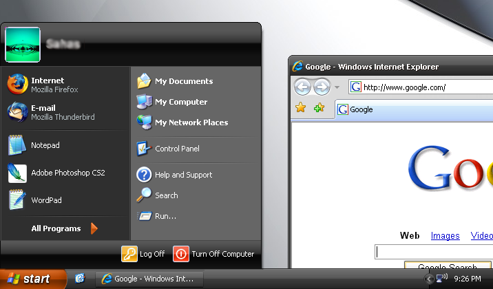
https://i.imgur.com/jwzJiSW.png

Re:Creating Windows XP Icons (2001) by V-2 on Thursday December 13, 2018 @07:04AM (#18671685)
I liked the non-standard, black Zune theme on XP. The default blue one is indeed timeless, but not in a positive sense, imho. It was a textbook case of the UI drawing attention to itself for the sake of it. When the dominating colour is so bright and jarring, how do you make the accents stand out?
Re:Creating Windows XP Icons (2001) by V-2 on Thursday December 13, 2018 @07:07AM (#18671701)
Re:Creating Windows XP Icons (2001) by amenod on Thursday December 13, 2018 @12:59PM (#18674428)
Is it just me or was this Start menu much easier to navigate than the Win10 one?
Re:Creating Windows XP Icons (2001) by naikrovek on Thursday December 13, 2018 @03:15PM (#18675622)
Not just you, but I don't see how it's any easier. Most of the same stuff is on that start menu as is on as the Win10 version, they're just arranged slightly differently.

People like what they like, you don't have to justify why. I hate carrots. Why? Doesn't matter, it's still a valid choice, same as start menus.

Re:Creating Windows XP Icons (2001) by Alex_Fragd on Thursday December 13, 2018 @09:09AM (#18672368)
this image brings a wistful tear to my eye
Re:Creating Windows XP Icons (2001) by bwat49 on Thursday December 13, 2018 @01:03PM (#18674477)
I liked the Royale theme that came with the media center edition
Re:Creating Windows XP Icons (2001) by babypuncher on Thursday December 13, 2018 @02:25PM (#18675179)
I liked the blue variant of this called "Royale"
Re:Creating Windows XP Icons (2001) by Shorel on Thursday December 13, 2018 @07:26AM (#18671813)
I still use it in my XP partition.
Re:Creating Windows XP Icons (2001) by richev on Thursday December 13, 2018 @07:49AM (#18671914)
I think that the blue gradient title bars came in with Windows 98. I remember marveling at how smooth the gradient was!

Before that, the Office 95 applications had a curiously black-to-dark-blue custom drawn title bar.

Then Windows 2000 introduced the subtle mouse pointer shadow, and translucent fade-on-click effect on menu items.

Agree with you about Tahoma being pixel perfect, at 8 point I think. Then came the marvels of ClearType!

Re:Creating Windows XP Icons (2001) by int_19h on Thursday December 13, 2018 @05:07PM (#18676565)
You're right - the gradient was in Win98.

As far as translucency - Win2K introduced the new APIs that any app could use to make a window translucent. That was used for those fade-on-click effects, and also for tooltips. But after people figured out that you could do it on any top-level window, there was a brief craze where random apps added it as an option, sometimes for no reason at all other than showing off (like, why would a CD burning app need a translucent window?).

Re:Creating Windows XP Icons (2001) by zozbot123 on Thursday December 13, 2018 @09:15AM (#18672405)
> I remember marveling at how smooth the gradient was!

Ironically, you used to be able to run KDE1 in 8 bits per pixel color mode (256-color palette - quite important for performance back then) and that did support titlebar gradients, unlike Win98 in the same hardware mode. That gradient was far from "smooth" of course, but like its Windows equivalent, it was still very helpful in making it easier to spot the titlebar at a glance.

Re:Creating Windows XP Icons (2001) by UI_at_80x24 on Thursday December 13, 2018 @10:13AM (#18672809)
I agree 100%.

IMHO it was the pinnacle of 2D UI design. Clickable areas were visually obvious, and there was no ambiguity about what happened and why.

And now we live in a world where fashion rules over function.

Re:Creating Windows XP Icons (2001) by petilon on Thursday December 13, 2018 @10:35AM (#18672994)
Windows 95's 3D look & feel was copied from NeXTSTEP. To me the pinnacle of 2D UI design was OS X from Steve Jobs' time. https://en.wikipedia.org/wiki/Mac_OS_X_Tiger#/media/File:Tig...
Re:Creating Windows XP Icons (2001) by gnu8 on Thursday December 13, 2018 @10:45AM (#18673107)
I miss the brushed metal theme too, but Tiger never looked quite right. There is way too much white space in that finder window, especially compared to the way the dock packs them so close together. The icons on the side bar not matching the folder icons is also annoying, when the document icons already don’t match the application icons on the dock. There are three different symbols on the screen for music, and that doesn’t make visual sense.
Re:Creating Windows XP Icons (2001) by int_19h on Thursday December 13, 2018 @05:09PM (#18676589)
Looking at NeXTSTEP screenshots, I would say that what got copied was the grey color palette used to make the widgets non-flat. But the actual widgets are rather different, that aside.

And didn't NeXTSTEP built on Motif in turn? Is Motif the granddaddy of "chiseled 2D", or was there something before it?

Re:Creating Windows XP Icons (2001) by brazzledazzle on Thursday December 13, 2018 @05:51AM (#18671352)
I’m right there with you I think but for me it’s Win2K3. Not hugely different but there were enough UI changes to make it feel like peak Windows design. Superficially they might look pretty similar but I think it’s worth mentioning as a distinct product instead of lumping them together.
Re:Creating Windows XP Icons (2001) by int_19h on Thursday December 13, 2018 @06:35AM (#18671549)
Win2K3 was basically Win2K + XP icons, as I recall. I did the same thing in XP, always switching it to classic mode. Then later in Vista, and even in 7 for a while. Unfortunately it's gone in 8+...
Re:Creating Windows XP Icons (2001) by zozbot123 on Thursday December 13, 2018 @09:28AM (#18672482)
"Windows Classic"-like widgets are also gone from GTK3 in Linux (whereas GTK2 still has its "Redmond" widget mode). Luckily the default 'Adwaita' theme is quite close in appearance, even more than what's now in Windows 8 or 10.
Re:Creating Windows XP Icons (2001) by jszymborski on Thursday December 13, 2018 @11:51AM (#18673760)
You can similarly get MATE really close to the classic windows UI using the Redmond theme.
Re:Creating Windows XP Icons (2001) by zozbot123 on Thursday December 13, 2018 @12:21PM (#18674042)
I know about that being an option in Ubuntu MATE, at least. But AIUI that's about 'UI' as in the large-scale layout of the desktop environment, with the "Redmond" option giving you a 'traditional' taskbar and system notification tray. (You can definitely get the same thing going in Xfce, though it involves fiddling with the panels - and it's a default in Cinnamon and LXDE.) Widget style is its own thing, though.
Re:Creating Windows XP Icons (2001) by pmorici on Thursday December 13, 2018 @07:26AM (#18671812)
The first thing I always do / did was switch to the "Windows Classic" theme.
Re:Creating Windows XP Icons (2001) by degenerate on Thursday December 13, 2018 @07:42AM (#18671877)
I've been using "Classic Start" ever since it came out, and I wish there was a way to make Win10 feel more like 2000/XP/Win7 visually. Having a functioning start menu is good enough I guess.
Re:Creating Windows XP Icons (2001) by rubyfan on Thursday December 13, 2018 @09:42AM (#18672582)
Windows Whistler Beta circa 2000. Had the simplicity of W2K with a little flair and a new start button menu. Way better than all the noise you see today.
Re:Creating Windows XP Icons (2001) by pndy on Thursday December 13, 2018 @11:57AM (#18673815)
There were Visual Styles mimicking Whistler theme from betas dubbed as "Watercolor" [1], [2]

[1]: https://i.imgur.com/gpJbTLl.jpg

[2]: https://i.imgur.com/lpKrYe0.jpg

Majority of powerusers despised default Luna and often used Classic theme instead; Watercolor had a potential of being Classic v2 with its 9x simplicity and modern (as for those days) touch, sadly it wasn't included by default.

Re:Creating Windows XP Icons (2001) by rubyfan on Friday December 14, 2018 @07:30AM (#18680333)
I loved that style and was so disappointed with what XP shipped with. I’d still take that style of any Win10 style.
Re:Creating Windows XP Icons (2001) by babypuncher on Thursday December 13, 2018 @02:25PM (#18675176)
Windows 98 also had a gradient in title bars if you ran your desktop at a high enough color depth, though the colors they used were less tasteful than Windows 2000.