Re:Creating Windows XP Icons (2001)
by V-2 on Thursday December 13, 2018 @07:04AM
(#18671685)
I liked the non-standard, black Zune theme on XP.
The default blue one is indeed timeless, but not in a positive sense, imho. It was a textbook case of the UI drawing attention to itself for the sake of it.
When the dominating colour is so bright and jarring, how do you make the accents stand out?
[ Parent
| on HN ]
https://skatter.com/files/2006/11/windowszunetheme.png
That's the one.
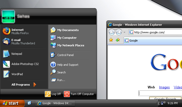
Is it just me or was this Start menu much easier to navigate than the Win10 one?
Not just you, but I don't see how it's any easier. Most of the same stuff is on that start menu as is on as the Win10 version, they're just arranged slightly differently.
People like what they like, you don't have to justify why. I hate carrots. Why? Doesn't matter, it's still a valid choice, same as start menus.
Re:Creating Windows XP Icons (2001)
by Alex_Fragd on Thursday December 13, 2018 @09:09AM
(#18672368)
this image brings a wistful tear to my eye
I liked the Royale theme that came with the media center edition
Re:Creating Windows XP Icons (2001)
by babypuncher on Thursday December 13, 2018 @02:25PM
(#18675179)
I liked the blue variant of this called "Royale"