"Don't mask or call special attention to key display features. Don't attempt to hide the device's rounded corners, sensor housing, or indicator for accessing the Home screen by placing black bars at the top and bottom of the screen. Don't use visual adornments like brackets, bezels, shapes, or instructional text to call special attention to these areas either."
https://developer.apple.com/ios/human-interface-guidelines/o...
> Inset essential content to prevent clipping. In general, content should be centered and symmetrically inset so it looks great in any orientation and isn't clipped by corners or the device's sensor housing, or obscured by the indicator for accessing the Home screen
...and...
> If your app currently hides the status bar, reconsider that decision on iPhone X. The display height on iPhone provides more vertical space for content than the displays of 4.7" iPhones, and the status bar occupies an area of the screen your app probably won't fully utilize.
[emphases mine]
My take is they don't want you putting a black background up there to mask it (unless all of your background is black, presumably) but you don't have to lay out around it either. For videos and photos in particular, since black is the normal background for outside the image I doubt there'll be an issue using it at the ends.
> Be mindful of aspect ratio differences when reusing existing artwork. iPhone X has a different aspect ratio than 4.7" iPhones. As a result, full-screen 4.7" iPhone artwork appears cropped or letterboxed when displayed full-screen on iPhone X. Likewise, full-screen iPhone X artwork appears cropped or pillarboxed when displayed full-screen on a 4.7" iPhone. Make sure that important visual content remains in view on both display sizes.
Emphasis mine.
EDIT: Also here [1]:
> Adhere to the safe area and layout margins defined by UIKit. These layout guides ensure appropriate insetting based on the device and context. The safe area also prevents content from underlapping the status bar, navigation bar, toolbar, and tab bar. Standard system-provided views automatically adopt a safe area layout guide.
The diagram shown suggests a "safe area" even inset a little from the notch.
[1] https://developer.apple.com/ios/human-interface-guidelines/v...
I wonder if the graphics and UI SDKs will have built-in functions to determine where these boundaries are (as they're likely to change in future models), or if developers will just be expected to work around them as best they can.
I find that an odd glass-half-empty view. Since the screen has more pixels than earlier phones, instead of worrying about some being "taken away" by the notch, consider it as Apple adding some space for status info and the like to dead space that was previously bezel.
But my bezel didn't literally cover parts of videos or fullscreen app UIs.
I don't really get your point. Sure, overall you get more pixels but the screen still gets covered partially and you're not allowed to fill in the left and right of it with a black bar to make your content look not overlapped.
Plenty of content will use a black bar, especially 16:9 video.
For non-video content you could put info there that previously would have covered other content. (Plus I think the non-pixel notch area would be a perfect place for Safari to banish those stupid floating "share" buttons).
Instead of getting hung up on the camera zone and what it "takes away", think of the phone as having a large rectangular screen plus a pair of small rectangular additional screens, like ears. Even if those little regions were always black you'd still have more pixels than Apple's previous phones.
Huh? I'm not sure I follow. By default video playback does not unless you manually resize it. Apple's updated language means you can't explicitly do this to cover those gaps with a black bar, either.
It's not exactly the best user experience if I have to manually resize videos smaller to fit the screen properly.
> Even if those little regions were always black you'd still have more pixels than Apple's previous phones.
That would be great but Apple does not approve of that as per their updated language in their ToS for developers. You can't just fill it in with black bars (otherwise I would agree with you though I would argue Apple should have ways to automatically handle that).
And I don't know what you mean by apple doesn't approve of that: their own Human Interface Guidelines for the iPhone X ( https://developer.apple.com/ios/human-interface-guidelines/o... ) read: "Inset essential content to prevent clipping. In general, content should be centered and symmetrically inset so it looks great in any orientation and isn't clipped by corners or the device's sensor housing, or obscured by the indicator for accessing the Home screen. " They also include a picture showing precisely that.
Also just above that they read, "When designing for iPhone X, you must ensure that layouts fill the screen and aren't obscured by the device's rounded corners, sensor housing, or the indicator for accessing the Home screen." I.e. don't use a square element part of which would lie off-screen, do try to light up in a practical way all the pixels.
But regardless of what apple says, feel free to be unhappy about this if that makes you happy.
So it looks like they do, in fact, black bar it by default. If you double tab it will zoom in which causes the video to be clipped by the notch. https://twitter.com/stroughtonsmith/status/90778373980314828...
> And I don't know what you mean by apple doesn't approve of that
Nothing what you posted is relevant to what I was discussing. In fact it was completely differently.
What I was discussing was having games / apps fill in the rest of the bar so it looks like a flat bar (so it won't look odd with partial content above and below the notch). Many iOS developers have been chatting about this over twitter and other forums and the language being pointed out seems to prevent deliberate obscuring / hiding of the notch itself. https://twitter.com/cabel/status/907684825376595968
> But regardless of what apple says, feel free to be unhappy about this if that makes you happy.
I don't follow; I originally replied to offer a correction to a statement you initially made. I never even stated that I am unhappy with the notch. I'm not a fan right now but it would likely grow on me and I was thinking about getting a new phone later this year.
There are some UX concerns that I think are legit to discuss. I don't see why that would make me someone who is happy to be unhappy.
Sure, if you zoom in part will be lost but then again if you zoom in, because of the different aspect ratio other parts of the video will be cropped too.
I guess we simply disagree that this is a big deal.
Thats one of the most awkward things Ive seen on an tech gadget that wasn't made by Doc Johnson.
You earned those looks.
I get having a screen to the edge of the phone is "cool" there is a half inch of black on the top of the iPhone 7, cutting it down to a 1/4 of an inch or whatever it is on the X and not going to the edge would have been perfectly sane... right?!
Edit: It wasn't a shout, so much as a dumbfounded exclamation. In retrospect, I should have table flipped and yelled "Im switching to a Nokia!"
I get that there is the FaceID, etc in there, but if they could reduce the size and focus on things that are necessary instead of narcissistic that'd be the bees knees.
    - IR camera
    - IR illuminator
    - Proximity sensor
    - Ambient light sensor
    - Speaker
    - Microphone
    - Front camera
    - IR dot projector
https://cdn.arstechnica.net/wp-content/uploads/2017/09/Scree...
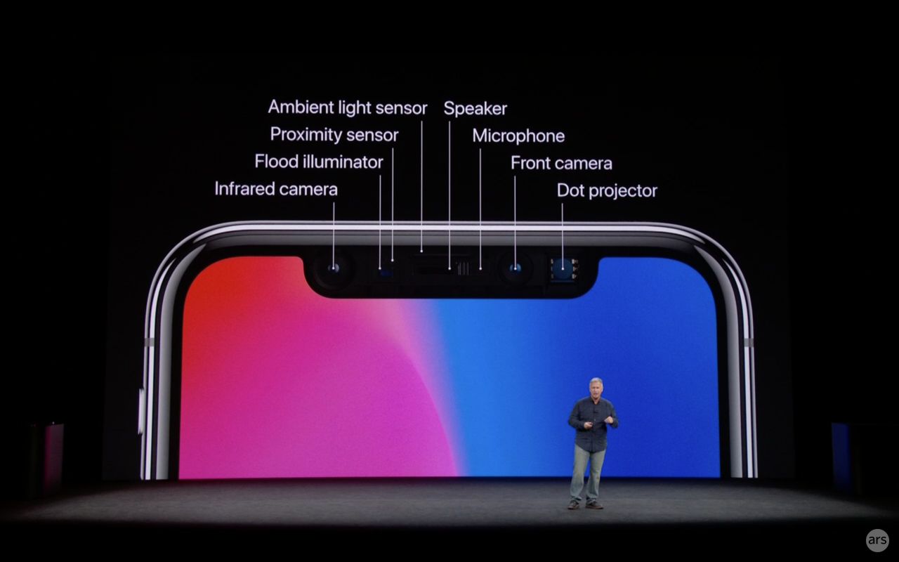
https://images.apple.com/media/us/iphone-x/2017/01df5b43-28e...
There is no camera bulge there... they just deleted it. This is not something I expect from Apple.
And, isn't it true that phone cases are pretty much a necessity? I remember I took my iphone case off a few a months ago... and just a week or two in, the screen shattered when I dropped it on the concrete floor outside as I was stepping outside the car.
Phone cases have a certain thickness (which is more or less equal to the thickness of bulge). In all likelihood, you'll have the case, so the bulge is perhaps not really a problem.
I like using them the way they were designed.
https://www.theverge.com/2014/9/16/6209759/apple-has-an-emba...
In the exact same way! I'm very surprised, I did not think Apple of all companies would deliberately do such a thing.
I would expect it from Apple these days. That bulge is the number one reason I will never buy a 7/8/X. Steve Jobs must have been rolling in his grave when they first showed that off.
In reality it's probably that the camera is positioned just right so that it's obscured.
They did the same thing when they made the iMacs skinny, just show them at the exact angle to hide the giant butt on them and make them look razor thin.
The lack of a headphone jack (and no valid replacement, such as USB-C) gets me way more annoyed!
By all means, if you're displaying UI stuff there then great, don't obscure your buttons with the notch. However I love seeing images/etc with all possible screen visible. I've been wanting a head/chin-less phone for years now.
From the looks of it, I love both of them. The Android and iPhone version.
Weird annoying notches in your screen better not be the future.
>They're gutting a huge market.
How big is this market of people using iphones to produce music?
Having attended and played hundreds of rock shows throughout the world, I've seen many musicians use iPads as synthesizers, loopers, effects pedals, and DAW recording studios. I and all of my professional musician friends use it in performances for both audio and visuals. The audio latency and MIDI support of iOS is legendary among musicians, and is why they dominate the musical app market compared to Android with its unusable 20-300ms audio latency.
Wired earphones are cumbersome and don't really offer any significant audio advantages.
I have a pair of studio headphones for listening to music when I'm at home. But when I'm out in the gym or heading to work on the metro, wireless earphones are 200% more convenient.
Remembering to charge them is easy. I reach my office and plug the charger right next to my laptop charger. Impossible for forget it
To be fair, OK-ish quality wireless earbuds are now available for ~$30.
You can get voice quality ones for less than $20.
Charging is annoying though. :(
This is laughably false. Accessories are a tiny percentage of Apple's revenue.
This is no small business, even by Apple's standards!
Removing the headphone jack was a marketing-driven decision. AirPods are a cool product, but wouldn't have sold anywhere near as well without the forcing effect of the jack removal.
This guy managed to install a fully-functioning jack back into an iPhone 7:
https://strangeparts.com/bringing-back-the-iphone-headphone-...
Maybe use it as product placement in the movie 'Last Action Hero 2'?
https://electronics.stackexchange.com/questions/102540/why-t...
I haven't used wireless headphones yet but I will continue to hesitate until they have fixed the audio quality and pairing issues for good.
Wait, you mean for music? I've tried them once and I felt as soon as there's more than 5-6 instruments the expression goes way down, it becomes basically impossible to even identify all the strands. Would not recommend - you can get something like AKG k702's for cheaper and get better sound.
Or did they make an exception for that, since most webpages are not specially designed for each and every device that Apple makes?
This is a weird UI problem and I'm looking forward to seeing how Apple addresses it in each of the built-in apps.

On the plus side it's only gonna be an easy software upgrade to fox this for video and the web although it remains to be seen whether apple will accept they're wrong.
[1] https://developer.apple.com/ios/human-interface-guidelines/v...
I think they wanted to show how "cool" is the whole edge-to-edge screen with all the four rounded borders. If you black out the notch and keep that side square, then you must do the same on the other side and the screen will just look like the old rectangular display.
While I'm sure there will be some option to do this, at least for video, for me, a square shaped phone would have made sense.
Me too. Still, it'll be nice if there's an option to disable the notch and just use a slightly shorter display. There are no doubt Apple engineers out there who want this, so I hope it's a hidden accessibility setting :)
The problem is that the AR game was most likely built with Unity, which has its own 4-5 different UI systems, and my guess none of them are aware of a safe area.
The problem is fixable, but why did Apple allow demo that was not polished enough to work well with their flagship phone?
Phones historically have been weird for not cutting off part of the image that CRTs and even flat screen TVs have been known to do.
Yet TV manufacturers, for some reason I cannot wrap my mind around, continue to implement it, often by default (or in the extreme case, as you mention, with no way to disable it). And so title-safe areas continue to be an issue long after the obsolescence of the technology they were invented to work within.
And even if you don't care about watching the film in the right conditions, isn't it annoying to know there's something you're missing behind that notch? It's like having somebody's head in front of you when you go to the movies. Also, there are many films that have a 2.35 aspect ratio, which is wider than 19.5/9.
Sure most of the videos are not films and you wouldn't use a phone to watch films in the first place, but for that price I expect those little details that make the difference. I think Apple has lost that in the recent years.
I don't expect the area encompassed by the notch to be meaningful to a lot of video content (possibly most). I think there are scenarios where it would be a minor problem, though.
I already find watching video on a phone annoying because my fingers get in the way. I'd think it would be worse on this device.
"Placing black bars makes your app feel cramped"
Screenshot from Apple design video: https://twitter.com/SteveMoser/status/907686208154816515
https://developer.apple.com/ios/human-interface-guidelines/o...
"Don't mask or call special attention to key display features. Don't attempt to hide the device's rounded corners, sensor housing, or indicator for accessing the Home screen by placing black bars at the top and bottom of the screen. Don't use visual adornments like brackets, bezels, shapes, or instructional text to call special attention to these areas either."
It's like the way people talk about moles or scars.
Would Jobs have delivered this?
note: I personally say no. The form factor is, with all it's curves, a failure for creating UI/UX that feels complete. It's going to force more people to go Android first with their software development. When Android starts getting newer and better software more frequently the sea change will continue to widen and even long lasting fans will want to try something else.
I don't understand this comment. What do "all its curves", as you say, have to do with iOS developers suddenly preferring Android? The iOS App Store has approximately a 7x revenue potential vs. Android's store, why would a developer abandon that just because of a new phone's form factor? There have been many new form factors in iOS devices over the last years, and that hasn't swayed anyone.
The protruding camera on the back of recent models would be considered unacceptable.
Here is another explanation http://www.quickanddirtytips.com/education/grammar/begs-the-...
That's the TL;DR version, the full rant is available at: https://news.ycombinator.com/item?id=13708712
I'm not sure if “that post” refers to the grandparent or the one linked from it, but in either case you are incorrect. There are several other things addressed beyond frequency of usage.
Language evolves - things that start out as misunderstandings or errors become informal usage, then dominant usage, then the correct way.
Others stay misunderstandings or errors.
It pays to learn the correct way so you sound educated as you speak, and so other educated people don't automatically discount what you say, but there's little benefit in attempting to correct others.
That said, mis-using erudite words or phrases spoils the effect.
Yes, language does evolve. For example, American English has evolved in such a way that "beg the question" now means "raise the question" to the vast majority of people in the year 2017.
Forgive me, but I think you're in the minority of people who bristle at the contemporary usage of this phrase, which makes you come off as incredibly pedantic.
I literally could care less about "begs the question". The formal use can be depreciated - we're not likely to staunch that floe. But irregardless of my feelings, people who flaunt the official meaning and right "begs the question" in the increasingly common usage have the wrong affect - they sound like they're putting on heirs - "raises" or "brings up" each sound more naturist.
(Yes, that was fun. I hope you like it, too!)
Kind of like how "I could care less" actually means you don't care at all, despite the literal interpretation of the sentence meaning that you're capable of caring less, which means you DO care.
"The question is," said Alice, "whether you can make words mean so many different things."
"The question is," said Humpty Dumpty, "which is to be master-that's all."
I've literally never seen a usage of "begs the question" that couldn't be immediately disambiguated by context.
But hey, if you want to use the wrong words, phrases, etc, then it's your right to do so. ...
Words mean things, but what they mean is a social phenomenon, not handed down from some authority.
You say while advocating for a mistranslation.
Should I start randomly using your and you're? If you can figure it out, what's the point of using the "correct" one?
Aren't you advocating for the "correct" use of "begging the question"? I'm just pointing out that such a use is also wrong.
> I thought I was advocating to keep everyone on the same page?
As if it actually confuses anyone.
> If you can figure it out, what's the point of using the "correct" one?
Because misspellings slow down comprehension. Using words in a different manner that both people understand doesn't.
I can see where you're coming from. It just sucks that this argument seems to be, "there is no right, get used to wrong shit". And I know, I know, you're debating whether it's wrong at all - but I can't help but feel when people say the exact opposite words than what they mean, it feels wrong. For example, "I could give a damn" vs "I couldn't give a damn" _(and variations of it)_. It's an almost hilariously opposite meaning to what the user intended, yet.. it's going to become the "right" meaning.
Is there no end in your eyes? When does this just start becoming broken English?
That's more understandable to object to because the words in a literal context are being misused. This is the creation of an idiom because of people misremembering the phrase. It's probably too late to stop, but idioms aren't created at a very rapid pace.
Begging the question is nearly the opposite situation. There exists an idiom where the words as taken literally are a mess, and people are using the same words, basically-correctly, to not mean that idiom.
What I cannot understand at all is the compromise in landscape mode, for games and video. Rather than just black out the uneven area and limit the drawable area to the largest unbroken rectangle, everything Apple shows appears partially obscured by the notch. The AR game example literally has the notch starting to eat into the UI. In my book, this leaps from "acceptable trade-off" to "bizarre sacrifice." It's like living with a cracked corner of the screen, right out of the box.