News for hackers. Stuff that matters.
Re:Flat UI Elements Attract Less Attention and Cause Uncerta... by chenster on Sunday September 03, 2017 @10:09PM (#15165188)
Thank you, Lord! My prayers have been heard. I'm just happy that I am not the only one who got rants about the flat UI. It really should go away. The flat design was born from Microsoft Windows phone Metro UI, if I recall correctly, then other designers quickly jumped on the wagon and claiming it's the next greatest and neatest "UI revolution". What a joke! It totally sacrifices usability. The outcome? A horrible user experience, and job security for the designers.

Link to Flat design: https://en.wikipedia.org/wiki/Flat_design It was indeed first introduced by Microsoft with the name Metro Design.

Microsoft is moving away from the notorious Flat UI to Fluent Design: http://www.firstpost.com/tech/news-analysis/build-2017-micro...

Re:Flat UI Elements Attract Less Attention and Cause Uncerta... by rdtsc on Sunday September 03, 2017 @11:23PM (#15165489)
> It really should go away.

It will. Designers will come up with a new thing pretty quickly. In that respect I guess they are probably no different than developers. Nobody likes to end the year with "yeah I just maintained this piece of code last year", instead it has to be "yeah the code the last team wrote was crap, so we tore it all out, replaced with a fancier later framework, added some features on top, etc".

Presumably people in charge of design at these big companies get paid decently, so there is some internal pressure to deliver something. So no matter how good, fast, clean the current interface, is there will be an unveiling of a "cooler / newer / fresher" interface. But I think the fundamental reason reason is most likely because of a need to create work to justify salaries.

This happens in software, in design, and probably many other fields. Managers, department heads, directors, CEOs they all play this game. Sometimes everyone in the game realizes what's happening but they just go along because it works out for them (well sometimes it doesn't work out, but then they blame the customers ;-) )

Re:Flat UI Elements Attract Less Attention and Cause Uncerta... by stephengillie on Sunday September 03, 2017 @11:40PM (#15165557)
The Interface itself is a type of artwork. Like all art, it must grow and change to stay relevant, or stagnate and be left behind on the Island of Irrelevant Toys. Like many things, it's a conversation between designers, and sometimes happy accidents do get made and dark avenues are explored.

Architecture[0] is one example of a design (basically a cave) growing and changing to stay relevant and reflect current use and needs. Recent trends have been moving away from the "monolithic" styles of the Cold War Era and specifically including blocks that stick out and have a very different color.

Also, some fire codes allow the upper few floors of an apartment structure to be made from wood[1], so long as all the floors below the first few are concrete.

[0] https://en.wikipedia.org/wiki/Timeline_of_architectural_styl...

[1] http://marks-thomas.com/2015/03/exploring-a-shift-to-five-st...

Re:Flat UI Elements Attract Less Attention and Cause Uncerta... by DougWebb on Monday September 04, 2017 @09:04AM (#15167939)
A user interface is a tool to connect the computer and a human user in order to allow a task to be performed. Unless these three components change, the only reason for the interface to change is to make it do its job more efficiently.

It's no different from the many other tools used by people to do their jobs. Once they reach an optimal form, they stop changing unless some drastic technological change occurs. Hand-tools for woodworking hadn't changed for centuries, until electricity was introduced. Electric hand-tools have only had small gradual improvements since then.

Re:Flat UI Elements Attract Less Attention and Cause Uncerta... by tripzilch on Wednesday September 06, 2017 @11:01AM (#15184206)
Well, something did change, otherwise it would not have gotten as big as it did. What changed was the role of the user in the eyes of whatever entity controlled the computer/cloud.

If the uncertainty was actually a bad thing in the eyes of the big cloud companies that pushed these designs, it would not have nearly gotten as far as it did. It's a way to control how the tool is used, given that it's powerful, making it too usable is not profitable.

Re:Flat UI Elements Attract Less Attention and Cause Uncerta... by Angostura on Monday September 04, 2017 @06:36AM (#15167169)
> Like all art, it must grow and change to stay relevant,

No, it really doesn't. It can change, if change is necessary, however most change in UI design is driven by fashion.

Re:Flat UI Elements Attract Less Attention and Cause Uncerta... by stephengillie on Wednesday September 06, 2017 @08:50PM (#15188357)
And fashion is a conversation, much like software language development is a conversation - a free exchange of ideas. The same concepts are not normally repeated verbatim, but iterated around, in a specific direction, if there is an obvious direction to go - otherwise in a random walk, like a lost hiker. Circumideation.
Re:Flat UI Elements Attract Less Attention and Cause Uncerta... by blub on Monday September 04, 2017 @07:18AM (#15167353)
Interface design is nothing like art. It must serve a purpose and be useable at least.
Re:Flat UI Elements Attract Less Attention and Cause Uncerta... by jaclaz on Monday September 04, 2017 @07:53AM (#15167538)
Whether it is an art or not (which is debatable) the point is that it needs to be ergonomic and usable, possibly in an intuitive way.

The article measures what would otherwise be obvious, more visible whatevers are seen by users easier and faster.

Re:Flat UI Elements Attract Less Attention and Cause Uncerta... by bfu on Monday September 04, 2017 @09:23AM (#15168037)
The only intuitive user interface is nipple. Everything else has to be learned!
Re:Flat UI Elements Attract Less Attention and Cause Uncerta... by flushandforget on Monday September 04, 2017 @11:37AM (#15168926)
And that can be stuffed up with prior bottle use, so not so sure if that's even true.
Re:Flat UI Elements Attract Less Attention and Cause Uncerta... by tripzilch on Wednesday September 06, 2017 @10:55AM (#15184153)
Not sure if this is what you're trying to say but it sounds like this is just a thing that designers will hop on a new trend every few years or so.

Except that I remember a few changes in design trends and many of them were for the better, others were a matter of taste that didn't really matter.

But "Flat UI" was a step down in almost every aspect (or whatever name Google called pretty much the same thing, and so did Microsoft have a name for their particular flavour of low-poly coloured squares). It doesn't even look good (personal opinion). Indeed it was confusing, after a while we got used to it, so it didn't hurt usability quite as much, but it was never good.

Just an excuse to not learn about actual usability guidelines. And with that, excuses to hide your anti-patterns under, which the tech giants all happily do. Tiny links function sometimes as buttons but all buttons are coloured squares so basically any layout element could do something but usually not, and with a touch-interface this adds even more stress because you can never tell where you can comfortably rest your finger to scroll or zoom, if even possible, which is not indicated because the cute flat scrollbars tend to fade away if they're not in use etc etc. Nonsense!

If most of the normal interface is already uncertain in functionality, then users (or consumers, eyes, or products) will not complain as much when they make a certain action harder to perform on purpose.

We got suckered into hostile UX. So maybe we can stop doing that now.

Re:Flat UI Elements Attract Less Attention and Cause Uncerta... by copx on Sunday September 03, 2017 @11:30PM (#15165524)
I have always hated this fashion with passion too. For me it makes UIs less aesthetically pleasing and harder to use.

One of the reasons why I still use Windows 7 is that I like its 3D transparent glass-like look and utterly hate the flat design of later versions which I would call soulless and ugly. And the UI elements are harder to distinguish for me.

That being said, many people do like it, and I am not aware of any studies about how many people like it / don't like / don't care in general.

Fortunately for us flat UI haters, that horrible design trend will go away the same way it came - as a fashion. Fashion by definition does not last. Sooner or later flat design will inevitability be considered old and unhip too.

Re:Flat UI Elements Attract Less Attention and Cause Uncerta... by andrepd on Sunday September 03, 2017 @11:54PM (#15165615)
Absolutely. I still stick with Windows 7 as well. I just can't stand the flatness, and the obnoxious amounts of space-wasting whitespace.
Re:Flat UI Elements Attract Less Attention and Cause Uncerta... by ktRolster on Monday September 04, 2017 @01:16AM (#15165885)
The whitespace is there because people design first for mobile, then port to desktop browsers as an afterthought. That's not going to change any time soon.
Re:Flat UI Elements Attract Less Attention and Cause Uncerta... by Pica_soO on Monday September 04, 2017 @07:45AM (#15167501)
I remember a admin at a company giving me a before and after on some tool- where the fat-finger-friendly UI reduced the presented information and thus the usefulness off the tool to basically zero.
Re:Flat UI Elements Attract Less Attention and Cause Uncerta... by akie on Monday September 04, 2017 @03:47AM (#15166459)
The introduction of copious amounts of whitespace is a very common design tool that is not limited to just websites. Have a look at an average art gallery or museum and you will know what I mean. And there's a reason why using whitespace is a good thing, as outlined in this article[1] for example.

[1] https://boagworld.com/design/why-whitespace-matters/

Re:Flat UI Elements Attract Less Attention and Cause Uncerta... by DougWebb on Monday September 04, 2017 @09:14AM (#15167986)
Sure it will.

People used to design for desktop first, then port to mobile as an afterthought. Originally, there was only desktop, and mobile was a completely different and separate thing. Then mobile got more capable, and by necessity (since everything was designed for desktop) mobile tried to be a small desktop.

Mobile was limited, and trying to be a small desktop didn't work out that well. So people switched gears and said "Well, let's treat everything as mobile first, and let desktop adapt because it's more powerful." So we began the mobile-first trend.

But in the meantime mobile has gotten much more powerful and less limited; today many mobile devices have higher resolution and more powerful cpus than the old desktops had. The screens have also gotten a lot larger than they were when mobile-first started.

So, I think we'll either wind up with a "tablet-first" trend, designing for the middle-ground and making both the smaller mobile and larger desktop adapt, or we'll go back to recognizing that mobile, tablet, and desktop needs are different and we'll design accordingly for each, but now with a better understanding and better toolset for minimizing the redundancy that can occur with split designs.

Re:Flat UI Elements Attract Less Attention and Cause Uncerta... by gsich on Monday September 04, 2017 @03:48AM (#15166463)
It's still bad.
Re:Flat UI Elements Attract Less Attention and Cause Uncerta... by userbinator on Monday September 04, 2017 @02:34AM (#15166171)
I prefer Windows Classic even more, probably because it's what I'm used to and the UI elements are easily recognisable but not too fancy.
Re:Flat UI Elements Attract Less Attention and Cause Uncerta... by digi_owl on Monday September 04, 2017 @04:05AM (#15166531)
Indeed. And why right now i am using IceWM on Linux, and consider Win2k the last sane Windows.
Re:Flat UI Elements Attract Less Attention and Cause Uncerta... by dep_b on Monday September 04, 2017 @09:09AM (#15167960)
Windows 2000 was the holy grail of Windowses. Stable, could play games, classic UI. XP was just a paint job that had more weird defaults to change back to classic.
Re:Flat UI Elements Attract Less Attention and Cause Uncerta... by jansho on Monday September 04, 2017 @03:38AM (#15166427)
Well there I was, thinking that maybe rejecting the free upgrade might have been a bit petty after all. I'm not a big hater of flat UI but phew, Windows 10 is ugly. Flat UI should have high contrast but with a feeling of lightness. For some reason Windows 10 went for a super dark palette: black, magenta, navy, blood orange etc. Sorry, not for my workstation.

On the other side of the spectrum, plenty focus too much on being neat and consistent that they become greyish, bland and sacrifice usability. Good ones use colours, shadows and placements wisely so that navigation does feel lighter and the experience is more content-focused.

Excellent ones do all that but without burdening the audience with that nasty aftertaste of pretentiousness.

Learn the rules, then break the ones you can't agree with. It's the designer's privilege to be able to do this more often than developers can ;)

Re:Flat UI Elements Attract Less Attention and Cause Uncerta... by ux-app on Monday September 04, 2017 @06:15AM (#15167090)
that's the tough thing about design, it's subjective. I personally really like the win10 design much more than 7. 7 Seems to dated to me.

I'd really love it if MS embraced shell skins. There are so many great ones, but I hesitate to jump through all the hoops to make them work.

Re:Flat UI Elements Attract Less Attention and Cause Uncerta... by cardiffspaceman on Monday September 04, 2017 @04:08PM (#15170556)
Churn makes things seem dated. After you see too many screenshots of it, the MS Office ribbon seems like today's thing and a plain old menubar seems dated. Could someone show me something that makes the ribbon seem dated? Nagel paintings seem dated now, but seemed hip back in the day, nestled between the ads for theaters showing Breakfast Club.
Re:Flat UI Elements Attract Less Attention and Cause Uncerta... by Illniyar on Monday September 04, 2017 @03:00AM (#15166282)
I really dislike that flat-design has destroyed the use of gradients, I think buttons are much nicer when they look 3d.

But flat design did spread the importance of contrast, simplicity and subtlety, not to mention using animations to convey meaning, which do wonders to make apps and the web look much better.

I think as we move forward elements of flat design and traditional UI design will merge into a new set of popular guidelines - hopefully they'll contain 3d looking buttons :)

Re:Flat UI Elements Attract Less Attention and Cause Uncerta... by bauerd on Monday September 04, 2017 @03:34AM (#15166413)
>[…] not to mention using animations to convey meaning, which do wonders to make apps and the web look much better

I'd argue most animations today degrade the user experience because they're not done right. Typically, animations have too long durations, transform annoying properties, catch my attention when they should not, and too often just make common interactions more time-consuming, laggy and hence painful. If I could selectively disable CSS animation/transform properties in Chrome, I'd do it in a heartbeat.

Re:Flat UI Elements Attract Less Attention and Cause Uncerta... by rocqua on Monday September 04, 2017 @04:03AM (#15166520)
Many gradients look gaudy to me these days. You don't need phong shading on your buttons, a slight bevel using a darker and lighter shade are enough to draw my attention.

That is not to say I like flat design, I dislike 'faux curvy 3d' design. Clean lines can be combined with depth perception. For this, very small gradients (i.e. to soften edges) make sense, but these are gradients that ought to be very small. On this 14" laptop I'd say at most 1mm.

Re:Flat UI Elements Attract Less Attention and Cause Uncerta... by Illniyar on Monday September 04, 2017 @06:13AM (#15167082)
I like the purple button in the cosmopolitan hotel example, and that is a full gradient as far as I can tell.

I agree that gradients can be use tactlessly but I find when the colors are chosen correctly they look really well.

Of course bevel is also a great looking option

Re:Flat UI Elements Attract Less Attention and Cause Uncerta... by seanp2k2 on Monday September 04, 2017 @04:53AM (#15166723)
Read the headline and thought the same first sentence. It's about dang time. Flat UI was an 80s thing because that's all we had. Put shadows and highlights on your frickin' buttons! Just because everyone went a little (or a lot) overboard with skeuomorphism doesn't mean that it's cool to just put a grey-on-darker-grey " " by a thing and expect everyone to know where the tap target area for that is. It's almost as bad as apps where you have to "pull out" from one side to get at other functionality with no indicators that this is a thing.
Re:Flat UI Elements Attract Less Attention and Cause Uncerta... by sp332 on Monday September 04, 2017 @05:19PM (#15170912)
Even DOS interfaces and old Mac OS had drop shadows. Apple even did UI research. Everyone knew back then that flatness is bad.
Re:Flat UI Elements Attract Less Attention and Cause Uncerta... by 2_listerine_pls on Monday September 04, 2017 @12:49AM (#15165805)
> I am not the only one who got rants about the flat UI. It really should go away.

The article is poorly titled. The issue is not about Flat vs Non-Flat. It's about emphasis of elements in a flat context. The article highlights "flat 2.0" as a better choice given that it uses 3D shadows.

Re:Flat UI Elements Attract Less Attention and Cause Uncerta... by imron on Sunday September 03, 2017 @10:30PM (#15165280)
Now to eradicate my other pet peeve - colourless icons (usually black on grey) that make it more difficult to distinguish icons from each other.
Re:Flat UI Elements Attract Less Attention and Cause Uncerta... by King-Aaron on Sunday September 03, 2017 @10:53PM (#15165372)
Just the ever-increasing abandonment of contrast in general. There's so many off-white on white, or light-grey on slightly-lighter-grey designs out there that might look nice in a certain lighting condition indoors with perfect eyeballs viewing it - but for 90% of other times the content is just totally invisible.
Re:Flat UI Elements Attract Less Attention and Cause Uncerta... by sogen on Monday September 04, 2017 @01:14PM (#15169515)
Yes, even old Apple agreed on that: single-color icons [1] where the first step towards color icons [2]:

1 .- http://mirror.informatimago.com/next/developer.apple.com/doc...

2.- http://mirror.informatimago.com/next/developer.apple.com/doc...

Re:Flat UI Elements Attract Less Attention and Cause Uncerta... by yoz-y on Monday September 04, 2017 @03:40AM (#15166437)
Colorless icons do have some merit though. You should always design your icons in a way that an outline is a good indicator and that a greyscale version works too. Relying on color to convey meaning is hostile towards the colorblind. I have had several users complain because we have used red and green lines to indicate correct and incorrect connections.
Re:Flat UI Elements Attract Less Attention and Cause Uncerta... by imron on Monday September 04, 2017 @11:21AM (#15168826)
> Relying on color to convey meaning is hostile towards the colorblind

Making it equally hostile to everyone is not necessarily a better alternative.

It's possible to design colour schemes that are suitable for colourblind users. Going colourless is not the only solution.

> You should always design your icons in a way that an outline is a good indicator and that a greyscale version works too

Unfortunately designers don't always do this - even supposed design-centric stalwarts like Apple screw this up. The icons in the Mail app for macOS always make me end up spending a fraction of second figuring out which one is which (new mail vs get mail, and archive vs trash vs junk).

Re:Flat UI Elements Attract Less Attention and Cause Uncerta... by rocqua on Monday September 04, 2017 @04:05AM (#15166526)
It doesn't need to be greyscale, colored monotone also works to help things stand-out without becoming too intricate.
Re:Flat UI Elements Attract Less Attention and Cause Uncerta... by yoz-y on Monday September 04, 2017 @04:58AM (#15166744)
It does not have to be, but it should gracefully degrade. Color should help but the outline/lightness should be sufficient.
Re:Flat UI Elements Attract Less Attention and Cause Uncerta... by stevedonovan on Monday September 04, 2017 @03:52AM (#15166484)
Good point, but then perhaps the solution is some minimal theming? Good use of a menu item ;)
Re:Flat UI Elements Attract Less Attention and Cause Uncerta... by yoz-y on Monday September 04, 2017 @05:08AM (#15166800)
One reason I don't like to use alternative icon themes most of the time is that they rot easily. If the theme developer does not keep up with the application updates it will lack elements. Since themes are usually free or for a single low fee, this will happen probably as soon as the theme developer stops using the application.
Re:Flat UI Elements Attract Less Attention and Cause Uncerta... by Pxtl on Monday September 04, 2017 @09:20AM (#15168025)
Not only that, but WinPhone had an extremely consistent design language. There was almost zero wiggle room for designers to style their apps individually. This was necessary to make sure that a button looks like a button even without bevels.

The modern mishmash of anything-goes design with flat styling makes modern uis inscrutable.

Re:Flat UI Elements Attract Less Attention and Cause Uncerta... by chickenfries on Sunday September 03, 2017 @10:48PM (#15165354)
It hardly says that flat UIs are bad and should always go away. It's nuanced.
Re:Flat UI Elements Attract Less Attention and Cause Uncerta... by chenster on Sunday September 03, 2017 @11:04PM (#15165419)
Because there's nothing wrong with the traditional UI design with pop up and shadow. Why introduce another ultimately flawed design that is subpar than the previous one? It's been over 15 years since it's initially introduced by Microsoft, and I still see the usability problem here and there today. 15 years seems like utterly long time to finally prove that it doesn't really work, does it?

The same argument goes to the LCD monitor aspect ratio 16x9 vs. 4x3. The former isn't any better than the latter. In fact, it has 19% LESS of screen real estate of the same screen. The only reason we all now use the 16x9 is because the mfg needed another standard in desperate to push sale because a good LCD monitor can last a very long time than the traditional CRT.

Re:Flat UI Elements Attract Less Attention and Cause Uncerta... by colejohnson66 on Sunday September 03, 2017 @11:22PM (#15165486)
Isn’t the reason 16:9 became popular cinematic more so than manufacturerers?
Re:Flat UI Elements Attract Less Attention and Cause Uncerta... by AstralStorm on Monday September 04, 2017 @03:38AM (#15166428)
For movies you need even more extreme ratios, 16:9 is a compromise that suits nobody. A4 or Letter with some extra on sides is better for most productivity.
Re:Flat UI Elements Attract Less Attention and Cause Uncerta... by colejohnson66 on Monday September 04, 2017 @04:25PM (#15170652)
Care to elaborate? Sure, manufactures could’ve done 21:9 (roughly 2.35:1), but from what I’ve seen, that wasn’t practical at the time. 16:9 was a good compromise. Especially for people who stretch 4:3 SDTV content into 16:9 instead of using black boxes; 4:3 content would look horrible on a 21:9 display. Nowadays though, 21:9 is becoming popular, and it has a ratio of 2.333:1 which is pretty close to a cinematic 2:35:1. If only Windows made snapping three windows side by side easier.
Re:Flat UI Elements Attract Less Attention and Cause Uncerta... by gsich on Monday September 04, 2017 @03:51AM (#15166479)
A compromise would be 16:10.
Re:Flat UI Elements Attract Less Attention and Cause Uncerta... by noir_lord on Monday September 04, 2017 @05:29AM (#15166895)
16:10 rotated is good, I have 2412's at home (1920x1200) and 16:9 at work (2560x1440).

The higher res screens win on pixels per inch but are a bit narrow in portrait, what I'd like is 2560x1600 at 24" that would be perfect.

Re:Flat UI Elements Attract Less Attention and Cause Uncerta... by EGreg on Sunday September 03, 2017 @11:56PM (#15165620)
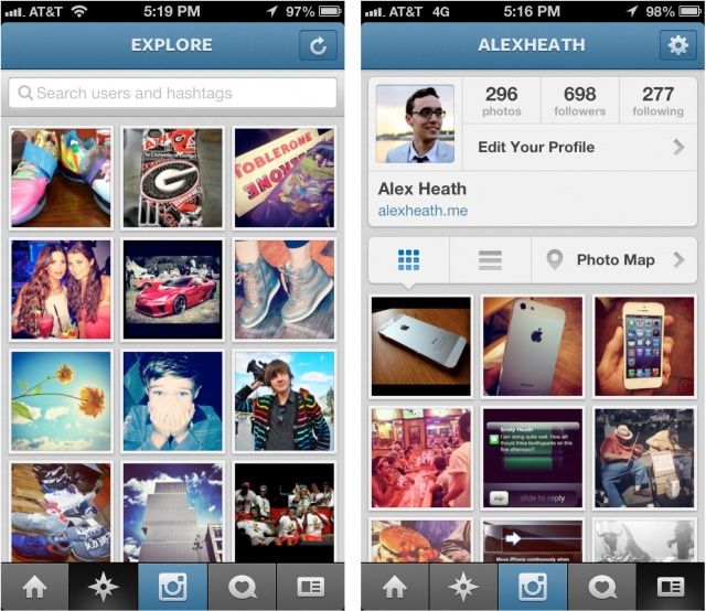
I've been saying this ever since Jony Ive has bastardized my beloved iPhone starting with iOS 7. Apple went from being a leader to a follower - of Microsoft! Sad to say that, today, Google's UIs are far more usable than Apple's. Less hidden tiny icons too.

http://magarshak.com/blog/?p=234

Steve Jobs and Scott Forstall would have never allowed this travesty.

Re:Flat UI Elements Attract Less Attention and Cause Uncerta... by yoz-y on Monday September 04, 2017 @03:43AM (#15166445)
Steve Jobs and Scott Forstall had a huge advantage, they only had to care about a 320x240 (and later @2x) canvas. Crafting backgrounds and textures is easy if you know the pixel resolution, however now with multiple sizes and high dpi screens, what you want is a flexible and adaptable UI. Flat design makes UI development easier. This does not excuse using simple labels instead of buttons but iOS 10 has backpedaled quite a lot on that.
Re:Flat UI Elements Attract Less Attention and Cause Uncerta... by gurkendoktor on Monday September 04, 2017 @05:11AM (#15166813)
I've been working on several third-party apps from iOS 4 to 10. Flat design (as implemented in iOS 7) hasn't really made development easier. Most iOS 6 apps weren't even crazy about textured backgrounds [1] [2] [3]. Mostly it boiled down to designers giving us a PSD that we would slice into handful of resizable textures for UI controls (like Android nine-patches). It was a bit like table-based HTML design, but in a good way, as the framework completely supported it.

Then iOS 7 killed textures, but introduced translucency to make up for its overall blandness. And that really ruined the simplistic beauty of UIKit programming, since everything now has to deal with all the band-aid that is needed to make views extend below translucent bars (layout guides, edgesForExtendedLayout, automaticallyAdjustsScrollViewInsets, ...). Here's a random example of how translucent vs. opaque bars can cause trouble. [4] We've traded a few minutes in Photoshop for hours of wrestling with UIKit's undocumented heuristics when it comes to layout code/transitions.

[1] http://www.iclarified.com/images/news/24614/92620/92620.jpg [2] http://photos2.insidercdn.com/javascript-121220.jpg [3] https://cdn.cultofmac.com/wp-content/uploads/2012/09/Screen-... [4] https://stackoverflow.com/a/33537188

Re:Flat UI Elements Attract Less Attention and Cause Uncerta... by intoverflow2 on Monday September 04, 2017 @12:03PM (#15169076)
> Steve Jobs and Scott Forstall had a huge advantage, they only had to care about a 320x240

Honestly this isn't a big deal it's massively overstated. OS X managed to pull of Aqua and MS managed to pull off Aero both with arbitrary UI sizing.

I feel this point is only stated by people who came to UI when they only had to worry about 1 size and then were shocked at the idea of treating the UI as anything other than a Photoshop flat.

Re:Flat UI Elements Attract Less Attention and Cause Uncerta... by yoz-y on Tuesday September 05, 2017 @03:23AM (#15173142)
Arbitrarily resizing the iOS6 podcast app would be a challenge. Indeed many applications would be quite easy to adapt, but on iOS6 and prior some of the applications used quite unscalable elements. For example the notes app with a lined notebook would be a pain to adapt if you could arbitrarily scale fonts (which you can since iOS7 or 8).

The difference is also (I think) the average size of teams which made the apps. iOS has started the boon of one developer per app. Before it was of course done, but the scale is not comparable.

Re:Flat UI Elements Attract Less Attention and Cause Uncerta... by exodust on Monday September 04, 2017 @12:55AM (#15165824)
When iOS7 first booted up I honestly thought it hadn't installed properly, that I was missing button graphics and background textures. The app store design was a joke, with no defining separation between elements, everything plain white, it became a chore to intuitively recognise different areas.

From that point I have wanted a customisable iOS interface, where we are "allowed" to apply our own skins and themes. If people like flat design, that's fine, but it's unreasonable that the same uniform interface is forced on everyone.

Re:Flat UI Elements Attract Less Attention and Cause Uncerta... by chenster on Monday September 04, 2017 @12:52AM (#15165812)
I thought about the same. Apple should be the forefront of the UI game considering the design and UI always have been their strong suit. With that said, Apple has improved upon the "too flat" UI with subtle 3D and shade that actually made the UI generally more usable. The trick is to find the right balance.
Re:Flat UI Elements Attract Less Attention and Cause Uncerta... by hashmal on Monday September 04, 2017 @05:42AM (#15166947)
There's a distinction to be made between the intrinsic properties of flat design, and how designers interpret it.

I think the vast majority of apps/websites using "flat design" are an insult to what it is really about. Removing elements, simplifying shapes... should be done to increase comprehension and efficiency (i.e. removing noise), not to make something look "clean" or cool.

Re:Flat UI Elements Attract Less Attention and Cause Uncerta... by azeirah on Sunday September 03, 2017 @10:21PM (#15165239)
Every type of design has its up- and downsides. You propose to do away with flat design, what's the alternative? You're just reinitiating the cycle.

Where are we going, if anywhere?

Re:Flat UI Elements Attract Less Attention and Cause Uncerta... by peterlk on Sunday September 03, 2017 @10:38PM (#15165312)
I'm not really in the design universe that much any more, but the successor to flat design seemed to be material design. It lives somewhere between skeuomorphism and flat design. Any designers care to comment what the new/next hot thing is?
Re:Flat UI Elements Attract Less Attention and Cause Uncerta... by JoshMnem on Monday September 04, 2017 @02:22AM (#15166115)
I think that some kind of minimalism will come next, after the novelty of the current trend wears off. There are accessibility problems with Material Design (and maybe Fluent Design) due to animation overkill and over-saturated colors.

I'm waiting for the study on how many types of animation can cause nausea in some people.

https://www.webaccessibility.com/best_practices.php?technolo...

Re:Flat UI Elements Attract Less Attention and Cause Uncerta... by jansho on Monday September 04, 2017 @04:26AM (#15166614)
There does seem to be a few brutalist articles knocking around lately but I think it'll stay a niche. Most designers are actually pretty lazy (or just prone to following trends, like other professions?) and would be happy to follow any good design docs (Material Design etc) then apply their own interpretation. But with brutalist UI, since it's usually accompanied by a sort of shock factor, it requires a bit more ingenuity than just choosing a unique colour palette. It also tends to be hit-or-miss, and that's risky.

There's some noise about creating the next interface for flat screens and VR/AR (Microsoft again) which as long as VR isn't mainstream, I think it'll be more of a play (and fad.)

I also think that the ideal UI doc (may not be the next trend) combine skeuomorphism and flat while leaving plenty of space for designers to express their own ingenuity through content. At this moment, you can feel UI dictating how the content should be created and organised; all those one-scroll container webpages and humble-braggy profiles bore me to death.

But the best UI takes a back seat while content is the main performer, OR, at the very least there is a variable organic component - Google's doodly homepage fits the latter actually. This sounds so stupidly obvious to point out, but I feel that too much effort is being spent on innovating UI than the content itself. Content is far more exciting and challenging! Storytelling is often done in one medium, but what if you use several, one for each small part of the experience? What if you focus on creating multiple micro experiences? (Not necessarily animated micro-interactions.) That for me is the real task of UX designers - not just organise flow but how best to present content as a memorable story.

Re:Flat UI Elements Attract Less Attention and Cause Uncerta... by michaelt on Monday September 04, 2017 @08:01AM (#15167582)

  Most designers are actually pretty lazy (or just prone
  to following trends, like other professions?)
If it means more people's buttons and checkboxes look the same, I'd say that's a good thing.
Re:Flat UI Elements Attract Less Attention and Cause Uncerta... by jansho on Monday September 04, 2017 @07:13PM (#15171421)
Very true but it's just boring. I'm shooting myself in the foot! Reading back my older post, I haven't been very thoughtful about expressing it properly; I simply think that the current trends such as one-scroll webpages also dictate (unintentionally maybe) about what kind of content should be put on and how they should be presented, resulting in many websites that look the same and feel the same. This is a shame because the great differentiator should be content.
Re:Flat UI Elements Attract Less Attention and Cause Uncerta... by King-Aaron on Sunday September 03, 2017 @10:51PM (#15165367)
Brutalism

> cough

Re:Flat UI Elements Attract Less Attention and Cause Uncerta... by coldtea on Monday September 04, 2017 @04:32AM (#15166645)
>Every type of design has its up- and downsides. You propose to do away with flat design, what's the alternative? You're just reinitiating the cycle.

Or, you know, just went back to where we were, which was better.

Re:Flat UI Elements Attract Less Attention and Cause Uncerta... by lmm on Monday September 04, 2017 @05:13AM (#15166827)
That's what flat was though. A return to the good old days of plain, simple UI that looked like what it was. I sure as hell hope we don't go back to rounded corners everywhere.
Re:Flat UI Elements Attract Less Attention and Cause Uncerta... by oneeyedpigeon on Monday September 04, 2017 @06:50AM (#15167231)
It didn't "look like it was", though, that's the problem. Buttons that are flat look exactly the same as any bordered element, e.g. text inputs. Or, at the very least, they look a lot more like them than they otherwise would.

Flat design was just a trend, partly as an overreaction to skeuomorphism. It was a case of 'looks' design overtaking 'usable' design, for no very clear reason; at least, no reason I can see.

Buttons were 'best' when they were 3d and button-shaped. That still leaves a huge amount of customisation for designers to work with, but those two very simple factors should be maintained when producing buttons, IMO. There was a very common understanding that buttons looked that way.

Re:Flat UI Elements Attract Less Attention and Cause Uncerta... by lmm on Monday September 04, 2017 @07:30AM (#15167421)
Skeuomorphism ceases to be useful once people don't remember the physical thing you're trying to use. 3D buttons aren't actually that helpful to my generation: a lot of the buttons I've used in real life (e.g. those on my microwave) aren't 3D. On a computer the most common button-like thing is a web link and those don't (generally) use the 3D-effect. 3D is one way to hint that a particular element is clickable/tappable, but not the only one. Of course if you want a really scream-in-your-face button it should probably be 3D and a contrasting colour and larger and underlined and ... - but my feeling is that good UI doesn't mean making the call-to-action as attention-grabbing as possible, it's better to have a sense of proportion.

(thinking about it more, the most important thing - and the thing that's backed up by solid science - is to use text rather than icons for button labels. I really hope that stays, even if we go back to 3D and rounding)

Re:Flat UI Elements Attract Less Attention and Cause Uncerta... by coldtea on Monday September 04, 2017 @08:52AM (#15167879)
>Skeuomorphism ceases to be useful once people don't remember the physical thing you're trying to use. 3D buttons aren't actually that helpful to my generation: a lot of the buttons I've used in real life (e.g. those on my microwave) aren't 3D.

That's probably a bad design on the part of the microwave maker. We still use tons of 3d buttons everywhere, and everybody is familiar with them.

>On a computer the most common button-like thing is a web link and those don't (generally) use the 3D-effect.

Links are links, not buttons.

Re:Flat UI Elements Attract Less Attention and Cause Uncerta... by delecti on Monday September 04, 2017 @11:02AM (#15168679)
> Links are links, not buttons.

I suspect that most people would have trouble coming up with a definition for a UI button that couldn't just as easily describe web links.

Re:Flat UI Elements Attract Less Attention and Cause Uncerta... by coldtea on Monday September 04, 2017 @11:13AM (#15168764)
Links take you to a different view (page, whatever), without affecting any other state.

Buttons perform actions (that might also present a new panel).

The problem is bad UIs muddling the waters between the two (having a plain text "label" looking like a link that does "Delete everything in my account" for example).

Re:Flat UI Elements Attract Less Attention and Cause Uncerta... by oneeyedpigeon on Monday September 04, 2017 @11:52AM (#15169012)
This fits with the convention that, generally speaking, links generate a GET request and buttons generate a POST one — javascript & the odd GET-form-for-searching aside. Of course, webapps have seriously muddied the water!
Re:Flat UI Elements Attract Less Attention and Cause Uncerta... by oneeyedpigeon on Monday September 04, 2017 @07:35AM (#15167447)
We haven't abandoned all of the old icons yet, though: a disk for save, an envelope for email, etc. And I think you're underestimating how much physical 'buttons' are still a part of everyday life: you might well be typing on what is essentially a huge array of buttons, after all.
Re:Flat UI Elements Attract Less Attention and Cause Uncerta... by lmm on Monday September 04, 2017 @09:39AM (#15168140)
I might; equally I might be "typing" by "swiping" an array of letters positioned on a flat touchscreen, with nothing 3D and no "pressing" in sight.
Re:Flat UI Elements Attract Less Attention and Cause Uncerta... by chriswarbo on Monday September 04, 2017 @09:03AM (#15167931)
> 3D buttons aren't actually that helpful to my generation: a lot of the buttons I've used in real life (e.g. those on my microwave) aren't 3D. On a computer the most common button-like thing is a web link and those don't (generally) use the 3D-effect.

Those are good examples, and got me thinking about the first hypertext system I used when growing up: AmigaGuide. That did use "3D buttons" for links: http://reality.cm/aguide.htm

Re:Flat UI Elements Attract Less Attention and Cause Uncerta... by tarsinge on Monday September 04, 2017 @01:49PM (#15169742)
> Skeuomorphism ceases to be useful once people don't remember the physical thing you're trying to use

The idea is interesting but it's disconnected from reality.

Change in the physical world is very slow, bet young people will still know what a watch or any everyday life item is in ten years (way more than the average software life). I understand that some people would find an UI for a music player with some photorealistic speaker or a fully wooden bookshelf library ugly but don't tell me people (old and young) don't know what it is. Or more far fetched I could still understand medieval fort icon on a firewall. I admit some are already forgotten like the floppy disk but they are an exception.

Re:Flat UI Elements Attract Less Attention and Cause Uncerta... by coldtea on Monday September 04, 2017 @08:50AM (#15167871)
When were those days? We had 3D buttons since the mid-eighties at least (SGI's UI, Motif/Athena, etc).

And that was what the majority of the world was familiar with since the mass explosion of desktop UI users with Windows 3.1. (And even the old mid-80s Mac OS had 3D-ish buttons and such).

Re:Flat UI Elements Attract Less Attention and Cause Uncerta... by jackmott on Sunday September 03, 2017 @10:55PM (#15165386)
don't go anywhere, ui design is a random walk.
Re:Flat UI Elements Attract Less Attention and Cause Uncerta... by chenster on Sunday September 03, 2017 @11:23PM (#15165492)
Agreed. So much for a 15 years random experiment.
Re:Flat UI Elements Attract Less Attention and Cause Uncerta... by flushandforget on Monday September 04, 2017 @11:36AM (#15168921)
Not knowing what is text and what is a link just kills me. We went through lots of this in the webs early days. We had icons for navigation and experimental flash navigation. But it made for mystery meat navigation - and in the end we returned to text. Now it's all gone full circle.
Re:Flat UI Elements Attract Less Attention and Cause Uncerta... by sogen on Monday September 04, 2017 @12:37PM (#15169279)
Yup, I remember a band website (Morcheeba) in the 90s had no underline in the links, thought "what the hell?!", was the first time I saw something like that, and I hated it.
Re:Flat UI Elements Attract Less Attention and Cause Uncerta... by ponyous on Monday September 04, 2017 @09:49AM (#15168192)
To be honest what they did with early versions of Windows Phones was pure genius. If I miss anything now that I use iOS, is the UX that Metro design provided. What made the UX shitty was when they decided to follow Android and iOS path, with hamburger buttons, buttons at the top, lower contrast... They stopped following their core UX ideas to comfort the users of other OSes.

Regarding PC market. I assume Windows 8/10 could be good, but we were too used to existing workflow, so it felt really weird when it came out. They should gradually introduce what Windows 10 offers today.

I agree Flat UI can be terrible if not done right, but so can be every other design.

Re:Flat UI Elements Attract Less Attention and Cause Uncerta... by bitL on Monday September 04, 2017 @10:08AM (#15168289)
Maybe genius, though definitely eccentric and appealing to a small minority. For me, WP became bearable, even elegant in some sense, when they introduced fully transparent tiles so that I could put some nice picture underneath and not look at those single-colored squares everywhere.
Re:Flat UI Elements Attract Less Attention and Cause Uncerta... by amelius on Monday September 04, 2017 @05:14AM (#15166831)
One problem with the 3D design is: it looks really silly when viewed from upside down. This is not a problem on desktops, but on tablets and phones it can be.
Re:Flat UI Elements Attract Less Attention and Cause Uncerta... by barrkel on Monday September 04, 2017 @05:21AM (#15166855)
Having a fixed "light position" at top / top-left isn't the only way of getting a mild sunk / popped effect. Using internal and external shadows can get much of the same effect in a way that doesn't have a fixed direction.
Re:Flat UI Elements Attract Less Attention and Cause Uncerta... by amelius on Monday September 04, 2017 @05:41AM (#15166939)
Good point. But external shadows pose a problem: pixels outside the original bounding box of the element need to be painted, and may overlap with other elements.
Re:Flat UI Elements Attract Less Attention and Cause Uncerta... by wowtip on Monday September 04, 2017 @06:20AM (#15167111)
Wonder if it would be plausible having light sensors on a tablet and base shadows on the room's available light?

Having a table flat on a surface and have UI "shadows" move around with light changes would likely be a pretty immersive effect.

Re:Flat UI Elements Attract Less Attention and Cause Uncerta... by intoverflow2 on Monday September 04, 2017 @09:54AM (#15168225)
Definitely believe Apple had been exploring sensor driven UI effects if you follow the signs like this patent [0]. Wouldn't have been shocked if they'd had a prototype with the whole UI doing it around iOS 4/5. But only the Music.app volume knob part shipped (iOS 4 IIRC the brushed metal on the knob had a tilt based lighting effect).

[0] http://www.google.com.pg/patents/US8130237

Re:Flat UI Elements Attract Less Attention and Cause Uncerta... by gbl08ma on Monday September 04, 2017 @07:09AM (#15167314)
Immersive but also very battery draining...