News for hackers. Stuff that matters.
Re:Flat UI Elements Attract Less Attention and Cause Uncerta... by EGreg on Sunday September 03, 2017 @11:56PM (#15165620)
I've been saying this ever since Jony Ive has bastardized my beloved iPhone starting with iOS 7. Apple went from being a leader to a follower - of Microsoft! Sad to say that, today, Google's UIs are far more usable than Apple's. Less hidden tiny icons too.

http://magarshak.com/blog/?p=234

Steve Jobs and Scott Forstall would have never allowed this travesty.

Re:Flat UI Elements Attract Less Attention and Cause Uncerta... by yoz-y on Monday September 04, 2017 @03:43AM (#15166445)
Steve Jobs and Scott Forstall had a huge advantage, they only had to care about a 320x240 (and later @2x) canvas. Crafting backgrounds and textures is easy if you know the pixel resolution, however now with multiple sizes and high dpi screens, what you want is a flexible and adaptable UI. Flat design makes UI development easier. This does not excuse using simple labels instead of buttons but iOS 10 has backpedaled quite a lot on that.
Re:Flat UI Elements Attract Less Attention and Cause Uncerta... by gurkendoktor on Monday September 04, 2017 @05:11AM (#15166813)
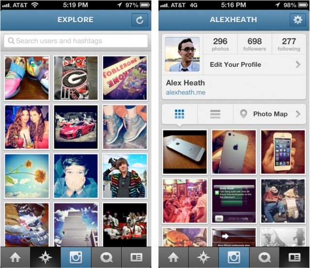
I've been working on several third-party apps from iOS 4 to 10. Flat design (as implemented in iOS 7) hasn't really made development easier. Most iOS 6 apps weren't even crazy about textured backgrounds [1] [2] [3]. Mostly it boiled down to designers giving us a PSD that we would slice into handful of resizable textures for UI controls (like Android nine-patches). It was a bit like table-based HTML design, but in a good way, as the framework completely supported it.

Then iOS 7 killed textures, but introduced translucency to make up for its overall blandness. And that really ruined the simplistic beauty of UIKit programming, since everything now has to deal with all the band-aid that is needed to make views extend below translucent bars (layout guides, edgesForExtendedLayout, automaticallyAdjustsScrollViewInsets, ...). Here's a random example of how translucent vs. opaque bars can cause trouble. [4] We've traded a few minutes in Photoshop for hours of wrestling with UIKit's undocumented heuristics when it comes to layout code/transitions.

[1] http://www.iclarified.com/images/news/24614/92620/92620.jpg [2] http://photos2.insidercdn.com/javascript-121220.jpg [3] https://cdn.cultofmac.com/wp-content/uploads/2012/09/Screen-... [4] https://stackoverflow.com/a/33537188

Re:Flat UI Elements Attract Less Attention and Cause Uncerta... by intoverflow2 on Monday September 04, 2017 @12:03PM (#15169076)
> Steve Jobs and Scott Forstall had a huge advantage, they only had to care about a 320x240

Honestly this isn't a big deal it's massively overstated. OS X managed to pull of Aqua and MS managed to pull off Aero both with arbitrary UI sizing.

I feel this point is only stated by people who came to UI when they only had to worry about 1 size and then were shocked at the idea of treating the UI as anything other than a Photoshop flat.

Re:Flat UI Elements Attract Less Attention and Cause Uncerta... by yoz-y on Tuesday September 05, 2017 @03:23AM (#15173142)
Arbitrarily resizing the iOS6 podcast app would be a challenge. Indeed many applications would be quite easy to adapt, but on iOS6 and prior some of the applications used quite unscalable elements. For example the notes app with a lined notebook would be a pain to adapt if you could arbitrarily scale fonts (which you can since iOS7 or 8).

The difference is also (I think) the average size of teams which made the apps. iOS has started the boon of one developer per app. Before it was of course done, but the scale is not comparable.

Re:Flat UI Elements Attract Less Attention and Cause Uncerta... by exodust on Monday September 04, 2017 @12:55AM (#15165824)
When iOS7 first booted up I honestly thought it hadn't installed properly, that I was missing button graphics and background textures. The app store design was a joke, with no defining separation between elements, everything plain white, it became a chore to intuitively recognise different areas.

From that point I have wanted a customisable iOS interface, where we are "allowed" to apply our own skins and themes. If people like flat design, that's fine, but it's unreasonable that the same uniform interface is forced on everyone.

Re:Flat UI Elements Attract Less Attention and Cause Uncerta... by chenster on Monday September 04, 2017 @12:52AM (#15165812)
I thought about the same. Apple should be the forefront of the UI game considering the design and UI always have been their strong suit. With that said, Apple has improved upon the "too flat" UI with subtle 3D and shade that actually made the UI generally more usable. The trick is to find the right balance.