News for hackers. Stuff that matters.
Re:In Loving Memory of Square Checkbox by grumbel on Sunday January 28, 2024 @08:59AM (#39165794)
My "favorite" toggle button is the one where they add on/off labels[1] to it, but only one, and the slider hides the label. So the label actually tells you the state, not the state it would be when you move the slider over the label. Or at least that's how I think how they work, it breaks my brain a little whenever I look at them.

[1] https://itsfoss.com/content/images/size/w1000/wordpress/2022...

Re:In Loving Memory of Square Checkbox by phkahler on Sunday January 28, 2024 @09:51AM (#39166291)
An icon or text should indicate the current state while hover text should indicate what will happen if you click. At least that's what we do. It's still confusing, but I agree you should be able to infer current state by looking at it. The person who designs it thinks it's obvious but it's usually not.

Checkbooks are quite self explanitory.

Re:In Loving Memory of Square Checkbox by coffeebeqn on Sunday January 28, 2024 @10:12AM (#39166491)
Hover isn’t really acceptable UX since the touchscreen era
Re:In Loving Memory of Square Checkbox by jfengel on Sunday January 28, 2024 @10:38AM (#39166718)
Even on desktops it's not great for accessibility. There isn't an indicator for what has tooltips, and they appear out of the usual flow of control.

Accessibility guidelines usually allow them but encourage you to make it a last resort.

Re:In Loving Memory of Square Checkbox by caymanjim on Sunday January 28, 2024 @10:48AM (#39166804)
Not to mention that half the time tooltips don't show up until you wiggle the mouse over them a bunch, and tooltip delays are arbitrarily timed and usually far, far too delayed (often on the order of hundreds of milliseconds when they should be like 10-50ms at most). And my biggest pet peeve about them is that, at least in Chromium-based browsers, they really don't like to go away once they finally show up, to the extent that I can often scroll the page until they're offscreen and they still don't disappear. Or they leave the farm entirely and persist outside the browser window.
Re:In Loving Memory of Square Checkbox by WorldMaker on Monday January 29, 2024 @12:20PM (#39179036)
Also, most windows aren't eligible for tooltips if they are not the focused, active window. I remember that difference being hard to explain to people when Windows 3.x and Mac Classic used entirely different title bars between the two states and sometimes even "shadowed" the window contents. It's especially hard to explain to today in a multi-monitor world and when inactive windows respond by default to all other inputs except some hover behaviors like tooltips. (I'm a software developer and know all this too well and I still tripped over it the other day wondering why tooltips wouldn't show up in a window and only realizing belatedly that the window wasn't active.)
Re:In Loving Memory of Square Checkbox by esafak on Sunday January 28, 2024 @03:46PM (#39169647)
It is ok; you just have to offer a different UX for each medium. And not every application is done on every medium. I don't code or write long-form on my phone.
Re:In Loving Memory of Square Checkbox by kwhitefoot on Sunday January 28, 2024 @03:54PM (#39169693)
Laptops have touchscreens too.
Re:In Loving Memory of Square Checkbox by esafak on Sunday January 28, 2024 @05:02PM (#39170258)
And trackpads or mice that let you hover.
Re:In Loving Memory of Square Checkbox by petee on Sunday January 28, 2024 @06:22PM (#39170911)
Some laptops fold so the mouse/trackpad is inaccessible and/or disabled.

I have a Lenovo yoga, and its a constant nightmare of websites and apps that cannot figure out if I am a laptop or a tablet, even with tablet-mode fully off. I am usually offered whichever UI is least useful for my current configuration

Re:In Loving Memory of Square Checkbox by throwaway2037 on Monday January 29, 2024 @12:27AM (#39172990)
Real question: Are there any touchscreens that provide the equivalent of hover with your finger?
Re:In Loving Memory of Square Checkbox by jerbear4328 on Monday January 29, 2024 @01:11AM (#39173240)
I have an older Android (Samsung S5) with a physical hover feature - you literally hover your finger close to the screen and it triggers hover actions like previewing a message or opening a magnifier over text. It is called "Air View"[1] in Samsung lingo, and was coupled with other features ("Air Gesture"[2]) involving moving your hand over your phone to do things like scrolling or waking the screen.

It's finicky on occasion, but when you are used to it, it's surprisingly intuitive practical! It wasn't super popular though, and I imagine it could be annoying to users who didn't want it. It appears they only did it for a few models, ending in the S5.

That phone was pretty interesting, sensor-wise. I kind of miss using it, and I wonder if it would be practical nowadays.

[1] Air View: https://www.samsung.com/hk_en/support/mobile-devices/what-is...

[2] Air Gesture: https://www.samsung.com/hk_en/support/mobile-devices/what-is...

Re:In Loving Memory of Square Checkbox by kmoser on Monday January 29, 2024 @01:02AM (#39173196)
Would tap-and-hold be the closest equivalent?
Re:In Loving Memory of Square Checkbox by mananaysiempre on Monday January 29, 2024 @01:41PM (#39180416)
At least that’s how you get tooltips on Android. Of course, tooltips were designed to be discovered by a user hesitating with their mouse over an UI element (sometimes works, sometimes doesn’t), while tap-and-hold on buttons you have to know about, and it’s still scary when the button looks like it could do something potentially destructive and you want to find out.
Re:In Loving Memory of Square Checkbox by rerdavies on Tuesday January 30, 2024 @11:29AM (#39192051)
Long-tap to see tooltips is a convention that has been proposed in various incarnations of the Android UI guidelines. The convention was present in very early Android UI guidelines (e.g. Android 4.x); I'm not sure if it still is.

The problem is that long-tap gets used for a lot of other things on Android (extended selection, particularly). The user experience is pretty unhappy if you use both conventions. And, in practice, long-tap tooltips are so rarely provided on Android apps that I doubt that ordinary users would expect them at all.

As far as I know, tap-and-hold (as distinguished from long-tap) isn't a conventional gesture on Android.

Re:In Loving Memory of Square Checkbox by phkahler on Monday January 29, 2024 @09:36AM (#39176703)
>> Hover isn’t really acceptable UX since the touchscreen era

It's an augmentation that can be used on desktops though. I agree that it shouldn't be necessary but, but it can help. Some apps aren't meant for mobile either.

Re:In Loving Memory of Square Checkbox by Scarblac on Monday January 29, 2024 @10:16AM (#39177189)
Depends on who your target audience is. Many applications can still safely assume they are for office workers using a desktop or laptop computer with a keyboard and a mouse.
Re:In Loving Memory of Square Checkbox by bmitc on Sunday January 28, 2024 @10:41AM (#39166746)
An element should do one thing, not two.
Re:In Loving Memory of Square Checkbox by eternityforest on Tuesday January 30, 2024 @05:59PM (#39197154)
Current state is the best, but it's still not immediately obvious unless you say "current: on" and "Click to turn off" in the hover.

At least sliders generally have right for on, as opposed to pure text toggle buttons which are just awful.

Re:In Loving Memory of Square Checkbox by mc32 on Sunday January 28, 2024 @09:28AM (#39166086)
Those are terrible. I think I’ve had analogs in the physical world where toggles indicated state by the color exposed (green = on, red = off) but this tries to be better by having both color indicator and text indicator) and you’re left deciphering their language a bit. Yes, it is terrible.
Re:In Loving Memory of Square Checkbox by Jasper_ on Sunday January 28, 2024 @12:10PM (#39167663)
The intended analog is lightswitches with the text on them.

https://cdn.thisiswhyimbroke.com/images/lightswitch-identifi...

Re:In Loving Memory of Square Checkbox by ptx on Sunday January 28, 2024 @03:42PM (#39169618)
I've never seen lightswitches like those, but that's a terrible design as well, for the same reasons.
Re:In Loving Memory of Square Checkbox by nerdponx on Sunday January 28, 2024 @06:03PM (#39170784)
They're ubiquitous in America, but approximately nobody pays attention to the text because the position is what indicates on/off, where "up" in "on".
Re:In Loving Memory of Square Checkbox by HPsquared on Sunday January 28, 2024 @07:25PM (#39171409)
Huh, I'd always considered that toggle switches are "down is on". (UK resident).

That way it's the same as a standard rocker switch (the direction of rotation is the same).

Re:In Loving Memory of Square Checkbox by ummonk on Sunday January 28, 2024 @07:49PM (#39171587)
I’d expect a rocker switch in America to also be the same as our light switches - pressed at the top for on, pressed at the bottom for off.
Re:In Loving Memory of Square Checkbox by nerdponx on Sunday January 28, 2024 @08:46PM (#39171889)
That's generally a rocker switches work on devices in America, e.g. guitar amps: the side that is pressed is "on" or selected/enabled.

Last time I was in Europe (Portugal), I remember having a lot of difficulty making sense of the light switches, but it was one of those apartments where you have two or three light switches controlling the same fixture, which is always confusing.

Still, I think the American light switches are actually pretty good. Maybe one day we will get a Technology Connections video about light switches around the world.

Re:In Loving Memory of Square Checkbox by DrSAR on Sunday January 28, 2024 @08:50PM (#39171900)
Until you encounter a switch that's part of a three-way switch arrangement where up can be on or off depending on the position of the other switch in the circuit.
Re:In Loving Memory of Square Checkbox by Izkata on Monday January 29, 2024 @11:23AM (#39178143)
I've lived with these my whole life, in every place I've lived, plus with one or two switches that were sideways, so the first time I'd ever heard "up is on" was in a comment thread like this a few months ago. I didn't think there was any sort of standard, it's just always been "flip the switch if it's not currently what you want".

This is in the US.

Re:In Loving Memory of Square Checkbox by nerdponx on Monday January 29, 2024 @01:32PM (#39180256)
It's still "on" in the sense of the circuit being closed.
Re:In Loving Memory of Square Checkbox by nerdponx on Sunday January 28, 2024 @09:00PM (#39171942)
In this case I mean "down" as in "the long part is pointing toward the ground", not "some button-like thing is depressed towards the wall".
Re:In Loving Memory of Square Checkbox by Spare_account on Monday January 29, 2024 @05:12AM (#39174682)
Agreed, in the UK:

- 'angled towards the ground' is 'On' (https://cdn.aws.toolstation.com/images/141020-UK/800/10481.j...)

- 'angled towards the ceiling' is 'Off' (https://www.tlc-direct.co.uk/Images/Products/size_3/MKK4870....)

Re:In Loving Memory of Square Checkbox by nerdponx on Monday January 29, 2024 @08:40AM (#39176095)
But that's completely backwards from a normal rocker switch!
Re:In Loving Memory of Square Checkbox by perilunar on Monday January 29, 2024 @09:53AM (#39176900)
In Aus most light switches are rocker switches that are also "down = on".

In aviation (and old cars) switches are usually toggle switches with "up = on".

Strangely I'm ok with both. I think of rocker switches as opposite to toggle switches automatically.

- https://www.google.com/search?q=rocker+switch

- https://www.google.com/search?q=toggle+switch

Re:In Loving Memory of Square Checkbox by beAbU on Monday January 29, 2024 @08:44AM (#39176136)
With a light switch you can immediately verify that the switch is in the correct position by looking at the light you want to control. Text/labels/positions don't add anything of value. Also, it's usually safe to experiment with the toggle until you get the desired state.

In software often none of this applies.

Re:In Loving Memory of Square Checkbox by teo_zero on Sunday January 28, 2024 @10:38AM (#39166721)
> green = on, red = off

Are you sure? I think the opposite is more common.

Re:In Loving Memory of Square Checkbox by djbusby on Sunday January 28, 2024 @10:54AM (#39166863)
I have at TV that is red-lamp off, blue lamp on.
Re:In Loving Memory of Square Checkbox by dylan604 on Sunday January 28, 2024 @10:55AM (#39166866)
where have you seen red = on, green = off?
Re:In Loving Memory of Square Checkbox by teo_zero on Sunday January 28, 2024 @12:02PM (#39167569)
In electrical industry, red used to mean powered or hot or dangerous, green unpowered or harmless.

All earth-leakage breakers in my area are like this: https://en.m.wikipedia.org/wiki/File:Schneider_Electric_A9D3... https://i.ebayimg.com/images/g/sHYAAOSwu2ZkBk5~/s-l960.webp

Electronics industry have diverged.

Re:In Loving Memory of Square Checkbox by pwython on Sunday January 28, 2024 @11:22AM (#39167117)
Most safety switches on firearms expose a red dot meaning the weapon is "ON"/ready to fire.
Re:In Loving Memory of Square Checkbox by DiggyJohnson on Sunday January 28, 2024 @11:26AM (#39167157)
I agree with you on that, but I’ve never seen green be the contrasting or alternative color.
Re:In Loving Memory of Square Checkbox by weebull on Tuesday January 30, 2024 @03:37AM (#39187722)
Maybe because a gun should never be treated as totally safe.
Re:In Loving Memory of Square Checkbox by Y-bar on Sunday January 28, 2024 @12:59PM (#39168085)
In security red generally means encryption/protection is active.

And then there is this: https://en.wikipedia.org/wiki/Tally_light

> In the active (on air) mode, tally lights are typically red.

> Some cameras and video switchers are capable of additionally showing a preview tally signal (typically green) for when the camera is about to be switched to and become the main source of video signal. Once the switch happens, green changes to red.

Re:In Loving Memory of Square Checkbox by weebull on Tuesday January 30, 2024 @03:39AM (#39187737)
> In security red generally means encryption/protection is active.

That's daft. You want to highlight (red) the insecure state, and reassure (green)in the secure state.

Re:In Loving Memory of Square Checkbox by Y-bar on Sunday February 04, 2024 @11:50AM (#39251858)
Really?

Do you want a real-world example have a look at US White House:

> President Obama talks on the phone aboard Air Force One. April 10, 2014.

> The Airborne Executive Phone has the red light on, which means it's a secure call.

https://www.electrospaces.net/2017/01/the-presidential-commu...

It is further made more clear because NSA literally calls their secure network the red network.

Re:In Loving Memory of Square Checkbox by kwhitefoot on Sunday January 28, 2024 @03:57PM (#39169725)
red and green should not be used like that. A significant fraction of the population, especially males, has difficulty telling them apart.

That's why mains wiring no longer uses red to mean live and green to mean ground.

Re:In Loving Memory of Square Checkbox by yabatopia on Sunday January 28, 2024 @09:28PM (#39172069)
I’ve seen it a few times on the web with cookie preferences pop-ups, to set your tracking and personalization preferences. Dark patterns to confuse and trick website visitors into enabling all tracking settings.
Re:In Loving Memory of Square Checkbox by vel0city on Sunday January 28, 2024 @01:04PM (#39168120)
Showing the current state matches light switches with the state on them.

https://www.homedepot.com/p/Leviton-15-Amp-Single-Pole-Switc...

Or car door locks which show red (unsafe) when unlocked. It's showing the current state, not the state that will be when toggled.

Re:In Loving Memory of Square Checkbox by lowbloodsugar on Sunday January 28, 2024 @02:01PM (#39168726)
Red means “stop” and green means “go”. So how the fuck does red mean “this door is passable”??!

“Unsafe” is contextual. If you are inside the car, and the car is on fire, then “locked” is very much the “unsafe” option.

Re:In Loving Memory of Square Checkbox by vel0city on Sunday January 28, 2024 @03:42PM (#39169626)
I've been in moving vehicles where opening the door would have been unsafe more than I've been in car fires. I often lock my car when leaving as well which usually unlocked is a bad state to leave it in, that normally happens more often than being in a burning car.

Are you in burning cars often?

Re:In Loving Memory of Square Checkbox by lowbloodsugar on Monday January 29, 2024 @12:06AM (#39172882)
Honestly, if I’m in the car and we’re driving then I want to see a red light for same reason: red means stop and green means go. Or from outside after parking it: will this door open or will it stop somebody.
Re:In Loving Memory of Square Checkbox by vel0city on Monday January 29, 2024 @12:34AM (#39173029)
Red also often means "danger, caution" not just "stop". A red stop sign means "pay extreme attention here, there's danger, please stop and evaluate". A red DO NOT ENTER sign isn't just saying to stop, its saying there's danger heading that direction. If you just stop there its probably not going to end well, So clearly they're signaling more than just "stop".

I'm still unsure, have you been in many burning cars before? More than just moving vehicles?

Re:In Loving Memory of Square Checkbox by rpmisms on Sunday January 28, 2024 @03:08PM (#39169336)
On many guns, switching the safety to the "fire" position exposes a red dot, red meaning "hot" or "fire".
Re:In Loving Memory of Square Checkbox by lowbloodsugar on Monday January 29, 2024 @12:09AM (#39172900)
Yeah my CZ pistol is like that and it’s fucking terrifying because in my mind red means stop or locked. I actually feel more secure with my Glock because it doesn’t have a safety so it’s unambiguous. If I point my Glock and squeeze, I know it’s going to fire.
Re:In Loving Memory of Square Checkbox by vel0city on Monday January 29, 2024 @12:24AM (#39172972)
The red of a stop light makes a lot more sense in relation to the red of a fire mode on a gun when you think of red being "caution, unsafe" instead of just "stop". Just like the red of a STOP sign is to caution you into paying attention of the danger of the cross traffic, not necessarily just stopping.

Red lights on top of towers isn't trying to tell planes and helicopters to stop, its telling planes to exercise caution around the tower.

Re:In Loving Memory of Square Checkbox by lowbloodsugar on Monday January 29, 2024 @12:44PM (#39179382)
Or like at a railway crossing. The flashing lights indicate danger, and the barriers drop. According to GP, the lights should flash when the barrier is not dropped, because now it's unsafe, FFS.
Re:In Loving Memory of Square Checkbox by weebull on Tuesday January 30, 2024 @03:28AM (#39187665)
Reprogram your brain for "Red means danger, green means safe" and you'll do a lot better.

Red at a traffic light means there's a danger so you stop. Green means it's safe to proceed.

Red on a gun safety switch means danger because it's live.

The red wire is live and dangerous. The green wire is earth and safe. (at least true in Europe).

Re:In Loving Memory of Square Checkbox by rpmisms on Monday January 29, 2024 @10:09AM (#39177092)
Ah, my CZ is a DA/SA with a decocker. I'd recommend it! No manual safety, but you can hold the hammer forward while holstering.
Re:In Loving Memory of Square Checkbox by wolfendin on Sunday January 28, 2024 @07:20PM (#39171372)
If you’re inside a car and the car is on fire, you’re not determining the state of the door lock by its position visually. For people inside the car unlocked is the unsafe position in most cases (leaving, driving.)

(Do car still come doors that don’t automatically unlock when the handle is pulled, if the child safety switch is disabled?)

Re:In Loving Memory of Square Checkbox by twixfel on Monday January 29, 2024 @11:22AM (#39178121)
At my current workplace (particle accelerator) one control panel in particular has red for "good" as in "this is red, so don't go in here, because everything's fine and you have no reason to". Always amuses me.
Re:In Loving Memory of Square Checkbox by folmar on Sunday January 28, 2024 @07:03PM (#39171258)
The link is 403 for me.
Re:In Loving Memory of Square Checkbox by Spare_account on Monday January 29, 2024 @05:00AM (#39174606)
Re:In Loving Memory of Square Checkbox by ajyotirmay on Monday January 29, 2024 @05:38AM (#39174835)
I guess such interactive elements always show the current state of the system, and when they are interacted with, it changes the state it was in, examples: 1. Social media buttons for upvotes/likes/dislikes 2. on/off toggle switches for features 3. microphone/speaker buttons on desktop OSes
Re:In Loving Memory of Square Checkbox by dotancohen on Monday January 29, 2024 @06:06AM (#39175007)
The YouTube play/pause button shows the action it will do, not the state that it is in.
Re:In Loving Memory of Square Checkbox by phkahler on Monday January 29, 2024 @09:48AM (#39176843)
>> The YouTube play/pause button shows the action it will do, not the state that it is in.

A lot of physical play/pause buttons show both symbols. Also in a lot of cases you can tell if a video is playing.

Re:In Loving Memory of Square Checkbox by dotancohen on Monday January 29, 2024 @10:11AM (#39177116)
Not if it's buffering because you know that you have a bad internet connection. Around here, I often see people skip to an earlier portion of the video to check if it is playing or not.

And that is anyway besides the point of consistent UIs' toggle switches describing their state, not their action.

Re:In Loving Memory of Square Checkbox by godshatter on Monday January 29, 2024 @11:21AM (#39178113)
I miss the old convention of showing a button with shadows indicating it's been pushed in vs. showing it with just a flat plane when it's not pushed in. A button that shows that it's been pushed in with a triangle icon means it's playing, clicking or touching it will stop it from playing. A button that doesn't indicate it's been pushed in with a triangle icon is not playing, clicking or touching it will start it playing. Bonus points if there is a small virtual led that turns on when it's pushed in.

Fewer and fewer devices we have access to these days have physical switches on them, though.

Re:In Loving Memory of Square Checkbox by rerdavies on Tuesday January 30, 2024 @11:52AM (#39192380)
As someone who has built media players, the established convention seems to be that the play/pause button shows what the button will do. It hurts me to do "button shows what it will do" every time. But all the other media players I'm familiar with do it this way.

Does anyone know of a major media player where the play/pause button shows what the state is, rather than what the button does?

Re:In Loving Memory of Square Checkbox by eternityforest on Tuesday January 30, 2024 @06:02PM (#39197190)
Why not just have separate play/pause buttons and highlight the active one?
Re:In Loving Memory of Square Checkbox by cesaref on Monday January 29, 2024 @07:50AM (#39175655)
And (as a european) i'm reminded of the confusing american light switches which show a light when they are off. Oh, and they toggle in the wrong direction (up is on?).

By comparison, it's quite common here to have a switch with a lamp to indicate the light is on, which get used when the status of the light cannot be easily seen where the switch is located (e.g a switch for a light in the loft/outside light etc).

Re:In Loving Memory of Square Checkbox by bonton89 on Monday January 29, 2024 @08:33AM (#39176014)
I believe American light switches are intended to confirm to a standard if installed correctly. But that all goes out the window with a 3 way switch.
Re:In Loving Memory of Square Checkbox by vel0city on Monday January 29, 2024 @08:38AM (#39176083)
I'd say in a residential setting our switches make a lot of sense.

The light up variety are mostly to aid turning on the lights in the dark and aren't usually the default. It's nice being able to see the switch when entering a dark room.In a residential setting it's a bit more rare to have a switch control a light you're not either immediately seeing or are often imminently going to see, like a closet or looking out a window next to the switch. It's not like you're often turning on and off lights across the house, so having it light up when the room lights up is rather redundant instead of offering that dark time help. Finally, having an on light would be really redundant since you can usually easily see the switch is physically pointing up or down and they sometimes even say ON or OFF.

As for up being on and down being off, it's about being easier to toggle to the safer state. It's more likely for off to be a safer state (think changing a bulb, having it connected to a garbage disposal, etc.). It's generally easier to flip the switch down than flipping it up, so it's easier to toggle to the safe state rather than the unsafe.

Re:In Loving Memory of Square Checkbox by Scarblac on Monday January 29, 2024 @10:19AM (#39177222)
> And (as a european) i'm reminded of the confusing american light switches which show a light when they are off.

I have those in Europe. The point is that you can find the light switch in the dark. Why would it need a light when it's on, if it's in the room that it lights?

Re:In Loving Memory of Square Checkbox by neuralRiot on Wednesday January 31, 2024 @04:28PM (#39209658)
This reminds me of when i was studying electronics and we had to design a circuit with some purpose. I made a “Light indicator” with an LED a photoresistor and some other stuff.
Re:In Loving Memory of Square Checkbox by wredue on Sunday January 28, 2024 @01:38PM (#39168483)
I actually hate this one because it’s completely unclear.

Does OFF there mean

-the setting is off

Or

-Slide this thing over to turn it off

I’ve seen it both ways. It’s confusing and not clear.

Re:In Loving Memory of Square Checkbox by RunSet on Sunday January 28, 2024 @02:27PM (#39168969)
Re:In Loving Memory of Square Checkbox by MrOxiMoron on Sunday January 28, 2024 @02:10PM (#39168824)
is the bridge open when it's up or is it closed when it's up?
Re:In Loving Memory of Square Checkbox by chrisweekly on Sunday January 28, 2024 @04:18PM (#39169914)
are you in a car or a boat?
Re:In Loving Memory of Square Checkbox by mvaliente2001 on Sunday January 28, 2024 @02:30PM (#39168994)
My same thoughts. The inventors of that revolutionary toggle button should all be tied to the South side of an ass walking towards the North.
Re:In Loving Memory of Square Checkbox by HaZeust on Sunday January 28, 2024 @07:10PM (#39171301)
I don't like these. They can be mistaken to users as an indicator of what moving the "lever" to the other side of the toggle button will actuate - effectively reversing the user's intent of the button as compared to what the buttons do.
Re:In Loving Memory of Square Checkbox by plorg on Sunday January 28, 2024 @08:03PM (#39171663)
Or when you try to unsubscribe from a mailing list and are prompted:

  Unsubscribe from the following:
  [X] List A
  [X] List B
  [X] List C

  [ ] Unsubscribe All Lists
But if you check the "all" button it clears all of the individual ticks.

I would say a solid 80% of unsubscribe prompts have some sort of similarly confusing layout or verbiage.

Re:In Loving Memory of Square Checkbox by amenghra on Monday January 29, 2024 @04:39AM (#39174469)
That's by design. They want to minimize the number of people who completely unsubscribe.
Re:In Loving Memory of Square Checkbox by neycoda on Monday January 29, 2024 @09:29AM (#39176640)
Having an Unsubscribe All Lists checkbox doesn't minimize that. It just adds form noise and pointless work for a dev. The minimization already happens with the preceding checkboxes to select each list to unsubscribe from, but that's just as inherent to the form as the desirable feature of being able to keep certain subscriptions while unsubscribing from others in an efficient way.

A button or link in place of the 'All' checkbox makes sense and is easiest for users to understand, and has less user actions required.

Treat your customers well even when they're exiting (especially) so they remember something good next time they consider you. "Well at least they made it easy to unsubscribe" is better than "Well they made it unnecessarily complicated to unsubscribe". No need to add insult to injury.

Re:In Loving Memory of Square Checkbox by beAbU on Monday January 29, 2024 @08:42AM (#39176114)
I have to admit I've never experienced this. When I check the "all" checkbox it goes and checks all the other checkboxen for me. Maybe I've only interacted with "nice" unsubscribe pages.
Re:In Loving Memory of Square Checkbox by neycoda on Monday January 29, 2024 @09:23AM (#39176577)
I've seen both versions, and whether they check or uncheck all of the other options (behaving like a radio button), both versions are overcomplicated nonsense.

The unsubcribe-all should just be a link or button with its own submit value or URL param (like unsubscribe=all).

I don't know why people overcomplicate things.

Re:In Loving Memory of Square Checkbox by neycoda on Monday January 29, 2024 @09:19AM (#39176524)
It makes no sense to have a checkbox for "Unsubscribe All Lists". That should just be a link. There's no point in adding a redundant form element even if it's only conditionally redundant.
Re:In Loving Memory of Square Checkbox by OJFord on Monday January 29, 2024 @12:31PM (#39179201)
Or a radio button between all and choose which to unsubscribe from.
Re:In Loving Memory of Square Checkbox by no_wizard on Monday January 29, 2024 @09:46AM (#39176816)
I think this is about confusing AI like that offered from gmail or iCloud email that will unsubscribe for you if you click on unsubscribe from their respective inbox / application. Fastmail offers this too.

I noticed there are times I have to do it manually and can't take advantage of auto unsubscribe because the button layouts are like this.

Re:In Loving Memory of Square Checkbox by snowwrestler on Monday January 29, 2024 @09:59AM (#39176967)
The unsubscribe buttons in email clients are powered by a header that the email includes. Google and Yahoo just started requiring these for all bulk senders (they were previously a best practice only). It doesn’t rely on what the manual preferences page looks like.
Re:In Loving Memory of Square Checkbox by louis-lau on Monday January 29, 2024 @09:03PM (#39185539)
This is just a standard unsubscribe header. It's added by the sender specifically for this purpose and has nothing to do with the UI you see. Not everything is AI, but it being the default assumption is funny to me.
Re:In Loving Memory of Square Checkbox by chazeon on Monday January 29, 2024 @12:05PM (#39178785)
I remember when I designed a list of checkboxes this case was specifically considered. The last one needs to be updated when all of the checkboxes above are checked or one of them is unchecked.
Re:In Loving Memory of Square Checkbox by MarkLowenstein on Monday January 29, 2024 @01:28AM (#39173358)
I would not be able to tell if these slider toggles were saying "yes" or "no" without them going from gray to green. How do colorblind people deal with them?

That the whole world adopted these abominations, when there was absolutely nothing wrong with checkboxes, is immensely frustrating.

Re:In Loving Memory of Square Checkbox by sbuk on Monday January 29, 2024 @06:18AM (#39175059)
Most of us cope just fine, so long as the contrast between the states is clearly different. My colour blindness is anomalous trichromacy, with a perception difference for red-green. Because the examples shared are a bright blue for on and black for off, I can see it just fine, however, I'd suggest making the switches off state back ground the same as the main background in this case. Aesthetically, it looks better.
Re:In Loving Memory of Square Checkbox by bonton89 on Monday January 29, 2024 @08:30AM (#39175995)
Does green (usually these are blue) mean yes? Every time I see one of these I realize I don't understand them and I'm not even sure they are consistent in behavior. I usually use a context cue to infer what they mean. The dumbest part is there is plenty of room to just write "on" and "off" right on them.

I think it is no coincidence these are the preferred control for all manner of dark pattern setting screens.

Re:In Loving Memory of Square Checkbox by marcosdumay on Monday January 29, 2024 @09:16AM (#39176490)
Yes, green means "yes".

Now, does light-green mean "no" because it's light, or "yes" because it's green? That one you have to check on each application.

Re:In Loving Memory of Square Checkbox by beAbU on Monday January 29, 2024 @08:34AM (#39176033)
Yeah so in your example:

"Disable all extensions" = OFF.

Does this mean all extensions are currently on, or off? Does toggling the switch to on /enable/ the disable-all-extensions subroutine?

A switch brings in a bunch of double negatives that can be avoided in most cases.

Hella confusing!

Re:In Loving Memory of Square Checkbox by phkahler on Monday January 29, 2024 @09:42AM (#39176773)
>> A switch brings in a bunch of double negatives that can be avoided in most cases.

If you put the labels next to the switch: ON [xxxx] ---- OFF then it's clear that sliding the switch toward the label puts it in the on or off state. But hey, we can save some screen real estate but swapping the labels and hiding the inactive one under the switch! Yay! For on/off a chechbox is much clearer for the size.

Re:In Loving Memory of Square Checkbox by marcosdumay on Monday January 29, 2024 @09:14AM (#39176476)
Physical switches are labeled like that. Somehow, it's not a problem for them, but I do agree that on-screen ones are very unclear.
Re:In Loving Memory of Square Checkbox by neycoda on Monday January 29, 2024 @09:34AM (#39176678)
It's rare to see physical switches like mobile toggles. Most switches show both labels with the switch pointing to the label. It's clear what the status of the switch is and what changing the switch will do.

With software however, the inconsistency comes from knucklehead design. Hipster aesthetics. "But I want ours to be different!" They introduce toggles that don't follow convention and make unclear the status and behavior, or if touching it will even do anything. It then muddies up in people's minds how the conventional ones look and behave.

Re:In Loving Memory of Square Checkbox by marcosdumay on Monday January 29, 2024 @10:33AM (#39177407)
Physical sliding switches usually look exactly like the ones on your link.

Ex: https://www.chily.com/customer/chily/product/3331_350.png
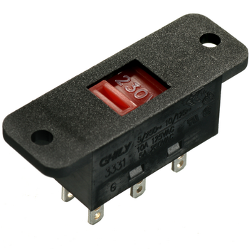
(Why selling photos of those things never seem to show the label?)

Re:In Loving Memory of Square Checkbox by fhub on Monday January 29, 2024 @12:14PM (#39178942)
My "favorite" is when they use green color to indicate "Off". Like in this page

https://www.istockphoto.com/plans-and-pricing

The dark patterns here are something to behold (A bit like Adobe's stuff)