News for hackers. Stuff that matters.
Re:The end of the nice GTK button by Flow on Friday March 25, 2022 @01:17AM (#30798865)
I really miss a consistent user experience. A core idea that I as a user can rely on to predict how a new app will work. I was in awe when I discovered as a kid that user interface were a research area. Things like Fitt's Law and so on. It was not just opinion.

Today I get the feeling it's mostly just opinion. Either the designer's opinion or the wish to copy the look of something.

Whenever I see a hamburger menu I silently think "Here someone has given up".

And there are a lot of behaviors that are not functioning well.

Is something a button? Should I click it or double-click it? How about long-press on it? How can I know when there's no visual clues?

Things like "Hide cursor while typing" in Windows. It has not worked properly for decades and today only work in some super old apps like Notepad.

Another thing is type-ahead. I remember in classic MacOS, people pressed shortcuts and started to type the filename or whatever. It was all perfectly recorded and replayed. In modern Windows, press Win-key and start to type, oops, it missed the first keypresses, presented the completely wrong results and made a mess of your workflow.

I feel confused and disrespected as a user every day and I've been using WIMP graphical user interfaces since 1986. Sure, computers do more today, but there's less consideration of almost everything.

Re:The end of the nice GTK button by Derbasti on Friday March 25, 2022 @03:50AM (#30799608)
> In modern Windows, press Win-key and start to type, oops, it missed the first keypresses, presented the completely wrong results and made a mess of your workflow.

The worst offender is the login prompt. In Gnome, from the lock screen, I simply start typing my password. As soon as I type the first letter of the password, the password prompt appears, and when I'm done I hit enter and it unlocks.

On Windows, the first letter merely makes the prompt appear, but does not yet type into the prompt. In fact, it will only start feeding letters into the prompt once the little prompt-appearing-animation has finished. If I just start typing my password, it will eat the first three or four letters. So I hit enter, wait for the animation to finish, and only then start typing.

That's not the end of the world, honestly. But it is a learned gesture that the system taught me by failing to do what I'd asked it to do. It just goes to show the attention to detail that makes a UI feel fluid and frictionless.

Re:The end of the nice GTK button by inetknght on Friday March 25, 2022 @09:50AM (#30802145)
> In Gnome, from the lock screen, I simply start typing my password. As soon as I type the first letter of the password, the password prompt appears, and when I'm done I hit enter and it unlocks.

Congratulations! You were able to recognize that it's a _login screen_ without seeing that there's a hidden password field.

The first time I booted to Gnome I waited damn near ten minutes for it to tell me it's ready for my login before I decided to start typing things to see if it was stuck.

It's _not_ intuitive.

Re:The end of the nice GTK button by brimble on Friday March 25, 2022 @12:24PM (#30804072)
Miming mobile OS lock screens is one of the weirdest damn things about modern desktop trends. It's so obviously a bad idea. I can't even figure out what useful functionality anyone thought that would provide. It's a fucking desktop, there's plenty of room to stick notifications or the weather or whatever on the same screen as the login prompt, if that's what you want.
Re:The end of the nice GTK button by apatheticonion on Friday March 25, 2022 @07:08PM (#30807863)
Honestly it's what annoys me most about Gnome. I daily drive Gnome 4x but for the love of god stop making design decisions for mobile users.

- Why is there a full screen app drawer?

- Why does the top bar do nothing and function like my Android top bar?

- Why are there no icons in my tray for my background apps (steam, slack, etc)?

- Where can I go to see my current running applications?

I would love to use a Linux distro on my phone, but not at the expense of my Desktop experience.

Re:The end of the nice GTK button by abenga on Sunday March 27, 2022 @01:57AM (#30818056)
I've said this on Reddit before, but the current Gnome is excellent for someone who loves it and only needs a few changes to make it work for you. Personally, I like how everything works (you could also say that this is some form of Stockholm Syndrome, ha ha). I like not having anything distracting from

The answer for most of these is "there's an extension for that"

> - Why is there a full screen app drawer?

https://extensions.gnome.org/extension/6/applications-menu/ (fully supported by the Gnome team; hopefully shouldn't break from release to release)

> - Why are there no icons in my tray for my background apps (steam, slack, etc)?

There are a variety of extensions that do this, I use Topicons Plus (https://extensions.gnome.org/extension/495/topicons/), which also seems to be a part of the core suite.

> - Where can I go to see my current running applications?

I rarely have to do this (for me it's almost always IDE, Terminal, Browser), but "alt-tab then escape" is an option. For the window list at the bottom, there is the Window List Extension (https://extensions.gnome.org/extension/602/window-list/), part of the core Gnome desktop as well.

In short, most of your complaints would be solved by logging into Classic Mode, which tries to emulate the Gnome 2 experience using some built in extensions.

> - Why does the top bar do nothing and function like my Android top bar?

I am not sure what this means, but I like the Shell's current behavior where we have as few active elements as possible detracting from your active window.

Re:The end of the nice GTK button by apatheticonion on Sunday March 27, 2022 @09:30AM (#30820078)
I should preface that I love Gnome and am excited by the future. My criticisms come from a place where I want to see it be the best experience possible on desktop, and the obvious choice when it comes to choice of DE.

> there's an extension for that

Yeah this is fair, sadly it's not a satisfying solution. Extensions are often not supported on the latest version of Gnome for some time and even then, there's an issue of discoverability for both experienced and new users.

I understand the desire for customizability, but I'd prefer my desktop environment come out of the box tailored to facilitate a desktop experience.

> https://extensions.gnome.org/extension/6/applications-menu/

I am happy there is an alternative however this has the side effect of removing the "Hit the super key then type a search query" workflow. Ironically, an actual application menu is nearly entirely useless for me outside of niche cases. I have been using start menu search and spotlight for years at this point - gnome's activities overlay is just that with extra animations.

> I rarely have to do this (for me it's almost always IDE, Terminal, Browser), but "alt-tab then escape"

This is exactly how I use my desktop too.

In MacOS I used virtual desktops so heavily to organise this and it was an _incredible_ workflow.

Monitor 1, desktop 1 is terminal, desktop 2 is IDE. Monitor 2 desktop 1 is debugging browser, monitor 2 is slack, music and misc. Flicking between the desktops, everything is positioned exactly where I want it to be and there is no guessing what is going to be shown.

I only started using Alt+Tab after coming back to Windows and now again on Gnome. Alt tab is a bit too guess-y for my taste. If you have multiple windows of the same type (e.g. browser and seperate browser debugger) open, what does Alt-Tab open?

In Gnome, rather than using virtual desktops, I hit the super key and pick the application out of the application mosaic because it's deterministic and faster than Alt-Tab

> I am not sure what this means

Swipe down from the top left and you have applications, swipe down from the top right and you have quick settings. Clock is in the center. The elements are responsive. It looks and functions like the top bar for a mobile device.

The top bar doesn't have application shortcuts, it doesn't show you active background applications.

If you look at the effort that all desktop experiences have made to make their top bar/desktop bar useful, you will see distinct differences when compared to mobile operating systems that have to be cognizant of their use of space.

MacOS has a global menu, taskbar tray, taskbar add-ons (for cpu usage, international clocks, etc) and applications are opened via spotlight (Albert) search.

Windows has shortcuts, a start menu with search, and a taskbar tray, along with lots of options to administer the computer when you right click the start bar.

Gnome offers a horizontally space efficient mobile-optimised top bar and a full screen, mobile style application picker. Application search and the open apps mosaic are the saving factors of it

Re:The end of the nice GTK button by throwaway82652 on Saturday March 26, 2022 @03:29PM (#30814614)
>Why are there no icons in my tray for my background apps (steam, slack, etc)?

I understand the other ones but I don't understand this one. The Android tray does exactly this, background icons on the bar are a mobile feature. If you consider the Windows taskbar to be the ideal desktop experience, it doesn't do that, it hides the icons in a menu.

Re:The end of the nice GTK button by apatheticonion on Sunday March 27, 2022 @09:12AM (#30819943)
Not sure what you mean here - both MacOS and Windows have icons in the system tray for background applications and it's been that way since before Android was a thing.

Windows does hide excessive icons, which MacOS doesn't do - it's a great way to hide running the pre-installed Skype and Teams at the same time :laugh:

Re:The end of the nice GTK button by throwaway82652 on Sunday March 27, 2022 @09:39AM (#30820140)
Normally I'm a Mac/Linux user, but last time I tried Windows it hid all the icons by default. They used to show them in older versions but they do not anymore, probably because everyone including the OS vendor itself uses it as a dumping ground for product tie-ins and clutter like that.
Re:The end of the nice GTK button by Timpy on Friday March 25, 2022 @09:09PM (#30808445)
These things made me move away from Gnome. In gnome3 occasionally the login screen would require me to click the screen and drag upwards to get the login prompt. Customizing any if these things was always a hacky workaround. I'm very happy with Mint Cinnamon right now.
Re:The end of the nice GTK button by dylan-m on Friday March 25, 2022 @12:34PM (#30804208)
One unfortunate reality is, for a lot of new users - especially people who haven't used desktop computers before - their first computer was a mobile device. If we don't want Apple and Google to take over the entire space, we need to meet them halfway.

The lock screen is weird, though, I agree. The newer (blurry background) one is better than the old one with the tedious swipe animation, but really could use a persistent "do this to unlock" prompt / button, because many people just aren't comfortable poking their computer unless they know what it is going to do. A lot of modern UI design unfortunately forgets that.

For what it's worth, the original design for GNOME's current lock screen involved bridging the gap between it and the login / switch user screen, which _would_ involve some more UI elements, but the actual implementation must have stalled somewhere.

Re:The end of the nice GTK button by ldng on Saturday March 26, 2022 @06:13PM (#30815840)
Oh ok, so people don't make the difference between a mobile phone and a computer. That is also why they don't know how to use a TV because it's not like a smartphone, right ?

That was a very bad idea from the very start. But it's the motto Gnome 3 was built on... I agree with the initial comment, Human-Computer Interraction SCIENCE went down the toilet drain to be replaced with so called UI/UX "experts"

Re:The end of the nice GTK button by SomeInterwebDev on Saturday March 26, 2022 @03:31PM (#30814629)
agreed. awful.
Re:The end of the nice GTK button by fxtentacle on Friday March 25, 2022 @04:29AM (#30799760)
That is one of the main reasons why I switched from XCode to CLion. XCode lost keystrokes, which drove me crazy. The other thing was that I could reliably type faster than XCode could display the letters, which made me feel like I'm drunk.

CLion seems to be quite excellent at recording and replaying everything, including stuff I type while the auto-completion is loading. Plus it has a really fast key to screen loop.

Re:The end of the nice GTK button by andai on Friday March 25, 2022 @09:27AM (#30801872)
JetBrains did a lot of work to reduce typing latency of their IDEs:

https://blog.jetbrains.com/idea/2015/08/experimental-zero-la...

As an aside, I find it amusing that more latency is introduced by a USB keyboard than existed in an entire 80's computer (from keypress to rendering on screen). See also: Carmack's rant about how it takes longer to put a pixel on the screen than ping across the Atlantic.

Re:The end of the nice GTK button by WayToDoor on Friday March 25, 2022 @09:53AM (#30802179)
Re:The end of the nice GTK button by jordibc on Friday March 25, 2022 @11:52AM (#30803642)
About the USB keyboard, that may be true only for the cheapest keyboard you could find, but basically not applicable anymore nowadays. Rather than giving you the details, let me link to this video, which is awesome at explaining it and much more -- the USB vs PS/2 part starts here: https://www.youtube.com/watch?v=wdgULBpRoXk&t=1766s
Re:The end of the nice GTK button by NovemberWhiskey on Friday March 25, 2022 @10:54AM (#30802908)
>As an aside, I find it amusing that more latency is introduced by a USB keyboard than existed in an entire 80's computer

Uh what?

Re:The end of the nice GTK button by andai on Friday March 25, 2022 @01:42PM (#30805099)
Found the article I was thinking of:

>at the time I did these measurements, my 4.2 GHz kaby lake had the fastest single-threaded performance of any machine you could buy but had worse latency than a quick machine from the 70s (roughly 6x worse than an Apple 2), which seems a bit curious.

>We can see that, even with the limited set of keyboards tested, there can be as much as a 45ms difference in latency between keyboards. Moreover, a modern computer with one of the slower keyboards attached can’t possibly be as responsive as a quick machine from the 70s or 80s because the keyboard alone is slower than the entire response pipeline of some older computers.

https://danluu.com/keyboard-latency/

Re:The end of the nice GTK button by the_pwner224 on Friday March 25, 2022 @12:00PM (#30803783)
Most normal keyboards, mice, and USB HIDs report events at a rate of 125 hz == 8 ms between reports.

Gaming mice usually go up to 1000 Hz / 1ms, the wireless ones usually let you configure down to 500/250/125 Hz if you want a bit more battery life. I'm sure that gaming keyboards also have a high refresh rate.

If you have a 144 Hz monitor that actually means your (normal) keyboard and mice are reporting events less often than your display is updating.

Re:The end of the nice GTK button by formerly_proven on Friday March 25, 2022 @12:51PM (#30804460)
A lot of gaming hardware is trash. 1000 Hz on the package, endless latency inside, buggy firmware, buggier and resource-hogging companion apps, which are always Windows-only, and there are still even "gaming keyboards" which are 2KRO, bad materials and so on

That being said pretty much any 1000 Hz mouse is better than any 125 Hz mouse when using high refresh rates because the discrepancy between the 125 Hz mouse poll rate and the 120 or 144 Hz display causes very noticeable jitter. If you have a mouse where the poll rate can be adjusted, this can be easily A/B tested; it's quite visible in high-framerate recordings as well (this can be done in OBS by using the fractional frame rate selector and just inputting 144:1).

Re:The end of the nice GTK button by natdempk on Friday March 25, 2022 @07:15AM (#30800719)
All of the Jetbrains editors also have these bugs in some places too unfortunately. The main one I run into is when you open the fuzzy goto modal (CMD + O) there’s a delay before the window opens where if you paste/type anything it goes into the file you’re editing instead of the search box. It’s been like this for at least 5 years.
Re:The end of the nice GTK button by cerved on Friday March 25, 2022 @07:54AM (#30800996)
The quality of JetBrains products are overall high
Re:The end of the nice GTK button by copperx on Friday March 25, 2022 @12:44PM (#30804359)
JetBrains develop the only modern software that makes me go "wow, that's amazing."

Ok, maybe not. Honorable mentions to some Adobe's algorithms and Apple's Sidecar / Universal Control functionality.

Re:The end of the nice GTK button by hulitu on Friday March 25, 2022 @04:31AM (#30799769)
Win 10 tought me to type again at least CTRL+ALT if i want my password to be accepted from the first time. Clicking with the mouse sometimes works before entering the password. It seems that at MS and also in other areas (Android, Gnome) people want just to code new things but not debug or fix bugs. They also must be as simple as possible because: 1. code reuse sucks. 2. Thinking is hard.
Re:The end of the nice GTK button by aitchnyu on Friday March 25, 2022 @06:03AM (#30800274)
When I log into a Win 10 virtual desktop with 1024*768, the login form with 2 text fields and a button gets shoved into a box and I have to scroll down to see it fully.
Re:The end of the nice GTK button by copperx on Friday March 25, 2022 @12:35PM (#30804229)
It's certainly not the end of the world, but it's death by a thousand papercuts. I find macOS has fewer sharp edges (but still has plenty of them), and Linux too, once the system is configured and only used for writing code.
Re:The end of the nice GTK button by formerly_proven on Friday March 25, 2022 @05:56AM (#30800234)
iirc this is a Windows 8/10 regression and worked perfectly on Windows 7.
Re:The end of the nice GTK button by d1sxeyes on Friday March 25, 2022 @04:32AM (#30799775)
> That's not the end of the world, honestly. But it is a learned gesture that the system taught me by failing to do what I'd asked it to do.

Although I agree this is annoying, to be completely fair, it doesn't suggest that you should start typing your password immediately.

You could also start typing 'news.ycombinator.com' and it wouldn't browse to HN, but you wouldn't say that it failed to do what you asked it to.

Arguably, you have been 'taught' or you have inferred yourself that you should expect a sleeping system to immediately accept your keypresses as a password, which although reasonable is not necessarily a good practice.

For example - I have two computers connected to the same keyboard, one is indeed Gnome, the other Windows. I have twice now typed my password into what I thought was my sleeping Gnome system, hit enter, only to have to apologise to someone on Teams because I accidentally sent them my password because my keyboard was sending my keypresses to the Windows PC.

Re:The end of the nice GTK button by OrderlyTiamat on Friday March 25, 2022 @05:39AM (#30800159)
I... am sorry, but I think that is extremely bad practice. You should not put yourself in that position, and your experience in that position does not excuse the design flaws in windows.

> You could also start typing 'news.ycombinator.com' and it wouldn't browse to HN, but you wouldn't say that it failed to do what you asked it to.

Well firstly, that isn't what the prompt is for, so I'm struggling to see the relevance. However it is a good example for me- When I type C-l right now, I can _immediately_ start typing 'news.ycombinator.com'. There is no delay, no animation, nothing. I didn't go through a learning experience of finding out how long I should wait before typing- it's just ready.

Fundamentally: _why_ should I have been "taught" anything about how long I should wait? I don't have to do that on my ubuntu laptop. I don't have to do that on firefox in the example you handed to me. It's bad when I have to learn that. The computer should never make me wait unnecessarily, and I find it worrying that people are so readily accepting of it.

Re:The end of the nice GTK button by tsimionescu on Friday March 25, 2022 @08:11AM (#30801150)
GP's (I think reasonable) point was that typing A on the keyboard of a locked (or worse, sleeping) computer has no reason to be interpreted as "input the letter A into the password field that will be displayed on screen", which is what the original post is assuming it should mean. There's no real reason it should even mean "input the letter A into the first field that comes into focus", which may anyway not be the password (it could be the Username field in certain setups).
Re:The end of the nice GTK button by kaba0 on Friday March 25, 2022 @09:16AM (#30801759)
Well, you usually see the logged in user’s name and icon on the screen, and presumably you left your own computer there.

And frankly, UX is about finding the little practices that make the experience better — arbitrarily waiting for windows to bring up a prompt is not making me any good, since I know what I want to do. So in my opinion in this very special case, windows is simply doing an incorrect thing — making the common case slow.

Re:The end of the nice GTK button by d1sxeyes on Friday March 25, 2022 @12:00PM (#30803780)
> Well, you usually see the logged in user’s name and icon on the screen

I don't have this experience. On Windows (10, at least), normally I see either a black screen (if it's asleep) or a wallpaper, clock, and a message saying 'Press Ctrl + Alt + Delete to unlock.'

> arbitrarily waiting for windows to bring up a prompt

I don't think it's arbitrary. It's doing something - it's calling Winlogon, spinning up disks and reading hibernation data into memory, restarting power to powered down components, probing authentication methods available (eg: fingerprint/card readers), in case of domain joined computers, validating whether the domain is available (which means firing up network interfaces), and if so, whether the user's password has changed, etc.

There are definitely downsides to Microsoft's approach here - as you mention, in a large number of cases, it takes more time to unlock the computer.

However, there are also upsides if you accept that UX is only one consideration when designing a secure log on prompt, and there may be other priorities.

Re:The end of the nice GTK button by d1sxeyes on Friday March 25, 2022 @07:43AM (#30800902)
> I... am sorry, but I think that is extremely bad practice.

Completely correct - I'm not excusing my lack of attention there.

> Well firstly, that isn't what the prompt is for

That's exactly my point. There is no prompt displayed on the screen, you have not been asked for input. You are pre-empting the next prompt before the system is ready for it.

> When I type C-l right now, I can _immediately_ start typing 'news.ycombinator.com'. There is no delay, no animation, nothing. I didn't go through a learning experience of finding out how long I should wait before typing- it's just ready.

Agreed - but that's with the application already open. From the lock screen, it won't do what you intend. With Firefox running and in focus, Ctrl + L tells the application to focus the address bar, but it only works in that context, you first have to prepare the correct context (computer unlocked, Firefox running, in the foreground and focused).

On Windows, Ctrl + Alt + Del tells the system to wake, not 'the next characters entered will necessarily be the password of the most recently logged in user'.

In fact, I tested a little bit, and often Ctrl + Alt + Del on a sleeping system actually asks me to enter a username first, not a password, although in some cases the username is pre-filled for me, and the password prompt will be focused. I cannot necessarily know a priori which I will be asked for until the system wakes and decides.

As soon as Windows displays the prompt, you can type into it (same as Gnome). The only difference is that Windows requires you to first wake and then authenticate once the system is woken, while Gnome allows you to do both simultaneously.

There is one particular 'pro' to the Windows approach of requiring Ctrl+Alt+Del which is that it's an interrupt sequence. If a malicious actor created a full screen application that mimics the Windows password prompt, it would not be effective because the Ctrl+Alt+Del sequence cannot be handled by an application. The same is not true for Gnome - if a malicious actor created a full screen application that mimics the login prompt on Gnome, you could be tricked into entering your password.

Re:The end of the nice GTK button by klibertp on Friday March 25, 2022 @10:52AM (#30802873)
> Arguably, you have been 'taught' or you have inferred yourself that you should expect a sleeping system to immediately accept your keypresses as a password, which although reasonable is not necessarily a good practice.

I fail to see why that wouldn't be a "good practice". Last weekend I read some articles on Canon Cat[1], and Jef Raskin referred[2] to the feature as something desirable:

> In many ways it was, for 1987, far ahead. [...] instant on with any keystroke (and you didn't even lose the keystroke)

He goes on to explain why it's a good idea to do so in the article, it's a good read.

[1] https://en.wikipedia.org/wiki/Canon_Cat

[2] https://www.apple-history.com/gui_raskin2

Re:The end of the nice GTK button by d1sxeyes on Friday March 25, 2022 @12:44PM (#30804367)
Thanks for sharing. I can definitely see why it might be appealing. However, using Ctrl + Alt + Del guarantees that only Winlogon can handle the logon, no other process can be simulating the login prompt.

My dad told me about a program he wrote for a PDP-11 which would just simulate a login prompt. When a username and password were entered, it would append it to a file somewhere, then print the 'Incorrect username or password' message, and exit silently.

The user would assume they'd fat-fingered the password, and try to log in again (successfully) and be none the wiser that their password had just been stolen.

The Windows dependency on Ctrl+Alt+Del makes this type of attack impossible, while systems that don't require a Secure Attention Sequence (as apparently it is called) to log in are susceptible to a slightly more sophisticated version of this attack.

Re:The end of the nice GTK button by klibertp on Friday March 25, 2022 @01:13PM (#30804746)
I see. It makes sense, and it's a valid concern that I didn't think of. Personally, I prefer the convenience of continuing where I left off with as little friction as possible, so I don't even lock the session when the screensaver kicks in. But I never take my laptop outside, and the threat of malware is considerably lower under Linux. If that wasn't true, I would probably also want to err on the side of caution. Choosing a specific key (I have a very conveniently positioned X86WakeUp physical button) or combination for waking up and getting to login prompt seems like a good idea in that case.
Re:The end of the nice GTK button by lelanthran on Friday March 25, 2022 @03:08AM (#30799408)
> And there are a lot of behaviors that are not functioning well.

The worst of which are dropdowns, lists or menus that inserts new items right over where your mouse is so that you accidentally click on the wrong thing.

All browsers do this for the dropdown that appears when typing in the URL bar. I type a few letters, see the site I want is 3 down in the dropdown, hit the down arrow three times and press enter, only to find that the item changed as I was hitting the down arrow.

And don't get me started on user elements that have a new position in the menu system for every release, if they even have a decent menu system.

Re:The end of the nice GTK button by mjevans on Friday March 25, 2022 @03:19AM (#30799471)
That is the worst thing. Updating a UI while the user is interacting with it.

Everything that reaches the screen should remain FIXED in place unless moved //by the user//.

This might happen E.G. because something was loading and now gets a resize event; so some list suddenly changes the position of everything rather than force the user to click something else to resize the misbehaving entry. (Scrolling could also do this, if it's based on a distinct UI element that is not 'activate the list'.)

I think of this frequently when I interact with bad offenders, Like Waze on my phone. I have like 2 addresses starred in addition to the home and work slots. It should PIN those, in a fixed (probably alphabetical) order under the home and work slots. If it's not going to do that for starred items (maybe I have 300 addresses?) it should give me a different widget to pin them.

Re:The end of the nice GTK button by kaba0 on Friday March 25, 2022 @09:18AM (#30801779)
I would add that adding to an end of a list dynamically can be okay (if it doesn’t cause previous content to jump as you mention).
Re:The end of the nice GTK button by mjevans on Friday March 25, 2022 @01:20PM (#30804830)
It's less egregious, but remember that clicking away from the list (e.g. to close it) is also often an input option. Even though that's a lower input priority it could still disrespect the user's desires if they were trying to leave the list.
Re:The end of the nice GTK button by kaba0 on Saturday March 26, 2022 @06:48AM (#30810744)
You are right, then perhaps leaving a placeholder area which is already bigger to accommodate some additional content? Eg. showing 3 actual lines plus a placeholder of additional 10, which might remain empty (but shows a loading indicator before)?
Re:The end of the nice GTK button by copperx on Friday March 25, 2022 @12:49PM (#30804428)
I estimate I have about 100 daily counts of frustration because of elements moving while I'm interacting with the UI. It drives me crazy, and I assume it drives younger people even crazier because they have quicker reaction times.

It's a disgrace that modern UIs haven't dealt with this.

I had high hopes for Windows Phone because it was the only mobile OS that had a realtime UI. I don't care how long an operation takes. Just give me immediate feedback! And respond to my input as if it was mission critical. Why is it so hard?

Re:The end of the nice GTK button by 0x38B on Friday March 25, 2022 @08:05AM (#30801096)
Related: If I type 'ha' for "Hacker News" in Safari's address bar on my iPhone, by the second letter it'll show "Hacker News". But if I'm too quick to hit "Go" on the keyboard, Safari instead searches DuckDuckGo for "ha".

The UI must update sooner than some underlying state; this bites me multiple times a day.

Re:The end of the nice GTK button by ghostpepper on Friday March 25, 2022 @12:23PM (#30804066)
I was just thinking about how windows xp and old linux DEs (Gnome 2, KDE3) somehow felt snappier and now I'm wondering if the rise of multicore/multiprocessing is to blame. When the windowing stack is running in the same physical core as the kernel maybe it's harder for these things to become disconnected.
Re:The end of the nice GTK button by brimble on Friday March 25, 2022 @12:28PM (#30804128)
Mobile Safari didn't used to do that. I wanna say they introduced that bug a year or two ago. It annoys me constantly and it's worrisome that they haven't fixed it yet.
Re:The end of the nice GTK button by bacheaul on Friday March 25, 2022 @04:31AM (#30799770)
Oh, don't get me started... MS Teams has been doing this recently at work. Everyone is pinning messages, because when you hover over the Edit menu item for a message and go to click it, two more menu items load asynchronously below it, and switch the Edit button out for a Pin Message button right when you go to click it. And it's not even consistently like that, just sometimes. It's infuriating...
Re:The end of the nice GTK button by watwut on Friday March 25, 2022 @06:10AM (#30800310)
Personally what I hate the most is heart icon randomly suddenly appearing exactly where I wanted to click resulting in me adding hearth icons to completely nonsensical messages.

Teams are the worst.

Re:The end of the nice GTK button by avip on Friday March 25, 2022 @07:52AM (#30800970)
The teams share screen “menu” is stubbornly stack on a strategic real estate with no way to hide or minimize. Consequently, it usually hides the browser tab I’m on.

But the best part is throwing in some rdp. The teams share screen rect is carefully designed to cover the entire Remote Desktop title which is required to resize it.

Re:The end of the nice GTK button by thesuitonym on Friday March 25, 2022 @10:17AM (#30802447)
I recently had to use the Outlook web client to send an email and the experience was nothing short of horrendous. The autocomplete feature kept eating keypresses unless I typed exactly what it was expecting, or accepted what it wanted me to say, and pressed tab. Of course, I can type faster than it can predict, so I'd be done with a word before the prediction would show up, and the damn thing would eat the space and the first two or three letters of the next work.

Who the hell is working on this stuff?

Re:The end of the nice GTK button by GekkePrutser on Friday March 25, 2022 @04:49AM (#30799873)
Yes!! This seems to be something from the last couple of months. It's so annoying. Though in terms of teams it has many annoyances to compete with..

Also for some reason I often seem to bring up the edit menu on the comment above the one I wanted to pick

Re:The end of the nice GTK button by donatj on Friday March 25, 2022 @07:21AM (#30800755)
The app search in both iOS and Android do this to this day. Every time I launch an app I didn’t intend to launch because it popped into the results suddenly, I nearly throw my phone. It’s literally rage inducing.

How hard is it just to grep The list of local apps on a device entirely before showing me the results? Why on earth does it even take a notable amount of time?

I don’t say this lightly when I say someone should be fired. Everyone on every level of every who let this exist should be blackballed by the entire industry. Managers, QA. Someone should’ve spoken up. It’s an absolute moral failure.

Re:The end of the nice GTK button by spoils19 on Friday March 25, 2022 @01:34AM (#30798960)
> I feel confused and disrespected as a user every day

I definitely agree with this, and I like your use of the word disrespect. I think the younger generation has encroached onto the sanctity of "the platform", if you will, and now us old timers are suffering. I time myself for my actions every day since I started noticing these despicable UI trends, and on average I waste about 2-3 hours a week trying to discover what behaviors work with flat UI applications.

But, take a natively designed application from Windows 2000, and it's extremely easy to understand and use! And, dare I say it, more pleasing to the eye than flashy, animated graphics of today.

Re:The end of the nice GTK button by AnonCoward4 on Friday March 25, 2022 @03:33AM (#30799544)
> But, take a natively designed application from Windows 2000, and it's extremely easy to understand and use! And, dare I say it, more pleasing to the eye than flashy, animated graphics of today.

Coming from that era, I strongly disagree. While I agree with the article, that some elements are harder to spot as interactable, I would still say that they are way more coherent than programs from W2K era and that one just got used to the broken design of the UIs of that era/platform.

While usually understanding the UI even in W2K, I don't think that the dumbing down of UI (and reducing palette/layers adds to that) for the dumb users is necessarily a bad thing. At the end of the day I am also a dumb user.

Actually using GTK3 for a while now and moving to GTK4 however might also trick me to not notice a downgrade in discoverability, so in that particular instance I might get tricked by getting used to a certain design language even if they simplify it to the point of actually decreasing UX for users that are unfamiliar with GTK compared to GTK3.

Re:The end of the nice GTK button by GekkePrutser on Friday March 25, 2022 @04:52AM (#30799887)
At least in the windows 2000 time every app was using the same UI toolkit. That helped a lot

What made some stuff hard was that there were not many pixels available for icons due to the more resolutions in those days, which made icons hard to recognise.

Re:The end of the nice GTK button by antifa on Saturday March 26, 2022 @11:42AM (#30812835)
> I don't think that the dumbing down of UI (and reducing palette/layers adds to that) for the dumb users is necessarily a bad thing. At the end of the day I am also a dumb user.

I think UIs should be dumbed down for dumb people. This is a good thing.

What I have a problem with is that UIs are forcing power users into only being able to experience software as if we were dumb users.

I'm deeply concerned about the future of software.

Re:The end of the nice GTK button by ephbit on Friday March 25, 2022 @04:33AM (#30799782)
> While I agree with the article, that some elements are harder to spot as interactable, I would still say that they are way more coherent than programs from W2K era ...

Maybe that's the thing. More coherence might be nicer, yes. But it might also not make UIs easier to use. Maybe sqeezing apps into a tight framework of UI coherence, makes the overall appearance of what's on the screen more appealing but at the same time loose usability.

Think of special applications like technical ones (Blender) or office (Thunderbird, LibreOffice) and also simple ones like a notepad application. Now try to find a common set of UI elements to use for all of them. What you'll probably get, is an OK notepad but a disturbingly bloated Blender.

TLDR Niceness does IMO conflict with usability and the former sure shouldn't be prioritized over the latter.

Re:The end of the nice GTK button by AnonCoward4 on Friday March 25, 2022 @06:28AM (#30800423)
> Maybe that's the thing. More coherence might be nicer, yes. But it might also not make UIs easier to use. Maybe sqeezing apps into a tight framework of UI coherence, makes the overall appearance of what's on the screen more appealing but at the same time loose usability.

It's a balancing act and you can screw up in either direction. What's clear is that limiting options and limiting depth is at a certain point really better from a UX standpoint - and I'd say old Windows toolkits are an example. It doesn't even mean there is missing anything, but that it is structured differently.

> Think of special applications like technical ones (Blender) or office (Thunderbird, LibreOffice) and also simple ones like a notepad application. Now try to find a common set of UI elements to use for all of them. What you'll probably get, is an OK notepad but a disturbingly bloated Blender.

Neither of these apps would have a problem with a GUI framework/toolkit per se. It's more an implementation detail of the specific frameworks/toolkits and the apps in question (also consider the time when they were founded).

Re:The end of the nice GTK button by Hendrikto on Friday March 25, 2022 @05:41AM (#30800165)
> But, take a natively designed application from Windows 2000, and it's extremely easy to understand and use!

Because that‘s what you are accustomed to.
Re:The end of the nice GTK button by wtetzner on Saturday March 26, 2022 @01:04AM (#30809379)
I think that’s the point. When every app uses a different set of UI primitives, there’s no consistent UI to become accustomed to. Instead you have to become accustomed to each individual app.
Re:The end of the nice GTK button by linguae on Friday March 25, 2022 @02:40AM (#30799282)
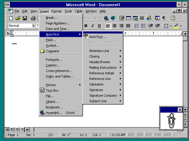
I feel the same way. It's like we're back to the MS-DOS era where every application had its own interface and you had to learn each application's way of performing tasks. macOS and to a lesser extent Windows prided themselves on consistency across applications. But this required developers to voluntarily conform to those platform's guidelines, and in the case of Windows, the goal of consistency was challenged by (1) Windows' backwards compatibility and (2) Microsoft's own disregard for consistency at times, such as Microsoft Office using its own UI toolkit instead of relying on the UI elements of the version of Windows Office is running on (for example, Office 97 introduced flat toolbars, a different style of menu bar, and the Tahoma font, which deviated from Windows 95/NT 4 and its button-style toolbars and its use of MS Sans Serif); this theme even carried over to Windows NT 3.51 where Office's UI was out of place; see http://toastytech.com/guis/nt351word.png for a screenshot). Contrast that with the Web, where there are no common UI/UX guidelines. Sadly this philosophy has spread to the desktop, where increasingly each application seems to have its own UI/UX without regard for the platform's guidelines.

There is one good thing I could think of about the loss of consistency across applications: the underlying operating system matters less when the application works the same across platforms. Ironically this may help with the adoption of desktop Linux; Chrome, Slack, Zoom, and VSCode generally work the same. To paraphrase, this fulfills Netscape's vision in the mid-1990's of reducing the operating system to a bunch of device drivers.

One would think that Microsoft and Apple don't want Windows and macOS to be reduced to a bunch of device drivers. Then again, perhaps Microsoft's and Apple's business models don't require the long-time maintenance of these desktop-oriented operating systems. Microsoft makes a lot of money from Office and Azure, and Apple makes a lot more money from the iOS platform than from the Mac.

Still, I personally lament the rise and triumph of the siloed app, and the decline of platforms that promoted UI/UX consistency through a set of standard human interface guidelines, and I feel personal computing is generally getting worse instead of better.

Re:The end of the nice GTK button by ho_schi on Friday March 25, 2022 @04:36AM (#30799800)
I've never seen any consistency MS-DOS, Win9x and WinNT. The worst offender is Microsoft itself with the file-browser, settings and office-suits. They don't maintain and evolve their toolkit, they just add new ones and recommend to use them instead:

  Win32: Win32, Windows Forms, WPF, MAUI, UWP, WTL, WinUI, MFC and probably more   
  Gtk: Gtk+, Gtk2+, Gtk3+, Gtk4
  Qt: Qt1, Qt2, Qt3, Qt4, Qt5, Qt6
Gtk and Qt didn't just maintain but provides major upgrades and changes. People complained that Gtk changed stuff, which is unfair. The various feature removals in GNOME3 after the first release provided bigger problems. I'm rather sure the changes between Qt major release also require work from developers. Custom theming is an issue with Gtk but also something I cannot recommend as developer and user. It is complicated on toolkit side and faulty on user side. Qt seems do to better in this regard but the user side problems remain. Apple just says just no to theming at all. I've also never felt the desire to theme Gtk because it looked good by default since Gtk3+ and even backported to some stuff to Gtk2+. There is of Java and Swing, yes, but I'm afraid the first error was including a toolkit into a language library.

With Gtk and their HIG most stuff looks decent and usable. Windows? Nobody cares about the HIG. Micrsoft provides more toolkits than I know. And a lot developers just do whatever they want on Windows. Or worse, they use Electron. Microsoft Teams is the worst "application" in this regard.

By the way:

https://gitlab.gnome.org/GNOME/gtk/-/issues/3787

The font rendering issue. I recommend ignoring the blaming (users) and ignoring (developers) on both sides and instead reading the details involved. Looks like mostly intended and used during development on HiDPI-Displays and they need people experienced in font drawing matters. Some fixes are landing already. Taking into account how much effort was put in Harfbuzz, Freetype, Pango and Cairo I think they can only learn from this - being more careful and keeping backward compatible solutions alongside until the new stuff is working fine for all.

Re:The end of the nice GTK button by pjmlp on Friday March 25, 2022 @06:03AM (#30800273)
The big difference is that with any of the Windows toolkits, an application written on their heyday will keep working today, good luck doing the same with any Linux toolkit.

Also only Qt is comparable in the full stack experience offered by Windows frameworks (and MacOS/Android/iOS/...), with the caveat it is anyway cross platform and not Linux specific.

Re:The end of the nice GTK button by hulitu on Friday March 25, 2022 @04:34AM (#30799788)
If you look at Windows 1.0 GUI and Windows 10 UI they look verry similar. Makes you think what Microsoft was doing all these years.
Re:The end of the nice GTK button by pjmlp on Friday March 25, 2022 @06:04AM (#30800278)
Internal political fights between DevDiv and WinDev.

If you are aware that DevDiv controls managed languages, and WinDev Windows/C++, it becomes quite clear why the back and forth between those UI frameworks, given who happens to be on top on a specific time.

And now there is Azure + WebUIs to add up to those resource fighting, oh well.

Re:The end of the nice GTK button by gurkendoktor on Friday March 25, 2022 @04:29AM (#30799761)
> Things like Fitt's Law and so on. It was not just opinion.

Here's another one: "users were roughly 37% faster at finding items when visual indicators varied both in color and icon compared to text alone"

Source: https://www.nngroup.com/articles/visual-indicators-different...

The whole point of the settings app shown in the OP's screenshots is to quickly find the relevant section in the sidebar. But even before the great design madness of 2012, designers have started to remove icon colors everywhere. (Except for app icons, where Google and Apple have now removed shapes instead, sigh.)

From the sidelines, it doesn't look like the trend is reversing in GNOME land. https://twitter.com/hadessuk/status/1506316793413087241

Re:The end of the nice GTK button by tauntz on Friday March 25, 2022 @05:00AM (#30799932)
> "users were roughly 37% faster at finding items when visual indicators varied both in color and icon compared to text alone"

Reminds me of https://i.kym-cdn.com/photos/images/newsfeed/001/927/386/c4d...

Re:The end of the nice GTK button by ehnto on Friday March 25, 2022 @02:58AM (#30799353)
Part of the discussion is that user interface is now a conduit for branding, probably the major conduit for software focused companies. You can't have consistent UI branding across devices unless you replace the UI to suit your branding. So rather than user interface being refined over the years into a consistent usable tool for each platform, by people specifically interested in UI and the paradigms of that platform, it's re-implemented year-over-year, with UX playing second fiddle to branding and design.
Re:The end of the nice GTK button by porker on Friday March 25, 2022 @03:12AM (#30799432)
> In modern Windows, press Win-key and start to type, oops, it missed the first keypresses, presented the completely wrong results and made a mess of your workflow.

On Win10 I'm getting regular delays in keypresses and just enough lag when typing to be noticeable.

I've been trying plugging in two USB keyboards as a poor man's split keyboard, and the amount of software (looking at you IntelliJ in particular) that does something that means the characters arrive out of order when typing is hugely frustrating.

Re:The end of the nice GTK button by sgt on Friday March 25, 2022 @03:14AM (#30799445)
Delays on keypresses.. in 2022. Are we going backwards?!
Re:The end of the nice GTK button by ephbit on Friday March 25, 2022 @04:43AM (#30799832)
Related, about latency: https://news.ycombinator.com/item?id=16001407

links to: https://danluu.com/input-lag/

Title: Computer latency: 1977-2017

Re:The end of the nice GTK button by cornel_io on Friday March 25, 2022 @03:21AM (#30799479)
IntelliJ is really bad about this sometimes. I get that their software does an incredible amount of really tough stuff behind the scenes (which is why I won't be switching any time soon), but God I wish they prioritized input responsiveness over everything else.
Re:The end of the nice GTK button by peebeebee on Friday March 25, 2022 @03:31AM (#30799533)
Haha, I love the “My IDE is so sluggish, it must be doing important stuff”. It really isn’t. IntelliJ is just horribly laggish. VSCode, an electron (!) app with 100 plugins isn’t even that slow.
Re:The end of the nice GTK button by ratww on Friday March 25, 2022 @04:51AM (#30799879)
Yes. Even if it were doing important stuff, this "important stuff" shouldn't be affecting typing. We have multicore machines now, there's no excuse anymore.

Imagine if it were the opposite, and moving the mouse or speaking into a microphone caused the compilation to fail in subtle ways. Well, background compilation/typechecking/whatever is messing with user interaction.

Re:The end of the nice GTK button by cornel_io on Saturday March 26, 2022 @05:26AM (#30810437)
I'm not naive, I've actually built IntelliJ plugins. I know engineers that work on the product, and I have an extremely good idea what it's doing under the hood. A lot of it is important to me and doesn't exist in VSCode, though that's also a great product for some languages.
Re:The end of the nice GTK button by mike_hearn on Friday March 25, 2022 @07:43AM (#30800906)
They actually did:

https://blog.jetbrains.com/idea/2015/08/experimental-zero-la...

There were big improvements over time. IntelliJ performance seems to vary a lot between people. For some (like me) it's great. Others complain of huge delays. Probably, the differences are OS related and/or project size or plugins related. There are so many different configs possible for an app like that.

Re:The end of the nice GTK button by kaba0 on Friday March 25, 2022 @10:15AM (#30802421)
Jetbrains really should just update the JDK they use.

With a slightly larger max memory setting than default and using at least G1 garbage collector (ZGC for even better results) they would get a buttery smooth editor, but it is configured quite badly by default.

Though sometimes they just have threading issues, which won’t be solved by above.

Re:The end of the nice GTK button by gjvc on Sunday March 27, 2022 @09:23AM (#30820025)
1000% agree. I am disappointed [1] with JetBrains' attitude to this problem. They seem to judge anyone who isn't using the JDK11-based JBR in 2020 as a difficult customer, and do not acknowledge latency/lagging problems on Linux. Mac users then reply to threads like this saying "works on my computer flawlessly, I don't know what you're talking about", until they confess to being Mac users.

I have tried JAOTC up until JDK16 with some IntelliJ products, but I think you are right in saying that the single most effective knob (or two) to twiddle in the default installation is to enable ZGC and increase the heap size.

Yes, I know JBR provide DCEVM builds (which need to be enabled by downloading the JDK and changing the "boot java" setting, ironically)

[1] and by that I mean "fuming"

Re:The end of the nice GTK button by cornel_io on Saturday March 26, 2022 @05:29AM (#30810447)
Yeah, vm options tweaks still don't cut it for me on my projects, and I've optimized pretty hard. Threading is the killer, esp. when connecting to other processes it can get all tangled up.
Re:The end of the nice GTK button by Moru on Friday March 25, 2022 @04:16AM (#30799715)
When I was in school we had 286 computers with windows on them. Some of them had input lag of about 7 seconds in the text editor we were using. Think it was Word but not sure any more. But at least they didn't miss keyboard input, every key stroke came out, just with more or less delay. I did most of my text editing at home on my Atari where there was no delay at all.
Re:The end of the nice GTK button by Hackbraten on Friday March 25, 2022 @08:30AM (#30801308)
Even Apple’s bootloader on Macs is dropping keypresses now!

Starting some time in 2020, the FileVault password dialog will drop characters whenever I’m typing quickly. And it never dropped characters before 2020 – even though I’ve had FileVault 2 on for many years.

And that’s at bootloader runtime, with not a single bit of the macOS kernel loaded yet!

Re:The end of the nice GTK button by hutzlibu on Friday March 25, 2022 @04:48AM (#30799866)
No, forward. Because the delay is probably because all of the telemetry and tracking, that has to be activated and synced with the servers, before it can responds to your request. All that amazing technology, unthinkable 20 years ago.

So definitely forward to big brother Panopticon.

Re:The end of the nice GTK button by hulitu on Friday March 25, 2022 @04:35AM (#30799790)
Yes.
Re:The end of the nice GTK button by fxtentacle on Friday March 25, 2022 @04:34AM (#30799786)
Oddly enough, I switched towards the JetBrains IDEs precisely because my impression is that they never lose keystrokes or change the ordering.
Re:The end of the nice GTK button by wolpoli on Friday March 25, 2022 @04:15AM (#30799706)
> In modern Windows, press Win-key and start to type, oops, it missed the first keypresses, presented the completely wrong results and made a mess of your workflow.

Every time I bump into these interaction issues, my stomach churns a little bit.

Right now, Windows 11 is especially bad because they have new and old code working side by side. It'll take a few years for Microsoft to rewrite enough of the Shell so everything will be consistent again.

Re:The end of the nice GTK button by tonyedgecombe on Friday March 25, 2022 @05:11AM (#30799992)
By then Microsoft will have moved on to the next bit of Apple envy and it will all be out of sync again.
Re:The end of the nice GTK button by WesolyKubeczek on Friday March 25, 2022 @06:14AM (#30800344)
Windows 11 looks like KDE envy tbh
Re:The end of the nice GTK button by thomastjeffery on Friday March 25, 2022 @12:01PM (#30803797)
Windows 11 is that next bit. They never finished windows 10.

I still have to dig through windows 7's control panel to change my microphone volume.

Re:The end of the nice GTK button by dm319 on Friday March 25, 2022 @05:58AM (#30800251)
Goodness the start bar on Windows. For something that is meant to be a key part of both the mouse and the keyboard workflow, how can it be so slow? My work computers can hang for so long on it, that it is quicker to find the application shortcut on the desktop.
Re:The end of the nice GTK button by dspillett on Friday March 25, 2022 @06:14AM (#30800343)
> how can it be so slow?

Because it is trying to be all things to all people: including supporting sponsored content and integrating with any fancy new/copied idea that the company is pushing (which may be quietly deprecated in the next major revision, but the hooks left adding abstraction load to everything else so that the few who actually found it useful don't complain).

Re:The end of the nice GTK button by AnIdiotOnTheNet on Friday March 25, 2022 @08:30AM (#30801306)
Computers are ludicrously fast nowadays. Games are capable of doing a whole lot of shit in <16ms consistently while responding to user input, so I don't buy this "it's doing a lot!" argument, it is coded badly.
Re:The end of the nice GTK button by drdec on Friday March 25, 2022 @08:49AM (#30801510)
I imagine the hold up is that it is connecting to an external service.
Re:The end of the nice GTK button by account42 on Friday March 25, 2022 @09:37AM (#30801997)
Some games also connect to an external service.
Re:The end of the nice GTK button by wtetzner on Saturday March 26, 2022 @01:12AM (#30809410)
Why couldn’t that be done in a separate thread?
Re:The end of the nice GTK button by totalkrill on Friday March 25, 2022 @07:22AM (#30800762)
Just you wait until they want to be able to run apps inside of it. Because they probably will want to do that. Unfortunately
Re:The end of the nice GTK button by dspillett on Friday March 25, 2022 @07:51AM (#30800963)
They've sort of already tried that, with animated smart tiles that were used by apps on Windows Phone and Win8. Not something I've seen recently, not sure if that is due to it being deprecated of if people just aren't using it on desktop as the menu is never visible for any considerable length of time.
Re:The end of the nice GTK button by hulitu on Friday March 25, 2022 @06:09AM (#30800303)
Maybe because telemetry :).
Re:The end of the nice GTK button by donatzsky on Friday March 25, 2022 @06:13AM (#30800330)
I believe it's not really an integrated part of the Explorer shell anymore, but rather a separate process that gets launched every time you open the start menu.
Re:The end of the nice GTK button by coffeeking on Friday March 25, 2022 @06:57AM (#30800606)
Yes, there are separate processes, however a new instance is not started each time you open it - the same window is re-shown.

    Taskbar: explorer.exe
    Start menu: StartMenuExperienceHost.exe
    Searching: SearchApp.exe
So, when you hit a key with the start menu focused, it closes the start menu and opens the search window (with the search text initialised with that key).

Perhaps keystrokes are lost during the switch.

Re:The end of the nice GTK button by fxtentacle on Friday March 25, 2022 @04:32AM (#30799774)
I still remember the good old days where keyboards had Function keys and apps would prominently display a F2 next to the save button, an F10 next to quit. Even for computer illiterate people, that made using keyboard shortcuts a bliss. Save was ALWAYS on F2 no matter what you did, so people would put physical stickers on their keyboard to make the F2 button say "Save" on the keycap.
Re:The end of the nice GTK button by hnlmorg on Friday March 25, 2022 @06:01AM (#30800260)
What system was this? I've used every version of Windows (literally), DOS since the 80s, Macs since the 90s, Linux since the 90s, Atari ST, and several different 8-bit micros and I don't recall ever using F2 to save. I do believe your anecdote but it's completely escaped me what platform might have used F2.

Also worth noting that keyboards do still have function keys. In fact I use F2 as my `tmux` control prefix. :)

Re:The end of the nice GTK button by ogurechny on Friday March 25, 2022 @08:02AM (#30801077)
Borland IDEs, Norton Commander (and its alternatives) built-in text editor, and programs that mimicked those green-grayish or blue-grayish text mode windows. Or those simply made with Turbo Vision.
Re:The end of the nice GTK button by hnlmorg on Friday March 25, 2022 @08:38AM (#30801395)
Ah yes, I now remember using F2 on Turbo Pascal. Thanks for the reminder :)
Re:The end of the nice GTK button by dspillett on Friday March 25, 2022 @06:21AM (#30800380)
I remember F2 being save in the DOS era, or maybe I'm misremembering and it was F3...

But for many years I've associated F2 with edit or rename.

Re:The end of the nice GTK button by hnlmorg on Friday March 25, 2022 @07:24AM (#30800777)
I do remember when ctrl+shift+insert was common for paste (rather than ctrl+v). I can't remember off hand was copy was beyond it being a similar key combination. Still trips me up these days using cmd instead of ctrl on macs.
Re:The end of the nice GTK button by dspillett on Friday March 25, 2022 @07:53AM (#30800976)
ctrl+insert for copy and shift+insert for paste are still a thing in the majority of places in Windows, though I think only the ancients like me use them (people newer to the game being taught ctrl+C & ctrl+V from the start).

Not long ago I even spotted it being usable in an app that blocked ctrl+C/ctrl+V.

Re:The end of the nice GTK button by garaetjjte on Friday March 25, 2022 @08:19AM (#30801208)
mcedit does have save on F2 (which I guess is carried over from DOS Norton Commander): https://rubenerd.com/files/2009/3612703566_52304223da_o.png
Re:The end of the nice GTK button by hn_version_0023 on Friday March 25, 2022 @08:28AM (#30801294)
This reminds me of one of my personal bugaboos, which seems especially bad in Microsoft Windows: windows that spawn child windows that require input focus, but that don’t grab focus leaving you typing into nothing at all!

Truly its crazy making.

Re:The end of the nice GTK button by drdec on Friday March 25, 2022 @08:48AM (#30801499)
IMHO, a worse practice is when you are happily typing along and the system throws up a dialog randomly, grabbing the focus and thereby "pressing" one of the buttons when you thought you were typing. Who knows what you just agreed to.
Re:The end of the nice GTK button by account42 on Friday March 25, 2022 @09:31AM (#30801916)
I'm glad that KDE has options to prevent that: https://docs.kde.org/trunk5/en/kwin/kcontrol/windowbehaviour...

Generally if you were interacting with the computer then whatever new thing should get focus iff its appearance was a direct result of your current interaction.

Re:The end of the nice GTK button by DrBazza on Friday March 25, 2022 @07:40AM (#30800887)
> Is something a button? Should I click it or double-click it? How about long-press on it? How can I know when there's no visual clues?

Since Windows 7 (or 8, I can't remember) and the "Metro" style apps, in the Control Panel in particular one of the controls (IIRC it was something like the 'show/hide icons in task tray'), that was previously a button, became a "hyperlink", essentially clickable text. Clickable text that was the same colour as unclickable text. What. The. **

Re:The end of the nice GTK button by marcus_holmes on Friday March 25, 2022 @08:37AM (#30801382)
I would love it if we could all just decide on a single WIMP interface and stick to that.

I understand that this would annoy designers. But they're annoying me so I think this is fair.

My go-to example at the moment is Figma, which is a design tool that I find almost impossible to use because it has so many hidden, unexplained "features" in its UI. If I accidentally brush the keyboard I have to quit the application and restart because I have no idea how to get back to the state I was in.

Re:The end of the nice GTK button by geon on Friday March 25, 2022 @07:57AM (#30801022)
When swiping between fullscreen windows, Macos sends the keystrokes to the last window until the animation has completed. The ”g” of all my git commands ends up in vs code if I’m too quick. Very annoying.
Re:The end of the nice GTK button by nojs on Friday March 25, 2022 @01:20AM (#30798882)
> Whenever I see a hamburger menu I silently think "Here someone has given up"

Can you explain what you don’t like about hamburger menus?

Re:The end of the nice GTK button by happymellon on Friday March 25, 2022 @01:48AM (#30799043)
Is a dumpster of features, you have no idea what you'll find in there.

Has someone hidden the zoom buttons in there? How about print? Perhaps that's also where save is, or tab colour? Most things in the hamburger menu are completely unrelated but exist for the removal of context. Button outlines so you have no idea what you can and cannot click on as well, which is mentioned in the fine article, are all modern design patterns. Looks over functionality.

Hamburger menu is just peak modern menus. Lazy.

Re:The end of the nice GTK button by eloisius on Friday March 25, 2022 @02:49AM (#30799317)
Yep. It's the miscellaneous everything bucket. It also seems to only be motivated by either scarce screen real estate (it first showed up in mobile interfaces), or graphic designers who think everything is "clutter" and by sweeping it away into the hamburger menu they can have their beautiful screenshot-worthy interface. I have a 27" monitor, but tons of websites and even Firefox itself hide half the functionality behind a hamburger.
Re:The end of the nice GTK button by prox on Friday March 25, 2022 @04:21AM (#30799731)
Originally the top menu was to have a way to access to all functions. Many still do (say LibreOffice)

The hamburger is kind of a weird breed of design signaling because of it. In some desktop apps it still is the original top menu, but not always. On websites and apps it can vary tremendously.

However, a top menu is not an expert level mode, it’s a beginners / proficient level mode. Expert level means using keyboard shortcuts.

Context driven display and modes are far more valuable when meeting spacial constraints. But that can be hard when you are dealing with many form factors and so the quick fix is the hamburger.

Re:The end of the nice GTK button by hulitu on Friday March 25, 2022 @04:44AM (#30799838)
> Expert level means using keyboard shortcuts.

This is true when you use only an editor and a debugger. When you need to use 10 programs each with its own keyboard shorcuts (which, BTW you need to search in internet which they are because the company doing the software did not bother to make them accessible in a help menu) you're gonna have a hard time. In the (1985) past you had for such things a holder attached to your keyboard where you had a listing of those keyboard shortcuts. Now the world has evolved and we have ... tada... the hamburger menu. P.S. I would not feel good as a developer to know that someone , somewhere curses me and my family constantly for the work i done.

Re:The end of the nice GTK button by danieldk on Friday March 25, 2022 @04:56AM (#30799908)
which, BTW you need to search in internet which they are because the company doing the software did not bother to make them accessible in a help menu

At least on macOS and Windows the shortcuts are shown in the (traditional) menu bar. With GNOME's use of hamburgers, it's anyone's guess. As someone who likes shortcuts, I found it very hard to figure out shortcuts in GNOME apps that have a lot of functionality hidden away. (Aside from keyboard shortcuts not being very consistent between apps on Linux.)

Re:The end of the nice GTK button by hulitu on Friday March 25, 2022 @06:18AM (#30800366)
In Excel 365 pressing ALT shows the shortcut key in the ribbon ( if enabled in options). The issue is that the ribbon looks now like google maps. In Edge pressing ALT sets the focus to the "...". What to do next is left as an exercise for the reader. In Teams, pressing ALT does nothing and the Help button has only "Themes", "News" and "Training" .
Re:The end of the nice GTK button by klibertp on Saturday March 26, 2022 @04:22AM (#30810195)
In Firefox, on Linux at least, when you press Alt you get a bar with all the standard File/Edit/View/History/Bookmarks/Tools/Help menus. In each menu and then in each item there's one letter underlined and it works as it should, so a sequence of Alt, h, a, will give you an About dialog (for example). The fact that the menu bar is not displayed by default doesn't bother me, because I don't use mouse to navigate the menus, and from keyboard I'd need the Alt key press anyway.

Slightly related: somehow, FF on Linux allows you to rearrange tabs from keyboard. Ctrl+Shift+PgUp/PgDown move the current tab left or right. As far as I can tell, this feature is only available on Linux. I have no idea why. It's much more convenient than dragging the tabs with mouse, because you don't have to worry about accidentally detaching the tab into its own window.

Re:The end of the nice GTK button by ratww on Friday March 25, 2022 @06:25AM (#30800403)
> Is a dumpster of features, you have no idea what you'll find in there.

I feel the same way about notifications. Both native notifications and notifications via e-mail.

It is no longer easy to find out if something changed or happened in most websites/applications. You must be bombarded with notifications all the time, and god forbid you take an extended break or something goes into your spam folder, because if you snooze you lose.

JIRA for me is the worst in this regard.

Re:The end of the nice GTK button by gigaflop on Friday March 25, 2022 @08:25AM (#30801258)
One of the first things I do with a fresh work inbox is set rules to push things into non-default folders. And then, I proceed to never look at them unless I'm digging for something.

61 unread notifications from Az Devops? Nah, I don't need to read those. I was watching that build in the background, I know it failed.

Mobile notifications should offer more filtering options at the system level. Why do I need to trust an app developer to respect my notification preferences? Why should I rely on the developer to build granularity into their push notification frequency?

It all gets simpler when you can filter at the 'inbox'.

Re:The end of the nice GTK button by rezonant on Friday March 25, 2022 @02:14AM (#30799163)
So on desktop applications, I assume you prefer all your functions to be on toolbars, and you have similar disdain whenever you encounter a File menu? I guess if there's a lot of functions, you probably need some tabs on your toolbar- so the Office Ribbon interface is idyllic I assume?
Re:The end of the nice GTK button by eqvinox on Friday March 25, 2022 @02:20AM (#30799197)
The difference between a file menu and an hamburger icon is that the file menu hides file operations while the hamburger icon hides… anything. something. dead bodies.
Re:The end of the nice GTK button by rezonant on Friday March 25, 2022 @02:39AM (#30799276)
Almost every desktop application has a File menu whether or not it deals with files. The File menu has an "Exit" item. Does it Exit the File? OBS has "Always on Top" as an option within "File".

Or we can look at it from the other side. "Where do I find the settings for this app?". Is it in File, Edit, View, Tools or Help. The answer depends on the app. Menus can be well organized or poorly organized but I don't think we should be banishing menus. The hamburger icon is just an iconic, space efficient way to say "menu"

Re:The end of the nice GTK button by heisenzombie on Friday March 25, 2022 @02:51AM (#30799325)
There are guidelines for what should be in menu bars, what order the items should be in, and how they should behave for different sorts of application.

For example, on Mac: https://developer.apple.com/design/human-interface-guideline...

And on Windows: https://docs.microsoft.com/en-us/windows/win32/uxguide/cmd-m...

> "Where do I find the settings for this app?". Is it in File, Edit, View, Tools or Help?

On Mac, it should be in the "App" menu and called "Preferences...", it should be the first item in the menu, except if you have an "About YourAppName" item which always goes at the top with a seperator underneath.

On Windows, it should be in the "Tools" menu, and called "Options...". 4 On Linux, it should be under the "Edit" menu, and called "Preferences".

If it's not, then the app (in my opinion) is broken. Of course, many apps are lazily ported across platforms or "hamburgerized". The Windows situation is obviously also more messy because of the newer "ribbon" standards complicating things a bit, but there are right answers.

(edit: fixed links)

Re:The end of the nice GTK button by RMPR on Friday March 25, 2022 @03:08AM (#30799411)
Re:The end of the nice GTK button by rezonant on Friday March 25, 2022 @03:11AM (#30799429)
Somehow that feels about right.
Re:The end of the nice GTK button by wtetzner on Saturday March 26, 2022 @01:21AM (#30809453)
They both work for me.
Re:The end of the nice GTK button by rezonant on Friday March 25, 2022 @03:07AM (#30799401)
Of course there are ancient, rarely updated guidelines that almost all applications ignore. Microsoft indeed has that great guide, and yet their own applications implement it inconsistently, and often incorrectly according to the guidelines. Apple is a tad bit better, but third party apps rarely get it right. The best thing Apple has going for it is specifically on the question of where Settings is: there is a dedicated app menu, so it just makes logical sense to put Settings there. Or was it Preferences? Options.

> On Linux, it should be under the "Edit" menu, and called "Preferences".

This one is a stretch, there are no such consistent and agreed-upon guidelines.

My point here is that just because things can be abused (or even, in the case of desktop applications, are almost _always_ abused), doesn't mean the general concept is useless or should be removed from applications. I would recommend instead of trying to cram a hundred possible actions into a tiny icon bar at the bottom of your iPhone, or removing 97 of those actions from the app itself and leaving just the most basic three down there, to maybe consider building a sensible and well-arranged menu layout _if and when_ you need more than those three that you can fit at the bottom.

Re:The end of the nice GTK button by dmitriid on Friday March 25, 2022 @04:06AM (#30799672)
> Of course there are ancient, rarely updated guidelines

You mean well researched guidelines with tons of evidence behind their decisions [1] that are as relevant today as they were 20 years ago.

> almost all applications ignore.

That most current applications ignore because people think they are ancient rarely updated guidelines.

This is especially evident in the MacOS world. HIG were the guide on the platform, and developers tried to adhere to them. And then the new breed of "designers" took over and even Apple breaks nearly every single one of them [2]

Microsoft has always been worse when it came to enforcing consistency of user interfaces, but even their choices were never random until quite recently [3].

[1] Apple's original HIG even had a bibliography section because it was actual research, and not some Dribble showcase: https://twitter.com/andy_matuschak/status/144740917559669965... and https://twitter.com/andy_matuschak/status/144771024771228057... etc.

[2] See, e.g. their abomination of an App Store https://grumpy.website/post/0RsaxCu3P

[3] Even the ribbon menus they introduced in Office weren't a random choice. They surely are now. See the Why the UI blog series: https://web.archive.org/web/20080316101025/http://blogs.msdn...

Re:The end of the nice GTK button by cornel_io on Friday March 25, 2022 @03:25AM (#30799505)
Wait, there's a standard for ribbon menus??? I thought that was just a horrible failed experiment that drove a huge number of people away from the MS suite towards Google Docs and was abandoned...
Re:The end of the nice GTK button by dmitriid on Friday March 25, 2022 @04:08AM (#30799678)
Originally it was a well-researched and executed concept, see https://web.archive.org/web/20080316101025/http://blogs.msdn...

Nowadays it's just a random hodge-podge no one knows how to use properly.

Re:The end of the nice GTK button by thesuitonym on Friday March 25, 2022 @10:58AM (#30802959)
This is a problem of poor app design, not the stunning indictment of traditional menus that you seem to think it is.

A poor menu layout can be fixed. A hamburger menu will always be a byzantine mix of everything because everything has to be in there. There is no organization, except flyout menus--which were a problem with traditional menu designs, but you could organize without them.

Hell, some applications have just moved the traditional menu behind the hamburger. Why? Because that was a good way to organize operations, even if it wasn't perfect, or wasn't always perfectly implemented.

Re:The end of the nice GTK button by danieldk on Friday March 25, 2022 @04:59AM (#30799925)
On macOS, both the Quit and Preferences items are consistently in the application menu (the menu left of "File" that has the name of the application). And the shortcuts are consistently Cmd + q and Cmd + ,

Well, unless it's an Electron app. Which is another good reason to avoid them altogether.

Re:The end of the nice GTK button by hulitu on Friday March 25, 2022 @04:51AM (#30799884)
> The File menu has an "Exit" item. Does it Exit the File?

Does it ? This is the issue when people see no more as their own OS.

In the past, just like today, there were multiple modes to exit a program. One of them is to press Exit and the programm will exit cleanly. The other is to press the X in the window corner in Windows ( or send a close message from a window manager) which, depending on the implementation, might lose data. There is also the option to kill the process. Now in my opinion this Exit is a good thing and it is clear what is doing.

Re:The end of the nice GTK button by Viliam1234 on Saturday March 26, 2022 @12:41PM (#30813328)
> The File menu has an "Exit" item. Does it Exit the File?

Happy to know I am not the only one who considers this weird.

It would probably make more sense to have an "Application" menu before "File". It could contain things like "About", "Help", "Setting" and "Exit". (Especially in cases where the current "Help" menu only contains "Show help" and "About". If it has more than five items, then I'd say it deserves a separate menu.)

Re:The end of the nice GTK button by samtheDamned on Friday March 25, 2022 @09:53AM (#30802176)
The ribbon menu was actually a step in the right direction for desktop only UI paradigm
Re:The end of the nice GTK button by SomeInterwebDev on Saturday March 26, 2022 @03:34PM (#30814647)
Declaring a tool good or bad because it's abused doesn't make sense.
Re:The end of the nice GTK button by nojs on Friday March 25, 2022 @04:47AM (#30799862)
I see what you mean. Brave on desktop comes to mind as an offender.
Re:The end of the nice GTK button by eitland on Friday March 25, 2022 @03:09AM (#30799415)
It is just a menu.

But instead of being an ordinary honest menu where half the items has their defined places on each OS and the rest can be found easily it is a jumbled mess.

And since there are no standards as for where to put things in a hamburger menu they can move around between each release of the application.

And the only reason to use it instead of an honest menu is because Chrome does it so therefore it must be a good idea. Period.

It is somewhat ironic that even as desktop screens get larger and larger applications has to "maximize real screen estate" by removing menus, while simultaneously working to remove real screen space improvements like the option of Tree Style Tabs on Firefox (yes, it kind of works and it is still awesome but it get harder and harder by the year).

Re:The end of the nice GTK button by toxik on Friday March 25, 2022 @01:39AM (#30798990)
It is the “etc” of UI design. It’s a cop out most of the time.
Re:The end of the nice GTK button by jug on Friday March 25, 2022 @04:05AM (#30799667)
Isn’t it because it’s the “Misc” counterpart to the preferences tabs?
Re:The end of the nice GTK button by thrower123 on Friday March 25, 2022 @10:01AM (#30802260)
> today only work in some super old apps like Notepad.

Old applications that actually follow the platform UX and accessibility guidelines

Re:The end of the nice GTK button by fho on Friday March 25, 2022 @03:14AM (#30799444)
> In modern Windows, press Win-key and start to type, oops, it missed the first keypresses

This does not seem to be the case, is it? I recently, accidentally hit Win+term+Enter into a Windows VM (intending it to hit the Linux host machine) and was surprised when a terminal popped up.

Re:The end of the nice GTK button by adhesive_wombat on Friday March 25, 2022 @03:22AM (#30799481)
If it's some kind of timing/performance/hardware interface issue, it's quite possible different machines will act differently.
Re:The end of the nice GTK button by Moru on Friday March 25, 2022 @04:20AM (#30799726)
It might also be working today but not tomorrow, then you accidentally start "Archies terminologies dictionary" as a websearch instead.
Re:The end of the nice GTK button by adhesive_wombat on Friday March 25, 2022 @07:25AM (#30800779)
Just call it fuzzy search and now it's a feature.
Re:The end of the nice GTK button by fho on Sunday March 27, 2022 @04:47AM (#30818759)
This actually has happened to me on Gnome several times ;-)
Re:The end of the nice GTK button by lkxijlewlf on Friday March 25, 2022 @08:56AM (#30801560)
Used to be they had time to get UI better. Now, if you have the same UI for 6 months people think you've stalled and start looking for new. Everything has to be constant churn, constant change. Far too many people today get bored way too easily.
Re:The end of the nice GTK button by bajsejohannes on Friday March 25, 2022 @04:45AM (#30799844)
> Another thing is type-ahead. I remember in classic MacOS, people pressed shortcuts and started to type the filename or whatever. It was all perfectly recorded and replayed. In modern Windows, press Win-key and start to type, oops, it missed the first keypresses, presented the completely wrong results and made a mess of your workflow.

The arguably worst offender in MacOS these days is the emoji picker. Press ctrl+cmd+space, and depending on how recently you opened it, it can take some hundreds of milliseconds to open (on an m1). All while eating your keypresses.

Re:The end of the nice GTK button by Aeolos on Friday March 25, 2022 @05:49AM (#30800209)
Yes, this one is particularly weird.

How can a grid of unicode characters take 500-1000ms to display on a machine with an m1, 16GB of memory and a blazing fast NVME disk?

Re:The end of the nice GTK button by armagon on Friday March 25, 2022 @10:37AM (#30802672)
Huh. I didn't know this existed.
Re:The end of the nice GTK button by marwis on Friday March 25, 2022 @09:20AM (#30801803)
Indeed Windows sucks but PowerToys has a much faster launcher replacement on alt+space
Re:The end of the nice GTK button by k8sToGo on Friday March 25, 2022 @03:45AM (#30799590)
Notepad is not old anymore because it has been recently replaced.
Re:The end of the nice GTK button by hulitu on Friday March 25, 2022 @04:54AM (#30799895)
> Notepad is not old anymore because it has been recently replaced.

They said the same thing about my parents dog which died last year.

Re:The end of the nice GTK button by InCityDreams on Friday March 25, 2022 @05:47AM (#30800198)
"Notepad", cool name for a dog.