But I'm also a developer, and I know that decently looking themes are a dime a dozen these days on Theme Forest. So having a very spartan design (unless it's a brand new project) just looks incomplete to me.
Sure, Stripe is the other extreme. I've actually tweeted to Stripe that their stuff is so nice, that I go there to look at pretty things rather than their product. But a polished website (and polished APIs) help fuel the perception that the product is really well thought out, whether it is or not (and in Stripe's case, it clearly is well thought out).
> Again, this might work for the target audience, developers.
Why?
> So having a very spartan design (unless it's a brand new project) just looks incomplete to me.
Why? What's wrong with something that "looks" incomplete if it meets all goals that you want to achieve? If the layout is clear, documentation is accurate and the website loads fast, works across various screens, it is accessible, what more do you want?
I don't think you've substantiated the refutal of source hut besides "It looks like a side project that sometimes is proud to not care about design". I suggest taking a hard look at why we design things instead of surrendering to your experiential biases (aka this is how its done and that's how it should be).
- Lack of hierarchy among elements
- Inconsistent layout from page to page
- No typesetting, paragraphs are squished together in a dark font
- No indication of what the current page is beyond the browser tab title
- Heavily contrasting colors in certain areas like call to actions (white-on-blue) that will bleed on cheaper displays
These are all things that if fixed would improve usability while adding zero decoration.
things are not perfectly aligned, the menu on the top is a little out of alignment with the button on the right.
the white box in the middle of the blue area is moved out of alignment with everything else, also the text above the white is a little smushed.
quotes could use some padding.
If all these things were fixed I would say Spartan design, I like it.
As it is now I find it a little annoying and ugly, of course without this post to add to I would never have tried to figure out what exactly I didn't like but that's how it goes I guess.
There was a lot of myself and the other dev saying to each other, "Really? Is this really a big deal?" Now you just see it all over the place because you have an eye for it.
If I don't like your little splash of color or little pizazz, maybe even find it distracting and in the way, what can I do?
In both cases, the userbase's opinions matter. My home has a very small userbase I can pretty easily poll quite thoroughly. Is the same true of a public website?
If this is where you are starting from, then I'm not sure what kind of conversation you are hoping for. Requiring that we substantiate our definitions of good design while you try to pass off "looking incomplete" as inconsequential to design is an unfair offer.
> what more do you want?
I want it to look complete.
Sourcehut looks like an engineer made it. Same with building design.
Wouldn't that be UX and not necessarily UI?
Design, as I understand it, is to produce pleasing interactions with a function that empowers you to achieve what ever task is at hand.
In the example cited by the OP, and by you, there is a clear and obvious difference between the two.
Let's start with a simple cross compare
Brief: I, as a user, wish to visit the home page to understand what it is.
Stripe's page manages that in about a second. The visual hierarchy makes the two core messages stand out and directs my eye to them. "the new standards in payments" and "the complete toolkit for internet business" - should those messages trigger a need, a job to be done, a want, an urge then it very effectively functions.
As I scroll through, the messaging is clear, the design is delightfully simple, but with lovely, unnecessary touches, that communicate quality, care, craft and respect towards the customer.
Sourcehut however draws my eye to announcing the source hut project hub, but i'm not yet sure what sourcehut even is. I scroll a little more. I read a lot of words I understand as a developer, but the answer of "what is it?" elludes me. I scroll back to the opening paragraph "Welcome to sourcehut! This suite of open source tools is the software development platform you've been waiting for. We've taken the wisdom of the most successful open-source communities and turned it into a platform of efficient engineering tools." Okay, so jargon word soup aside, and given that both sites are engineer focused, why is this so hard to parse? What tools do i want? Or not know I want?
I see website that has been made simply, quickly, and for one purpose, which seems to be to exist as a page for those who know and understand what it is, already, to live somewhere. It does not communicate care, craft, ease of use, and it seems to look like the sort of sites we downloaded printer drivers from back in the day.
The purpose of beautiful sites, software, apps, whatever, is to celebrate the world, to create something wonderful, to be empathetic to our users, our fellow humans, to make something that makes us smile, that delights for no reason than it can.
This is not an experiential bias, it is a core element of society, that aesthetics matter to many for a multitude of reasons, and perhaps, it is a bias that you have that chooses to reject it, for reasons I can only hope are not rooted in rejecting it's purpose within humanity because "it doesn't make sense to you".
The good, the bad and the ugly. We want to make it not look like a side project by open source guys but actually make people excited like Stripe does.
Only thing I ask is be extremely specific and give immediately actionable advice. We support desktop and mobile browsers.
Don't switch between dark/light and light/dark text. It's jarring.
Your use of red/yellow/green/blue makes it look like you're ripping off Google. That's skeezy.
Your sizes and placements are all over the place. Tiny text. Giant text. GIANT screenshots. Shit thrown all over the place. The key to good design is planning. It looks like you didn't have a plan.
On content:
Phrases like "Empowering people", "Uniting communities", and "help people get things done in the real world" are all meaningless fluff that tell me literally nothing about what service or product you provide. The very first thing I see when loading your page should be a PRECISE statement of exactly what you do for me.
On tech:
Navigation performance is terrible and things are interactive for no reason. I don't need or want a rendered globe that spins around when I drag on it. But if you're going to do it anyway, at least make sure that it's not super janky.
There's some extreme layout pop when mousing around your navbars.
On advice:
Practically speaking, nobody cares about someone else's shitty side project. If you want it to look nice, hire someone with even a modicum of aesthetic sense.
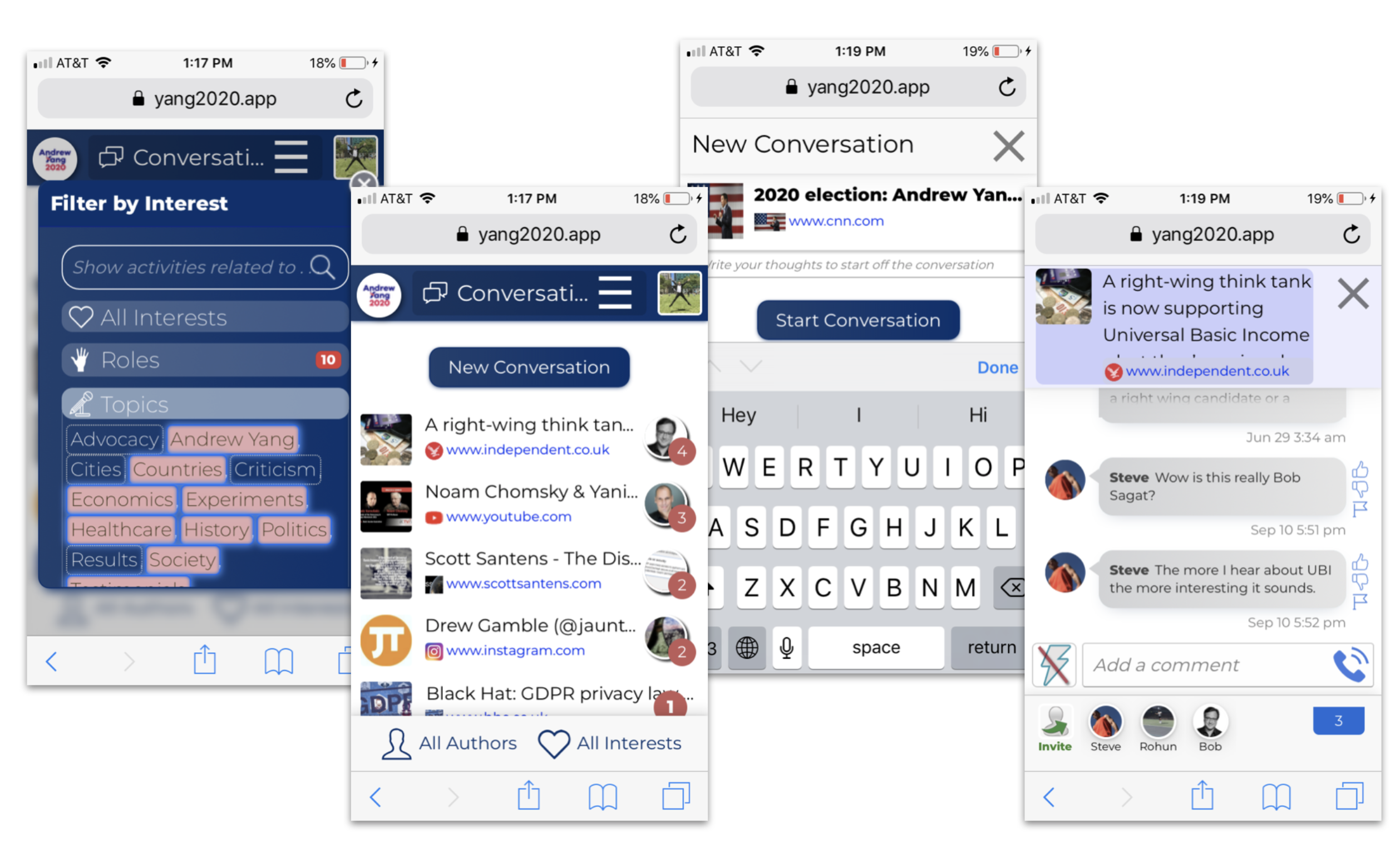
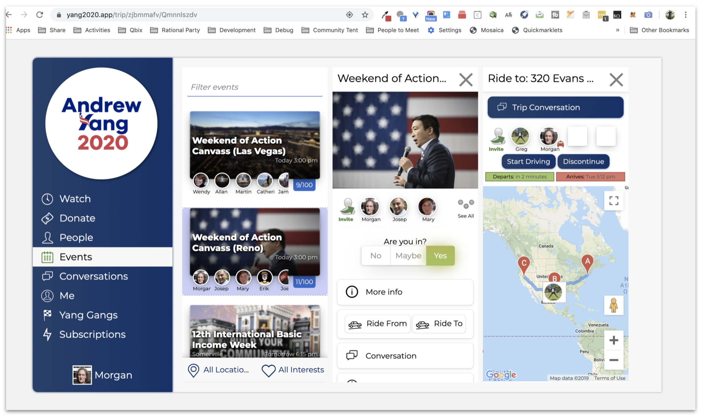
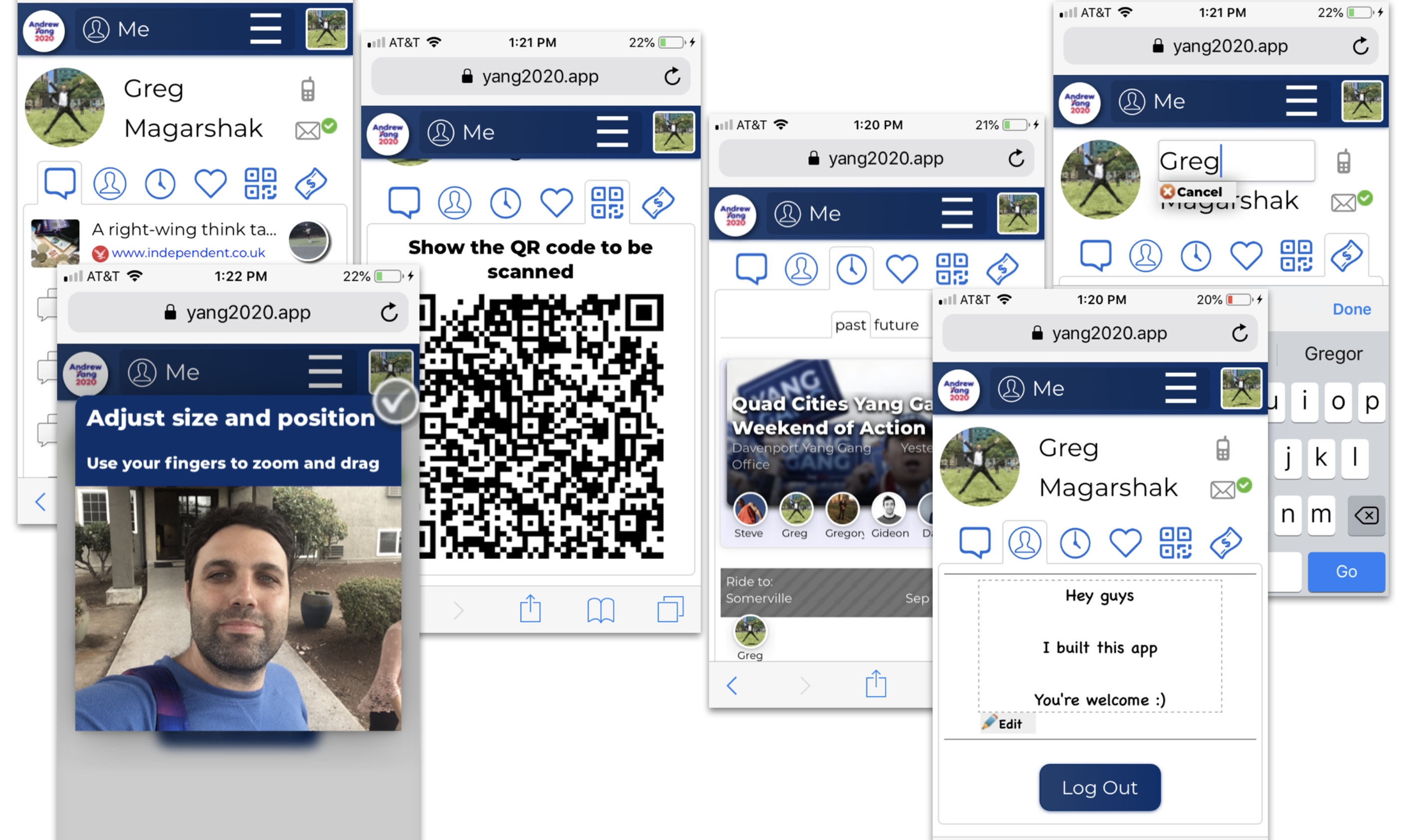
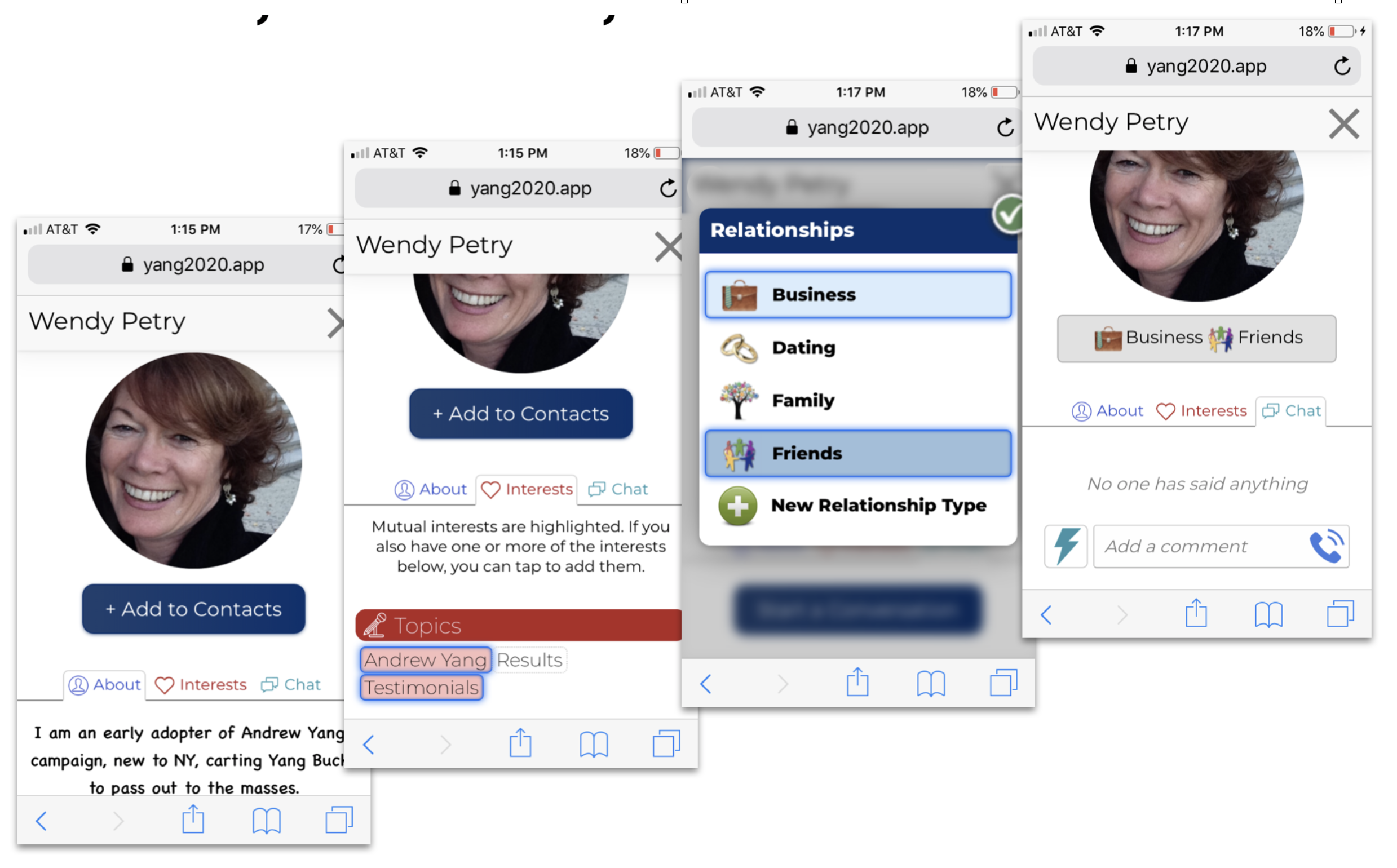
https://qbix.com/img/welcome/communities.png is a photo encoded as a PNG. That's a bad idea that will lead to unnecessarily large file sizes (1.9 MB). Use JPG or a newer format like WebP. Better yet, eliminate this image entirely as it's a boring stock image that adds nothing.

https://qbix.com/img/mainVideo.png is also huge (2.1 MB) but doesn't need to be. If it's a video frame then why make it 2,654 px by 1,490 px?

Other huge images on the homepage:
https://qbix.com/screenshots/conversations.png
https://qbix.com/screenshots/desktop.png
https://qbix.com/screenshots/personal.png
https://qbix.com/screenshots/profiles.png
https://qbix.com/screenshots/rides.png

At the very least lazy load these.
Remove all the boxes and drop-shadows. They look very outdated. Use full-width for the hero and remove the whole box-shadow around the lower sections.
Now using space to separate the sections. For example, adding a vertical padding of 64px to the "We build apps" section automatically makes it look like a Stripe-like site. An example: https://onepagelove.com/smash-lite
Use bullet points:
On the "Are you still sending emails?" section just use bullet points. Remove the border and background color on that table with odd-even colors. And add actual bullets. You already used <ul> and <li>, now let people know that those are bullet points. Add some padding between each bullet point.
HTML bullet points already make it better to read. If you want to look cute, use bullet point images that catch the eye. Similar to how this template does: https://onepagelove.com/devbook
Use visual hierarchy:
For the section titles, use a larger font size, like 36px. Add some padding to the bottom to make it stand apart from the text. Users will use this to their advantage to scan your page.
You're already using bold for the bullet point titles, so you're aware that they're important. Make them pop more by putting the title in its own line and make it a bit bigger. I'd try to use less copy. Drop the effect that collapses the text when you click it.
Be consistent:
Designers are very consistent when it comes to spacing. Try to stick to multiples of 8px: 8px, 16px, 24px, 36px, 48px, 64px. Try to avoid using multiple fonts and colors for things that are in the same hierarchy.
I think you get the gist. Alternatively, just get a free template like the ones I linked, it's much easier than designing things from scratch.
"We build apps for all kinds of communities."
Should be towards the top of your page so that visitors can get context immediately.
Keep in mind, a lot of visitors won't watch your video.
Watching the video is a larger investment of time than simply reading. And they may be in an environment without headphones.
I recommend adding a tool like Hotjar to your site so that you can watch video of actual usage.
That way you'll discover more tidbits yourself.
That would be more efficient than asking us for feedback, since we're not your customers.
https://qbix.com/communities/platfrom
Which isn't the most well-put-together 404 (well, from the message, looks like a 412) page, but hey, I'm not a designer. :)
It's devoid of flourish, but for its purpose this is entirely adequate. I wish more sites could be as pragmatic and usable.
If I somehow end up on a similar looking website, I'd often close it and move on to the next result on Google.
My brain automatically associate that UI with an archive website that probably hasn't been uploaded since 2005ish.
If you know that your brain is wrong then why aren't you actively trying to teach it not do that association?
The sad thing is there's a lot of modern tech they're using under the hood; which a majority of people will never see or appreciate.
It's like my buddy used to say, "I gave you the capabilities to design a beautiful Ferrari; and you gave me a Toyota Corolla instead."
This is honestly horrible. Extraordinarily poor typography, my eyes don't know where to focus. And the visual polish is amateur hour.
Come on...we're talking about Stripe...a $36B company that accepts payments around the world. You can't just drop a random website in here and claim it's an example of "good" when it doesn't even take into account context.
I would like to counter your point with this website of a company that has over $700B in assets and can probably buy a Stripe every single year for the next 20 years...I present to you Berkshire Hathaway: https://www.berkshirehathaway.com
Berkshire's website doesn't serve the same purpose as Stripe's.
This is exactly what I'm talking about wrt context and design.
https://i.imgur.com/kdKK3cY.png

On the left side SourceHut has almost everything you want to know, on the right side Stripe has... a couple of background images, one button to "START NOW" (start what?) and to contact sales (for what?).
Stripe's site is a classic case where form took precedence over function.
When I look at Stripe's website, I immediately read: "The new standard in online payments". Ok, they handle online payments, that's really clear.
When I look at Sourcehut, the first thing I read is that Drew DeVault posted: "Announcing the SourceHut project hub". Ok? Is that really the first thing I should know? Then I read further and still have zero idea what the actual tools are until I actually dig deeper.
The whole point of the Stripe website is to make people want to use Stripe. That's the function, and if a lot of form helps with that, the function achieved. And I'm pretty sure the Strips homepage is doing a good job drumming up business considering their success.
SourceHut's site tells you what it does, how it does it, what features you can find in there and a bunch of other things. It is packed with information.
When i want to learn about what something is, i want information about what that something is.
In other words, the value it offers you. How it enables you to achieve what you want to achieve. That's what matters, the technical functionality does not.
I don't care that Nike uses vulcanized rubber and cotton, I care that my friends will think they look cool, and thus make me look cool.
So they focus on communicating that value proposition rather than an info dump about the product.
Sourcehut says "lots of open source mini services that work without JavaScript". Cool, why do I care? Is there a cost saving? Would my devs prefer this? Can it do something other paid services can't? Why should I use it?
This is sales, not engineering.
It's particularly disheartening to me because those people seem to include all web designers.
The minimal "spartan" design of Sourcehut probably works great for their audience. The same design approach would not work for Stripe.
The homepage is basically a book you have to read from top to bottom, without any content structure your eyes can hook up to to correctly extract important information.
Hacker news is what i'd call minimalist, but your eyes can immediately identify the various content blocs and functions.
Are you talking about this page? https://sourcehut.org/
It seems like the opposite to me, each feature has a big heading that you can quickly read to get an overview of all the features, with smaller, more detailed descriptions below.
This is an example of a total misunderstanding of one of the most basic graphical design principle : you don't group together information that is not related.
Only within a given culture, and only within a given span of time.
Unless designers think that some cultures are wrong, of course.
And what those fundamentals are changes with the fashions of the era.
For example, frames were once good design, and proper.
Image maps were once good design, and proper.
Both of those things are forgotten now.
It was possible to do both bad and good design with them.
Good page design should lead you to certain actions and organize the content into some sort of hierarchy.
Yeah, it's called skimming and scanning [1].
This is why things like information hierarchy [2] and vertical rhythm [3] are emphasized in modern design.
[1] https://en.wikipedia.org/wiki/Speed_reading#Skimming_and_sca...
[2] https://zevendesign.com/designers-guide-to-visual-hierarchy/
I ignored the section you're describing since my eyes are looking for something tangible that draws my attention but since there is nothing I just ignore everything and don't read a single word.
And I'm not even talking about the brutalist design here. As many others have pointed out there are good minimalist non-designed landing pages (pinboard, tarsnap).
I'm sorry but you don't get to decide what matters.
Users will decide that for you. And the truth is nobody gives a fuck about sourcehut or whatever other project enough to honor it with a "genuine attempt".
Nobody is going to slow down to wade through the unreadable, mess of information splattered on the page just because it's there and available.
So if that's the assumption you're building with, you'll be hosed.
It's important to design for how people actually use things, and how people actually behave, and the information customers are actually looking for.
The hubris of the technologically competent, one so often spied on this website, is to believe that those unwilling to join them on the top of the mountain don't deserve the mountain, rather than that a ski lift should be installed.
It's as though the democratisation of technology over the past thirty years has completely escaped their attention.
Other classic HN examples:
https://pinboard.in/ https://www.tarsnap.com/
> Stripe’s design is decorative.
Of course, you already admitted the subjectivity of it all. I accept that. But at the same time, there is a reality that we all exist in, a reality heavily dictated by what we see and what we feel, and design has the ability to affect and influence those at a "pre-attentive" level -- ie before the efficacy of a product can be known or evaluated. So when I land on stripe.com, and I know nothing about it, I can at a minimum infer that there is a team of competent, professional, smart people behind the product judging by how the website looks and feels. I'm also associating a sense of happiness, wonder, and enthusiasm with the brand through my interactions on the website. I am seeing the bright colors, the crisp lines, and the smooth animations and I am, in my mind, creating a narrative about Stripe - that they have a high quality bar, that this product will be enjoyable, that there is craftsmanship here. There are many more people in this world that are attracted to beautiful things and intriguing stories than people who aren't.
> deep down inside I personally belong to the functional design or “no design” camp.
I assume this is just about software. Of course, we all love decoration in other parts of our lives. We love our little icons, we love our desktop wallpapers, we love our avatars. At a broader scale, the presentation of food on a plate. A favorite t-shirt. Gardens. Book covers. The color of your car. The color of your house. What type of furniture you choose to own. Movies. Music. All of these, from functional objects to artistic expression rely on some sense of decoration. There is inherently an "excessiveness" to all enjoyable things that makes them more emotionally charged than the sum of their atoms (or code) alone. I'm sure we can also agree on that.
Sorry for the diatribe. I hope it doesn't feel like an attack on you, OP, but I just find the overall sense on HN that things like a color palette or some animations are meaningless.
Of course, design can be used to disguise bad products. That's the bad kind. Stripe, as an example, isn't in that category.
For example, let's look at the spacing. The padding and margin in each section are inconsistent, almost random. It forces you to do mental work to separate them in your mind, and it doesn't allow you to take mental breaks, because it's hard to find your place if you look away, almost like reading a book. The header literally just runs into the body of page, like a single wall of text. And at what benefit? Slightly less scrolling? Scrolling is trivial.
Copywriting is part of design. Tell me, what purpose does this copy serve? "Welcome to sourcehut! This suite of open source tools is the software development platform you've been waiting for. We've taken the wisdom of the most successful open-source communities and turned it into a platform of efficient engineering tools." Most of this is useless and can be cut. People skim on the Internet. Give them bite-sized and useful info, not a paragraph that says welcome.
SourceHut is capitalized in three different ways: SourceHut, sourcehut, and Sourcehut. This is not really communicating to me great attention to detail or professionalism. If you think that's not important, then you probably don't understand why restaurants with clean floors and well-maintained exteriors inspire more trust in diners than dirty or dilapidated restaurants. We look at exteriors to get an idea of what's going on behind the scenes.
Typography is important, too. There's no main heading on the page, nothing to call your eye to, except the blog post at the top. I have to hunt to figure out where to start reading, and I'm almost guaranteed to start in the wrong place and then adjust. The headings in the main body also aren't sufficiently bold to stand out and draw your eye. Even the indentation of the testimonials is inconsistent. Why aren't they indented along with the bullet points to convey that they fall under the headings?
Where color is used, it's distracting and misleading. My eyes are drawn toward random links and testimonials rather than to important parts of the page that I should read first. (For comparison, look at how Stripe.com uses color to draw your eye to headings.)
The clickable buttons are tiny. The images are tiny, too -- far too small to be useful. They also lack captions, and clicking on them takes me to random and confusing places. Compare to the highly readable code examples on Stripe.com.
I could go on. It's not a terrible homepage. It's functional. I've seen much worse. But it has many obvious major design flaws that make it a worse experience for reading.
Developers have a norm of loving minimalistic, simplistic, text-heavy, old-school, nostalgic interfaces. That's fine. I'm partial to them, too. But it's important not to get, "I like this," confused with, "This is good design." It's not. A good rule of thumb is that if you have to be inculcated with the beliefs of a particular tribe in order to find something good, and everybody outside that tribe finds it repulsive, it's probably not good.
EDIT: I spent 10 minutes in the dev tools and made a better version: https://i.imgur.com/AoOy50x.png

If you look at minimalist, functional design in the "real world", there is often an enormous amount of work and many iterations behind it to get to that final stage where nothing more can be removed. It is not designers just not doing anything.
And at least from my perspective having a couple of iterations from the basic idea, is what sourcehut is missing.
My first impression opening the page and the screenshots is, that it is very messy and nervous. Even though on a a bit closer look the information structure seems to be well thought out. It could benefit tremendously from a designer going over it an making adjustments to typography and use of white space.
Not adding anything, no animations, no fluff, but tidy and straighten things up. Arguably on the website itself I would remove a lot. Should be way more spartan in my opinion.
Other sites have marketing needs. They might colors or motifs to evoke positive associations with related brands. Or avoid negative associations with others. Or just to avoid looking too much like a competitor.
A lot of this is hard to articulate for most. Heck, even some designers can't explain why another design feels right and another doesn't. It just comes across as "that one looks nicer". But there are often (though certainly not always) deeper, functional purposes behind what seems to just be an aesthetic.
For a website it's almost too beautiful, diverse with different elements, colorful, etc. It's something I want to put on my wall or see in a brochure, not something that's ideal for digesting content. I need something that's 50% Stripe, 50% Craigslist.
Anyway, I certainly look to them for inspiration in my work, but if the entire internet looked like Stripe, I think it would get old very quick.
I've reported the issue to their support multiple times over the last three years and they've agreed it was an issue but as far as I can tell, have no plans to fix it.
Drew writes about his spartan approach towards design: https://drewdevault.com/2019/03/04/sourcehut-design.html
These things are subjective though. Stripe’s design is decorative. Besides, “Decoration is crime” cliches, deep down inside I personally belong to the functional design or “no design” camp.