> Again, this might work for the target audience, developers.
Why?
> So having a very spartan design (unless it's a brand new project) just looks incomplete to me.
Why? What's wrong with something that "looks" incomplete if it meets all goals that you want to achieve? If the layout is clear, documentation is accurate and the website loads fast, works across various screens, it is accessible, what more do you want?
I don't think you've substantiated the refutal of source hut besides "It looks like a side project that sometimes is proud to not care about design". I suggest taking a hard look at why we design things instead of surrendering to your experiential biases (aka this is how its done and that's how it should be).
- Lack of hierarchy among elements
- Inconsistent layout from page to page
- No typesetting, paragraphs are squished together in a dark font
- No indication of what the current page is beyond the browser tab title
- Heavily contrasting colors in certain areas like call to actions (white-on-blue) that will bleed on cheaper displays
These are all things that if fixed would improve usability while adding zero decoration.
things are not perfectly aligned, the menu on the top is a little out of alignment with the button on the right.
the white box in the middle of the blue area is moved out of alignment with everything else, also the text above the white is a little smushed.
quotes could use some padding.
If all these things were fixed I would say Spartan design, I like it.
As it is now I find it a little annoying and ugly, of course without this post to add to I would never have tried to figure out what exactly I didn't like but that's how it goes I guess.
There was a lot of myself and the other dev saying to each other, "Really? Is this really a big deal?" Now you just see it all over the place because you have an eye for it.
If I don't like your little splash of color or little pizazz, maybe even find it distracting and in the way, what can I do?
In both cases, the userbase's opinions matter. My home has a very small userbase I can pretty easily poll quite thoroughly. Is the same true of a public website?
If this is where you are starting from, then I'm not sure what kind of conversation you are hoping for. Requiring that we substantiate our definitions of good design while you try to pass off "looking incomplete" as inconsequential to design is an unfair offer.
> what more do you want?
I want it to look complete.
Sourcehut looks like an engineer made it. Same with building design.
Wouldn't that be UX and not necessarily UI?
Design, as I understand it, is to produce pleasing interactions with a function that empowers you to achieve what ever task is at hand.
In the example cited by the OP, and by you, there is a clear and obvious difference between the two.
Let's start with a simple cross compare
Brief: I, as a user, wish to visit the home page to understand what it is.
Stripe's page manages that in about a second. The visual hierarchy makes the two core messages stand out and directs my eye to them. "the new standards in payments" and "the complete toolkit for internet business" - should those messages trigger a need, a job to be done, a want, an urge then it very effectively functions.
As I scroll through, the messaging is clear, the design is delightfully simple, but with lovely, unnecessary touches, that communicate quality, care, craft and respect towards the customer.
Sourcehut however draws my eye to announcing the source hut project hub, but i'm not yet sure what sourcehut even is. I scroll a little more. I read a lot of words I understand as a developer, but the answer of "what is it?" elludes me. I scroll back to the opening paragraph "Welcome to sourcehut! This suite of open source tools is the software development platform you've been waiting for. We've taken the wisdom of the most successful open-source communities and turned it into a platform of efficient engineering tools." Okay, so jargon word soup aside, and given that both sites are engineer focused, why is this so hard to parse? What tools do i want? Or not know I want?
I see website that has been made simply, quickly, and for one purpose, which seems to be to exist as a page for those who know and understand what it is, already, to live somewhere. It does not communicate care, craft, ease of use, and it seems to look like the sort of sites we downloaded printer drivers from back in the day.
The purpose of beautiful sites, software, apps, whatever, is to celebrate the world, to create something wonderful, to be empathetic to our users, our fellow humans, to make something that makes us smile, that delights for no reason than it can.
This is not an experiential bias, it is a core element of society, that aesthetics matter to many for a multitude of reasons, and perhaps, it is a bias that you have that chooses to reject it, for reasons I can only hope are not rooted in rejecting it's purpose within humanity because "it doesn't make sense to you".
The good, the bad and the ugly. We want to make it not look like a side project by open source guys but actually make people excited like Stripe does.
Only thing I ask is be extremely specific and give immediately actionable advice. We support desktop and mobile browsers.
Don't switch between dark/light and light/dark text. It's jarring.
Your use of red/yellow/green/blue makes it look like you're ripping off Google. That's skeezy.
Your sizes and placements are all over the place. Tiny text. Giant text. GIANT screenshots. Shit thrown all over the place. The key to good design is planning. It looks like you didn't have a plan.
On content:
Phrases like "Empowering people", "Uniting communities", and "help people get things done in the real world" are all meaningless fluff that tell me literally nothing about what service or product you provide. The very first thing I see when loading your page should be a PRECISE statement of exactly what you do for me.
On tech:
Navigation performance is terrible and things are interactive for no reason. I don't need or want a rendered globe that spins around when I drag on it. But if you're going to do it anyway, at least make sure that it's not super janky.
There's some extreme layout pop when mousing around your navbars.
On advice:
Practically speaking, nobody cares about someone else's shitty side project. If you want it to look nice, hire someone with even a modicum of aesthetic sense.
https://qbix.com/img/welcome/communities.png is a photo encoded as a PNG. That's a bad idea that will lead to unnecessarily large file sizes (1.9 MB). Use JPG or a newer format like WebP. Better yet, eliminate this image entirely as it's a boring stock image that adds nothing.

https://qbix.com/img/mainVideo.png is also huge (2.1 MB) but doesn't need to be. If it's a video frame then why make it 2,654 px by 1,490 px?

Other huge images on the homepage:
https://qbix.com/screenshots/conversations.png
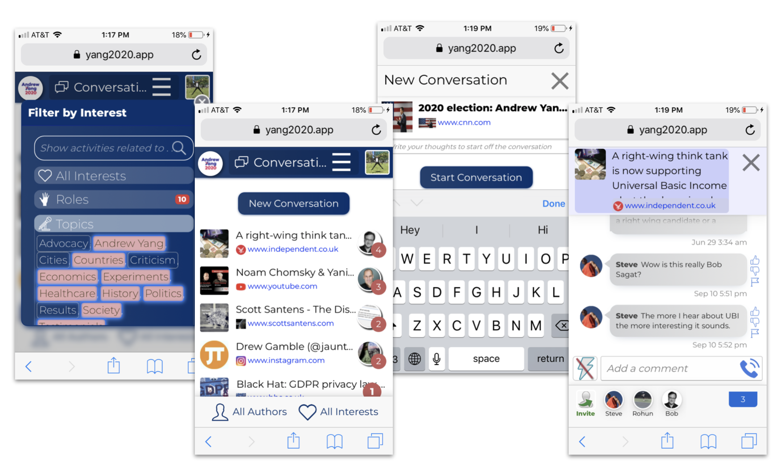
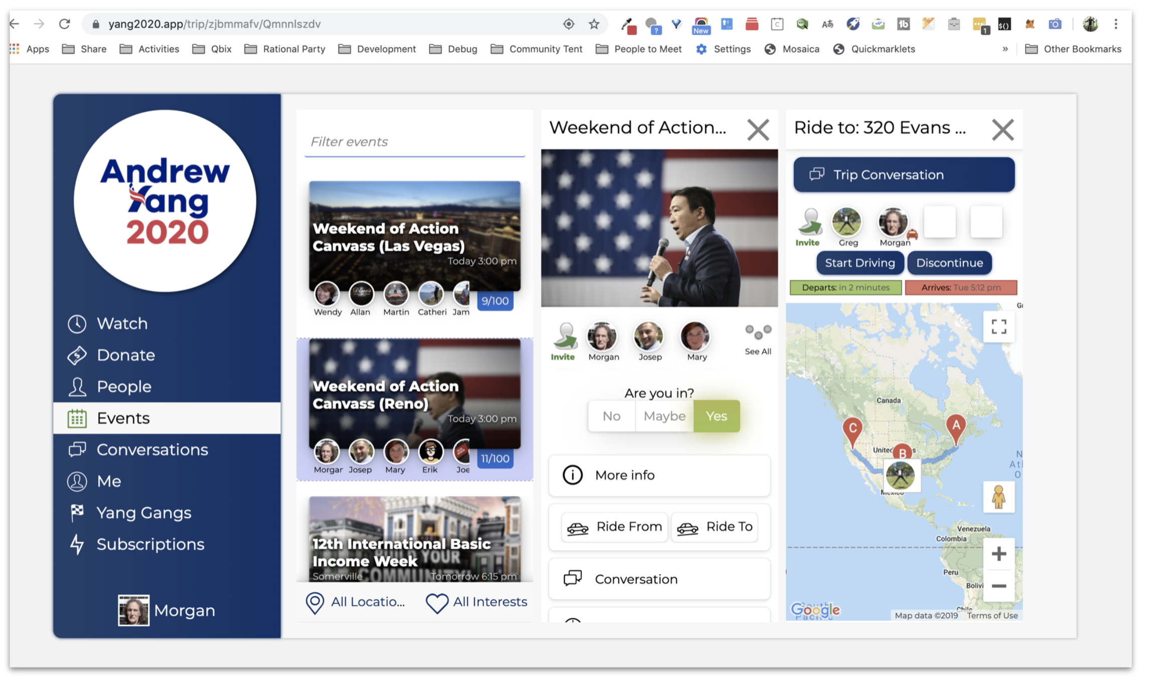
https://qbix.com/screenshots/desktop.png
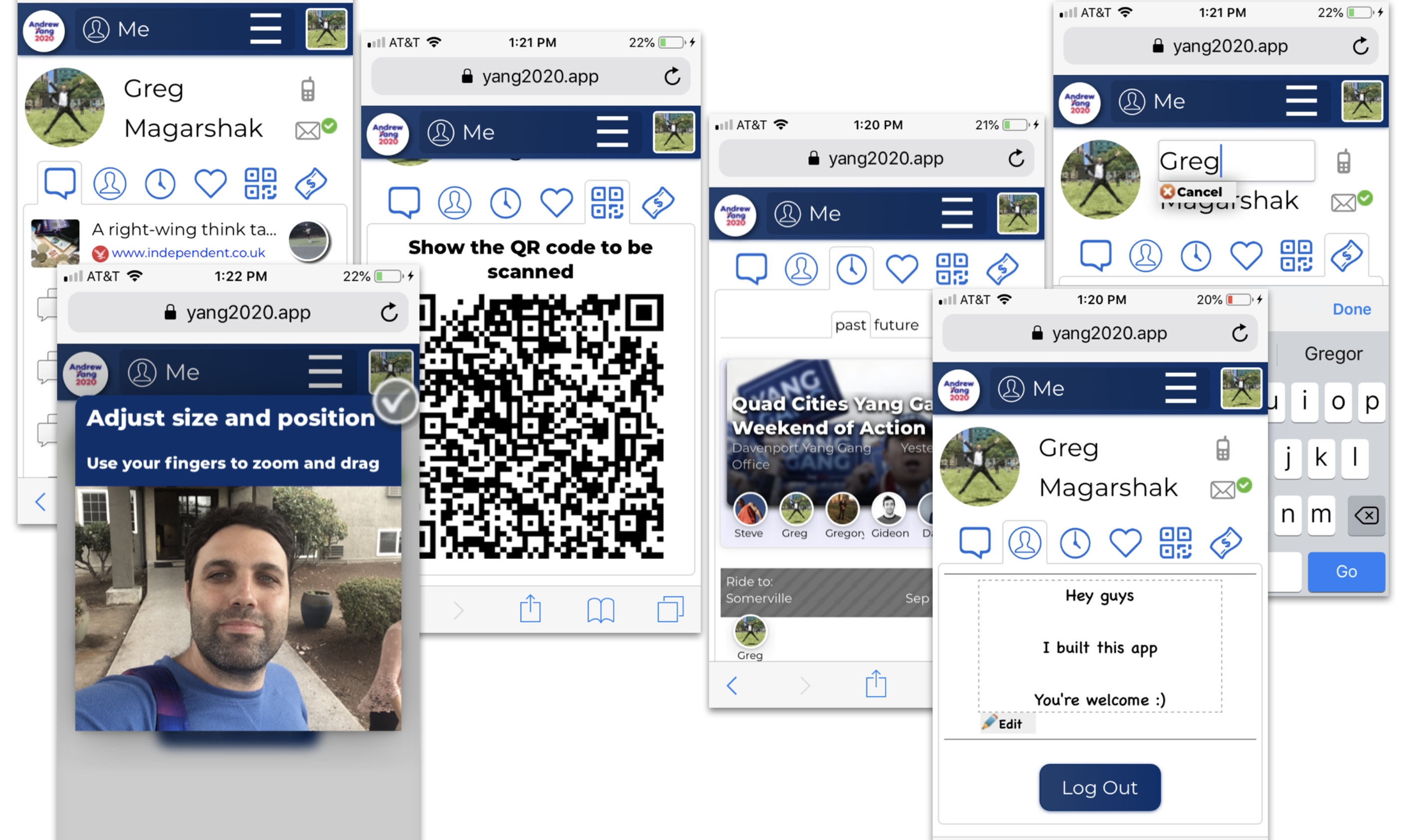
https://qbix.com/screenshots/personal.png
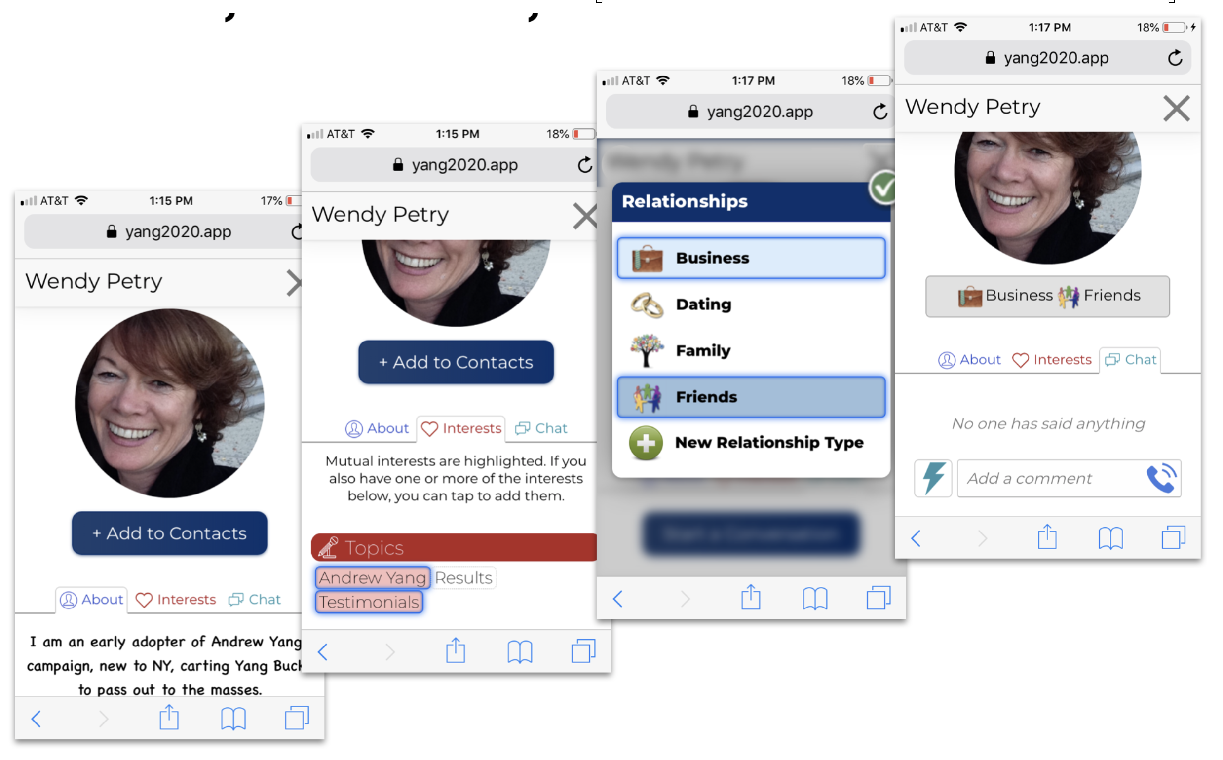
https://qbix.com/screenshots/profiles.png
https://qbix.com/screenshots/rides.png

At the very least lazy load these.
Remove all the boxes and drop-shadows. They look very outdated. Use full-width for the hero and remove the whole box-shadow around the lower sections.
Now using space to separate the sections. For example, adding a vertical padding of 64px to the "We build apps" section automatically makes it look like a Stripe-like site. An example: https://onepagelove.com/smash-lite
Use bullet points:
On the "Are you still sending emails?" section just use bullet points. Remove the border and background color on that table with odd-even colors. And add actual bullets. You already used <ul> and <li>, now let people know that those are bullet points. Add some padding between each bullet point.
HTML bullet points already make it better to read. If you want to look cute, use bullet point images that catch the eye. Similar to how this template does: https://onepagelove.com/devbook
Use visual hierarchy:
For the section titles, use a larger font size, like 36px. Add some padding to the bottom to make it stand apart from the text. Users will use this to their advantage to scan your page.
You're already using bold for the bullet point titles, so you're aware that they're important. Make them pop more by putting the title in its own line and make it a bit bigger. I'd try to use less copy. Drop the effect that collapses the text when you click it.
Be consistent:
Designers are very consistent when it comes to spacing. Try to stick to multiples of 8px: 8px, 16px, 24px, 36px, 48px, 64px. Try to avoid using multiple fonts and colors for things that are in the same hierarchy.
I think you get the gist. Alternatively, just get a free template like the ones I linked, it's much easier than designing things from scratch.
"We build apps for all kinds of communities."
Should be towards the top of your page so that visitors can get context immediately.
Keep in mind, a lot of visitors won't watch your video.
Watching the video is a larger investment of time than simply reading. And they may be in an environment without headphones.
I recommend adding a tool like Hotjar to your site so that you can watch video of actual usage.
That way you'll discover more tidbits yourself.
That would be more efficient than asking us for feedback, since we're not your customers.
https://qbix.com/communities/platfrom
Which isn't the most well-put-together 404 (well, from the message, looks like a 412) page, but hey, I'm not a designer. :)
It's devoid of flourish, but for its purpose this is entirely adequate. I wish more sites could be as pragmatic and usable.
But I'm also a developer, and I know that decently looking themes are a dime a dozen these days on Theme Forest. So having a very spartan design (unless it's a brand new project) just looks incomplete to me.
Sure, Stripe is the other extreme. I've actually tweeted to Stripe that their stuff is so nice, that I go there to look at pretty things rather than their product. But a polished website (and polished APIs) help fuel the perception that the product is really well thought out, whether it is or not (and in Stripe's case, it clearly is well thought out).