It's basically the polar opposite of something like a Linux tiling WM and it's quite different from Windows, where it's the norm to maximize everything.
My use cases almost always want the maximum available vertical space. Every window that scrolls, I want as large as possible in that direction. But, on the other hand, I can see how smaller overlapping windows would leverage spatial memory for faster switching.
Where did you get this idea? It's definitely not the norm and MSFT supports an excellent tiling window system: https://learn.microsoft.com/en-us/windows/powertoys/fancyzon...
Even without that utility though, it's easy to snap windows to one side or another of a monitor - particularly useful for ultra widescreen monitors
The Windows users I encounter IRL tend to not be particularly technical though so that may bias things.
I personally get some usage out of tiling but as mentioned in another comment the tiling proposal triggers in W11 are over sensitive and kind of annoying.
MacOS has a number of interesting features in the kernel, and it has a reasonably good and highly uniform UI, with global shortcuts and all. But its window management is insufferable.
Good thing there are utilities that try to help that. (I already forgot which, I handed back my last work-provided MBP in 2018.)
Without some kind of data in hand, it's anecdotal either way, so I figured I'd throw my hat in.
Which is what is so bizarre about it. Everything else about Apple is about cleanliness, focus, minimalism, simplicity.
Yet the windowing system is designed so that everything's overlapping, it's hard to pick out your foreground window from 20 other background windows of varying shapes and sizes and positions, and bringing up Expose/Mission Control shows you something like a detective's corkboard as he tries to connect the dots to solve the case of the serial killer.
It's quite jarring when the rest of the Apple aesthetic is clean minimal lines, and then your windows are meant to look like a three-year-old tossed rectangles all over the place and never cleaned up after themselves.
Granted, that was ~40 years ago and things are different now, but you can see where the roots of the idea trace back to, and the idea probably has some level of relevance even today. As noted in my other comment, on Windows users often opt out of window management entirely by maximizing everything because it's simpler.
> it's hard to pick out your foreground window from 20 other background windows
This is mostly a casualty of two things: first, the flat UI epidemic which stripped contrast from UIs and made active/inactive windows states less distinct from each other and second, the proliferation of web/Electron apps which for the most part do not implement inactive states for controls at all.
If you boot up a Mac running the last non-flat OS version (10.9 Mavericks) and do work on it with entirely native apps, you'll find that the active window is very visibly active and background windows are very visibly inactive.
The other thing I tend to do is to keep the windows I'm actively using peeking out to click on to foreground which sidesteps the issue of command-tab foregrounding all windows.
Vastly better than Windows (unless 11 has decided to fix them), but grouping windows together in a new desktop involves swiping up, clicking the plus to create a new desktop, dragging both windows to the new desktop. Control left/right to move between the desktops, oh that terminal would be useful as well, and find that there is no native shortcut to move windows between desktops.
You absolutely do not need to resize and drag windows around manually to find the one you want!
I’d argue this probably means you have too many windows open. Part of the abstraction for macOS programs is that the program isn’t the window, and vice versa. You can close all of a program’s windows without closing the program itself. This frees you up to close windows willy-nilly and know that you can just open them back up again if you need to. Keep just what you need for the current task-at-hand open on your desktop and close everything else.
Personally, I’ve actually been using Stage Manager, which takes rapid-unitask- switching toward its maximum level. Just one app open on each screen at a time. Other windows hanging out in-sight, but not cluttery. Switching’s just a click away, and of course all the keyboard shortcuts work nicely, too.
It's basically an over-engineered Gnome, where some features like side by side windows there was a red line by UX and someone worked around the law to "sort of" offer the option.
In what ways do you feel that GNOME is more limited than the macOS desktop?
Here’s just a few shortcomings compared to macOS pulled from memory and from playing with my GNOME install for a few minutes just now:
- No built in UI to remap modifier keys
- Disinclination towards menubars, with any functions that don’t fit on the toolbar or in the hamburger menu getting trimmed
- No ability to search menu items for an app-agnostic command palette
- No ability to assign/remap key shortcut for any menu item, including in third party apps
- No desktop icons without extension
- No per-virtual-desktop wallpapers
- Dash can’t be pinned to left or right edges
- Files and folders can’t be pinned to the Dash
- Overview can’t group windows by application, making it impossible to move all window of an app between desktops at once
- Minimize and zoom/maximize buttons are hidden without GNOME Tweaks
- All windows for an app can’t be closed, minimized, restored, or zoomed all at the same time
- No option in settings to change UI accent color
- Frequently accessed control center sections can’t be dragged out and made top-level items
- File manager obscures root filesystem and other partitions
- GNOME apps don’t allow user to customize toolbars unlike native Mac apps
If I really drilled there’d probably be enough to fill a blog post.
It's been some time since I used vanilla GNOME, so I don't know how much of what I recall about GNOME applies to the latest vanilla experience.
The main one of those I'd miss or reach for is menu bar searching. That's probably my favorite feature of macOS!
> No ability to assign/remap key shortcut for any menu item, including in third party apps
I suspect there's not a good way for GNOME to offer this, unfortunately. Menu bar implementations are multiple on Linux, not singular like on macOS.
> Minimize and zoom/maximize buttons are hidden without GNOME Tweaks
That is absolutely wild. All the time? Until mouseover?
Sorry for neglecting other items! They do sound potentially annoying, but don't stick out to me as much as the things I replied about.
All the time, normally only the close button is visible. I can kinda see the reasoning for hiding minimize since GNOME lacks a representation of minimized windows (except in overview), but I can’t figure out a good reason to hide maximize.
IDEs on the other hand I like having fill my screen because of all their editors and panes, but I still don’t use actual fullscreen but rather option-click the green button which resizes the window to fill the desktop without actually going fullscreen.
They had Unity from 2010 to 2017, so it must have been a while.
> Also Ubuntu had ads for Amazon in its start menu.
Ubuntu isn't Linux. I've been a happy Fedora user for many years now. Much more sane desktop settings than Windows or Mac.
You go look at early Mac OS X and it’s strikingly similar, it’s well and truly reached a point where they need a shakeup but are scared of the short term pain in breaking user workflows.
Today, we all have gigantic monitors, many have more than one, but for whatever reason people want to maximize or tile windows. Maybe it's the influence of the fullscreen only, unitasking paradigm from phones and tablet computers, but it just doesn't make much sense to me on a desktop computer.
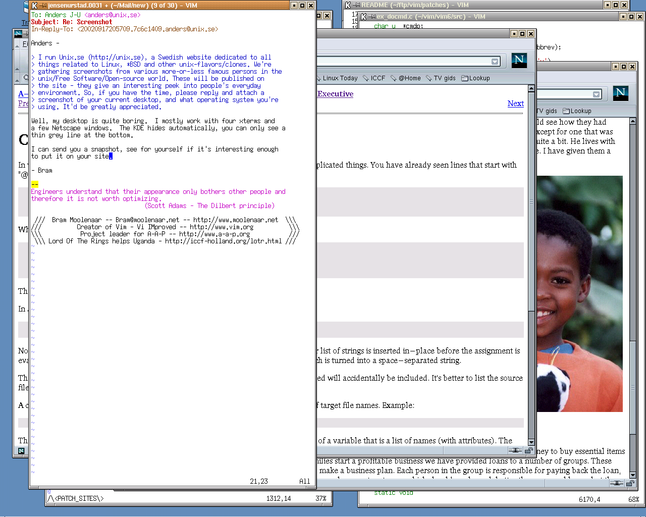
1: https://anders.unix.se/images/desktop_b_moolenaar.png https://anders.unix.se/2015/10/28/screenshots-from-developer...
https://appfire.com/ as an example, but I’m always flummoxed how ALL wordpress themes cap at 10 words per line of text in the body of the blogs, and 25cm of white blank on either side (10 inches).
I need a bigger screen.
I keep my terminal (read: text editor) fullscreen because then I have enough horizontal space to have two panes open next to each other (sometimes with an additional directory viewer to the left).
99% of the time, I'm in the terminal or the web browser. I don't understand what I would gain from not maximizing them, but I do understand what I would lose.
If you're visually impaired, you'll also likely find yourself needing to maximize because all of the blank space used in modern design trends means that if you scale up the app or the font sizes, all that empty space the app is burning up forces you to maximize the window just to fit the important elements on the screen.
Completely the opposite. It's the influence of having computers powerful enough to have massive multitasking. Arranging windows like papers on a desk is easy when you have a handful of simple programs and a couple of browser windows - it's very different when you have 100 tabs with their own task-swapping logic in front of 20 other programs. You've already lost easy swapping so you might as well gain the extra pixels.
For example, Photoshop, your photo document was contained in a window, your tool palettes were windows, etc. If you were viewing a reference image, you could have that open in a separate window alongside the image you were working on, rather than having to switch tabs or switch windows.
They also know that power users have options in the 3rd party app market if they want more fiddly or opinionated window management and have decided to stay out of that fight.
Casual users have moved to phones and tablets, like, 80% of them.
Lol? knowing how to install Steam doesn't ascend to a 'power user' status. And btw, 99% of games are running fullscreen.
It makes no sense, and every time they add a new paradigm it just makes it worse. I had high hopes that Stage Manager would finally solve it, but I turned it off after a week. It was just more of the same nonsense.
Every other windowing OS recognized that menus belong on their applications' main window frames, which makes the desktop an unlimited workspace.
Apple should have made the same transition with OS X, but, in true Apple fashion, petulantly refused to acknowledge that others got it right. So we're stuck with this idiotic swapping of menu contents behind the user's back. If you're temporarily done with an application and minimize it, revealing the one you were working with before... guess what? You're still using the menu for the application you "dismissed." Asinine.
Having a singular menu position is consistent. It gives you an 'infinite' Y target...you just slam your pointer into the top of the bar and get menu options, and only have to care about X accuracy.
The persistent menu on minimise, I do agree, is daft. But having a consistent location I think is a good decision. Need menus? Look at the top. Need menus? Mash your mouse into the top of the screen.
"It gives you an 'infinite' Y target...you just slam your pointer into the top of the bar and get menu options"
Except that essentially nobody does this. Remember that you and I and other HN readers are not the general public, and the general public is not going to assume they can do this. Watch actual users. Not to mention that this only helps in the Y direction; you still have to position carefully to get to the horizontal item. Most people do not separate those two. I've been programming on Windows and Mac for decades, and I never ever "slam" the cursor to the top of the screen.
Also, "slamming" the cursor in Y will not work if you're using multiple monitors and one is above the other. For example, if you have a laptop on your desk with a big monitor above and behind it.
And any loss of "slamming" convenience is offset by the proximity advantage of a window-mounted menu. If the menu is on the window you're working in, you have to move the cursor less to get to it. On today's large, high-resolution monitors this can be quite a savings.
And finally, with the menu on an app's main window there's never any confusion as to which application's menu you're using. Again, with today's large screens, you are more likely to have multiple applications' windows up. It's hard enough to tell which application owns the menu without peering at the corner and reading a name, which is never a fast or intuitive solution and even worse if applications are presenting similar UIs (for example two graphics-editing apps).
And if you minimize an app and are left with a couple more on the screen... who owns the menu? Who remembers the last place he clicked? Why should you have to click around on apps' windows to swap the menu out to the one you want, and then roll all the way to the top of your 27-inch screen to use it?
Strange argument.
I like macOS but have never really vibed with the window management. The only way it makes sense to me is if they don’t actually want you to full screen windows most of the time. Swiping up on a laptop helps but when on my Mac Mini, it’s just not that intuitive. I’m aware there’s a keyboard shortcut that is also bound to the swipe up function, but I never incorporated it into my routine
I tried for months to go vanilla and get my head around the features. But why, why do fullscreen windows create their own space when I want them to exist within a space? Why can't I briefly bring up Finder on top of my fullscreen window? Why are there lengthy animations to switch between spaces? Why do CMD+Tab and CMD+` have a million special rules for which windows they select? Why is there no way perfectly position more than two apps next to each other? Why are apps in splitscreen married to each other? Why can't I easily swap one of them? Why are some window operations keyboard-exclusive, while others can only be performed with the mouse?
There has got to be a perfect workflow where all this makes sense. Otherwise, they wouldn't build it like that? Right?