News for hackers. Stuff that matters.
Re:Firefox Release 89.0 by kevincox on Tuesday June 01, 2021 @09:31AM (#27354128)
Does anyone feel that this new UI brings notable improvement? I don't think it is much worse, other than taking some extra vertical space but for the most part my reaction is "meh". I feel like these resources could have been spent much better in other parts of the browser. Am I missing some reason why this is worth the investment?
Re:Firefox Release 89.0 by weavejester on Tuesday June 01, 2021 @10:44AM (#27355177)
My initial reaction to the beta version was that the UI was much worse, but I decided to give it a chance and spend a few weeks trying to get used to it.

Now that I've had time to play with it, I'm even more convinced my initial reaction was correct. But I've also had time to reflect on why, and in my view there are two problems with this new design.

Removing visual separators from the tabs makes them much harder to distinguish - the only difference between one tab and the next is a larger horizontal space. In prose, when we want to separate sentences, we don't just use longer spaces; we use other visual indicators like capital letters and full stops (periods). Paragraphs are separated by vertical space, which is visually distinct from a horizontal one.

The second problem is that the tab you're not supposed to click on (the active tab) looks like a button, while the tabs you are meant to click on (the inactive tabs) are presented as text. This is opposite to normal UX conventions.

There are some subjective improvements to the look and feel of this UX change, but overall I'm confused as to why the Firefox UX team would go against established conventions to produce something that's visually more difficult to use and less intuitive than they had before.

Fortunately userChrome.css is still usable if you set an about:config option (toolkit.legacyUserProfileCustomizations.stylesheets), so I can see about fixing the problem myself, but I'm concerned that Firefox's march toward reduced configurability will eventually remove this option.

Overall, my concerns on Firefox are the same as most; in the pursuit of market share, they're moving further and further away from their roots by removing customisation options. Remember when you could change Firefox's theme without using hidden configuration options?

Re:Firefox Release 89.0 by tpxl on Tuesday June 01, 2021 @01:58PM (#27358635)
Oh god, you were not joking. I'm honestly wondering what graphics designers are thinking to come up with a design that _literally will not distinguish neighboring elements from each other_.
Re:Firefox Release 89.0 by BuckRogers on Wednesday June 02, 2021 @12:42PM (#27370840)
Pretty good observations. I'm someone who knows very little about UX/UI and what you said makes a lot of sense. Having the active tab "depressed" is more typical.

While I think the redesign looks good, I don't really have strong feelings on it. I mostly just want a supported interface, so I finally gave up on compact mode. It's just ok. I guess they wanted to differentiate themselves from Chromium browsers in a more significant way?

While most complaints, including from my spouse, are that the tabs are no longer delineated, that part hasn't bothered me much. I consider the delineation the icon on the left, and x on the right.

Part of me likes the freshening up. I won't quit using Firefox over these changes, I've been using it for 20 years now and won't be changing until I'm forced. There's still no other browser with a built-in search bar that also works correctly with a keyboard shortcut other than Firefox and Vivaldi. Vivaldi has everything I need in a desktop browser, it just isn't supported at all on iOS which is equally important for me these days. And honestly, Firefox is probably the only browser that isn't from Apple or Microsoft that I'd use. Otherwise I prefer something as important as a browser backed by a truly large organization. Microsoft Edge is really hard to beat in my view once you consider all the intrinsic qualities to it like support. I'll put it this way, no one is making a mistake using Safari or Edge.

I like most everything about Firefox, the browser hasn't ever been ruined, but you got to wonder if there's truly even a place for 3rd party browsers in this era. If I weren't a legacy user, I'd just use Edge and be happy not knowing what I'm missing out on with alternatives.
Re:Firefox Release 89.0 by chrnad on Tuesday June 01, 2021 @09:52AM (#27354478)
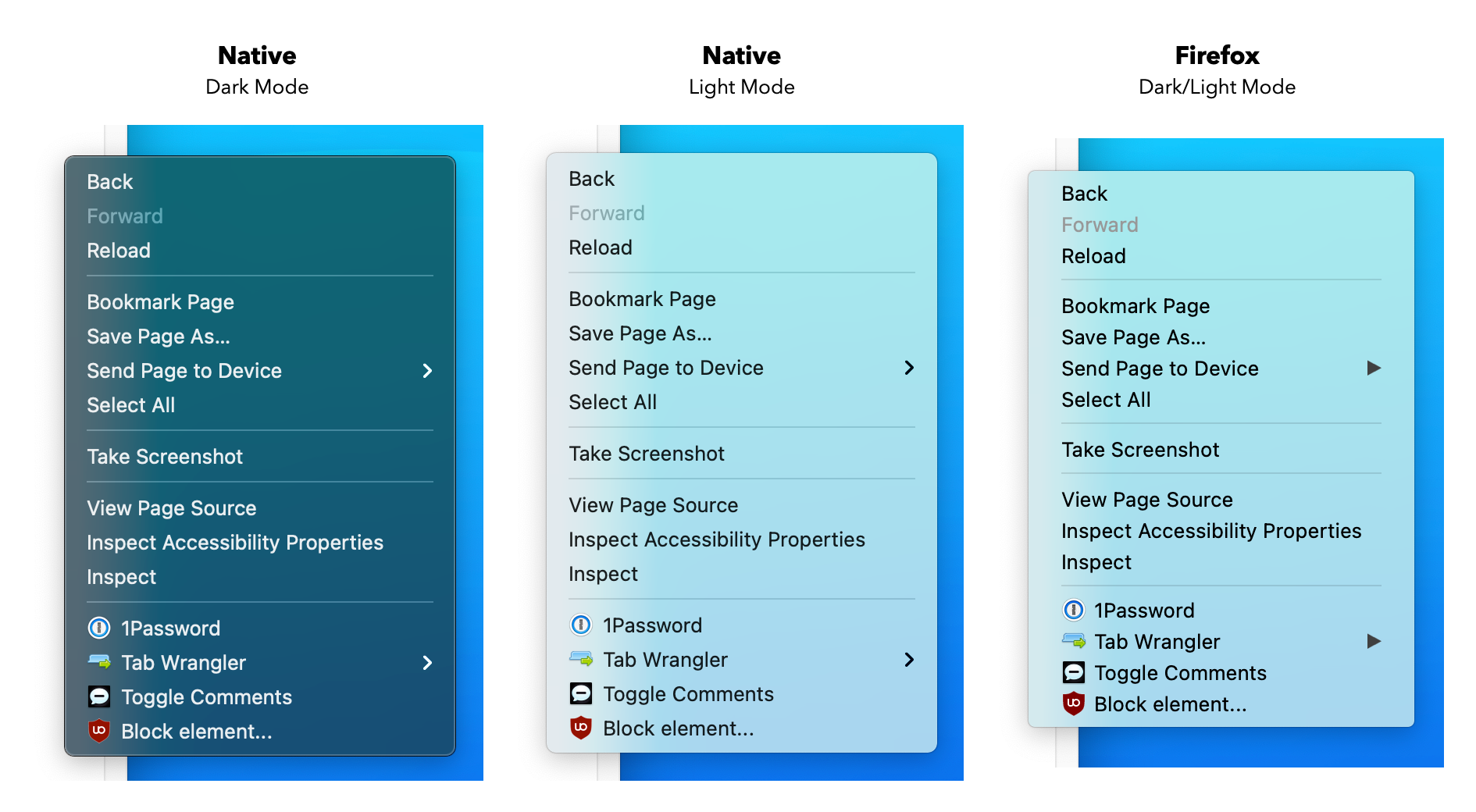
I personally think it's a big improvement over what it was before -- on macOS at least. On macOS, Firefox had always felt a little bit off. Nothing too egregious, but just enough to make it slightly unpleasant (like the non-native context menus). I feel like that has been resolved in this update.
Re:Firefox Release 89.0 by ivanche on Tuesday June 01, 2021 @10:02AM (#27354632)
Since you've already mentioned it - I hear that Firefox has non-native context menus all the time, but for the life of me couldn't tell any difference between "native" and "non-native" context menus. Anybody has any proof/example of this?
Re:Firefox Release 89.0 by sirn on Tuesday June 01, 2021 @10:38AM (#27355113)
https://files.grid.in.th/vKeXJQ.png

It looks close, but details and behavior are a bit off. For example:

- Firefox context menu does not respect system's dark mode

- Different horizontal and vertical margins between items

- Different font rendering (e.g. text looks bolder)

- Different right caret icon

For behavior difference, for example: when navigating sub-menu items, macOS uses cursor velocity and cursor direction to determine if user is trying to go to submenu and immediately dismiss it if user is not. Firefox context menu uses a delay to archive similar effect. (To test this: open a sub-menu in a context menu, then move the cursor up. macOS native menu dismiss immediately, where old Firefox has a small delay before it is dismissed.)

Re:Firefox Release 89.0 by makecheck on Tuesday June 01, 2021 @11:10AM (#27355562)
And on Big Sur, the old Firefox menus were still using edge-to-edge rectangular selection but the system ones now use rounded-rectangles that appear to detach from the edges.
Re:Firefox Release 89.0 by Scarbutt on Tuesday June 01, 2021 @12:01PM (#27356619)
That tabwrangler extension is great, thanks!
Re:Firefox Release 89.0 by Hamuko on Tuesday June 01, 2021 @10:07AM (#27354705)
Right-click on a word in Chrome/Safari (or really any other macOS application) and right-click on a word in old Firefox.
Re:Firefox Release 89.0 by pseudalopex on Tuesday June 01, 2021 @10:04AM (#27354664)
Re:Firefox Release 89.0 by dbg31415 on Tuesday June 01, 2021 @10:20AM (#27354901)
Try streaming a call on MacOS... you'll feel a bit off.

40x the energy usage vs Safari. It's atrocious. Laptop gets to silly high temps, has to be bad for battery life... But I'm sure glad we have some new popup confirmation windows. Cool.

EDIT: I use FF on my Mac as my primary browser. Just so frustrated at how little fucks they give about performance and battery usage.

Re:Firefox Release 89.0 by freediver on Thursday June 03, 2021 @11:17PM (#27390170)
May I ask why not just use Safari?
Re:Firefox Release 89.0 by dbg31415 on Monday June 07, 2021 @11:44PM (#27430442)
I mean, I do for streaming calls.

BUT, I really do like Firefox's ability to clear history and cookies on close. I like the extensions for Firefox... Safari doesn't really have any extensions... not really anyway. Things work funky, if they work at all. I think I run 40+ Firefox extensions for work.

Everything from ClearURLs, to Wappalizer, to Reddit Shine. Nothing works on Safari.

Firefox is great, except they don't give a flying poo about battery life or heat issues on Macs. Really frustrating given we're all mobile these days.

Re:Firefox Release 89.0 by pseudalopex on Tuesday June 01, 2021 @10:03AM (#27354641)
They stopped trying to make menus even look native on other systems.
Re:Firefox Release 89.0 by foepys on Tuesday June 01, 2021 @10:11AM (#27354774)
To be honest, Microsoft has given up trying on Windows as well. Every Microsoft application feels different and MS Teams even ignores the Windows notification infrastructure.
Re:Firefox Release 89.0 by pseudalopex on Tuesday June 01, 2021 @04:18PM (#27360711)
2 wrongs don't make a right.
Re:Firefox Release 89.0 by foepys on Wednesday June 02, 2021 @12:59AM (#27365018)
There is no definite native UI on Windows. If you can point me to one, I might believe you but even the settings menus on Windows use different UIs.
Re:Firefox Release 89.0 by mikewarot on Wednesday June 02, 2021 @01:11AM (#27365084)
Windows has had a native UI forever. Here's how to use it in assembler

  https://www.codeproject.com/Tips/1035362/Simple-Window-With-Assembly
Re:Firefox Release 89.0 by leodriesch on Tuesday June 01, 2021 @09:37AM (#27354237)
I think the new design is really beautiful. For me that is an improvement and I switched from Edge to Firefox for now. But design is always subjective and I can understand how many people would rather see technical improvements over UI refreshes.

But as you can see it brings some users back to Firefox.

Re:Firefox Release 89.0 by SketchySeaBeast on Tuesday June 01, 2021 @09:34AM (#27354180)
I've been using it for a while now with Firefox developer edition and I can't figure out a reason why it was done. Does it give a new look? Sure, but I too don't know if anything was made better because of it.
Re:Firefox Release 89.0 by nathanaldensr on Wednesday June 02, 2021 @12:11AM (#27364744)
Many of these changes are made not to improve some actual user grievance but merely to satisfy designer egos or product managers' needs to remain employed.

Simply: it's make-work.

Re:Firefox Release 89.0 by userbinator on Tuesday June 01, 2021 @09:36AM (#27354218)
Because "designers".

I'm absolutely sick of this trend of dumbing-down lowest-common-denominator UI, removing useful features and affordances for learning. Insanely huge buttons, rounded corners everywhere, floating controls in a sea-of-white/blackspace...

On the bright side, I believe the UI is still highly customisable so it should be possible to make it look exactly as you want, but it's not exactly straightforward.

Re:Firefox Release 89.0 by userbinator on Tuesday June 01, 2021 @03:45PM (#27360225)
I'd like some arguments for why this inane trend of UI is occurring, instead of just downvotes... otherwise the "we'll dumb you down so you can't rebel" theory gains more weight! If there's one thing this fucked-up industry is good at, it's lying and pulling the wool over your eyes so they can herd you where they want.
Re:Firefox Release 89.0 by ddek on Tuesday June 01, 2021 @09:40AM (#27354284)
I think I'll throw a fit when my 'tabs-on-the-bottom' css inevitably stops working. Why? I don't know. It's not notably better, it's just I like having the top of the content at the top of the screen. But it uses the most legacy of firefox's legacy features, so I can't see it staying around forever.
Re:Firefox Release 89.0 by trog on Tuesday June 01, 2021 @08:38PM (#27363392)
My userChrome for tabs on bottom stopped with v89 - can I ask what you're using to get tabs on bottom now?
Re:Firefox Release 89.0 by nsonha on Tuesday June 01, 2021 @09:47AM (#27354395)
hey have you tried taskbar at the top? I know you didn't ask for suggestion but I'm guessing the taskbar is why you prefer tabs at the bottom?
Re:Firefox Release 89.0 by anoncake on Tuesday June 01, 2021 @11:55AM (#27356509)
Someone who went to the trouble of moving the tab bar to the bottom, which AFAIK was never a built in feature, probably also dragged around the taskbar at some point if they use an OS/DE that has one.
Re:Firefox Release 89.0 by potamic on Tuesday June 01, 2021 @11:03AM (#27355437)
I don't like it. The tabs look like buttons and not tabs. It's such an unnecessary deviation from a standard tabbed interface look and feel that everyone is accustomed to. I'm not sure what their reasons are for experimenting with something new but I would be curious to know.
Re:Firefox Release 89.0 by rhdunn on Tuesday June 01, 2021 @11:32AM (#27356039)
I'm using https://github.com/ShatteredIcicle/firefox-ui-regression-men... in my userChrome.css file to use more traditional looking tabs. I'm trying to figure out how to make the active tab background the same colour as the bar where the forward/backward buttons are so it integrates into that UI.
Re:Firefox Release 89.0 by herjazz on Tuesday June 01, 2021 @08:48PM (#27363461)
I'm using the Lepton fix. That might work for you:-

https://github.com/black7375/Firefox-UI-Fix/tree/photon-styl...

Re:Firefox Release 89.0 by open-source-ux on Tuesday June 01, 2021 @02:22PM (#27359041)
"I'm not sure what their reasons are for experimenting with something new but I would be curious to know."

This is pure speculation on my part, but I assume the "Firefox team" wanted the selected tab to stand out visually. The selected "tab" turns white in the default theme. But if the tab is attached to the URL toolbar, then the URL toolbar also needs to be the same colour as the selected tab. It would look odd if they were attached but each was a different colour.

I assume the "Firefox team" wanted the active tab to stand out visually, but not the whole URL toolbar. So the tab becomes a button and is detached from the URL toolbar. Now the active "tab" and the URL toolbar can have different colours: A "louder" colour for the selected tab to make it stand out, and a "quieter" colour for the URL toolbar that lets it recede a little from the foreground.

That's what I think may be the reason for the tab change - but as I say, it's pure speculation (and could be completely wrong).

Re:Firefox Release 89.0 by bambax on Tuesday June 01, 2021 @11:35AM (#27356085)
After using it for a couple of hours the new version is super annoying. It takes more time and effort to find a tab, everything is less legible. What could possibly be the point of this?? Look more like Chrome?

If I want something that looks like Chrome I can use Chrome. It's not like it's more expensive or anything...

Re:Firefox Release 89.0 by myfonj on Tuesday June 01, 2021 @12:23PM (#27357003)
Besides floating tabs I find rest of Proton overhaul pretty good: better contrast, subjectively nicer colours, better focus styles, nice icons.

After removing all corner rounding and tweaking tab bar I am quite happy.

Re:Firefox Release 89.0 by qmmmur on Tuesday June 01, 2021 @12:28PM (#27357095)
Care to share the CSS for removing the rounded corners?
Re:Firefox Release 89.0 by myfonj on Tuesday June 01, 2021 @12:42PM (#27357357)
Well I went full mental and simply bruteforced it [1]. I'm doing it for page content as well with userstyle.

[1] https://gist.github.com/myfonj/f5415dd0580663a82ea18407ef2ee... This file starts with instructions how to make it work; I'm on Developer edition, Windows, dark theme. Same instruction wit illustration can be seen in Twitter thread [2] [2] https://twitter.com/myfonj/status/1387584962354982912

Re:Firefox Release 89.0 by Vinnl on Tuesday June 01, 2021 @09:39AM (#27354263)
There's more info on tabs now, e.g. when a tab is playing audio. And it apparently was also triggered by observing that people didn't really know they could move tabs around and manipulate them in other ways, which does seem more obvious now that they're "detached" from the content.

That said, I won't really notice since I use the Sidebery extension for vertical tabs. But I've got a separate profile running to isolate Spotify and its desire for DRM, and there it's been nice in a small way.

Re:Firefox Release 89.0 by viraptor on Tuesday June 01, 2021 @09:44AM (#27354356)
> more info on tabs now, e.g. when a tab is playing audio.

That was present for a few versions now. Playing tabs had the audio icon which could be used to mute/unmute.

Re:Firefox Release 89.0 by Hamuko on Tuesday June 01, 2021 @10:00AM (#27354600)
Yeah, not only did the old tab design have an indicator what tab was playing audio, it actually was more helpful since the audio indicator did not take over the favicon. I could clearly see that it was YouTube's favicon next to the speaker icon - now I only see the speaker icon.
Re:Firefox Release 89.0 by Vinnl on Tuesday June 01, 2021 @10:44AM (#27355176)
I didn't mean the icon, but there's now a line for actual text besides the page title, which I'm assuming is/can be used to display useful info.
Re:Firefox Release 89.0 by ziml77 on Tuesday June 01, 2021 @12:15PM (#27356878)
Can it? My bar is full of tabs so all I see there is "PLAY" (the fading at the end of the button makes the "I" and "N" hard to see and the "G" is completely gone)
Re:Firefox Release 89.0 by Vinnl on Wednesday June 02, 2021 @11:36AM (#27369913)
I would assume so, but as said, I have vertical tabs so I'm not really using it myself. If it doesn't now then it at least seems obvious it can in the future.
Re:Firefox Release 89.0 by alluro2 on Tuesday June 01, 2021 @10:06AM (#27354688)
True - my only gripe with it is that video icon is in the same place - if I have 5 YouTube tabs, 1 playing, that one with audio icon is very hard to distinguish from the other 4 with video icons. Not sure if video icon is useful to some people at all, especially since it's shown even if video is not actively playing.
Re:Firefox Release 89.0 by bhandziuk on Tuesday June 01, 2021 @11:35AM (#27356097)
Huh, for me the speaker icon doesn't show unless I mouseover the tab. So I can't see which tab is playing at all. And the Muted/un-muted icons are almost identical.
Re:Firefox Release 89.0 by twobitshifter on Tuesday June 01, 2021 @10:15AM (#27354839)
With the disconnect from the page, they’re not really “tabs” anymore at all, and haven’t been on mobile for a while. The tab bar is now a dock/task bar/window manager.
Re:Firefox Release 89.0 by afranchuk on Tuesday June 01, 2021 @11:02AM (#27355411)
I had the same reaction. It reads a bit like the UI engineers didn't have enough to do and stared at it until they found things to change. For instance, having the tab visually disconnected to cue that you can rearrange it is fine... but at this point if a user doesn't know they can rearrange tabs, maybe they shouldn't be rearranging tabs.
Re:Firefox Release 89.0 by jillesvangurp on Tuesday June 01, 2021 @11:46AM (#27356338)
I don't mind the changes. I had to look a bit for the new location of the screenshot tool. It's now a button you can add to the toolbar. Otherwise, the changes are mostly pretty subtle and they make sense to me.

They have UI people and designers. So they are going to be doing UI and design things. IMHO they are better off with these people than without. Browsers are very competitive. So, keeping the UI fresh and up to date is important.

Also, they can't keep everyone happy by changing nothing, which would make yet other people unhappy. So, kind of a damned if you do and damned if you don't. I feel the changes are mostly reasonable and not disruptive so I see very little reason to get upset over these changes.

Re:Firefox Release 89.0 by sfink on Thursday June 03, 2021 @12:12PM (#27383496)
I had the same issue with the screenshot tool, and added it back, but then I learned that it's been added to the right-click context menu and now I'm torn on whether I still need it as a separate button.
Re:Firefox Release 89.0 by bambax on Tuesday June 01, 2021 @10:37AM (#27355096)
Completely useless, yes. The tabs are now semi-transparent on Windows, which is annoying and doesn't help anything.

I guess there's an option somewhere to set opacity to 100% but I'm not ready to spend 30 minutes to hunt it down.

Re:Firefox Release 89.0 by anoncake on Tuesday June 01, 2021 @11:48AM (#27356378)
If it exists, it's likely buried in about:config, which is guarded by a warning telling you to go away. And eventually it will be removed because no one[1] used it, which proves that the designers were right.

[1] Except for some weirdos who disabled telemetry. They're probably so paranoid they believe Mozilla would abuse the studies feature to promote a TV series or something like that.

Re:Firefox Release 89.0 by skyfaller on Tuesday June 01, 2021 @11:40AM (#27356206)
One notable recent improvement I will mention is better support for dark mode in the default theme (although I think this fix precedes Firefox 89, it's definitely available in Firefox 88). I previously had to hack the CSS to prevent Firefox pages from searing out my eyes with white at night.

These days I'm more satisfied with the default CSS on e.g. the Firefox Home page, although some pages like "view source" still do not respect dark mode unless I edit them.

Re:Firefox Release 89.0 by addicted on Tuesday June 01, 2021 @10:00AM (#27354607)
I found the UI changes on windows, while being fairly minor, being much nicer than what was before. It's added a lot of polish without affecting my workflow in any ways.
Re:Firefox Release 89.0 by Devid2014 on Tuesday June 01, 2021 @09:37AM (#27354238)
For me this new UI is worse as the classic one.
Re:Firefox Release 89.0 by peteretep on Tuesday June 01, 2021 @09:42AM (#27354332)
It's much better when you use it than when you look at the pictures, imho
Re:Firefox Release 89.0 by nsonha on Tuesday June 01, 2021 @09:37AM (#27354230)
yeah honestly I don't understand why they don't just freeze the UI and focus on some privacy incentives, that's what end users care as well as where VC money is.
Re:Firefox Release 89.0 by duped on Tuesday June 01, 2021 @10:52AM (#27355280)
The tabs are more compact than they used to be
Re:Firefox Release 89.0 by mrweasel on Tuesday June 01, 2021 @11:06AM (#27355488)
Really? They seem much bigger, like twice the size.

I don’t dislike them as much as I initially did. They’re just a little to big on low resolution monitor.

Personally I’d like to see browsers move away from trying to be “special” and just follow the design of operating system. A little tricky on Linux, but for Windows and macOS just follow the guidelines from Microsoft and Apple.

Re:Firefox Release 89.0 by duped on Tuesday June 01, 2021 @12:45PM (#27357434)
I'm wrong, but the difference is about 2 pixels on Linux.
Re:Firefox Release 89.0 by mrweasel on Tuesday June 01, 2021 @01:56PM (#27358608)
Okay, I was way of. The tabs just seem much bigger, but if it's only two pixels I won't complain again.
Re:Firefox Release 89.0 by conradfr on Tuesday June 01, 2021 @06:37PM (#27362373)
12px on my Windows 7 computer.

https://i.imgur.com/yb6t2tX.png

Re:Firefox Release 89.0 by hajile on Tuesday June 01, 2021 @09:53AM (#27354494)
The UI/UX team that works on this likely aren't backend coders. They can either fire the team or put them to use, but reassigning them random C++/Rust tasks probably isn't possible.
Re:Firefox Release 89.0 by kevincox on Tuesday June 01, 2021 @10:03AM (#27354650)
To be perfectly blunt it doesn't matter what a team is doing. They paid $X million to "design resources" and directed those resources at the redesign featured in this release. Instead they could have paid that to backend, other UX initiatives, the extension team, the privacy team...

I understand that you can't swing resources around freely in the short term but you don't have a bunch of designers sitting around by accident. Someone decided that they should hire them.

Re:Firefox Release 89.0 by LargoLasskhyfv on Tuesday June 01, 2021 @10:47AM (#27355209)
Let them clean the restrooms.
Re:Firefox Release 89.0 by pseudalopex on Tuesday June 01, 2021 @10:08AM (#27354712)
You're right the money could be spent elsewhere. But calling people resources is rude to put it mildly.
Re:Firefox Release 89.0 by kevincox on Tuesday June 01, 2021 @10:19AM (#27354885)
I said I was being blunt in the prefix.

I definitely agree that we need to think about people, that was a large component of "you can't swing resources around freely". Firing people is not something that I would like to see. The point I was trying to emphasize is that it isn't as if Mozilla just happened to have X people with design skills and Y people with whatever other skills. There was planning to build the teams and planning to pick the projects. So while I agree that you can't just put people on random projects I wanted to point out that Mozilla had a lot of agency in the decisions that lead up to a team working on the redesign, it didn't happen just because they happened to have a bunch of designers available.

Re:Firefox Release 89.0 by Zababa on Tuesday June 01, 2021 @02:14PM (#27358880)
> But calling people resources is rude to put it mildly.

I don't think it's considered rude, since "Human Resources" is a widely accepted term.

Re:Firefox Release 89.0 by pseudalopex on Tuesday June 01, 2021 @04:02PM (#27360493)
Human resources is just a depersonalizing term for personnel. Design resources is just a depersonalizing term for designers.

Human resources is less bad because it doesn't refer to specific people. And most people can't choose what the department is called. But they can choose what they call other people.

Re:Firefox Release 89.0 by hajile on Tuesday June 01, 2021 @10:33AM (#27355065)
Good UI developers are incredibly hard to find. If they let them go, it will take a couple years to get a new team assembled and integrated into Mozilla.

I agree with the idea of other UX initiatives though. They could definitely have the team work on other parts of Firefox even though that isn't as immediately visible to all users.

Re:Firefox Release 89.0 by brotherofsteel on Tuesday June 01, 2021 @11:49AM (#27356392)
>Good UI developers are incredibly hard to find.

Is that why the ones they do have keep messing up the UI?