Well Evernote has a free tier and past that it’s really <$50 per year - plus there is currently an additional 40% off, so I think your competitor pricing research might be a little off.
I mean if you are really comparing against Evernote it’s really free for a similar service, and offer multi-device sync between mobile and their desktop app as a service, so I would say the Evernote free tier is the most comparable even though I like the look of your product.
This is a $19.99 app or $2.99 per month subscription to compete with things like notability.
As you have a free tier, I'll give it a shot.
Not to mention, Evernote used to cost more, but that lost them a bunch of customers (and lost their dominant market position). So, I'm not sure that's the competitor that I'd be trying to follow for pricing.
Notability is a great app, but it's a sketchbook so not really a comparison.
Your app looks great, as soon as the price point is somewhere near sensible for me I’ll be a customer, but it’s quite a way off for me personally yet.
Which is a silly way of saying, if you think the pricing looks daft where you are, it costs almost twice as much here!
I can't actually see a clear use for Muse right this second, but I am going to attempt to use it to lay out a high-level application architecture so let's see how it goes down tomorrow with the CTO. The major issue I can see coming is that everything is slower than me writing on the screen. Creating a box, typing stuff, moving it, then drawing arrows and line. I have to keep switching between fingers and pencil, which disrupts my flow. I'm sure your research will have some insight on this matter. It's a nicely polished product and you seem to have nailed both design and execution, if not the costs - it's not really in my discretionary spending budget right now, but if it proves a critical component, that changes everything. Good luck.
Switch to iPad, it's downloaded already, and... I have to enter my email again? AND the code? Okay, the email says, "Click this link on your iPad to register" so I click the link on my Mac (don't do email on my iPad), transfer the link and... Nope! It won't accept it, gives the same, "Open this link on your iPad" message.
I'm with the "Add sign in with Apple" people... seems like a much nicer thing, for us.
Since you said you're looking for feedback, I'd love to be able to add an Apple or Google Map view, and zoom into a specific area, add pins, and add notes. Think planning a trip or road trip.
The other idea I've been looking for is something that renders in-line web previews in a flexible way. So if I were to paste a link to a website into the app, it wouldn't treat it as just a text hyperlink, but rather, render a small web preview that I could resize or manipulate to display the portion of a page I'm interested in. Ideally this would then be cached so if the page were to update my preview wouldn't break. But also have an option to refresh the preview to update to the latest content. Or auto-refresh to use it more like a dashboard monitoring tool.
Otherwise, for critiques, I wish it played nicer with landscape/portrait. And I kind of like how interactions are geared towards dragging things in from off the screen or flicking things off the screen, but I feel like it's not quite smooth yet. Things seemed to get stacked together and cluttered half in/half out of the canvas as I was working through the tutorial.
Cheers for the launch!
Web pages (including subsets) also a critical card type on our roadmap.
You're right that portrait mode is clumsy right now. We will fix this for sure--it's a challenging technical and design problem due to the spatial model.
You mention "a generous free tier" yet I don't see any talk on the web page for the free tier nor what all I'm getting for $100 a year.
If I had to decide between this and a subscription to ACM (also $100) I'm taking the ACM subscription, cause I know I'm getting something of value there.
Particularly, looking at https://launch-preview.museapp.com/handbook, the inbox/card mechanic seems worth pointing out, and boards/cards as your primary model of higher-level organization.
Also a question: the handbook says boards contain cards, and cards contain boards -- they can be organized as mutually recursive? That's cool. In fact, there are very few of these modern systems that properly let you recurse
Yes, boards and cards are a key abstraction. Boards are just a type of card that can contain other boards--think of boards like folders/directories on a filesystem.
Subscription fatigue, yeah, I know. Hoping to write an article about this in our industry, but the reality is that this is what's sustainable for a small team that wants to avoid venture funding (and eventual acquisition "incredible journey" stuff) or monetizing by selling your personal data.
In the case of Netflix that's obvious - new shows. Dropbox is a little more annoying, but there's still the premise the cloud component is fundamental to how their service works.
"Daily admission to the software I installed" doesn't feel like much in the way of value, even if you are continuously investing into the product behind the scenes. The equation can even become negative (e.g. forced UI revamp, user hates it, now they feel like you're charging them to make their life worse).
I get the cashflow appeal and business arguments, but I disagree it's the only way. I sold software online with a small bootstrapped team for over a decade under the plain old "buy it once" model, resisting the subscription fad even when the MBA's pushed to go that route, and made it work. My customers were always happy to buy the major version upgrades (every couple years or so) because it was really clear what new value they were getting.
I balk at yearly subscriptions to software too for the exact reason you state. But, I also realize that one time purchases don't keep the doors open indefinitely. I wish I had a magic solution for this conundrum, but I don't.
This doesn't seem to be any better incentive-wise than the model I described (stopping payment stop further updates, so you keep whatever you have today), but comes with the user-backlash of losing what they thought they had (no one feels good about rolling back)
tl;dr: you buy the app and 1 year of updates. You keep what you pay for.
I wonder if it would be viable for an app like photoshop to have a feature marketplace. You start with a very basic version of the app and you buy the features you want piecemeal. You then have a separate service contract for ongoing support (ie: bug fixes).
[0]: https://agenda.com/ [1]: https://medium.com/@drewmccormack/a-cash-cow-is-on-the-agend... [2]: https://www.sketch.com/
It might work better with consumers, where such a strategy isn't cost-effective, but I also imagine its a difficult system to tech support -- you get a combinatorial explosion of possible "features" that may be in play. Anyways, it incentivizes bad behavior even consumer side, encouraging results like 200 $1 features and communities/tutorials/discussion becomes strangled
I mean it costs the same as a Netflix subscription, or alternatively 2 triple-A games. I get that you have set the price you think you need to sustain a team, but I really don’t get the value proposition to the customer and not sure this is thought through.
If you find value in their product, and use it frequently, is $100/yr that much? I haven't tried it yet, but superficially it seems much less trivial than Fantastical, which is a great product, but not worth $40/year.
I personally hate subscriptions as currently implemented. I'd like to see pricing amortized over two years, and after that a reduced subscription price since you are primarily funding maintenance in many cases.
Not everybody has Silicon Valley or even US salaries (I sure don't) and subscriptions quickly add up and become non trivial.
At work we still have Office 2010 on most our workstations. Imagine how much we would have paid if we had an Office 365 subscription all those years (I'm not sure 365 even existed at the time of 2010 release but bear with me for the example).
Now whether the product is helpful enough with those things to be worth the price, well for that the market will decide :-)
At the risk of sounding brusque, that comes off as more than a little reductive. "Your choices are poor compared to mine." I don't think you meant it that way but text doesn't convey emotion.
Regarding the what I value aspect: This is yet another (cool-looking) app that asks me to pour my creativity and thoughts into it yet charges me rent to keep them there, even though the app, as you say, does not have recurring costs to you.
So now, if I want to invest my time and soul into making this my One True Creativity App and keep it, hypothetically, for the rest of my life, I'm looking at $4,000. Or even if I just keep it for the next decade (assuming it survives that long and the shutdown of the subscription doesn't yank my data away from me with it), that's a grand.
I'm genuinely sorry but I'm not going to take that risk or pick up that expense. Sell me the app and I'll buy it; don't rent it to me.
That way people who hate subscriptions or lock-in know they have an out and don’t have to lose anything.
It doesn’t really matter if you sell 10 at $100 or 100 at $10, and sometimes selling 100 at $10 is significantly easier.
All that said, I'll join the chorus of skeptics over the $100/yr price. Apparently you have people willing to pay that, which is great, and hopefully a sign that you have built a good product -- maybe we on HN are just a bunch of cheap, cynical bastards.
I understand folks gotta make a living but I feel the price is based on “Hey got away with it”. Best of luck but I’ll stick with my notes and scribbles on blank business cards and notepads
For me Muse’s competitor is 100 (double sided where appropriate) cards for a fiver every month or two. I’ve never had my data held hostage for nonpayment either (I don’t know if they do this, I’m just not new to subscription models)
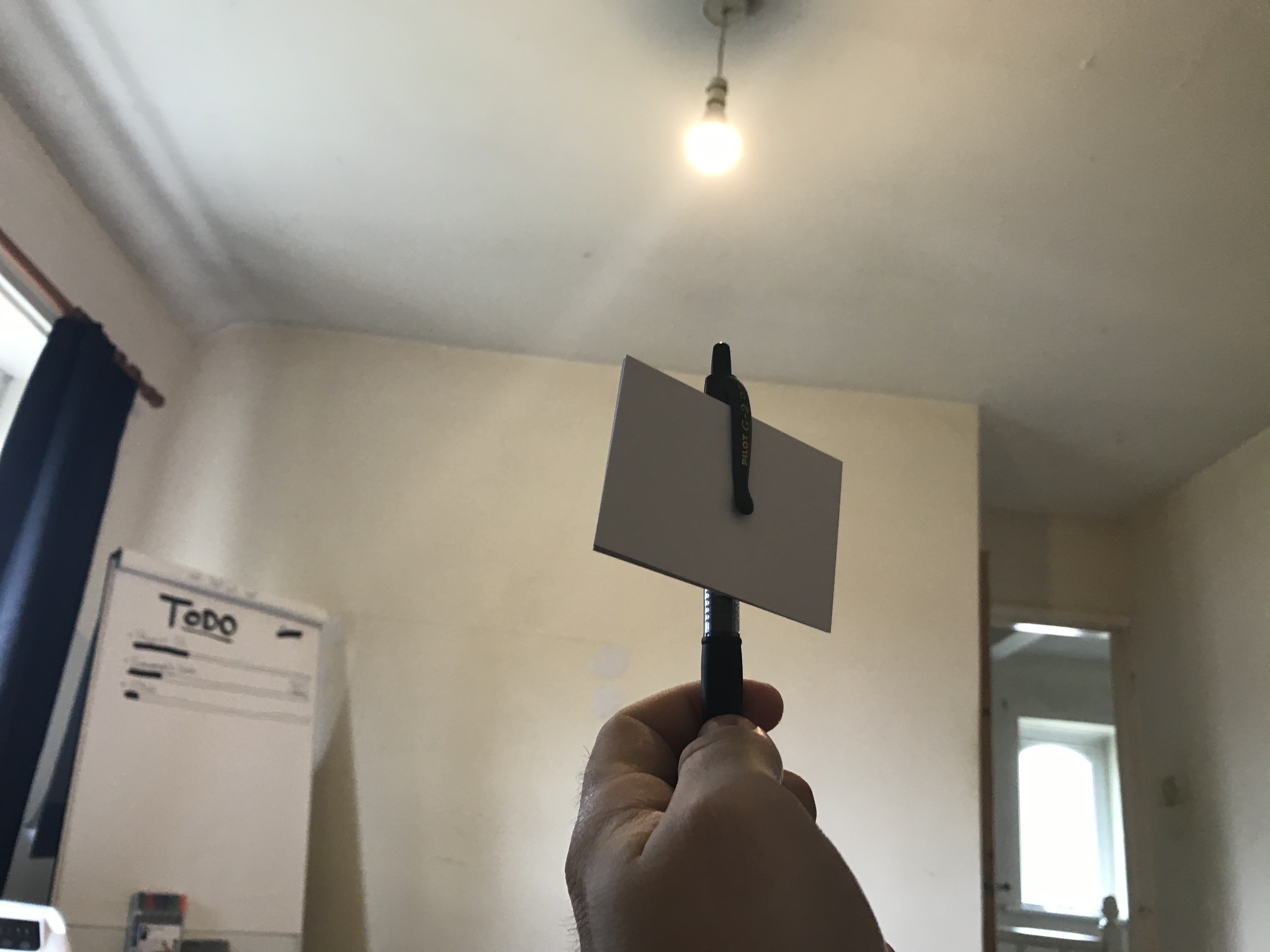
Also if you do happen to use Evernote you know why I’m using business cards. So easy to digitise if I ever do need to
I highly doubt that. I've seen a lot of advice to overprice on here, the idea being that you can never charge too much. "Double your price" is the most consistent advice on this site.
I come from an entrepreneur attitude, my time is my most precious commodity. I don't optimize minor expenses, I optimize the big picture, my time, outcomes, and most importantly income/revenue coming in.
No this is rent seeking imho : this software is already built there's no need to work on it full time for the next 10 years just to bloat it with mostly useless features.
Sell it, make a profit, work on version 2.0 (1.0 is probably missing crucial things that will become apparent once it's battle tested), sell it again then put it in maintenance mode and go work on something else.
Please apologize for the tone I'm not a native speaker so I don't know how to say it nicer. I don't intend to hurt your feelings, actually I hope you will succeed even if I won't subscribe.
Muse would also not receive the purchases it needs if it had an up-front cost of $60 or more (which is what a typical app would cost on the Mac).
Super Cool App v4 - $9.99
Super Cool App v5 - $12.99
Total Bundle Price - $22.98
Bundle Upgrade Price if you have v4 - $8.99
I've been thinking about this repeatedly for years, usually triggered by apps like this. I might even have written about it here or on my blog and I agree it is a hard problem.
First, for anyone who wonders why do companies need recurring revenues after the initial version has been (I didn't either a decade ago):
Releasing software into the wild is less fire-and-forget than one would think. Platform APIs change, security holes are found etc.
Second: I have been trying to look for models - hoping to find some I truly enjoy - and I'll try to summarize the ones I can remember, with examples:
- the original WhatsApp model: a tiny recurring charge. In an alternative world where they weren't bought and at about the same time - as network effects set in they could have started charging companies for API access, not to spam but tonrun helpsdesks, bots etc. Micropayments also looked promising.
- The Jetbrains model: you pay a subscription but as long as you have paid for a minimum amount of time you get to keep the last version that was released while you were paying.
- A similar model is used by the Agenda app. I almost never use it and yet I'm tempted to pay (again, I have done it before) because I love the business model.
- then you have the commercial sponsor model where someone pays to be the default choice for something the end user would probably choose anyway: this worked really well for Mozilla and Opera for a number of years.
- Then there is the old school pay one model, this often bleeds into one one of the above models as new more or less improved releases are pushed every year.
- There are freemium models which are more or less free: some charge only for superficial features (reddit), other for one time upgrades to extra tools, other charge on a monthly basis for access to extra tools.
I think I currently have 3 app subscriptions going, one for MeWe and one for Concepts and one for Paper Pro, and then there's a couple of newspapers, mandatory payments for the national broadcasting, there's Netflix and Spotify and payments to Hetzner for my hosted NextCloud instance and after that I really really don't want another subscription unless it is
- very inexpensive
- or is something I use everday,
- or it replaces one of my existing ones.
I've downloaded it to test now, but for now it looks like a OneNote competior priced at the same level as the entire Office 365 personal edition?
Edit: I've tested it a bit now this looks extremely promising but the price is steep for an app and there is no option to pay monthly for a couple of months to test. At least you were generous with 100 reusable cards so I will continue testing it.
I think you have a pretty big hurdle in the sign up and might be losing customers because of this. I would suggest allowing users to at least try it without signing up and also provide "Signup with Apple" instead of email.
I still need to actually install this and give it a try (saw it just before a work meeting sadly, about to have lunch with the spouse, etc.), but did want to ask a quick question about it in comparison to an iPad app I found recently called Endless Paper. The main point of it being to have an infinitely zoomable/scrollable “document” you can both draw on with a stylus but also import pictures you can draw over, etc. How does Muse compare to that kind of idea, and does it offer something similar to that? Or is it more of something like Tinderbox where you can organize a whole bunch of different things at a single “zoom level” in a sense?
I’ll leave thoughts once I get a chance to play around with it some :)
Tinderbox (https://www.eastgate.com/Tinderbox/) is a great comparison—they have a different design aesthetic, cost a bit more ($249 one-time), but similar use case of deep knowledge work and thinking.
Endless Paper (https://www.endlesspaper.app/) is a sketching/drawing app, so not very similar to Muse.
On the infinite canvas point: this is one of the things we researched in the lab. Our studies revealed that it sounds nice, but in practice it's incredibly disorienting because you have no sense of scale. That's why we have a discretely-zooming interface; the difference is subtle but critical for high-speed thinking working.
Most note apps are just that: note apps. I’m sure as you went on the journey of building this, you assessed and categorized every app out there.
As an indecisive consumer, understanding the landscape and thus the unique value for Muse (relative to the other offerings) would be huge. Is this in the same category as a note taking app, what are the philosophical differences, etc. Maybe that doesn’t make a ton of sense, so let me try making the point in a different way:
if you’re right - you’ll have changed the path for humanity’s thinking in the biggest way since the “text editor”. Buying in requires me to understand the compromises and trade offs - something that could be accommodated by sharing your design principles publicly.
For me, I’ve been waiting on the right App to buy an iPad. I’m not sure if this is it, but I have a maxed out iPad Pro I just bought my wife so I can at least give it a go. Good luck to both of us.
I view note-taking (apps, or just on paper) as being about capture and later retrieval. But in a pretty static way--you take notes from a meeting, later you read them to remind yourself. Knowledge bases like wikis are more powerful version of this data in, data out mechanism.
Muse is about thinking. That means: pulling together a huge number of sources, arranging, culling, finding patterns, having insights. Which can then lead to a creative work (like a book or a piece of software) or a decision (like making managerial decisions as a startup founder or team lead).
Hope to hear how your journey with the iPad (and Muse) turns out :-)
Hard to give feedback because your design decisions and trade offs are not public and in your writing you give more of a business vibe than a designer, would've been nice to have the designers here instead of you. But you asked for it so here we go...
Good attempt so far. Frankly, something like it should've been "a mode" for iPadOS. Instead, unfortunately, you're app is restricted by its horrible limitations. There's no separation between content and features that can be applied to content. Take PDF just as an example. No matter how good your team is, the chances that it will create a better toolset than what Adobe already has created are slim. The second I decide to interact deeper with any of Muse's supported content types while in a board, I'm left to leave Muse and deal with an entire different app. Result? My flow is broken. This interaction is conceptually unnecessary. If the PDF is already open in Muse, why can't I bring all the great features from Adobe in and when I'm done I continue with my flow?
2. Your metaphor needs a lot of work. I won't go into many details but I'll highlight one of them. What's up with the grids? Why can't I arrange the content anyway I like? Flipped, 34 degrees, etc.
3. Infinite canvas - bring this in. How to deal with it spatially was solved decades ago.
4. This is related to the last two points... computers are a meta-medium and either you are stuck in the medium that existed before or you're not letting your designers that know this not shine. Stop thinking only in 2D!
This is a hard no for me. 3D wizbang stuff sounds amazing on paper (heh) but in practice, it is massively distracting. People tried to build 3D desktops and a whole bunch of bullshit 3D wankery with GNOME and KDE and none of it was as revolutionary as it claimed to be. The time it takes to build 3D content arragement app for Muse can just be spent in improving 2D problems you're referring to.
I also dislike your tone about - "You can never achieve this" or "was done decades ago, why haven't you done it yet?"
Try doing it yourself then, and show some compassion. Provide constructive feedback and not lofty statements that criticize unconstructively.
This is one of the things that really bothers me about feedback. Please don't do this.
Definitely best idea here IMO.
If you don't support this for the gestures, where is it on the roadmap? I'm a new iPad pro owner, so this would appeal to me greatly. Honestly, its a sticking point I'm not getting over easily. While they should just 'translate' I know some app developers have had to consider the touchpad when designing their apps for more complex gestures.
A trackpad-driven mode can be nice when you're using it with a keyboard for a lot of text entry, but I think Muse excels when you're in full tablet mode with the stylus. Hence we feature that more prominently in our documentation (https://museapp.com/handbook).
I hate entering text without a keyboard. I have an iPad stand that allows me to collapse quickly between hands-on tablet and keyboard/touchpad in less than a second. I love the drawing aspects, and I don't mind doing certain 'quick' things in a hands on way, I totally see where its an advantage. However, if I'm input text beyond a few lines, its to the keyboard and trackpad. If I'm organizing a large volume of things, its keyboard and trackpad. Its just faster.
There is a reason that Apple gave in after all these years and added a touchpad.
What bugs me about this answer is you assume to know whats best for interacting with the device (not the app, which should follow device and platform norms)
to reiterate, following the customs of the platform will always be better than expecting users to break out of those customs. Yes, gestures and hands on interaction are a custom, but now we have customs around keyboard and trackpad too. They deserve equal weight and this really should be a priority. I'm really shocked you launched without this consideration. This tells me you don't understand the Pro market as well as you think you do, and for $100 USD a year, you should really be positioning yourself in a way that says "Pros, we understand you, and you need Pro tools. We see the iPad as a Pro tool. We see iPadOS as a tremendous platform for Pro Tools. So we made Muse, with first class and best in class support for iPadOS and its Pro features"
This doesn't say that to me. Feels like you didn't consider it. I am surprisingly passionate about this, so I apologize in advance if this is harsh.
The only time a response of this nature is ever elicited from me is when I actually want something to succeed and I think its a really good thing that I'm willing to pay money for. $100 USD for me for a tool like this, which I have always conceptually wanted but never had the time money or skillset (I don't do native mobile development, alas, and I haven't been able to break into it in any meaningful way to gain more expertise) is why I'm so fired up. I want to evangelize this app within the first few moments of firing it up and playing with it. Its that good.
I just really care about good touchpad and keyboard support. I want first class for all available inputs.
Muse works great with pinch, scroll, etc gestures. We still need to work on pointer hover states. Other things you're missing in the app trackpad support, or just making a general case of its importance?
You can do some pretty neat things with gestures here too, like swiping 'between' things, that didn't translate to the app either.
I'm doing both, frankly. This is a pro tool for pros, and as such, you're more likely to encounter people like me than not.
Might be nice to have a "slide over" type view of all the things in the inbox, and choose one at a time.
Are there plans to have this cross-platform?
I currently use two tools: GoodNotes and Concepts. Concepts is much better for drawing, with its layer system and the excellent "use your finger to lasso-select" tool. I love the infinite canvas, too. But Concepts requires too much fiddling. The tool palette can't be fixed. I would like to have the same tool and color palette in all documents, so that I can avoid wasting brainpower on fiddling with tools. Concepts also fails in organizing multiple documents — the viewer wastes lots of screen space and it takes a long time to find a document. I reported all this to the Concepts team, but they seem to prefer to compete in the crowded "drawing app" space rather than in the almost empty "thinking app" space.
GoodNotes is much better for thinking. I love the responsiveness, a simple tool system. Palette management is better in that I could set the colors once and have the same ones available everywhere. I still can't lock/save/export these settings, but as long as I'm careful, this works.
GoodNotes isn't perfect: there is a bug where the app opens with the list of documents rather than where you left off. To use the lasso selection, you have to use the toolbar, rather than use your finger like in Concepts. It has a weird concept of "paper sizes" (what paper?!) — I want to draw on a canvas which is exactly iPad-sized, with no panning, zooming or margins, but I always end up with either wasted margins, or fiddling around with zooming in GoodNotes. Document organization isn't that great — I want to quickly create multiple single-page notes and I do not want the app to ask me each time whether I want to save or delete my "Untitled" document. This isn't Windows 95, people.
Moving on to Muse:
First, to get this out of the way: $100/year is just fine. In fact, I could pay more if the tool became really good. It's a business tool for me (at a first approximation, I get paid for thinking).
I don't care that much about the emphasis on inserting images or videos. That's just not what I do. My notes are mostly drawings and text.
Inserting PDFs and marking them up is a very nice feature and I liked the PDF viewer initially. Still, it wouldn't work for me in practice: when designing electronics I routinely work with 600-page PDFs. I need the tool to remember the position, have a simple bookmarking system, and a way to quickly navigate to somewhere around page 400 visually. Also, no continuous scrolling, please — single page flips only.
I expected a double-tap on the pencil to pull up the eraser and it didn't.
I couldn't figure out how to pan the board (perhaps you can't?). I think I need either zooming+panning or multiple pages.
I couldn't figure out how to delete a card.
I could drop the card into a board (initial screen), in spite of trying multiple times.
The lasso system is way inferior to GoodNotes or Concepts. I'd rather have object-based selection, not one that cuts through anything. And I really, really like the idea (from Concepts!) of using your finger to lasso.
The tool colors are ugly. I would like to have my own palette (5-8 colors and at least two thicknesses).
I tried using Muse for actual work, but at the moment there is just too much fiddling around and I'd lose some of the functionality I now have in GoodNotes.
Summary: while price is not a concern at all, this is quite far from a good thinking tool for me, and the primary emphasis on inserting images isn't aligned with my needs.
Muse should try to reach feature-parity with GN and/or lower their price. Then I think they can surpass GN, because GN wasn't designed specifically to replicate a thinking board/desk. Altogether Muse is coming out strong with a great design philosophy and marketing approach.
Today my team and I are launching Muse, a thinking tool.
Engineers sometimes talk about “typing problems” and “thinking problems”; Muse is for the latter. For example: designing a distributed system, doing a deep read of an algorithms paper, or creating a product roadmap.
My colleagues and I spent a few years doing research at a lab called Ink & Switch. You can read HN discussions of our publications on software performance [1], the creative process [2], and local-first software [3].
[1]: https://news.ycombinator.com/item?id=18506170
[2]: https://news.ycombinator.com/item?id=20255457
[3]: https://news.ycombinator.com/item?id=21581444
One research question for us was whether touchscreens could ever be as powerful as desktop tools like vim or emacs. That resulted a prototype we named Muse. We saw commercial potential and spun it out of the lab last year.
A founding insight for Muse is that deep thinking happens away from the computer. e.g. in a sketchbook, on a whiteboard, or just in your head. There are some up-and-coming tools for thought like Notion and Roam but they’re tied to the desktop/laptop form factor and primarily focused on text. We saw an opportunity for a thinking tool that blends together visual media, text, and offers spatial navigation on a tablet.
Since this is a technical crowd, you might be interested in some of the challenges building this thing, like maintaining 120fps at all times. There is no concept of opening a file or a loading screen—you just navigate to a document and it’s already there. Ink rendering is another ongoing engineering challenge, from point simplification to curve fitting to stroke masking for the eraser. Happy to talk about any of this in the comments.
We’re charging $100/year, comparable to other prosumer tools like Dropbox, Evernote, Roam, etc. There’s a generous free tier and you can export your data as a flat files (PNG, PDF, TXT).
We’re building in public on Twitter: https://twitter.com/MuseAppHQ and Mark and I talk shop on our podcast: https://museapp.com/podcast
HN is known for sharp critique, so bring it on. Will also answer questions or accept praise if you feel like doing one of those :-)