This is actually a pretty cool conversation topic during dinner. I would take the opportunity to show off. It doesn't have to be a downside. "Hey, did you know that [interesting stuff]...?".
If your guests are the kind of people who get irritated instead of awed by cool explanations about the world, I admit then you have a problem.
It's far from common knowledge or a well known fact that the only reason the World Map looks the way it looks is just an arbitrary projection type that's picked for equally arbitrary reasons. Because as I mentioned, compass navigation is hardly the only map use-case. It may have originally started that way in the 1,200s or whatever, but today we use maps for all sorts of visualizations and other things. And the assumption that "Mercator projection" is the "right" shape of the world is held by most not because they have "size hang ups" but because it's just the way it is. Just like any assumption you hold that you never question because there is no reason to question it really.
1. It's very useful for sailing
2. European nations who were good at sailing created the age of empires (yes this was a bad thing)
3. These empires persisted until the end of WW2 (1945) or arguably even the Suez crisis (1956) at which point the American/Soviet world order began
Changing a map is changing everyone's internal worldview, and for obvious reason empires were not about to allow such a massive change unless they had a good reason[0] so It's really only been about 80 years and most of them we were at war with the Soviets, so when we thought about maps, we thought about if they were red or star spangled, not which projection.
I'm not saying it's right or wrong, I'm just not at all surprised we have the "original" one.
0 - I could easily see an alternate history where e.g. the Spanish and/or Portugese use a different one if it makes them look "better" than the English, or vice versa. Now i'm curious of what projection could be 'anglo/iberi-maximal'
I lost it in the post. Whenever I hear the “crisis” part presented without the perfectly rational explanation I get frustrated and spend more time trying to figure out if this is a problem.
Saying “maps distort the way we see the world” is a problem unless you immediately follow it with “and that’s ok because…”
Otherwise we waste time on stuff like “eyeballs distort the way we see the world” when it’s true but not an issue at all.
Especially since the first paragraph mentions how countries closer to the equator tend to be poorer. As if that’s somehow relevant.
It does imply that poor countries around equator are bigger then they look like. That is it.
So what?
Do these countries become more powerful, richer, or have more resources than others because they are represented bigger on a common map projection? If so, then let's just hope that our new overlords from the Antarctican Coalition are benign emperors :D
No. They become so by colonizing and stealing other's resources. Then the map projections that are convenient for them, are imposed upon the rest of humanity.
This, among other legitimate uses, has the side-benefit for them of presenting said countries as larger than they are, and thus being one more way to subconsciously hammer onto everybody their superiority at that level too...
Pretty sure all of the former colonies are independent nations by now, and have been for more than a generation.
> Then the map projections that are convenient for them, are imposed upon the rest of humanity.
Excuse me? Who is imposing what on whom now, and how?
Last time I checked, everyone is free to use whatever map projection they want, centered on whatever point of the globe they want. Or they can use an actual globe.
> has the side-benefit for them of presenting said countries as larger than they are, and thus being one more way to subconsciously hammer onto everybody their superiority at that level too...
Yeah, pretty sure I don't perceive Antarctica as some kind of superior super-nation. Or greenland, although I gotta say, it's a really cool place, especially during summer.
Yes. And if someone breaks your legs, you should totally be able to run a marathon after, say, 15 years. After all, they haven't broke your legs for a while.
History and national development doesn't work like that. A major handicap can still keep you back for centuries.
It's even more than a handicap relatively too. It's not just that you were held down (and the other side neutral): the handicap for you was at the same time an enrichment off your back for the other side.
Even more more so, since "independent nations" is mostly a facade for the busines as usual, of neocolonialism: the same shit, but somewhat more convert (bribing politicians, setting up banana-republic conditions, if needed bringing in the army, supporting this or that dictator into power, and so on, and using monetary policy and foreign aid to make sure they never stand on their legs).
And it's also not the topic of the discussion tbh. This is about the impact of the Mercator projection, and unless I get to see a peer reviewed study convincing me otherwise, my point stands.
The article also doesn't answer whether the distortions are intentional, a side-effect, a trade-off, or a combination of some of this. The author promises a follow-up article, unfortunately a "premium" one which I suppose you must pay for (edit: sadly, it's paywalled: https://unchartedterritories.tomaspueyo.com/p/are-maps-decei...)
So bringing it up doesn’t contribute to the article and is a bit off in the article. Why not mention that the days are longer in the summer away from the equator. Or they people near the equator have darker pigment. Or many other true but irrelevant facts.
I like this site[1] for showing the true size of countries on a standard projection. Look at how much the US actually changes in size when you move it's latitude even a little.
Like it or not, the perception of scale of a problem is linked to apparent size - Africa looks smaller then it is, whereas the European countries look a lot larger then they are. When we talk about a problem affecting somewhere, the idea that "most of the world is experiencing it" is contraindicated by our maps even if only subconsciously.
[1] https://www.thetruesize.com/#?borders=1~!MTc0MzY1MDE.NTAzNDg...
Consider saying "If you want to learn more about it".
Saying only "if you want to learn" is condescending and patronizing and is a thing those imperialists living in the northern hemisphere do.
I don’t think you are getting what I’m saying. Greenland is larger than countries we spend far more time obsessing over with history lessons.
Importance in education and subsequently people’s mental models is not at all driven by size on the projection. It’s a dumb theory not backed by any real research.
People have internalized a sense of the relative sizes of different countries, and that internal representation is what they refer to.
Maybe the future article will try to claim that we like Mercator because it matches apparent size to importance.
Maybe it'll try to claim that wealth differences are caused by different apparent size.
With the current fashion being to see all inequalities as imposed by force, the later seems more likely.
.
... And since the date on the post is a couple months ago, I looked for that follow up and it was two days later but mostly paywalled: https://unchartedterritories.tomaspueyo.com/p/are-maps-decei...
The blurb at least sounds like it is indeed exploring that second option, but the meat of whatever argument and conclusion isn't public.
I question what percentage of those maps in reality are actually Mercator? I feel this is one of those strawman memes that mercator is everywhere, when in practice it feels relatively rare to actually encounter it.
https://www.nationsonline.org/maps/Political-World-Map-3360....
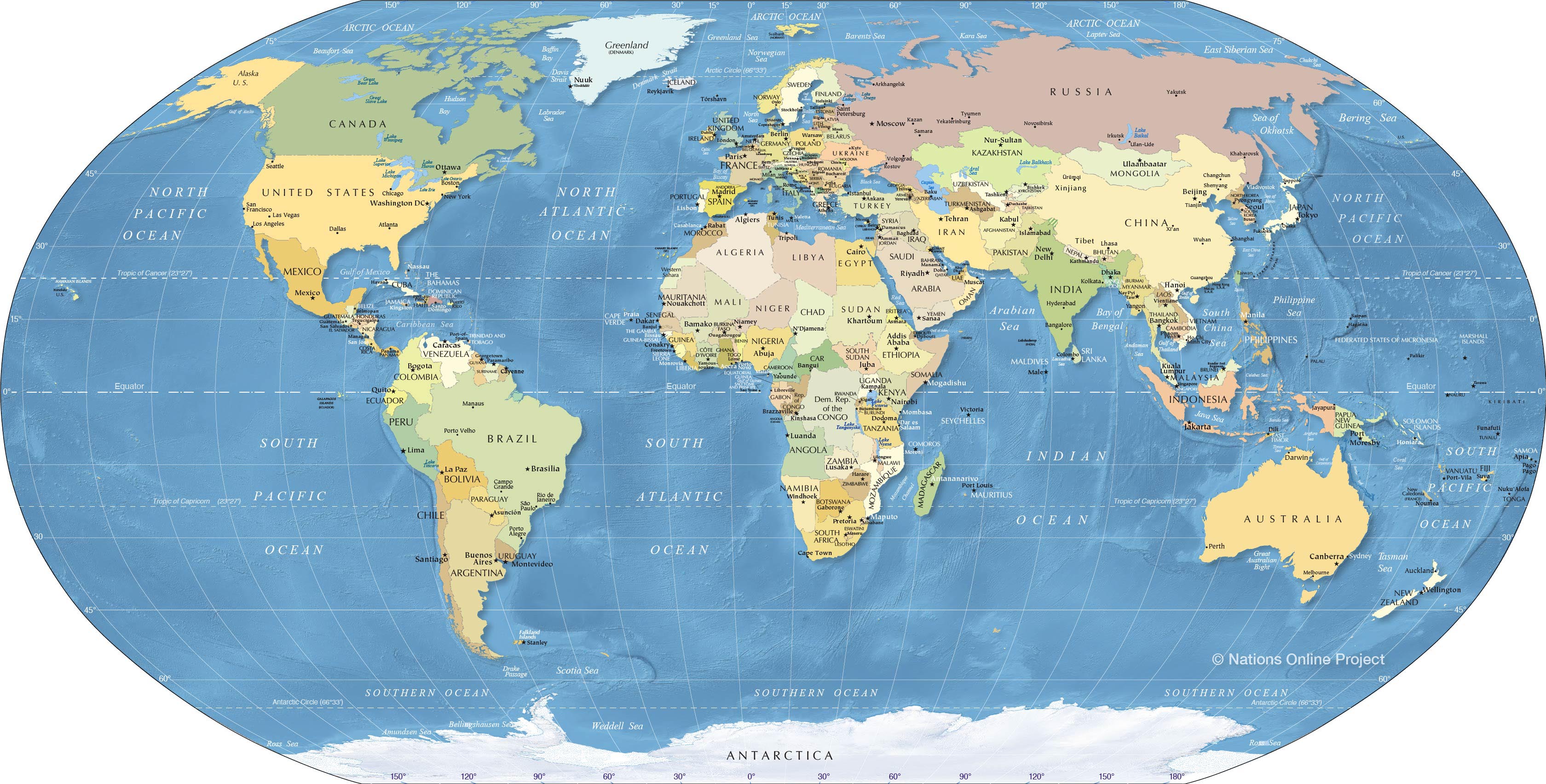
Also, using a (truncated) Mercator projection for a GDP per capita map (or any political map that isn't about land mass) is not a bad idea as its most notorious flaw becomes an advantage because coincidently, it tends to enlarge small countries and shrink large countries, which makes for a more readable map.
It enlarges the two biggest countries in the World (Russian and Canada) while shrinking central American and central African countries that aren't particularly big to say the least…
Not true. They're honestly discussed all the time to the point of becoming tiresome.
For others who haven't, here it is: https://youtu.be/vVX-PrBRtTY
Although the projection it proclaims as superior, Gall-Peters, has grievous flaws of its own.
https://en.wikipedia.org/wiki/Gall%E2%80%93Peters_projection
And I have no idea what "The West Wing" is. And I doubt I am rare here at all also.
https://news.ycombinator.com/item?id=32532282
https://news.ycombinator.com/item?id=25104787
And it was something we covered in school on the 80s.
It’s an interesting post but not really revelatory.
For example, I'd never noticed until today that so much of Scotland is actually west of England because Great Britain doesn't actually go straight-up north to south but is rather "tilted".
I also didn't know that Papua was so big, before today I wondered how could there be so much linguistic diversity in what I though was a medium sized island.
So I don't mind the geography trivia from time to time.
Even as a Brit this sometimes catches me out. I live near Bournemouth which is approx in the middle of the south coast of England. If I draw a straight line due North, it's only just inside Scotland. ALL of Scotland is west of London.
Unrelatedly, the other amusing fact is that when the ISS goes overhead (256 miles high at perigee), it is much closer to me than Glasgow (450 miles away).
The point of any article isn't just its factual content; it's the hidden message from the way it's said. I don't know if you intended to say it the way you did when you started off with the comment about poverty in the first two sentences, but by doing so, you set the tone for the rest of your article. (You also didn't expand on that tidbit so it kind of leaves your audience wondering why you mentioned it.)
I like the rest of the article though.
The comment about poverty was compatible with believing it was deliberate and evil, careless, or excusable but unfortunate.
Why do you presuppose that others infer & arrive at the same interpretations you do? Isn't your own form of generalization from the subjective inferences made from your own individual mind, to the thoughts of others, presumptuous?
I'm getting tired of the progressive tendency to read offence, bigotry, racism, sexism, transphobia, etc. into every little word & minutiae of nuance uttered by others. It's on the verge of induced pareidolia for outrage & victimhood.
Do you reside or hail from one of the aforementioned countries, or are you merely "signal boosting" and getting outraged on their behalf?
No, you're just being stupid.
This isn't a new issue. There's an episode of The West Wing about the evils of the Mercator projection. It aired 22 years ago.
When you write an essay doing nothing more than repeating a several-decades-old cliche, people are going to assume you don't have anything to say other than the content of the cliche they heard decades ago. And they will be right.
However it contributes to a misunderstanding that may in some way favor richer countries, and that could be a reason why nobody's trying very hard to focus kids' exposure on more accurate maps.
The mechanism I'm alluding to is a sense that "this place is very big, and so it's reasonable that it controls more than other places." It's not a highly-developed intellectual analysis, but more of a gut-level conception that informs casual interpretation of news and events.
It was called out multiple times in my geography glasses in the 80s that the flat contiguous map was wrong and we spent lots of time looking at globes and North or South Pole centered maps.
Nobody is being oppressed or underrepresented by this projection. This isn’t an episode of the west wing.
And?
The trade-offs between longpolling and websockets are rarely discussed outside of very small cohorts. The tradeoff wankel-engines and piston-based motors are rarely discussed. The tradeoffs between oak and pearwood are rarely discussed.
That's why our society has division of labor and people becoming experts in their topics.
And I am pretty sure experts on cartography have discussed the different merits and tradeoffs and converged on Mercator for a reason. I don't know what that reason is, and I don't care. It works, I can use it, and as long as no one can point out a tangible problem with it, I see no reason to worry about it. Same as the cartographer doesn't need to know or care why I decided that the chatapp he installed uses longpolling to communicate with the backend instead of a websocket. Same as I don't need to know or care why the carpenter who made my desk used oak instead of pear or rosewood.
And seeing countries as smaller or bigger than they are isn't a problem in my eyes. I can reasonably expect an educated person to know that maps are 3D->2D projections and are thus distorted. If I want to know the exact size, I can always look it up. I don't have a more or less favourable view of a country or its people based on the countries apparent size on a map.
That’s a fun hypothesis, but is there actually data supporting (1) that “a vast majority” of westerners misperceive country size in this way, and (2) that specifically such a perception causes them to consider foreigners to be unimportant?
Although implicit bias exists, studies show its impact on the real world is much smaller than commonly believed.
And now I would like to see some data, peer reviewed study, or similarly supported source for this statement.
Because I don't see many people claiming that greenland or antarctica are super important powerhouses in the world.
I'm not sure there could even exist a particularly satisfying source for this. One of the issues with "soft" sciences is that it can be quite tricky to measure any effects, much less design a viable study that demonstrates causation.
I suppose a social scientist (i.e., not me) could support this claim using ideas from psychology or finding related studies. But I doubt anything will ever be particularly convincing unless we lived in a universe where people told the objective truth and a mandatory survey was asked with the explicit question, "Have the distortions induced by map projections influenced your beliefs regarding people in other countries?"
That's the point of the post. The trade-offs between different projections are rarely discussed, considered or even mentioned outside very small cohorts because there is a specific shape of the world map that most people who are not map-heads or spherical projection experts take for guaranteed. Get a non-Mercator projection map and put it in your dinner room, and then see how many of your guests will comment about "so.. why is this map weird? It doesn't look right?" then tell them "every flat map projection distorts [...]"
> Mercator is and remains popular because it preserves local angles and shapes, which makes it simple use this projection to navigate by rhumb lines (compass headings). Because most maps people are exposed to are designed for navigation, it is the most commonly seen projection. And yes, it distorts size and is largely unusable past about ± 70º latitude. Every map is a compromise.
Out of the millions of decorative world maps on walls, kids with maps to learn the world, world maps on the news, maps used in data visualization charts etc., non of those are using the map for "navigation" yet they still use Mercator projection simply because "that's the right shape of the world" regardless of what "right" means. Not because they evaluated the compromises of the different projections and figures "oh maybe someone will be lost at sea and only have access to our GDP per capita world map visualization, better use Mercator projection to preserve local angles and line up with compass headings"