News for hackers. Stuff that matters.
Re:Server Mono: A Typeface Inspired by Typewriters, Apple's ... by worewood on Sunday August 11, 2024 @06:44PM (#41219815)
Number One, Pipe Character, lower case L, upper case I, zero and O, Parentheses and Brackets, are so common pain points on coding and terminal fonts. Those should be painfully distinct.
Re:Server Mono: A Typeface Inspired by Typewriters, Apple's ... by DidYaWipe on Sunday August 11, 2024 @07:04PM (#41219888)
The first thing I look at on ANY font is the capital "i." No crossbars? No dice.

This one has those and a distinguishable zero vs. O, so far so good.

Whoops; someone pointed out that 1 and l are indistinguishable. That's a major failing.

Re:Server Mono: A Typeface Inspired by Typewriters, Apple's ... by PontifexMinimus on Sunday August 11, 2024 @07:51PM (#41220083)
> Whoops; someone pointed out that 1 and l are indistinguishable. That's a major failing.

Agreed.

Re:Server Mono: A Typeface Inspired by Typewriters, Apple's ... by rob74 on Monday August 12, 2024 @02:36AM (#41221677)
Maybe that's what they meant by "inspired by typewriters" (on many typewriters there was no 1, you had to use lowercase L)? But I agree that this is not a "feature" you want to have in a font that you use in terminals and/or for programming.
Re:Server Mono: A Typeface Inspired by Typewriters, Apple's ... by rbanffy on Monday August 12, 2024 @06:50AM (#41223075)
Re:Server Mono: A Typeface Inspired by Typewriters, Apple's ... by teddyh on Monday August 12, 2024 @11:17AM (#41225421)
Re:Server Mono: A Typeface Inspired by Typewriters, Apple's ... by rbanffy on Tuesday August 13, 2024 @06:18AM (#41234023)
I was looking for this one.
Re:Server Mono: A Typeface Inspired by Typewriters, Apple's ... by fouc on Monday August 12, 2024 @01:19PM (#41226941)
I kinda feel like the difference between the 1 and l is still reasonably obvious, the top serif is significantly different. But it could be improved by removing the bottom left serif from the l.
Re:Server Mono: A Typeface Inspired by Typewriters, Apple's ... by bobbylarrybobby on Sunday August 11, 2024 @10:50PM (#41220808)
I've never understood why the lowercase l and 1 so often look the same in monospace fonts. It's not like anyone actually writes an l like that — why not just a small bottom right hook? And maybe a top left hook as well? But a whole base is insanity.
Re:Server Mono: A Typeface Inspired by Typewriters, Apple's ... by geo255 on Sunday August 11, 2024 @11:29PM (#41220961)
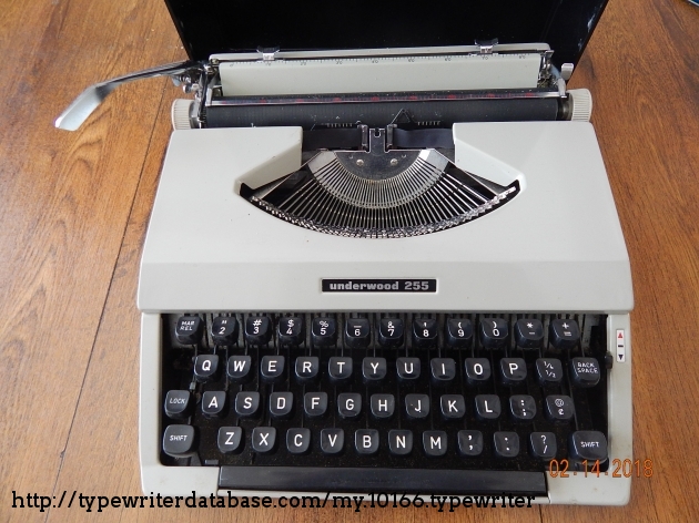
My first typewriter didn't have a "1" key. You were supposed to type lowercase L when you needed a "1".

Underwood 255: https://typewriterdatabase.com/img/gunderwood%20_10166_15186...
Re:Server Mono: A Typeface Inspired by Typewriters, Apple's ... by geocar on Monday August 12, 2024 @02:31AM (#41221644)
Because of the positioning you can press "l" then backspace then "." and get a serif on the bottom which makes it look a little-more one-like.

Similarly you get a "!" by doing "'" backspace "."

Re:Server Mono: A Typeface Inspired by Typewriters, Apple's ... by 7bit on Monday August 12, 2024 @02:12AM (#41221532)
> It's not like anyone actually writes an l like that

Excuse me?!

Re:Server Mono: A Typeface Inspired by Typewriters, Apple's ... by InsideOutSanta on Monday August 12, 2024 @05:50AM (#41222790)
I agree that this is a bad decision for programming, but the reason most fixed-width fonts do that is that they can look visually uneven if they don't use exaggerated serifs on narrow characters. It can even get to the point where words look like they have spaces in them if the wrong characters are next to each other.

Monospace (https://monaspace.githubnext.com/) has a feature that dynamically changes between different versions of characters and moves them inside their space in the font grid to make up for that. But even so, its bottom serifs on 1, I, and l extend to both sides.

Cascadia Code (https://github.com/microsoft/cascadia-code) has a lower-case L whose bottom serif only extends to the right. It's the typeface I use for writing code, and IMO, it's currently the best option available.

Re:Server Mono: A Typeface Inspired by Typewriters, Apple's ... by Someone on Monday August 12, 2024 @07:19AM (#41223240)
> It's not like anyone actually writes an l like that

Counterexample: looking at https://www.nist.gov/srd/nist-special-database-19, the example in the manual has a lowercase L that’s just a vertical line.

Re:Server Mono: A Typeface Inspired by Typewriters, Apple's ... by criddell on Monday August 12, 2024 @07:43AM (#41223376)
Is that page showing the complete set of glyphs? I assumed it was a subset because I didn't see the degrees symbol ° and surely they have that.