This one has those and a distinguishable zero vs. O, so far so good.
Whoops; someone pointed out that 1 and l are indistinguishable. That's a major failing.
Agreed.
https://www.omnimaga.org/humor-and-jokes/dilbert-'we-could-o...
Underwood 255: https://typewriterdatabase.com/img/gunderwood%20_10166_15186...
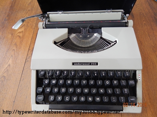
Similarly you get a "!" by doing "'" backspace "."
Excuse me?!
Monospace (https://monaspace.githubnext.com/) has a feature that dynamically changes between different versions of characters and moves them inside their space in the font grid to make up for that. But even so, its bottom serifs on 1, I, and l extend to both sides.
Cascadia Code (https://github.com/microsoft/cascadia-code) has a lower-case L whose bottom serif only extends to the right. It's the typeface I use for writing code, and IMO, it's currently the best option available.
Counterexample: looking at https://www.nist.gov/srd/nist-special-database-19, the example in the manual has a lowercase L that’s just a vertical line.
although some characters still seem to be missing, most of them work as intended.
edit: nevermind, looks like it was using Lucida Sans instead! what is going on? does the OTF only include ASCII or something?
FWIW everyone's complaining about this so I'll throw in the recent monospace release that absolutely blew me away: https://monaspace.githubnext.com/ Who needs hackers when you have Microsoft the evil tech conglomerate pumping out fonts, anyway?
Because of variations on how software terminals and GUIs render fonts, this is very tricky. That’s why so many terminal programs take over box-drawing characters and implement the glyphs themselves. This way the glyphs defined by the font are a rendering failsafe and it’s sometimes better to not even implement them and leave it to the systems font substitution mechanisms.
Hardware terminals had fixed vertical spacing, which made alignment much easier.
E.g., under "lines", the rows are overlapping; https://i.imgur.com/KnOP2Wu.png ; I would think they're only supposed to just touch, with no gap, no overlap.
The boxes, similarly, don't quite line up right. https://i.imgur.com/6pVYh9a.png (Even the 100% box isn't lining up right, although somehow what FF screenshotted != what it rendered. sigh.) The point being, you want these to tile seamlessly. Oddly, they tile differently in the pictures-of-font that break up the page. (Which I'm not sure what they're supposed to be? One is called "5af1d7a5-fa60-4827-9b4f-808cdb635d59" and has no alt text. They remind me of Dwarf Fortress though.)
As other people hint, this seems like the line height is cramped. I/l/1 ambiguities is a deal breaker for any terminal font, though.