This is why I disagree with the notion that style is only skin-deep. It's an integral part of UX, but only when considered within the framework of UX. The points value is now shaded in 3D: Why? The rank is now an orange circle: How does this help the user?
The best visual design is always based on UX. Do users consult the rank often? If not, the orange should be reserved for something else more demanding of the user's attention. Are the point totals interactive? If not, the 3D shading should be saved for use as an affordance somewhere where there is interaction. It's questions like these that turn a pretty visual design into something that not only looks but works great.
Semantics, but I think you are agreeing with your parent that there should be something deeper than the gloss applied in this redesign. That design must go more than skin-deep. Arguably the word “style” could refer to paint jobs, so your statement was fairly confusing.
I fully agree with your comments regarding the bizarre amount of visual attention demanded by the rank numbers here and the points’ affordance of clickability (and said as much on a comment there).
http://30.media.tumblr.com/tumblr_m2tjm5GuRF1rtfgd6o1_1280.j...
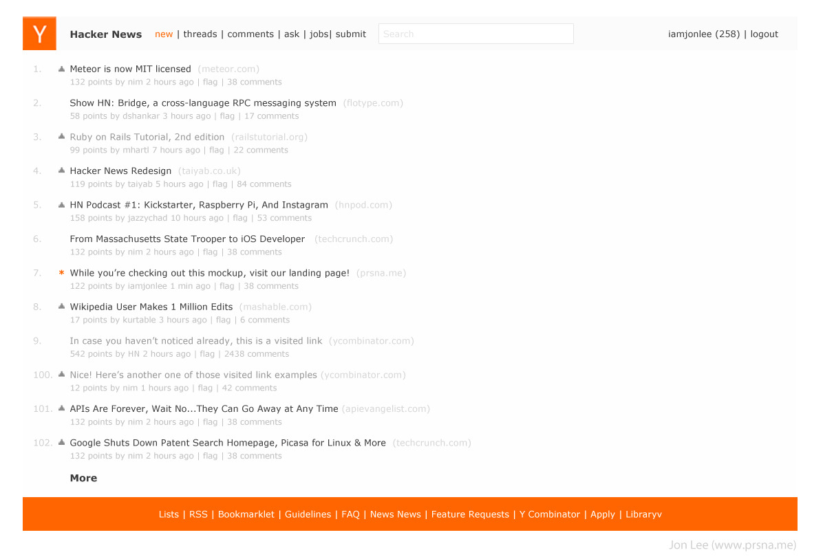

Here are some thoughts on why I made mine this way:
1) Hacker news is read by hundred of thousands of people every month- to adapt to a completely new design would wreck the user experience the users have come to expect.
2) Your patterns and icons, while I appreciate the gesture takes focus away from the headlines. The most important thing should be the headlines on hacker news. That's how it was designed to be. Everything else should pale in color compared to it.
3) As SeoxyS mentioned, I designed mine as to not disrupt the functionality that everyone's used to. What I did was "design" the page to improve readability. I made the background color behind the text a light grey so it's not as gloomy as the current site and used a dark grey font rather than the black on current site to improve faster reading. Black on white is always tiring on the eyes, which is why I tried to adapt different shades of grey.
4) I don't like HN's top nav bar right now because it takes focus away from the logo. The logo should be consistent with the one found and recognized on YC's main site. A logo on the site should be loud and clear. I made the top nav bar a darker grey so that it would give focus back to the logo. 5) The selected links are now orange instead of white. By having tiny accents of color, it adds the kind of eye candy that you want but nonetheless tied in with functionality. UX comes first, then UI. You can make something pretty after think about how you'll first make it user-friendly.
6) To improve eye candy, I gave the bottom nav the bright color of HN to really lighten up the page. I felt that otherwise there would be too many grey areas.
7) I moved the search to the top and yes, this does change what the users are used to, but in my opinion a good change. I've read many posts where people (including myself) have had a hard time finding the search button. To move it to the top nav will adapt to web standards.
Normally, I'd make the search larger and start right aligned at the end of the top nav bar and instead move the username + logout link above it, but I felt that it might be too disruptive, so I sacrificed what looks the best for a better experience (this is important).
The main text is too light and low-contrast: it looks like it is frightened of being there and trying to run away and hide! (and so the most big and powerful thing on the page is the footer, which does not seem the right priority...)
The HN audience tends to want high-information-density, not necessarily visual joy (or for that matter extra sugar for clarity of new users). Its a very different thing to design than a website-shopfront. Generally I think it works very well as is....
Nitpick: Observing exponential growth doesn't depend on the time span.
Am I missing something? I don't see any noticeable difference between this and the current design.
It's now harder to read
I find it immensely more readable than the current design, which to me is a left-justified wall of dense, unnavigable text. The low-contrast colors of the secondary information make it hard to pick out information quickly and increase eye strain.
The changes are subtle, but they are noticeable. Enough to be visually appealing, yet keep the practical design.
I find it ironic that this submission is near the top of the front page at the same time as this (excellent) essay about startup culture (among other things) is also on the front page:
http://blakemasters.tumblr.com/post/21437840885/peter-thiels...
The design of any website is supposed to be a reflection of your company culture. It needs to make the people you're trying to attract feel comfortable and at home. Sorry to be blunt, but this redesign does the exact opposite of that, for me at least.
Please don't take offense at this because it isn't meant toward you as a person; I fully support people doing redesigns of sites and posting them, but in this case I can't help but feeling like "dear god no." If you watch Rocky IV, the reason it's so easy to root for Rocky is that he's a product of his community, whereas the other guy is a product of some cold and unfeeling scientific process. Hacker News is a community, so you want a website that feels like something that a community would make. This redesign just doesn't do that.
And what's the point of the huge margins on the one you linked to? Can't we make better use of the space somehow?
I think the OP has a helluva nice looking start to a website redesign, and I hope he doesn't get discouraged from the hivemind criticism I'm seeing on this page.
Another thing I think the current HN design does well is act as a filter or repellent. Hackers can typically deal with an unattractive interface, whilst the average person would be turned off and leave the site. Those who stay on the site do so for its content, they don't need any extra convincing to stay.
Having said that, I haven't found a mockup I prefer over plain HN either. It's about the content. Design largely stays out of the way.
Your eye might need to jump around more because you're not used to the new design yet. Sometimes an article might say "discuss" which just means 0 comments. This would make that much clearer.
You might say you shouldn't have to "get used to" a good redesign, but after using a website for years, almost everyone would need to overcome old habits.
HN might be designed to compact a large amount of data in a small area, but reading tiny letters isn't exactly good UX.
I appreciate the feedback, and will definitely take it into consideration.
Both engineering and design are instances of the same type of problem solving process. But because design is focused more on qualitative and subjective elements, its state space is much larger and, I believe, its design solutions (or attractors) more fuzzy. Because of this, design and engineering actualize themselves quite differently in real life, often requiring different skill-sets.
And I think that because the web and application design disciplines require more engineering-thinking -- architecture, for example, must also consider spatio-temporal qualities -- most design-thinking is delegated only to the most superficial facets of the process. What would really help understanding is for more designers to push into the engineering side of things, and more engineers into the design side of things.
You are absolutely right. Eye candy can quickly become eye straining.
Hacker News is successfull not only because of its content but also because of its design. It's simple and pragmatic, as it should be. I always need only seconds to read the headlines of the whole page.
Hacker News, please don't change anything!
Eye candy doesn't help the user with navigation or add functionality but it can make a website look more professional and in-turn more trustworthy.
For e commerce websites getting the users trust is an important consideration and I'd argue eye candy is maybe just as important as the design.
Of course in the case of Hacker News I wouldn't like to see this kind of redesign implemented and would prefer the focus of the site's design to be solely on improving it's functionality and usability.
http://textbookcentral.com.au/33/university-of-sydney/list/
(Admittedly the page numbers on the bottom are more for search engine crawlers than people)

That's really nice. It's not clear where the stylesheet is though. I'd love to use it, where might it be?
edit: waxjar already posted it further below.

My longer reply got lost somewhere.
I think of a "story" as a narrative: a sequence of events involving characters. In an epic story, there's a hero, a quest, thresholds, guardians, a special world, obstacles, tests, allies, a shadow, a return etc. Could you elaborate on what "story" means in terms of design?
It works, but seems to subtract more than it adds. It looks a little less like itself, and a little more like every other site.
Its simple and to the point.
And yeah, insane spacing between the lines makes absolutely no sense.
The striped header is not more visually appealing than the current plain one.
The difference is that style is only skin-deep. It's superficial. It's an added bonus on top of design. Design, on the other hand, is the core of the product: how it functions. It's the soul: what story it tells.
Your redesign, while prettier, does nothing to improve the user experience, or to tell a story. Sure, it's easier on the eyes, but it's a much worse design, in that it makes the user experience worse. It's now harder to read: less information is on the screen. (11 story as opposed to 25, on my screen.) The information hierarchy within stories is less clear. The eye has to jump around more to get the secondary information (poster / point count / comment count / time posted). The flag functionality is simply gone…
You did a good job making it look better, and should be commended for that. But as for the design, try again.
PS: Take this as friendly critique. Take it in, learn what you can, try again. Rise, repeat. Don't be discouraged, but realize you have a long way to go. You'll get there!
--
Note: Check out this redesign, which I think is quite effective, and is installable as a extra stylesheet on the current HN code: http://akhun.com/seo/skitch/Hacker_News-20120420-180413.png