Tried out a more semantic redesign inspired by original submission, OP comment, and the attached screen:
I've tried one too that I think should really be how HN redesign should look like.
http://30.media.tumblr.com/tumblr_m2tjm5GuRF1rtfgd6o1_1280.j...
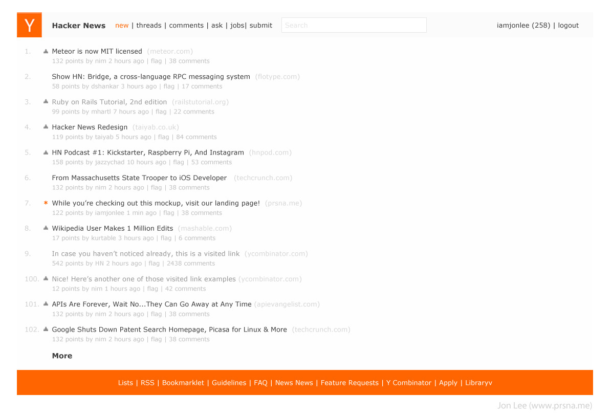
I agree, this one is less deviated from the original - it's nice but still 'feels' HN
Woah, now that is minimal, I kinda like that.
Semantics, but I think you are agreeing with your parent that there should be something deeper than the gloss applied in this redesign. That design must go more than skin-deep. Arguably the word “style” could refer to paint jobs, so your statement was fairly confusing.
I fully agree with your comments regarding the bizarre amount of visual attention demanded by the rank numbers here and the points’ affordance of clickability (and said as much on a comment there).