Which red? There isn't a single, true "red". And different materials produce different reds (my work's Sony BVM-X300's reddest red is going to look way different than your monitor's red). Not all displays use only RGB color primaries, too. For example, at Dolby's office in San Francisco they have a projector in their theater that uses 5 (IIRC) color primaries, not 3. 6-primary projectors exist. And other non-RGB displays.
> When I say (255, 255, 255), I expect the display to show me something as close to white as possible
Which white? D50? D55? D60? D65? D67? Something else? And yes, these different white points (and many others) are actually used in practice.
> (and at the brightest possible setting).
100 nits looks way, way different than 4,000 nits. Some monitors can do 10,000 nits.
> When I say (0, 0, 0), I expect the display to show me something that looks as close to black as possible. It's up to the display technology to decide whether this means just turn off that pixel on the screen or disengage the backlight or do whatever, but at the end of the day it's just trying to approximate black.
Which black? This might sound dumb, because we can agree that there is an objective "absolute black" (i.e. zero photons). But when an artist creates an image, the monitor they use has some version of black. If you don't account for that, the image may be distorted. Blacks can be crushed, for example.
An absolute color space exists. It's called XYZ. We could use it. Some image formats support it.
[1] I think from a stupid thing I did as a kid.
XYZ is really annoying to work in though. ACES is a pragmatic solution here, quite literally: https://blog.frame.io/wp-content/uploads/2019/09/ACES-APO.jp...
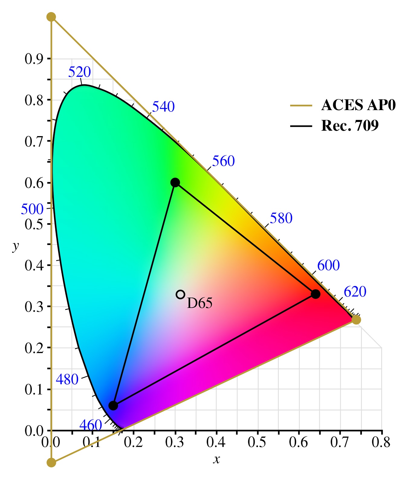
Okay, fair enough two out of three primaries are imaginary colors, but nobody said you have to use the whole color space when your processing pipeline is meant to be using 32 bit floats. Delivery formats might want to be using a more real color space.
By working space I mean a space in which a user manipulates the data in some way, e.g. image editing, grading, compositing or rendering.
What "red" and "green" are has changed quite dramatically with different display technologies. A display designed to meet Rec.2020 can show colors that other displays literally cannot produce and the deviation between the primaries is so big that everything looks like garbage if you don't do a color space conversion. Take some sRGB content and display it on a DCI P3 display. Looks like shit. Humans look like crabs.
> On monitors and displays, sure, those vary, but why allow people to specify a color profile on an image
The sole reason why we have device profiles defining device color spaces is so that we can convert from the image's color space to the device's color space. If images don't have a profile assigned to them, you don't need a device profile.
So you either have both image and device profile, or neither. Just one doesn't make sense.
If your green is going pink, then either your profiles are wrong, or your software is broken. Maybe it really is pink, and it just looks green for you, because you're ignoring color profiles.
But the fact is, most software is broken, and you should store images with the sRGB profile.
And also, you can actually calibrate consumer hardware, so that you can scan a photo, and reprint it. And the scan, display, and print will look exactly the same. (It's not the case by default, because consumer printers do what you do, stretch or fit the color space to the printer's. The Vivid and Natural profiles in the driver, respectively. This is a good default for documents, not for professional photography.)
We can continue believing that Santa exists, or we can accept that effectively nobody has correct color profiles, and doesn't care either.
It's nice metadata you have there, would be a shame if I applied night mode to it at 6PM.
> also, you can actually calibrate consumer hardware
...with professional hardware that costs more than the one you have at hand.
Again, pretty much everyone will just tweak their monitor/printer settings until they get results that look OK.
>display and print will look exactly the same
Until you turn off the lights. Or until you turn on the lights (what color temperature is you light?). Or until the wind blows, moving that cloud over the sun, changing light temperature.
Or — wait for it — actually, that's all, while you've been waiting the sun has set.
The point being, all we can shoot for is FF0000 being what would be "red" for most, 00FF00 being "green", and 0000FF being "blue" — and then accept the "fade" of the digital image from one screen to another as a fact of life.
So, learn how to stop worrying and love unspecified RGB colorpsaces. Magenta only exists in your brain anyway [1]
Side note: did you ever think about how your recorded music isn't adjusted for the frequency response of the loudspeakers, and half the people will listen to it with the "BASS MEGABOOST" feature on anyway?
That's why the art of mastering exists. It's accepting the reality, and putting work into making it work with uncalibrated, crappy hardware — as well as hi-fi gear.
PS: have fun calibrating your vision to make sure that you don't see green where I see red
[1]https://medium.com/swlh/magenta-the-color-that-doesnt-exist-...
[1]: even though for some reason I don't know, it works much less well: if you try and take pictures with the wrong white balance setting, the picture will look like shit no matter how long you look at it.
As a side note,
> [1]https://medium.com/swlh/magenta-the-color-that-doesnt-exist-...
This article is pretty terrible, as her author mixes everything up.
https://blog.kaetemi.be/2021/02/01/calibrating-an-inkjet-pri...
Just imagine you're using an HDR display, where the brightest white is as bright as the sun.
That is precisely what attaching a profile to the image is supposed to avoid. It indicates what (255, 0, 0) in that image actually means. Then you convert that to the display profile to get the triplet that you must send to the display to actually get something that looks like it.
> Isn't having a color profile for the display enough?
What would you do with just one profile?
Because with digital data we can do better?
The analogue in photography is photographs lose color clarity and fade as they age. Why should I care if this is the case in images as display technology evolves when this is already a problem with every physical medium?
> For correct editing operations, and correct display. Sadly, it's not pedantry, it's reality.
I've been designing images and graphics for the web and sometimes for print off and on as a regular part of my various job functions since ~2009 and I have yet to see a situation where a color profile on an image isn't a huge pain and something that needs to be stripped away to get seemingly correct results.
Back to my point, I still don't see the value of having a color profile applied to an image. Images exist in the ether as platonic ideals, and we try to approximate them with our various display technologies. Why complicate the matter by also having multiple "flavors" of the platonic ideal itself? When I say (255, 0, 0), I expect the display to show me its best approximation of red. When I say (255, 255, 255), I expect the display to show me something as close to white as possible (and at the brightest possible setting). When I say (0, 0, 0), I expect the display to show me something that looks as close to black as possible. It's up to the display technology to decide whether this means just turn off that pixel on the screen or disengage the backlight or do whatever, but at the end of the day it's just trying to approximate black.
This is complicated enough, why do I need an image that will look good on only one kind of display and will have it's greens look pink on other displays. Isn't having a color profile for the display enough?