Designers, people who make their living giving life to a "look" or a "user experience" feel pretty strongly about their work (this is typical of many artists, programmers, architects, musicians, Etc.) In part because they often see their own work as a reflection of them, and in part, and I speculate here, because the creative process is mysterious and it is easy to feel like a fraud when you don't really know how you come up with something, you just do.
So designers look at Elementary OS and they evaluate its look, its theme, its "presence." And what they see seems to remind them strongly of Apple's OS. I completely understand that because that was my first thought as well and I'm not a designer, I thought "Oh, this looks like they put an OS X shell on top of Linux."
I happen to think the other stuff you did, the performance tuning, the application integration, the "fit and finish" if you will is very impressive and it reminds me of how Ubuntu took something mashed up and made it more cohesive.
How ever the design elements always dominate product discussions, even if they shouldn't. Look at the discussion around the Honda Element (car) are they about its innovations in how it converts its internal spaces? Its motor design? No, people talk about how stupid it looks to them (which completely misses the point of the car).
What I'm saying is the Elementary team is going to get razzed a lot about the design elements. Try not to take it personally. The correct response is the one you've latched on to, "We built an OS we wanted to use based on technology we wanted to use, we built it this way." Own the vision.
[1] "rip off" sounds bad "homage" sounds good, both mean "it looks like."
I think you're spot on, particularly about [1]. A lot of the flak we get seems to stem from the fact that we're very very much a design-oriented (as in, design at the top) community. We don't have business people saying "But people will think this looks like XYZ and that's bad for our bottom line".
I personally think there must be a happy median between the "design purist" approach we currently lean towards and the "market differentiator" style. We haven't quite hit on it, as some the feedback we've received today suggests, but with thoughtful insight from people like you, and lots of internal discussions, I think we'll get there :)
ElementaryOS settings screenshot: http://i.imgur.com/vnjmHrQ.png

It's got the same left-aligned, bolded categories, in the same order, with almost identical text. It even senselessly copied the choice of the Apple Magic Mouse as the mouse icon. That tiny smudge at the bottom represents the Apple logo!
I don't mean to suggest that an ElementaryOS designer is responsible for this instance. A similar layout and icon is used in Xubuntu. But Linux is clearly doing more than "building on ideas" in its relation to OS X.

It's getting late and I don't want to write a whole book about it's design (though I could), but basically here's the story:
I saw some mockups Daniel Fore (the project's founder and lead designer) created for a hypothetical system settings app. Here's an example: http://danrabbit.deviantart.com/art/User-Accounts-Plug-19860...
I set about coding the app. I was painfully aware of the visual similarities between OS X and Switchboard. I spent literally MONTHS wracking my brain trying to find a better design which was as elegant and efficient. I argued with Dan (who had created a mockup which would become the main interface for switchboard, which you linked), I talked to other designers, I mocked things up by hand. And I/we came up with some really creative alternatives which looked very little like System Preferences in OS X.
In the end however, I was faced with an ultimatum. Do I change the settings app JUST to look different than OS X, and lose out on the well-established excellence of Apple's design?
I truly felt awful about having to face that question. Frankly, it made me upset and depressed for quite a bit. Ultimately however, I was convinced and just said "screw it".
You're absolutely right that I'm not the first one to "copy" Apple's settings program. Here's Ubuntu's. It's extremely similar to the two ones you linked: http://zeth.net/archive/wp-content/uploads/2011/11/ubuntu111...

You could say that I failed. You could say I failed to come up with a better interface. And in that sense, I did. But I get extremely frustrated when people dismiss the product of my careful investigation and thought into this matter as "oh, he just wholesale copied OS X". Because it ignores the fact that I really tried to come up with a better solution.
In the end I couldn't, and it seems nobody else has either.
I will say though, I did really try to innovate on the technical side. And in that sense, I think I succeeded. You can see that in some of Switchboard's finer points, such as exposing APIs to the settings panes (which are called Switchboard "plugs") which allow them to actually interact with Switchboard's internal UI, providing, among other things, progress bar support in the title bar.
I wrote an article for the elementary Journal announcing Switchboard here: http://elementaryos.org/journal/attack-settings
And I put together a quick presentation highlighting Switchboard's vision and architecture here: http://www.youtube.com/watch?v=JF37THZoNsA | https://docs.google.com/present/edit?id=0Aah2wnTpXrZAZGRuaDI...
Hopefully, you can see that we did not just "senselessly copy" anything.
It's better to either do an exact copy or to be different enough that you don't invite comparison, otherwise what you've come up with will always look like an inferior copy of the original. At least until the user has spent enough time with it that it becomes the new default. But don't forget that user acquisition is just as important as long-term usability.
So "user acquisition" isn't really a concern for us, though frankly, I believe it should be. And until it is, I guess we really can't complain about the flak we get for being "copycats".
And for what it's worth, I am an active user of both OS X and elementary OS and Switchboard feels 105% native on elementary OS. They each feel right in their native environment. Then again, I'm about as biased as possible (though I'd like to imagine my views are somewhat normative ;)).
I think the benefits far outweigh any drawbacks (I can't really see any), so you'd probably do well to ignore the negative feedback and keep doing what you're doing.
That's us, thank you.
In other words, this is constructive criticism. Don't ignore it because it's "negative" and you're doing something "positive". All progressive positive things are born out of a criticism of the existing state of affairs. Any effort can be improved. If you ignore criticism – not just mine – you are doomed to stagnation!
Than why have you released the project to the public, made a nice website for it, made documentation, etc? Why do something good in the world if you don't care if it benefits people? Rather, if you've done something that you hope will benefit people in the world, don't you think you should try to benefit as many people as possible? The design choices you've made encode that goal, wittingly or unwittingly.
Indeed you are as biased as possible, which is why you have to listen to others if you hope to have any true understanding of your situation. Take what I said into consideration – it effects the spread and usefulness of your efforts whether you care or not.
We care about spreading our efforts. We care about having a nice public face and benefiting as many people as possible.
I was reacting to the more crude notion of "user acquisition". That is absolutely NOT our goal; our goal is to build something great. I was viewing the term "user acquisition" as "focus on getting as many people to use our product as possible".
I think you mistook what I intended to say, and if I was not clear, I apologize. But please don't think that I'm saying we couldn't care less about spreading what we've created and making it beneficial to as many people as possible. I'm saying that we care deeply about building something great, and that is our primary focus, not convincing people to use it.
Incidentally, I did notice the nice little "importing wallpapers" progress bar after clicking on the Desktop icon. Kudos for that.
(And while I have your attention, I also noticed inconsistencies in 'and' vs '&', e.g. "Time & Date" vs "Mouse and Touchpad".)
I meant "senseless" to apply specifically to the choice of Magic Mouse as the icon. The Magic Mouse is a good icon for OS X, because it looks like the mouse that comes with a Mac. But most ElementaryOS users will use a mouse that looks very different, and may not even recognize that icon as a mouse (where's the buttons, the scroll wheel?) The Magic Mouse is indeed pretty, but its use as an icon only makes sense on Mac OSes, just like a rectangular game controller icon would only make sense on the Wii.
I agree with you about the mouse icon. The logo at the bottom is in fact a gear in the original svg, but I agree that is an example of something which would probably be better served by a different, less OS X ish icon. Speculating on Dan's behalf (he created that icon), I think he just liked the design of that sort of icon. Frankly, I think it should be changed to something more generic. I'll see about bugging him about it.
http://www.guidebookgallery.org/pics/gui/settings/menu/win31...
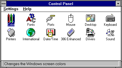
http://www.guidebookgallery.org/pics/gui/settings/menu/win95...

I think it's still a clean, elegant way to present OS settings on modern computers (large display, mouse input). The best way "discovered" to date. So if anyone is copying anyone, it's that people are copying the best known way to do it.
---------------------------
Side Rant: Microsoft started diverging away from the above with Windows XP (or was it Windows ME?) by buring things:
http://www.energystar.gov/ia/products/power_mgt/winXP_contro...

...and made it extremely difficult to navigate by Windows Vista/7/8 by sticking things inside sub-categories inside of sub-categories:
http://screenshots.modemhelp.net/screenshots/Windows_Vista/C...

It's a different, more complex way to do the same thing. Nobody is copying them though. ;)
God MS screwed 95 up so badly.
I want to single that statement out and go on from there. I'm a bit hesitant to write this comment because, well, I'm about to criticize you and Apple, and at least the latter tends to invite downvotes and a not so nice discussion. But I think it is important to try to get that message across.
When I see an OS X clone or designers trying to copy OS X, like Ubuntu did with Unity (placing the windows title buttons to the left just because, global menu and so on) I don't think it is bad because it is copying something. I feel when something like this happens like an opportunity is missed to do something better, and that someone must have made the decision who sees himself as designer and uses OS X and now copies OS X. Which is bad mainly because: The "well established excellence of Apple's design" is questionable. It is just not there, from my perspective.
Apple made good stuff. The iPhone was groundbreaking, like maybe other of their stuff before - I won't argue with that. But that doesn't mean all of it is great. And especially on the software side. When judging the software I tend to think that it is not always that great - one finds clear usability errors, weird graphical designs, whole concepts that only seem to work for people being strongly accustomed to them. To copy them blindly leads to disaster, not only when copying the errors Apple made, also when copying sound concepts.
Take the global menu Ubuntu copied. It sacrifices visibility and therefore discoverability of the menu items for visual appeal. And yes, that leads to issues - just yesterday I looked a guy over the shoulder on a crypto party who came from windows, had unity freshly installed and didn't find the option he should have because it simply wasn't visible. I had to show him that the item was hidden, that he had to hover the global menu bar. Clearly, from an usability perspective, Unity became worse because it tried to copy OS X (guess which system its designer at the time was using. You won't need three tries.).
What I'm trying to say is: You say you tried to come up with your own design. I applaud that. And now you copied something which was there, which is alright (though to copy the Mac OS Icons is a ripoff in bad style, completely unnecessary, even if that wasn't you fault). But I want to invite you to free yourself from the thinking that a design is excellent because it is made by Apple. Don't fall into this trap. Don't regard good design as process which is a restyling of old Linux programs with their own design history or windows influenced stuff to stuff that looks and feel like OS X and therefore is good. Stuff is good because it works and is beautiful or whatever you want to achieve, and it is not necessary to copy Apple when trying to build something useable and beautiful. And it is especially not necessary that when already copying Apple, then even to copy the visual characteristics like the icons or the colours or the font. Elementary is a name in some circles by now already - please use that to try to find your own style (Linux would profit!).
Maybe you personally don't even do this. Maybe you are not a designer who uses OS X and defines himself by that and therefore only copies OS X. But the presentation of the elementary OS sure gives the feeling that this is exactly what happened - OS X guys building what they already have, just in "free", just running under Linux. That would be a pity, because the Linux desktop can use people trying to design it into a better form - what it doesn't need is to become OS X.
PS: It would've been really easy to find better categories. That the whole thing is just x sections with one or more rows of Icons in it, that is alright - one could easily come up with that solution when designing it from scratch, it is sound. But why the section names? Just by glancing on it one has to realize there are other possible and sound options.
If you're criticizing us for not being perfect and not innovating enough, I can't argue. But don't assume (I am explicitly rejecting the claim) that we simply love OS X and want to make our own free version of it, or that we treat Apple as some sort of standard of "proper design". All I can do is invite you to come down to the trenches with us and see what it's all about. I think you'll find it's harder than you might imagine.
P.S It absolutely would not have been easier to find better categories. Those categories are the result of the manual naming tens of thousands of Debian packages going back a decade or more. We give users the option of browsing (as has been the tradition on the Linux desktop for the last 7+ years) by the traditional categories, or by using a free-form fluid list.
P.P.S Frankly, I find your dismissal of our design efforts mildly insulting, though I know you only meant to provide constructive and thoughtful criticism (which I appreciate, at any rate). A bit of constructive criticism for you would be to avoid assuming that because something seems like an obvious solution that it must have been the first or easiest solution. This can come across as arrogant and belittling, and has the tendency to undermine the constructivity of your feedback.
Trying to be constructive: You might want to try to use visual distinction to minimize the appearance of copying, especially if that wasn't what happened. Things like the font and the OSX-icon are unnecessary in every case.
Thanks for the invitation, if it's a serious one. I'm using my own ambiance-themed icewm-desktop with my own dock at the bottom, had a look at a lot of window managers, and HCI is what I do atm. If I someday want to work on a desktop for more user than myself I might even remember the offer and will count on a proper introduction^^
Part of my point was that it is harder than just to copy Apple. I'm happy to hear you say that.
In every case I give you the benefit of the doubt that it might behave so much in its own way that the resemblance would be insignificant when actually using it.
And have fun with your release - I bet it will be quite popular.
I might have older icons because I'm running Lion on this hard drive (I've got Mountain Lion on my other drive, I don't recall any icon differences) but their icons do not look the same as mine.
Your previous comment was a slew of accusations that they have copied OSX (with few examples of such copying), along with ranting about how unspectacular Apple is. They never stated there was no influence from OSX; it's obvious there is, and there is nothing wrong with that.
I don't like it when my comments are called rants when they aren't. I tried very carefully to walk the line here, especially I didn't want to (and didn't) bash Apple.
It's obvious that there is influence and I argued why that may be dangerous. Software design is in a special position, copying Apple can be a bad sign and so on... I won't repeat it.
[1] e.g http://elementaryos.org/journal/whats-still-window-controls
Which can be rephrased as: I'm a hack and could think of no original ideas of my own, so I opted to copy another OS verbatim.
Thankfully Apple doesn't think that way not even for their own design -- they improve (or at least attempt to) OS X's design with each release. And they have even more excuses than you to rest on their laurels (namely, that the laurers are theirs to begin with).
I think you are missing some context.
Early Apple experiments in GUI design initially used multiple menu bars anchored to the tops of windows, but this was quickly dropped in favor of the current arrangement,[1] as it proved slower to use (in accordance with Fitts's law). The idea of separate menus in each application was later implemented in Microsoft Windows and is the default representation in most Linux desktop environments. – http://en.wikipedia.org/wiki/Menu_bar
This was in 1983, when Tognazzini was working on the Lisa, inventing some of the UI concepts we still use and very carefully considering efficiency when choosing them. You may disagree with him—his stance that the mouse is faster than a command line shell is widely controversial—but visual appeal was not nearly his main concern.
PS: Hiding the items has nothing to do with Fitts Law, it even destroys its applicability...
However, you didn't comment on the mouse icon. Maybe the inspiration from OS X's in this particular (and very minor) case went overboard. I think that things like this give lots of ammunition to naysayers and people who are destructively critic in nature.
Maybe it would be a good idea to make sure there are no isolated UI elements (like icons) that draw a high amount of verbatim visual inspiration from Apple's. ;-)
Personally, I agree with you that the mouse icon (and I've stated this elsewhere) is needlessly similar to OS X's. Frankly, the designer likes Apple' design aesthetic and probably liked their icon, and tried to create his own take on it.
Which is fine, but yeah -- it probably shouldn't be something we ship with, given our long-standing history of perceived similarity to OS X.
* The designer did it, not me!
* I argued with him for months and ended up saying "ah, screw it".
* Ubuntu and Gnome do it too!
I don't see any of these as exculpatory. Not that what you've done is necessarily wrong per se, I'd just rather you come by it honestly. I don't think any of these designs (or for example some of the icons - or even the decision to group elements into these categories) are "inevitable".
What kind of "hacker" community does not allow room for the occasional independent thought expressed with a hint of abrasiveness? I welcome downvotes from passive aggressive screwballs on this site. They are a badge of honor.
> Did we actively intend for it to be reminiscent of OS X? Absolutely not
This statement is a total lie.
As others have pointed out, I never said that it isn't in fact reminiscent of OS X, or that we did not evaluate the design of OS X along with a handful of other platforms when we created our designs.
The argument here is about intent, not the result. And there's positively no way you can prove the former, as much as you might dislike the latter.
(I would be happy to describe in greater detail the design process if it might help convince you that we didn't set out with the intention of copying OS X.)

http://3.bp.blogspot.com/-Ygmw7HeOfYw/TwfS6NXj1RI/AAAAAAAAB5...

I hope this was a typo. But other than that you have a point.
Personally, if I wanted to make an OS look like MacOS, I'd advertise it as "We wanted MacOS on the PC, but Apple don't give it. So we made an OS based on Linux that follows the same attention to design."
Or better yet - change the look. I doubt that stylish grey is the only possible colour. I can see that it's not MacOS, but it feels dirty when it looks a lot like MacOS, down to using a Mac look-alike laptop in the ad, and you claim to have made something original.
It may be. But it doesn't feel like it.

Frankly, I expect we'll try to get that amended soon.
Our desktop interface and apps are actually quite different from Ubuntu, though we are an Ubuntu-based distribution.
To give some concrete examples:
- We use our own desktop environment and window manager, Pantheon and Gala, respectively.[1]
- We write many of our own apps in-house or work closely with the third-party apps we ship with. For example, our music player, settings application, and calendaring program (to name a few) are all written completely by us. Our mail program, web browser, and photo management app are developed by third-parties who we have strong developer and personal connections to.
- Similar to the above point, we have our own human interface guidelines[2]. You might find you like it more than Ubuntu's.
- elementary OS is extremely fast and lightweight. Our ISO is ~200 MB less than Ubuntu's, and our OS boots faster and is more responsive. A simple youtube or google search should back me up here.
I hope this was helpful to you and perhaps others. Again, we really appreciate your interest and curiosity. I'd definitely encourage you to give it a whirl once you've aced your exams :)
[1]: http://elementaryos.org/journal/meet-gala-window-manager [2]: http://elementaryos.org/docs/human-interface-guidelines
I dont mean it in a "resistance is futile" kind of way - but more in terms of not-immediately-needed kind of way. Especially the browser. Webmail suffices for now - I know people want a Sparrow-like mail app on the desktop, but there is so much more effort that can be put in on projects like color calibration, Redshift-like functionality [1], etc.
You are off to a decent start - I really, really hope that you guys dont start building Twitter apps. Instead you should expose API guidelines for things like Contractor (OSX Services?) and have something like extensions.gnome.org - but maybe in Vala for performance.
Just my $0.02.
I'm not sure what you meant about Contractor, because we definitely do have API guidelines for it.
Also, there is an excellent third-party Twitter app for elementary OS called Birdie: http://birdieapp.github.io/
I appreciate the input :)
Good job btw!
And like you say, a lot is simply good design. Apple didn't invent nearly as much as their marketing department (and legal) would have us believe.
Tangentially, I've fallen in love with tiling WMs, but they all seem mediocre at best. @aroman it'd be awesome if you guys made an alternative tiling WM that was as sleek as your windowing manager.
I still switch to Windows occasionally for gaming (although I try to limit my gaming habit). Another reason for using Windows for me would be screen capture software (Webcammax [best], Manycam, more...) which is completely absent from Linux (hint hint, elementary. I think this could be revolutionary).
I like:
1) tile movement is very dynamic; it's tree-based
2) supports transparent terminals; I like seeing my pretty wallpaper
3) mod key works well for switching desktops, and moving tiles between desktops
4) good multi-monitor support.
I don't like:
1) no dropdown application menu. dmenu is ok, but I need to find a good menu bar app.
2) You can mouse drag-resize, but not drag-reorder tiles. It's on their todo list.
Can we work on making optimized hardware in the same way Apple products are. Can we work on optimizing power consumption, apparent load time etc etc. I can't wait to give this OS a shot.
By the way, I'd definitely encourage you to get involved with elementary. New collaborators are always welcome, and it seems like you've got a lot of our same design principles in mind.
Have a look here: http://elementaryos.org/get-involved
Right now I have some experience in PCB design and I am just building my skills to design full blown ARM and i7 based laptops to cover both low/high end markets.
We'll see where things so. Good luck.
Really? Are those really worth complaining about? If anything, successful OSes (based on user base) have taught us that marketing should focus on user-centric features first, technical ones second.
It currently has package signing, right? What's the problem? I'm confused at how a historical problem that has been fixed even matters when discussing why or why not to use it. It's like saying you wouldn't use OS X because 10.1 didn't support Intel processors.
And this is HN, man. For the average poster here, "technical" features and "user-centric features" are one and the same.
What they don't realize is that there are a bunch of howtos out there around customizing Ubuntu to "look like OSX" and this looks like one more.
I wish this discussion could be around performance enhancements and innovations in usability, but I cannot get past the OSX clone-ness.
In an admittedly egoistic sense, I am a loner Latitude/Ubuntu user in a world of Air/OSX all around me. This is not something I will be able to explain off. And this is in India. I assume it will be much worse in the US.
It was created to be beautiful and usable, not as an OS X clone. I can assure you OS X was used (along with Windows, iOS, and Android) purely as inspiration -- not as a target or design guide. There are only so many neutral window control colors. We use silver and black (apps can request to use the dark variant), Windows uses transparency, Ubuntu uses a muddy brown, and OS X uses chrome.
If you really feel opposed, as you pointed out, there are dozens of excellent GTK+ themes. Some people have even written them specifically with elementary in mind[1]. Feel free to use them :)
[1] http://www.elementaryupdate.com/2013/07/5-new-awesome-elemen...
I don't think you will find many people able to believe that. I have no opinion formed on the OS, but claiming for the similarities to be "coincidence" is not going to fly.
If the you guys get into Apple's radar I think it's pretty safe to assume you will get sued. Which is why I understand this kind of public statement. Otherwise it wouldn't make any sense to me.
Anyway, regardless of superficial concerns it looks like you are doing a good job, according to some reviews I've read.
Taking steps to differentiate from OS X a bit more would (arguably, perhaps) be an improvement, albeit not a technical one.
I'm sure other people with rMBPs will be trying Luna in the coming days, so hopefully we can assess what the current state of affairs is and make any necessary changes.
Speaking on behalf of the whole elementary team, it would be greatly appreciated if you gave it a shot and reported your findings to us via Google+, Twitter, or via direct bug report here: https://bugs.launchpad.net/elementaryos
You can use this guide to prepare the USB drive with Luna: http://www.maketecheasier.com/install-dual-boot-ubuntu-in-ma... The relevant steps are the first few. Obviously replace the filename of the Ubuntu ISO with the Luna one :)
I personally used that guide this morning to create a bootable USB Luna liveCD with the final ISO to install it on my Macbook Air, so I can vouch for its credibility and compatibility.
Also, I'm no pro on this, I'm not even sure if retina is that high DPI feature they keep talking about. However, if it is, Luna+1 (code name for next version of elementary OS) will use GTK 3.10 (or a newer one) for sure.
If you're really interested in a completely customizable and hand-tailored OS, I'd honestly suggest you look into something like ArchLinux or Gentoo[2]. Both platforms have made available most of our applications and components, so you can pick and choose to build the desktop you personally want :)
[1]: https://aur.archlinux.org/packages/?O=0&C=0&SeB=nd&K=element... [2]: http://wiki.gentoo.org/wiki/Pantheon
Besides that, we do offer some customization, you just have to use dconf-editor to change the configuration keys and not a GUI for several things. And there's also "elementary Tweak" which adds even more configuration.
The simple answer is: we don't know yet. We actually had a conference call with some folks from Canonical a few weeks ago discussing this very issue. At present, it seems like there are three options (I'm taking these points mostly from the minutes from that call):
1. Port everything to Qt and use Mir (because GTK+ might not work under pure Mir -- they've been backing Wayland so far). This would require an IMMENSE amount of work and would be tantamount to rewriting almost every line in our codebase.
2. Help port GTK+ (or make an extension/fork of it) to Mir. This might honestly be less work than #1, but elementary would be at a specific disadvantage because most of our developers (speaking for myself as well) don't really have the skills needed for something like this.
3. Do nothing and use XMir until we absolutely must switch.
We don't have an official or internal consensus on this point yet, to my knowledge. However, I would personally tend to think we'll be leaning toward #3, depending on how XMir shapes up.
This is definitely an area of interest and importance for us, and it's something that will undoubtedly continue to be discussed as we begin the L+1 cycle and beyond.
- we rely very heavily on Launchpad - we rely on the hardware support and testing work they do - the Ubuntu userbase seems to be a bit more in-line with the kinds of people who will enjoy elementary OS (this isn't a technical reason) - we have some close relationships with Canonical/Ubuntu employees/developers
It's definitely a possibility, though personally I don't see it becoming feasible in the near term.
Kubuntu have already said that they will be using wayland and not switching to Mir, so you may want to talk with them, too. It doesn't seem like anything but stock Ubuntu will be using Mir.
What is concurrency and multi-threading support like in the language?
With Vala's object system built upon GObject, wouldn't targeting Qt be a problem?
For concurrency, I have personally written async vala code (which has some excellent support, including closures), but there is full thread support via GObject. The thread safety stuff is the same as the underlying library, and lots of work goes into GLib/GTK+ to make them thread safe where appropriate.
Yes, targeting Qt with Vala would a real problem. That's why we have absolutely no plans to move to Qt :) Not that it hasn't been brought up -- I remember some very vocal discussions in IRC a few years back when a few developers (mostly who have since moved on, interestingly) tried to convince us to jump ship and go to Qt. It was a lot more feasible back then too, since we were still pretty early in the Luna cycle. But the insurrection was ultimately quelled with practical concerns and majority mindshare :)
Doesn't GObject basically mean all the languages supported are compatible and we can write libraries/applications (which are generated into C code) and they are binary compatible with each other without extra code or configuration.
I think that's really interesting and could make very fast, and robust applications very flexible as well.
I am actually watching a talk on PyGObject by the author Tal Liron. https://www.youtube.com/watch?v=6QrGmA_RR4E
Unfortunately, my first impression from the video was that this is a direct copy of OS X, down to the apps, and in terms of UI and experience, not in terms of skin-deep chrome. The reasons for that were:
General window chrome - toolbars, buttons
Dock on bottom (why not sides, our screens typically have too much horizontal real-estate?), bouncing icons in dock, similar 3D shelf feel to earlier Mac OS dock.
iTunes app demonstrated has a UI which is almost exactly like the iTunes in Mac OS - there's plenty of room for innovation here, why present things in the same way?
Finder app again presents exactly like Finder in Mac OS, but with tabs
System preferences again has a layout very reminiscent of Mac OS - in isolation this doesn't mean much, it's cumulative
Exploded windows view is very like Mission control, X symbols on top left look like iOS
Spinning progress indicator is similar to the style introduced by Mac OS
Typography is reminiscent of iOS7 because of use of Raleway which is reminiscent of Helvetica Neue - not a big deal and it is a nice font.
Window chrome is a close match to the current Mac OS grey, fullscreen buttons top right, titles centred etc. Again, in isolation this means nothing.
So those are some reasons people might think you are copying from Mac OS X - NB the grey window chrome is the least of your problems. Individually they don't mean much, but cumulatively they give the impression you haven't spent enough time rethinking the way these apps and OS services work and have by default chosen the Mac OS way - I think if you want to call it an OS (built on Linux) it should provide a different experience, which is different enough to be new and interesting. One other tip on your video was that to me it feels like you're rehashing the discussions you had in making a video for the first 20 seconds - I don't care about all that meta stuff, I just want to see the OS in action. Just jump in with something impressive.
So all that negativity out of the way (and I thought it necessary because you don't acknowledge that you did intend it to be reminiscent of OS X), this is a great effort, and I might even try it out sometime (like most people I have a very high resistance to switching OS, but this one is intriguing). You have clearly put a lot of work and polish into this, so congratulations on the effort, and I think it's a really worthwhile project, but be wary of sticking too close to existing designs.
Mac OS X is not the apotheosis of interface design, far from it, it's just one of a million possible pathways, and is probably at a local maximum where you can't easily escape without trying things which are radically different.
Personally I'd put some effort into differentiating yourself visually from other OS's, not just for the sake of it, but because there are so many other possibilities to explore - there are tons of areas you could improve - launchers, overlapping windows, window chrome (do we need toolbars there all the time), as that's an important part of the first impression, and if you have something sufficiently different it can really help people remember you and be tempted to try it out. Think for example of the tabbed windows in BeOS, it immediately gives it a different identity and makes it stand out, without sacrificing usability.
That's retrogade copying: http://www.apple.com/osx/preview/#finder
>Or maybe you're just all very good.. We have some great programmers in the team accomplishing the seemingly impossible every now and then, I'm still amazed at some of the things we've pulled off.
How do I make the terminal background solid? I can't read the terminal when open over another window. I could not discover any way of changing the settings in the terminal application.
Booted my ancient workstation (quad Xeon, nvidia GT520 graphics card) and had the usual issue with 'composited' dekstops and nouveau - very slow screen refresh.
This is not a LunaOS specific problem, it happens with Gnome Shell based distributions. (Ubuntu 12.04 drops down to the Unity 2d shell which is much more responsive, XFCE is fine with built in compositor). My guess is that LunaOS UI is built on top of Gnome shell somehow?
I'd have to install the proprietary drivers for this particular card.
There seems to be a lot of feedback here which basically says "this trying to rip off OS X". I would like to offer you some insight into our internal assessment of these claims.
Is elementary OS reminiscent of OS X? I can't disagree. Did we actively intend for it to be reminiscent of OS X? Absolutely not.
We build upon good ideas from all sources. We don't have a dock and silver window chrome because OS X does. We made those design choices because they work (Windows has slowly made its task bar more and more like the OS X dock) and because they look good.
Could we have changed the window chrome to be, say, green, just to try to make ourselves stand out from OS X? Sure, but frankly, we don't feel we have to. I think there is a strong sense in our design team that we shouldn't change things simply for the sake of being "different" -- we should change things to actually improve them.
Disclaimer: I wrote this post myself and it reflects my own personal opinions, though I'd be happy to ask other core team members to back me up here -- I think they'd agree.