News for hackers. Stuff that matters.
Re:GMail: designer arrogance and the cult of minimalism by jdietrich on Thursday April 26, 2012 @11:45PM (#3897417)
It's funny, a couple of years ago I was reading articles about how Google's design teams were supposedly hamstrung by their culture of incessant testing. I remember anecdotes about a/b testing 41 different shades of blue and designers being made to provide data for their choice of border width.

Now a whole bunch of people who haven't seen Google's test data are adamant that their redesigns are a usability disaster.

Unless something has radically changed within Google, I'd be very reluctant to question any of their design decisions. I'd be doubly reluctant to call them arrogant whilst panning their design based on nothing but instinct and supposition.

Re:GMail: designer arrogance and the cult of minimalism by ajross on Friday April 27, 2012 @12:25AM (#3897513)
Redesigns of a heavily-used UI are always "usability disasters". People spend many hours perfecting their workflow in one environment and FLIP THEIR LIDS when someone changes it. It's not a rational thing (nor, frankly, an unjustified one). What surprises me is that we haven't figured this out yet and rehash the same flame war every time.

The desktop environments show this best: c.f. Gnome 3. Also Gnome 2. And Gnome 1 for that matter (vs. KDE2). And KDE4. And KDE3. And Windows Vista. And OS X Lion.

Re:GMail: designer arrogance and the cult of minimalism by kamjam on Friday April 27, 2012 @09:07AM (#3898833)
I actually find the redesign quite nice. I was pretty sure I wouldn't like it when I first switched to it, I "temporarily reverted back" which helped me "map" the old functionality to the new. Stuff the blogger is ranting about are all easily "fixed" back to the old look and style, but he hasn't gone to the trouble of looking. In fact, the 2nd comment on site tells you how. The demarkation thing, I haven't used the default theme ever since additional ones were available, I see his point but just adding a background solves that. There is also new functionality for display density, i used the one which reverted to the old look.

But at least they have provided the functionality to go back to an old style look (albeit i had to dig around a bit and the average user may struggle, GMail settings are not the most user friendly IMO). I very rarely use it, but I still struggle with the ribbon style menu in MS Office, and that's been around for years!

Re:GMail: designer arrogance and the cult of minimalism by ImprovedSilence on Friday April 27, 2012 @09:52AM (#3898979)
I heavily disliked the new Gmail setup at first. But what it did do was kinda force me into learning all the keyboard shortcuts. (as I still don't know what half the buttons do...) Makes my workflow so much nicer. because of this, I do enjoy gmail even more.

(I'm still not a fan, as I can't use my old custom color scheme, but that's another matter)

Re:GMail: designer arrogance and the cult of minimalism by nollidge on Friday April 27, 2012 @10:53AM (#3899294)
> I still don't know what half the buttons do...

Do you have JS disabled? They all have tooltips.

Re:GMail: designer arrogance and the cult of minimalism by ImprovedSilence on Friday April 27, 2012 @11:37AM (#3899526)
fair enough. I guess my point was, I learned the keyboard shortcuts for those actions, so I never need to use the buttons. It was an exaggeration, the trash can icon isn't hard to figure out. But I don't even see them anymore, it's the "I don't use it, so I don't see it" blindness.

I highly recommend picking up the keyboard shortcuts, they are so amazingly fantastic. deleting, reading, labeling, archiving, marking important/unread. they all work wonders.

Re:GMail: designer arrogance and the cult of minimalism by rhubarbquid on Friday April 27, 2012 @05:37PM (#3901122)
You can switch from icons to text labels in the settings.
Re:GMail: designer arrogance and the cult of minimalism by forgotusername on Friday April 27, 2012 @08:17AM (#3898702)
> People spend many hours perfecting their workflow in one environment and FLIP THEIR LIDS when someone changes it. It's not a rational thing

I've had some thoughts on this recently, and wholeheartedly disagree. We spend aeons engineering stability into every other interface within a software ecosystem, since it's supposed to improve stability, reduce surprising breakage, improve engineer efficiency, discoverability, etc., but when it comes to interfaces in the user plane, it's like the only established methodology is FUCK YOU Driven Development.

In these systems, and Gmail, the user is not considered an intelligent, complex actor in the system, but instead something more like a child sitting in a cinema whose only criteria for synchrony is to be repeatedly dazzled by confounding changes to the way it interacts with the system.

This is fundamentally wrong in so many ways. Not least, the user is the main purpose for the existence of these systems (er, right??), and yet the user's interface to the system is the one most likely to functionally break without warning.

You cannot address the reliability of the entire system without considering the last mile - dropping a change the size of the Gmail redesign on millions of users without a multitude of small iterations, or with a huge amount of fanfare and warning, is an unmitigated disaster for the reliability and efficiency of the overall system.

I don't give 2 fucks how much of the scientific method was abused to create the new system up to that point, if it doesn't comfortably fit the millions of delicate tendrils that have grown between my mind and it, then from the user's perspective the change is much closer to an abject failure.

I suspect in years to come this will be an increasingly important area for study, and I pray the outcome to some extent will simply be that corporations will need to give up achieving quick feel-good wins by arbitrarily fucking with the user-machine interface, although I could be wrong. We could always be further reduced to that mindless entertainment-only child in the cinema, responsible only for the most basic direction of the outcomes of our interaction with the overall system, the tacit attitude of the large corporations as they drop huge changes like this without warning.

The outcry we hear over these changes isn't just bored people being picky, it's the sound of a trillion dying neurons in a million interconnected biological systems. Much as a fully grown cat wouldn't fare well being stuffed into a jar, the users here suffer just the same. Thin the cat's diet slowly over time, widen a border here, replace some text with an icon there, and the small bits of death and shrinkage that occur over time will mean that cat will soon be ready to contentedly purr its way into that jar and fall into a dreamy slumber all of its own accord.

Re:GMail: designer arrogance and the cult of minimalism by Drbble on Friday April 27, 2012 @09:51AM (#3898973)
Gmail gave people months to use the two interfaces side by side before dropping the old interface. And they flooded users with notifications of every incremental change, and were roundly mocked for that too. It is impossible to satisfy everyone all the time.
Re:GMail: designer arrogance and the cult of minimalism by forgotusername on Friday April 27, 2012 @12:21PM (#3899782)
Keeping the old interface was a good move, although it only (at least for me) leads to procrastination. The same problem exists, which is the mental adjustment that you need to make at some point.

Another interesting angle is that in the new interface, they had to add a dropdown menu to control the amount of padding used on UI elements (compact, cosy, comfortable). Had they gradually moved from compact to cosy, then to comfortable over a longer period, the need to provide an option might have been removed entirely. So some of the complexity avoided in having incremental changes over a fixed term has instead become software complexity needing maintained over a potentially longer or indefinite period.

In either case, a gradual transition would avoid the need for all this. For me, the two biggest gotchas with the new design was the text->icons change and associated relocation of some buttons, and the border change. Had the text->icons change been introduced distinctly, and allowed to stew for a few weeks - months, then the border size changed from compact to cosy for a few months, I possibly would have had no reason to complain at all (the amount of adjustment/effort required for each individual change is amortized over time, and by the time a new change appears, my comfort level has already returned to maximum for the current state of the UI).

Re:GMail: designer arrogance and the cult of minimalism by im3w1l on Saturday April 28, 2012 @06:33AM (#3902601)
The approach is good, but the time given is too short. Compare with how long XP was kept alive alongside Vista.
Re:GMail: designer arrogance and the cult of minimalism by JackC on Friday April 27, 2012 @11:01AM (#3899336)
The outcry we hear over these changes isn't just bored people being picky, it's the sound of a trillion dying neurons in a million interconnected biological systems.

You seem to be suggesting that having to learn something new is like having your brain die. That seems inaccurate. Isn't learning a (not very) different interface more like having to exercise a muscle a little bit that you were hoping not to exercise? I mean, not a cool thing to do to your users if the new interface is worse, but not inherently a bad thing.

Re:GMail: designer arrogance and the cult of minimalism by menacingly on Friday April 27, 2012 @10:24AM (#3899144)
I completely agree.

It's the sort of thing that happens when a priesthood in a field comes to possess the One True Knowledge. They start to issue statements like "you can't trust your intuition" and "you don't understand this enough to like it yet"

Re:GMail: designer arrogance and the cult of minimalism by adrianbravo on Friday April 27, 2012 @11:50AM (#3899603)
It's an email redesign, not the Holocaust.
Re:GMail: designer arrogance and the cult of minimalism by Duff on Friday April 27, 2012 @11:32AM (#3899502)
The flames die down when people realize that there are design improvements that help them down the road.

OS X Finder UI is a mess anyway, so changes that make it easier for non-technical folk are probably net positives.

I don't have a good public example in mind, but the users at my employer often flip with volcanic rage when applications are changed -- even godawful VB5 legacy apps. Usually you can discern the "I hate change, and am typing up a memo of complaint" arguments versus "you made things worse" arguments based on who is complaining.

With respect to GMail, when people like pg who get the big picture are saying that the UI sucks, it probably sucks.

Re:GMail: designer arrogance and the cult of minimalism by falling on Friday April 27, 2012 @12:51PM (#3899937)
> With respect to GMail, when people like pg who get the big picture are saying that the UI sucks, it probably sucks.

this very website proves that that is not necessarily true.

Re:GMail: designer arrogance and the cult of minimalism by ericd on Friday April 27, 2012 @07:02PM (#3901407)
This website's UI is not the prettiest, but it's extremely intuitive and functional. That's much more important in most cases.
Re:GMail: designer arrogance and the cult of minimalism by falling on Friday April 27, 2012 @08:45PM (#3901650)
Agreed of course, and actually I don’t mind the look.

The problems are: small unreadable font, small controls/buttons, content too wide to read comfortably, doesn’t correctly support mobile, links that rely on cookies that expire (what is this? 1998?).

Re:GMail: designer arrogance and the cult of minimalism by abraham on Friday April 27, 2012 @02:08PM (#3900317)
> Redesigns of a heavily-used UI are always "usability disasters". People spend many hours perfecting their workflow in one environment and FLIP THEIR LIDS when someone changes it.

That isn't a usability disaster. That is a habit/memory disaster.

Re:GMail: designer arrogance and the cult of minimalism by ajross on Friday April 27, 2012 @03:48PM (#3900746)
You say potato, I say potato. To someone who spends their working life in gmail (or whatever) having it suddenly go away, being replaced with a different tool which requires different workflows is certainly a "disaster" in some sense. It's an equivalent annoyance, for example, to losing one's laptop or phone and having to restore a new one from scratch (assuming you have working backups anyway).

What it's not is incontrovertible proof that the new one is "bad". It might be great, but it's still a net loss of productivity while the users learn it.

Re:GMail: designer arrogance and the cult of minimalism by mattmanser on Friday April 27, 2012 @07:49AM (#3898621)
You're begging the question.

If we take what you say is true every redesign is good, which is patently false.

A perfect example is the Office Ribbon UI, an unmitigated disaster. Also putting Vista in your list there, mmmmmm. Wasn't exactly a great redesign was it.

The Google redesign is also pretty much a disaster.

Re:GMail: designer arrogance and the cult of minimalism by adestefan on Friday April 27, 2012 @08:01AM (#3898655)
Am I the only one that actually likes the ribbon? I can actually find the options I want to use in Office 10 instead of trying to dig through dozens of drop down menus.
Re:GMail: designer arrogance and the cult of minimalism by snowwrestler on Friday April 27, 2012 @05:58PM (#3901195)
I love it too; much easier to find features I don't use regularly.

Fair or not, I feel like people who complain about it today (years after it launched) are just announcing, "I'm bad at adapting."

Re:GMail: designer arrogance and the cult of minimalism by read_wharf on Friday April 27, 2012 @08:11AM (#3898683)
"Am I the only one ..."

The answer to this is always "no."

Except this time.

Re:GMail: designer arrogance and the cult of minimalism by sokoloff on Friday April 27, 2012 @08:44AM (#3898775)
Amusing, but untrue. I took a (long) while to like the ribbon, but I have to say that I find it a large improvement in usability, and it makes it vastly more likely that I will accept "other than the basic/defaults".

It actively encourages exploration. That's good for some use cases, and it's certainly good for Microsoft.

Re:GMail: designer arrogance and the cult of minimalism by rubynerd on Friday April 27, 2012 @11:09AM (#3899383)
I love it, I used to be on the fence until I discovered the magical ALT key
Re:GMail: designer arrogance and the cult of minimalism by olalonde on Friday April 27, 2012 @08:05AM (#3898668)
> Office Ribbon UI, an unmitigated disaster

Are you kidding me?

Re:GMail: designer arrogance and the cult of minimalism by pinaceae on Friday April 27, 2012 @08:29AM (#3898741)
the ribbon is the best thing MS has done in a long time. a ballsy move, but absolutely needed to have a UI that is able to guide users through the very complex functionalities of excel, etc.

use ms office daily, love the ribbon.

Re:GMail: designer arrogance and the cult of minimalism by fr0sty on Friday April 27, 2012 @09:04AM (#3898827)
I use excel every week or so and I grumble at that stupid ribbon every time.

I _was_ a proficient excel user once upon a time but now I feel like I'm trying to cook in my kitchen after some "organization expert" came in and moved all my stuff.

IMO, life is too short to have to re-learn stuff you already know.

Re:GMail: designer arrogance and the cult of minimalism by pasbesoin on Friday April 27, 2012 @09:30AM (#3898901)
Same boat. I was a very proficient Excel user. The ribbon completely fucked my workflow. In addition, they broke just enough of the shortcut keys to break my flow.
Re:GMail: designer arrogance and the cult of minimalism by gruseom on Saturday April 28, 2012 @01:41AM (#3902135)
What shortcut keys did they break?
Re:GMail: designer arrogance and the cult of minimalism by pasbesoin on Saturday April 28, 2012 @04:05PM (#3903928)
I don't recall exactly. I'd been away from much use of Excel for a few years, then had occasion to use it helping someone else. Whereupon I suddenly went from an early 200x version (lastly 2003, I think?) to 2007.

The ribbon was annoying enough. But then I started manipulating using shortcut keys. And a subset didn't product the expected results.

I spent some years working heavily in Excel, including extensive on-the-fly worksheet structure modification (shoving data around, adding and deleting rows and columns, copying values or just the "text" portion of cells, etc., etc.). So those shortcuts were second-nature, or "muscle memory", as they say, if a bit stale.

It was a one-off, helping that person. I currently do a little budgeting in Excel, but without much such manipulation, so I haven't continued to trip across and so recall in detail what broke.

I do continue, in my more spiteful moments, to hope they reserve a special level of hell for the people who make such UI changes. For a subset of people, Excel is a heavy-duty industrial tool, and dicking with the UI is tantamount to dicking with their livelihood, not to mention peace of mind. At a minimum, implement and insist on backward compatibility (as an optional mode, at least), no matter how much your "rock star" designers piss and moan, or your Management pisses and moans about supporting multiple interfaces. You have a responsibility to the user base that has propelled your product to such success while integrating its functionality into their subconscious actions.

Re:GMail: designer arrogance and the cult of minimalism by ajross on Friday April 27, 2012 @11:36AM (#3899520)
I think, given the diversity of opinions in the responses to your post, you might want to rethink some of this. I certainly said no such thing. Some redesigns are "good", and some redesigns are "bad". But that decision is personal and subjective. You can't change a UI without annoying someone somewhere. And any UI that lots of people use regularly (gmail, Office and desktops are all great example) is going to have a metric ton of loud complainers every time they change.

And that applies whether or not the change has merit. It's inherent in the process. So any analysis of a UI that starts with an "I HATE THE CHANGES!" blog post is flawed and (in the scientific sense) biased. Show some testing, write your own rant, or just sit tight.

Re:GMail: designer arrogance and the cult of minimalism by soofaloofa on Friday April 27, 2012 @09:09AM (#3898842)
The Ribbon UI is one of the best improvements to Office in years.
Re:GMail: designer arrogance and the cult of minimalism by ylem on Friday April 27, 2012 @10:29AM (#3899172)
I think that the office ribbon redesign was rather brave for MS. As a non-expert user of Office, I found it easier to find commonly used features--I can imagine how for experts it would be annoying--but for new users, it really helped with discovery and I'm considering the idea for some of my own projects...
Re:GMail: designer arrogance and the cult of minimalism by kyouens on Saturday April 28, 2012 @09:47AM (#3902926)
I actually like the ribbon, especially when working on tables, charts, and the like. My only complaint is that it takes up so much vertical screen real estate.
Re:GMail: designer arrogance and the cult of minimalism by mortenjorck on Thursday April 26, 2012 @11:55PM (#3897449)
You're probably thinking of Doug Bowman's classic "Goodbye Google" post: http://stopdesign.com/archive/2009/03/20/goodbye-google.html

I think two things are entirely possible here: One, that in reaction to Bowman's high-profile indictment of Google's design culture, there has been a shift over the past few years toward Apple-like, auteur-driven design at Google, that was misapplied in this case, or (I think more likely), every detail of the new Gmail UI was extensively tested by itself, but there was no final arbiter to say "you know what? This one part sucks; let's change it despite the data."

Re:GMail: designer arrogance and the cult of minimalism by furyofantares on Friday April 27, 2012 @12:52AM (#3897600)
So you think the possibilities are that either google ignored the data or the data is wrong with no affordance to the possibility that you are wrong?
Re:GMail: designer arrogance and the cult of minimalism by eridius on Friday April 27, 2012 @02:53AM (#3897920)
A third option is they tested each individual change in isolation, and then grabbed all of the high-performing changes and lumped them together. Just because the individual changes may have been improvements within the context of the old UI doesn't mean they're still good once put together with all the other changes.

That said, I have trouble believing that changing the buttons from labels to icons could have possibly tested as an improvement. I'm with the OP; I have to mouse over every button and read the tooltip to find the Report Spam one.

Re:GMail: designer arrogance and the cult of minimalism by seldo on Friday April 27, 2012 @03:16AM (#3897982)
FYI, I found this article really helpful:

http://jasoncrawford.org/2012/04/how-to-cope-with-the-gmail-...

It shows how to: get rid of "importance" markers, add some contrast back to the colors, remove superfluous whitespace, and most importantly, change the impenetrable icons back to text.

Re:GMail: designer arrogance and the cult of minimalism by Drbble on Friday April 27, 2012 @11:29AM (#3899479)
Maybe Gmail 's spam detection is too good. It's the octagonal "stop sign" icon.
Re:GMail: designer arrogance and the cult of minimalism by seldo on Friday April 27, 2012 @03:12AM (#3897971)
When something is as viscerally, obviously bad to me as the new GMail UI, I go with my gut. Google has no track record of great UI that would make me question that feeling. They built the world's simplest home page not because of some profound respect for minimalism; they just didn't have anything else to put on it.
Re:GMail: designer arrogance and the cult of minimalism by OpinKerfiBjarni on Friday April 27, 2012 @06:53AM (#3898454)
This is wrong. The minimalism of the front page was, in the early days, a point of pride and something that engineers fought for (note: I worked for Google for 3 years on a team with a fair number of old-timers).

I'm failing to come up with a link at the moment, but I remember a widely circulated bit of folklore about how an unnamed engineer within Google set up a cronjob that anonymously e-mailed the entire team a single number every day. After a while people figured out that the number was the byte count of the front page, the implication was that it was a metric that needed to be watched carefully.

Re:GMail: designer arrogance and the cult of minimalism by sdoering on Friday April 27, 2012 @07:40AM (#3898598)
And even this seems to me to be not quite right. There was a talk, Marissa Meyer gave on Velocity '09:

http://blip.tv/oreilly-velocity-conference/velocity-09-maris...

Just watch from 1:00 to 2:00 -> One Minute will answer the question.

Here she tells the story, how the first Google Design came to live. It is quite interesting. It seems, that minimalism wasn't a rational choice and that it came to stay only, because the data proofed it to be the right lucky choice.

I can understand, that the minimalistic homepage was a point of pride. I would be proud, to minify the homepage of the company I work for.

Re:GMail: designer arrogance and the cult of minimalism by OpinKerfiBjarni on Friday April 27, 2012 @11:21AM (#3899440)
Yeah, it's really the last point that I was making - that it was a point of pride to keep it small, even after there was all sorts of "stuff" that could be added to it. The fact that it was small to begin with was probably a combination of luck and intuition.
Re:GMail: designer arrogance and the cult of minimalism by seldo on Friday April 27, 2012 @11:48AM (#3899589)
> The fact that it was small to begin with was probably a combination of luck and intuition.

Which was the point I was making.

Re:GMail: designer arrogance and the cult of minimalism by rwallace on Friday April 27, 2012 @09:00AM (#3898812)
Well, these things are matters of opinion. Personally I'm happy with the new user interface. I find it works fine. (I did switch the buttons from icons back to text - credit to them for providing that option.)

As for the world's simplest homepage, that was the reason I switched from AltaVista to Google in the first place. I only started noticing the better search results after I switched to avoid the clutter.

Re:GMail: designer arrogance and the cult of minimalism by amouat on Friday April 27, 2012 @05:03AM (#3898219)
That's not fair, they could easily have overloaded the home page with junk at any point.

They just realised that users came to google to perform a single, clearly defined task and decided the home page should reflect that.

I wouldn't argue it was "respect for minimalism" but it was respect for functional simplicity.

Re:GMail: designer arrogance and the cult of minimalism by Drbble on Friday April 27, 2012 @09:54AM (#3898990)
Everyone complains when Apple changes anything too. Google nailed that part.
Re:GMail: designer arrogance and the cult of minimalism by nchlswu on Friday April 27, 2012 @12:44AM (#3897580)
When Brin took the lead, the design culture inside Google changed.

My facts may be slightly off, but Brin essentially gave a lot more freedom to designers. As part of the Google redesign (or +ifying), Brin gave all the design responsibilities to the same division that's been producing some Google's commercials. This is undoubtedly a division that appreciates design more, but arguably doesn't appreciate the data as much.

After this, we all saw the obvious redesigns across Google's products. With such a drastic redesign, I am doubtful they did any large scale a/b testing that they typically do (for individual features or otherwise).

Its pretty evident something changed, and I personally have no doubt it's due to changes in the way Google goes about design. They've swung from one end of the spectrum (data obsessed) to another side that's too focused on 'artsy' design.

Re:GMail: designer arrogance and the cult of minimalism by pork on Friday April 27, 2012 @01:10AM (#3897654)
Um...Page took the lead, not Brin.
Re:GMail: designer arrogance and the cult of minimalism by nchlswu on Friday April 27, 2012 @05:41PM (#3901134)
...Oops. Thanks for the correction.

that also explains why my any of my searches failed to come up with any sources. anyways, if anyone wants to go here: http://googlesystem.blogspot.ca/2011/10/more-about-googles-n... it explains some of it. The division I was referring to is Google Creative.

Re:GMail: designer arrogance and the cult of minimalism by pcwalton on Friday April 27, 2012 @12:19AM (#3897497)
I'm not sure that the fact that something has been thoroughly A/B tested makes it indefensible. It is possible that overuse of A/B testing results in a local maximum, with sweeping changes needed to reach the global maximum.
Re:GMail: designer arrogance and the cult of minimalism by adrianhoward on Friday April 27, 2012 @06:17AM (#3898385)
It is possible that overuse of A/B testing results in a local maximum, with sweeping changes needed to reach the global maximum.

That's not overuse - that's just bad use :-) There is nothing to stop people split testing radical redesigns.

Re:GMail: designer arrogance and the cult of minimalism by alextp on Friday April 27, 2012 @07:00AM (#3898474)
It's actually a more subtle problem: if you test a radical redesign, there's a higher likelihood it will fail even if a subsequent series of small changes to it would have produced something better, just because the incumbent is so well optimized.
Re:GMail: designer arrogance and the cult of minimalism by adrianhoward on Friday April 27, 2012 @07:05AM (#3898486)
So, so right.

What I was trying to say was that the problem isn't with A/B testing - it's with overly simplistic usage and interpretation of A/B testing.

Re:GMail: designer arrogance and the cult of minimalism by ZeroGravitas on Friday April 27, 2012 @08:09AM (#3898677)
On the other hand, the tendency for users to become attached to existing ways of working also leads to getting stuck in local maximums.
Re:GMail: designer arrogance and the cult of minimalism by ekianjo on Thursday April 26, 2012 @11:57PM (#3897458)
I have heard the same thing about Google before, but obviously there seems to be a change. The old Google would not "push" a new interface when there is so much resistance to the new design. I may be suffering from a sample bias, but no Gmail user around me likes the new design. If they did test this stuff, maybe they cherry-picked their target population to get the results they wanted to please the designers. Who knows.
Re:GMail: designer arrogance and the cult of minimalism by reneherse on Friday April 27, 2012 @02:00AM (#3897783)
To give a counter example to your first point regarding the "old Google": A year or two ago they did a major redesign of the Google News page. There was a huge amount of negative and often thoughtful feedback in the user discussion forums, but it was all seemingly ignored, and the new interface was implemented ostensibly without change.

The page has since changed again, I believe, and it's even more of a mess. Scanning the page while scrolling is nearly impossible unless you've very carefully placed your mouse pointer over elements that do not expand on hover. (It's really maddening and I barely use the page anymore because of it.)

Re:GMail: designer arrogance and the cult of minimalism by ekianjo on Friday April 27, 2012 @04:04AM (#3898087)
Thanks for the addition. Well when I refer to the "old Google" I am not sure where to draw the line, it may have started earlier than the recent G+ integration anyway. It has more to do with my perception of an "old Google" organization which used to be open to user feedback rather than the more recent one, blatantly pushing changes with seemingly no passion about their established user base opinion.

I may be wrong. To confirm whether things changed or not, we'd need to get Google insiders to speak out on that subject.

Re:GMail: designer arrogance and the cult of minimalism by reneherse on Friday April 27, 2012 @04:47AM (#3898190)
My history of closely scrutinizing Google products doesn't go back very far, so I couldn't say where the line between their old and new approach might be drawn. It also might be something that varied between product teams...

There is another possibility, that direct (verbal) user feedback is discounted as being "anecdotal" and not included when making "data driven" design decisions. But as you mentioned, this is all speculation without an insider's POV.

My intuition, however, is that their data-driven technique over-optimizes the various minutiae while allowing broader flaws to persist. I'd chalk that up to a lack of design vision to guide the testing.

Re:GMail: designer arrogance and the cult of minimalism by ekianjo on Friday April 27, 2012 @05:03AM (#3898222)
It seems that the design elements were built progressively, while adding new features, by getting user feedback on what works and what did not. That was partly the reason why "Google Labs" existed in the first place.

I think there was a clear line drawn at least with the G+ integration, since they started consolidating the appearance of all services under the same UI and same color codes. There is a now a clear "design vision" in Google (even if it clearly sucks bad) and it's clearly not as Engineers-driven/Fonctionality-driven as before. Having Icons without text next to it is not just a style issue: it's a well known flaw in terms of usability. Everyone knows icons+text are superior to icons only. Especially when your icons are dark grey on light grey background. No differentiation whatsoever. I can't believe someone was actually paid to do this.

Re:GMail: designer arrogance and the cult of minimalism by Drbble on Friday April 27, 2012 @11:33AM (#3899508)
We use testing to discover when what "everyone knows" is wrong.
Re:GMail: designer arrogance and the cult of minimalism by commandar on Friday April 27, 2012 @01:17AM (#3897679)
Sample size of one, but I love the new Gmail UI, personally.
Re:GMail: designer arrogance and the cult of minimalism by ekianjo on Friday April 27, 2012 @04:01AM (#3898079)
Is there some kind of site somewhere that could simply gather votes on simple questions such as "do you like the Gmail UI ?" so that we can talk numbers, if possible with a large enough user base to avoid the sample-size bias ? I'd be interested to know if there were. That way, we could really compare if most people have a problem or not with the Gmail UI.

At least, we can see there was a significant increase of "Gmail interface sucks" articles when the new UI came out. That has to represent some part of the users, to the least.

Re:GMail: designer arrogance and the cult of minimalism by adrianhoward on Friday April 27, 2012 @06:25AM (#3898401)
Is there some kind of site somewhere that could simply gather votes on simple questions such as "do you like the Gmail UI ?" so that we can talk numbers

The problem is that the numbers don't matter in isolation. It's wrapped in two assumptions:

* That it's possible to make something that the vast majority of the population likes. Especially for something as complex and context dependent as email. No matter what Google does some section of the population won't like it.

* That it matters to Google (or any other company) that N% hate a product. I don't care if 75% of the world hates my product if the remaining 25% love it - and shovel money in my direction because of it.

Re:GMail: designer arrogance and the cult of minimalism by jaredsohn on Friday April 27, 2012 @04:09AM (#3898098)
The general problem with this is you don't know if you're sampling fairly or not. Perhaps the easiest way to do this (although there may be a sampling bias) would be to search twitter for 'gmail', 'gmail sucks' 'like gmail', etc. to get an idea of what people who tweet about it think.
Re:GMail: designer arrogance and the cult of minimalism by taligent on Friday April 27, 2012 @07:20AM (#3898525)
Re:GMail: designer arrogance and the cult of minimalism by saint-loup on Friday April 27, 2012 @04:41AM (#3898171)
I'm a sucker for clean layouts with a lot of whitespace, gradient-free themes and monochrome icons, but here there's just too much space wasted, especially with the bars in the upper part. That's my only real gripe with this Gmail and Reader redesign.
Re:GMail: designer arrogance and the cult of minimalism by Duff on Friday April 27, 2012 @11:25AM (#3899457)
I'd argue that something has radically changed within Google.

Personally, I don't mind the new interface that much -- once it's in compact view and you change to a darker theme. They did make some significant improvements for folks who live in multiple Google Accounts, and I think the Google+ integration is pretty slick.

But, there is no way that incessant testing produced metrics leading to the default white-on-white theme and non-compact view configuration. Maybe they surveyed people with poorly chosen questions or did something else that caused the testing to fail. But they didn't do a meaningful usability test that involved using a mail app.

GMail originally moved email UI forward with the conversation view -- I think they saw this new look as a similar thing, and pushed it out.

Re:GMail: designer arrogance and the cult of minimalism by tallanvor on Friday April 27, 2012 @03:15AM (#3897977)
You should never be reluctant to question things.

From my experience, the new design is horrible for usability. The lack of definition between the menus and the content makes it much more difficult for me to pay attention to the emails. --I've had to switch to a theme, which helps a bit, but in my opinion it's still much harder to use than the older design.

Re:GMail: designer arrogance and the cult of minimalism by el_presidente on Friday April 27, 2012 @05:24AM (#3898269)
There is absolutely no way they tested their design on anything smaller than a 15" laptop. I don't need to see their test data to figure that out; loading Reader or Gmail on my 10" netbook is good enough.
Re:GMail: designer arrogance and the cult of minimalism by icebraining on Friday April 27, 2012 @06:25AM (#3898399)
Agreed, the content pane gets reduced immensely on my 12" screen. Thank FSM for Stylish and Google Reader Absolutely Compact ;)
Re:GMail: designer arrogance and the cult of minimalism by Drbble on Friday April 27, 2012 @12:03PM (#3899677)
Try the mobile layout,and ask them to change their amuser agent detection.
Re:GMail: designer arrogance and the cult of minimalism by baddox on Thursday April 26, 2012 @11:55PM (#3897452)
I thought the general consensus was that all the Google usability testing actively resulted in bad designs.
Re:GMail: designer arrogance and the cult of minimalism by zerostar07 on Friday April 27, 2012 @09:53AM (#3898985)
I for one still get confused with their icons. I mean, Archive doesn't look at all like archive, Spam looks like a quota warning error, "move to" looks more like "view another folder", and the lack of borders makes my eyes wander outside of the text all the time. And I have to agree about the uselessness of the importance icon. All my mail is marked as important, yes, i know that, how does this help me? It's more useful to know whether you 've replied/acted on an email instead (that could be a nice feature). Not saying the redesign is absolutely bad, after all it's not a radical departure from the previous one, just some things need fixing.
Re:GMail: designer arrogance and the cult of minimalism by jim-greer on Friday April 27, 2012 @11:14AM (#3899401)
I really like the importance system. My inbox is in 3 sections: Important, Starred, and Everything Else. I look a Everything Else once per day and can typically blow it all away without reading in a couple of clicks.

edit: As for knowing what you've acted on, I always archive an email when replying. There's a Labs feature called 'Send & Archive', which makes this easy.

Re:GMail: designer arrogance and the cult of minimalism by ashleyw on Friday April 27, 2012 @06:59AM (#3898468)
You can go too far with A/B tests, and maybe the Google execs realised that. You just end up with a fragment of your user base who like everything and convert well, and likely a majority who don't (to varying degrees, of course.)

To make a 'good' product, you've got to make some tough design and feature choices on your users' behalf. Case in point: Microsoft vs. Apple. Microsoft are well known to test extensively with "real" users, and Apple, well…don't!

Re:GMail: designer arrogance and the cult of minimalism by Drbble on Friday April 27, 2012 @12:04PM (#3899684)
What is a conversion in Gmail?
Re:GMail: designer arrogance and the cult of minimalism by ashleyw on Friday April 27, 2012 @03:49PM (#3900754)
A click of an ad. Their ideal user is be somebody who regularly uses the service through the website, rather than mail clients, doesn't use an ad-blocker, and clicks the ads.
Re:GMail: designer arrogance and the cult of minimalism by DavidAbrams on Friday April 27, 2012 @12:37AM (#3897554)
OK. I'll call them inept and pan their design based on months of USE. As far as I'm concerned, there's only one example needed to prove the failure of this new design:

http://farm7.staticflickr.com/6034/6310566055_4a5f5d4a53_b.j...
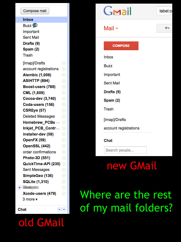
Re:GMail: designer arrogance and the cult of minimalism by thezilch on Friday April 27, 2012 @01:15AM (#3897671)
Click the square/arrow to the right of any label, there are a plethora of options, including when and why a label should be shown at all costs. Frankly, the label functionality that exists now, in the redesign, is amazing.
Re:GMail: designer arrogance and the cult of minimalism by DavidAbrams on Friday April 27, 2012 @03:14AM (#3897973)
Re:GMail: designer arrogance and the cult of minimalism by thezilch on Friday April 27, 2012 @03:33AM (#3898025)
Ok, upon closer inspection of your original screenshot, it appears you need to hover the padding-area between "Chat" and the border line above -- a separator between labels and the chat modules. You should notice a resize cursor and an ellipsis icon; this separator is movable and reveal more of your labels, without having to hover the labels area to reveal them.
Re:GMail: designer arrogance and the cult of minimalism by ubernostrum on Friday April 27, 2012 @04:12AM (#3898107)
Important tip based on what I see in this thread from multiple people:

If the response is "oh, no problem, just try to find this button, or hover on this very small area to trigger a non-obvious behavior"... we're probably not talking about good UX.

Re:GMail: designer arrogance and the cult of minimalism by DavidAbrams on Friday April 27, 2012 @04:29AM (#3898147)
Why would I move the cursor to an area in which there are no visible controls?

Thanks for your response, but this is shitty UI. Is the user supposed to sweep the entire screen, pixel by pixel, looking for Easter eggs?

Re:GMail: designer arrogance and the cult of minimalism by thezilch on Friday April 27, 2012 @04:58AM (#3898208)
You've never hovered over the chat area? Nonetheless, the bar could could probably use a hint when also hovering the labels area. I'm still unsure how you have written off the designers as simply inept. I could take down any UI with such an attitude.
Re:GMail: designer arrogance and the cult of minimalism by taligent on Friday April 27, 2012 @07:22AM (#3898532)
Excuse my language. But are you fucking kidding me ?

That is the worst UX I've seen in a long time. Since when is blank space considered a target area to hover your mouse over.

Re:GMail: designer arrogance and the cult of minimalism by Drbble on Friday April 27, 2012 @12:13PM (#3899732)
Wince every OS (MacOS and Ubuntu and Google anyway) adopted on-mouseover scrollbars and click corner to resize?

You might be also interested to learn about this new peripheral that you put on your desk and wiggle, and--get this-- it makes a pointer on your screen move. Crazy, right? It will never catch on! Touch your desk to interact with the screen? What brain-dead idea will they come up with next?

Re:GMail: designer arrogance and the cult of minimalism by bct on Friday April 27, 2012 @12:24PM (#3899792)
I get a scrollbar in that pane when it's too small to display all the labels. That makes it pretty obvious, it's strange that you don't have one.
Re:GMail: designer arrogance and the cult of minimalism by Drbble on Friday April 27, 2012 @12:08PM (#3899699)
You have never thought to click the edge of a box to drag its border to enlarge the box?
Re:GMail: designer arrogance and the cult of minimalism by option_greek on Friday April 27, 2012 @03:28AM (#3898010)
Ya, one of the worst changes of the new design. You have to hover over edge of the last folder to see all of them. They could have used simple accordian instead of all this mess. The new Gmail causes me nausea when ever I use it.
Re:GMail: designer arrogance and the cult of minimalism by ragmondo on Friday April 27, 2012 @05:32AM (#3898281)
This is my major gripe as well ...
Re:GMail: designer arrogance and the cult of minimalism by anthonyb on Friday April 27, 2012 @01:03AM (#3897631)
Go to Settings > Labels, then pick the ones that you want to show. Pity your "months of USE" didn't take you that far...
Re:GMail: designer arrogance and the cult of minimalism by DavidAbrams on Friday April 27, 2012 @03:11AM (#3897968)
WRONG. All of my labels/mailboxes are set to show:

http://farm8.staticflickr.com/7100/7117915617_c0c8cab3fc.jpg

Any other wrong advice you'd like to try to contradict me with?

Re:GMail: designer arrogance and the cult of minimalism by rkudeshi on Friday April 27, 2012 @03:54AM (#3898063)
You can hide the chat box. Look for a button at the bottom center of the sidebar (so lower left of the entire screen).

That should show you as many labels as possible. Because of the new multi-panel approach, you'll have to scroll down the sidebar if you have more labels than fit (like an iframe).

Re:GMail: designer arrogance and the cult of minimalism by DavidAbrams on Friday April 27, 2012 @04:33AM (#3898153)
Thanks for the chat-box info.

This is more bad (Easter-egg) UI: There's no visible control next to "chat" (or any of the other labels) until you've already rolled the cursor over it. Why would the user roll the cursor over there, if there are no visible controls?

It's incredible that we're LOSING common UI sense at such a rate.

Re:GMail: designer arrogance and the cult of minimalism by anthonyb on Friday April 27, 2012 @08:07AM (#3898674)
That's a very common UI mechanism on the web. The alternative is to have a bunch of handles and buttons plastered over everything.

Most desktop UIs are the same - there's all sorts of right click options on various UI elements, and have been for years. Drag and drop, drag to select, dragging stuff into your recycle bin or onto another folder to copy them.

How are you supposed to know that? By experimenting with your UI and learning how it works.

Re:GMail: designer arrogance and the cult of minimalism by crazygringo on Friday April 27, 2012 @11:27AM (#3899470)
But it's one thing to learn a UI for your whole OS. You learn it once, and you're done.

For websites, it shouldn't be necessary. I personally abhor the "hidden until hover" buttons that are becoming increasingly popular. I spent ten minutes trying to discover why GitHub had removed it's "edit issue" functionality until I realized that I had to hover over the issue text for the button to appear in the corner. It's horrible.

Re:GMail: designer arrogance and the cult of minimalism by anthonyb on Friday April 27, 2012 @08:01AM (#3898656)
Well, it works just fine for me. Look, non-eyeburning theme, different coloured stars, non-hidden mailboxes.

http://farm8.staticflickr.com/7101/6972254464_24774f868a_z.j...

Just for kicks, I switched to the default theme - same deal, mailboxes hide properly, etc. The red button's annoying, but hey, that's why I switched theme.

Perhaps you might want to quit flaming people (and Google) and fix your settings or browser or whatever the hell is wrong with your PC?

Re:GMail: designer arrogance and the cult of minimalism by anthonyb on Saturday April 28, 2012 @01:39AM (#3902130)
Nice downvote, but compare his screenshot and mine. There's something pretty clearly wrong with his stylesheets or browser or something. There are no visible controls in his new GMail section - something that nobody else seems to have.

Further, he doesn't seem to be even the slightest bit interested in figuring out what's going wrong.