The actual message includes a countdown which automatically makes an SOS call if you do nothing.
Remember that the Apple Watch is just guessing. Hence, using "It looks like" is more appropriate. Otherwise, a tech illiterate senior might not understand why the Apple is suddenly asking if he/she fell so directly when there is a false positive.
I like Apple's version more.
"Fall detected"
"Sudden motion - Injury suspected".
"Fall detected" --> which is not technically correct. The watch didn't detect a fall. The watch is only seeing signals that suggest you might have fallen.
"Sudden motion - Injury suspected". --> There are probably many data points fed into an algorithm that detects falling so saying one of those factors, "sudden motion" is not accurate. "Injury suspected" is vague. Who did the Watch suspected had an injury? And not every fall results in an injury.
I still think Apple's version is the best out of any of the alternatives suggested here. I guess that's why most people here are developers - not HCI/UX people.
Good UI design should render the action obvious - a button should look tappable, a slider slidable and so on. That way the label can use its minimal estate to focus on describing the action instead.
“Swipe for help” might also be suitably ambiguous that some users think it means “get help” in the sense of an info page, or assistance.
I’d go with something like “(SOS) Make emergency call” or regional equivalent. Combined with a more obviously swipable UI design.
Ideally then usability test on 50 people to seen if it works!
> ((SOS) swipe for help)
That's basically what every designer says. What these people usually forget is that these intuitive Interfaces are only intuitive for people that think like them.
Nothing about that screenshot indicates that I'd have to swipe to take action. There is a very high chance I'd be unable to figure it out in a stressful situation while hurting... Unless I've already encountered the same interface in a less stressful environment.
The SOS could just be a button with the label to the right.
It’s not a button to avoid an accidental press, because the false positive means emergency services are dispatched… and with enough false positives, the service stops being useful (wolf crying).
so if I actually fell and broke my thumb, I won't be able to easily activate it.
Swiping is a terrible gesture, nothing related to "emergency" should be linked to swiping.
It's much better to put there a "DID NOT FALL" button than a swipable element to avoid false positives.
False positives are still better than false negatives, in these circumstances.
Otherwise, you can use your remaining four fingers to swipe. Or your nose. Or Siri. Or remove the watch with your teeth and use the other hand.
But more obviously, broken thumbs still swipe too.
Swiping should be used for low priority confirmations, like confirming you want to buy a subscription or pay for some in-game addon.
In my opinion it shouldn't be used to answer phone calls either.
A button would mean I'd answer endless calls by accident, in my pocket. No, sensors don't prevent this. Yes, my leg, through my pocket fabric, can push buttons.
Did you test all of this, before deciding a button is better?
That's honestly not a design issue.
The design of the following device was never criticized because answering a phone call was "too easy"
https://en.wikipedia.org/wiki/Nokia_3310
Anyway, I've never said to use a button, I said "swiping is a terrible gesture"
My parents have enormous issues swiping to answer phone calls. So they answer by accident to a lot more calls than they did when the phone had buttons, because they answer while trying to hung up. It's not clear at all that they could not do anything and the call will automatically end after a while. It's not clear at all that they could silence that phone call, without silencing all phone calls.
It's even worse than that: most of the times they call me back because they could not swipe "the right way" and were unable to answer.
But they are not stupid, they've gone through life pretty well, they worked with precision instruments in health care, where people lives were at stake, it's the interface design that is stupid!
There was a time when things were designed to be used by people leveraging human natural abilities, not forced onto people because they look cool in ADS.
> Yes, my leg, through my pocket fabric, can push buttons on
Don't keep your phone in you front pocket then!
Anyway, I don't know how big you are, but the pockets of my jeans can't handle more than half a smartphone.
And previous generations of phone never activated on their own while in my pockets (yes, they could fit, because they were sized to be handhelds not small tablets)
But, more importantly, you're not considering more ergonomic gestures than swiping, like a long press.
You are assuming that your habits are the best possible implementation.
EDIT: there's also this: swiping can reveal physical characteristics of the user which could be considered not exactly a good thing, in this era of data harvesting and targetization.
https://www.sciencedirect.com/science/article/pii/S107158191...
I'm not a native English speaker, sorry, big for me means big as per dictionary definition, not large or fat or "you should be ashamed of your body".
Anyway, a search for "jeans pockets smartphone" produces the following results, which is exactly what I meant, pants here have the same pocket size you can see in the following pictures.
https://previews.123rf.com/images/bacho12345/bacho123451508/...

https://previews.123rf.com/images/wisawa222/wisawa2221707/wi...

https://previews.123rf.com/images/aquapictures/aquapictures1...

https://images2.minutemediacdn.com/image/upload/c_fill,w_144...
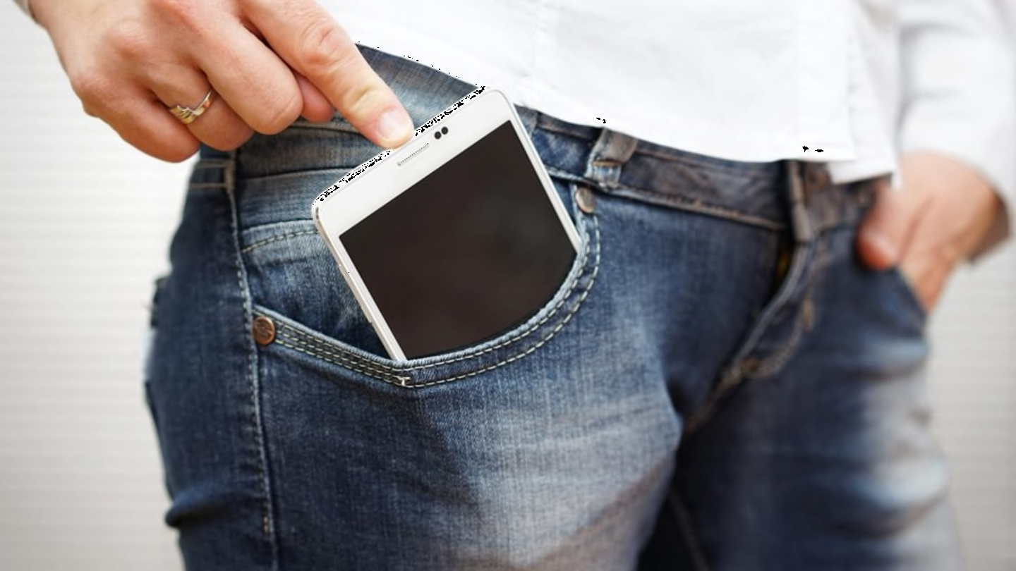
I think looser pants are why ginormous phones fit, although I am sure upthread's comment about many pants being tailored differently now, is probably true too.
My own usage case is, as with anyone, unique. The real problem is, singular thought in design.
Look at chrome, and how google removed pinch zoom and reflow, to "force" websites to update for mobile.
Thanks google, clearly you could care less about older eyes. About older websites.
Stop mentally enslaving yourself.
ehehe I have grey hair and grey beard too.
I still wear jeans when nobody watches, but in all honesty when I wear classic suit pants to go to the office, the pockets are even smaller than the jeans ones, so my phone stays in the pocket of my (suit) jacket.
My issue with swiping is that when phones fitted entirely in one hand, for example the Samsung Galaxy SII or the iPhone 4, swiping made sense, everything was close enough and you never lost grip.
Now that they are so big, there's a lot of lateral movement to cover and it's becoming to be nonsensical. I usually drop my phone 2/3 times a day because of needing to swipe, it never happened so often before. I have also started to suffer from joint pain on my right thumb due to phone gestures.
I've watched my parents trying to do it with both hands - with one hand they keep the phone, with the other hand they try to swipe-up to answer using their index finger - and the movement 90% of the time falls too short and the swipe fails.
It's painful to watch, I think we should rethink gestures or phones' dimensions.
For kids, a kid sized phone would seemingly work better. 1/3 the size, weight, and theoretically with a smaller font and display.
Thankfully most people have four backup fingers on the same hand..
try to do what you do every day without using a thumb and tell me how good it is to have 4 "backup" fingers.
I hope this isn't true and you've merely lost track of the context of this discussion.
On a smartphone it's hard to keep track of a long thread if I have a broken thumb.
Good.
Now watch these images and tell me how these people are holding the devices in their hands (hint: watch their thumbs).
Unfortunately for you, you're still a primate with opposable thumbs.
https://static.vecteezy.com/system/resources/previews/002/88...
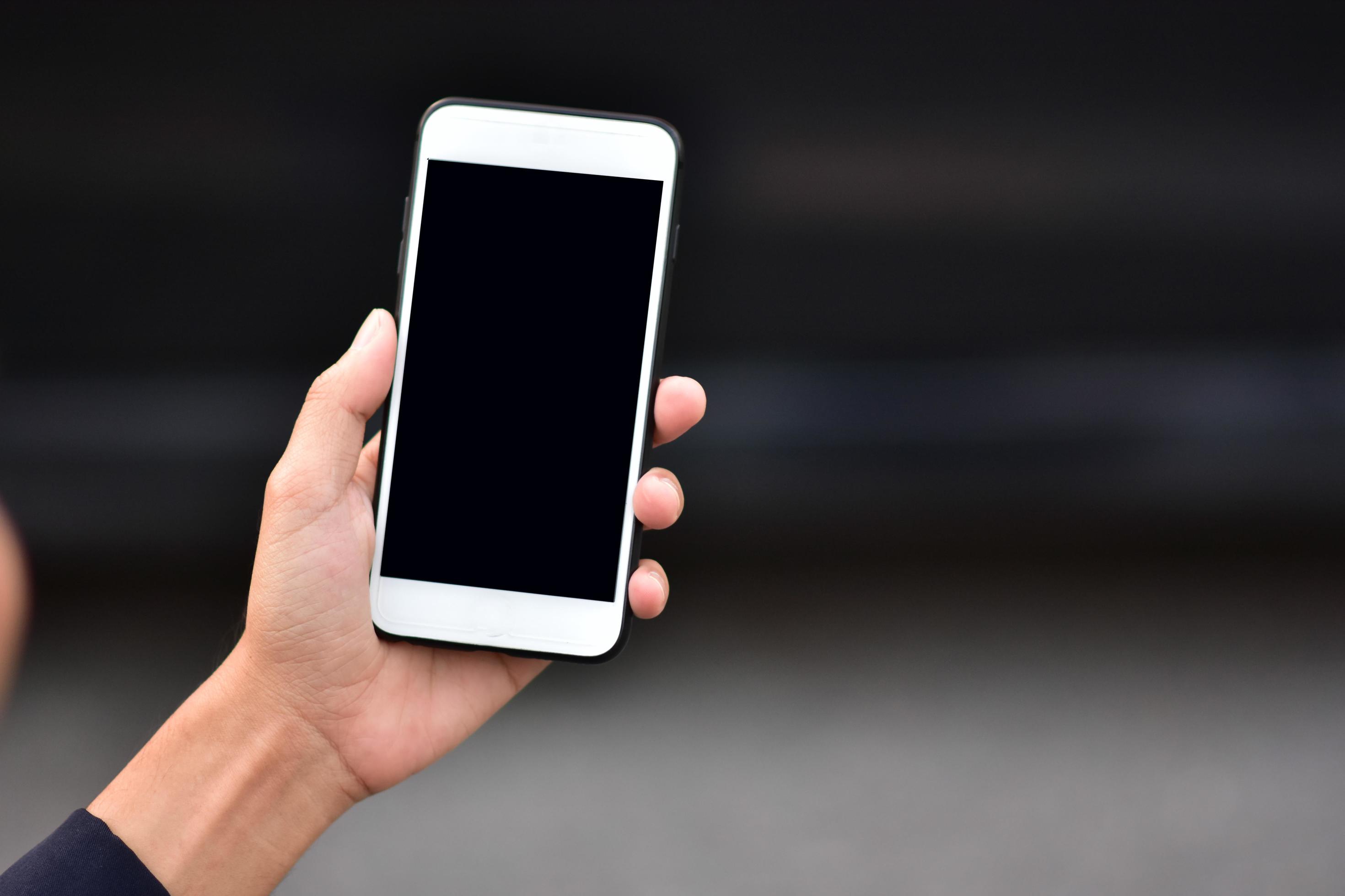
https://t4.ftcdn.net/jpg/03/31/88/03/360_F_331880337_DmRJT2I...
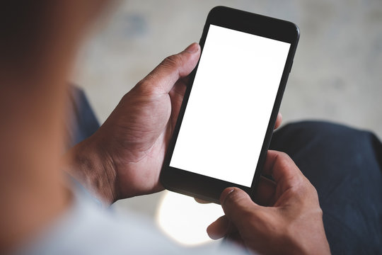
https://c8.alamy.com/comp/FXTP62/holding-generic-smart-phone...
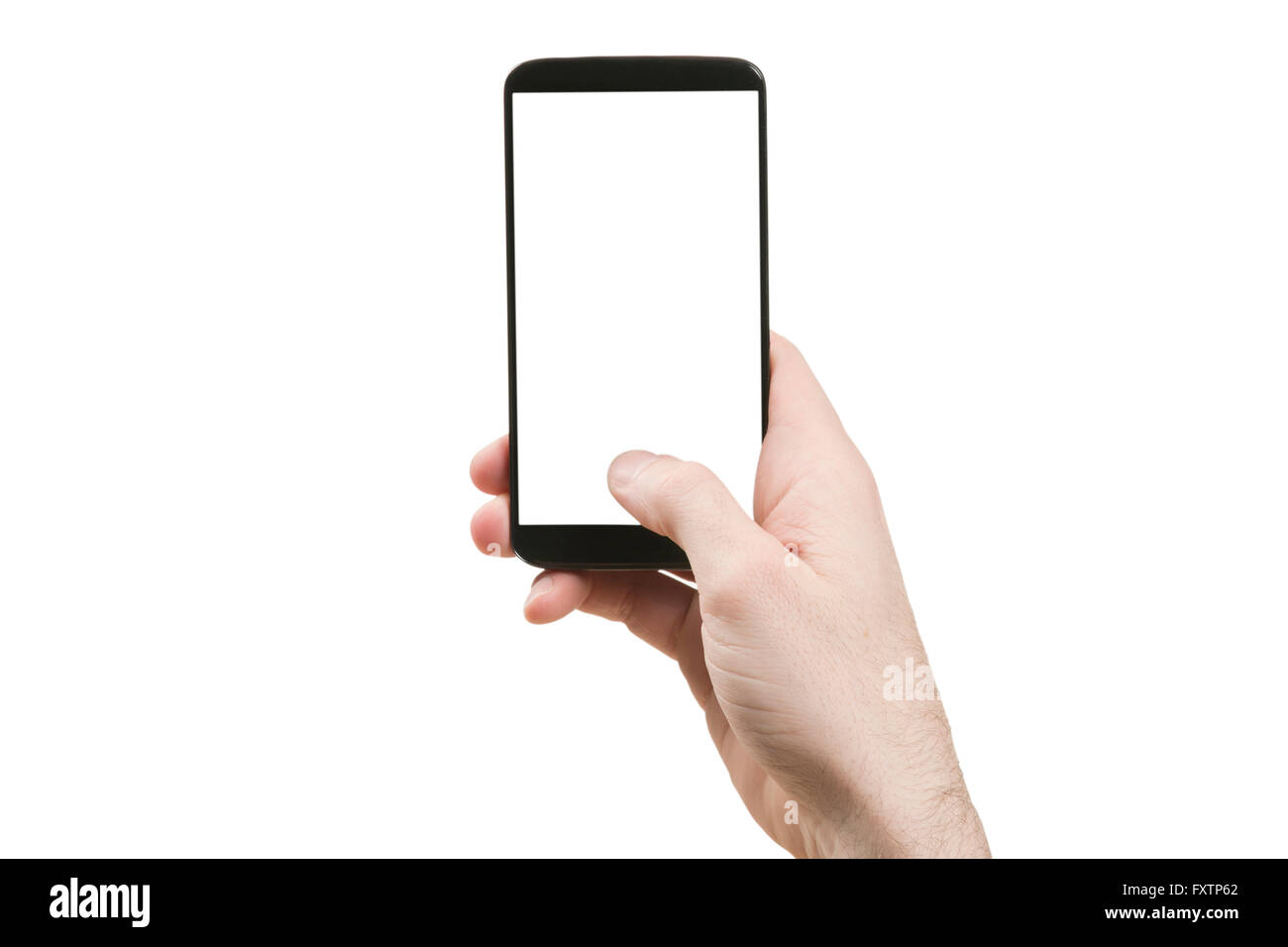
> If your thumb was injured and you needed emergency assistance, would you really give up instead of trying to use your index finger?
it's obvious you never saw an emergency situation or never lived one.
You still think it's a matter of will.
People give up and die, of course, that's the problem!
Meanwhile a better gesture would be long press the screen with the palm if you need help.
Bad ergonomics is bad, regardless of how much people love feeling cool with their touch screens, it won't last.
In 10 years people playing with pocket sized touch screens will look like this photo.
http://i2.cdn.turner.com/cnn/2010/TECH/mobile/07/09/cooper.c...
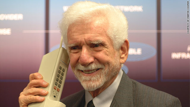
Cars are already removing them because they are a distraction and don't work!
Mazda to remove touch screens from all new cars - June 2021
Top Stellantis Designer Wants to Remove All Touch Screens - June 2022
Shocker! Test Shows Physical Buttons Are Less Time-Consuming in Cars Than Touchscreens - Aug 2022
Are Car Touch Screens Getting Out of Control? - Feb 2023
You know ironically what the real reasoning behind it also is?
Touch screens are cheap, why should I buy a luxury car to watch a black piece of glass in my car when it's turned off? It doesn't feel luxury, it feels identical to the cheap car of everybody else, it looks identical to induction burners. And why is the manufacturer saving on costs if the car costed me a premium price, because it's nominally a top brand?
Would you buy a Prada bag made of cheap plastic in China?
It's pretty crazy that people might be depending* on an Ultra model doing some extreme outdoors activity, and it turns itself into a little brick because it's tapping against something slightly conductive.
*—Don't do this with any tech.
Users are not interacting with a screenshot. If you try to tap the slider it will slide a little to the right and fall back to indicate it’s a slider. There are also other actions on the watch that use this kind of interaction. And if you fail to either call ems or confirm you’re OK, it will call them for you.
Yes, they are. You seem want a distressed user to aimlessly wonder though the UI trying to learn how every object behaves. That's not only unreasonable, on this case it's mean.
You would be correct if it was a game.
I agree with you more than the GP, but this isn't a good way to structure a rebuttal.
Though a return to a little bit of depth in interface design would help. Even plain tappable buttons often have zero affordance these days.
People can’t interpret that kind of nonverbal/abstract cues. It’s quite an inner circle thing of nerds that those seem ultra obvious.
Nerds would type SOS at a command prompt.
Which is why a successful interface designer understands who will be using the interface. There's nothing natural about any touch interface. It's all learned. When designers say "a button should look tappable", that's a design requirement, not a design solution. What solution achieves that requirement will depend on the audience the interface is intended for.
Looking at the screenshot of the SOS slider, I would have a hard time recognizing it as a slider myself, when seeing it for the first time.
Might want to run it by the ethics board, though, before subjecting 50 people to traumatic events.
When the user is wearing the device (dedicated Android phone), a 'chain' of protection is rendered (3D) which indicates the state of the Fall Detection algorithm. When the algorithm detects a fall, the chain is broken.
During the fall, the app indicates whats happening with audio prompts - caretaker alerted, acknolwedged, etc. - and then in order for the app to be changed from "Alert all caretaker" state back to 'ring of safety' mode, the user has to swipe the alert icon. The purpose for this is to ensure that in the case of fall, the app persists until the caretaker acks the app, physically.
This proved to be quite workable and fit with multiple users - the 3D "chains" were easy for the frail user to see, while wearing the device - then in case of falls, audio and vibration was used to let the user know help is on its way - and then, to acknowledge, the alert caretaker gets a separate UI that makes accidental de-activation (during an actual fall) impossible.
It’s way less clear. You’re relying on implication to convey the fact that the watch thinks you’ve fallen, rather than just saying it.
If you’ve hit your head and are concussed, that extra level of indirection and confusion that your question introduces could have a significant effect on the outcome of the situation.
Furthermore, falling is not binary, so there’s the question about where the boundary is. In an emergency situation, I don’t want to have to deal with any of this. It’s terrible UX.
"Call emergency services?"
"Yes" "No"
Although it removes the context of the watch' reasoning.
Reminder that the screen is a false positive protection mechanism and will only ever be seen in a specific context.
You have to solve for the lowest common denominator, not the hacker's technically correct preference.
This ain't about the watch falling, it's about someone possibly needing to call emergency services and contacts when they're hurt. "I'm OK" is a great prompt in that context, even if it's not an explicitly accurate response to whether the watch or wearer fell (which in turn is why the focus is not on the fall but on their need for help).
You did say "likely" but to provide an example: skiers who know they fell cannot comprehend the message trivially (not having noticed it's existence) and summoning help is often not the proper action to take. Call centers serving ski towns are swamped with false positives due to this issue.
“Why is my watching asking me to call 911 to get it repaired? My hip is broken!”
I can’t tell if you’re trolling me or not but I’ll assume you’re not.
If you didn’t fall, then you know it’s wrong.
If they are not laying in the floor then they already know it’s wrong.
"Fall detected. Call 911?"
“Huh? No, I didn’t fall. Don’t call 911”
Or
“I did fall, but I’m fine. Don’t call 911”
Apple's version is better. It's more accurate of what the feature does (guessing based on factors), and it's more human.
When a fall was detected the sample played: "A fall has been detected" When the caretaker was alerted: "The caretaker has been alerted" When the caretaker acknowledged: "The caretaker is on their way" ..
I dunno why its so hard. Talk to the user, re-assure them that the app is doing its job.
Besides, it's all a moot point because it's the wrong question to ask. It doesn't really matter if you actually fell or not. It detected what it "thinks" was likely a fall and the real question to ask is: do you need help?
If you turn the corner and see someone laying on the ground, do you ask them if they they just fell, or do you ask them if they need help?
Asking whether you did fall is not really the right question in that situation.
For example: I did have a serious fall (that hurt a lot) with my bike that triggered this feature – but I was conscious afterwards and seemed somewhat ok. As such I didn’t want my watch to make an SOS call (dialing emergency services and contacting my emergency contacts). I wanted to give myself time to assess the situation first.
However, I did fall and the Watch correctly detected that fall. So to this yes/no question I would have to technically answer yes.
In that context the “I’m OK” button is actually pretty great. It works both if you didn’t actually fall (a false positive) and also if you did fall but it’s not serious enough to call an ambulance. (If you say I’m OK it actually asks follow up questions to determine whether it was a false positive or whether you did actually fall.)
When the watch detects a fall there is a countdown and noise and vibration and after that the watch will make an SOS call automatically. As such it‘s not so important to make it super clear and easy to make that SOS call manually. In that context it seems like a fine tradeoff to me to prevent accidentally making that SOS call.
I think it‘s exactly right for the watch to put front and center why it’s doing what it‘s doing in those situations, while also making it very clear that there can be false positives.
But the Apple Watch is worn by consumers so "It looks like you've" is way better.
On Swiping, though, it's kind of a lost cause on iOS/WatchOS. If you don't know to do the goofy swipes everywhere, your experience is miserable.
The correct way to do it is:
The original message doesn’t even mention it’s a swipe. I can imagine a stressed person trying to tap that message or icon without realizing it doesn’t work. Targeting at eldery you must be crystal clear, not subtle-UX-clear.