On the subject of changing tastes, I suspect that in 10 years anything in a corporate Memphis style [1] is going to look horribly amateurist and outdated. This shows up a lot more in landing pages and tutorials than ads, but I'm sure there are similar artifacts in ads these days.
It already looks amateurish and outdated.
Note how design-focused companies like Apple almost never use it. It’s mostly used by Facebook and Google, who aren’t know for sophisticated design.
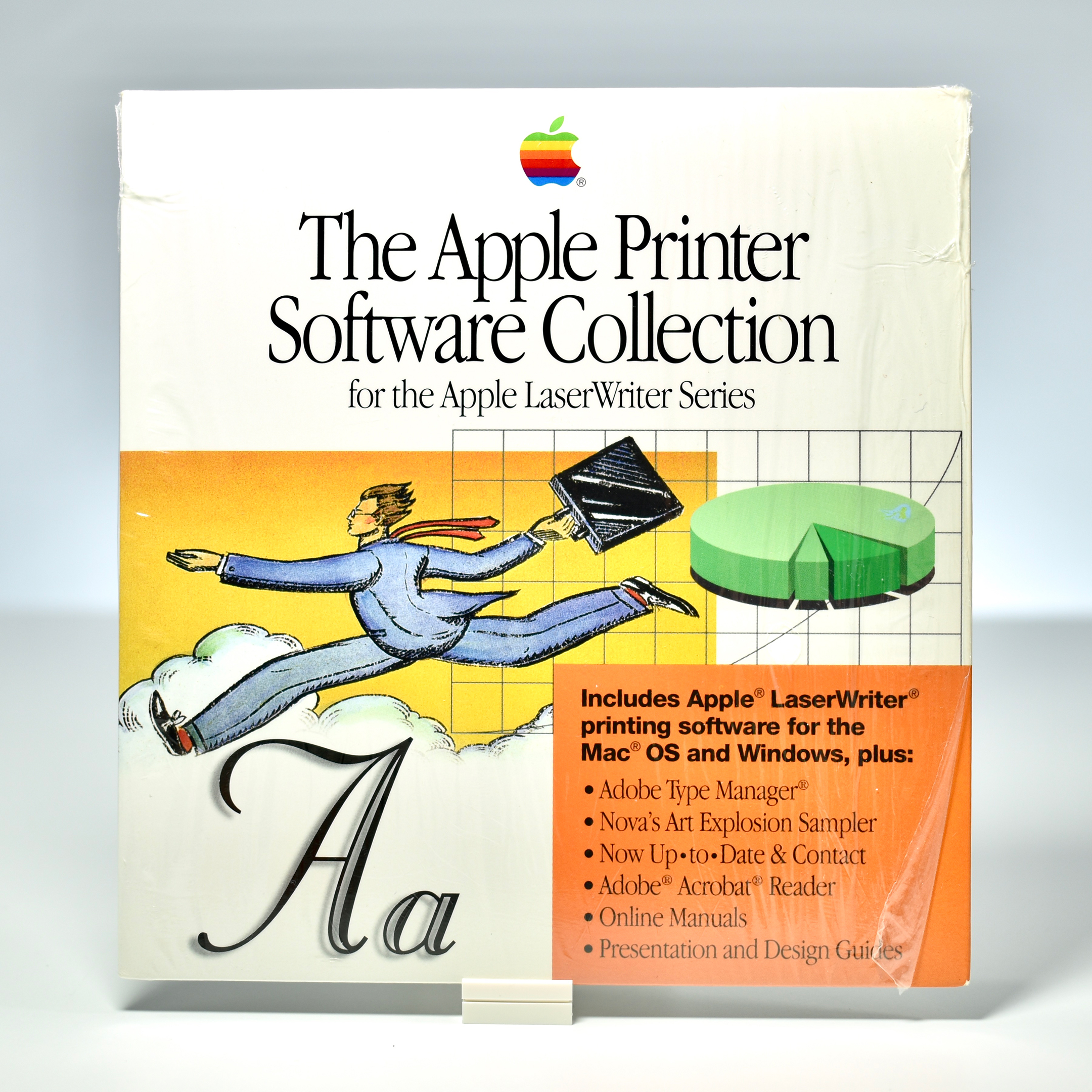
I seem to remember Apple already having used a similar style of art in manuals in the 90s. [1]
[1] http://mattjfuller.com/wp-content/uploads/2020/05/DSC_0702.j...
Re:Old video game advertisements
by King-Aaron on Wednesday September 29, 2021 @09:21PM
(#28702155)
I see any brand that uses corporate memphis design as being slack and amateur. It's literally 2020's MS Clip Art.
Re:Old video game advertisements
by monkeydreams on Thursday September 30, 2021 @04:47AM
(#28704337)
> I suspect that in 10 years anything in a corporate Memphis style [1] is going to look horribly amateurist and outdated.
I suspect that in 30 years the corporate Memphis style will be a selling point where yet-to-be-born designers try to revive some "Retro Cool".
That link is a wild ride. I expected a design blog. Instead I got a communist indictment of startup culture through the lens of the commodification of illustration.
Same! A refreshing take on the startup world from the outside.
Agree! I really appreciated their main page too with no ads (I think) and the way articles populated the endless scroll.
I miss hand-lettered signs with misspellings and punctuation errors in carry out places. Now even the smallest mom and pop has professionally lettered signs and menus.
Re:Old video game advertisements
by willcipriano on Wednesday September 29, 2021 @05:33PM
(#28700261)
The UK is having gas shortages and I saw a article where one of the gas stations was pictured and they had a glossy, perfectly on brand sign explaining the situation. I was thinking that a couple of decades ago it would've been crazy to get those printed and distributed to stores in less than a week.
Re:Old video game advertisements
by matrixcubed on Wednesday September 29, 2021 @05:16PM
(#28700069)
Thankfully, I’ve seen greengrocer’s apostrophes survive that evolution of signage polish.
I think graphic design becoming much faster and cheaper, and elaborate custom-designed and custom-printed/manufactured signage, wraps, et c., becoming far cheaper to make, is part of the cause.
I also suspect much of this is a very visible case of Graeber's "Bullshit Jobs", specifically of the "zero-sum competition" variety—which makes sense, given the relation of this to marketing and ad-spending. I don't think Target having the entire facade of its buildings designed & built to be "on brand" does very much good of any kind, per se, nor do brand-driven price tag or end-cap sign designs and such, and the (apparently) increasing tendency to tear down rather than repurpose—I assume because making the old building fit your design system would cost about as much as building new, anyway, and if you build new you also get... a new building—sure seems socially harmful. However, they feel they have to, so they don't look shabby next to all their competitors.