I think the underlying reasons for that are underappreciated.
When you pick #000000 for your text color, people won't see it as pure black anyway. Imperfections in your screen's backlighting aside, your screen reflects the ambient lighting, or, if you're outdoors and pointed the wrong direction on a sunny day, your screen reflects sunlight that is orders of magnitude brighter than the screen itself (measured in cd/m^2). #000000 never shows up as actual black either.
So if you're going to put black text on white background, just use #000000 on #ffffff. Nature doesn't need any more help to make text on screens hard to read.
That color contrast is perfect for a game, a movie or an image. But you don't want the feeling of something as bright as looking into the fucking sun mixed with the darkness of the deepest starless night. That's just painful, both in light mode and dark mode.
Just calibrate your monitor correctly, increase your contrast if your monitor can't even display Rec.709 sRGB, instead of compensating for your shitty monitor by making your website painful for anyone with a good monitor.
EDIT: this comment puts it very well: https://news.ycombinator.com/item?id=26741285
Over 99% of users don't, most phones are not high end and as such don't have such a screen.
> feeling of something as bright as looking into the fucking sun
Again, not a experience around 99% of internet users can follow, their devices don't get that bright, especially not on a per-pixel basis.
Also most people use devices in rooms with varying degrees of natural sunlight showing in.
And if whites are to bright then it's because my screen is wrongly setup for my eyes/usage. A perfect color calibrated screen is ironically often not a perfectly setup screen for normal usage.
There are very specific definitions for colors, and what they mean.
#000000 means 0.1 nits, #ffffff means 100 nits. That's standardized and specified.
The screen can't be wrong if it correctly matches the standard. If real-world content doesn't obey the standard, the content is wrong, not the standard.
Uhm, scree brightness control is a thing. Adaptive brightness is standard even on non high end phones. Same for desktops etc.
So a part of a standard which maps color to specific brightness levels is pretty much irrelevant outside of the unrealistic case of a perfect calibrated monitor in a perfect environment. Which does exist. But again is for most internet users unrealistic.
If you modify the brightness in software, you can also tonemap it properly and retain the contrast easily.
Those are the people you usually want as customers. And you're making your website painful for them. That's a decision you can make, but don't be surprised if you'll fail with that attitude.
Keep colors and contrast restricted to the range possible by reflective materials (i.e. what can be printed on paper or ever be encountered in nature) and all the issues are immediately gone. You don't have to use grey-on-grey (which is super annoying). Just keep to the range of colors a newspaper will have, or a zebra will have.
motherfuckingwebsite does it right, too: follow the preferences (which in my case is almost exactly the same as the perfectmotherfuckingwebsite)
The worst are websites with far too little or far too much contrast that don't even follow preferences. At work I've had to repeatedly go against designers wishes refusing to implement their design and saying: I'll implement you anything within of 4.5:1 to 10:1 contrast ratio. But I won't go below that (no, I can't make the text 10px tall in #c0c0c0 on #f0f0f0) nor above that.
Generally, media and text need very different contrast ratios and colorspaces, and text should never use the full contrast available.
But the big issue is that most content is using entirely unmanaged colors, not even correctly setting them to sRGB (or actually the color profile of whatever shitty 6-bit 100:1 contrast panel from 2004 they managed to find on the dump).
If that was actually used, we wouldn't have any of these issues and everything would be correctly tonemapped. But they don't, they set no profile, which in some software means "whatever the display supports" (although recently enough software enforces "probably sRGB at 1000:1 contrast 100nits max brightness" luckily).
Sometimes, you just have a shitty monitor. There are entire communities dedicated to calibrating monitors as I'm sure you are aware, it's time consuming and can be expensive, it's not a solution, we have manufacturer ICC profiles for a reason.
But the reality is that I can't use some websites because they chose to make my experience worse so users with badly produced and badly designed devices have a better experience. We're yet again at a situation where obeying the standard is punished.
No, it is not.
> No reflective material can reach those colors or that contrast.
Even if that was true, nature includes light sources as well as reflective materials.
Emissive light sources in nature (except for rare occurrences like lightning, certain jellyfish and cherenkov radiation) are all black body radiation.
That's very different from the colors and contrast ratios possible by modern OLED monitors. The best example would be the blue LEDs used in modern OLED panels, which when they were introduced had a strange unnerving blue glow because that color just doesn't exist in nature.
Additionally, the contrast ratios possible by modern OLED panels are also far beyond anything in nature, as in nature anything that is bright, be it reflective or emmissive, will as result also light up its surroundings and reduce contrast naturally.
Because designers are taught that too much contrast causes eye strain. They're advised against putting pure black text on bright white backgrounds.
https://www.wired.com/2016/10/how-the-web-became-unreadable/
They also won't have screen where they are likely to feel anything has too much contrast.
IMHO a screen which displays a common black and white website with so much contrast that it strains the eye is a 100% failed product which completely ignores reality.
A website which has so much contrast that it strains the eye on any spec-compliant monitor or a cheap 1990s CRT is a failed product. Reducing the quality of monitors to compensate for shitty websites can't be the solution.
Same for black and white text documents.
Or black and white shell promts.
And so on.
So it's pretty obviously for me what is detached from reality and what isn't.
EDIT: It's the color space which is broken I guess, white (on a website) should be neutral background white not eye hurting brightness and the color space should have some "whiter then (normal,neutral) white" colors. I.e. the normal white color should not have defaulted to maximal brightness.
Sure, but that's already the standard.
The people who obsess over using #fff as default white just happen to be the ones whose monitors show #fff the way #ccc was supposed to be shown (and used to be shown, on CRTs)
You have to be very careful not to rely on it though: as you mention lighting and protection conditions or just plain bad monitors can kill the more subtle difference completely. And, more importantly, those with sight deficiencies might miss it even in ideal circumstances.
One thing you should always consider during the requirements phase of a web application is whether your app is likely to be used projected on a conference room wall. Things like contrast and fonts make huge differences in such hostile settings, and available screen real estate is also considerably limited.
When people are already getting short with each other before you even get to the actual reason for the meeting, you know it's going to be a long day.
But corporate wanted our fonts to match their other product. I don't know if it was my imagination or not, but it felt like that act broke a couple people on the team, myself included.
More high-contrast options exist then Black foreground on a White background.
I'm not disagreeing with your point, I loathe grey on grey sites. Being visually impaired nothing makes me rage-quit your site quicker if my DarkReader extension can't unfuck a site.
I'm posting https://contrastrebellion.com/ so all the replies and followup conversations can see it too.

There are good reasons to avoid bright white backgrounds in certain cases since it can be hard to read in dark environments as your eyes switch between the bright screen and dark world. But in this case, pure white on pure black is still the best option for contrast. And the correct solution is to dim the backlight of the display to reduce brightness.
You don't need a pure white background, but for gods sake PLEASE stop making the text light grey! Having to squint to read a website is headache-inducing.
(Edit: Okay, I should have read TFW. They mention the reason for the line width)
There's definitely a sweet spot; I typically have my browser windows at 2/3 width on a 2560px wide monitor. 100% width lines are a chore to read honestly, there's definitely a higher cognitive load.
More contrast isn't always better, or you would read text by printing out foil stencils and aiming them directly at the sun to read.
What would be really cool is if web browsers offered a mode that forced a contrast minimum when viewing websites. This would benefit devs and users alike: Users would have a pushbutton way to make bad websites readable, and devs would have a push button to show what their site would look like to users who get annoyed enough to push that button.
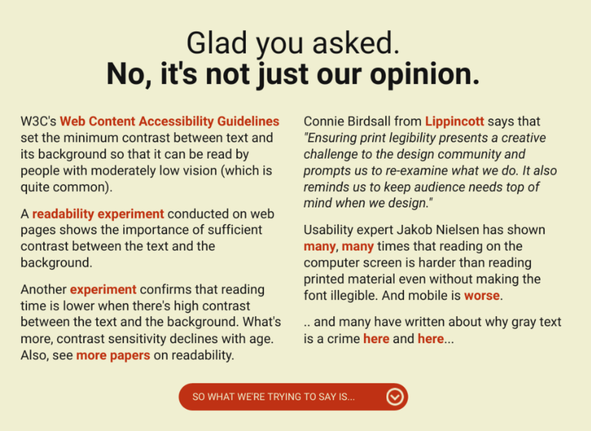
Do you like 400 nits of #ffffff right into your eyeballs? No? Me neither.
The alternative is absolute darkness with extremely bright text, which in turn makes it unreadable (if you have astigmatism as I do) and literally causes pain due to the high contrast.
Nothing in nature has such an extreme contrast.
The only reason anyone would ever use full contrast is if they have a shitty 6-bit monitor panel that doesn't even reach the contrast ratio of a shitty 1990's monitor. And they don't even have a proper color profile, so their computer thinks their monitor has all the contrast ratio in the world, and doesn't tonemap fuckall.
The only way to resolve this is if either everyone finally switches on a color managed workflow, or we outright ban the shitty panels where #000000 on #ffffff is necessary for readability instead of being just painful.
#ffffff is the color of looking directly into the sun and absolutely painful bright, #000000 is the color of the deepest, starless night. You need these colors for movies, for games, for images. But your text should never be the contrast between a starless night and looking directly into a star.
Increase the contrast of your monitor, calibrate your panel, but don't build a worse website to compensate for your shitty panel.
EDIT: this comment puts it very well: https://news.ycombinator.com/item?id=26741285
No. There's no definition of what they map to.
That's why we need USERS to be able to scale the ranges of brightness and contrast.
My environment changes during the day. I want to be the one in control of my screen, not some random website.
That's not really an option, though. You'd have to separate text and media from the website, split it apart, and configure it separately, as most websites just have everything without any color management.
If these shitty websites with full contrast would at least set a colorspace for their images, so I could take the color profile of a cheap 2004 LCD as default for unmanaged media and text, I'd at least avoid the painful situation.
What about black text on white pages in an actual hardback book? But since you referred to nature, what about zebras?
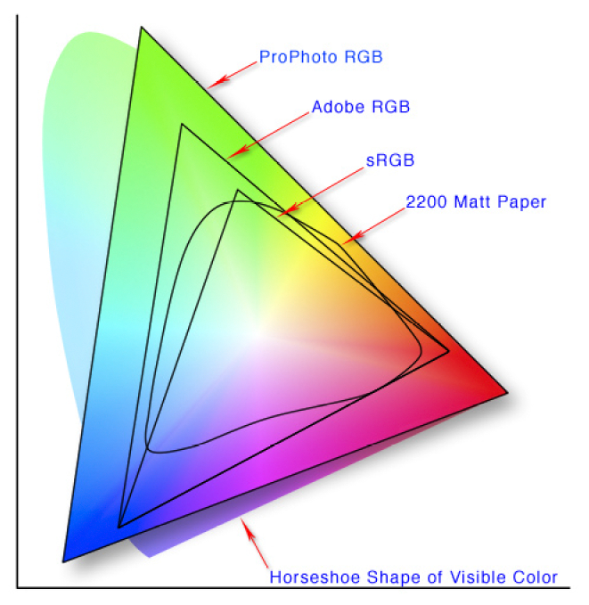
The not-triangular shape labeled "2200 matte paper" are all colors representable by reflective materials.
Colors outside of that range can only ever be produced by emissive materials, such as fire, stars, or your monitor.
All the colors your website uses should be from the range of reflective colors, as those are the ones seen in nature, and the ones your eyes are adapted to see.
The same applies also to black/white contrasts. Even vantablack next to a white sheet of paper (which would already be massively higher than any contrast in nature) still has a much lower contrast ratio than your monitor has.
> don't build a worse website to compensate for your shitty panel
Never change.
But this is a general issue - you want to be able to represent extremely high contrast, far beyond the brightness of a sheet of paper in photos, movies, games, etc. But you want a significantly lower contrast for text. Sadly, websites mix both and offer no way to configure them separately.
If you don't like what your display does, tweak its settings to do what you like.
Colors are standardized and have a very specific meaning.
I just dislike the colors these website authors have chosen, often without knowing what they're choosing, as their monitors often distort the colors and show something wrong.
None of this can be solved until we've got widespread color managed workflows and tonemapping on the web.
And I don't like reconfiguring my display for every different kind of content.
What I don't like is websites using #ffffff
Another commenter mentioned that all text should just be black on white and people can dim their screens as necessary. It's somewhat a matter of personal preference, but this seems like a bad solution to me. Most people are not looking at exclusively text when browsing the web, there are lots of pictures and videos as well. Users shouldn't have to be constantly fiddling with screen brightness. In photos and videos, contrast is often used for dramatic effect, where you want some parts to get brighter than others. If the text is too high contrast so you have to dim your screen further to view it comfortably, then the photos or videos you see alongside the text won't be as impactful and enjoyable. Why should every piece of text you read be as dramatic as the most intense rays of sunlight or something in a photo or movie?
I really only get annoyed with the "less contrast" meme when it's something like a Google website where the UI disappears if your monitor's contrast settings weren't tuned professionally. (I used to have to adjust my monitor settings around making the UI elements on Google+ visible.)
Dunno what the science says, but I really hate #000 on #fff, or vice-versa.
Yes, a lot of websites now go to the opposite extreme, but the reaction should simply be: so DON'T GO TO EXTREMES! Neither too much nor too little contrast are good.
And since you've pointed out they do go for sensible values here, why the outraged all caps???
One sensible reason for this is that it allows using higher contrast, or different hues w/ similar contrast, as a kind of emphasis that naturally stands out from the surrounding text. Same reasons why most terminal emulators display text as light-gray-on-black, while keeping pure white as a highlight color.
High contrast text can appear blurred for them while reading.
I think it comes down to what you're used to, what your vision is like, and how sensitive your eyes are. Some prefer high contrast, some don't.
Because too much contrast on a monitor means white on black, which on average (that is, 99% of people's setups) brightness levels settings strains the eyes and people actively dislike it.
Its not some book reflecting ambient light, but a monitor with a led shining white (blue-ish) light on your eyes...
>Contrast is good.
Water is good too. Too much water though, and you die: https://en.wikipedia.org/wiki/Water_intoxication
Because too much contrast can be jarring and distracting, making it harder to read.
These kinds of things are subjective.
> A little less contrast
WHY. WHY DO PEOPLE DO THIS. To give this person credit they have at least chosen some sensible values, rather than gone with something that was just about enough on an expensive graphic designer high-contrast monitor and then not tested it on anything else. Leaving the rest of us squinting to try and read text or manually overriding CSS.
Despite not being a complete idiot, they have still made the content harder to read. Contrast is good. It makes things easier to read. Why would you want less? Yes I know the art theory stuff about never using black because it doesn't appear naturally. You know what else doesn't appear naturally? TEXT. Black on white is a perfectly acceptable default, please don't change it for your body text without a really good reason.
(ranty style done in homage to the linked websites, but it felt good to get that out)