No. There's no definition of what they map to.
That's why we need USERS to be able to scale the ranges of brightness and contrast.
My environment changes during the day. I want to be the one in control of my screen, not some random website.
That's not really an option, though. You'd have to separate text and media from the website, split it apart, and configure it separately, as most websites just have everything without any color management.
If these shitty websites with full contrast would at least set a colorspace for their images, so I could take the color profile of a cheap 2004 LCD as default for unmanaged media and text, I'd at least avoid the painful situation.
What about black text on white pages in an actual hardback book? But since you referred to nature, what about zebras?
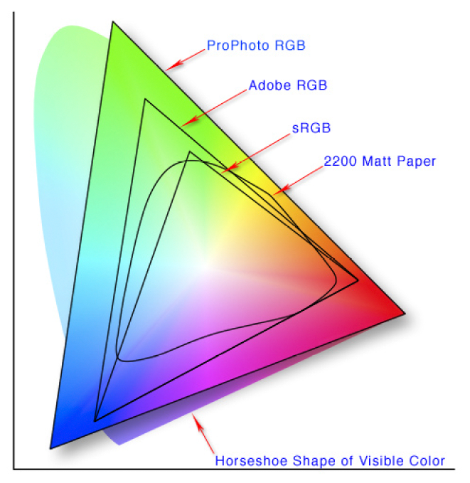
The not-triangular shape labeled "2200 matte paper" are all colors representable by reflective materials.
Colors outside of that range can only ever be produced by emissive materials, such as fire, stars, or your monitor.
All the colors your website uses should be from the range of reflective colors, as those are the ones seen in nature, and the ones your eyes are adapted to see.
The same applies also to black/white contrasts. Even vantablack next to a white sheet of paper (which would already be massively higher than any contrast in nature) still has a much lower contrast ratio than your monitor has.
> don't build a worse website to compensate for your shitty panel
Never change.
But this is a general issue - you want to be able to represent extremely high contrast, far beyond the brightness of a sheet of paper in photos, movies, games, etc. But you want a significantly lower contrast for text. Sadly, websites mix both and offer no way to configure them separately.
If you don't like what your display does, tweak its settings to do what you like.
Colors are standardized and have a very specific meaning.
I just dislike the colors these website authors have chosen, often without knowing what they're choosing, as their monitors often distort the colors and show something wrong.
None of this can be solved until we've got widespread color managed workflows and tonemapping on the web.
And I don't like reconfiguring my display for every different kind of content.
What I don't like is websites using #ffffff
Do you like 400 nits of #ffffff right into your eyeballs? No? Me neither.
The alternative is absolute darkness with extremely bright text, which in turn makes it unreadable (if you have astigmatism as I do) and literally causes pain due to the high contrast.
Nothing in nature has such an extreme contrast.
The only reason anyone would ever use full contrast is if they have a shitty 6-bit monitor panel that doesn't even reach the contrast ratio of a shitty 1990's monitor. And they don't even have a proper color profile, so their computer thinks their monitor has all the contrast ratio in the world, and doesn't tonemap fuckall.
The only way to resolve this is if either everyone finally switches on a color managed workflow, or we outright ban the shitty panels where #000000 on #ffffff is necessary for readability instead of being just painful.
#ffffff is the color of looking directly into the sun and absolutely painful bright, #000000 is the color of the deepest, starless night. You need these colors for movies, for games, for images. But your text should never be the contrast between a starless night and looking directly into a star.
Increase the contrast of your monitor, calibrate your panel, but don't build a worse website to compensate for your shitty panel.
EDIT: this comment puts it very well: https://news.ycombinator.com/item?id=26741285