As a user, I want separate edit bars for separate functions. I don't want Google know everything I type (or mistype) in the address bar. When I type foobar in the address bar please give me anything that returned the web server at foobar or give me an error if there is no foobar or the foobar have no web server. If I want to search foobar then I will type it in the search bar by myself.
Reconfirmed this for my Google accounts and in fact it is not storing search history. Ofcourse Google may be tracking it on their end, but I assume very few services don't track, so that's a non-issue (at least for me).
For anyone who wants to check, the url is:
...or at least it's that they claim.
EDIT: "they" being Google. http://blog.chromium.org/2008/10/google-chrome-chromium-and-...
I know that they are supposed not to misuse this information, but I would feel much better if they didn't receive it at all.
I also use ctrl-L and ctrl-K for navigating and searching, respectively, and I've found the way Chrome handles ctrl-K by focusing on the navigation bar and filling it with a '?' lacking. For instance, it clears my last query, where I often refine queries after quickly inspecting the results I got first time around. The requirement of having a '?' in front of search queries is also annoying, since it hinders a lot of keyboard shortcuts. Most notably, if I change my mind, Ctrl-A doesn't allow me to restart typing a query without manually inserting the '?' again.
I've taken to changing my Chrome search engine to "https://www.google.com/search?q=%s&complete=0", which does disable the autocomplete behavior, but also appears to give a slightly older version of the search page.
Obviously the proper next step would be to switch to DuckDuckGo.
What's so complicated?
My final point, letting users decide would be the best option here, and Firefox did exactly this! I managed to reconfigure it into a single address-bar working as search bar too, except search engine auto-completion.
In regards to the whole tinfoil hat comments about Google knowing everything you type, well I hate to burst your bubble but they probably already know everything about you, including but not limited too your inability to spell duck right.
I can't remember the last time I used Firefox intentionally. Chrome replaced it long ago.
As a web dev, I find myself more annoyed at the anomalies of Gecko everyday. I fix more Gecko related bugs than IE11 bugs, and that just feels wrong.
I don't expect this to be a popular opinion, but I have to say based on recent experience that if it wasn't for Chrome, I'd be using IE11 on a PC and Safari on a Mac. Firefox just feels too kludgy every time I use it.
Gecko and Trident are very good in comparison. Google needs a better QA process, especially after forking Webkit.
The only thing that bothers me with Firefox beside some UI is the single process model.
Exactly how I like it, I HATE getting search results when I make a type-o, or try to go to an internal site and forget to specify http://
I use this all the time, small thing but it's awesome! I'm pretty sure it exists in other browsers as well though.
ctrl(cmd)+l to focus omnibar, alt(shift)+enter to open results in a new tab
Turns the address bar into an ACTUAL address bar. (Hope I didn't forget any.)
See answer 1, manually set your DNS server in wifi Advances page.
Like the chap above your comment, I absolutely despise having the Firefox differentiation because my habit is to click the address bar and then depending on whether I have realised the mistake before/after hitting enter it's: (1) "S&%^ I have clicked the wrong one, <tab>" (2) "FFS I didn't want http://byron burger locations"
unless you make more gTLD typos than your search queries, the mechanism works great.
Use the customizer. People complain when they change and complain when they don't
> The address bar is square edged while the search bar is round edged, which is displeasingly visually. (I realize this is because there's a convention of "search bars are rounded," but the inconsistency remains.)
Maybe this is just the Mac version. On Linux they both have about a 3px border radius.
>Tapping the hamburger menu on the far right, it appears with a combined drop-and-fade-in effect, and then disappears instantly.
Sounds like a bug, not happening on linux though.
>The scroller applies a fade effect to incoming content, but only to the text, not the image, which is jarring.
Is this only on the slide show or something? That's not really much to complain about. I see web pages with different designs all over the internet.
>Multi-touch swipe
I have multi touch swipe set up for other things, but that sounds like something that needs work.
> Use the customizer.
Most users-on-street don't want to customise either.
Edit: The moderation on this is baffling. Does anyone genuinely believe users want to customise to achieve reasonable defaults?
HN should ban new users from moderating for a year.
Most users on the street aren't on the hacker news forum. Also if you are going to play the "most users on the street" game, then most users on the street aren't going to install a browser that didn't come with the OS.
I don't think anyone said they were.
> then most users on the street aren't going to install a browser that didn't come with the OS.
That's true. So it's even more important to retain them by having sensible defaults.
Not really. What is wrong with having a product that caters to a power user, or a niche group? Why does everything have to be dumbed-down for the "user on the street"? If you want dumbed-down then use the browser that came with your OS. If want something that isn't dumbed-down then you most likely have the know-how to customize your toolbar.
Firefox is a browser for everyone. It focuses on freedom and privacy. The browser that came with your OS most likely does not. There is no minimum level of technical expertise required. The UX is designed to be simple.
Agreed, but nobody in the thread is debating whether people know to customise a tool bar in a web browser.
The only thing that has been questioned is whether most people want to customise a browser to achieve defaults they find reasonable.
What's sensible about mixing three things (location, history and internet-search) into one location?
In Chrome I can't find anything in my history because the browser starts searching the internet instead. It's a horribly frustrating user-experience.
Which you cannot even customize. In Firefox you can customize the behaviour. I know which browser I prefer.
You actually need quite a bit of karma (maybe 500?) on Hacker News before you can downvote things, so anybody downvoting you can't be that new of a user.
IME, you can earn a lot of karma quickly with links. I'd say 1/3 of my karma came from links, and initially that's what pushed me over the top. So they're most likely not new users, but anyone with a month of submissions could have crossed that threshold. It makes me wonder if the two karmas, and the features that get enabled, should be separate things.
- the documentation and character support issues can be 'bugs'
- defaults that fit most users are good
- reminding someone being personal of the HN guidelines
...get moderated up, then down to -3 or -4, then back up to 1 again.
Noticing the folk in the conversation there's lots of newish accounts, and some are replying before they've actually read what they're replying to. Downmods for 'I disagree' are more popular now as well.
I'm just responding to a comment saying 'customise it'. if the simplicity argument is true, then 'customise it' is not an appropriate suggestion.
The simplicity argument, of course, could not be true, since simplicity may threaten safety in this particular implementation.
Since we're talking about one person's preference rather than the results of a user study, that hardly seems relevant.
They might find your position unreasonable, and your absolutism not contributing to the discussion.
It's absolutely not given that Chrome's behaviour is the "reasonable" default.
I can't imagine that most users-on-street would want or benefit from separate address and search fields either.
  > Separate address and search bars is old-fashioned.
  > As a user, I don't want to have to make this
  > distinction, and it's hard to imagine most
  > users-on-street wouldn't find this confusing
As you type into the search bar, autocomplete queries are sent to the search provider. This happens even if your intention was not to search, but just to enter URL manually.
In simpler terms: you are telling Google what sites you are visiting even when you don't use Google.
(AndrewDucker mentions this on this thread too, but his comment emphasises the UI aspect, whereas I think the privacy aspect needs to be stressed).
I have around 30 set up, from Wikipedia (w) to Google Image Search (gis), etc.
As power users, we tend to ignore the power of default settings. Their values have to be chosen carefully because only a small part of the public are even aware of them.
Several commenters here seem to imply that they shouldn't be the ones personalising their browsers. Turns out it's the other way around: they are the ones who know how to personalise it, whereas defaults should be about users who don't know how to do it.
Given the new gTLDs, I'm thankful that Firefox still has a separate search box. Say I'm want to know about the "asdfg.cat" file that showed up on my system. If I put that into the URL bar and hit enter, it's going to say "Oh, I know what .cat is, it's the TLD for Catalan related websites. Let's go to asdfg.cat!"
Same goes for things like "mail.app", which had conventionally referred to Apple's mail client on OS X. I have no idea if they'll end up owning that domain or if someone else will. And either way, I didn't want to end up on the web site if I was trying to search for it.
Mainly I don't like that it buries the fact that searching is a separate action and that you can pick what you're doing. And I think it's even more of a problem for inexperienced users, because to them the program is saying "Doing this action will randomly either search or go to some webpage, and you don't understand which will happen."
I also like keeping the search provider dropdown. It calls attention to the fact that you don't have to use google (and I don't). Google obviously has motives to prefer burying this in right click, but I think it fits Mozilla's agenda to leave it as a very visible setting.
i never use ? or quotes, because in 99.9% cases the search is very different from an address, and it's easy to tell which is being proposed. I also love having search recommendation for 5% searches where i am not sure of exact wording.
and yes, it's more of a power user feature, which is why i like it.
I use the address bar primarily (in FF) but the search bar is useful as a "scratch pad" for storing details I want to see briefly. It's certainly an edge case.
Chrome is almost unusable for me because I can no longer type the names of internal websites and have them come up. That single change in its behavior drives me back to Firefox.
Even fewer keystrokes.
If you type in the search bar then it automcompletes by sending all of your keystrokes to your search provider. If you type in the address bar then it autocompletes by using your history.
These are two very different use cases, and I appreciate the ability to search my history without notifying google of the name of internal servers.
The big reason I really like this is that the address bar is local to the tab, and the search box is window. If you have a topic you want to dive into on another tab, you can safely transcribe information from multiple current tabs and then create a new tab with the search. Especially when some of the information is in the current url.
1. The rounded tabs are simply ugly, and remind me of web design from a decade ago. It's also weird how they go from square to round on rollover. Poor design choice in my opinion.
2. It's far more difficult to find the active tab now. For comparison, the old style (http://static.filehorse.com/screenshots/browsers-and-plugins...). In the new version, I have to scan the toolbar to find the active tab based on the rounded or square edges. It's a lot easier the old way to find a bright active tab on darker, faded out inactive tabs. That's UX 101. It doesn't stop there, the entire toolbar, tabs, search, etc, blends together in a blob of light grey and white right now. Very little distinction between anything.
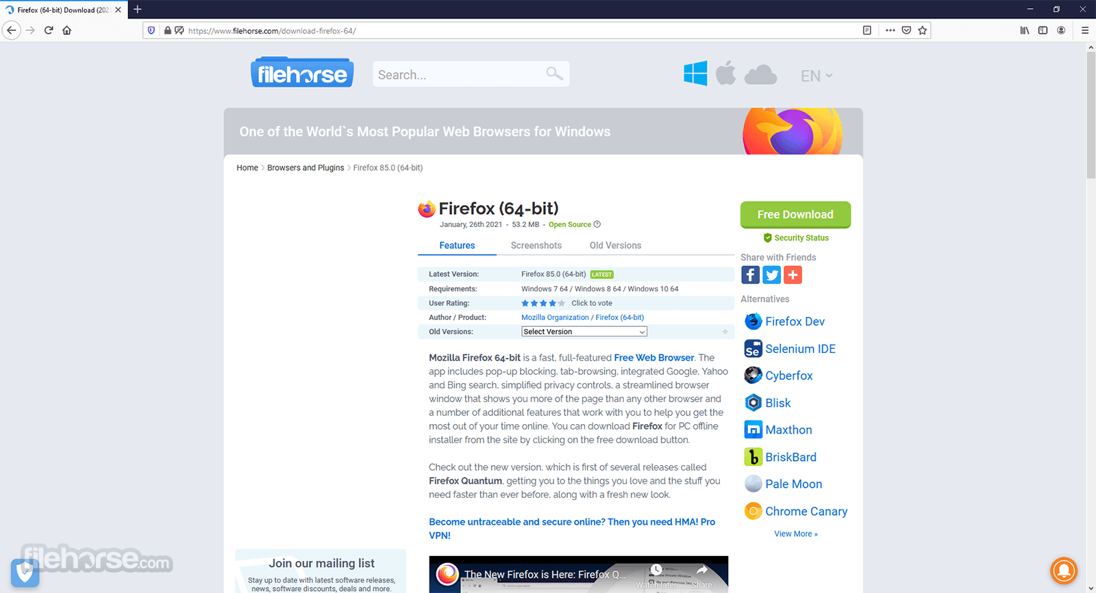
3. I never liked the orange Firefox button in the top left, it always seemed out of place and forced. Replacing it with an icon and menu is fine, but that icon should be on the left, before the first tab. The menu opening to a grid of icons is also awful. How it transitions to the right when you click something like 'History' is extremely bizarre. I have no idea why they tried to reinvent the wheel here, a typical list menu that everyone is familiar with would work best. That's great you can customize it, but 9/10 people will never use that feature, so it's a step backwards for them.
Overall, I see it as a change for the worse. It's not rocket science here, and nailing down a proper browser interface should be a walk in the park. We're talking about some tabs and a toolbar, there's no excuse for it to be anything but perfect after more than a decade. I'm 100% confident I could knock out a better design, that would be better received by people in a weekend. They have some nice features and design choices, but they got it 90% there, and keep tripping over polishing the remaining 10%.
Customize: rip it out, install foobar(1) addon and/or use search keywords for search engines
This is how it works on ChromeOS too. It even has a nice black and white effect on the previous page until it's fully loaded.
umm... I don't know if this works on mac too, but at least in the windows Firefox, you actually CAN use the address bar as a search bar. So why two bars? well the search bar also lets you CHOOSE your search engine, unlike Chrome which hardwires you to google. Yes yes, you might say but why would i want to search anywhere else? Well just like you hate having to actually GO to google to search on google, people hate going to wikipedia or wolfram alpha or ask.com etc etc before searching there. So it lets them query their engine of choice right from the bar. Oh and depending on your version, the address bar automatically searches on the engine selected in the search bar.
Now since you are a fairly old user of FF, i don't really understand the need to tell you all this, ut i just felt your nitpick about the searchbar saw this "feature" as a "design flaw"
If you need to access it, command-k is your friend.
http://en.wikipedia.org/wiki/History_of_Firefox
Edit: Fixed typo as pointed below. :D Thanks for nitpicking the nitpicking. :)
I think it worked out for the best -- Firefox is an excellent name and brand. It's hard now to imagine it being something else!
Monopoly? Before Firefox/Firebird there was Netscape Navigator, which was to be the "Mosaic killer" (hence "Mozilla").
IE was never the only browser around, even on Windows.
[1]: http://en.wikipedia.org/wiki/File:Internet-explorer-usage-da...

What you're missing is that many, many sites were only developed for IE, and only worked at all in IE. No, not "graceful degradation," not "progressive enhancement," that all came a decade later: if you were not using IE, the sites were very broken, even unusable - and nobody cared: after all, Just Use IE Like All The Normal People Do, right?
Either that or you have an addon installed that is using a huge amount of memory.
Even on startup it isn't that better compared to chrome.
Chrome 11 extensions 1 tab: ~300MB
FF 2 extensions 1 tab: ~200MB
It's not FF 29, it's 28 - but I doubt the memory management improved much in 29.
But to be fair, it's a lot better now than it used to be.
But FF is definitely uses more memory than chrome and with few other resource hungry applications running it becomes practically unusable on my low end laptop.
On my 512MB Raspberry Pi, this used to be FF's greatest strenth. Unfortunately the latest versions are getting nearly as bad as chrome. I wish Mozilla would focus on their strengths and put more resources back into their memshrink project.
When Chrome started to get fat, it was great to have a lightweight alternative like Firefox. But lately even Firefox has been causing my 1GB netbook to thrash. I hate to have to junk a perfectly good machine that is only used for email and browsing just because of software bloat. After doing a factory restore, it looks like that or a lightweight Linux distro(while losing flash and HW accel) are my only options.
There are many memory usage improvements made in firefox that don't appear explicitly in the areweslimyet tests, and there are many others, like better memory usage reporting accuracy and new features that do, thus the apparent increase in memory usage throughout the latest versions that you pointed.
https://bugzilla.mozilla.org/show_bug.cgi?id=476541
This bug makes Firefox useless to me and has been around for over 5 years!
This is the third one I'm aware of that is a basic usability thing. Others include a complete failure to browse to sites that present a duplicate SSL certificate, and an odd breakage that results in downloads getting half completed but the UI saying they're complete anyways.
But the default has to be to show the search bar because of contracts they have with search partners, I believe.
But it's never felt very good on the Mac to me, and it still doesn't. Here's a few early thoughts on this release, from the perspective of a happy Safari user, w/ a pretty (nit-)picky eye.
* Separate address and search bars is old-fashioned. As a user, I don't want to have to make this distinction, and it's hard to imagine most users-on-street wouldn't find this confusing
* The address bar is square edged while the search bar is round edged, which is displeasingly visually. (I realize this is because there's a convention of "search bars are rounded," but the inconsistency remains.)
* Tapping the hamburger menu on the far right, it appears with a combined drop-and-fade-in effect, and then disappears instantly.
This is jarring on the Mac, because it is exactly the opposite of native menu behavior, which is to appear instantly, and disappear with a fade. (I also believe the native behavior makes more sense: when you're tapping a menu, you want to do something, so you don't want to be slowed down by an animation -- just show the menu.)
(Addition of a hamburger bar on the far right at all is suspicious; often it's a UI "dumping ground")
* The "what's new" slideshow that appears at the bottom of the screen has to be controlled by clicking small <- or -> arrows, instead of just scrolling, which feels very outmoded
* The scroller applies a fade effect to incoming content, but only to the text, not the image, which is jarring.
* Multi-touch swipe to go back/forward shows no feedback! (Safari does this best, where the whole page slides away, revealing what's underneath; Chrome does a half-assed thing with arrows fading in, which isn't nearly as nice, but at least better than no feedback.)
Pretty nitpicky, I know, but I recently read an article trumpeting this release of Firefox's incredible attention to detail.
On the Mac at least, I think it still falls short.