News for hackers. Stuff that matters.
Re:Whatever goes up, that’s what we do by epistasis on Thursday March 27, 2014 @06:44PM (#7484048)
>text links replaced by only graphical icons

This is a terribly pernicious trend in all sorts of software, not just GMail. I really hope that the fad dies out soon, because it's preventing me form effectively using software that otherwise may have been great.

Re:Whatever goes up, that’s what we do by redorb on Thursday March 27, 2014 @08:37PM (#7484535)
Vincent Flanders called this mystery meat navigation [1] and has a whole site about webpages that suck.. (a bit dated)

[1]http://en.wikipedia.org/wiki/Mystery_meat_navigation http://www.webpagesthatsuck.com/mysterymeatnavigation.html

Re:Whatever goes up, that’s what we do by jey on Friday March 28, 2014 @02:12AM (#7485627)

    Some people have asked, "Where are the sites?" Well, the 
    menu above should aim you in the right direction. 
Too bad that Web Pages That Suck sucks.
Re:Whatever goes up, that’s what we do by JimmyM on Friday March 28, 2014 @06:53AM (#7486373)
You should read the FAQ, http://www.webpagesthatsuck.com/faq.html, the design is deliberate.
Re:Whatever goes up, that’s what we do by Jack000 on Friday March 28, 2014 @04:58AM (#7486010)
wow that site's still going. I remember reading his book when I first started learning web design. Always thought the bad design on that site was done ironically though..
Re:Whatever goes up, that’s what we do by Kluny on Thursday March 27, 2014 @06:53PM (#7484076)
It's like they realize that reading English is kind of tough, so they give you a whole new language to learn, which doesn't help at all.
Re:Whatever goes up, that’s what we do by debt on Thursday March 27, 2014 @07:37PM (#7484274)
I think it's done to more easily deal with internationalization. Instead of making the design fit the translated text, just remove the text altogether and stick with just the icons.
Re:Whatever goes up, that’s what we do by techtalsky on Thursday March 27, 2014 @09:52PM (#7484814)
Well "mystery mean navigation" refers to something specifically where there's little chance of understanding what the icons refer to without rolling over them, much like "mystery meat" in your fridge that you can't remember what it is without opening the tupperware.
Re:Whatever goes up, that’s what we do by MichaelGG on Friday March 28, 2014 @01:13AM (#7485474)
For accessibility, they still need the text. So only hassle saved is the minor one of designing a bit larger to fit languages that need more pixels.
Re:Whatever goes up, that’s what we do by wyclif on Thursday March 27, 2014 @08:12PM (#7484403)
One of the first things I did when Gmail updated the design was to revert back to text links in the settings.
Re:Whatever goes up, that’s what we do by joshfraser on Thursday March 27, 2014 @08:40PM (#7484544)
Where is the setting for that? I can't seem to find it.
Re:Whatever goes up, that’s what we do by isbadawi on Thursday March 27, 2014 @08:51PM (#7484587)
Settings -> General -> Button labels. You can choose between "Icons" and "Text".
Re:Whatever goes up, that’s what we do by ekianjo on Thursday March 27, 2014 @08:55PM (#7484604)
Thanks for this! I was not even aware the option existed. Done!
Re:Whatever goes up, that’s what we do by xentronium on Friday March 28, 2014 @09:10AM (#7486938)
You might also like other advice from this article: http://jasoncrawford.org/2012/04/how-to-cope-with-the-gmail-...

At least for me it made gmail bearable again.

Re:Whatever goes up, that’s what we do by acheron on Thursday March 27, 2014 @10:06PM (#7484864)
Reminds me of Neal Stephenson's The Diamond Age, where most people can't actually read and just follow animated icons. "Mediaglyphs" I think it was called.
Re:Whatever goes up, that’s what we do by jellicle on Thursday March 27, 2014 @10:35PM (#7484976)
The best kind are the ones that change the icons with every iteration (Ubuntu, I'm looking at you), so you can't even memorize the icons.
Re:Whatever goes up, that’s what we do by andrewljohnson on Thursday March 27, 2014 @08:23PM (#7484455)
But it's a trend that is extremely helpful to non-English speakers.
Re:Whatever goes up, that’s what we do by BHSPitMonkey on Thursday March 27, 2014 @08:44PM (#7484557)
Only if the iconography is more obvious than the equivalent English text (or icon + text). If it's not, then you might as well be using Egyptian hieroglyphs.
Re:Whatever goes up, that’s what we do by benihana on Thursday March 27, 2014 @09:42PM (#7484776)
>I really hope that the fad dies out soon

I wouldn't hold my breath. I think a lot of the reasons we're moving to icons instead of text is because sometime in the next ten years, the majority of all internet traffic will originate on phones, and phones don't have nearly as much real estate to devote to labels as desktop screens do.
Re:Whatever goes up, that’s what we do by scep12 on Thursday March 27, 2014 @09:55PM (#7484825)
Using icons over text gets you some nice wins when it comes to i18n as well. I.e. you're fitting an icon, not variable width text.
Re:Whatever goes up, that’s what we do by benstein on Thursday March 27, 2014 @11:02PM (#7485080)
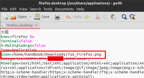
Show me a "Save" icon that doesn't _still_ look like a floppy disk. Until then I'll take my text labels.
Re:Whatever goes up, that’s what we do by desas on Friday March 28, 2014 @02:57AM (#7485718)
The stock save icon in Ubuntu hasn't been a floppy disk for years. Here it is:http://ubuntuhandbook.org/wp-content/uploads/2014/03/firefox...
Re:Whatever goes up, that’s what we do by couchand on Friday March 28, 2014 @01:20AM (#7485498)
When Stack Overflow recently released the new top bar no one could figure out the Inbox icon. I guess office desks don't have inboxes anymore, either. I'm really curious what the next one to go will be. The standard trash can??
Re:Whatever goes up, that’s what we do by baudehlo on Thursday March 27, 2014 @11:11PM (#7485121)
Modern apps don't have a save function. There's no need for it.
Re:Whatever goes up, that’s what we do by z3phyr on Friday March 28, 2014 @02:53AM (#7485709)
All the apps must have 'Manual Override'. Save is desirable in ethical scenarios.
Re:Whatever goes up, that’s what we do by mcherm on Friday March 28, 2014 @08:36AM (#7486775)
What?

I don't comprehend what you mean by "manual override", nor how saving can have any ethical implications whatsoever.

Re:Whatever goes up, that’s what we do by andrewflnr on Friday March 28, 2014 @02:16PM (#7488980)
I'm pretty sure it's a joke, probably a reference.
Re:Whatever goes up, that’s what we do by marcosdumay on Thursday March 27, 2014 @10:23PM (#7484936)
Just decide which decade you are talking about. I hear this since the 90's.
Re:Whatever goes up, that’s what we do by duaneb on Thursday March 27, 2014 @07:47PM (#7484301)
> fad

You realize that iconography predates all civilization, right?

Re:Whatever goes up, that’s what we do by Pacabel on Thursday March 27, 2014 @08:14PM (#7484411)
I think he's talking within the context of software, you know.

Even within this context, icons have been used for a long time in things like toolbars. But historically they've been quite descriptive of what they do, and often times have been accompanied by a textual description if there's any uncertainty as to their meaning.

Like the earlier commenter wrote, however, we've seen the use of icons really taken to a stupid extreme as of late. This is especially true when it comes to websites and web apps. The icons are often rather abstract, to the point of causing confusion and harming usability.

Even desktop apps have succumbed to this. Look at Chrome's menu icon. In the last version I used, it was a stack of three horizontal lines. At a glance, it's not clear at all what it represents. It's only after clicking it, and seeing the menu that opens, that the connection is made.

Re:Whatever goes up, that’s what we do by sirkneeland on Thursday March 27, 2014 @08:24PM (#7484462)
IE6 predates all of civilization too.
Re:Whatever goes up, that’s what we do by duaneb on Thursday March 27, 2014 @08:33PM (#7484514)
Of all the things that inhibit our use of programs, icons are surely the least because after you've pressed them a couple thousand times, I hope you still don't forget them. Text takes up a lot of space.
Re:Whatever goes up, that’s what we do by Pacabel on Thursday March 27, 2014 @10:11PM (#7484891)
What you're saying about icons is true, but only if we're talking about desktop software that has major releases only every few years, or software that otherwise uses a very standardized and common set of icons.

That isn't what we see with most web apps these days, including the major ones. There's continual change, including the icons that are used, where they're positioned, and what happens when they're clicked on. If you discover what an icon means and does today, there's a very good chance it'll have changed by tomorrow, if it's even still around.

We're much better off losing a small amount of space, but getting an obvious and unambiguous description when text is used instead of icons.

Re:Whatever goes up, that’s what we do by XorNot on Friday March 28, 2014 @12:01AM (#7485280)
Also the trend is wrong. Old mobile devices needed icons. But then you have a 1920x1080 screen on a new mobile device, you can read and distinguish truly tiny text quite easily (I'm finding a lot of websites are much better in desktop mode on my S4 these days, for example).

Text works just fine in most applications, because the shape of a particular word is itself iconography.

Re:Whatever goes up, that’s what we do by bmm6o on Thursday March 27, 2014 @08:17PM (#7484429)
Nice selective quoting.

> fad [of replacing text links with icon-only buttons in software UI]

Re:Whatever goes up, that’s what we do by blockross on Thursday March 27, 2014 @08:05PM (#7484373)
True, but don't confuse iconography with brand marketing.