Using icons over text gets you some nice wins when it comes to i18n as well. I.e. you're fitting an icon, not variable width text.
Show me a "Save" icon that doesn't _still_ look like a floppy disk. Until then I'll take my text labels.
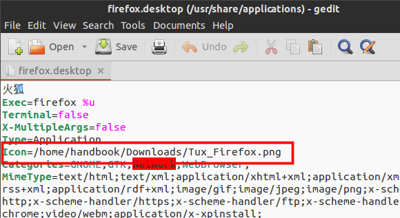
The stock save icon in Ubuntu hasn't been a floppy disk for years. Here it is:http://ubuntuhandbook.org/wp-content/uploads/2014/03/firefox...
When Stack Overflow recently released the new top bar no one could figure out the Inbox icon. I guess office desks don't have inboxes anymore, either. I'm really curious what the next one to go will be. The standard trash can??
Modern apps don't have a save function. There's no need for it.
All the apps must have 'Manual Override'. Save is desirable in ethical scenarios.
What?
I don't comprehend what you mean by "manual override", nor how saving can have any ethical implications whatsoever.
Re:Whatever goes up, that’s what we do
by andrewflnr on Friday March 28, 2014 @02:16PM
(#7488980)
I'm pretty sure it's a joke, probably a reference.
Re:Whatever goes up, that’s what we do
by marcosdumay on Thursday March 27, 2014 @10:23PM
(#7484936)
Just decide which decade you are talking about. I hear this since the 90's.
I wouldn't hold my breath. I think a lot of the reasons we're moving to icons instead of text is because sometime in the next ten years, the majority of all internet traffic will originate on phones, and phones don't have nearly as much real estate to devote to labels as desktop screens do.