It's especially "interesting", when the slider allows to navigate to the exact frame you want (that happens very rarely) and the information you want to see is in the subtitles burned into the video - the ones not shifting with UI controls. The UI obscures that and I have to make tens of attempts with increased sloppiness due to frustration to take it all in.
Most often it's something I keep mishearing and need subtitles to actually understand what's being talked about. For example, I keep hearing "Hello awful person" in Anton Petrov's videos. https://youtu.be/PyRf7B1Ji4A?si=bIA7S8qB_WLdLgVs&t=45
https://www.versionmuseum.com/images/websites/youtube-websit...
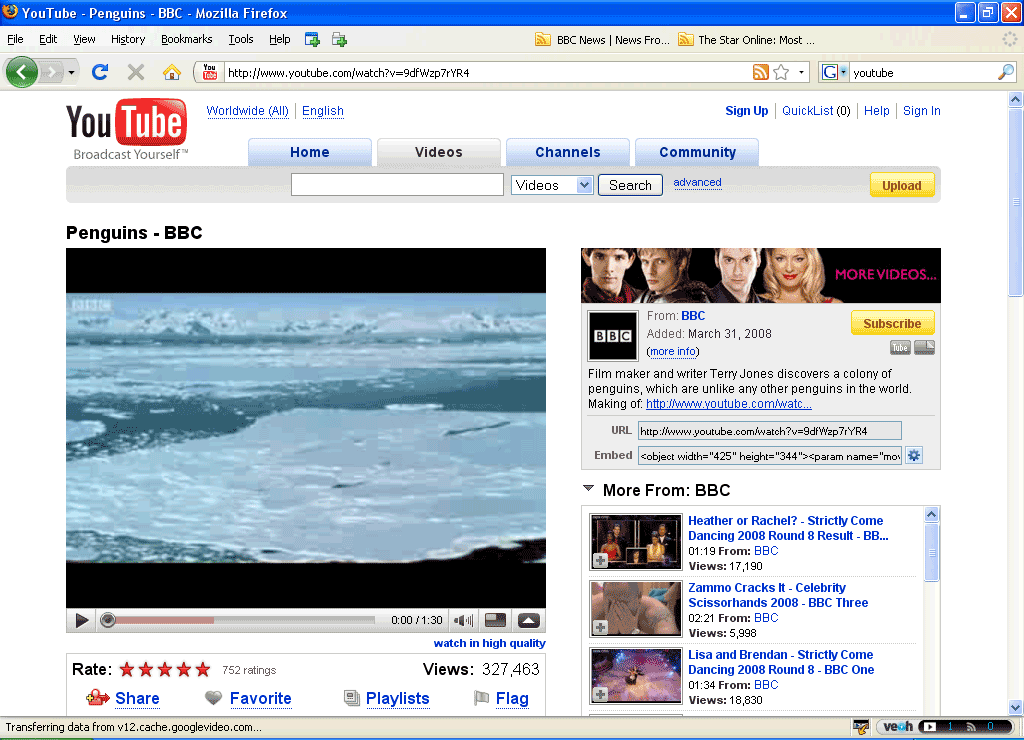
What's the right trade-off here in your mind then? Leave the controls always-on/visible? On a small screen, it takes a lot of real estate (except in portrait mode), and small UI controls are a pain to use so you need to make them big enough. I struggle with this, I really don't know what is the right trade-off here.
Portrait mode is exactly what I have in my mind. You have plenty of places on the bottom of the video canvas.
For YouTube at least, you only has full-screen mode when in landscape anyway.
This is besides your point but I thought I would mention it. I like controls that hide in full screen mode regardless of portrait or landscape because you want to focus on the content.
There was some way to get the same effect in android, but I can't recall right now
That's why the full-screen mode exists
One reason people might enter fullscreen mode is to avoid seeing distracting things on the screen. Controls might be distracting.
Accept it and you will be less frustrated.
Most people don’t care enough about UX to make purchasing decisions based on it. Therefore, most companies don’t prioritize it. Therefore, most product designers have no incentive to care about UX.
This has always been true.
YouTube Premium offers Premium Controls which is a sidebox with the controls like you are asking for.
Once you want to do anything else you have to exit everything and open it back up though, it’s not really efficient
It's under "Modify Playback with Premium Controls":
Weird, that page says "Premium controls are available on Android, iPhone, and tablets, but are not yet available on desktop.", and I'm not seeing the option on desktop
Worst though is YouTube shorts where you can’t rewind
Edit: Also there are keyboard controls for going frame-by-frame, if you need that much control. Or there was last time I used it a long time ago.
I personally think iPad YouTube app's touch is not too bad; but in general (not limited to YouTube), I think the UI design of web video players are all too fixated on the existing design.
For example, when not in fullscreen mode, I don't see why all the controls need to be confined to the video frame and disappear when not hovering. While this design choice has its benefits, it also presents significant drawbacks: it obscures the actual content when you're interacting with the controls (a problem that's particularly acute on smaller screens), and performing quick, repetitive actions becomes difficult because the controls aren't visible until you hover over them, among other issues. This approach to web video player UI has been a pet peeve of mine for some time.