These days every application reinvents its own controls for everything. For example, in a web browser the tab bar and address bars are totally custom controls. Electron apps like vscode take this to the extreme - I don't think vscode or spotify use any native controls in the entire UI.
I blame the web in part. It was never designed as a system to build application UIs, and as such the provided UI primitives are primitive and rubbish. Developers got used to building our own custom elements for everything - which we build fresh for every client and style in alignment with the brand. UIs built on the web are inconsistent - so our users never get a chance to learn a common set of primitives.
And for some reason, OS vendors have totally dropped the ball on this stuff. Windows has several competing "official" UI libraries. Every library has a different look and feel, and all are in various stages of decomposition. Microsoft's own software teams seem as lost as everyone else when it comes to navigating the morass of options - if windows 11 and MS Teams are anything to go by. Macos isn't quite as bad, but its still a bit of a mess. Every year I expect the people building xcode to know how to build and debug software on macos. And then xcode crashes for the 3rd time in a week. Xcode achieves the impossible of making the javascript ecosystem seem sane and attractive.
I'd love a return to the halcyon days of vb6, where UIs were simple and consistent. Where there was a human interface guidelines document that UI developers were expected to read. I want users and developers alike to know how the platform works and what the rules and conventions are. F it. How hard can that really be to build?
https://guidebookgallery.org/pics/gui/interface/dialogs/colo...

... But limited to only allow you up/downvote between -1 and 1.
Everything else could be done with buttons and a TextField / Label for comments and replying.
The web is a bit weird in that it taught us to build every UI as a giant scrolling document. And HN is no different. A more "classic" UI approach would be something like Thunderbird mail - with 2 panes: a "comments" tree on top and a "message body" down the bottom. That would be harder to read (since you'd need to click on the next message to jump to it). But it might encourage longer, more thoughtful replies.
Thunderbird: https://lwn.net/Articles/91536/
Or you could reimplement HN with classic controls and something like TB 114's UI:
https://www.ghacks.net/wp-content/uploads/2022/08/account_ma...
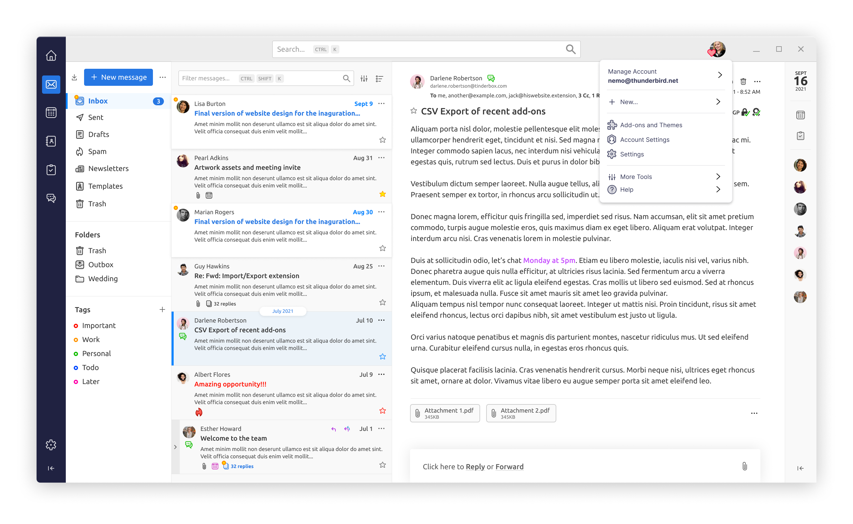
Probably still worse that what HN is now though.
Usenet had a much better model for discussion groups/forums like HN in my view, though crucially for the modern world it is missing some kind of "comment voting"/user-driven moderation. I wonder if there's an HN<->NNTP gateway around somewhere?
It really isn't. Web is anemic in controls and layouts compared to what's actually possible with proper controls and control over those controls.
Web apps also can't use a lot of native shortcut keys to build keyboard-friendly UIs. Its rude to override the browser's right click menu. Alt-anything might bring up browser native controls. Ctrl/Cmd+S is owned by the browser. And so on. Some of this stuff you can override, but even if you do, users never experiment because those shortcut keys basically never do what you expect.
The HN UI would be very easy to recreate in something like Delphi, I'd call it trivial.
We use Delphi at work. Our main application is a regular Windows desktop application. I recently had to add a new module to our application at work, it required three new input windows/screens, each with 100-150 input fields, few dozen buttons, and several grids.
I made the UI parts in a day. A few more hours the day after and all the UI logic and database loading/saving was done, and I had a functional UI for all three windows/screens.
Many of our customers have HTML-based ERP or CRM systems that we integrate with. I've never seen any of them that are close to dense UIs, and most of the time I see the user having to click through multiple sub-screens just to do a relatively simple task like looking up a couple of values. With a denser UI that could all have been on a single screen and saved the user a ton of time.
But I'd love to be proven wrong. Any examples out there of actually dense, in the good sense, web UIs?
I realised I should've added: Have you actually seen a proper dense UI? Look at any professional software. You will die of old age before you can implement just the layout for it using web technologies.
Here's Cubase with TAL-U-No-LX synth emulator in front of it: https://pbs.twimg.com/media/E8M6-QOWEAQMgGl?format=jpg&name=...
The skins are made using XML and QSS (Qt CSS).
It's not web per se, but it is not too far from it either. I would say it's a combination of both, Web and Desktop technologies, into one.
https://i0.wp.com/djtechtools.com/wp-content/uploads/2021/07...

You have no control over layout or control over rendering. In native apps (especially desktop apps) you can always go down or up any level you want. In the browser you're always fighting the quite rigid and high-level layout and rendering engine.
It's somewhat better now with grid and felxbox, but the browser will always have its own ideas on how the children can be laid out, and there are no good ways for children to depend on the parent, or for the parent to depend on the children etc.
There are very, very few dense layouts on the web. And while late-90s/early-2000s sofware was often ridiculed, you could create dense control-rich interfaces in minutes. Because they are usually not ad-hoc hacks added to the platfrom as an afterthought, like everything on the web.
My experience had been that most (almost all) of them _only_ worked with a single font in a single font size and a specific window size. If you did change any of these, it got unusable.
About consistency: except for those that didn't, not even MS themselves were consistent. http://hallofshame.gp.co.at/shame.html
The 90s had been also the time of programs like Kai's Power Tools https://mprove.de/script/99/kai/ and Winamp.
I'm sorry, but "interface consistency" is not something that comes to my mind when I think of 90s and early 2000s Windows programs (neither was Linux). Irix with 4DWM had been quite consistent at that time.
In comparison, modern windows doesn't even hide its inconsistencies. Try right clicking on the desktop in windows 11. You get a dropdown with large item spacing and rounded corners. But then if you click "Show more options", the dropdown is replaced with a different dropdown with subtly different menu items, small spacing and sharp corners.
They aren't even pretending any more.
This isn't Kai's photo goo we're talking about here. This is core windows.
Unless you opted out, basically every application in the 90s and early 2000s was built using the core platform's UI library. There were a few exceptions, but the 90s were a golden age for platform consistency compared to today.
Now its hard to find any 2 applications on windows which use the same UI style. Firefox and explorer? Nope - the maximise and close buttons have a different style. Spotify? Nah thats some custom webview. Visual studio? Nope, thats using an old windows library. Whatsapp desktop? Qt. Intellij? Some java thing. And so it goes. Its an absolute zoo.
They're pretty fast to create, relatively consistent, simple and fast/easy to create.
That's not what people want, they want all the flexibility and features of say Gmail or maps. B along with some communication and flexibility. Not to mention running on every OS under the sun, and being able to use accessibility and screen reader tools on all those platforms.
Uh, no you can't. Web forms aren't rich enough to build most desktop applications. You can't make vscode, gmail, slack or spotify using web forms. They're just a bad set of primitives for applications. (In the web's defense, it was never designed as an application platform).
Yet - we had some version of all of those applications in the 90s, on every OS at the time. And (mostly) using the platform's built in UI libraries so the look and feel was consistent and delightful.
I can't speak to font sizes since IIRC that was an option but I left it default.
I taught courses on VB from versions 3 to 6 and this was always something we went over.
IMO the fact that someone cared enough to make a site about what is largely nitpicks like this shows exactly how these stood out in the otherwise consistent landscape of UIs in the 90s.
Nowadays such a site would have 99% of every application released. It could even be automated, just somehow track all new .exe files in GitHub, MajorGeeks, Softpedia, etc and add them automatically to a hall of shame list, chances are even without human supervision the overwhelming majority will be correct :-P.
Part of what causes this crap is that the costs aren’t visible. If you can get it through stakeholders’ heads that they’re cutting the feature development rate in half (and making UX worse, and paying in maintenance time and a higher defect rate, but those are harder to make them understand) with their twee UI, some can be steered away from it, or at least convinced to tone down the most-harmful parts.
A billion times this. And this is when the next version of the design system isn’t incompatible with the previous one.
I can’t fathom why they made the decision to push every style to a different rendering engine. Working on Windows gets you to see every look and feel and the deeper you go, the closer you get to Windows 2000.
They seem to aim at minimising users leaving and maximising the extraction of data obtained per user
I'm gonna ask a dumb question out of ignorance because I know responsiveness is all the rage, but... what do we gain from it? Would it not be more straightforward to build UIs from the ground up for desktop and mobile targets than make one UI to morph to fit both?
This alone means you either handle any window size and size ratio or your UI will break for some users.
You should spec your UI in device-independent units and let the GUI handle things like different pixel densities (or aspect ratios) and font sizes.
As for the web, responsive design was so great that in almost every site i had to zoom out to make it think i had a monitor with a bigger resolution than i really did.
These days and since i do not maximize the browser (because my monitor is huge - like all modern monitors that do not have awful image quality tend to be), i often have to resize the window because sites tend to think i'm using a mobile phone and instead of scaling down / hiding less important stuff (that would at least be appropriate for a narrower viewport) they make thing ultraginormous (because touch screens), overly padded out (because touch screens) and they hide all options behind a hamburger menu (because mobile screens are physically too small).
I'm certain there are theoretically ways to do it "right" (a friend web developer told me how but i forgot) but absolutely zero sites (that i visit) do that.
* - two for one up front, ongoing development and maintenance costs of modern responsive UIs is going to be much greater than doing things right 2 or 3 times, but those costs are beyond the next sprint, and pay the good chunk of salaries in this industry, so...
--
[0] - And, unfortunately, this thinking became the zeitgeist of software development, so OSS projects do the same.
Most of the controls you have on the average GUI app are present in HTML. The big difference is that HTML describes active documents, not dialog boxes.
Styling should be provided by the host, not the app. The app should give, at most, hints to the system - that this button is the default, what the tab key navigation order is, etc.
> Web front-end are a completely different game in that regard
They shouldn’t be. The API is different, because the presentation layer leaks all over the place into the app logic. With runtimes such as VB’s the UI elements see and react to events, while the runtime takes care of pushing those events either to the host software or to the event handlers that are part of the app.