https://guidebookgallery.org/pics/gui/interface/dialogs/colo...

... But limited to only allow you up/downvote between -1 and 1.
Everything else could be done with buttons and a TextField / Label for comments and replying.
The web is a bit weird in that it taught us to build every UI as a giant scrolling document. And HN is no different. A more "classic" UI approach would be something like Thunderbird mail - with 2 panes: a "comments" tree on top and a "message body" down the bottom. That would be harder to read (since you'd need to click on the next message to jump to it). But it might encourage longer, more thoughtful replies.
Thunderbird: https://lwn.net/Articles/91536/
Or you could reimplement HN with classic controls and something like TB 114's UI:
https://www.ghacks.net/wp-content/uploads/2022/08/account_ma...
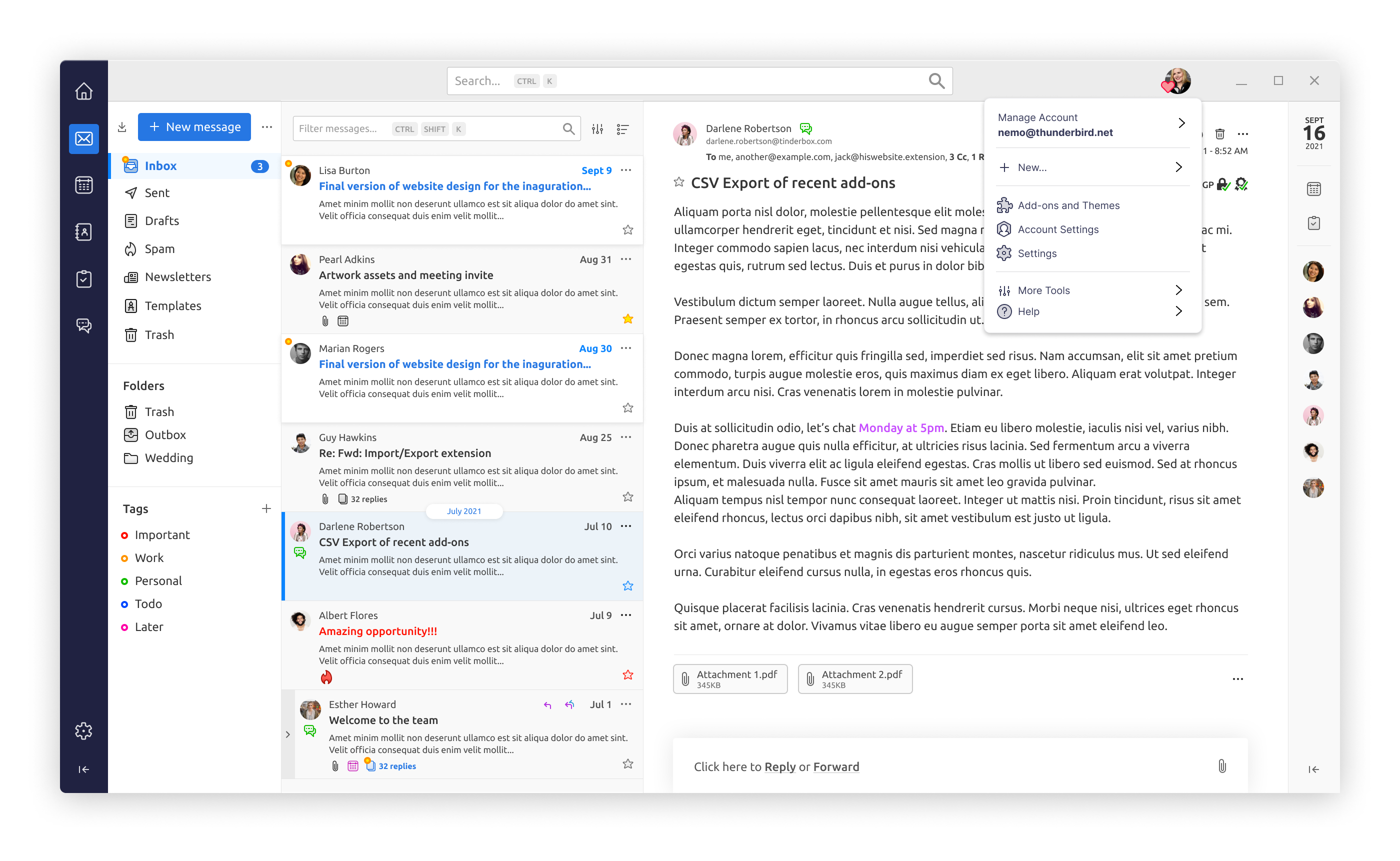
Probably still worse that what HN is now though.
Usenet had a much better model for discussion groups/forums like HN in my view, though crucially for the modern world it is missing some kind of "comment voting"/user-driven moderation. I wonder if there's an HN<->NNTP gateway around somewhere?
It really isn't. Web is anemic in controls and layouts compared to what's actually possible with proper controls and control over those controls.
Web apps also can't use a lot of native shortcut keys to build keyboard-friendly UIs. Its rude to override the browser's right click menu. Alt-anything might bring up browser native controls. Ctrl/Cmd+S is owned by the browser. And so on. Some of this stuff you can override, but even if you do, users never experiment because those shortcut keys basically never do what you expect.
The HN UI would be very easy to recreate in something like Delphi, I'd call it trivial.
We use Delphi at work. Our main application is a regular Windows desktop application. I recently had to add a new module to our application at work, it required three new input windows/screens, each with 100-150 input fields, few dozen buttons, and several grids.
I made the UI parts in a day. A few more hours the day after and all the UI logic and database loading/saving was done, and I had a functional UI for all three windows/screens.
Many of our customers have HTML-based ERP or CRM systems that we integrate with. I've never seen any of them that are close to dense UIs, and most of the time I see the user having to click through multiple sub-screens just to do a relatively simple task like looking up a couple of values. With a denser UI that could all have been on a single screen and saved the user a ton of time.
But I'd love to be proven wrong. Any examples out there of actually dense, in the good sense, web UIs?
I realised I should've added: Have you actually seen a proper dense UI? Look at any professional software. You will die of old age before you can implement just the layout for it using web technologies.
Here's Cubase with TAL-U-No-LX synth emulator in front of it: https://pbs.twimg.com/media/E8M6-QOWEAQMgGl?format=jpg&name=...
The skins are made using XML and QSS (Qt CSS).
It's not web per se, but it is not too far from it either. I would say it's a combination of both, Web and Desktop technologies, into one.
https://i0.wp.com/djtechtools.com/wp-content/uploads/2021/07...

You have no control over layout or control over rendering. In native apps (especially desktop apps) you can always go down or up any level you want. In the browser you're always fighting the quite rigid and high-level layout and rendering engine.
It's somewhat better now with grid and felxbox, but the browser will always have its own ideas on how the children can be laid out, and there are no good ways for children to depend on the parent, or for the parent to depend on the children etc.
There are very, very few dense layouts on the web. And while late-90s/early-2000s sofware was often ridiculed, you could create dense control-rich interfaces in minutes. Because they are usually not ad-hoc hacks added to the platfrom as an afterthought, like everything on the web.