Re:E-Paper Wall Paper
by jtbarrett on Sunday March 19, 2023 @01:45AM
(#35216376)
The displays can show black, white and red. He picked a good image for that palette. Still, the dithering was surprisingly effective.
[ Parent
| on HN ]
Sounds like the early two color process in Hollywood… they got red (for skin tones) and a sort of teal blue green that could sorta do plants and sorta do sky, but wasn’t real convincing at either.
Re:E-Paper Wall Paper
by throwthrowuknow on Sunday March 19, 2023 @08:15AM
(#35218218)
They should have used orange and blue https://tvtropes.org/pmwiki/pmwiki.php/Main/OrangeBlueContra...
Dithering is amazing. I built a display to show my calendar:
https://www.stavros.io/posts/making-the-timeframe/
When testing it out, I tried to show a grayscale image, because the display supports four tones, but it came out horrible. Then I displayed a dithered two-tone image (black and white) and it was much, much better:
https://www.stavros.io/posts/making-the-timeframe/dithered.j...
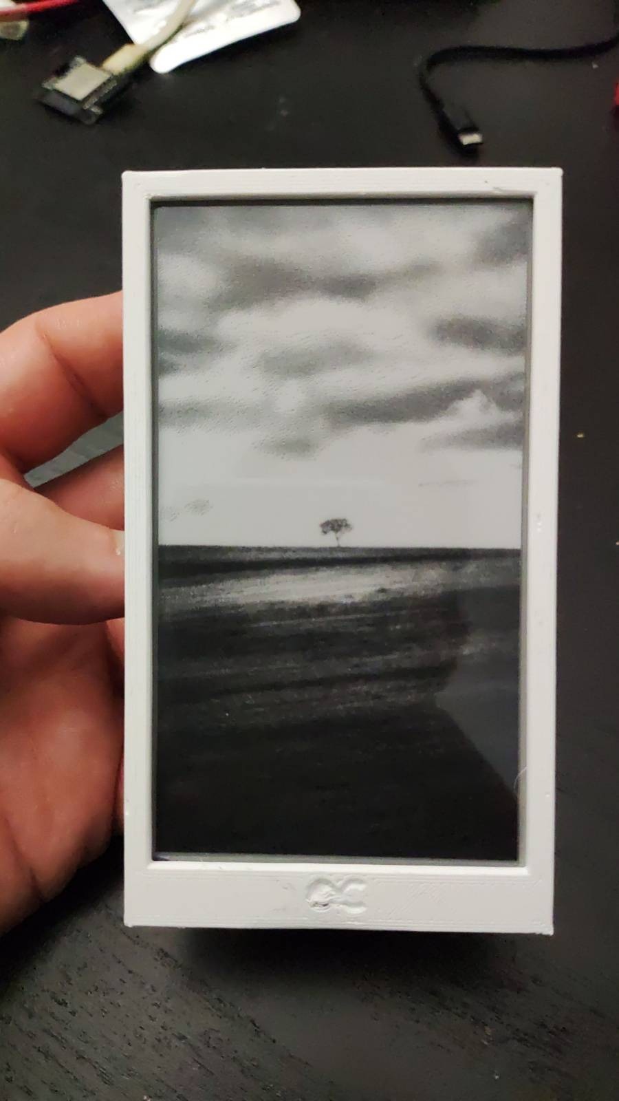
I wonder if there are any arbitrary-palette dithering algorithms that I could try, it would be great to be able to use the other two tones and still dither.